CLIENT
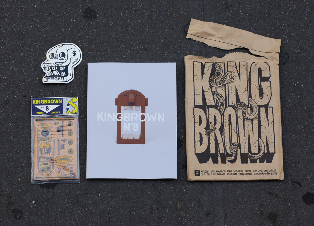
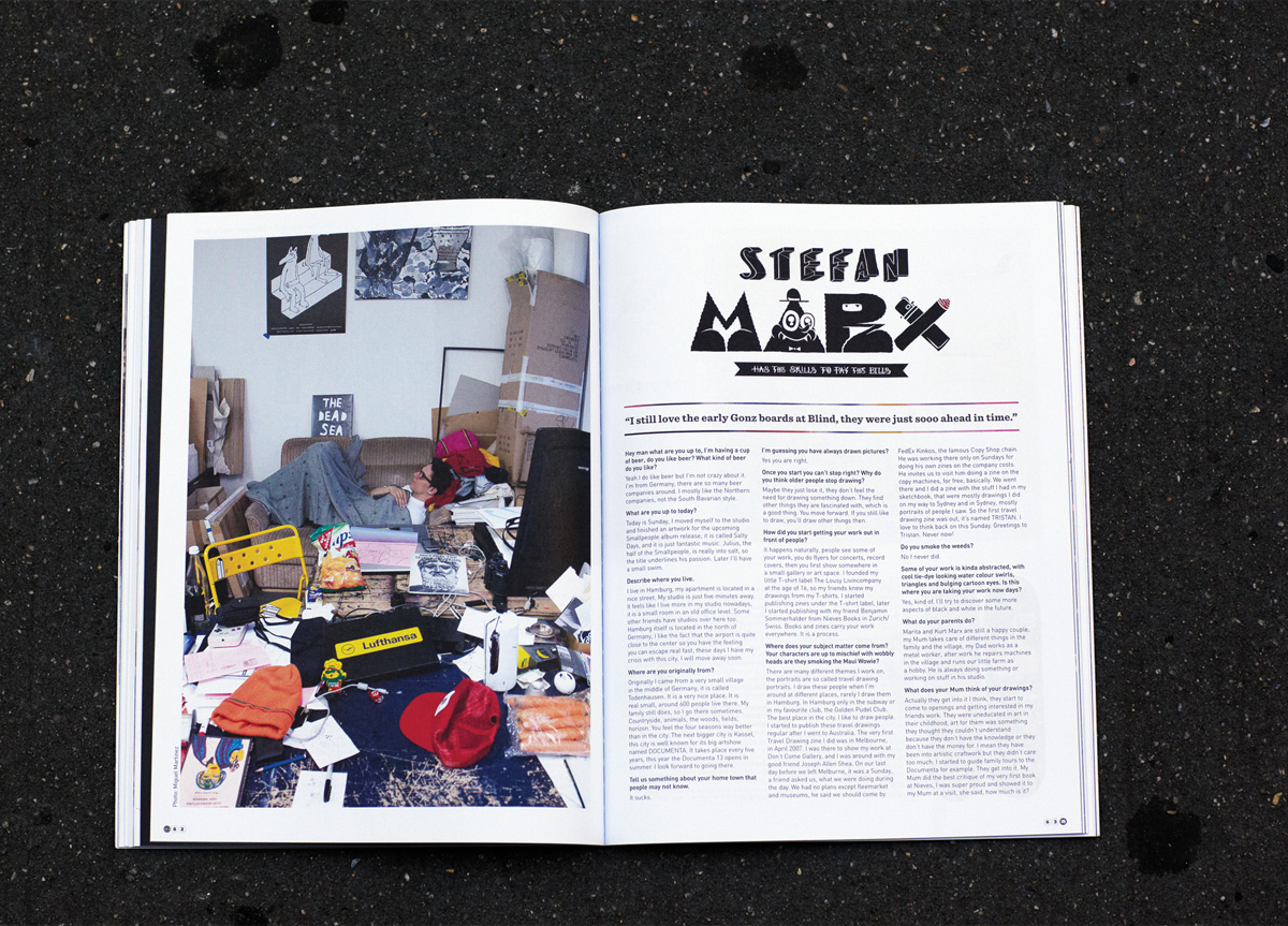
Kingbrown is a limited edition periodical—somewhere between a book, a magazine, and an art zine. Each issue is handcrafted, delivered inside a silkscreened brown bag which is designed and curated by some of the world’s leading innovators of photography, illustration, skateboard art, and design.
BRIEF
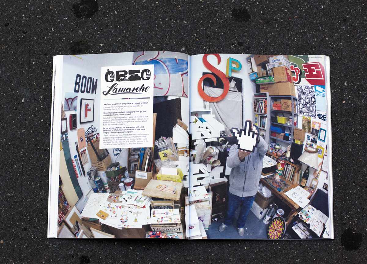
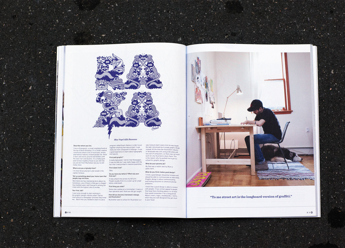
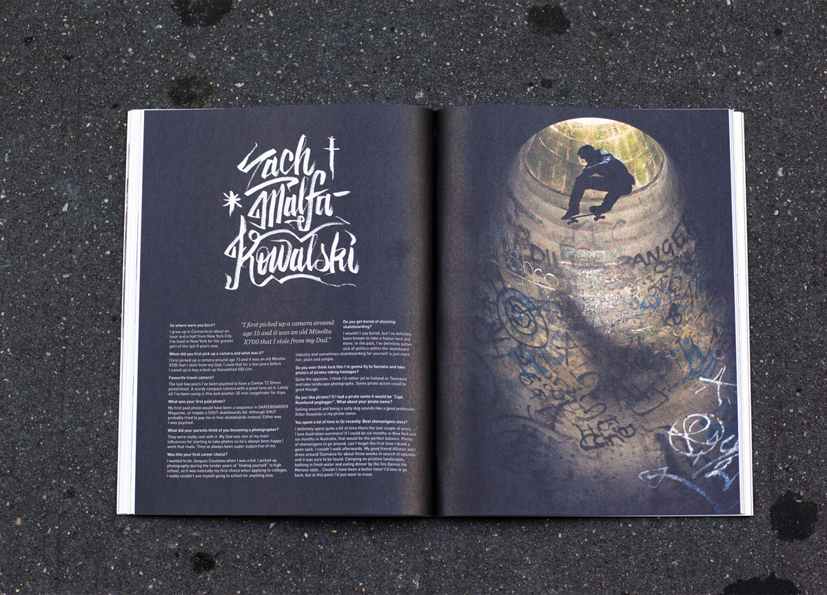
Kingbrown is West Australian slang for a longneck beer—a 40oz. Inside Kingbrown you will find profiles and interviews that take you on a twisted journey inside the studios and minds of some of our very talented friends, with the aim of keeping you inspired and connected to the subcultures we love most.
APPROACH
Printed with quality in mind, each page is a collectible item, individually sealed and packaged. Now in its 8th edition, Kingbrown has achieved worldwide success and is now available for the first time in the U.S.
PRODUCTION LESSONS
The biggest challenge is always dealing with people in multiple countries. Printers, artists, collaborators, distribution, or ourselves. Communication is key and we wish we were better at it.
Judge’s Comments
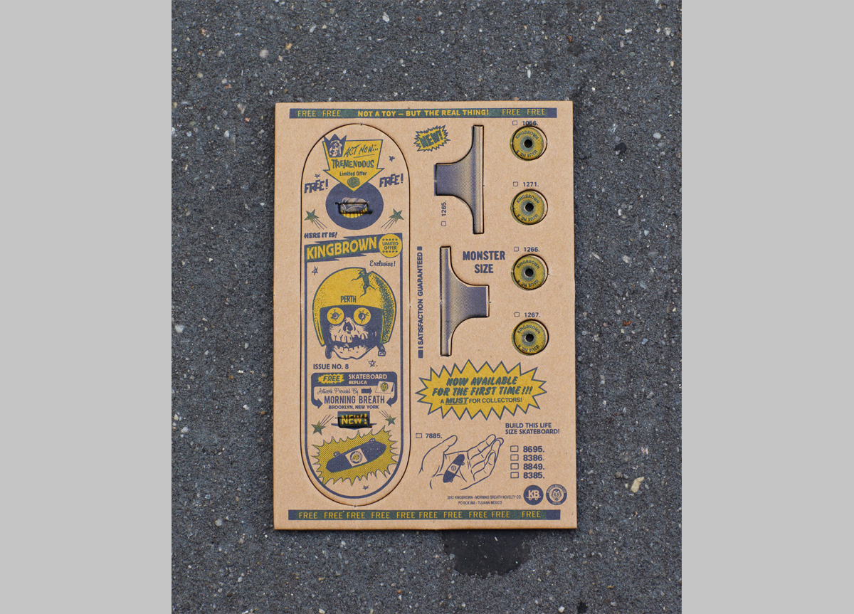
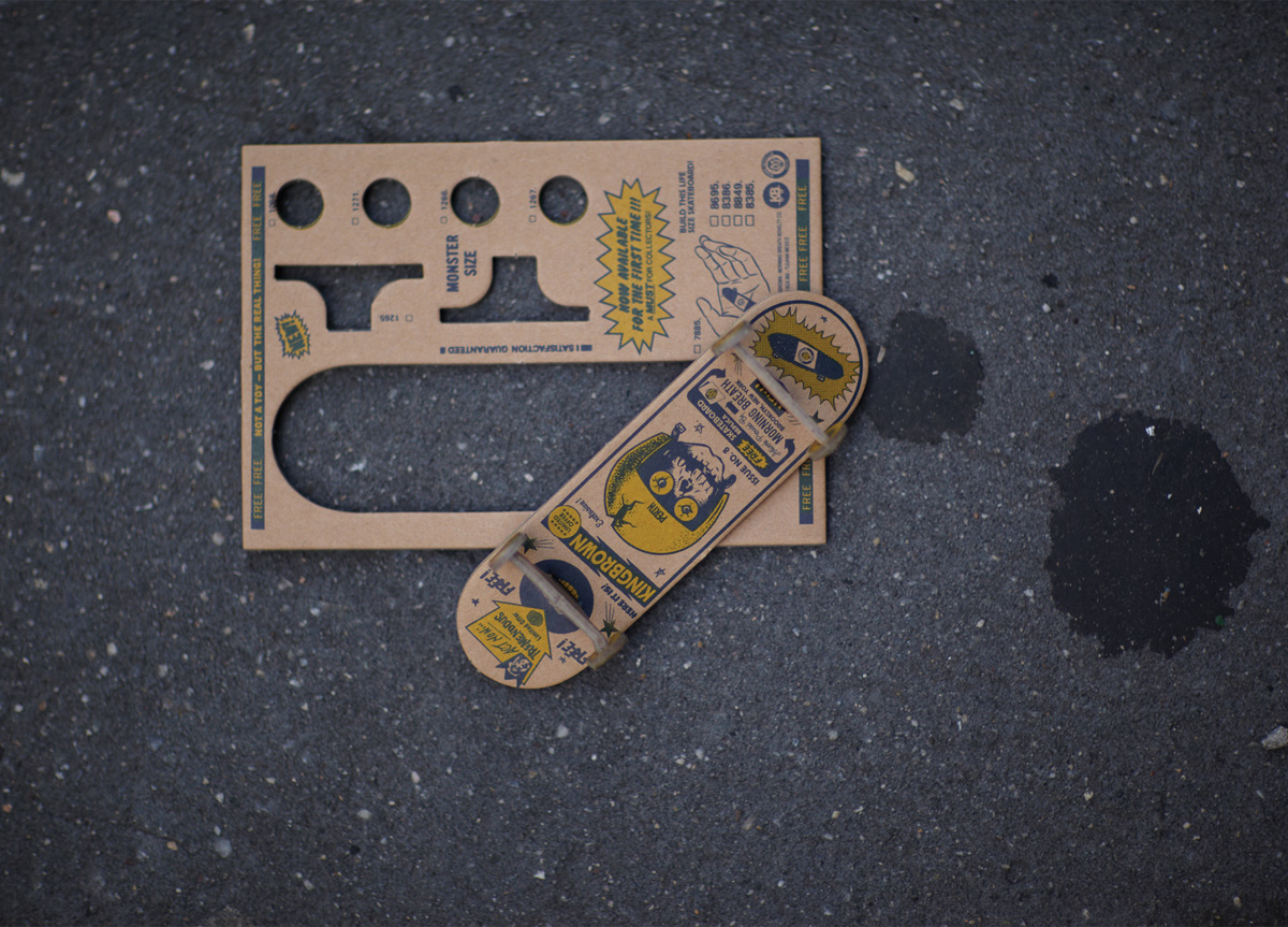
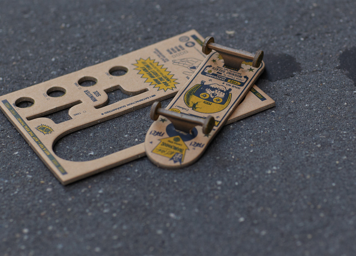
The Kingbrown Magazine is everything I like to see in print. A smart yet ambivalent execution, appearing to care and not to care at the same time. With perfect binding and printed beautifully, the uncoated cover and text are unassuming and humble. Opening the cover reveals rich, inky pages balancing clean and gritty simultaneously. The influences are diverse and many, from Japanese fashion mags to vintage skate and punk zines. The layouts are trend-current, audience-focused, and well planned little pieces of eye joy. Each page is equally captivating, appearing a bit DIY if not for the expertly laid out content. The level of care and detail is applied similarly to everything in the kit. A sewn shipper envelope and cleverly insane fingerboard expertly executed in chip board complete the balance of this dynamic piece. These kids did not phone this one in. The work is inspired, fun, and immensely engaging. Bravo. — David Dodde
Contemporary magazine design has become a confusing mosh of images and type and color and photo and lettering. It’s as if most magazines are created by dumping all the contents (ads and all) into a paper bag, shaking it all up, and spilling it onto the page. This piece seems to achieve the impossible in contemporary magazine design: coherence. It still uses everything under the sun in its execution— crazy images and hand-worked lettering and an “anything goes” attitude. But it adheres to a rigid layout formatting that defies the rest of the publication’s wild appearance. The tension created by that classical page layout contrasting with the organic freedom of the imagery makes this work actually look like a REAL magazine. Bravo! — Art Chantry
This magazine is awesomeness —art/skateboard/interviews— great font use and layout and handsomely produced. — brad murph
This is totally rad. — DJ Stout
