CATEGORY

Mix

RANK

Salvage


PRODUCTION DETAILS

Quantity

500

Page Count

64 + 32 + 8p cover

Number of Colors

CMYK + 1

Binding

Sewn

Dimensions

Book 7.87 × 10.62
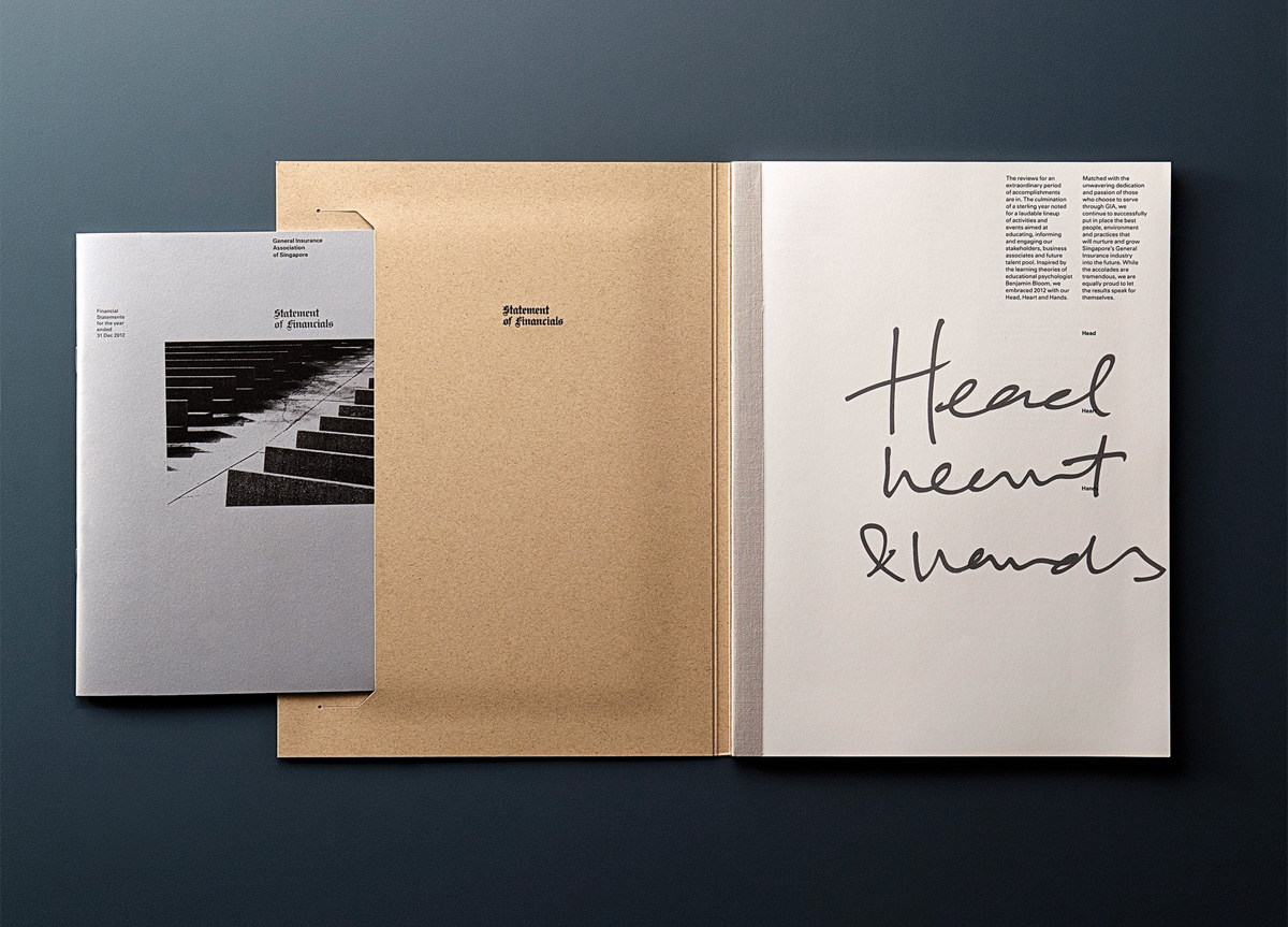
Financial Report 5.82 × 8.26

Paper Stock

Cover Environmental Desert Storm, Frankonia Grey, 324gr/ms
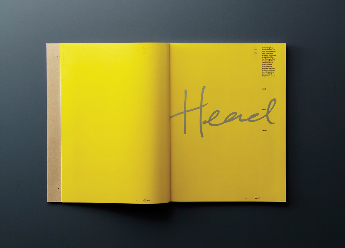
Interior Excel Bulky, Satin, 115gr/m2
Financial Section Shiruku, Premium White, 130gr/m2

Special Techniques

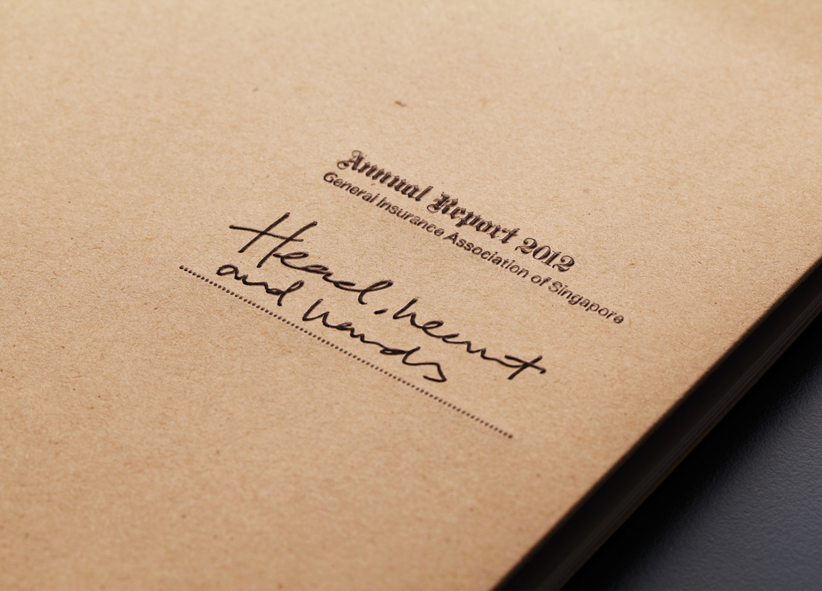
Foil stamp
Emboss
Overall matte varnish


DESIGN CREDITS

Creative Director

Larry Peh

Designer

Randy Yeo


TAGS

, , , , , , , , ,


LINKS

andlarry.com
colourscan.com.sg
gia.org.sg

Annual Report for General Insurance Association of Singapore by &LarryAnnual Report for General Insurance Association of Singapore by &LarryAnnual Report for General Insurance Association of Singapore by &LarryAnnual Report for General Insurance Association of Singapore by &LarryAnnual Report for General Insurance Association of Singapore by &LarryAnnual Report for General Insurance Association of Singapore by &LarryAnnual Report for General Insurance Association of Singapore by &LarryAnnual Report for General Insurance Association of Singapore by &LarryAnnual Report for General Insurance Association of Singapore by &LarryAnnual Report for General Insurance Association of Singapore by &Larry


CLIENT

Gen­er­al Insur­ance Asso­ci­a­tion of Sin­ga­pore (GIA) is a trade asso­ci­a­tion of the Gen­er­al Insur­ance indus­try that rep­re­sents the inter­ests of its mem­ber com­pa­nies. It was estab­lished in 1965.


BRIEF

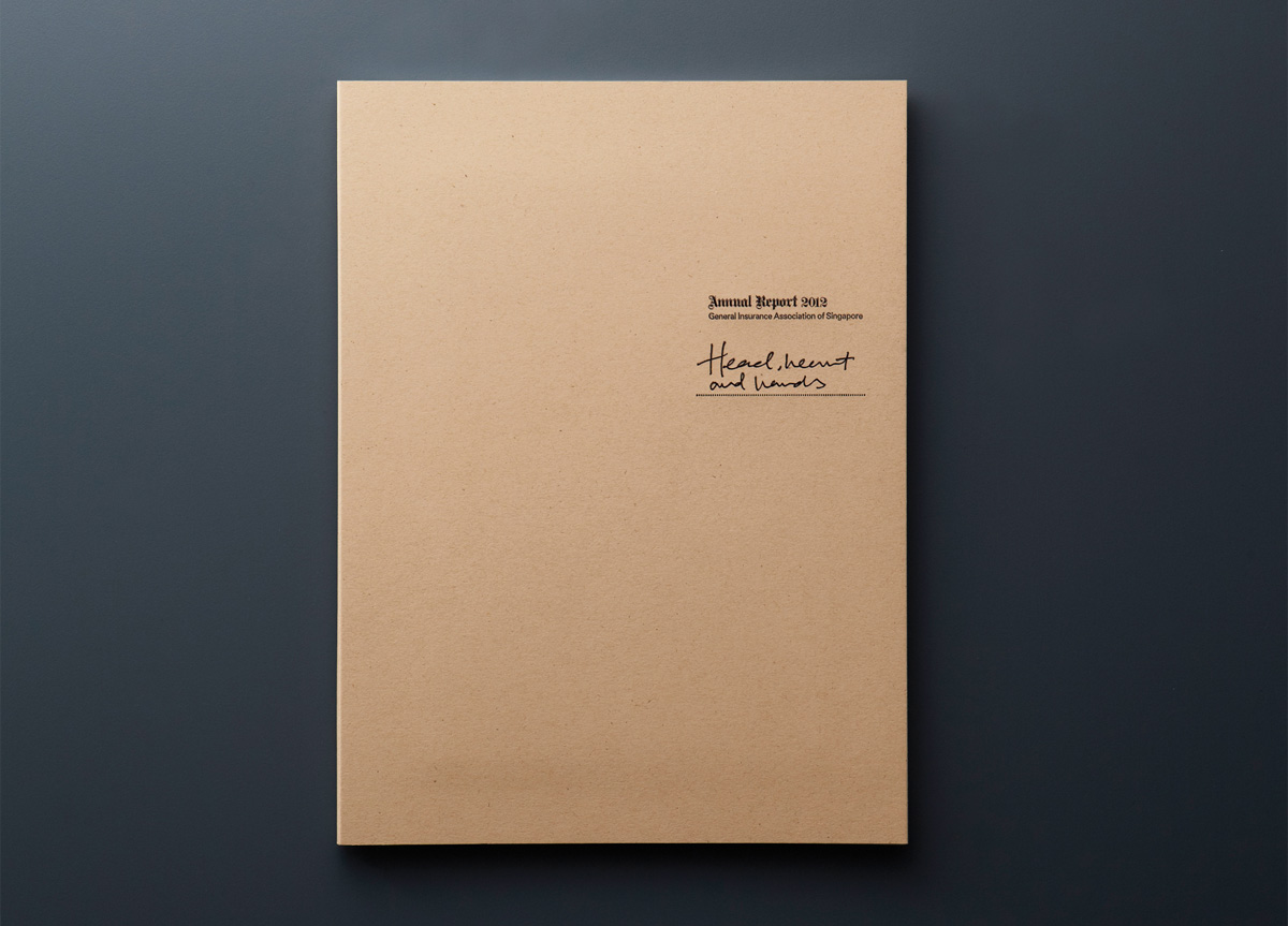
We were com­mis­sioned by GIA to design their 2012 Annu­al Report.


APPROACH

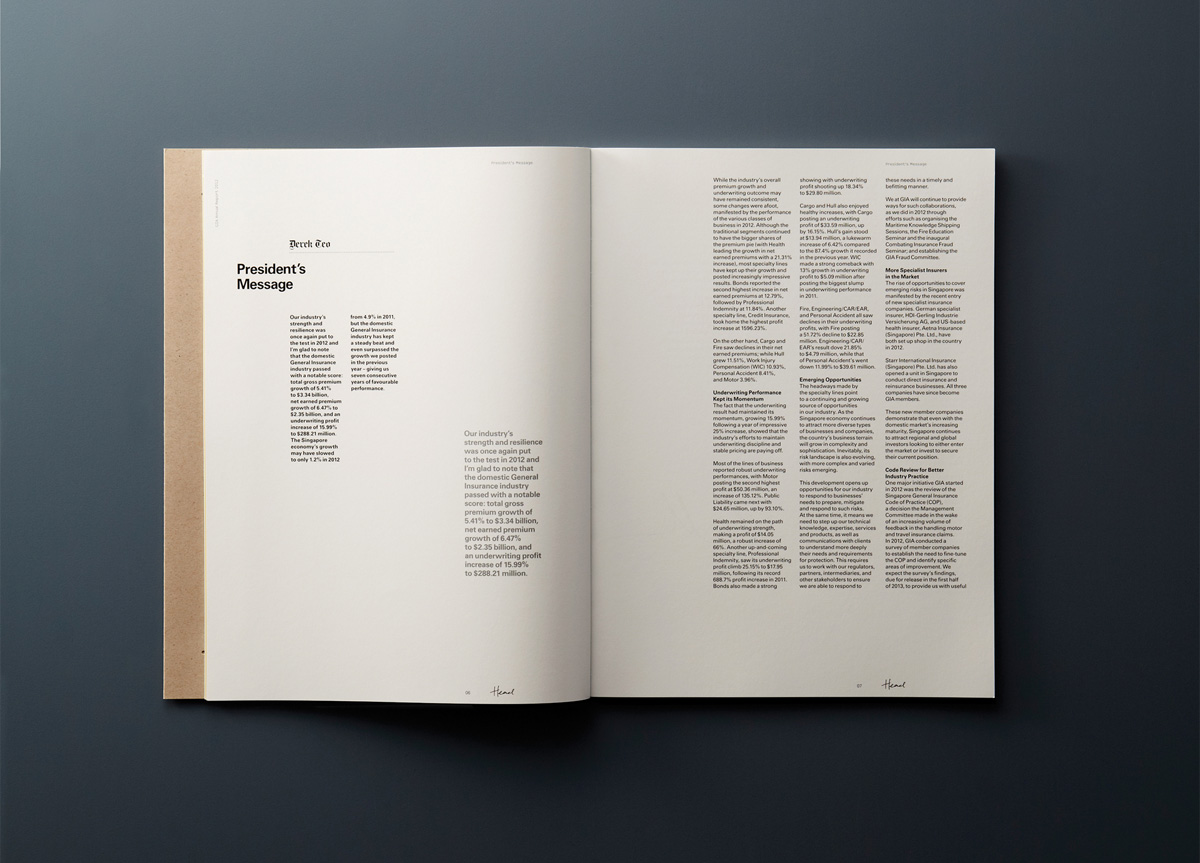
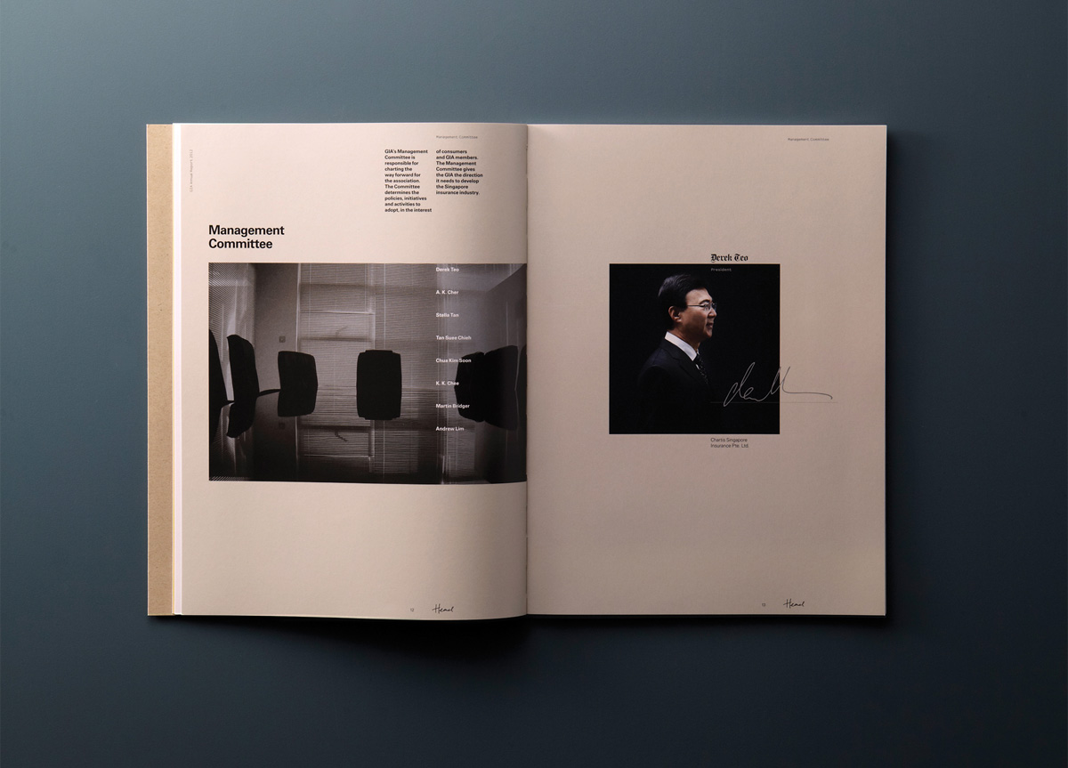
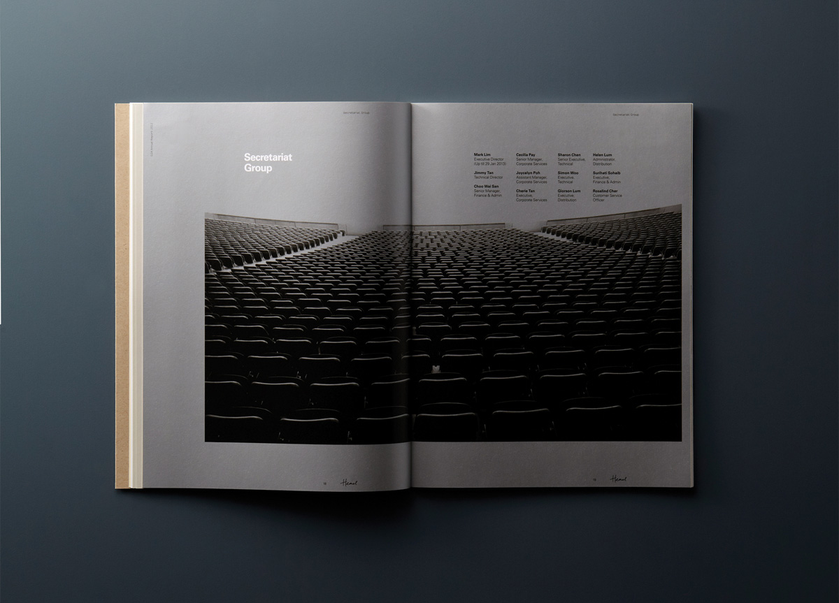
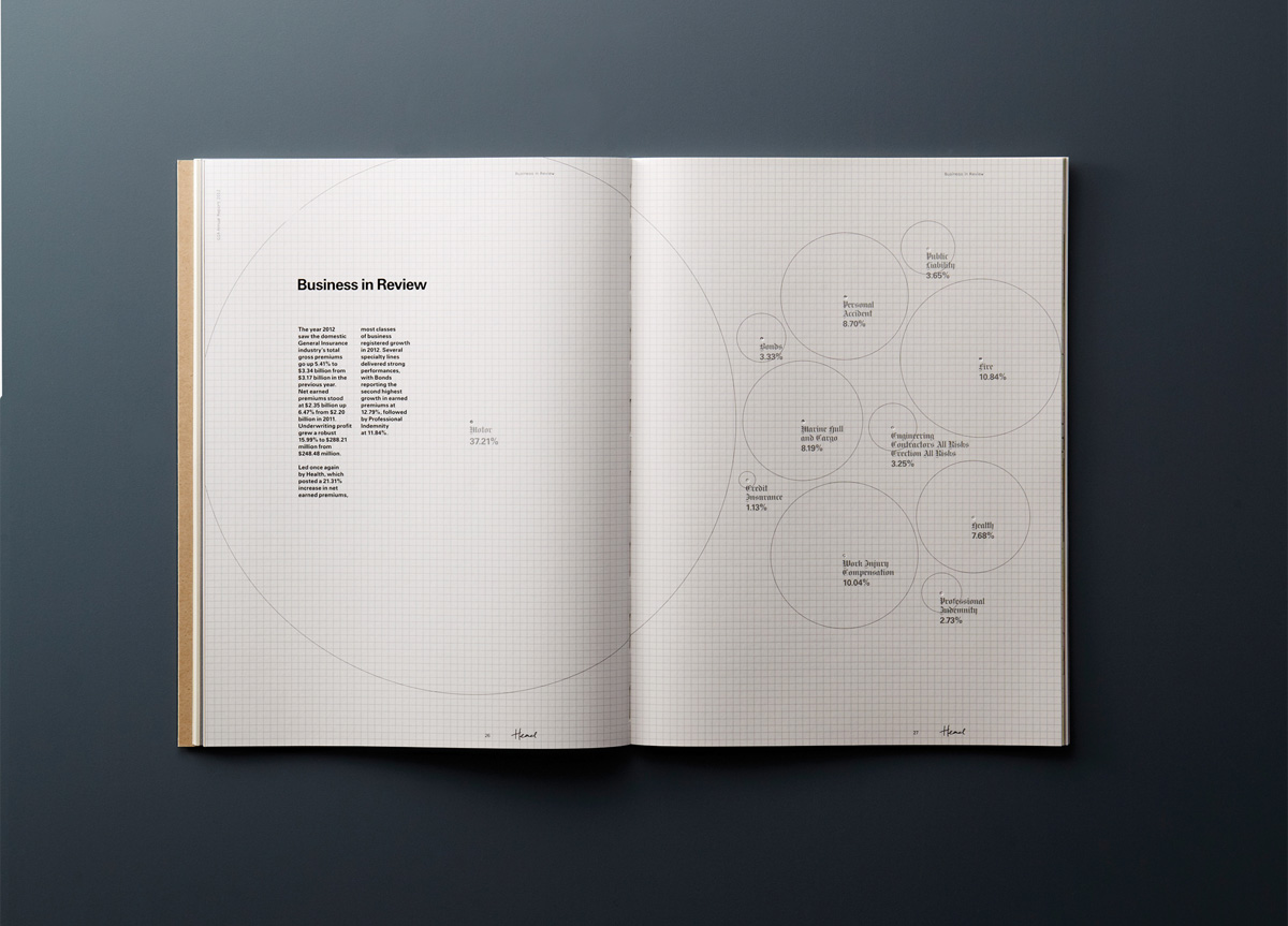
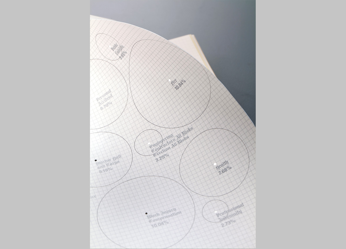
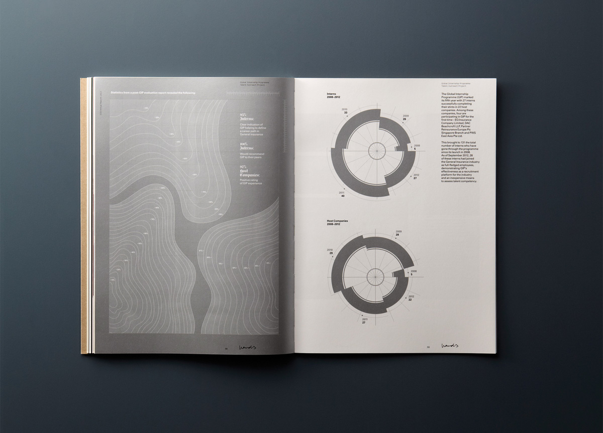
As an asso­ci­a­tion, GIA con­tin­u­al­ly edu­cates, informs, and engages their mem­bers and the pub­lic, result­ing in prac­ti­tion­ers being bet­ter equipped, claims reduced, and a cul­ture of shar­ing and gain­ing knowl­edge through col­lab­o­ra­tion with oth­er asso­ci­a­tions inter­na­tion­al­ly. Titled Head, Heart and Hands, the direc­tion for the Annu­al Report was inspired by edu­ca­tion psy­chol­o­gist Ben­jamin Bloom’s Tax­on­o­my of Learn­ing Domains. As a sig­nif­i­cant point of depar­ture, the visu­al lan­guage, mate­ri­al­i­ty and print/finishing process­es drew ref­er­ence from edu­ca­tion­al metaphors and themes.

PRODUCTION LESSONS

Printing with Staccato 20 Micron required a different way of dealing with colors and profiles during proof and press stage as opposed to traditional lithographic printing. Working closely with an experienced printer meant that all expectations were met and managed each step of the way.

Table of Contents