CLIENT
I Ruv Ru is the creative playspace and upcoming portfolio of an enigmatic Russophile and graphic designer.
APPROACH
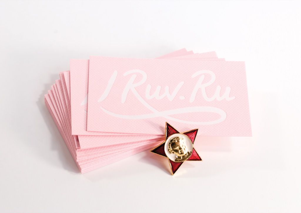
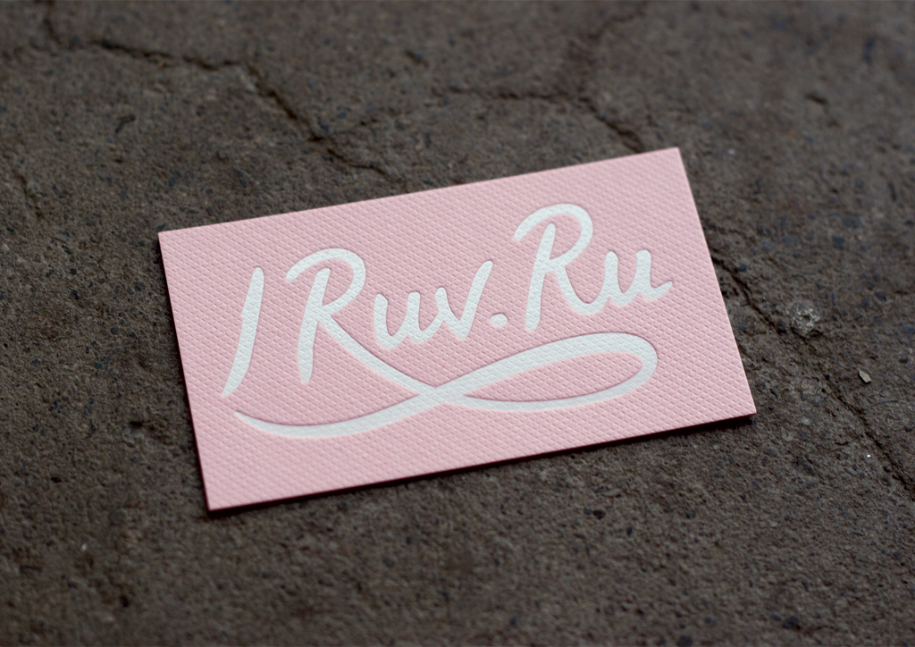
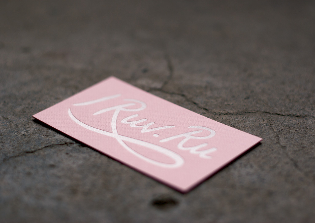
The lettering solution for I Ruv Ru was thick brush script lettering for the name, with a dot between the Ruv and the Ru to signify that it doubles as a url. For the production I wanted something with a hint of valentine, amplifying the cutesy-love theme, without toeing over the line into kitsch. I chose the thick card for its class and solemnity, in the feminine pink color of a love note. Always going for contrast when it comes with printing, the quilted texture of the card was paired under the smooth white foil-blocking of the lettering.


