Introduction
© 2012 Copyright by UnderConsideration LLC
No part of this website may be reproduced in any form without written permission of the copyright owners. All images in this website have been reproduced with the knowledge and prior consent of the artists concerned, and no responsibility is accepted by producer, publisher, or printer for any infringement of copyright or otherwise, arising from the contents of this publication.
About UnderConsideration
A graphic design enterprise that runs a network of blogs, publishes books, organizes live events, and designs for clients. Run by Bryony Gomez-Palacio and Armin Vit in Austin, TX.
design, layout, and production
UnderConsideration, LLC: Bryony Gomez-Palacio, Armin Vit, Jessica Mullen, Kelly Cree
typography
DIN Next by Akira Kobayashi, Linotype
Diverda Serif by Daniel Lanz, Linotype
Code
WordPress Version 3.4.2
MemberWing
SlidesJS
Following closely on the footsteps of our inaugural Brand New Awards—a judged competition celebrating the best identity work—and their goal to establish a different approach toward award shows and competitions in the design industry, the FPO Awards aim to institute a new model for judging not just graphic design concepts and execution but the way those are produced through different printing methods and finishing techniques and how the two practices work together to transform an ethereal idea into a produced reality. While there are dedicated competitions focusing on print expertise and proficiency and there are dozens of design competitions, each placing emphasis on one aspect over the other, none strive to reward each project on the merits of the two.
Our first modification to the model was putting together a panel of five judges that consisted of both designers and printers—three of the former and two of the latter. A simple premise. But one that required finding an elusive breed of designers with a penchant for print production and printers with an eye for design. In theory, their arguments and preferences would establish a balance that would meet the rigors of their own area of expertise so that greatly designed pieces were expertly produced and impressively produced pieces were greatly designed. In practice, this worked fantastically: the discussion around each project and the standards that emerged on judging day reinforced that, as Frank Sinatra sang on “Love and Marriage”, you can’t have one without the other.
The second modification was to the categories. The common approach by both print and design awards and competitions is to separate the entries by type of project, from posters to brochures to stationery to invitations and so forth, creating silos that pit the preconceptions of each type of project against itself, so decisions are based on what judges think a, say, business card should look or feel like in the context of existing business cards. In the FPO Awards the categories are organized by printing methods, from offset to silkscreen to letterpress and by finishing techniques, from binding to die-cutting to varnishes. “This made the judging a lot more interesting,” observed judge Charles S. Anderson, “and emphasized not only the design, concepts, and aesthetics, but also the physical aspects of each piece including the printing, paper, binding, and finishing techniques.” Among other reasons, our category organization prompted Anderson to praise the FPO Awards as “one of the most interesting competition judgings of my career.”
Finally, we also tried a different take on entry fees. Setting the lowest fee for the simplest project, a business card. Working its way up to flat pieces like posters and postcards, followed by single-fold and unbound pieces like invitations, then moving into multi-page pieces up to 24 pages and lastly into lengthier page counts for books or annual reports. With all these modifications in place we were hoping for 500-plus entries and an international runaway success in our hands. Not quite. We only received 287 entries, mostly from the United States, falling far short from our quantifiable expectations. Although discouraged by the low number, we were very surprised as the entries came into the office—the next better than the last. Perhaps, we thought, it was just us trying to find a silver lining. Not quite either. The judges confirmed this trend.
“In terms of quantity, this was perhaps one of the smallest shows I have judged,” reiterated Anderson, “Fortunately, it was also the highest quality based on a percentage of the whole. There were literally no bad entries, which is unheard of and a testament to the FPO audience.” Judge Jessica Hische added that “There wasn’t a 'cast off’ round because almost all pieces submitted were high quality entries.” And the other design judge, Marc English, reflected that “There have been awards I’ve juried where great work was not in abundance. This was not that show, and in fact was quite the opposite.” While quantity would have proven financially rewarding, quality proved to be the defining characteristic of the FPO Awards, probably best summed up by the Best of Show winner.
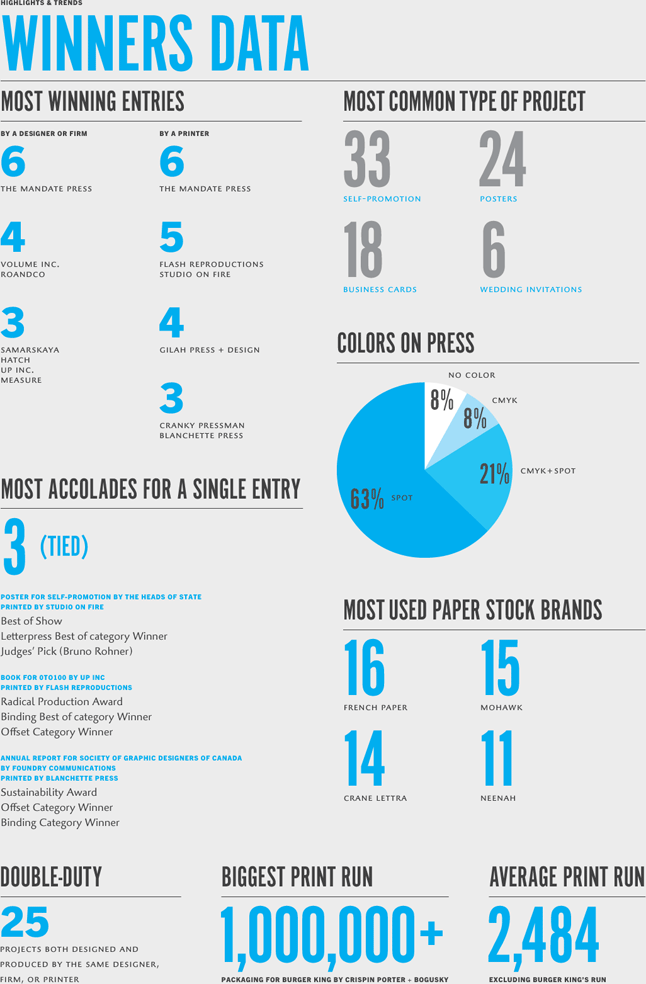
Printed as a 4-color letterpress poster, the Heads of State imagined business cards for 32 characters of F. Scott Fitzgerald’s The Great Gatsby, each with its own distinct typographic personality. Laid out on a 4-by-8 grid, the large poster was graphically joyous and impeccably printed by Studio on Fire. The judges could literally not put it down and many of them wanted to select it as their Judges’ Pick but it was fitting that letterpress maven Bruno Rohner claimed it. Parallel to the Best of Show we wanted to offer two other special awards. The Sustainability Award, given to the project that went to the greatest length in ensuring the best use of resources and in considering its impact on the environment during production and after, went to Foundry Communications’ annual report for the Society of Graphic Designers of Canada for their reuse of thousands of existing make-ready sheets from previous jobs that required minimum trimming and binding and were beautifully printed by Blanchette Press. The Radical Production Award, given to the project that did something new, unexpected, or out of the ordinary with any existing print method or finishing technique, went to design firm Up Inc and printer Flash Reproductions for their spine- (and mind-)bending panoramic binding of a 216-page book of amazing portraits of 100 people, aged 0 to 100, with their nose smack in the middle of each spread.
These three top winners reflect the creativity, resourcefulness, and craftsmanship that the FPO Awards strive to reward. And in conjunction with the other hundred winners, the FPO Awards reflect the new state of print design: A more restrained and thoughtful use of resources to produce pieces that both satisfy their designers and printers, and that engage and stimulate their end users in a way that only ink and paper can.
Congratulations to the winners and many thanks to all who entered.
Bryony Gomez-Palacio + Armin Vit
Principals, UnderConsideration