CATEGORY

Letterpress

RANK


PRODUCTION DETAILS

Quantity

750

Page Count

Number of Colors

2

Special Techniques

Binding

Dimensions

2 × 2


DESIGN CREDITS

Bradley Emmons


TAGS

, , , , , ,


LINKS

bradleyemmons.com
j2.com
exquisiteletterpress.com

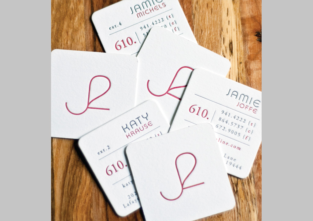
Business Card for J2 Communications by Bradley Emmons Marketing & Design


CLIENT

J2 Com­mu­ni­ca­tions is a pre­mier pub­lic rela­tions and strate­gic mar­ket­ing agency serv­ing the high­ly influ­en­tial sub­ur­ban Philadel­phia neigh­bor­hood, known as the Mainline.


APPROACH

Bradley designed the J2 Com­mu­ni­ca­tions iden­ti­ty to appeal to the high-end, influ­en­tial, Main­line sub­ur­ban Philadel­phia socialites who meet and greet at posh lifestyle and char­i­ta­ble events. A small, but tac­tile let­ter­press card was the ide­al solu­tion to eas­i­ly fit in small hand­bags or purs­es and to cre­ate a mem­o­rable impres­sion as the user ran their thumb along the lines of the “J2” mark. Sub­tly and sub­con­scious­ly, J2 can effec­tive­ly com­mu­ni­cate their deep-root­ed, open lines of com­mu­ni­ca­tion and the val­ue of a high-end PR com­pa­ny who works behind the scenes for its clients. Size and shape of the cards were also pur­pose­ful as small­er ver­sions of the drink coast­ers often shar­ing the con­ver­sa­tion table at spe­cial events. A cus­tom, mut­ed red col­or was then cho­sen for its approach­able, light-heart­ed, and fun attitude.”

The challenge was certainly achieving the custom muted red ink color. To quote Peter Fraterdeus of SlowPrint Letterpress: “The muted red, as you specified, began as a PMS color, but rather than adding black to reduce the brilliance and achieve your desired effect, I used a tiny amount of green in the mix. I’ve always been a big fan of color physics, and this is one of those things that lets me make a less brilliant color, but still with full intensity of hue. The grey also started out as the specified PMS color, but we then added a tiny bit of the red back into it. I find that this always helps to unify the color palette, bringing the separate hues back into the same family, in a way.”

Browse entries