CLIENT
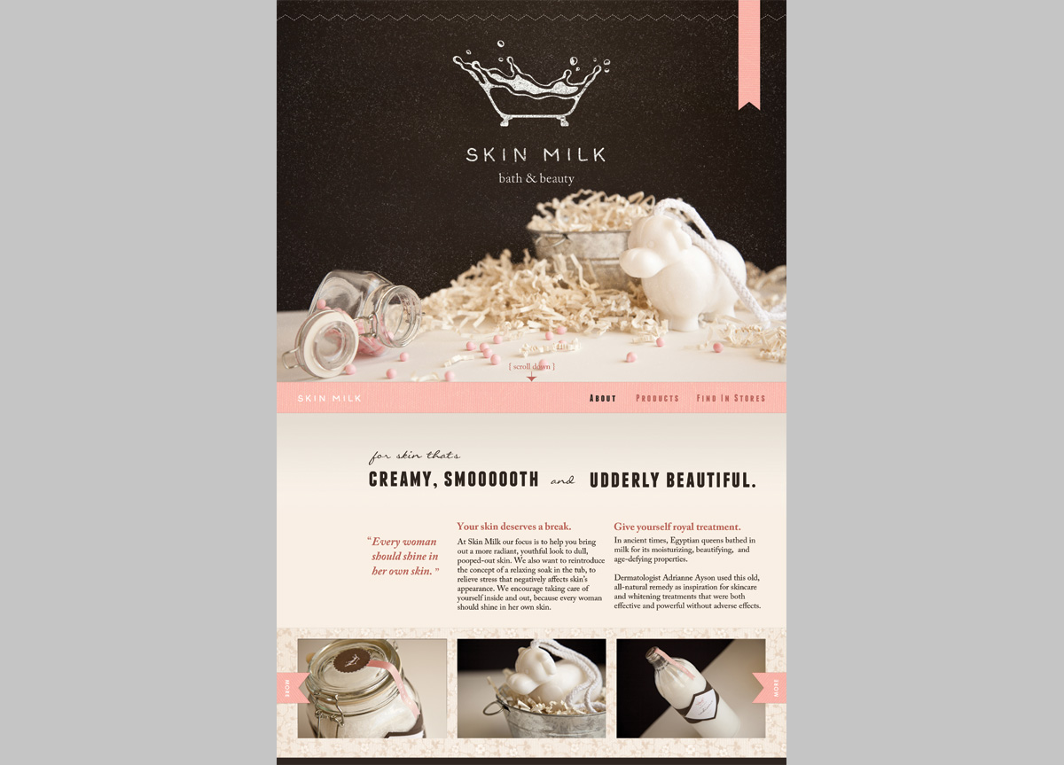
A bath and beauty product company focused on natural, gentle skincare, and skin whitening. The products are based on milk, historically used for moisturizing skin. Based in California, it targets 25- to 40-year-old Filipino, Japanese, and Korean women concerned about maintaining fair and youthful skin.
BRIEF
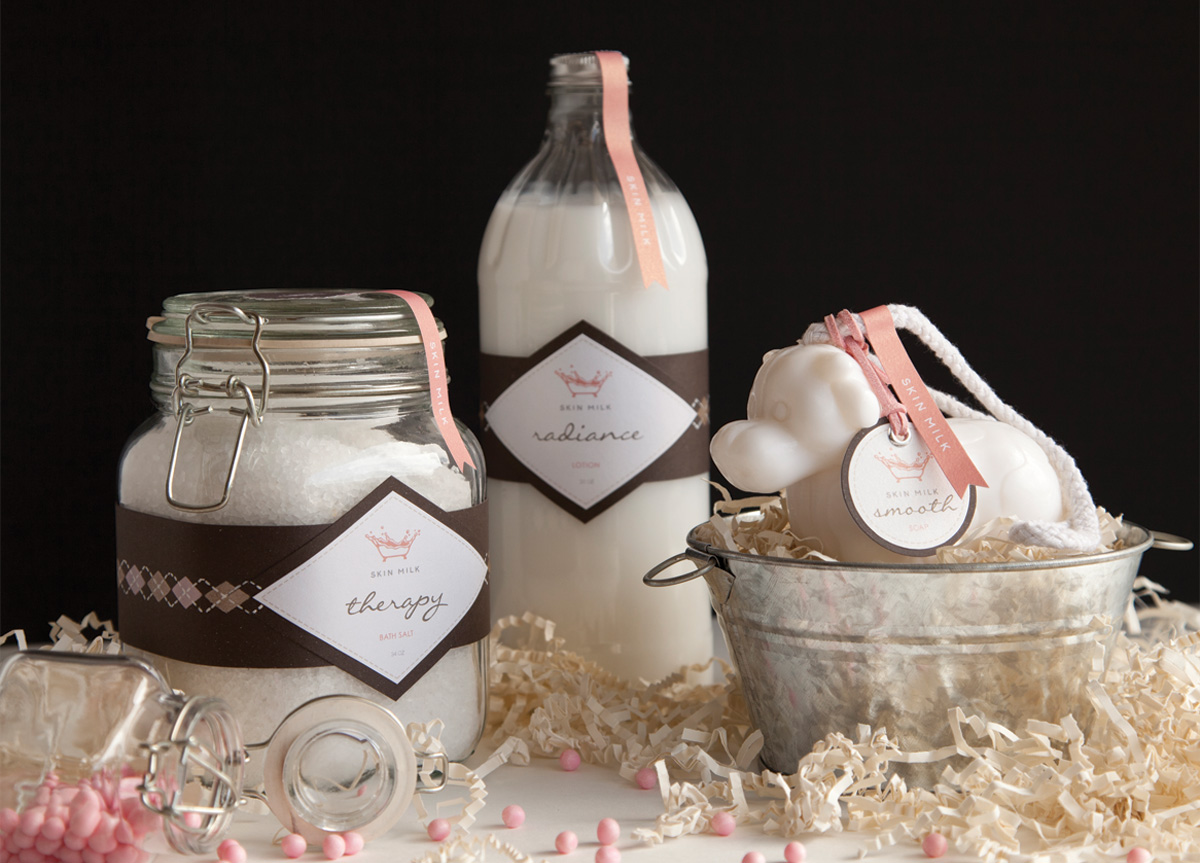
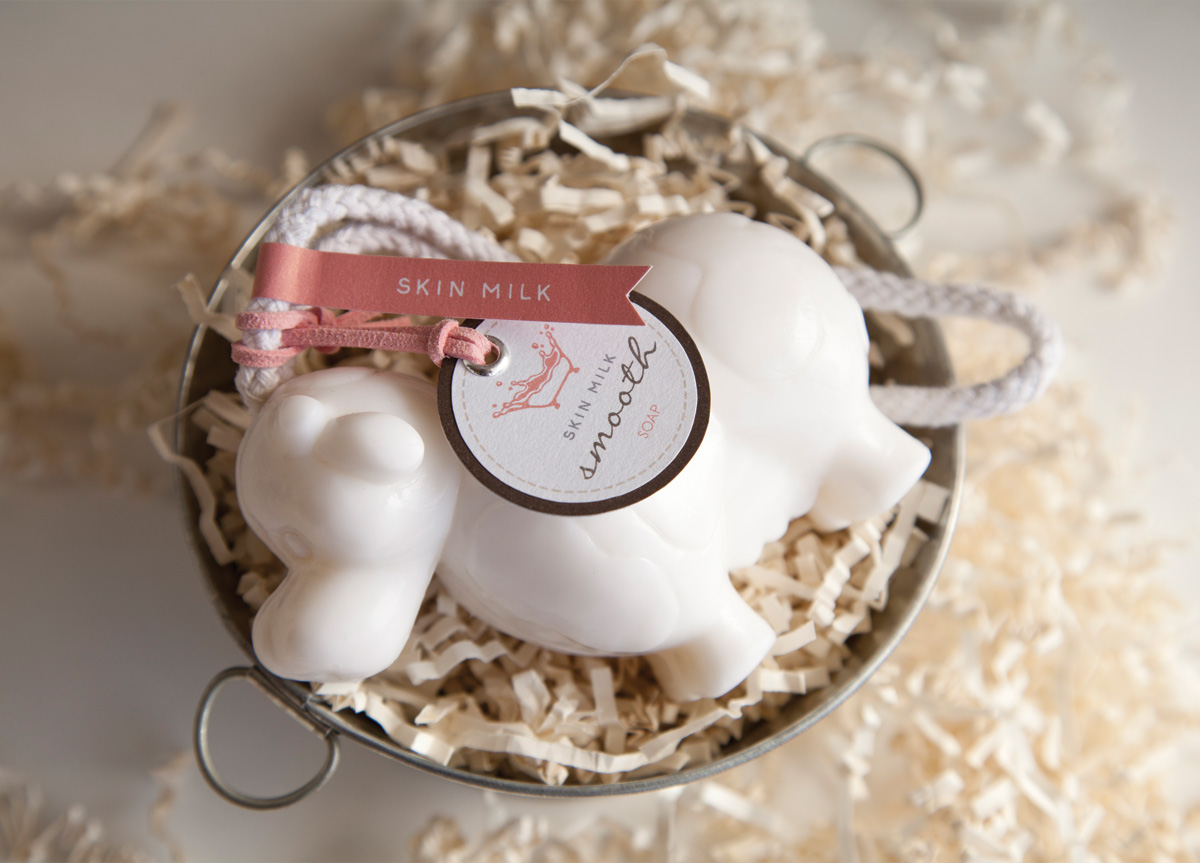
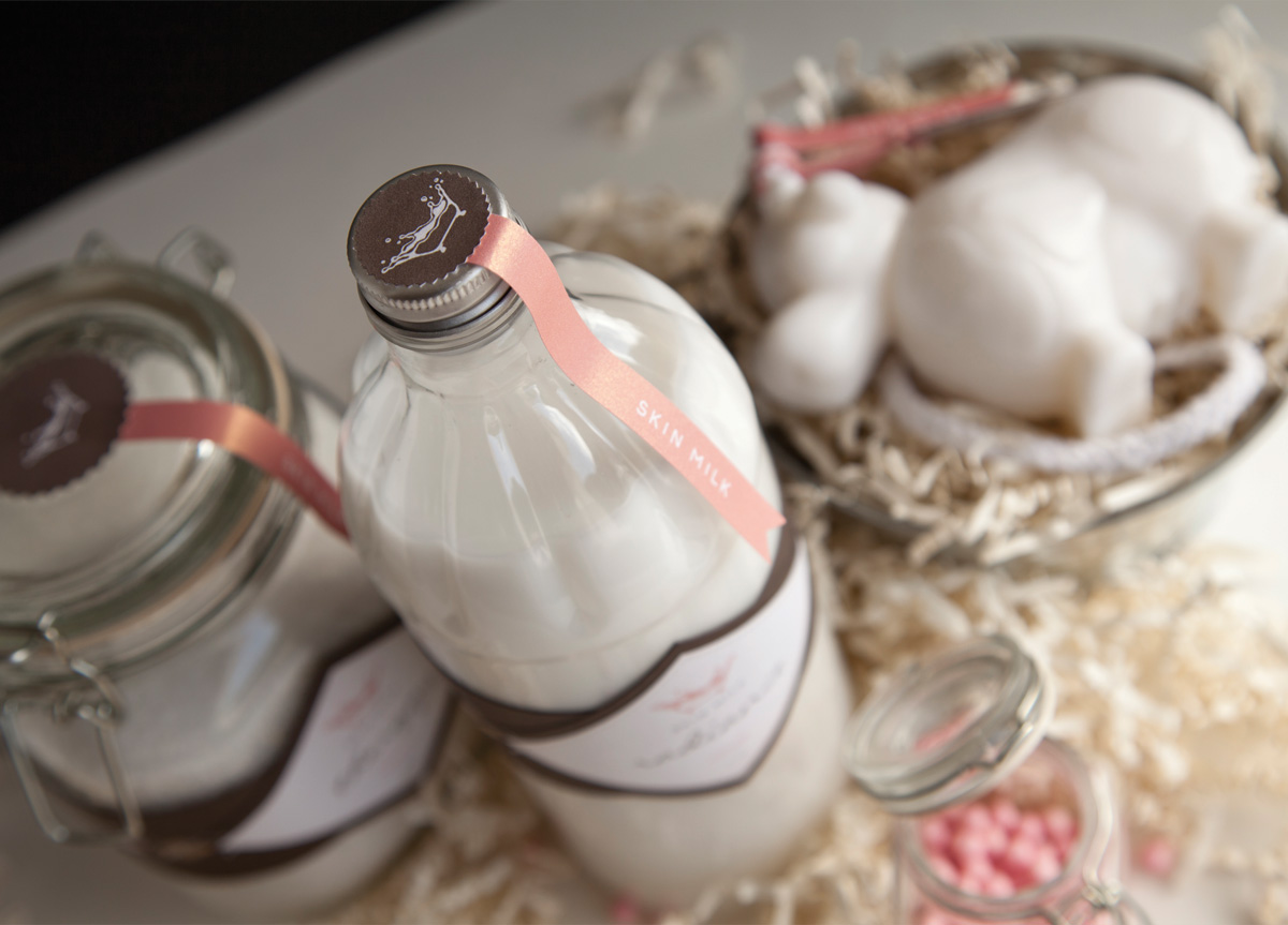
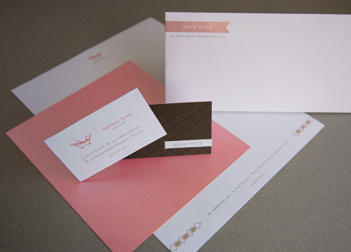
Conceive a brand and develop its brand identity. Create an identity system (logo, stationery, packaging, and web design), that reflects the brand’s persona. Balancing unity and variety across the identity system was a challenge. We were required to find and purchase three related items to be packaged. It was important to find the right items because their materials would affect the final look and feel.
APPROACH
The brand plays on milk and the idea of a relaxing soak in the tub. Milk’s white color alludes to a creamy complexion. The logo is a milk splash that is also a bathtub. The packaging materials were all chosen for their homely vintage feel. Pink was chosen for femininity and browns for naturalness. Other touches add to the feeling of comfort—warm photography, hand-done type for the logo, hand-painted argyle (to represent sweaters), and quilt-like debossing on the business cards. Besides natural, gentle skincare, Skin Milk is all about encouraging women to take time out to treat themselves well.
