
![]()
![]()
CLIENT
A third generation, family-owned and operated cookie manufacturing company located in Chicago, IL.
BRIEF
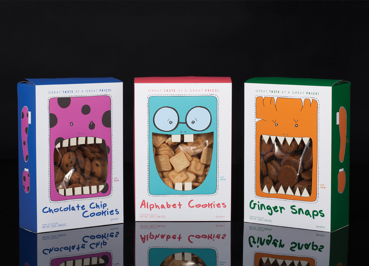
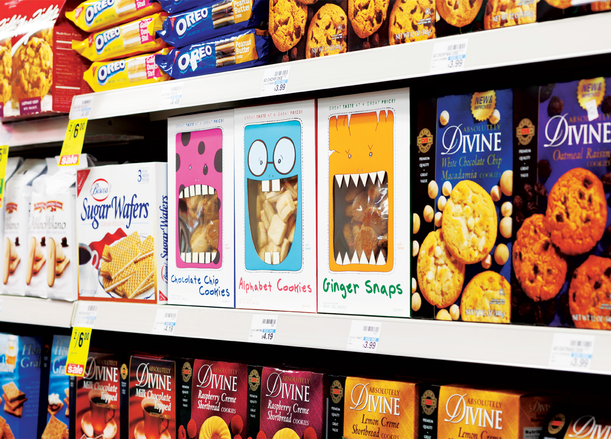
I chose these cookie boxes from a 99-cent store. My goals were first to repackage them while thinking about my responsibility for the environment and, second, to make them look as if they cost double the price.
APPROACH
First, I researched my subject within its industry, while looking at their competitors. I did lots of concept sketches and suggested materials and colors. I built actual three-dimensional compositions taking into consideration each side of the product, and then I finalized my designs focusing on children as my target audience—because they love cookies. The final product utilizes illustrated cookie monsters with die-cut mouths to reveal the cookies through the monsters’ mouths.


