CLIENT
A catering company that has been delivering exceptional food with outstanding service to its clients at top venues all over London, UK, for over a decade.
BRIEF
Jackson Gilmour is a family run, chef-led and award-winning catering company. With a prestigious client list that includes Her Royal Highness the Queen and a staff of chefs with more than a few Michelin stars between them, they needed a rebrand that expressed their offer as one of the best in the business.
APPROACH
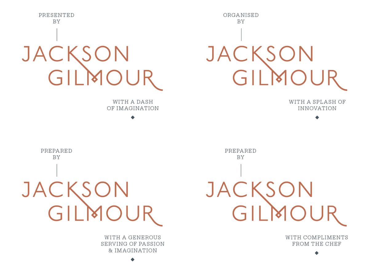
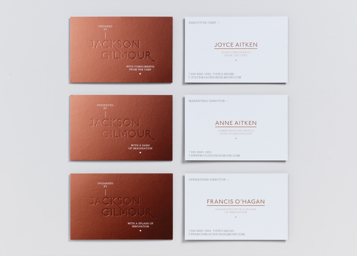
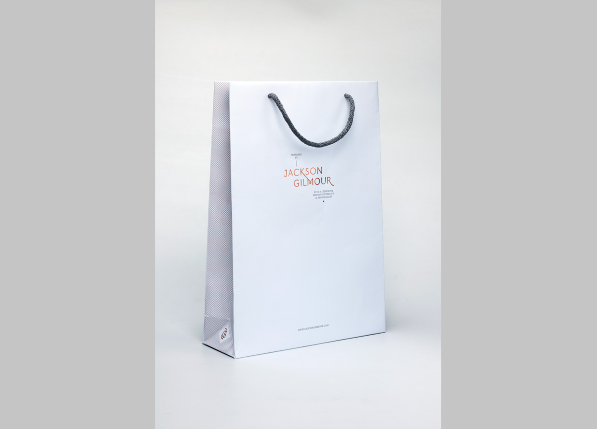
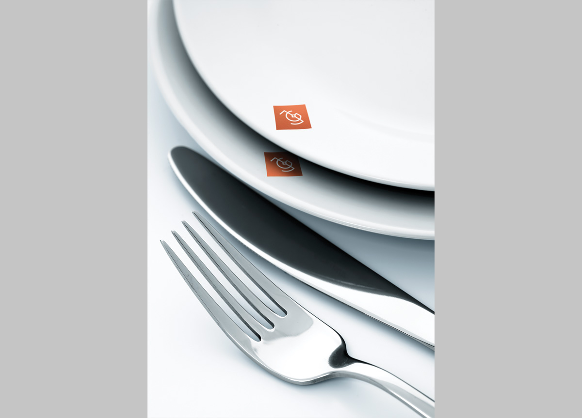
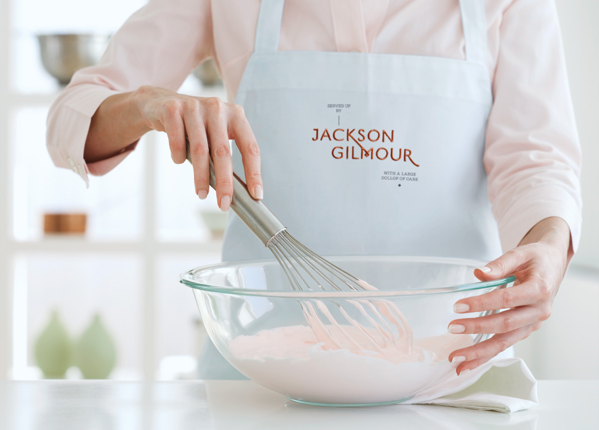
Focusing on their unique offer as a chef-led catering firm, we devised a brand language reminiscent of cookery and recipes. Add a dollop of typography inspired by copper pot hallmarks, a twist of the diagrammatic language of family trees, a tablespoon of very expensive print techniques, heat at a high temperature, and you end up with a chef-led, engaging, and high-end rebrand.
The Magpie Studio team took a thorough brief and allowed plenty of time to understand the nature of our organization and the industry we work in. They were tenacious in their creativity and remained committed to an original approach even when their first attempts didn’t quite hit the mark with some of us. We are absolutely delighted with the final result. The use of the copper metallic finish combined with a quirky, contemporary typeface has given us genuine “stand-out” in the event catering industry. The link with vintage kitchenware and our Celtic roots was inspired. The identity works brilliantly across all mediums and we have had a hugely positive response from both clients and competitors. Changing a company identity is a challenging and time-consuming process, but the Magpie team remained committed and upbeat throughout. We are now extremely proud to hand over our business cards! — Anne Aitken, Marketing Director of Jackson Gilmour
