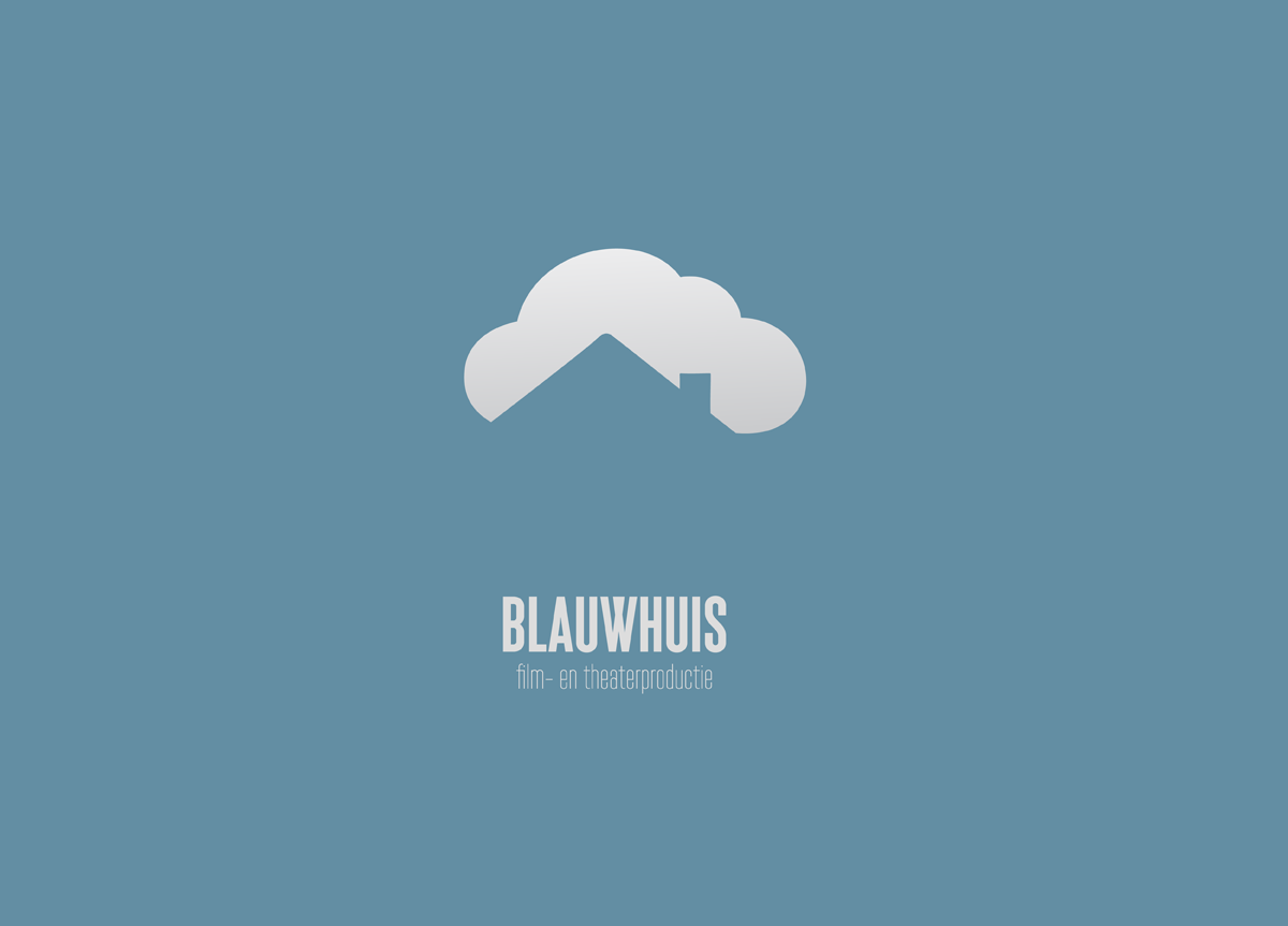
CATEGORY

Logos

LEVEL

Professional

RANK


DESIGN CREDITS

Designer and Concept Developer

Frederic Lootens


TAGS

, , , , ,


LINKS

FRED+ERIC

Blauwhuis by Fred+Eric


CLIENT

A Bel­gian the­ater and film pro­duc­tion house. The name means “Blue House” and is the name of the small cas­tle where the com­pa­ny was based in when they started.


BRIEF

Blauwhuis pro­duces the­ater and films with a focus on amaz­ing their audi­ence. Be it by using visu­al effects, spe­cial use of cam­era tech­niques, or through sto­ry­telling. The client want­ed me to design their new logo and gave me carte blanche, as long as the logo would cap­ture their vision.


APPROACH

I stayed clear and sim­ple, by look­ing for a sim­ple logo that would be visu­al­ly inter­est­ing. Instead of mak­ing a logo with a blue house, I went for the sug­ges­tion of a blue house against a blue sky. Only a cloud shows the sil­hou­ette of the top of the house.

Being a young production company that focuses on film, music, and theater, we wanted to find a clear image to represent ourselves. Our belief in the power of suggestion was what we wanted to be reflected in our logo. FRED+ERIC charmed us from the start by presenting the concept using a short animation, which, in all simplicity, illustrated the power of suggestion and the dreamy air of our productions. We were mainly in contact with Fred and we are looking forward to working together with this versatile duo for future projects. — Jonas Baeckeland, Co-founder of Blauwhuis

Browse entries