CLIENT
A California-based brand that works with world-renowned designers — like Karim Rashid, Yves Behar, and Michael Graves — to create innovative cutting tools for the home and office. Most products use ceramic cutting technology and are a celebration of vibrant color, bold design, and extraordinary function.
BRIEF
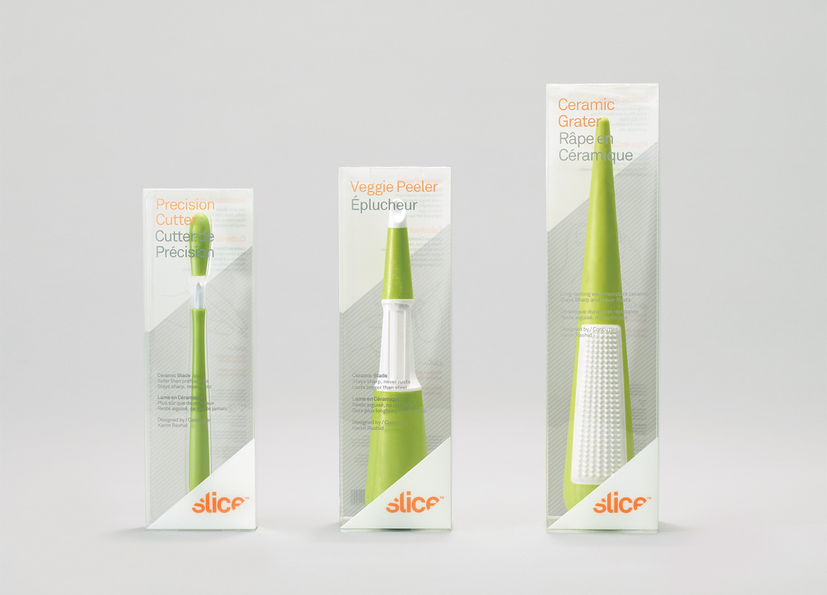
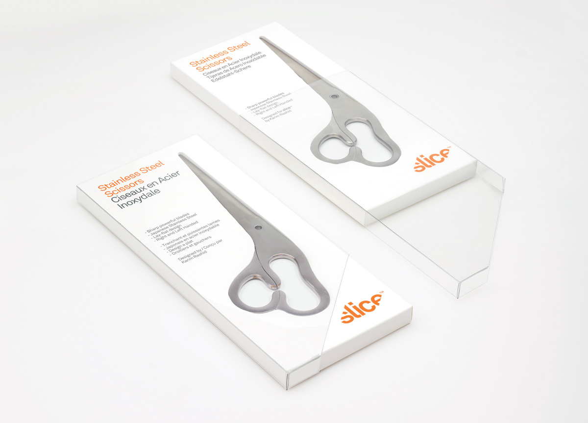
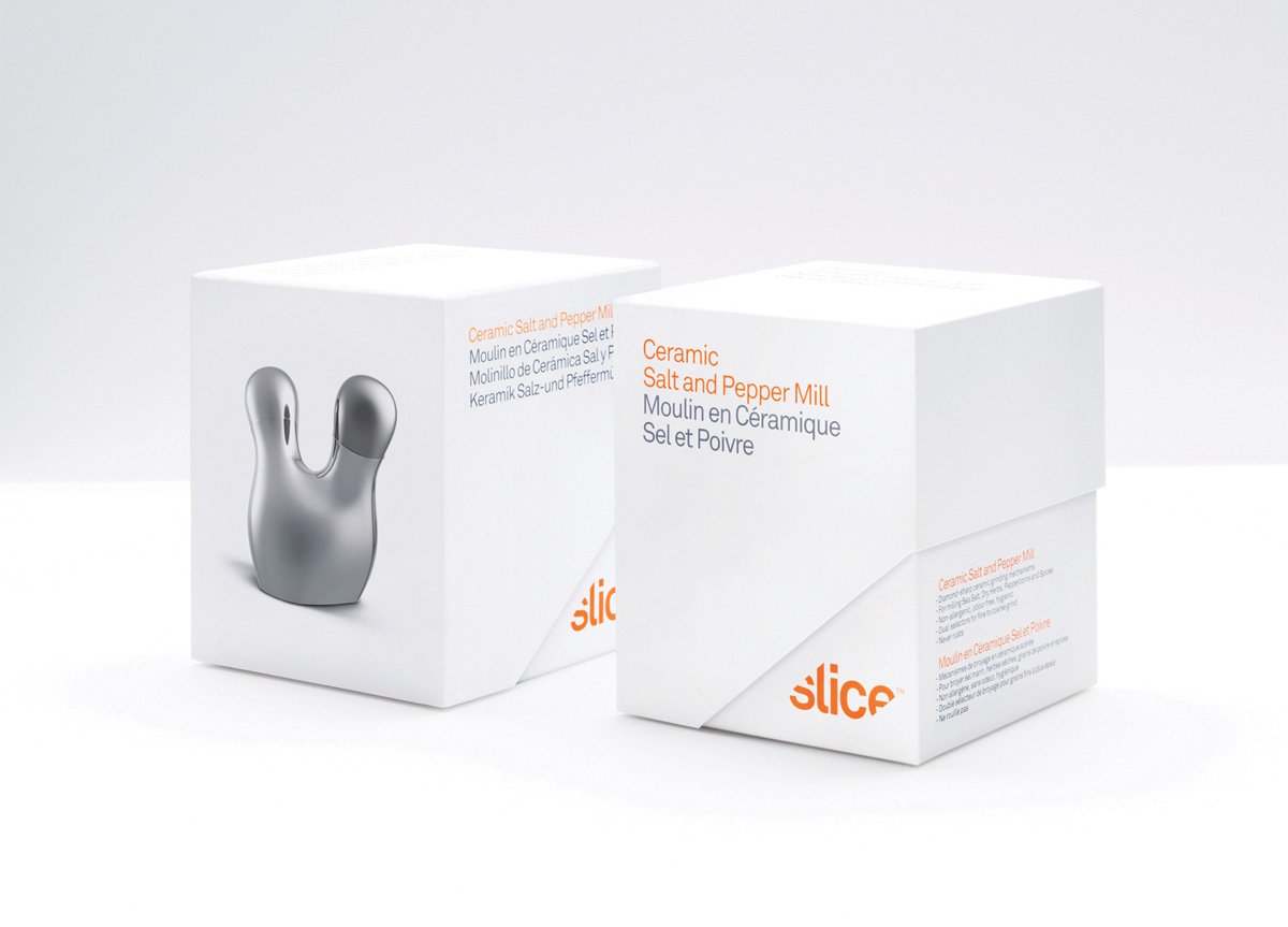
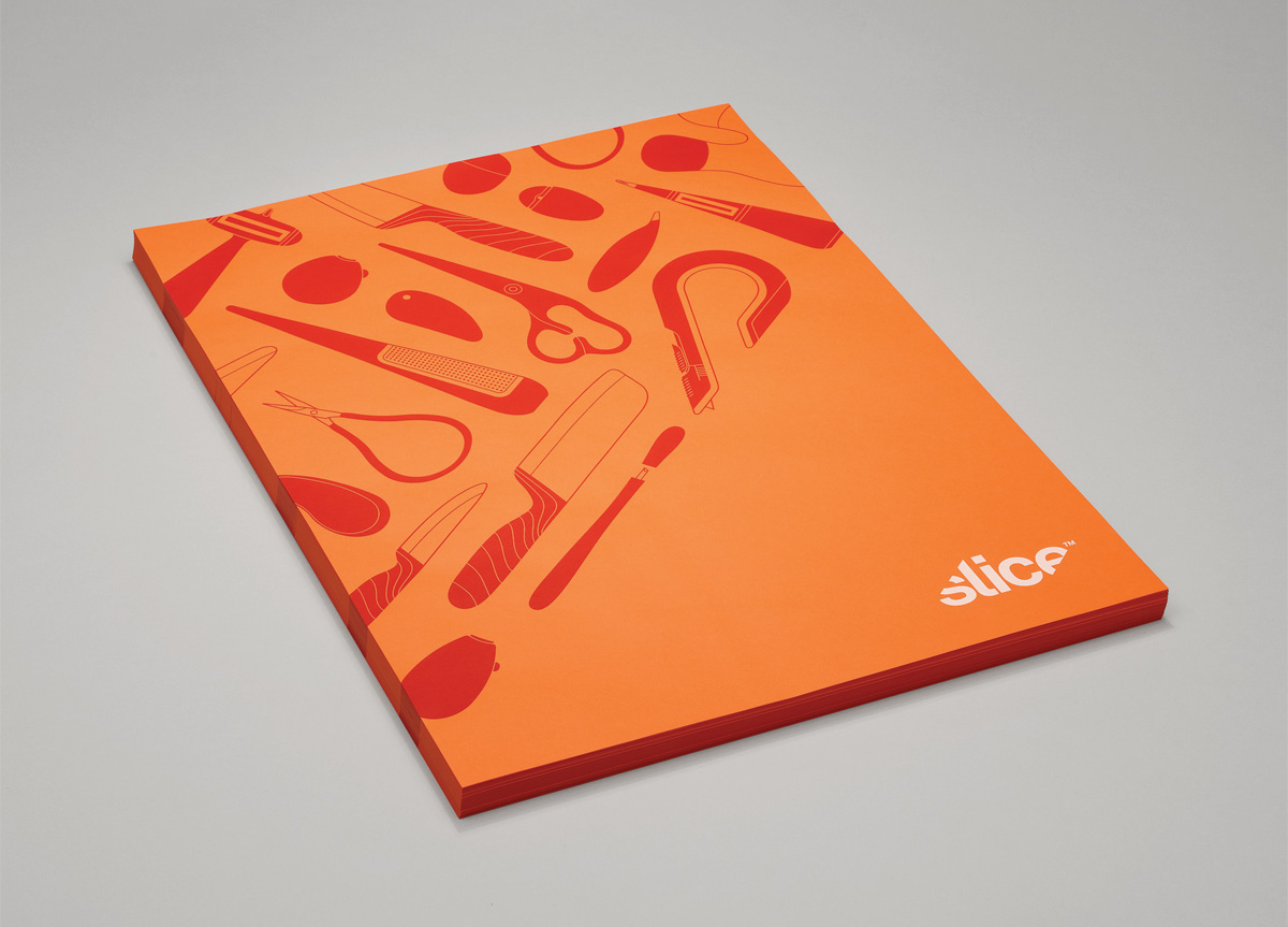
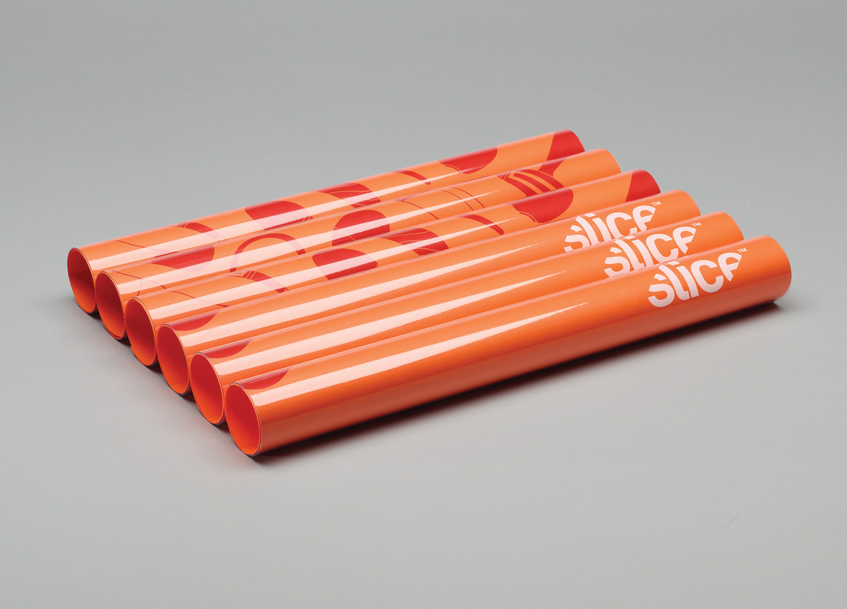
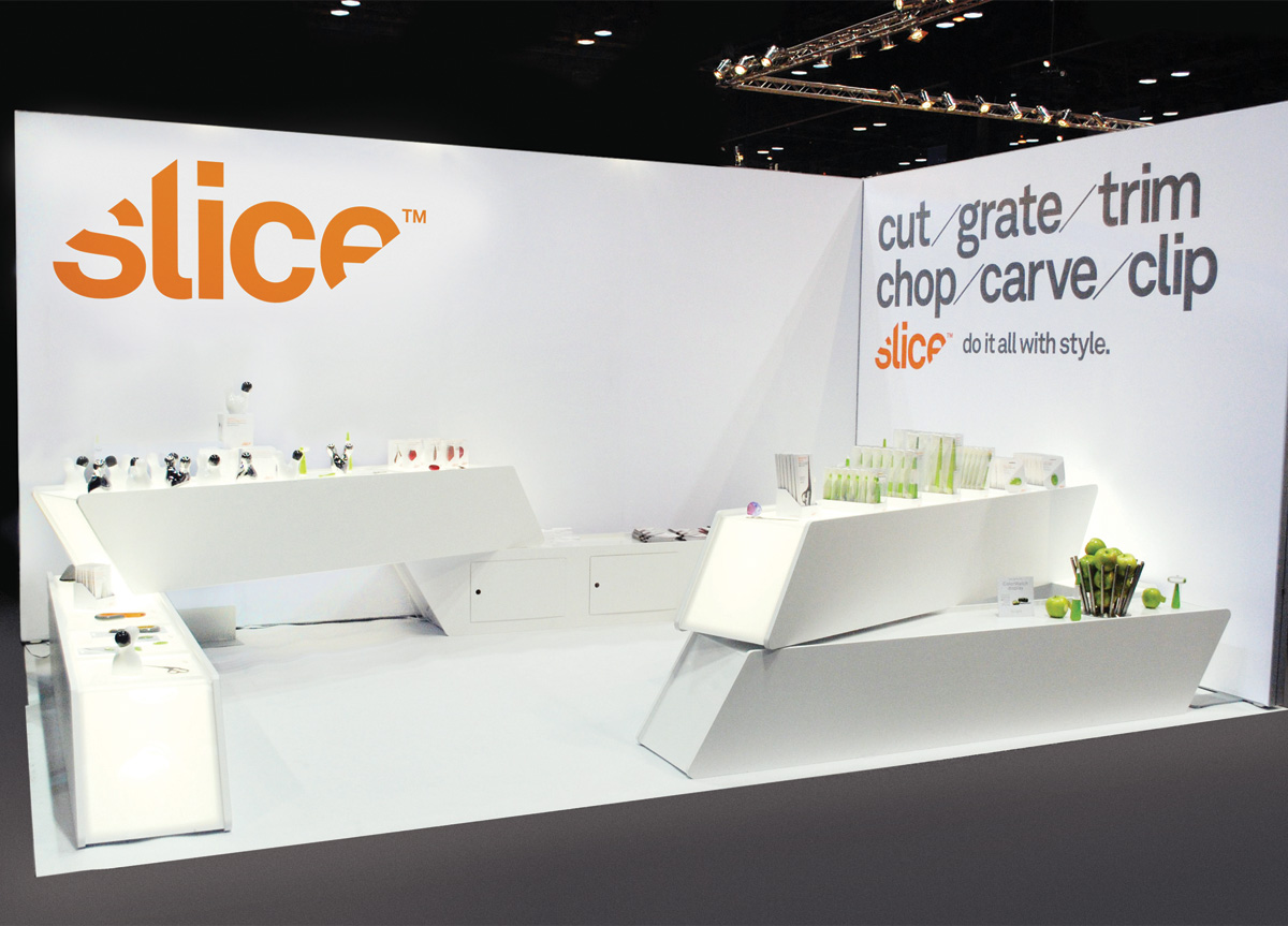
Redesign the graphic identity for Slice that would appear primarily in product packaging. Their existing logo was deemed a little flat, and the packaging too unsophisticated, so we were tasked with making the branding simpler and more elegant, while still retaining a level of boldness and playfulness.
APPROACH
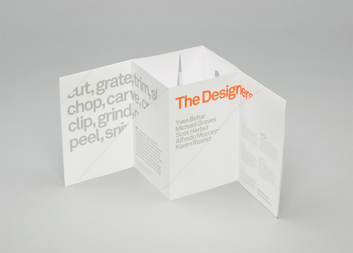
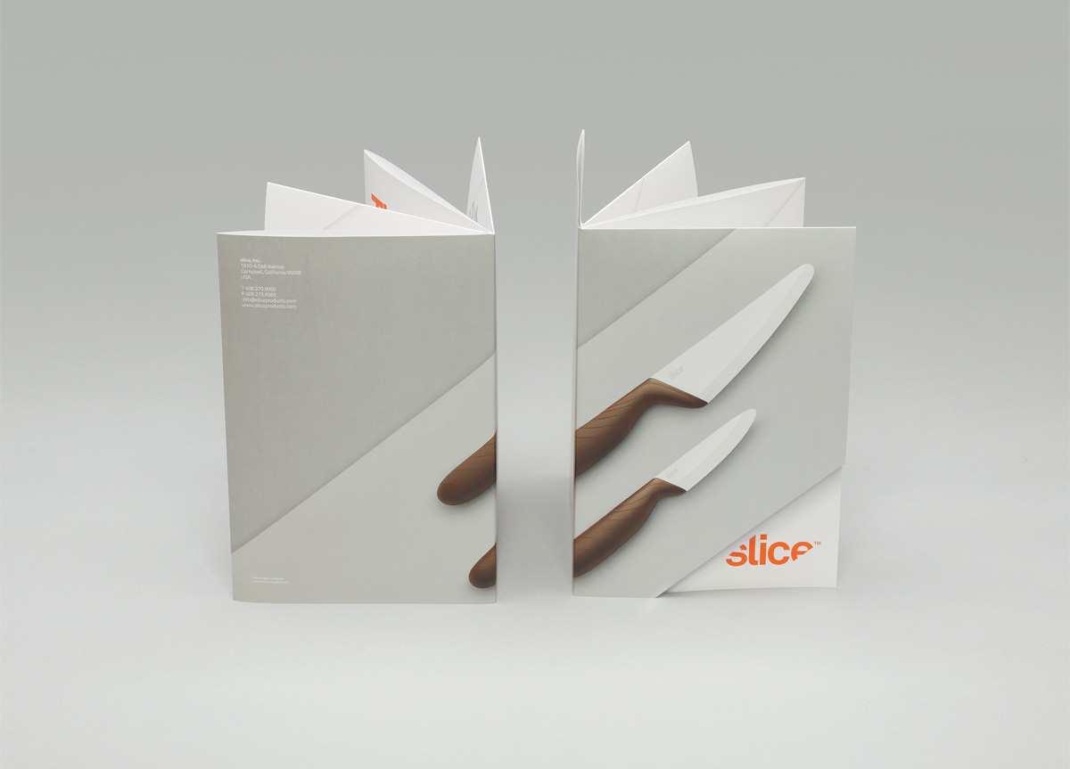
We approached the design of the logo and packaging in parallel, realizing there was an opportunity to forge a perfect unity between the logo and the graphic identity as expressed in the packaging. By simply cutting away at the word Slice at an angle, not only did it make the wordmark more dynamic but it allowed us to exploit the angled cut across numerous packaging executions — weaving a little branding into every physical form. We changed the type from the original Helvetica, which was a little generic, to Akkurat. The slight curl on the ‘l’ added a little personality and softness to an otherwise angular logotype.
