CLIENT
A world-class collection of science-related objects and exhibitions in London, UK.
BRIEF
Increased competition from London’s other attractions, coupled with a new architectural vision and master plan for the museum, meant the time had come to look properly at the museum’s brand.
APPROACH
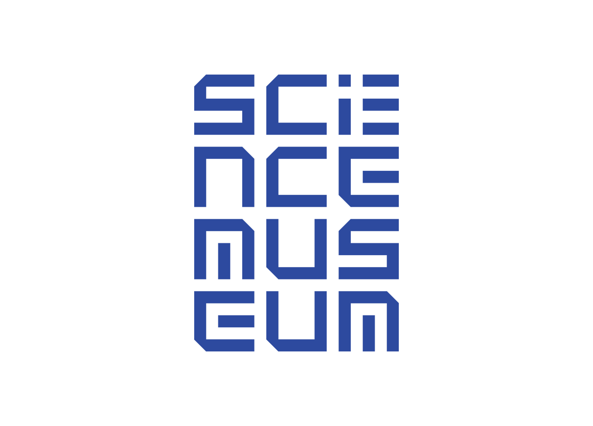
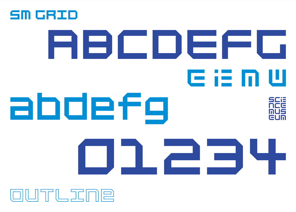
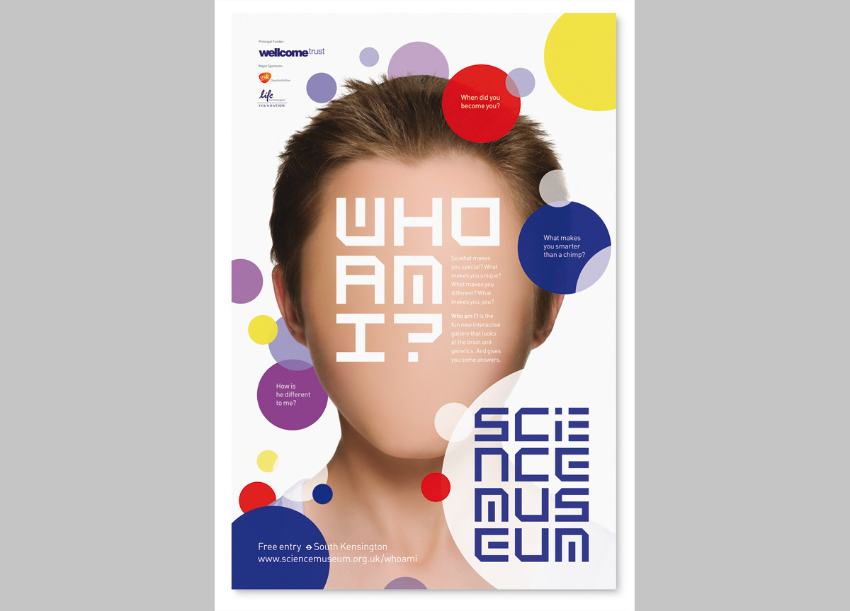
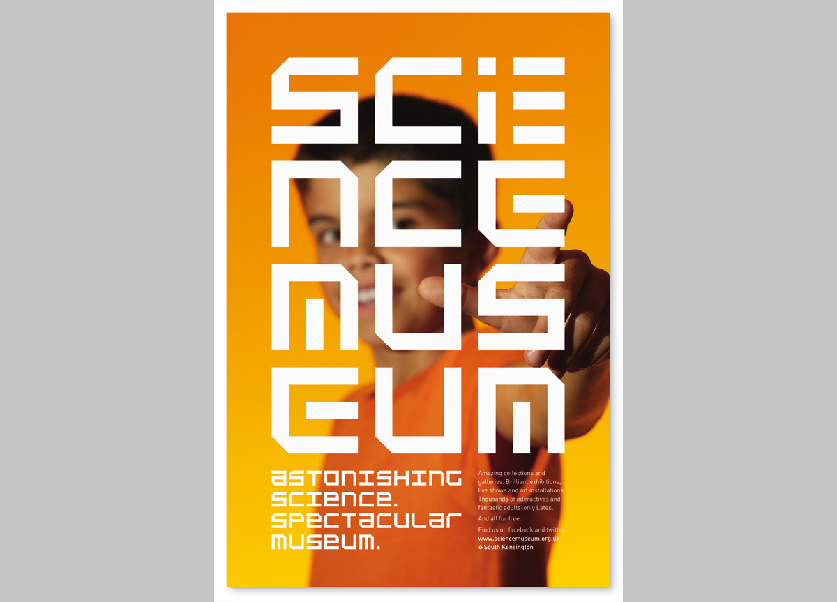
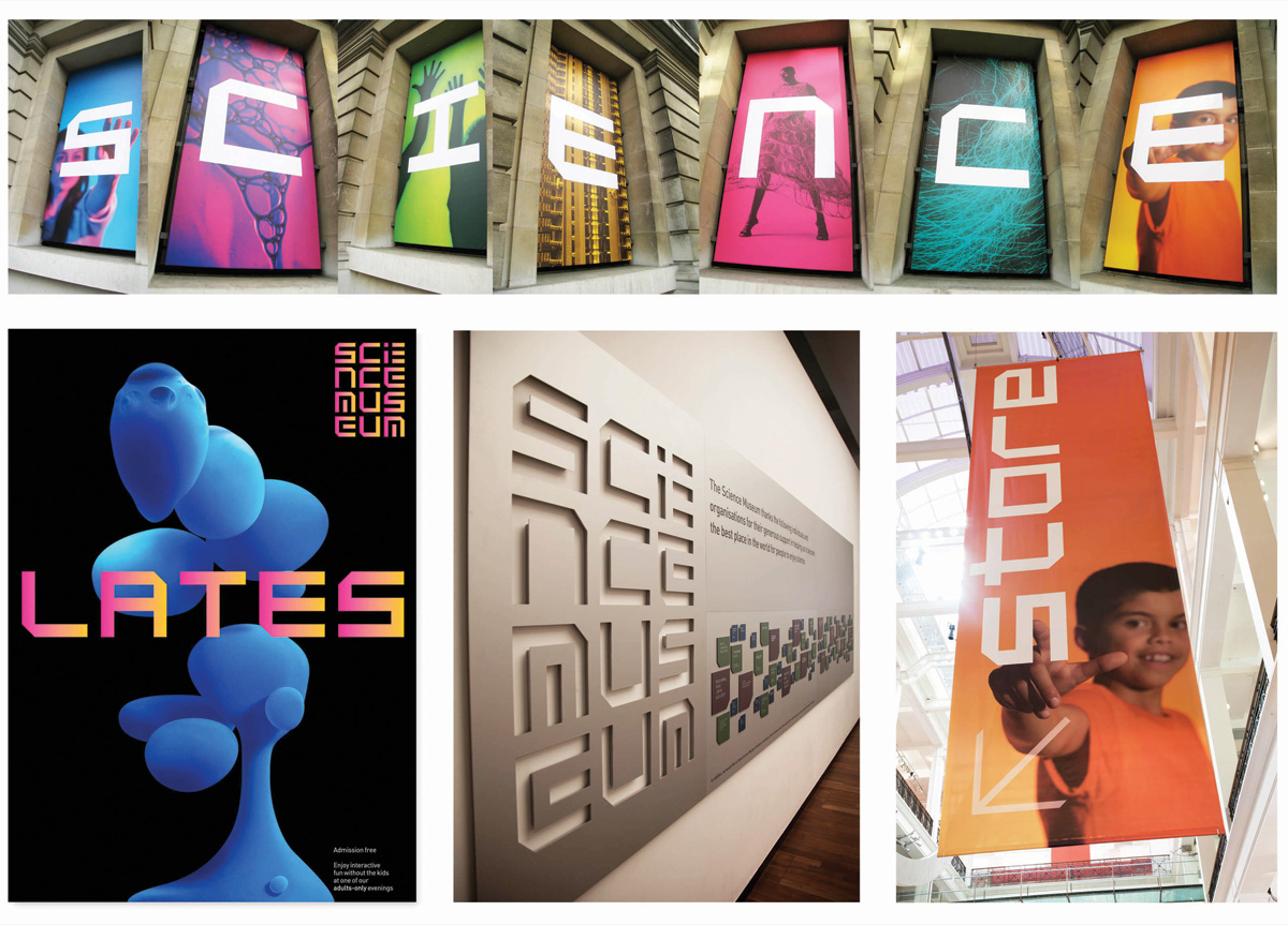
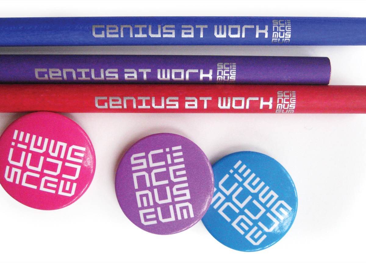
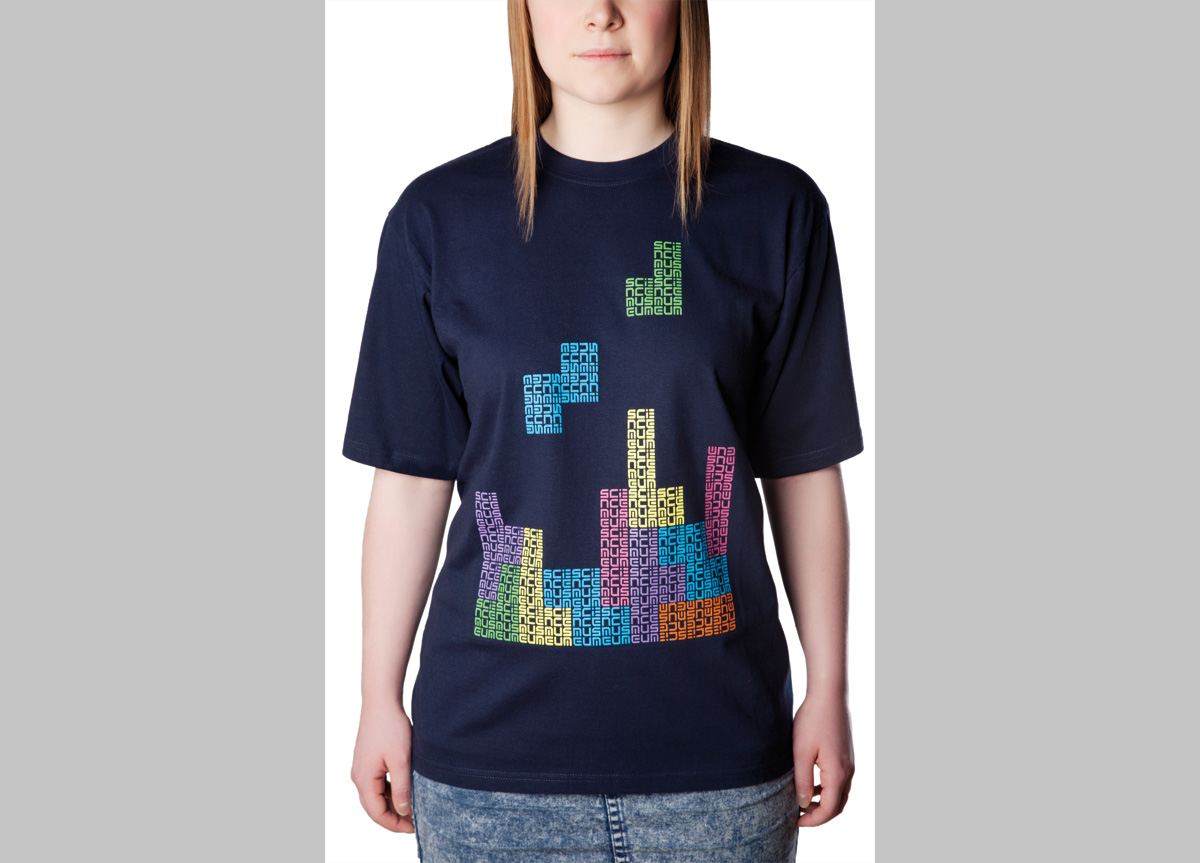
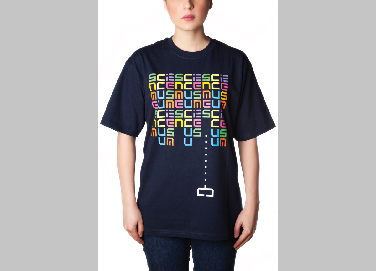
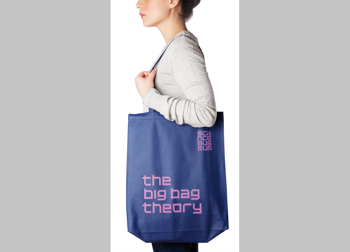
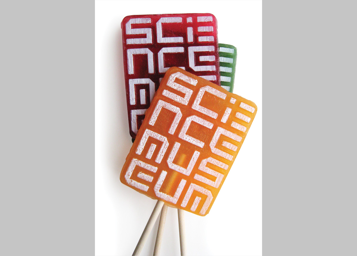
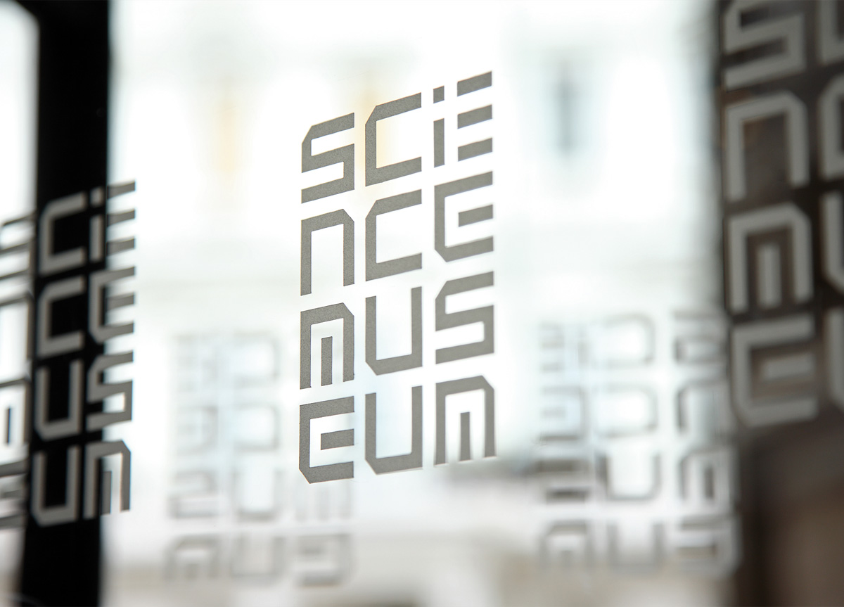
After a long audit and design investigation, a visual route began to take shape that took the two-word name and created a unique arrangement of the characters into a four-line block that took its cue from code and digital typefaces. It takes a little bit of working out, but “decoding and sharing” seemed an apt analogy for the museum itself. It also provided them with what they’ve never had: a unique wordmark to identify themselves that can be literally “stamped” onto everything they do. We then swiftly extrapolated the logo into a house style that gave them immediate presence in London’s highly competitive marketing environment. A unique typeface was drawn following the letterforms of the logo, which is being implemented across the marketing materials and increasingly the interior and exterior of the museum. Supported by a new brand, and leading with interesting events, the museum is showing that it can attract a different audience and throw off its slightly geeky image (and attract thousands of new fans in the process).
