CLIENT
A restaurant and cocktail bar located in the Tribeca neighborhood in New York, NY. They focus on a dialogue-based dining experience, where a handful of diners are served a twelve-course meal directly from the chef. The combination of small food plates with the component of uniquely crafted cocktails creates an atmosphere of refreshing modernity.
BRIEF
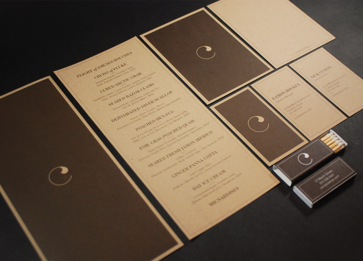
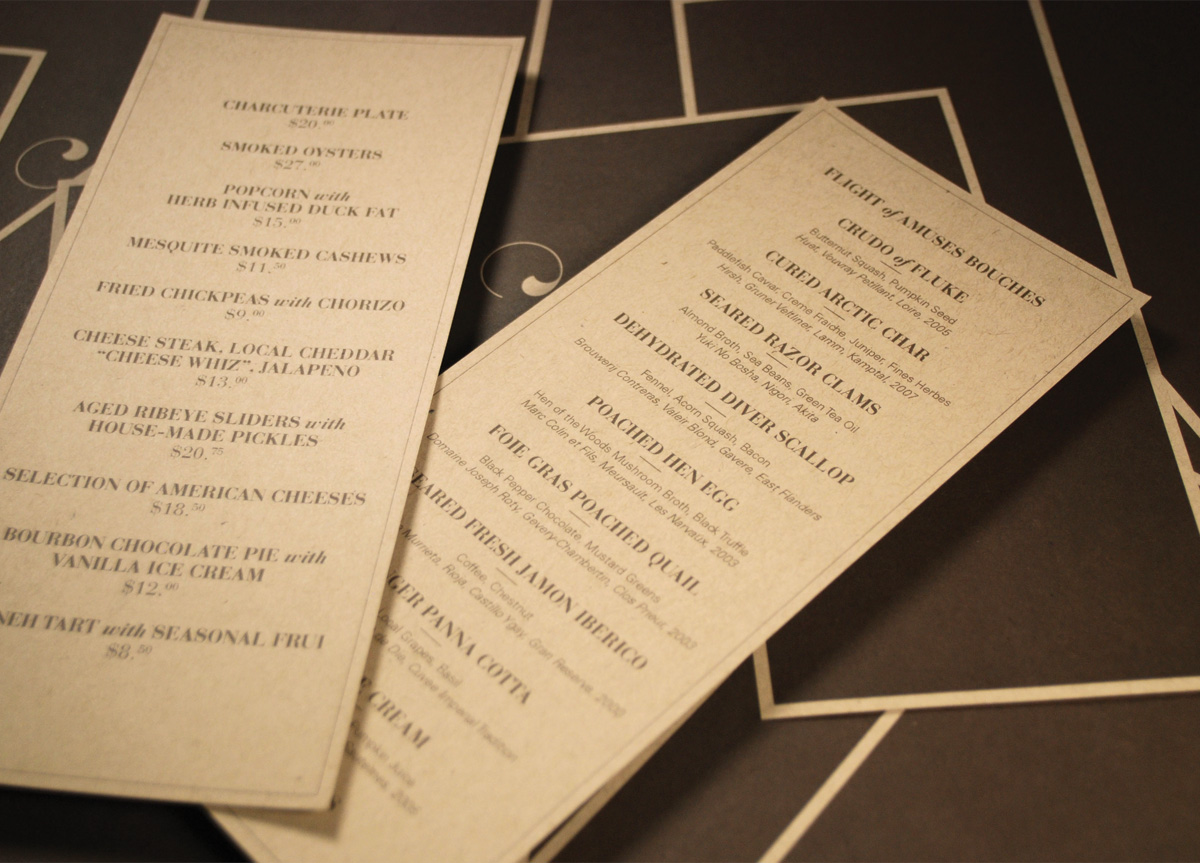
The brief was fundamentally simple: a logo, menus, business card, etc., but after conversation with the chef and general manager, it quickly became apparent that the identity for their establishment needed to be something more conceptual than literal. Was it possible to start off without ever putting the name of the restaurant on anything? Could you establish a “speak-easy” space without building a reputation first? We thought so. The identity needed to compliment the space and live as a reminder of your experience, not overwhelm you with a brand image.
APPROACH
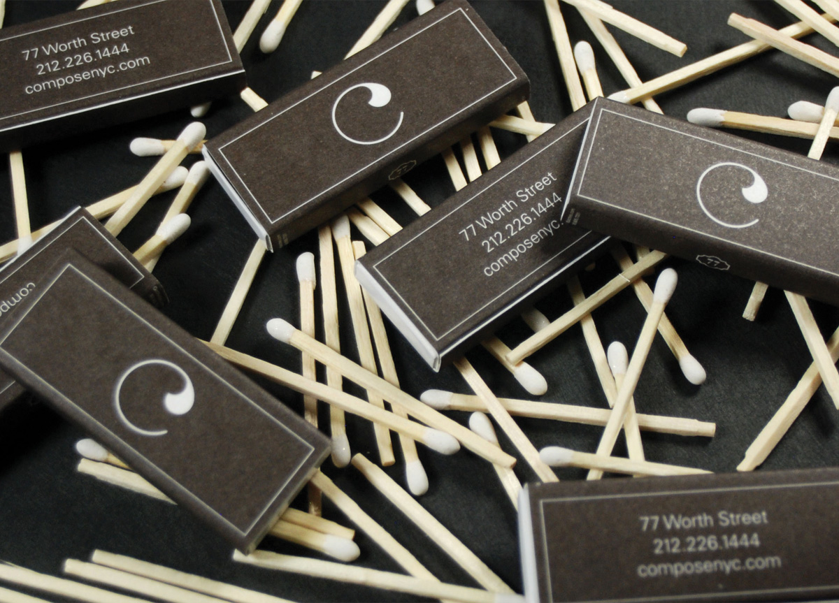
Architecture, geometry, and culinary tools were the primary inspiration for the mark. To begin, the restaurant restored 10-foot-high wooden doors that would go within the facade of the space. On these doors was a beautiful floral pattern that became a theme throughout the restaurant’s interior. Taking this pattern and matching it with the ubiquitous shape of a circle (stools, plates, glasses, cocktail garnishes), the solution manifested into a simple “C” mark. This mark came to represent many things: it stood for their name but it also represented the idea of traditional methods paired with modern solutions.
