CATEGORY

Comprehensive Identity Programs

LEVEL

Professional

RANK

Judges Pick

DESIGN CREDITS

Creative Directors

Alicia Johnson
Hal Wolverton

Designers

Keira Alexandra
Kiffer Keegan
Adam McIsaac

Copywriters

Kyle Barron-Cohen
Kiffer Keegan
Adam McIsaac
Editor Eron Otcasek
Roberto Serrini

Producers

Allison Pickard
Susie Shuttleworth

Audio and sound design

Joe Johnson
Eron Otcasek

Animation directors

Kiffer Keegan
Catherine Chesters

Animators

Daniel Pernikoff
Brian McGee
Chris West
Kiffer Keegan
Joe Lawrence


TAGS

, , , , , , , ,


LINKS

thelabnyc.com
comedycentral.com

Comedy Central by thelab


CLIENT

The only all-comedy network, currently seen in more than 98 million homes nationwide and airs award-winning programming, including The Daily Show with Jon Stewart, The Colbert Report, South Park and Tosh.0.


BRIEF

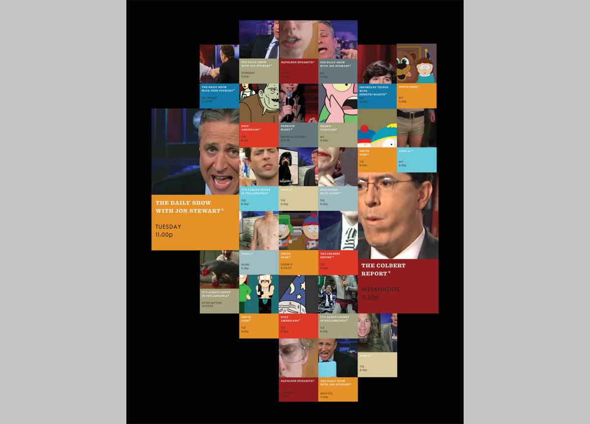
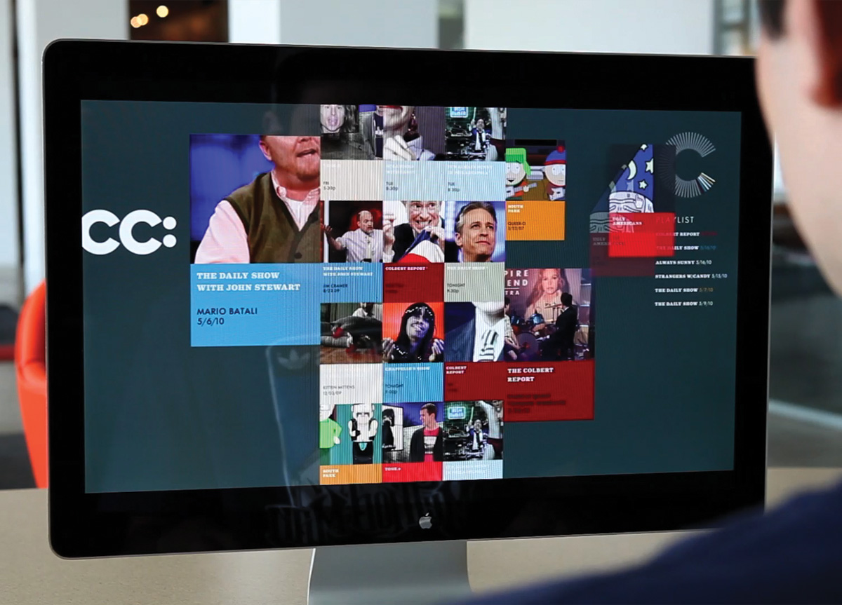
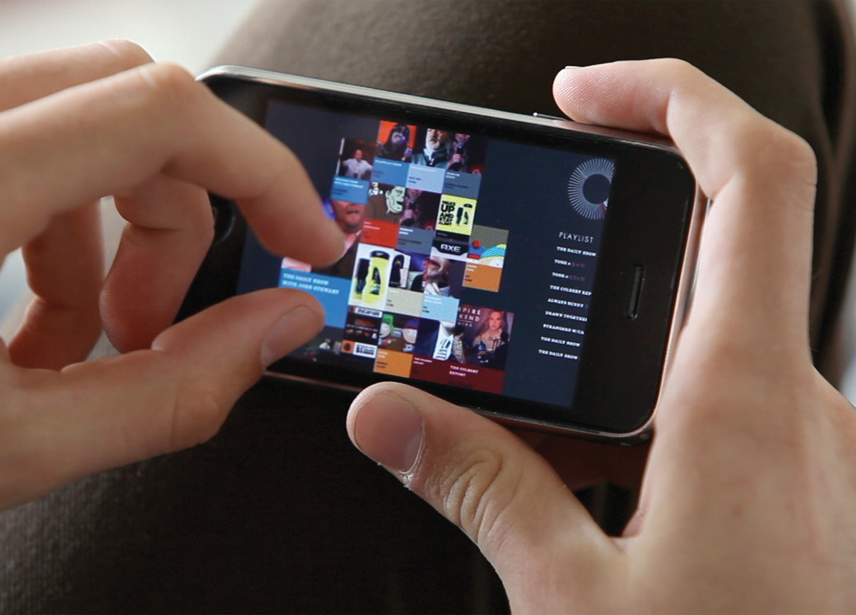
Comedy Central needed a branding solution that more firmly attached the network to their programming while reaching a younger audience. We began with the insights that (1) comedy is inherently social, and (2) the content needed to travel in a branded way across platforms. On a basic branding level, the challenges revolved around issues of scale and transportability that the logo and branding needed to address. Because a network is a brand that houses other brands — shows, content, personalities — we needed to create a system that celebrated the rich content (the programming) without abandoning the providers (the network).


APPROACH

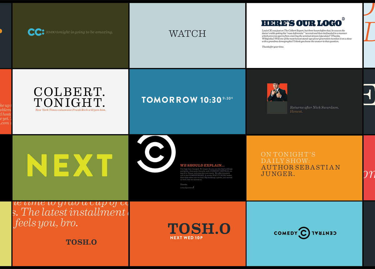
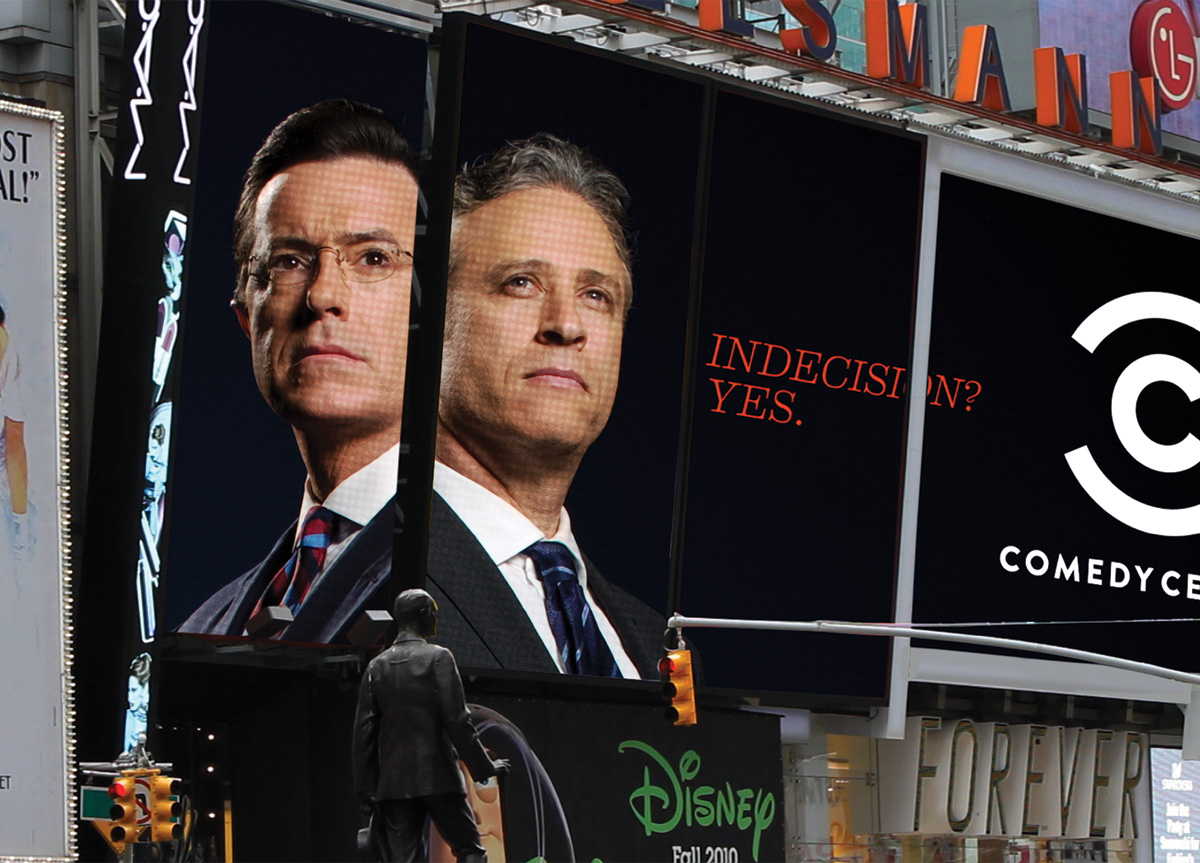
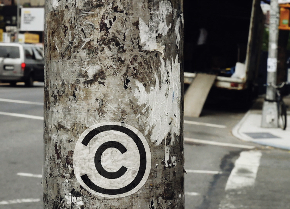
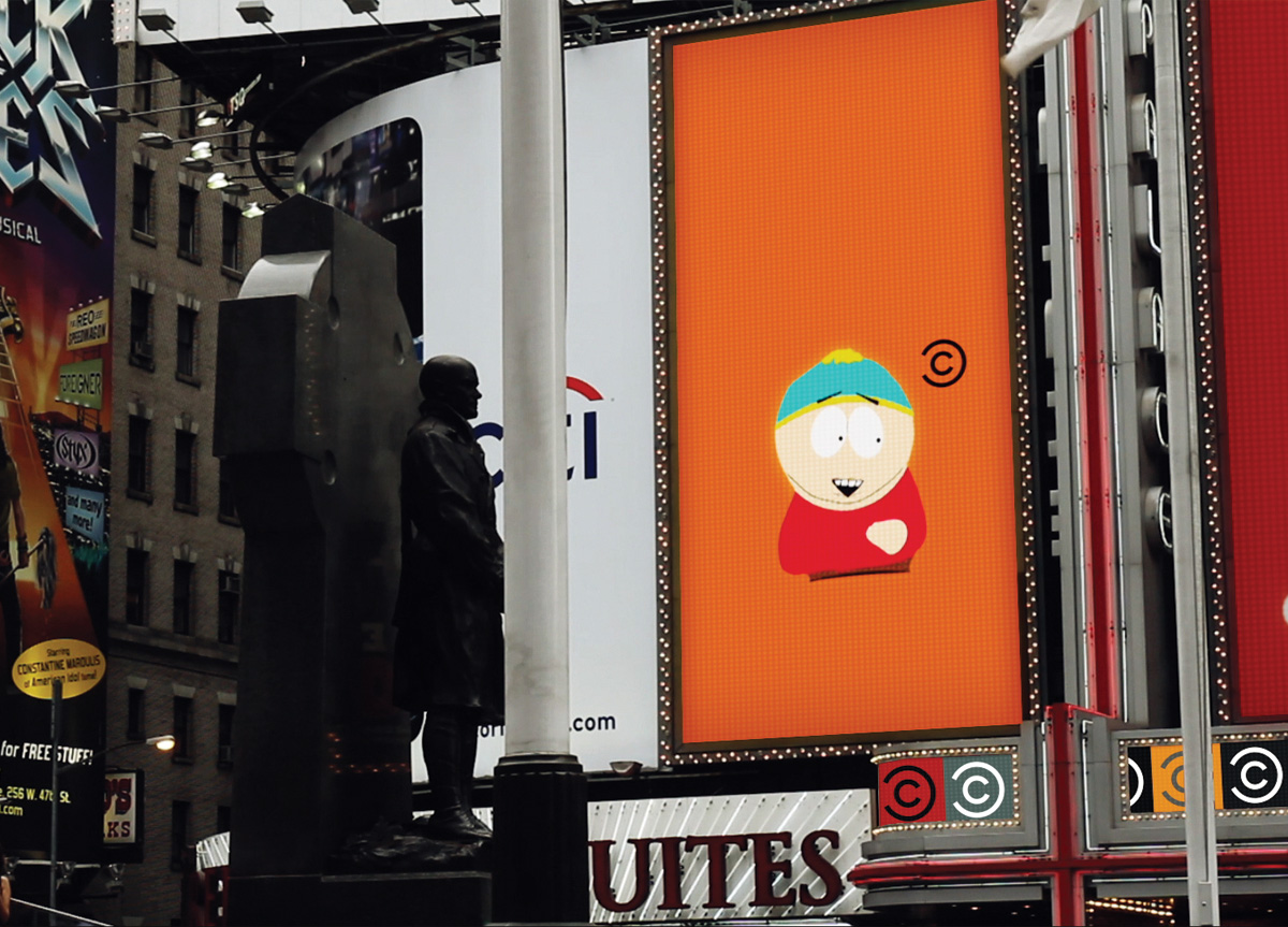
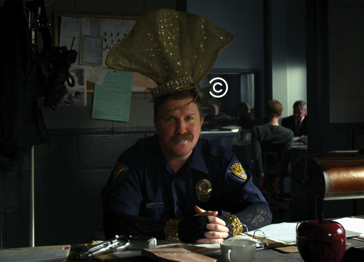
The web, like comedy, is inherently social, so we started from a digital perspective, moving it from behaving like a television brand to a media brand. This led to the idea of creating a new logo to “tag” content. We recommended that Comedy Central sanction funny content, not seek to be funny. The brand plays a larger role in culture, the arbiter of funny, and that’s what the re-brand needed to communicate. The arbiter of funny was considered for each adaptation of the brand, creating a next generation media brand.


We went to thelab with a creative challenge to help us re-connect with our audience and our content in a multi-platform world. Their fresh perspective helped usher in a whole new relationship with our brand, our content, and our audience. The Comedymark and identity system has inspired a radical shift, not only in our branding style and network aesthetic but in our company culture, as well. The new identity is a clear challenge to always celebrate our content in everything we do. — Chris Scarlata, on-air design director of Comedy Central Brand Creative

Judge’s Comments
This new identity looks so damn conservative and serious, reminding you of a copyright symbol at first glance, but then you see it’s not. The upside down “central” is a brilliant punchline. One would expect that something funny happens with the word “comedy,” but it’s the word “central” which is upside down and humorous. It’s in the applications where this program is quite playful and really shines. The copyright analogy takes on a different meaning when, for example, you see the silhouette of a dog humping a pig and the logo assumes the position of a copyright mark. The whole program is very sophisticated and well thought out, like a well delivered and perfectly timed joke. — Steff Geissbuhler

Browse entries