CLIENT
POZnan Teatr Polski w Poznaniu is a modern and open to new ideas theatre that cultivates the best theatrical traditions.Two distinct trends that identify its artistic profile is a reinterpretation of Polish classics and others from around the world, and the implementation of modern drama.
BRIEF
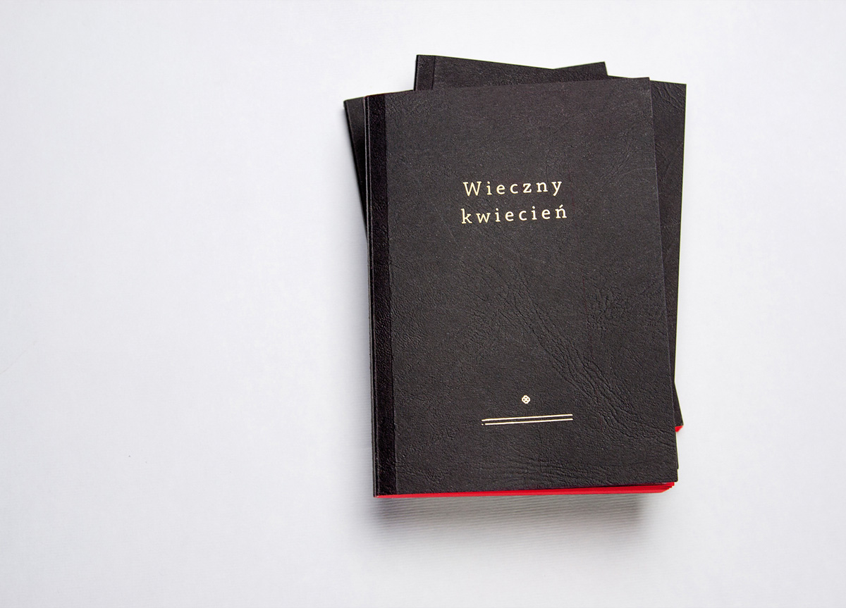
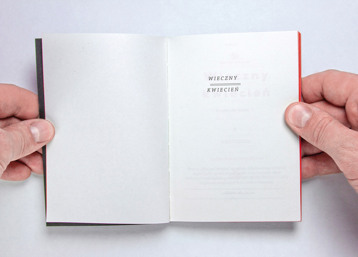
My assignment was to design a program for the “Eternal April.” It constitutes an artistic frame for the play “Eternal April” by Jaroslaw Jakubowski, directed by Agnieszka Korytkowiej-Mazur.
APPROACH
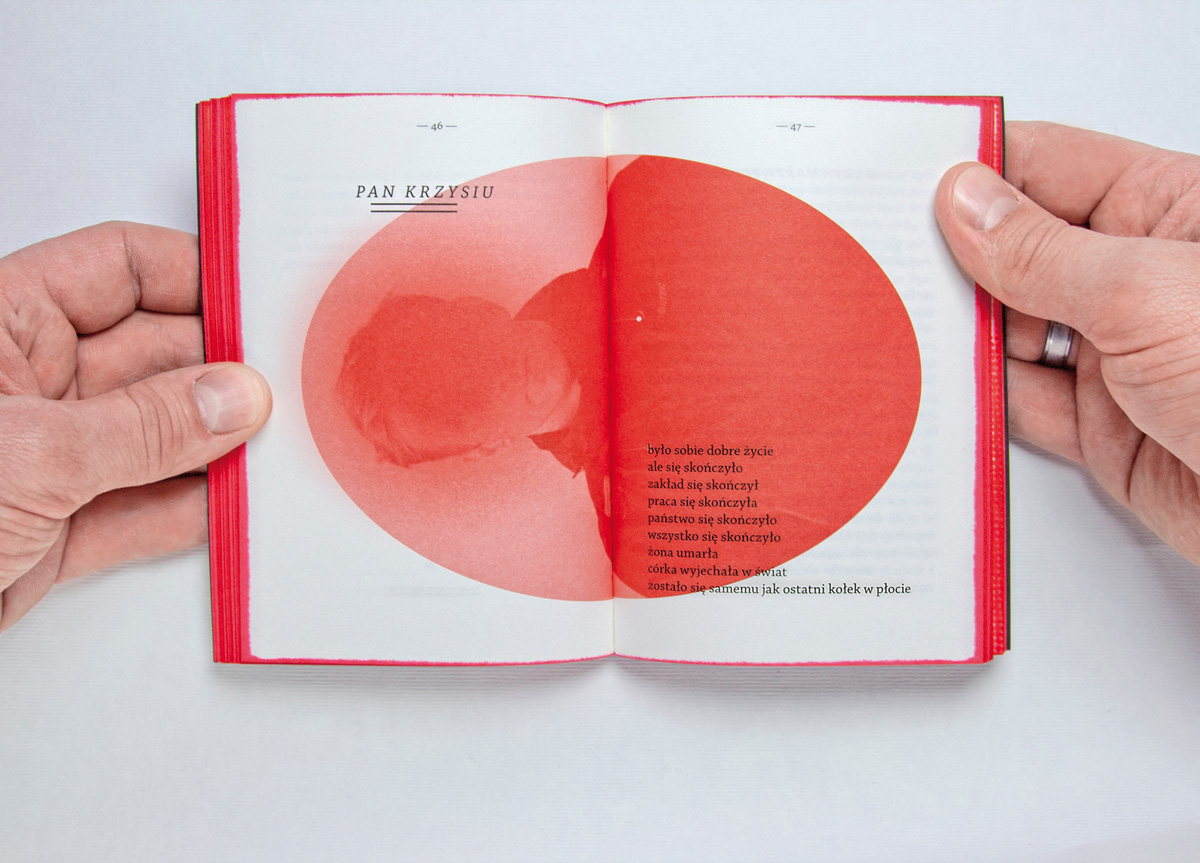
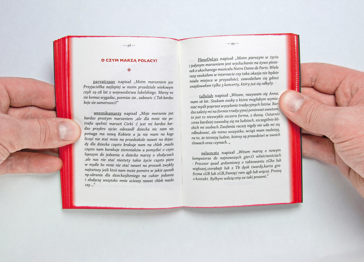
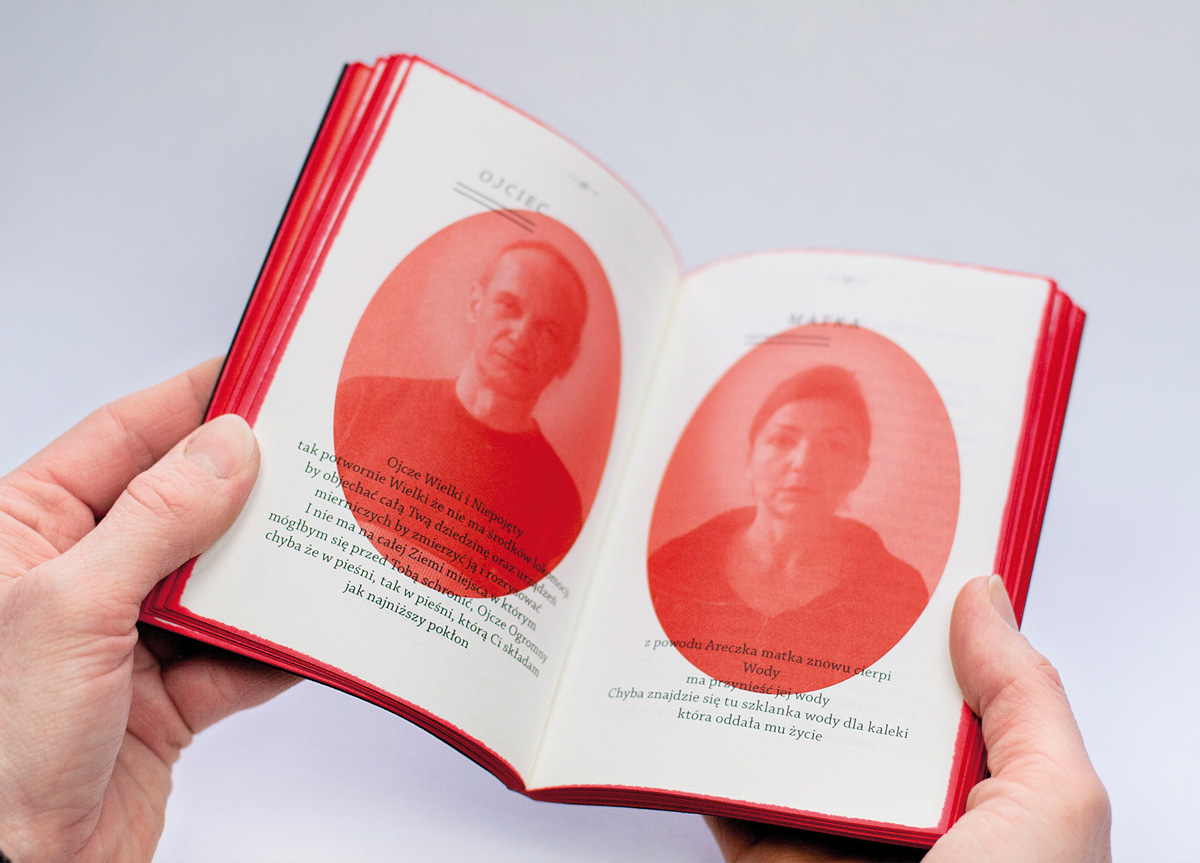
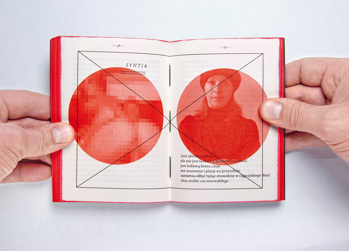
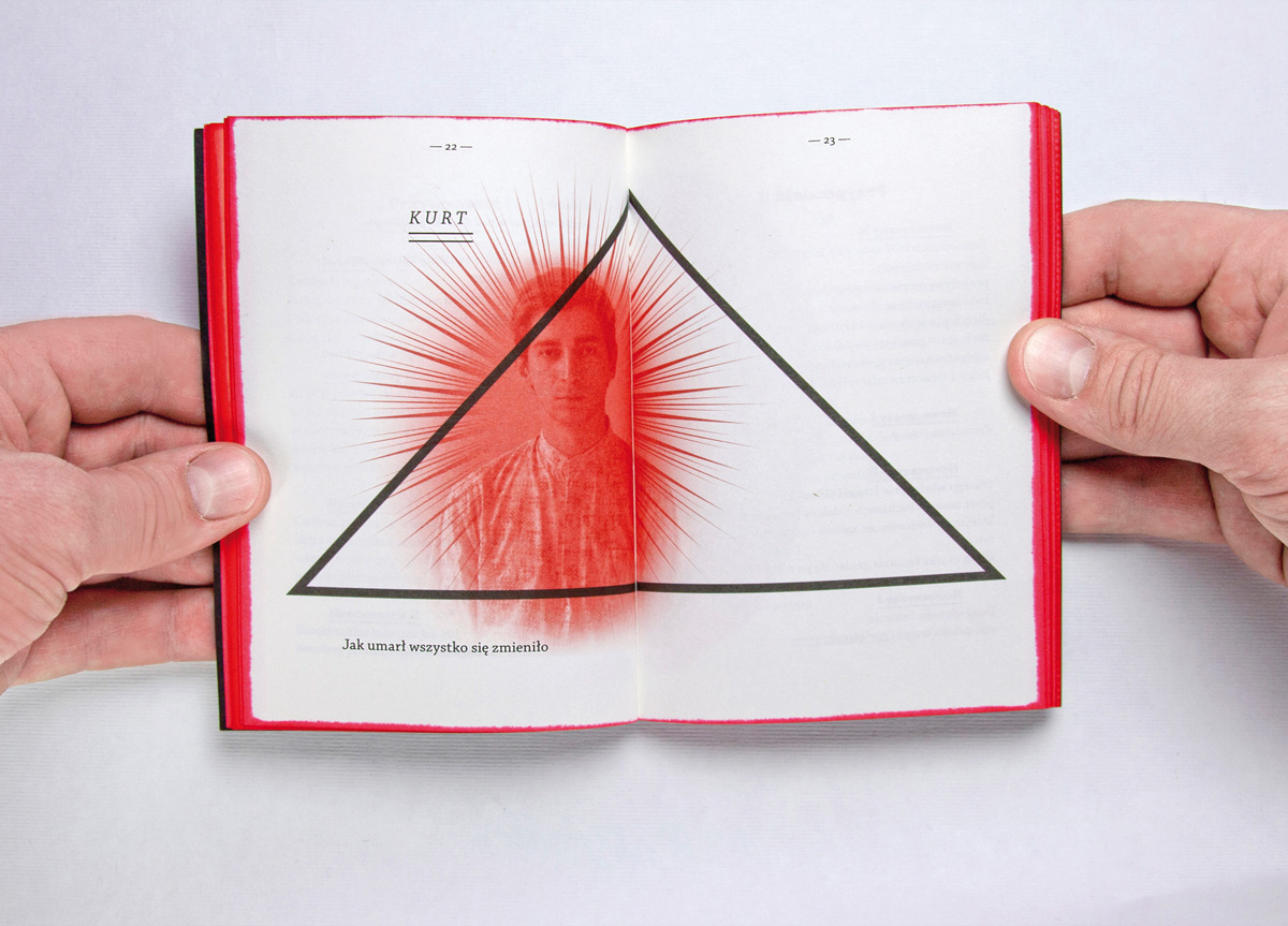
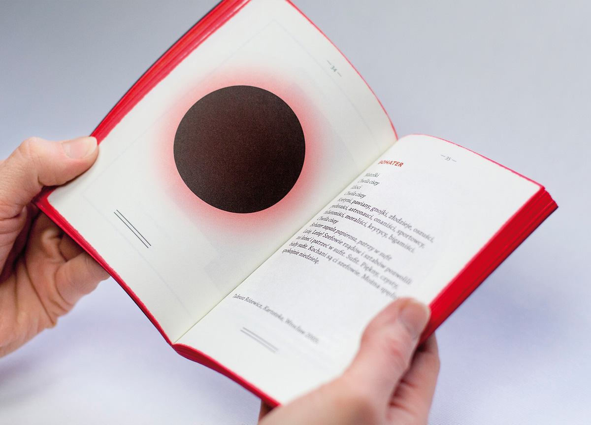
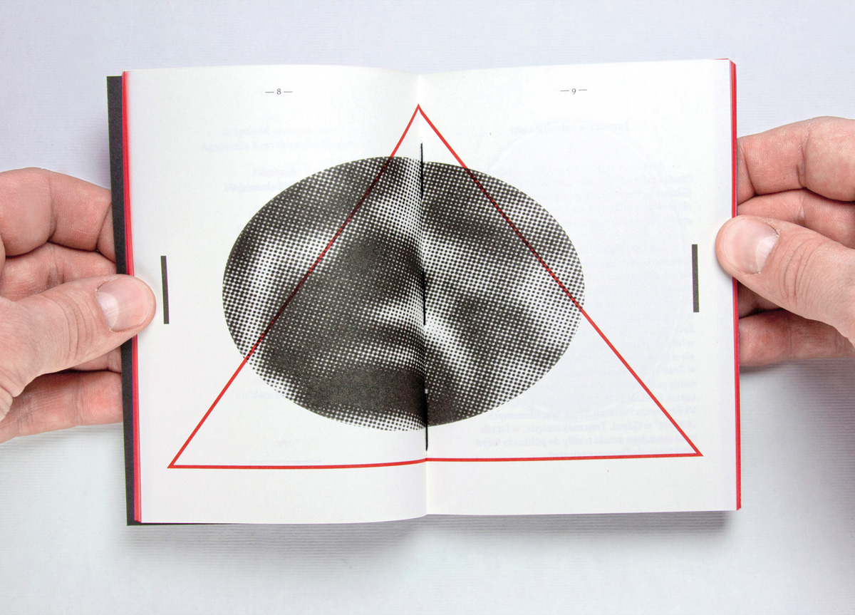
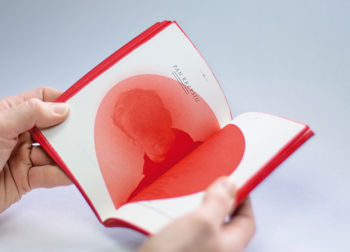
This program was inspired by a prayer book from the early twentieth century. As in the play, the program mixes the sacred with the profane using a torn picture of Polish society in a cultural and religious context.
PRODUCTION LESSONS
The biggest challenge was to find a balance within the mixture of the profane and the sacred as placed in cultural and religious contexts.
Judge’s Comments
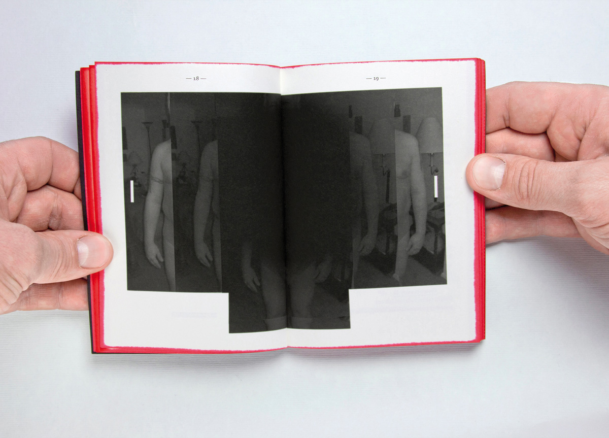
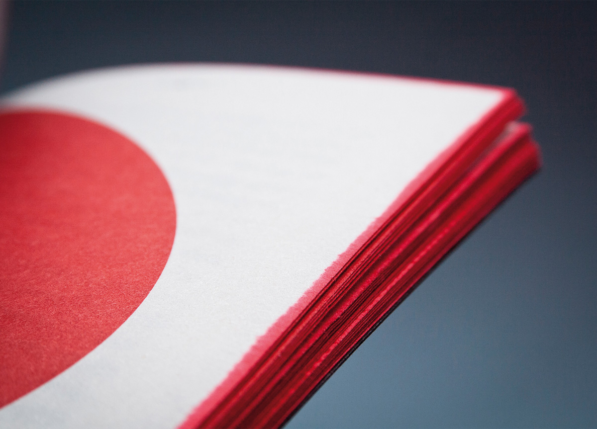
I loved this little book because it seemed smart and lovingly cared for and even though the entire thing is in Polish (and I’m Texan) there seems to me to be a clear concept from front to back. The typography is classic but confident and the illustrative technique seems vintage (Bauhaus or Dada) but contemporary and fresh at the same time. The designers have taken the typical existing imagery of actors and sets from theatrical productions and have transformed them into pure graphic joy through their own sheer will. The entire book is printed only two-color but I give its creators a standing ovation for their stellar performance. — DJ Stout
