CLIENT
Holly Hunt is known for a look that is consistently at the forefront of style and quality, and their showrooms and collections lead the industry in luxury home furnishings. The company designs, produces, and showcases custom made products including indoor and outdoor furniture, lighting, rugs, textiles, and leathers.
BRIEF
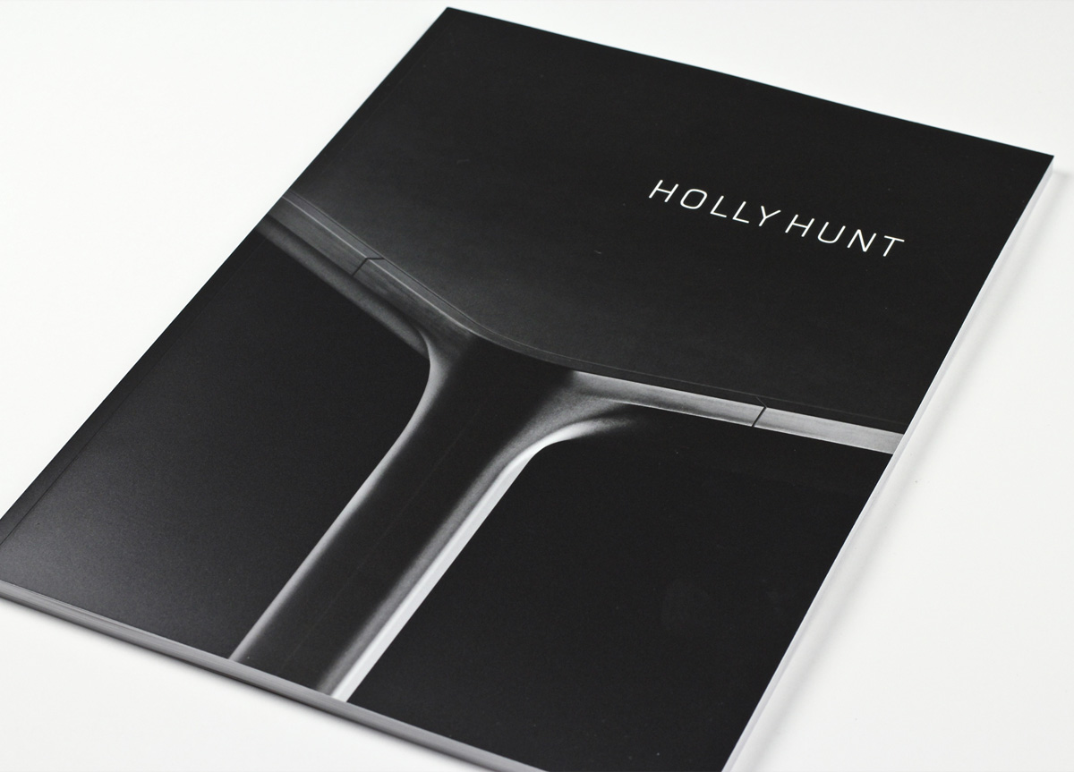
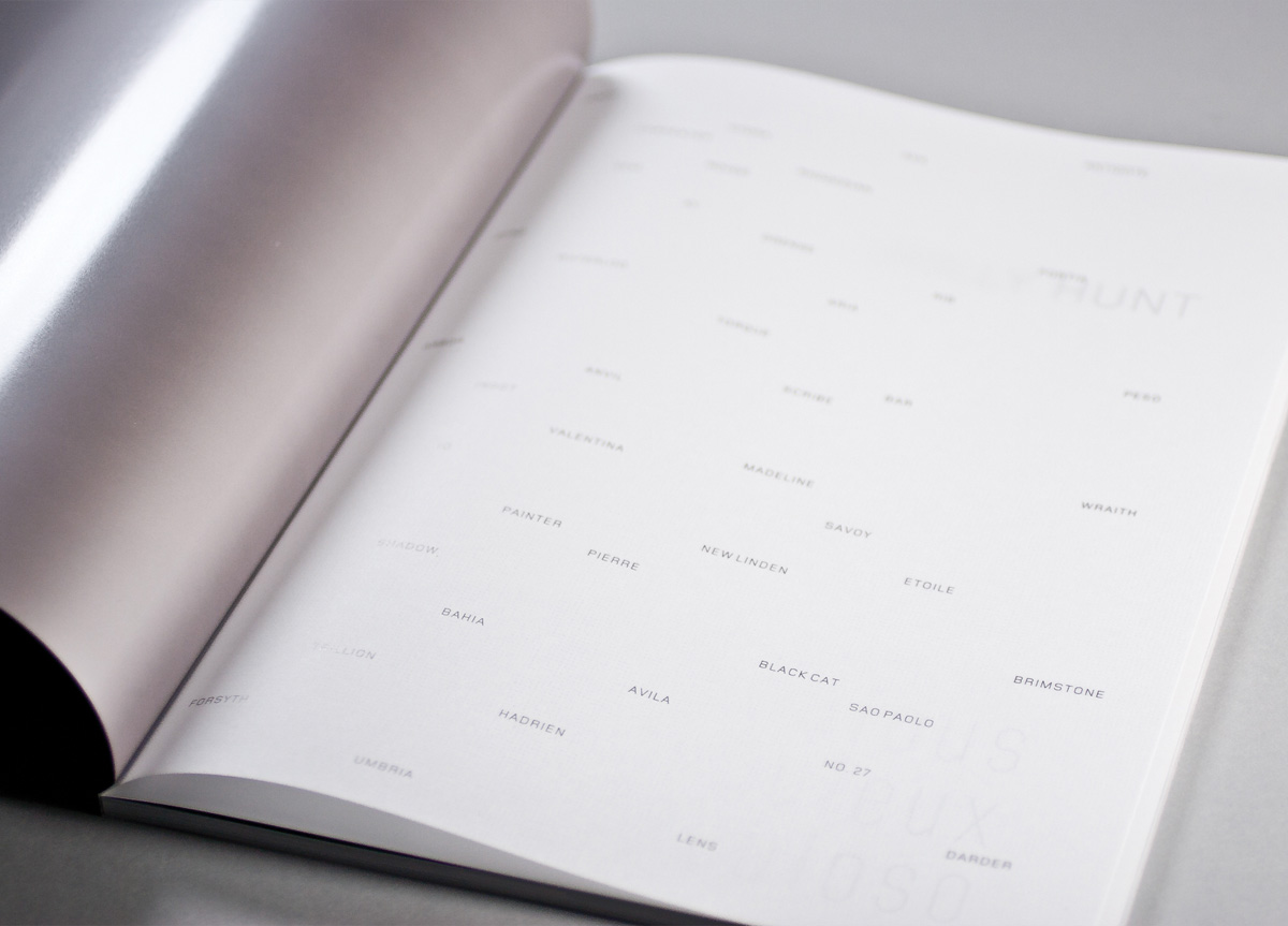
Holly Hunt wanted to create a keepsake brochure that would demonstrate the new direction of her brand. At the beginning of the process, Holly made mention that “the aliens have landed and they are pretty.”
APPROACH
Our approach is always aiming towards sublime design, expressed through lovely typography.
PRODUCTION LESSONS
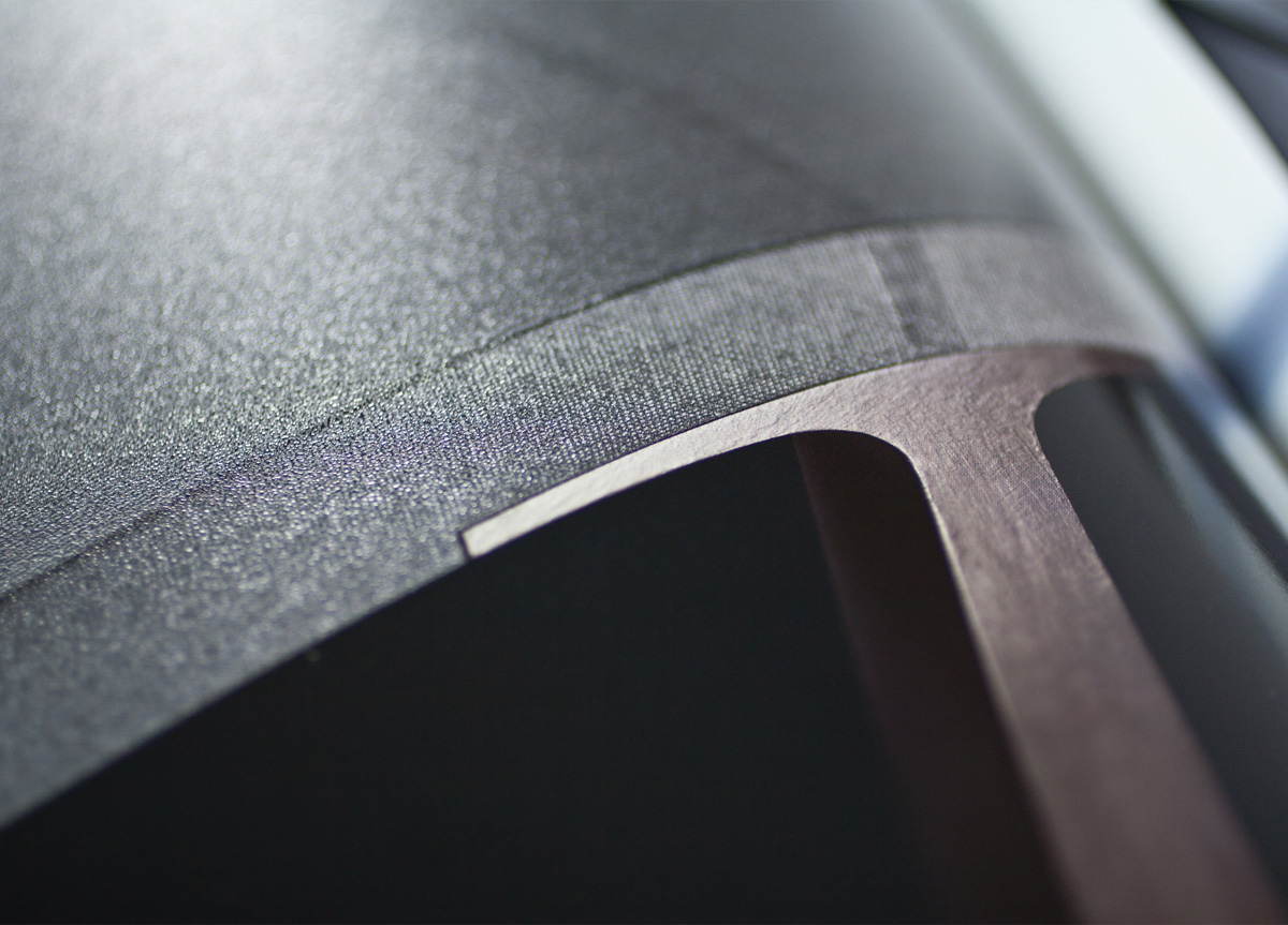
Marry the right paper with the right process and it will always look right.
Judge’s Comments
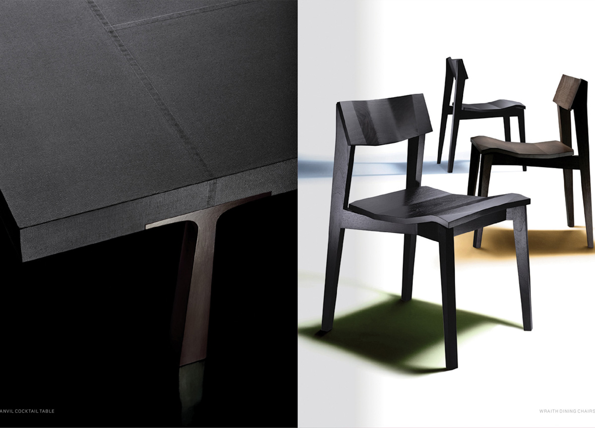
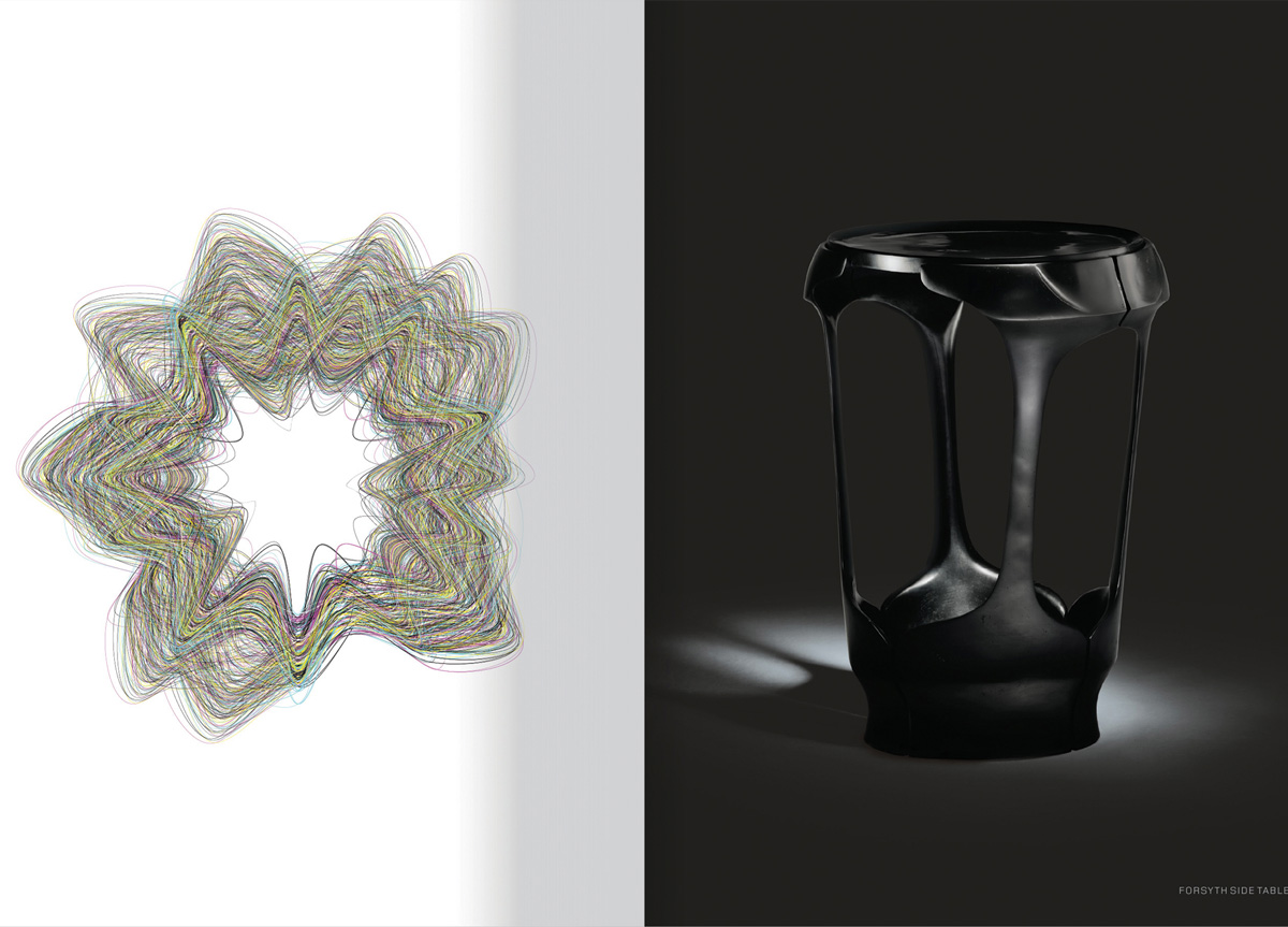
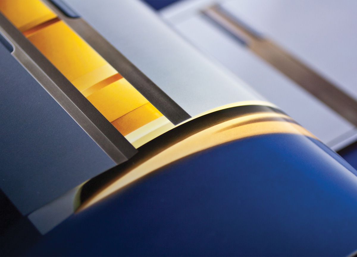
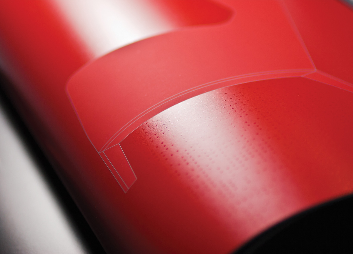
Among the many special techniques and technologies that have been left behind in the transfer to a digital printing process is the science of printing varnishes. This piece is a blowout—a graphic overkill of varnish ideas—many of which I haven’t seen in use for over a generation. You could use this one piece as a “how to” textbook showing how to use varnish to do almost anything. — Art Chantry
I loved leafing through this catalog because of its dense, rich color and more importantly the smartly applied varnish. This sensual catalog begs to be looked at again and again. — David Dodde
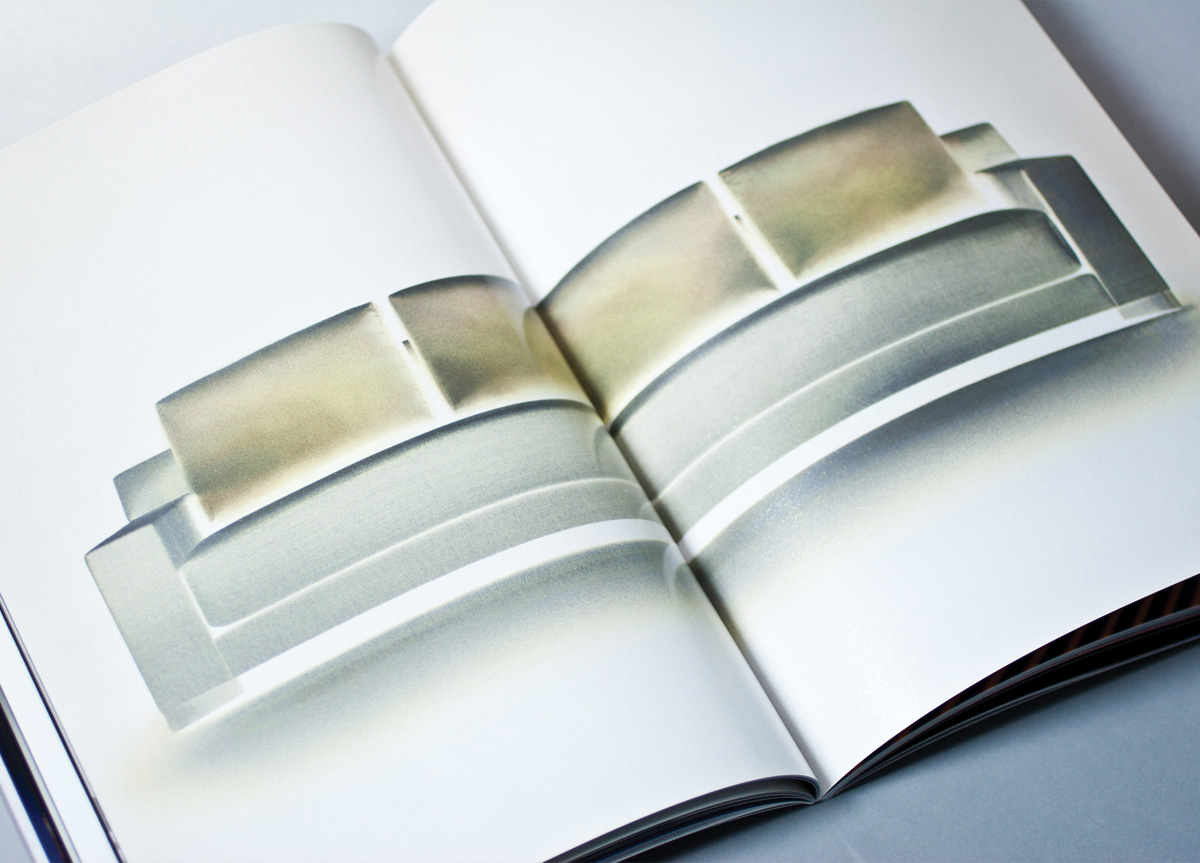
The production value (photo/design/print) was great. The mix and match of stocks, inks, and varnishes just made this piece feel like a sculpture in your hands. — Pum Lefebure
The striking varnish work elevates the exquisite beauty of the brochure’s photography and furniture design. — brad murph
The printing and explorative use of varnishes here shines like expensive jewelry. — DJ Stout
