CLIENT
The Department of Art at Mississippi State University is home to over 300 Art Majors.
APPROACH
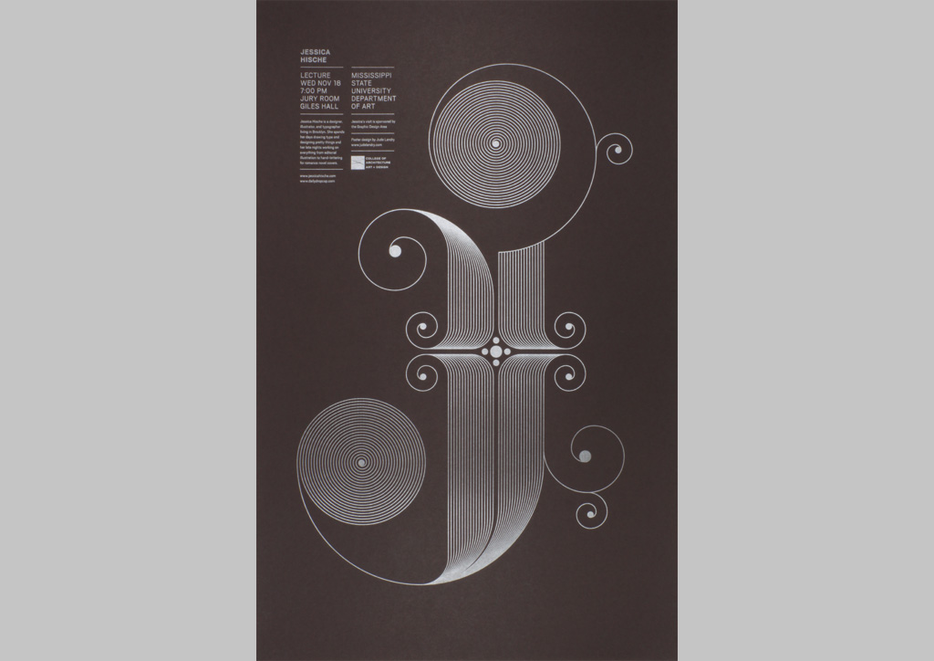
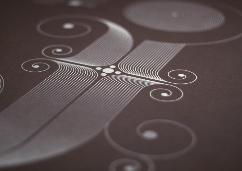
This poster was created to lure college students to a lecture and workshop by visiting artist Jessica Hische, whom we invited as she launched her Daily Drop Cap project—where she draws a custom letter each day and posts it for anyone to use on their own websites. I designed this letter “J” as an homage to her inspiring work. Printing with one spot color on brown paper was a money saving solution that didn’t give the impression of a low printing budget.
I had spoken with Scott Lipsey at Mississippi State University about printing a silver spot ink on brown paper, and he assured me they could easily do it. Because the print shop is less than a mile from my office, I was able to watch the entire printing process. It all went very smoothly.
Judge’s Comments
I chose this poster because it managed to stand out among all of the other more elaborately printed pieces, even though it was printed with a single color (silver) on dark brown paper. The primary letterform accurately reflects the essence of Jessica Hische’s elegant typographic aesthetic, and the supporting typography is perfect. The fact that this poster was printed on a beautiful and amazing sheet of French Paper that I designed may have also slightly influenced my vote. — Charles S. Anderson


