CATEGORY

Offset

RANK


PRODUCTION DETAILS

Quantity

1,000

Page Count

80 + Cover

Number of Colors

Cover 1/1
Interior section I 1/1
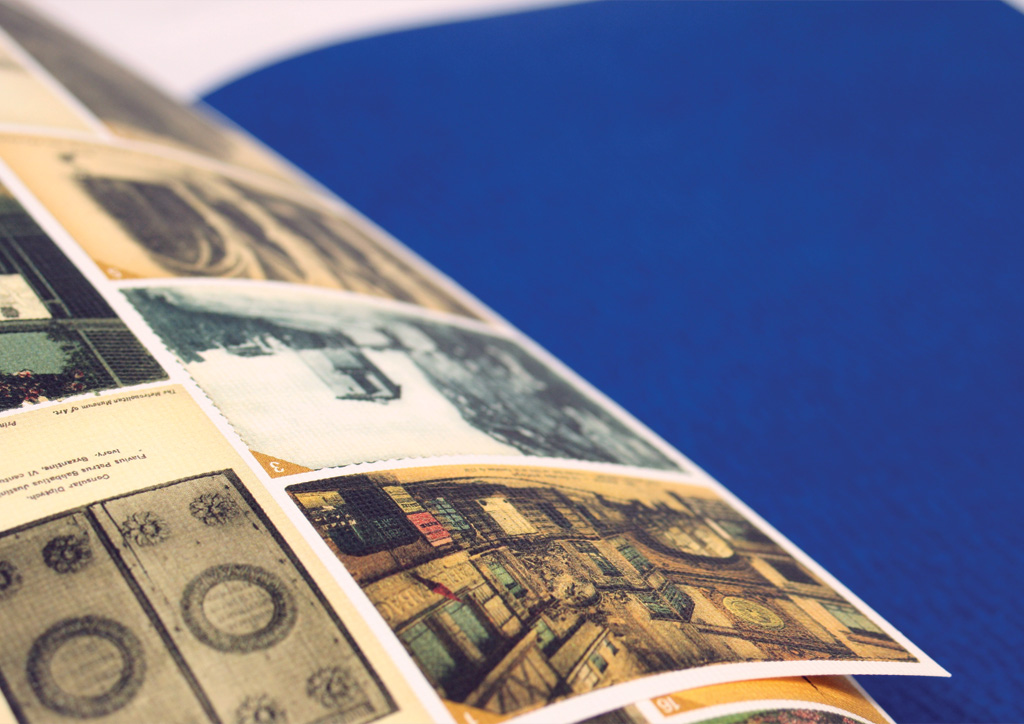
Interior section II 4/1
Band 4

Special Techniques

Aqueous varnish

Binding

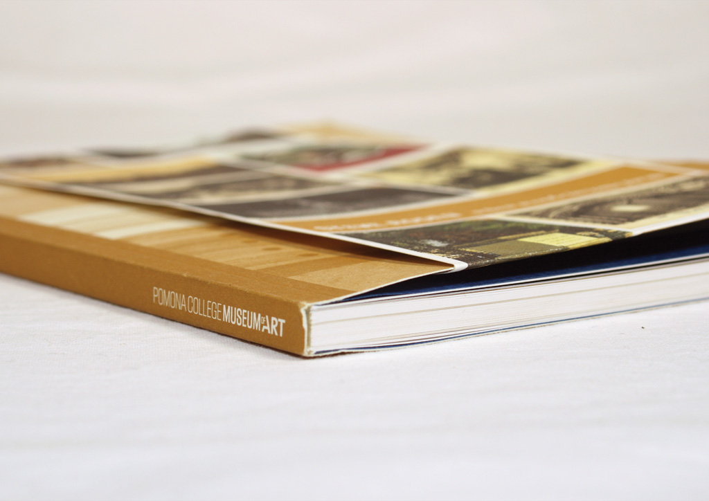
Perfect bound + Dust jacket

Dimensions

5.5 × 7.75


DESIGN CREDITS

Designer

Kimberly Varella
Editors Rebecca McGrew and Eli Pulsinelli


TAGS

, , , , , , , , , ,


LINKS

deptofgraphicsciences.com
pomona.edu/museum
sourceprintmedia.com

Exhibition Catalog for Pomona College Museum of Art by Department of Graphic Sciences


CLIENT

Pomona Col­lege Muse­um of Art is the site of an active pro­gram of tem­po­rary con­tem­po­rary and his­tor­i­cal exhi­bi­tions through­out the aca­d­e­m­ic year for Pomona Col­lege in Clare­mont, CA.


APPROACH

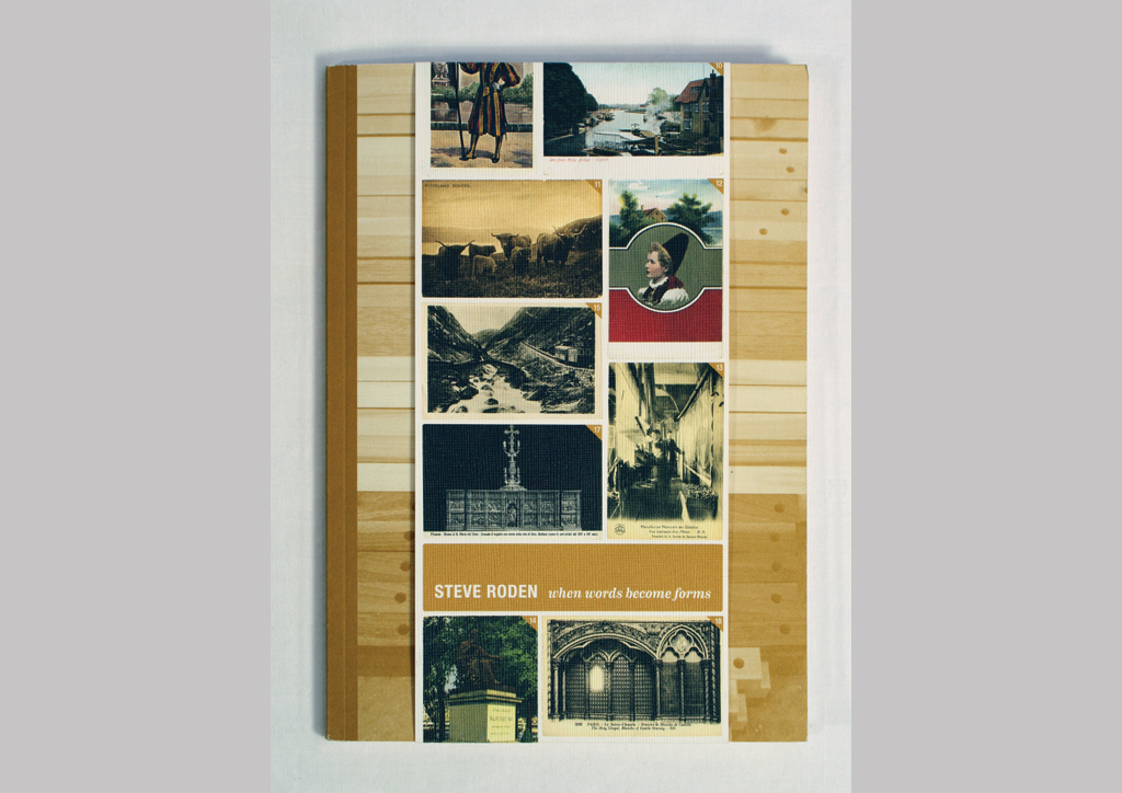
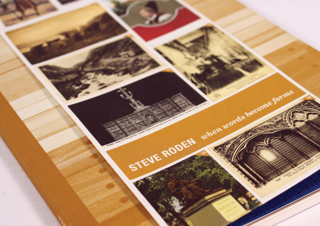
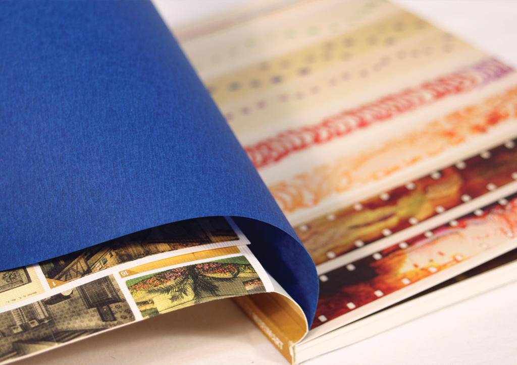
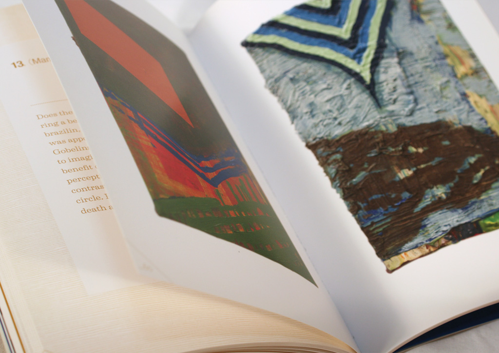
In order to high­light the mul­ti-dis­ci­pli­nary work of artist Steve Roden, we knew that we would have to design an equal­ly lay­ered and com­plex object, while meet­ing the rev­e­la­to­ry stan­dards of a muse­um cat­a­log. Roden’s exhi­bi­tion was based on a col­lec­tion of post­cards by a well known artist that Roden and col­lab­o­ra­tor Michael Ned-Holte recre­at­ed into poems and paint­ings of the same dimen­sions (3.75 by 5.5 inch­es). This result­ed in the inti­mate size of the cat­a­log and the cross-ref­er­enc­ing bel­ly band that con­nects the orig­i­nal post­cards to the paint­ings and poems repro­duced within.

Understanding the nature of print and utilizing a combination of spot and process colors can really help in getting more bang for your buck. We met several times with our print rep before even starting the design process, ensuring that the blue prints for the complex architecture of this catalog were worked out. A 4/1 signature can give the feeling of a coffee table caliber book, while saving costs in plates and wash-ups.

Browse entries