CATEGORY

Offset

RANK


PRODUCTION DETAILS

Quantity

2,500

Page Count

46 + Cover

Number of Colors

Cover 1/1
Interior CMYK + 1

Special Techniques

Binding

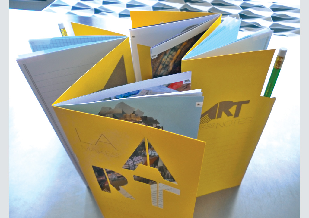
Z-fold
Double saddle-stitch

Dimensions

4.25 × 10.25


DESIGN CREDITS

Designers

Kimberly Varella and Liz Anderson


TAGS

, , , , , , , , , , , ,


LINKS

deptofgraphicsciences.com
calfund.org
sourceprintmedia.com

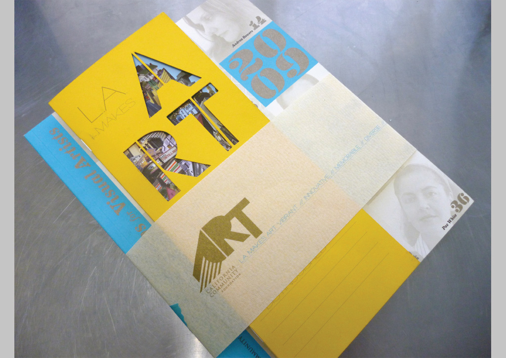
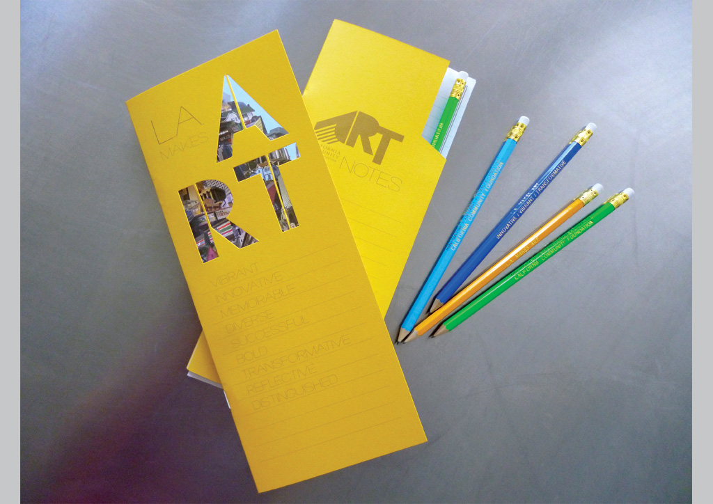
Campaign materials for California Community Foundation by Department of Graphic Sciences


CLIENT

Cal­i­for­nia Com­mu­ni­ty Foun­da­tion (CCF) is a non­prof­it orga­ni­za­tion that man­ages 1,600 funds for mak­ing grants, loans, fel­low­ships, and schol­ar­ships. With a con­cen­tra­tion of resources in pri­or­i­ty areas such as the arts, and focused atten­tion on low-income, eth­nic minori­ties, and vul­ner­a­ble populations.


APPROACH

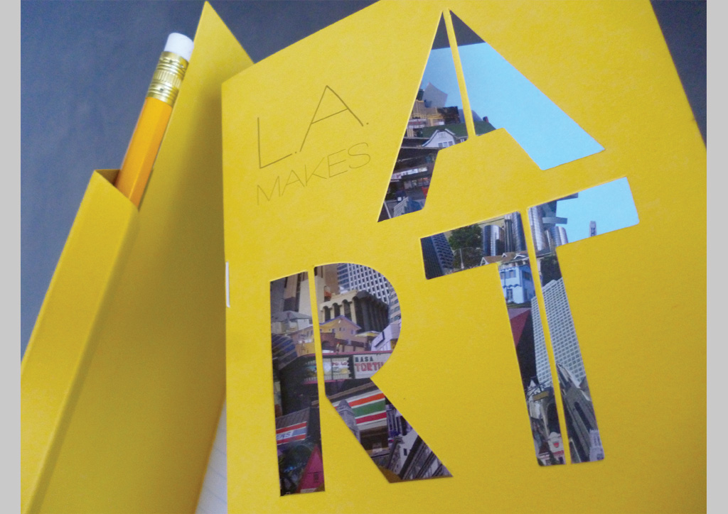
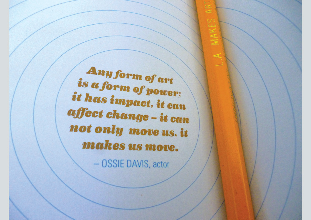
This piece was geared towards CCF donors to reveal the mul­ti­ple art funds that they man­age. We ini­tial­ly built a cam­paign around this focus called “L.A. Makes Art” which talked specif­i­cal­ly about art in Los Ange­les, CA and how fund­ing the Arts not only makes art hap­pen but also plays a fun­da­men­tal role in the cul­ture of the city. The brochure dou­bled as an infor­ma­tion­al guide to CCF’s funds and a sketch­book to invite fun­ders to become a part of art-mak­ing in Los Ange­les. These brochures are pro­vid­ed at many events includ­ing stu­dio tours, muse­um tours, lun­cheons, etc. where donors and artists will con­nect directly.

PMS 872 looks really red on yellow paper. We had to wash up and change to 871—huge difference. Could have been avoided by ordering a draw-down. Also, the paper for the cover was much more rigid than we anticipated. We ended up doing a double score on the folds to help it sit—a little—flatter.

Browse entries