You’re looking at one of the…
A graphic design firm generating its own projects, initiatives, and content while taking on limited client work. Run by Bryony Gomez-Palacio and Armin Vit in Bloomington, IN.
Join our Mailing List
Colophon
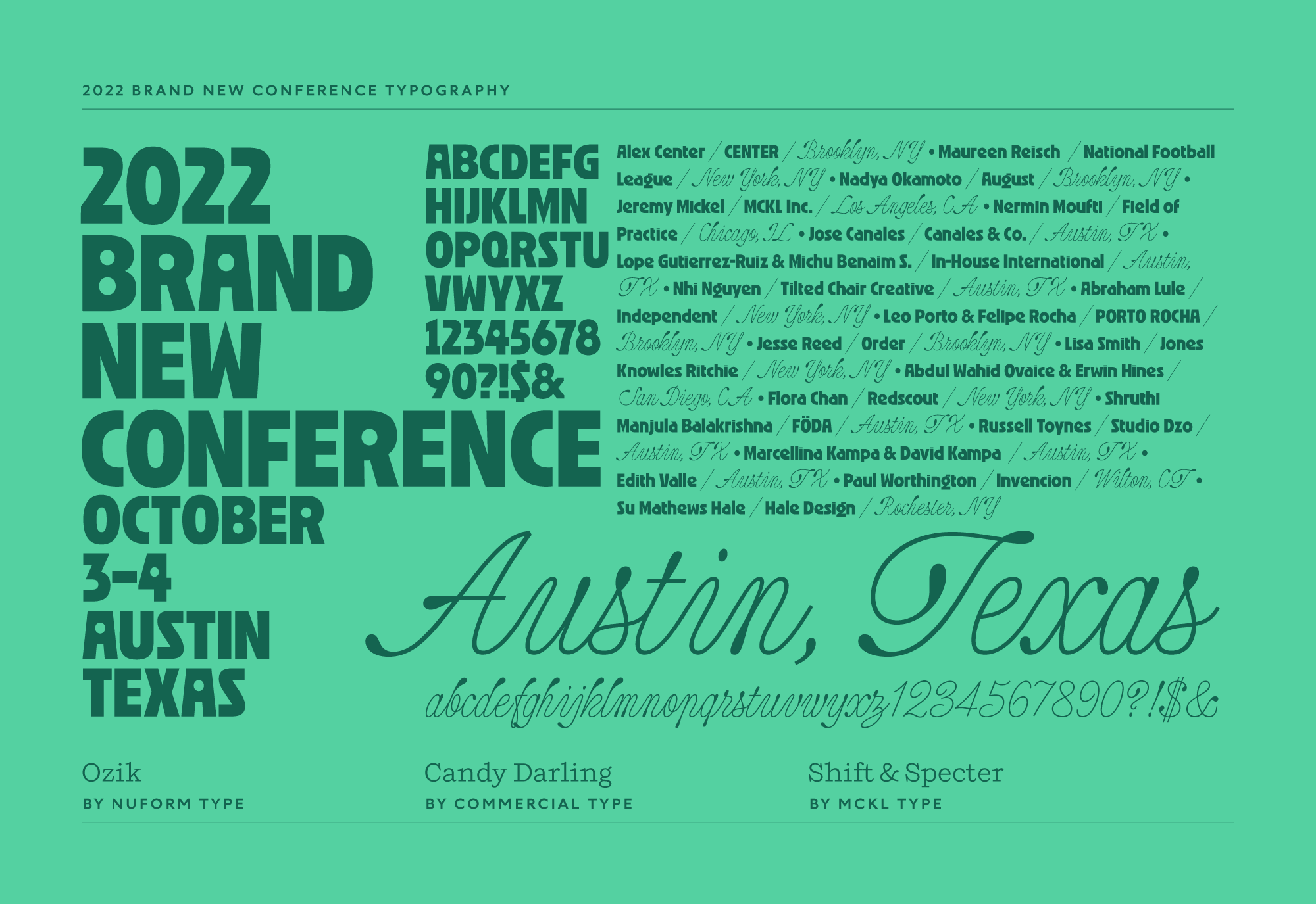
Headlines and wordmark
Druk Condensed XX Super by Berton Hasebe for Commercial Type.
Body
Neue Haas Unica by Toshi Omagari for Monotype. Served via fonts.com.
UCLLC logo
Custom lettering by Mark Caneso.
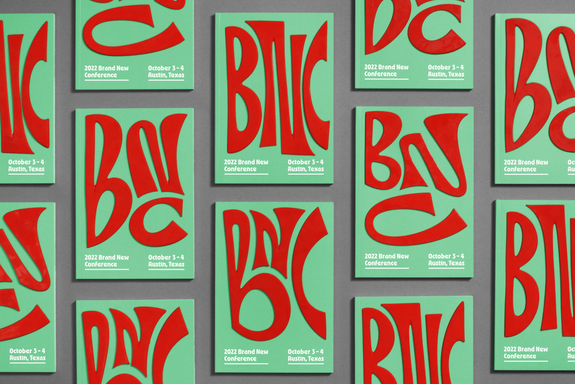
2022 Brand New Conference Identity
This past October 3 – 4 we celebrated the eleventh edition of the Brand New Conference in Austin, TX. After a three-year absence it was great to be back even if the months leading up to the event were some of the most brutal we’ve had in terms of production and preparation for a conference but it was all worth it with happy attendees, happy live streamers, happy speakers, and happy sponsors. Here is a deep dive into this year’s extra weird — and elastic — identity.
There are a lot of self-playing videos, so if your computer fans start to scream you can use the button below to pause them all at once and then start playing them as you scroll down.
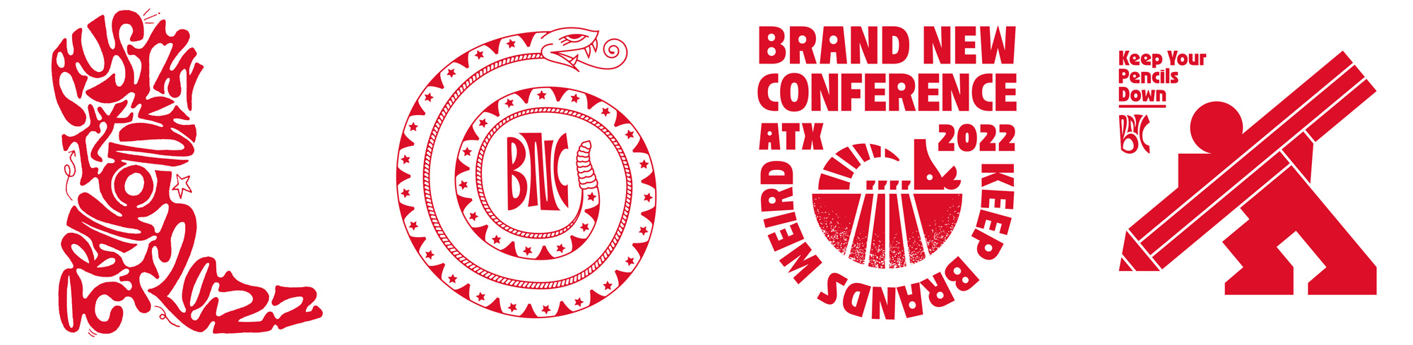
Keep Austin Weird
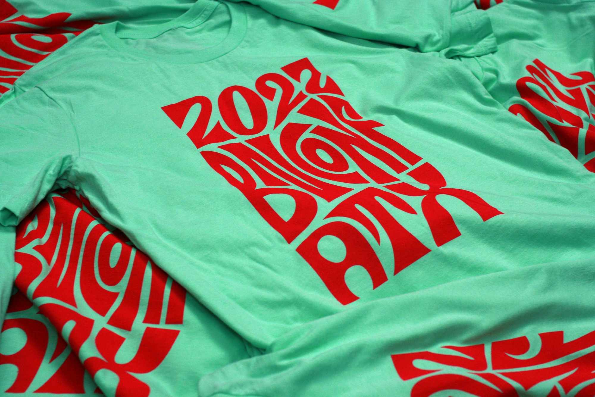
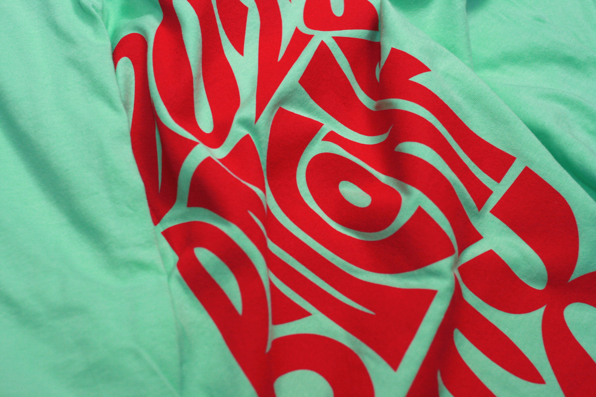
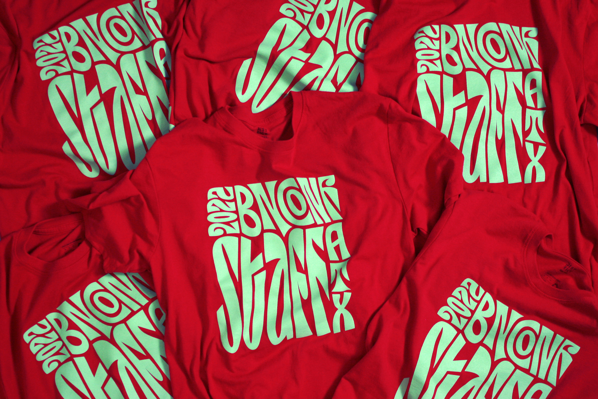
We have a more detailed write-up about the genesis of this year’s identity here and for the sake of the length of this post, we will keep this prelude relatively short. The basic premise is that if there was one year where we could get a little weirder than usual — and outside of our comfort zone — it was this one as Austin gave us the perfect excuse-slash-concept with its unofficial motto: Keep Austin Weird. The main problem was that we — as in UnderConsideration’s Armin and Bryony — are not really good at doing weird design so, for the first time ever in the history of the conference and of any of the initiatives we’ve developed over the years we COLLABORATED with someone to play a key role in the design of the identity. This may sound like it’s a normal thing to do but, trust us, this was a big stretch for us. Enter Sultan Jum, aka GEO.
Doing what he does best — which is morphing existing typefaces into highly expressive letterforms that contort to each other’s shapes as they jolt into completely new compositions in a matter of seconds — GEO took Nuform Type’s Ozik and transformed it into some delightfully complex compositions with a kinetic energy that captured that weird vibe we were looking for, one that wasn’t just plain ugly or overly trendy but one that felt surprising, hypnotic, and, dare we say, sophisticated.
I Love You So Much
Another Austin reference that played a huge role in this identity was one of the city’s most popular pieces of street art: The “I Love You So Much” graffiti mural on the side of the popular Jo’s Coffee in the even more popular neighborhood of South Congress. It’s quite possibly the most Instagram’d mural in Austin.
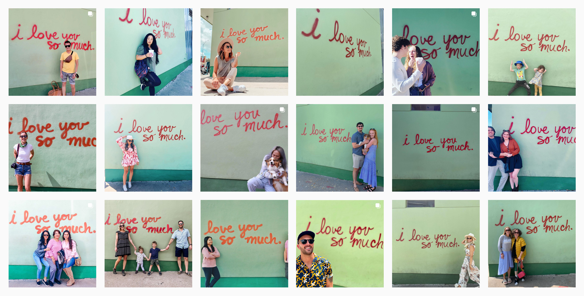
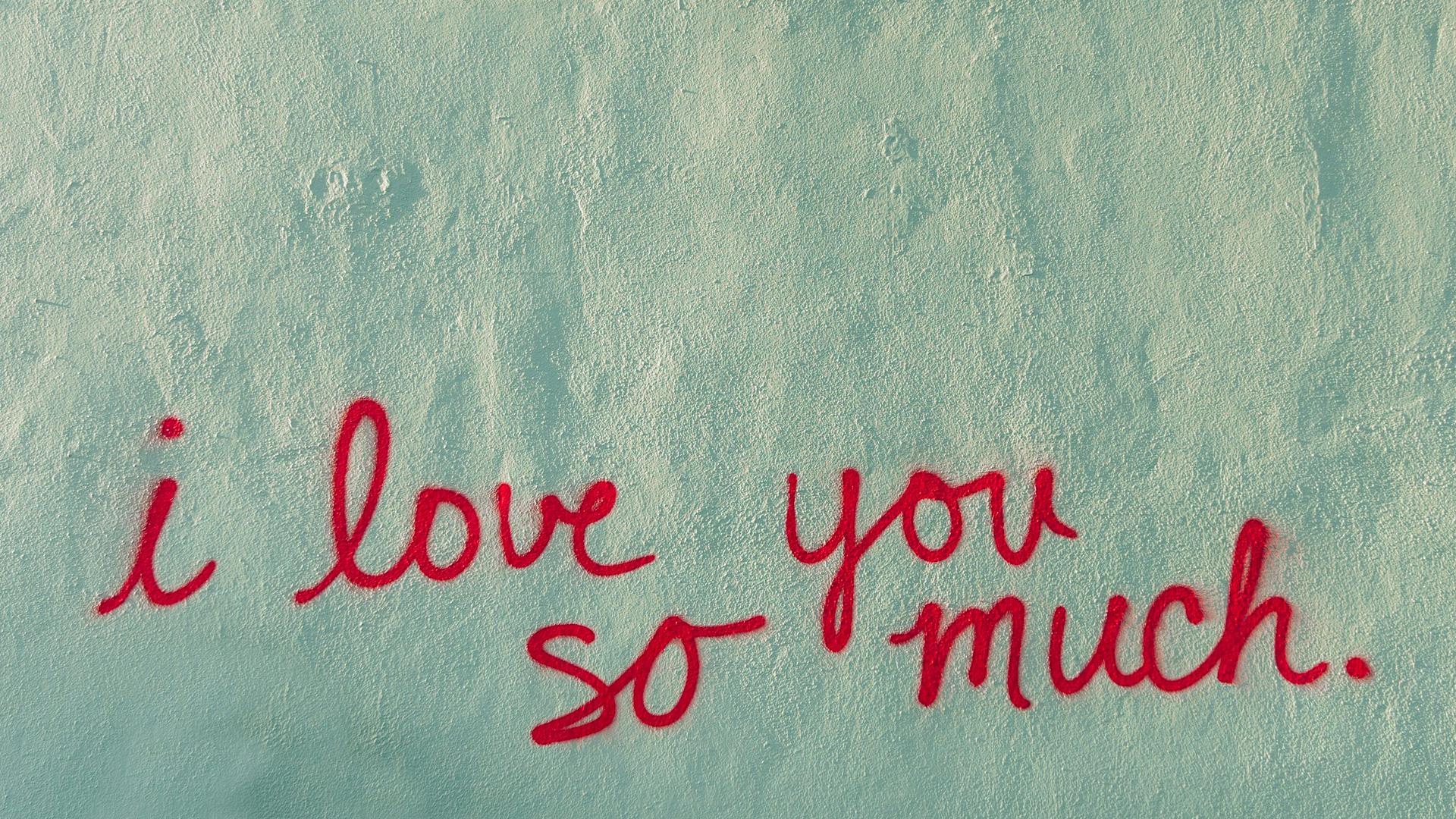
Needless to say, we found our color story here with the combination of mint green and dark red. The graffiti also justified the use of a script typeface, which is something we had already started toying with but, admittedly, was a gratuitous choice until we landed on building the whole identity around this mural. We dug deep to find something off-beat and it was in Commercial Type’s Vault where we found what we didn’t know we were looking for: Candy Darling. Lastly, we selected two supporting typefaces — MCKL Type’s Shift and Specter — for body copy and bits of typography that needed to be more… readable.
Digital Assets
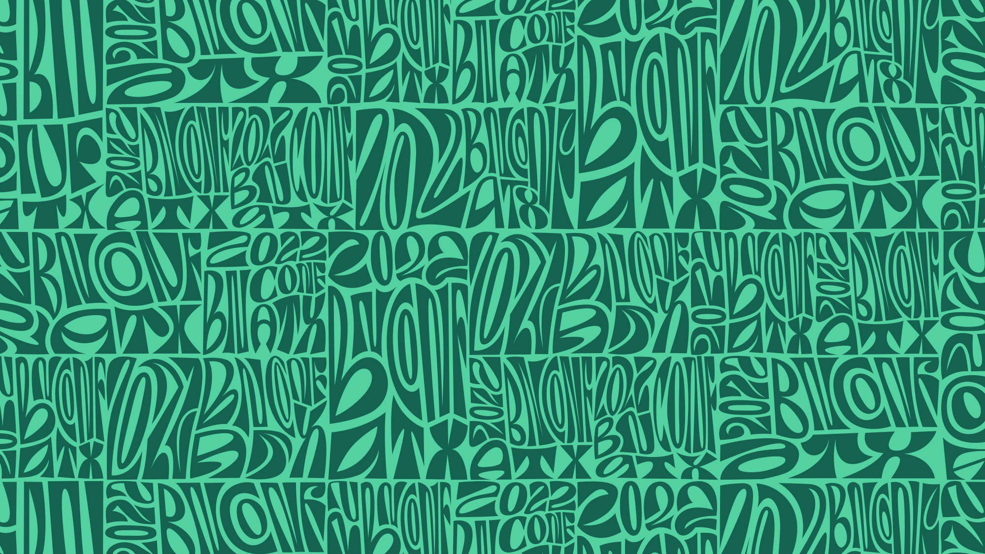
Given that the first assignment for each Brand New Conference is to launch the new website, announce speakers, and promote it on social media, we only have to worry about digital assets because, disclaimer, at this point, which is mid March, we usually have no idea how anything of what we are doing so far is going to manifest physically and this year in particular we had even less of an idea of how to translate GEO’s amazing digital animations into static physical applications. At that point, though, it didn’t matter, we had to put something online and GEO provided a great suite of motion assets — creating 16:9, 1:1, and 9:16 versions of “BNCONF” and “2022 BNCONF ATX” — that helped us build an initial design system.
A few months after the initial launch, GEO also provided the pièce de résistance of motion assets, animating the full name of the event. This was only done in the 16:9 ratio because it was super complex — below the animation is a glimpse at the After Effects file.
From the “2022 BNCONF ATX” and “BNCONF” animations we extracted all the keyframes where the artwork went edge to edge and created a pattern from them. We then, somewhat painstakingly, extracted the animations between keyframes and created an animated version of the pattern.
GEO also created “simpler” animations for each speaker, using only their first name to minimize the amount of letters that needed to be animated. Still, it was a lot of letters.
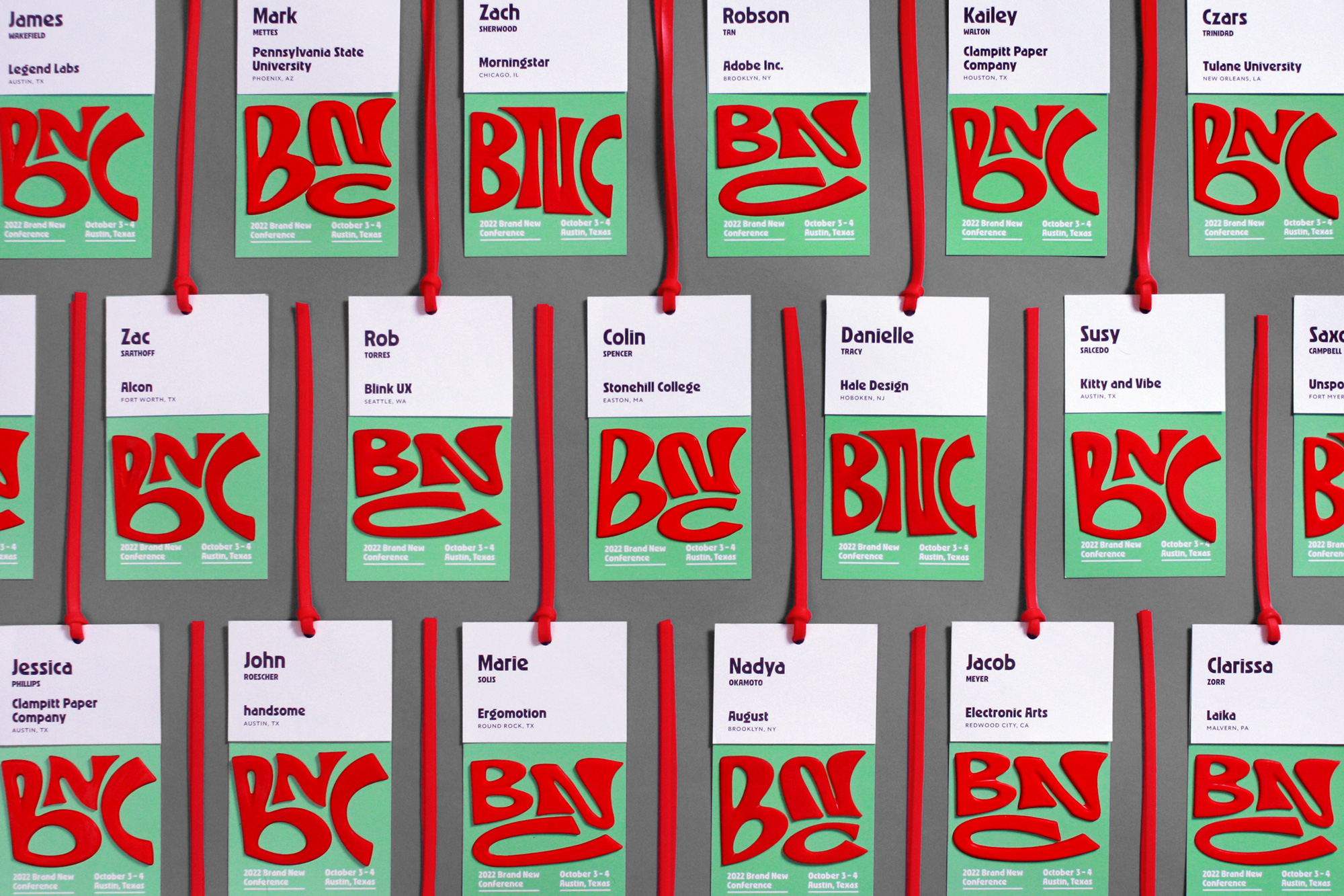
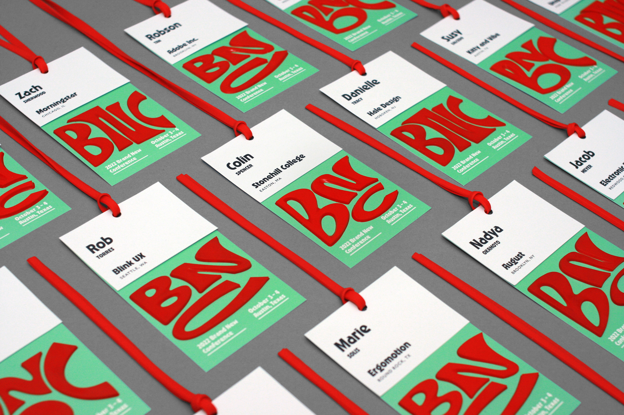
Programs and Badges
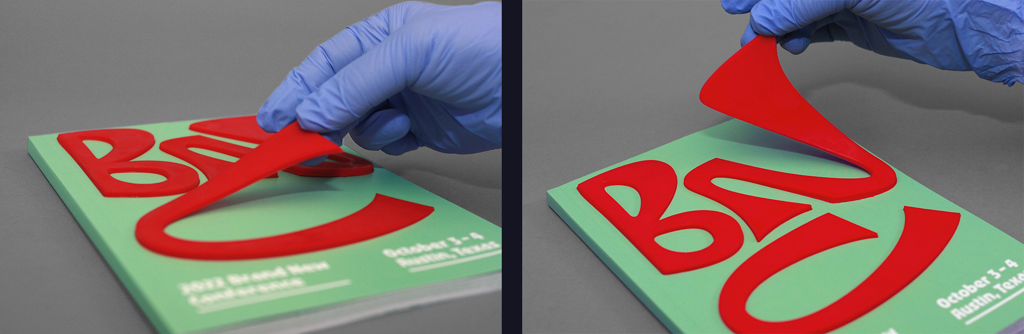
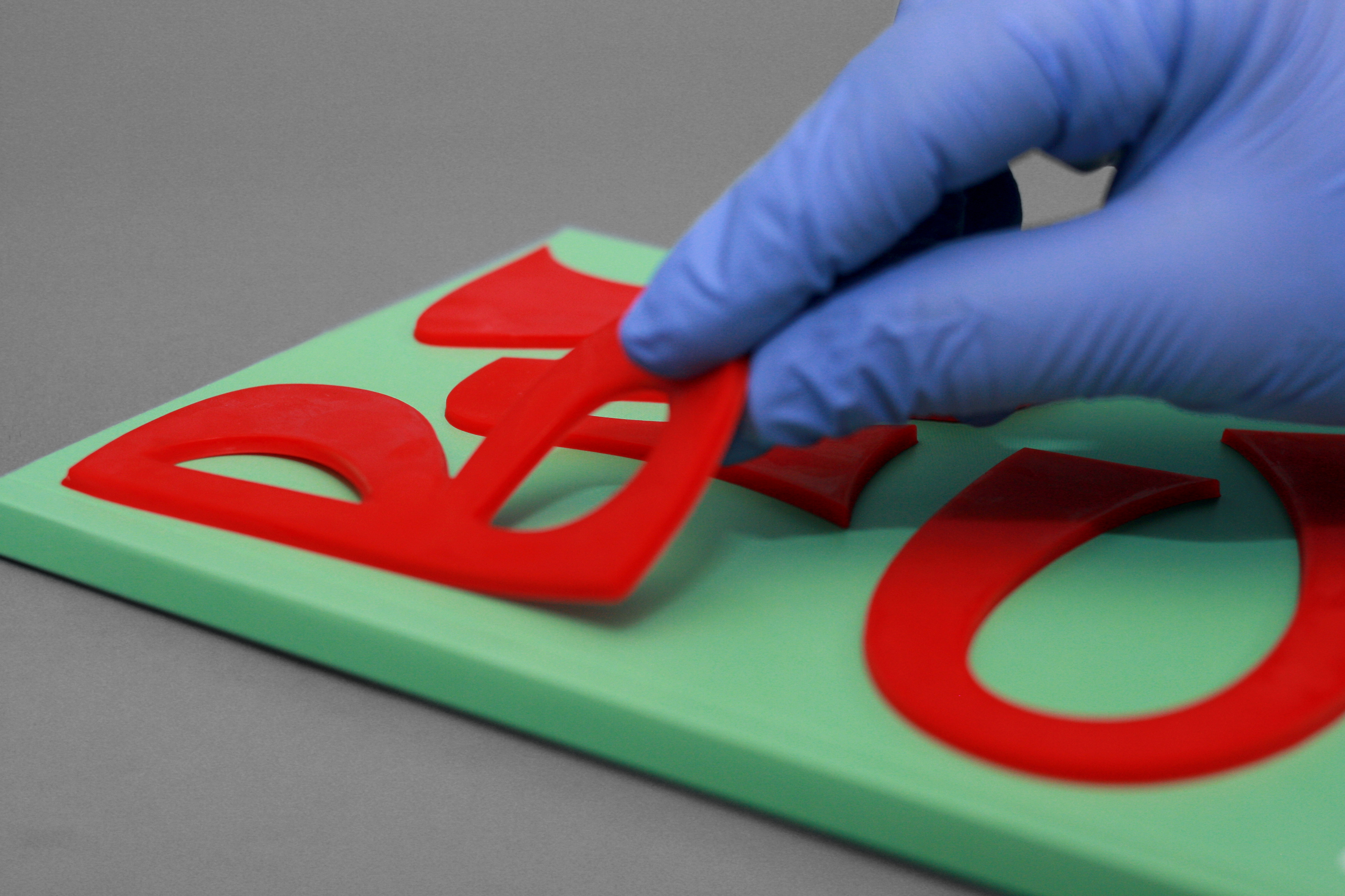
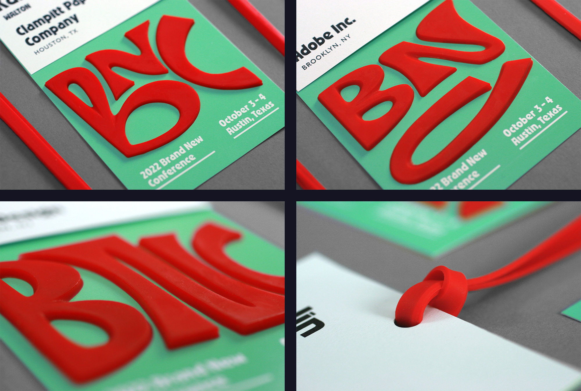
With the website launched in early May and plenty of assets to work with for social media posts it was time to focus on the physical applications and, wow, did we struggle. Part of the problem was that after hurrying to get the website launched we then had to tend to the First Round events in Europe over the Summer, which ended up consuming most of our time and energy from May to July. We thought we might have some time to think about it in taxis and airplanes while we moved around but we were so busy with First Round we simply could not think creatively. After Europe it still took us a good month — in full panic mode — to arrive at a general concept we were happy with: tl;dr To translate the elasticity and stretchiness of GEO’s animations through a collection of rubber-y materials. Rubber bands and physical therapy stretch bands were our first sources of inspiration (which do make an appearance further below) but we still needed something more. Enter PMC™ Polyurethane Rubber Compounds.
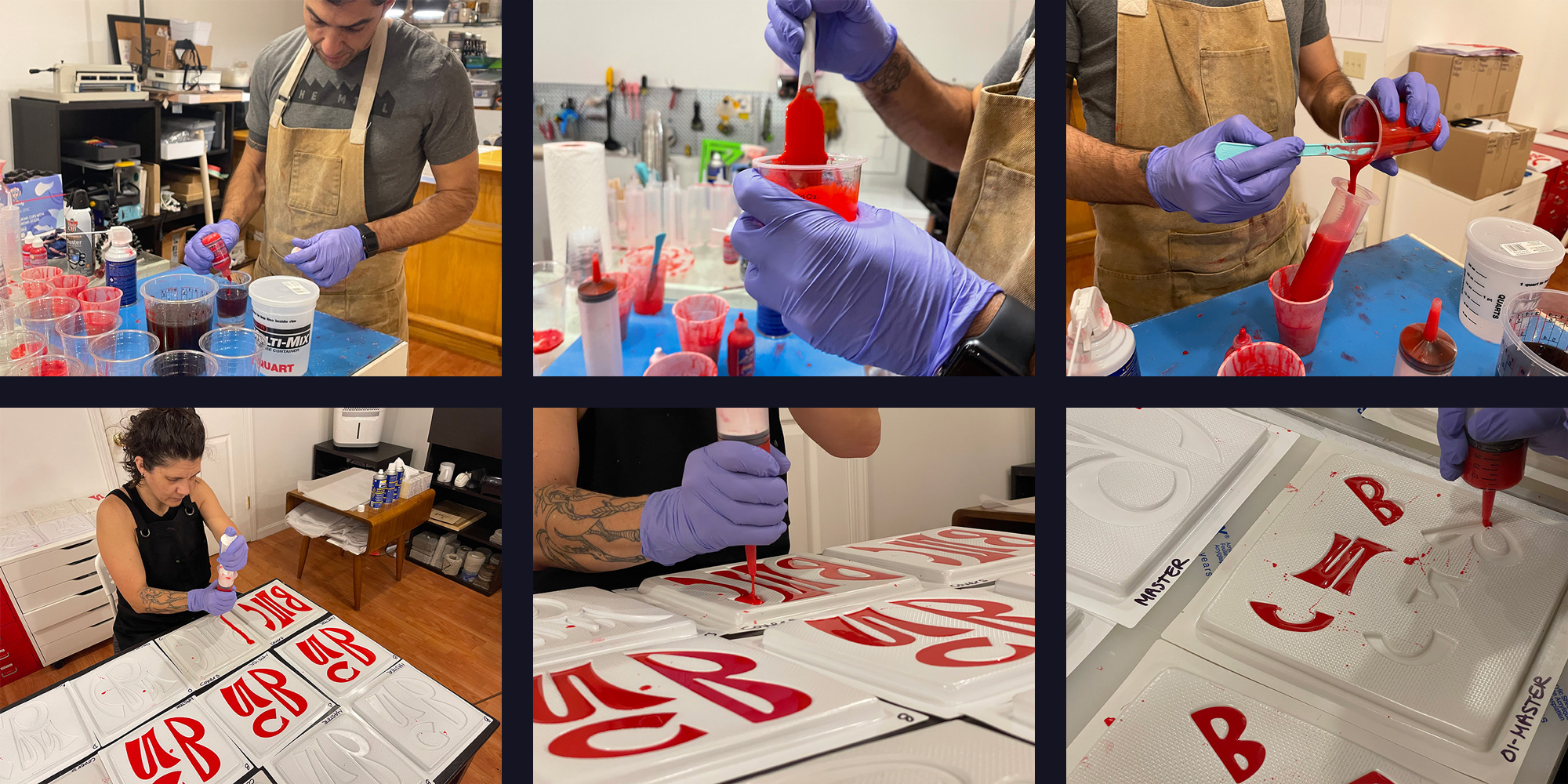
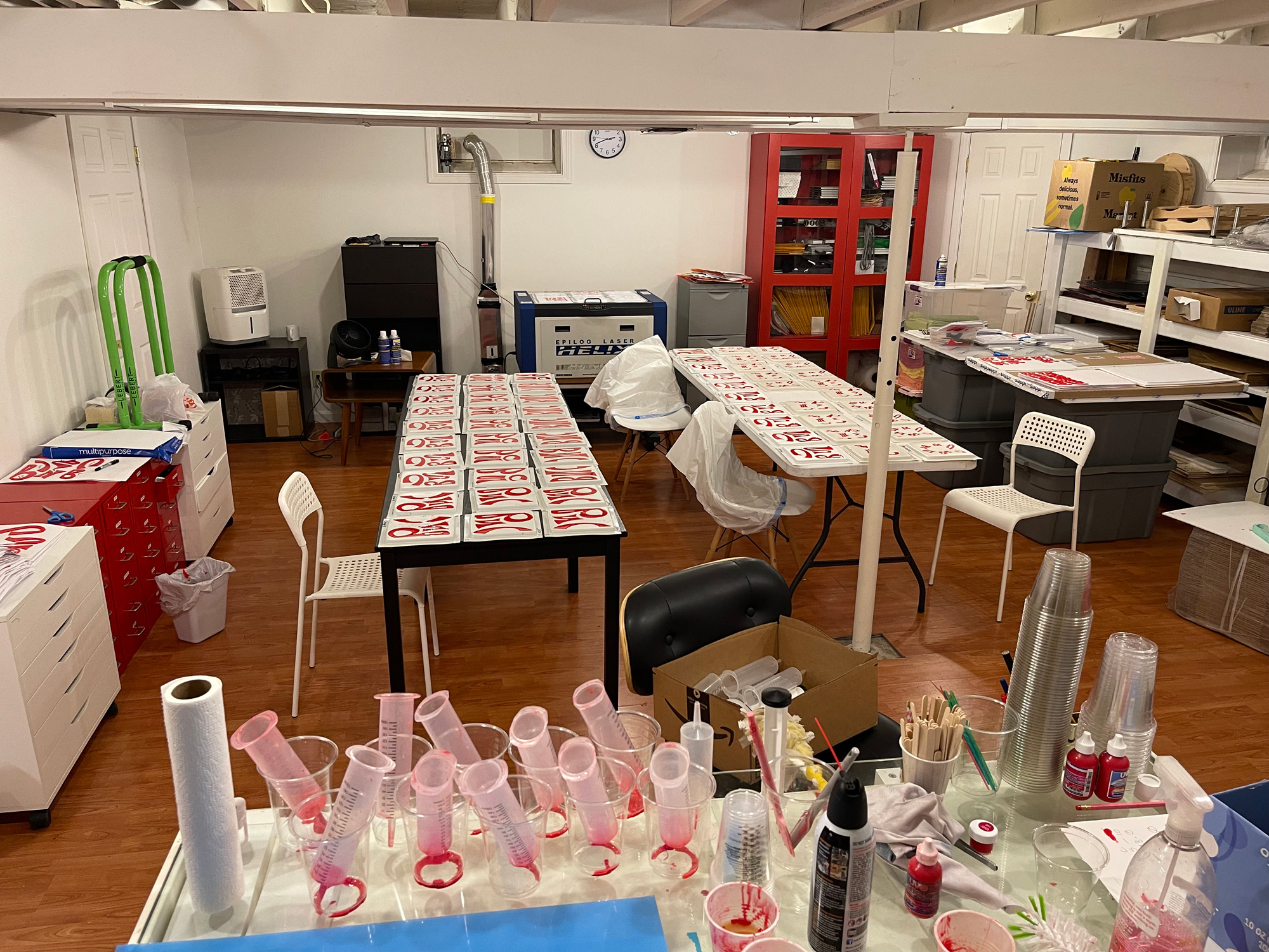
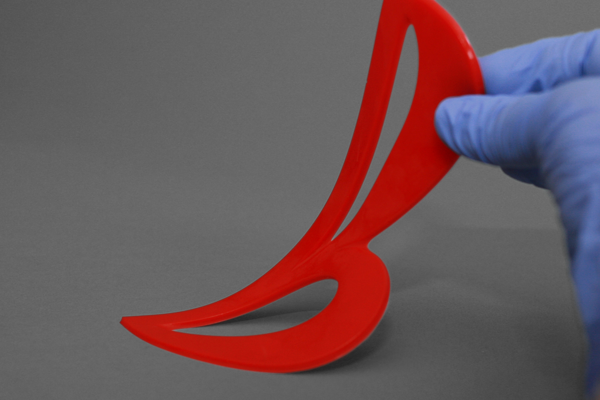
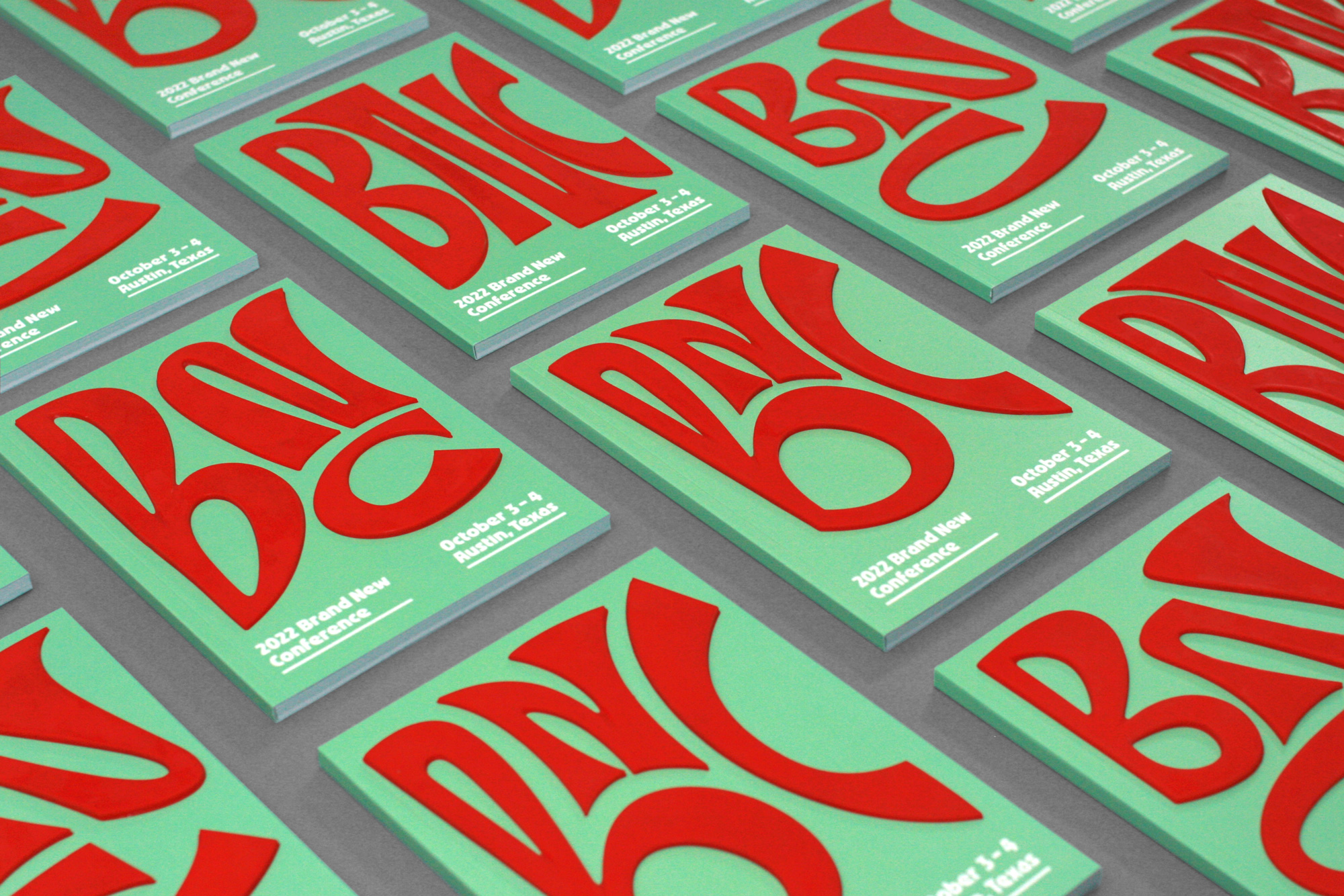
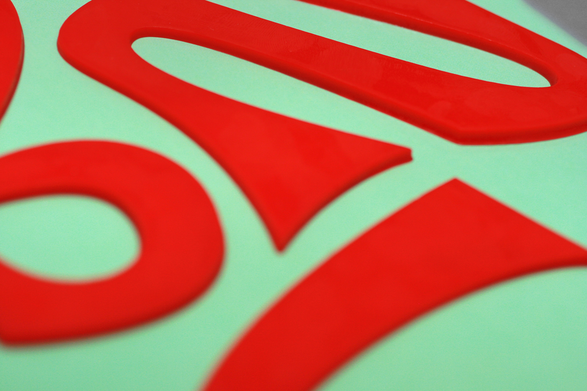
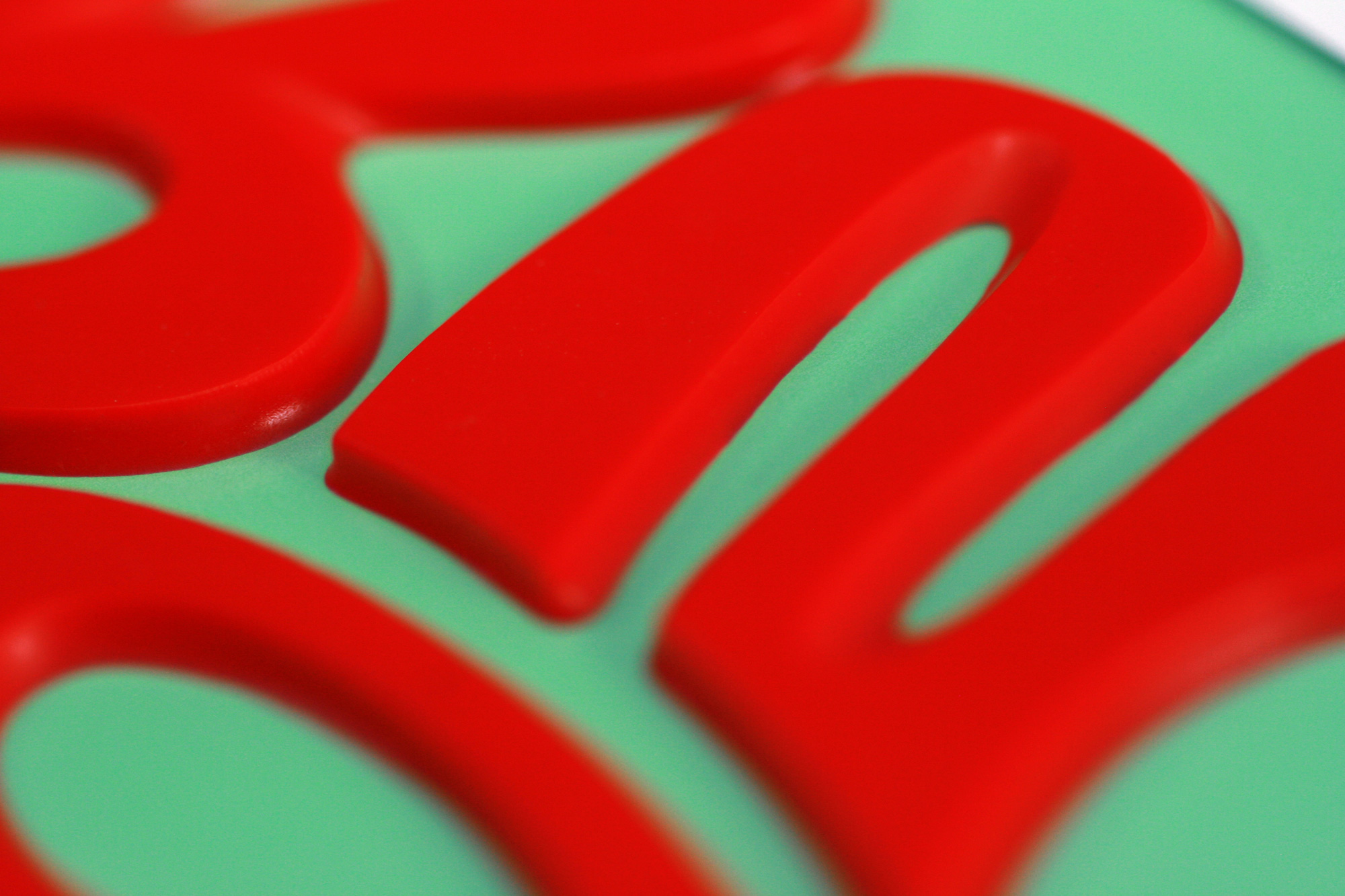
Having used this product in 2018 to make the molds for the concrete pours of the 2018 Brand New Conference identity we knew they were flexible and a little stretchy but one “feature” we didn’t expect during our initial test of making a thinner version was how sticky/tacky the letters were and when adhered to coated paper they were able to stick to it without any glue and, even better, they could come off and on, which would a) allow us to skip one step in the production and b) allow attendees to peel the letters off and stretch them. We would later painfully learn that the stickiness/tackiness wears off and we had to rekindle it two weeks before the event by rubbing alcohol on the backs of 3,300 rubber letters. But we digress: Having arrived at a physical manifestation of the digital animation of the lettering we pushed forward in producing four different molds — using a Mayku FormBox we had bought four years ago at a Kickstarter price and had gone mostly unused until now — for the program covers and four different molds for the badges spelling “BNC”.
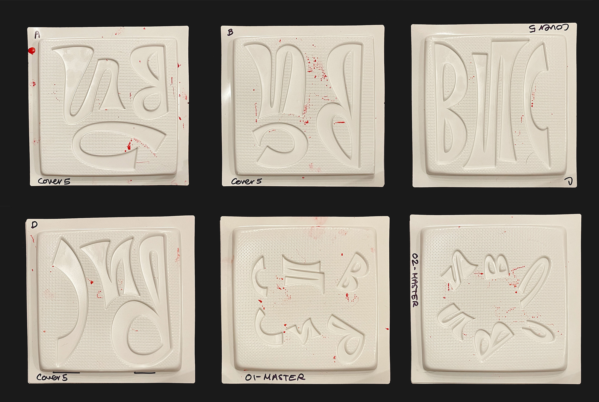
With around 40 molds for program letters and 20 for badge letters we would spend the next three weeks producing letters every day — with two shifts on Fridays, Saturdays, and Sundays — based on an assembly line that would take us 50 to 60 minutes at a time once we had perfected all the measurements, timings, and quantities of the various elements at play.
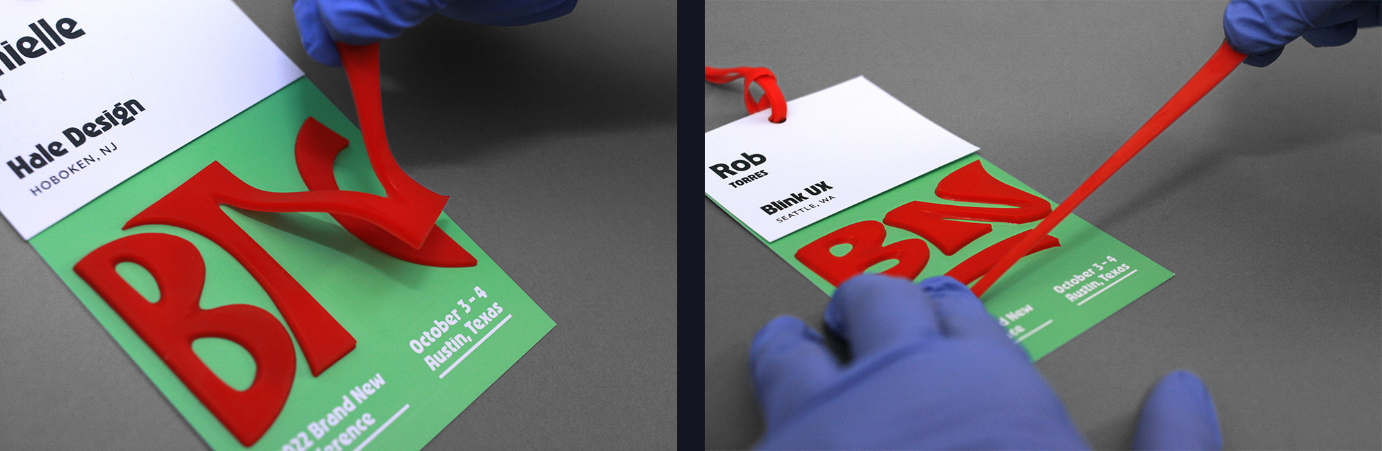
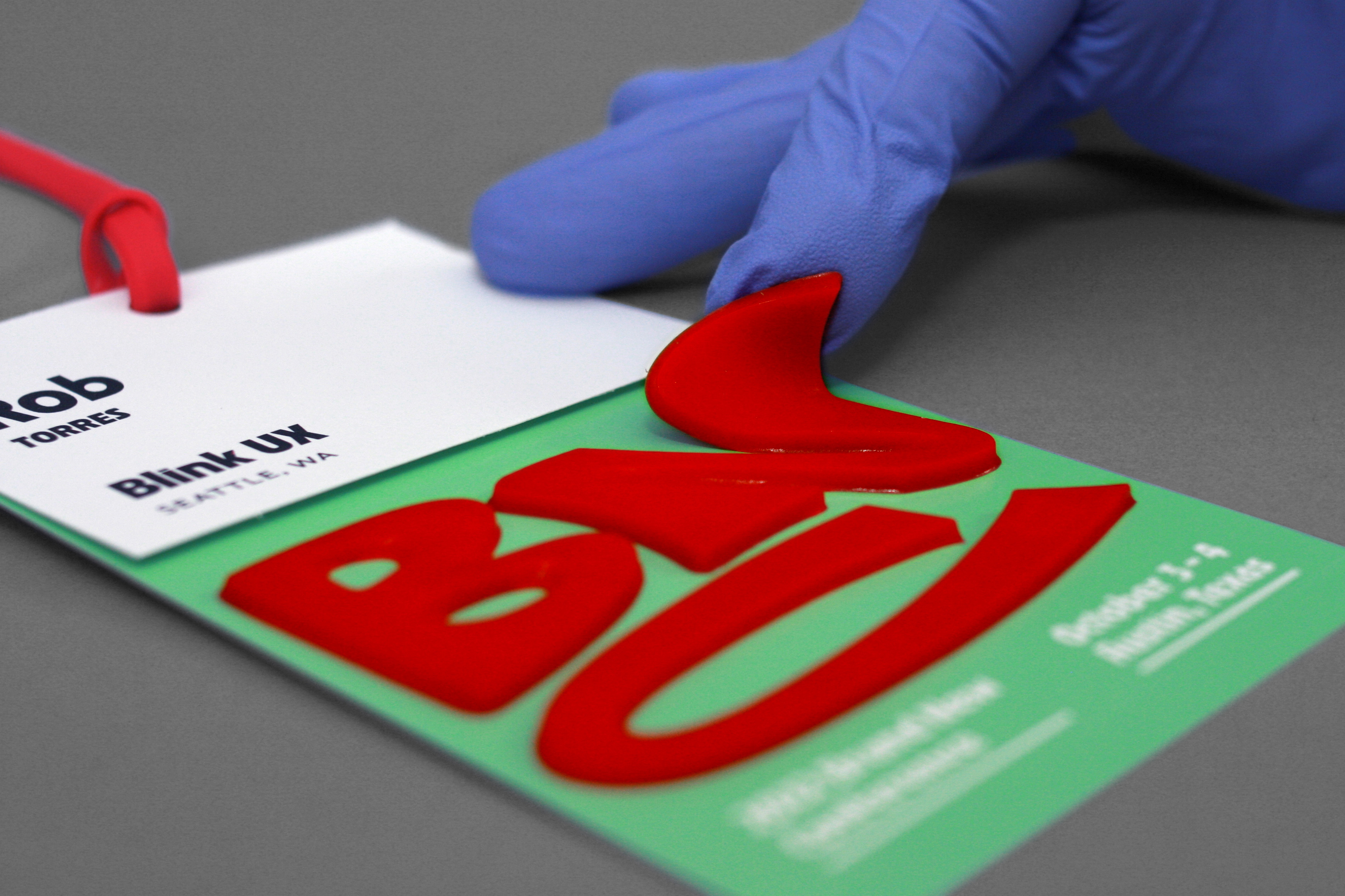
Despite the aforementioned trouble we had with the letters losing their tackiness we were able to adhere them (without glue) to the program covers. The letters can be removed and stretched but they do need alcohol afterwards to re-attach and they held up pretty well during the event as people perused the program.
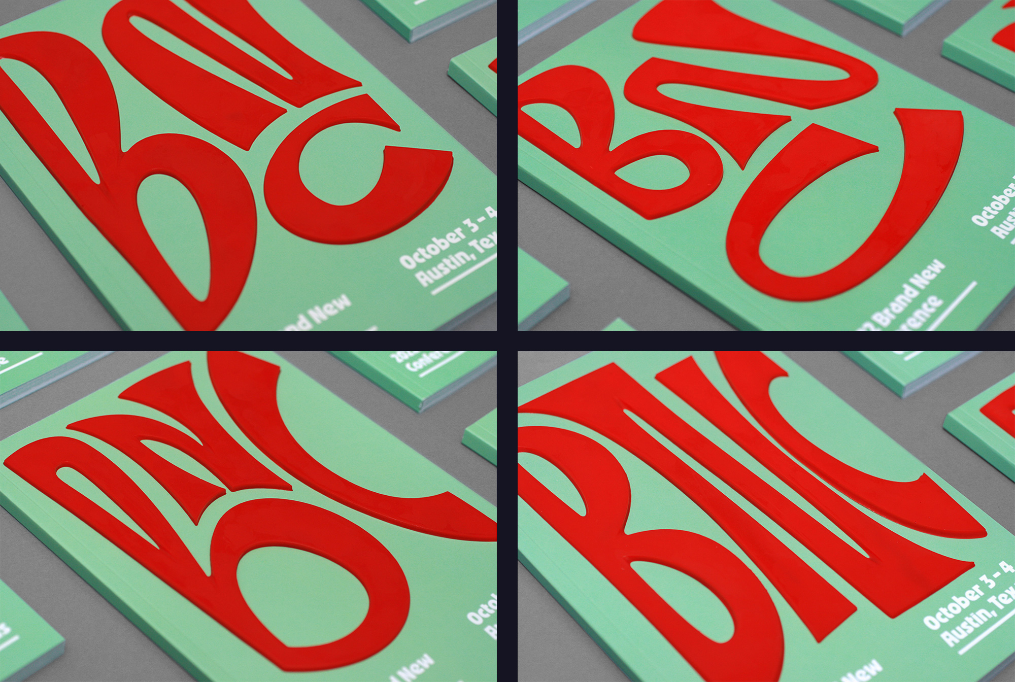
The badges also suffered from the loss of tackiness but it was only about half of them… we still had to review each one and apply alcohol to the ones that came off. We were pretty worried about letters coming off from attendee’s badges during the event, which did happen but people seemed happy to pick them up and tuck them away for safekeeping. The rubber band mentioned earlier in the post shows up here in place of the typical lanyard. These were custom-ordered to match the red of the letters and we were delighted to find that the texture also matched perfectly, which was unintentional.
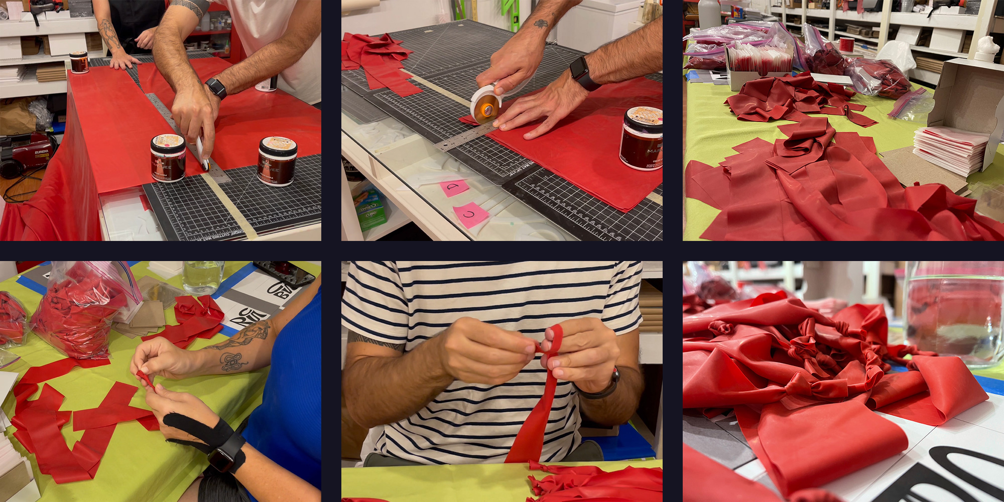
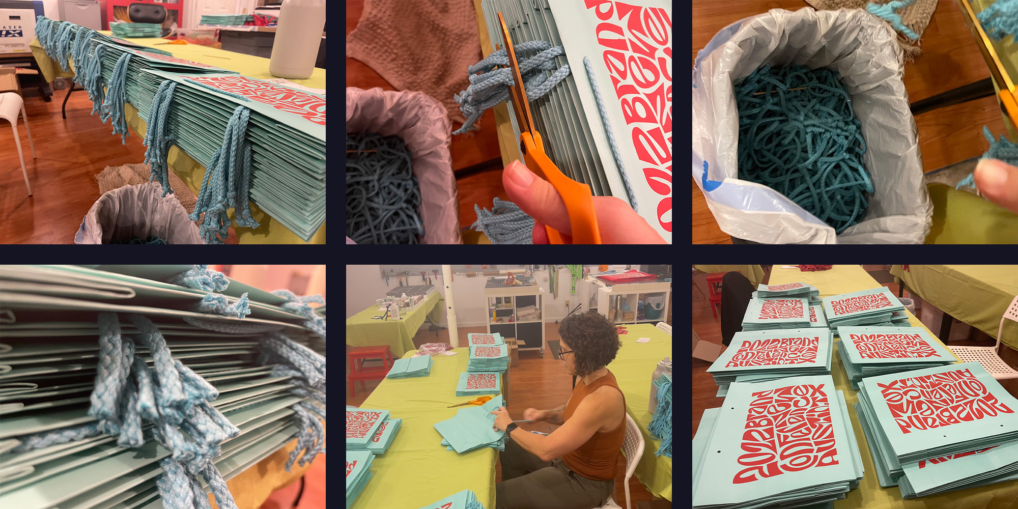
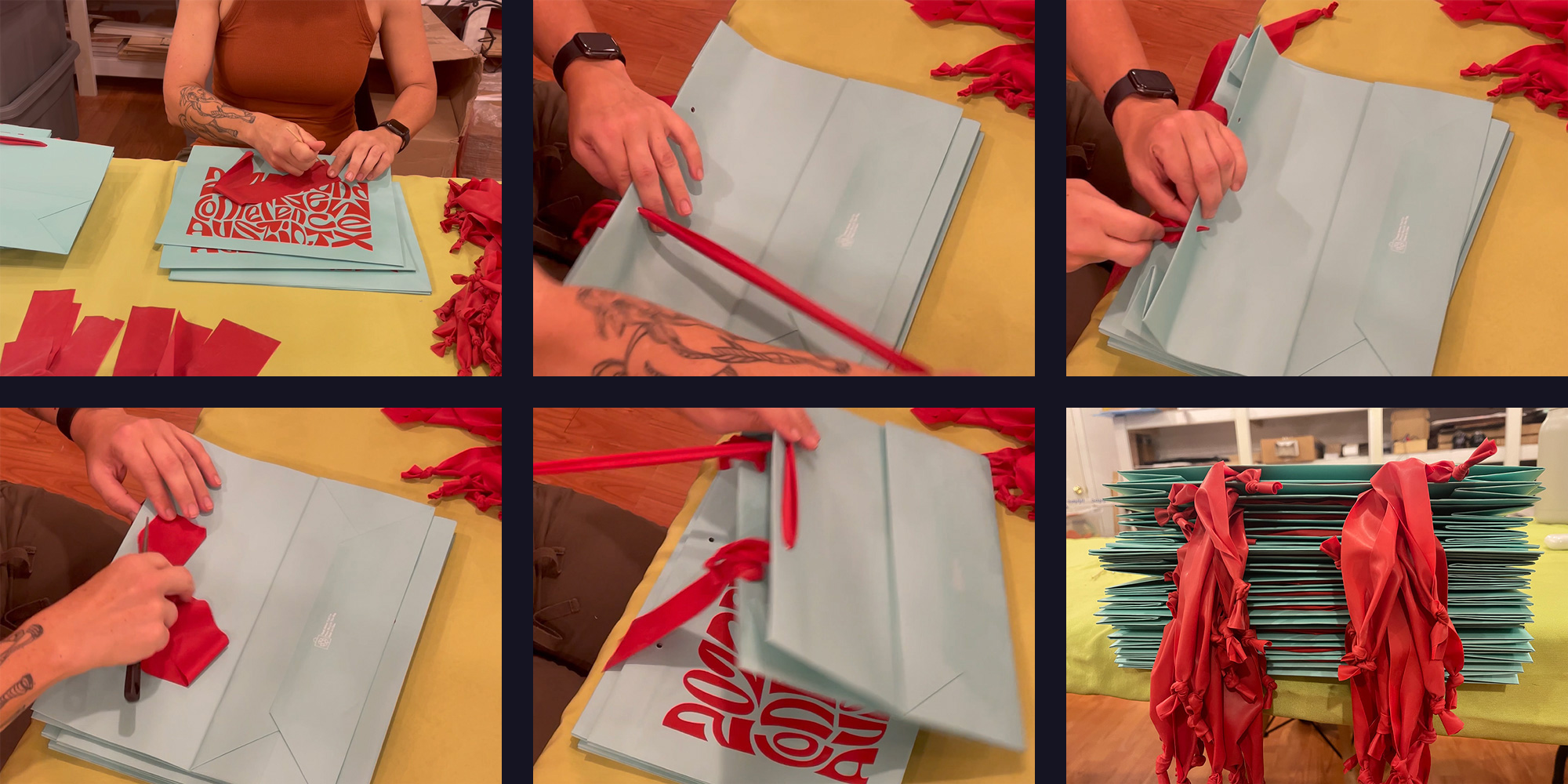
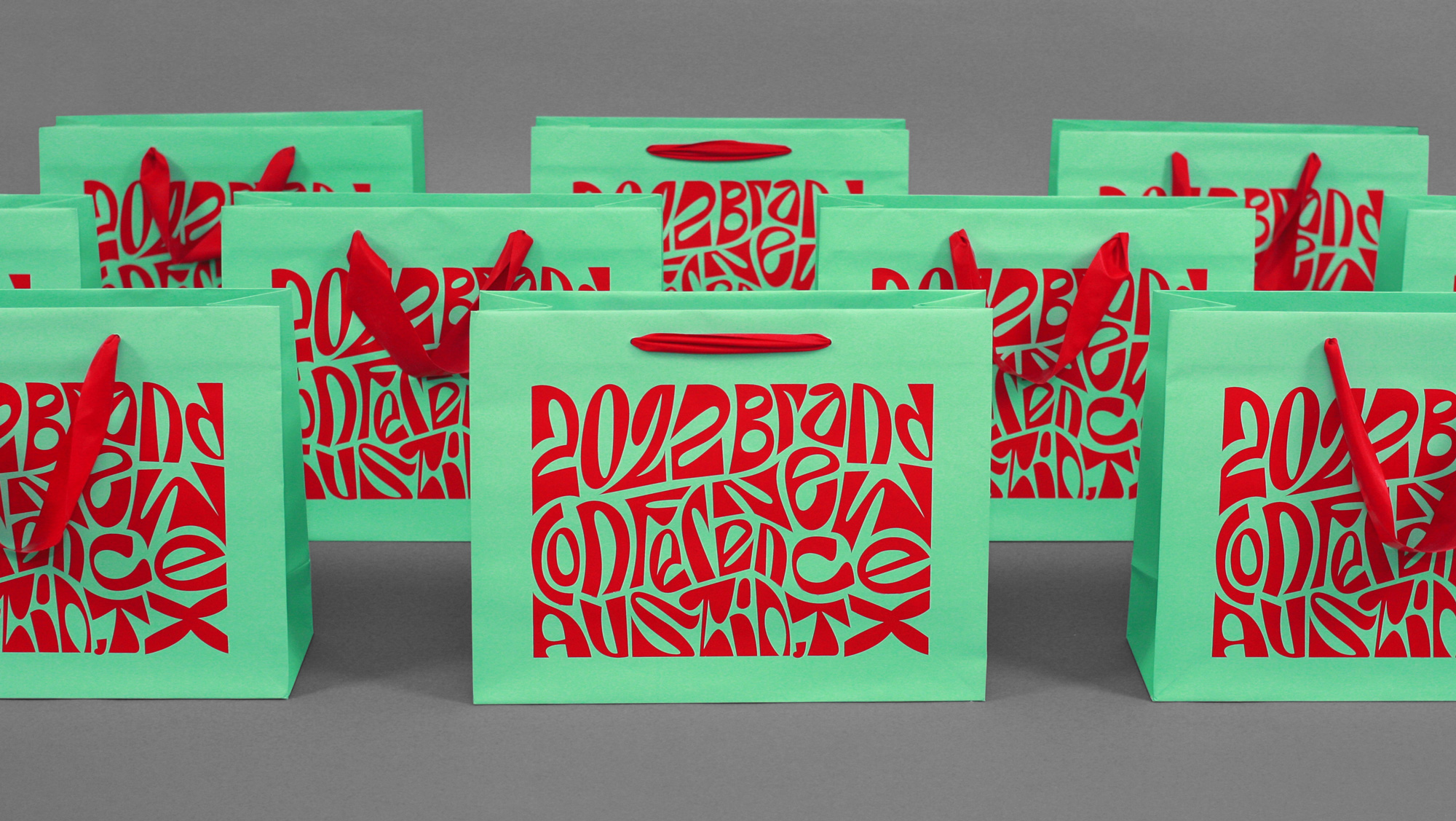
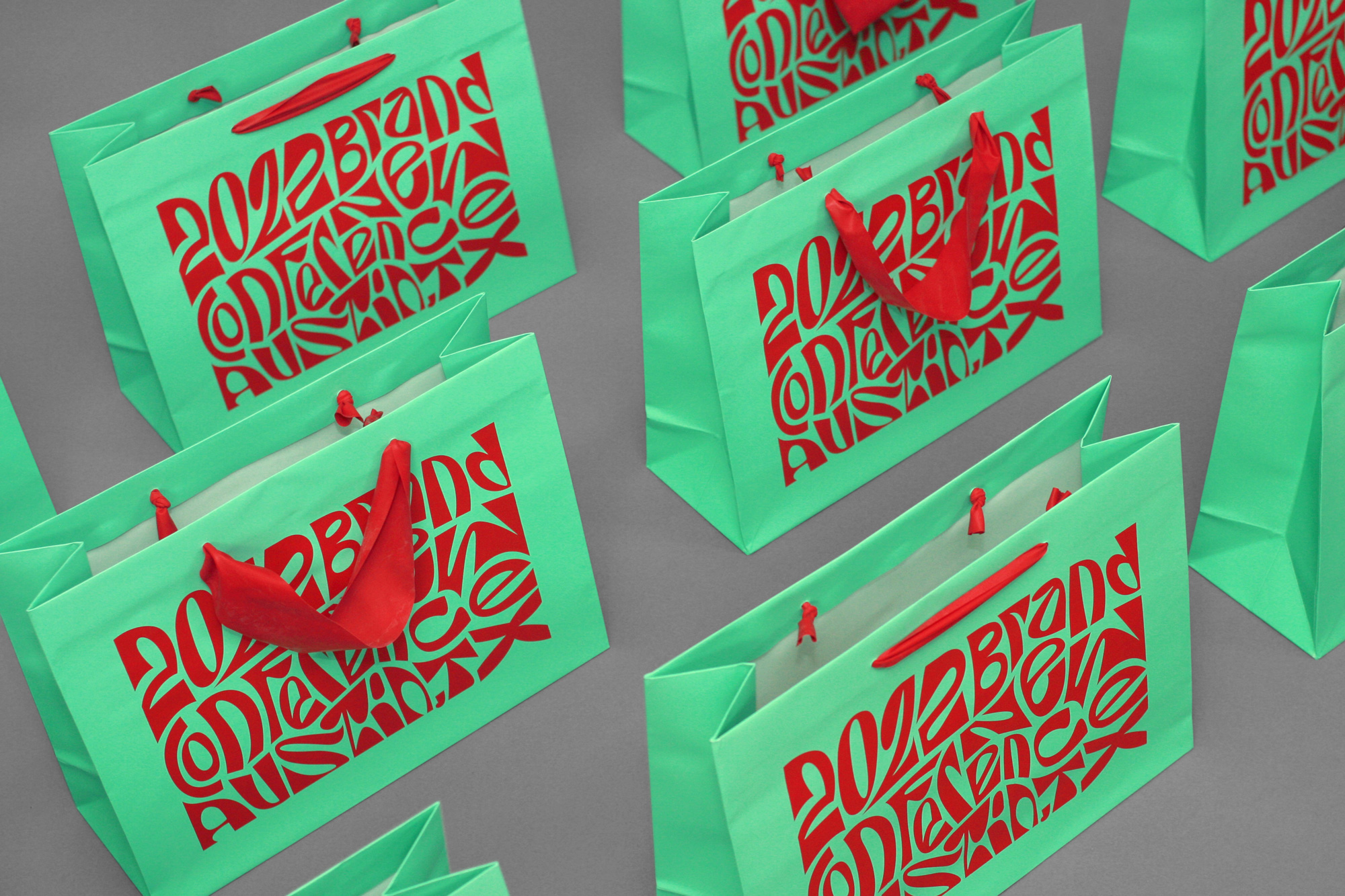
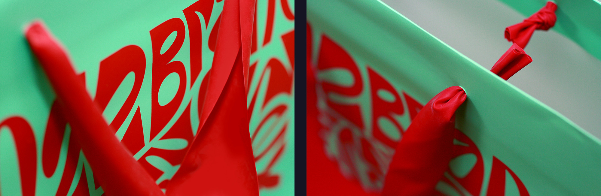
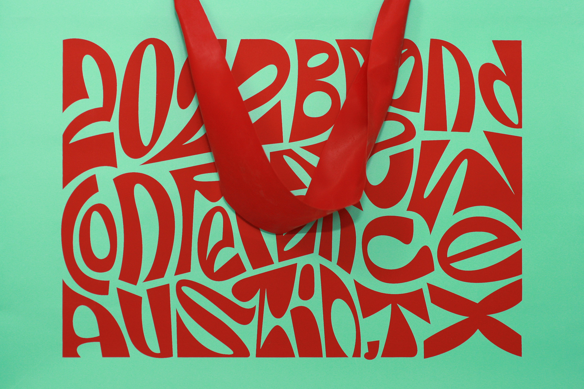
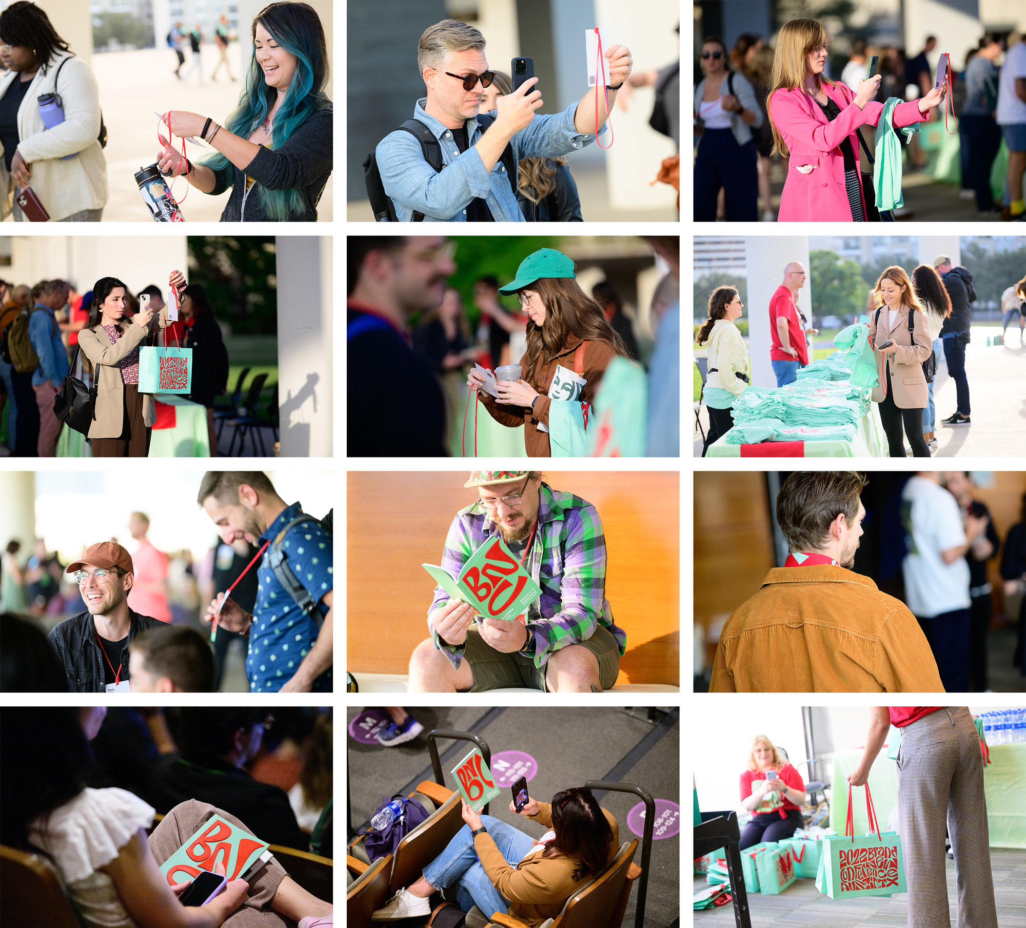
Bags
For the goodie bags we opted for a non-tote-bag mostly out of tote-bag-fatigue and we were very keen on testing out some unconventional handles using stretchy latex — inspired by the physical therapy bands mentioned earlier. While we did start with an order of a roll of those bands, it turned out that all of the different brands available had a logo imprinted on them so we had to source a similar material but we could only find it in huge rolls, which meant we had to cut them to size and insert them into the existing stocks (for which we had to remove the existing handles). If you have never had to create, extract, and then re-insert 2,200 bag handles we do not recommend it.
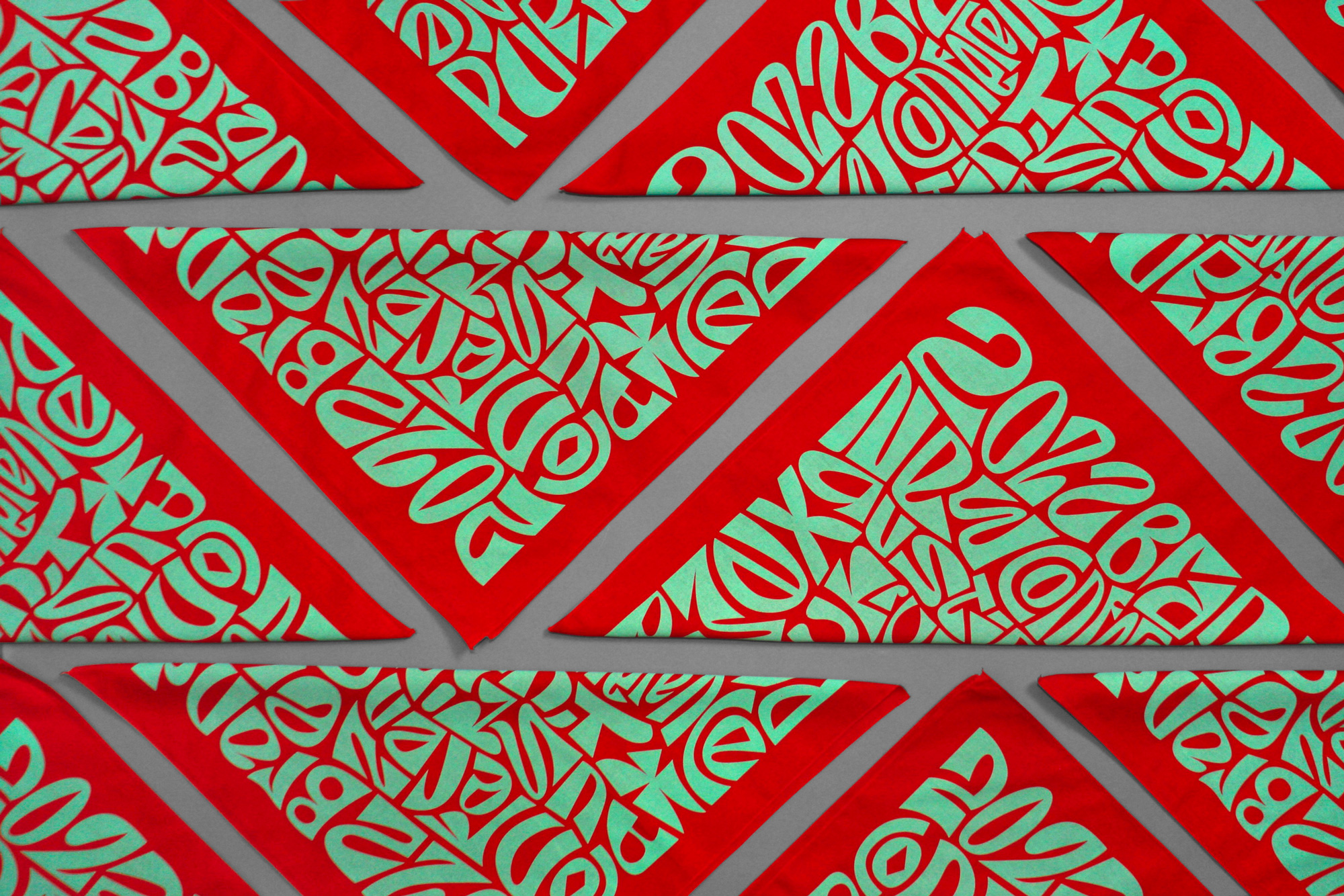
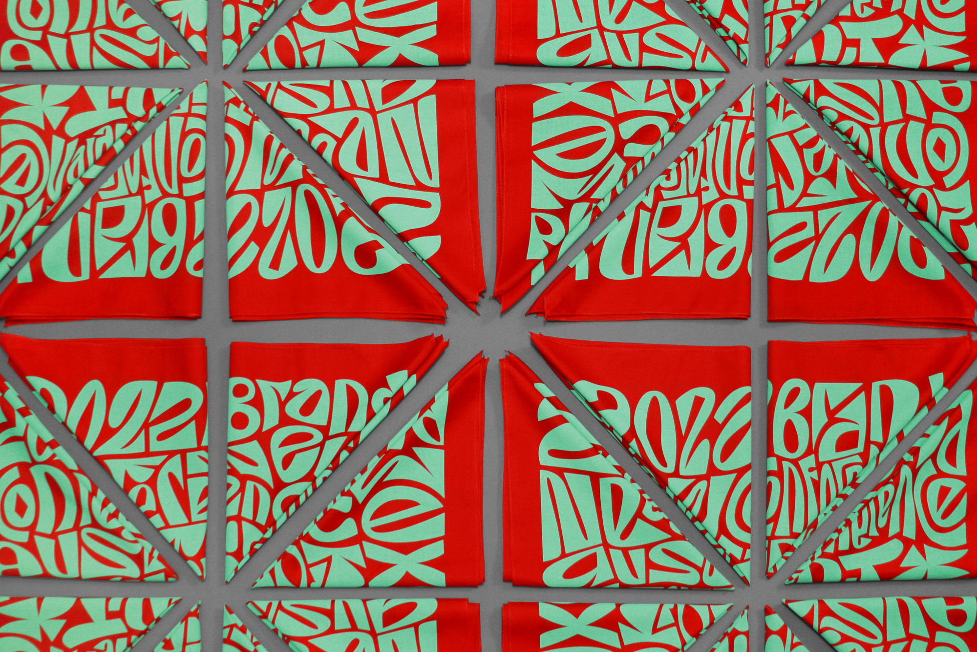
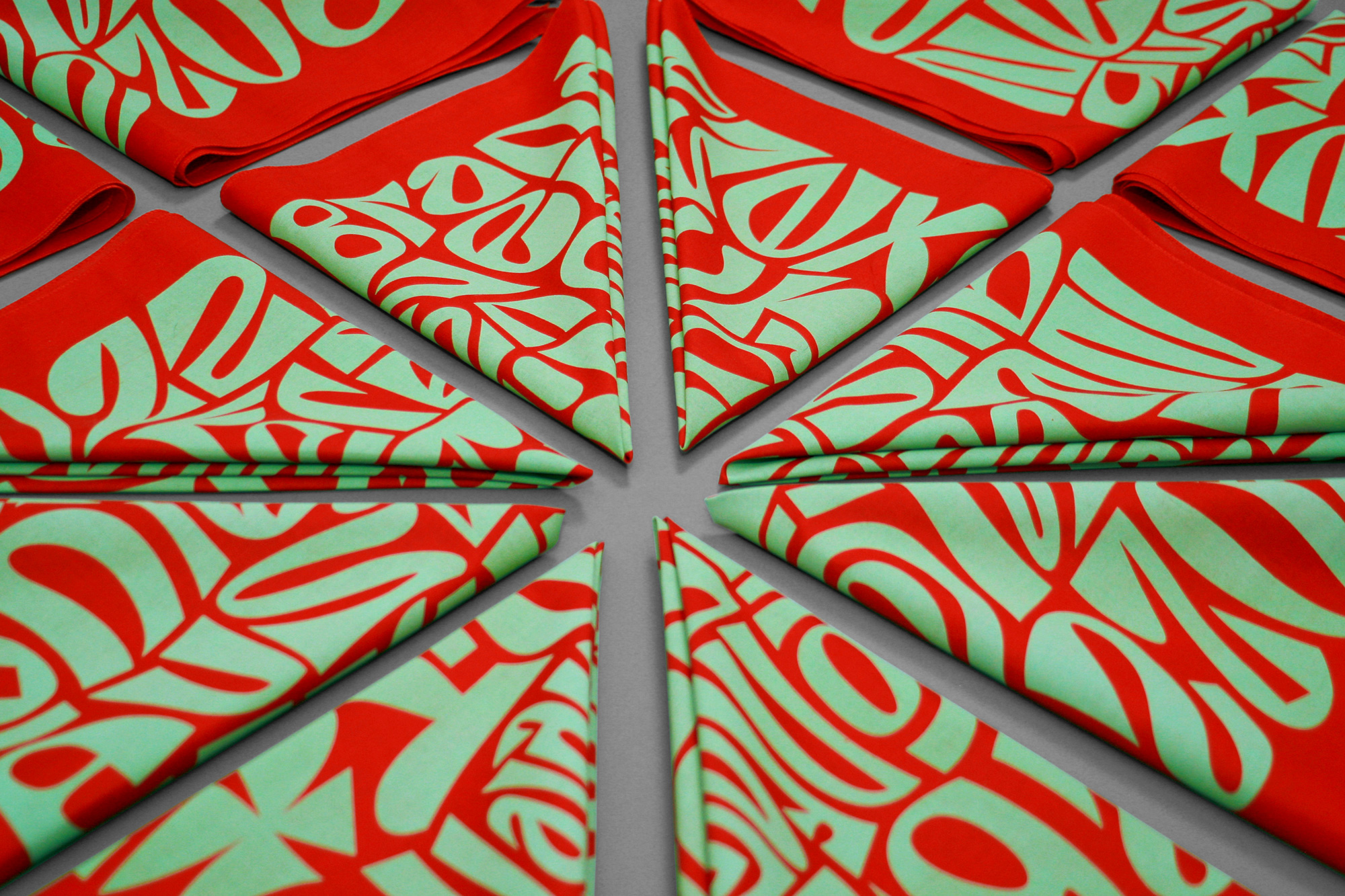
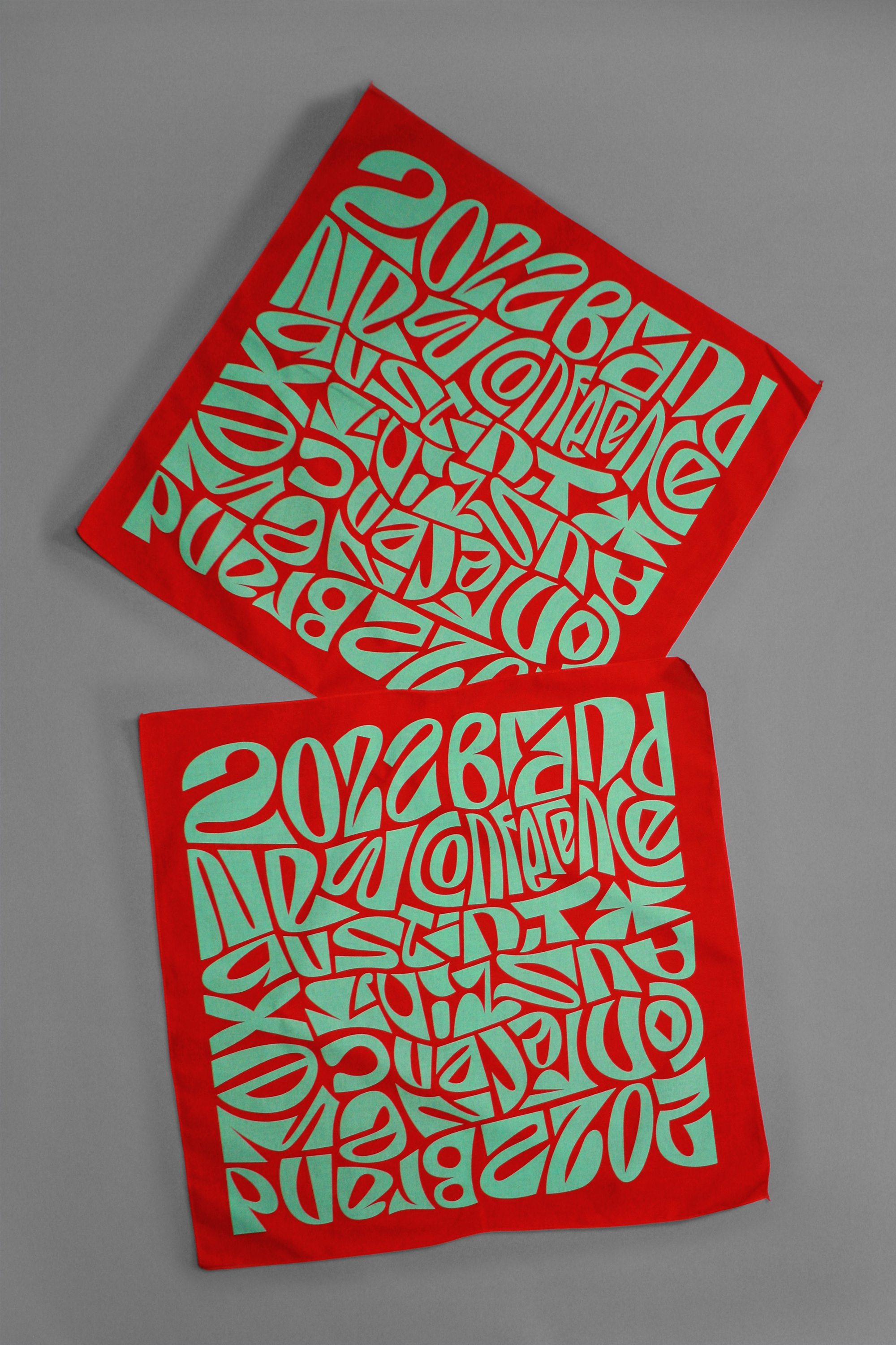
Bandanas
No big concept here… we were in Texas, people wear lots of bandanas in Texas, so we made some.
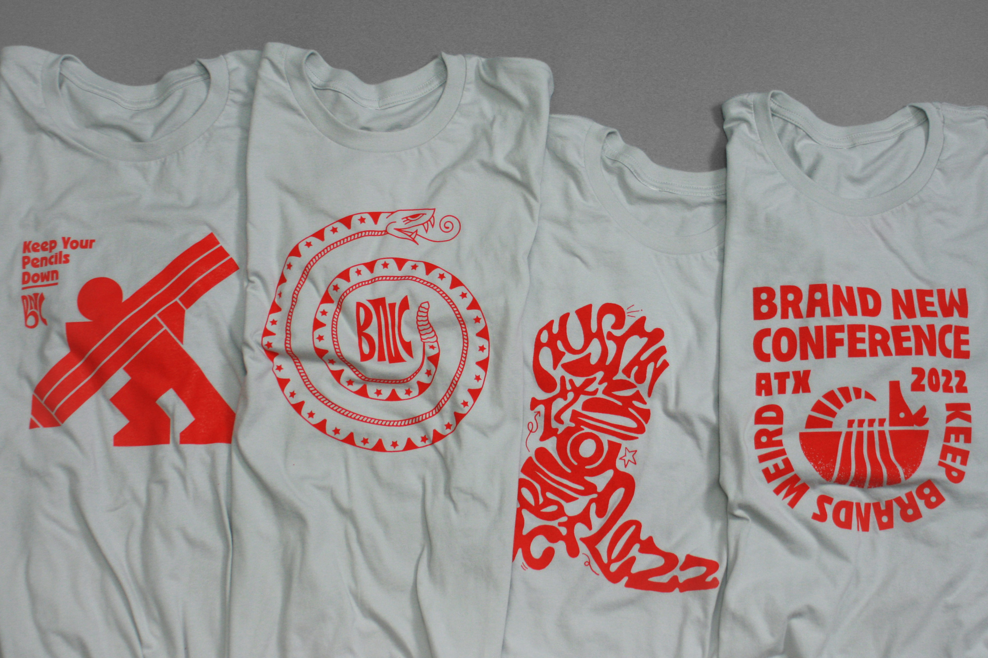
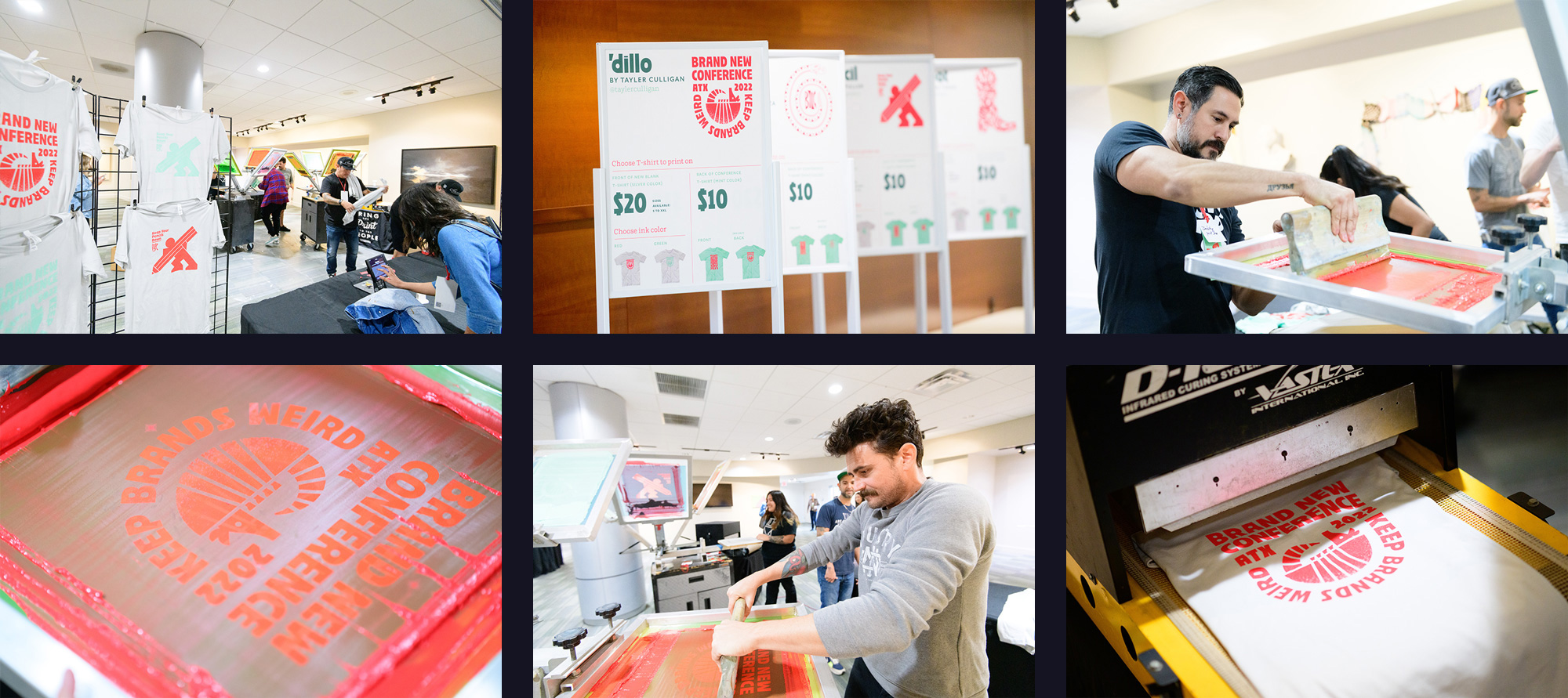
T-shirts
No surprises here nor any big concept, just some good-looking t-shirts for attendees and staff.
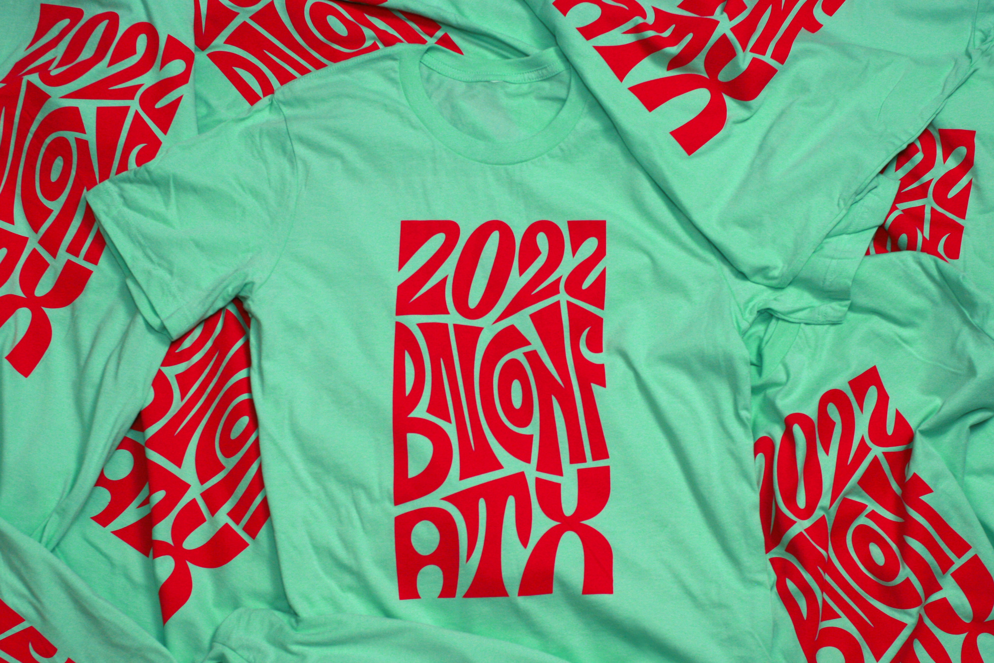
This year we also did some live printing with the fine folks at Industry Print Shop who are based in Austin and with whom we’ve been printing with for years. Instead of us trying to design more t-shirts that would have looked more like the same of what we had already done so far, we decided to skim our list of registered attendees to see whose portfolio caught our eye. We had the pleasure of working with Mira Thekdi, Tony Carranza, Tayler Culligan, and Scott Fuller. (Fun fact: All, except Mira, had been conference volunteers in the past.) The brief was simple: Do whatever you want that has something to do with Austin and use in any way, as much or as little, design cues from the conference identity.
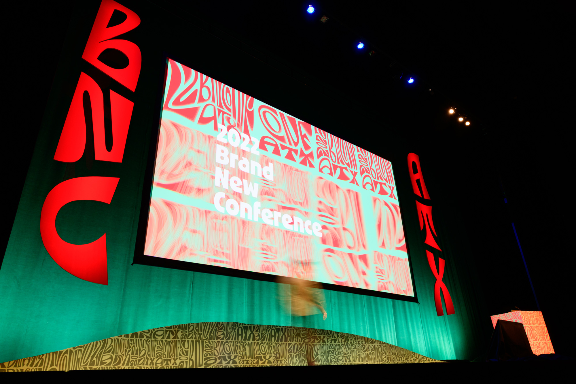
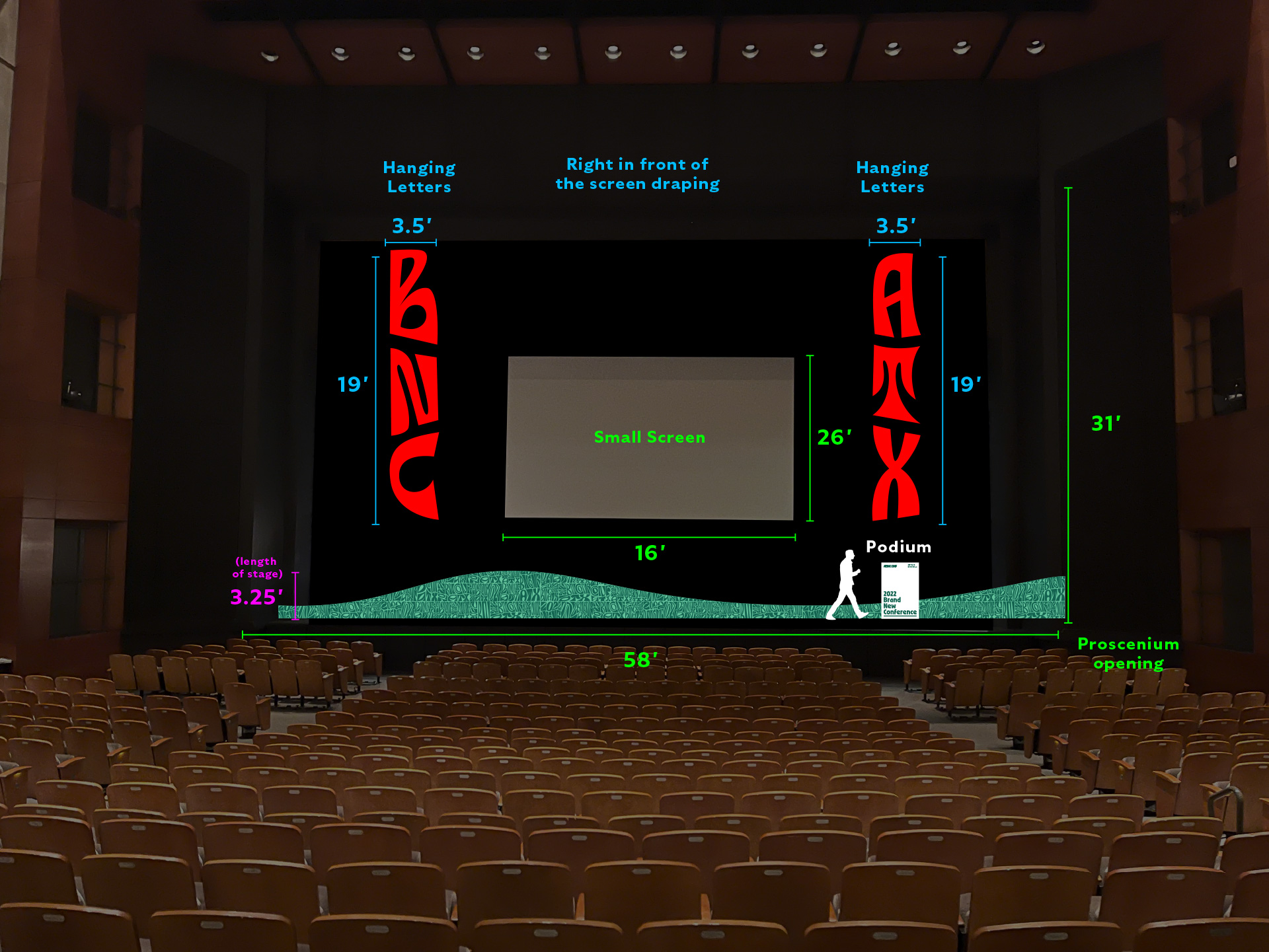
Stage
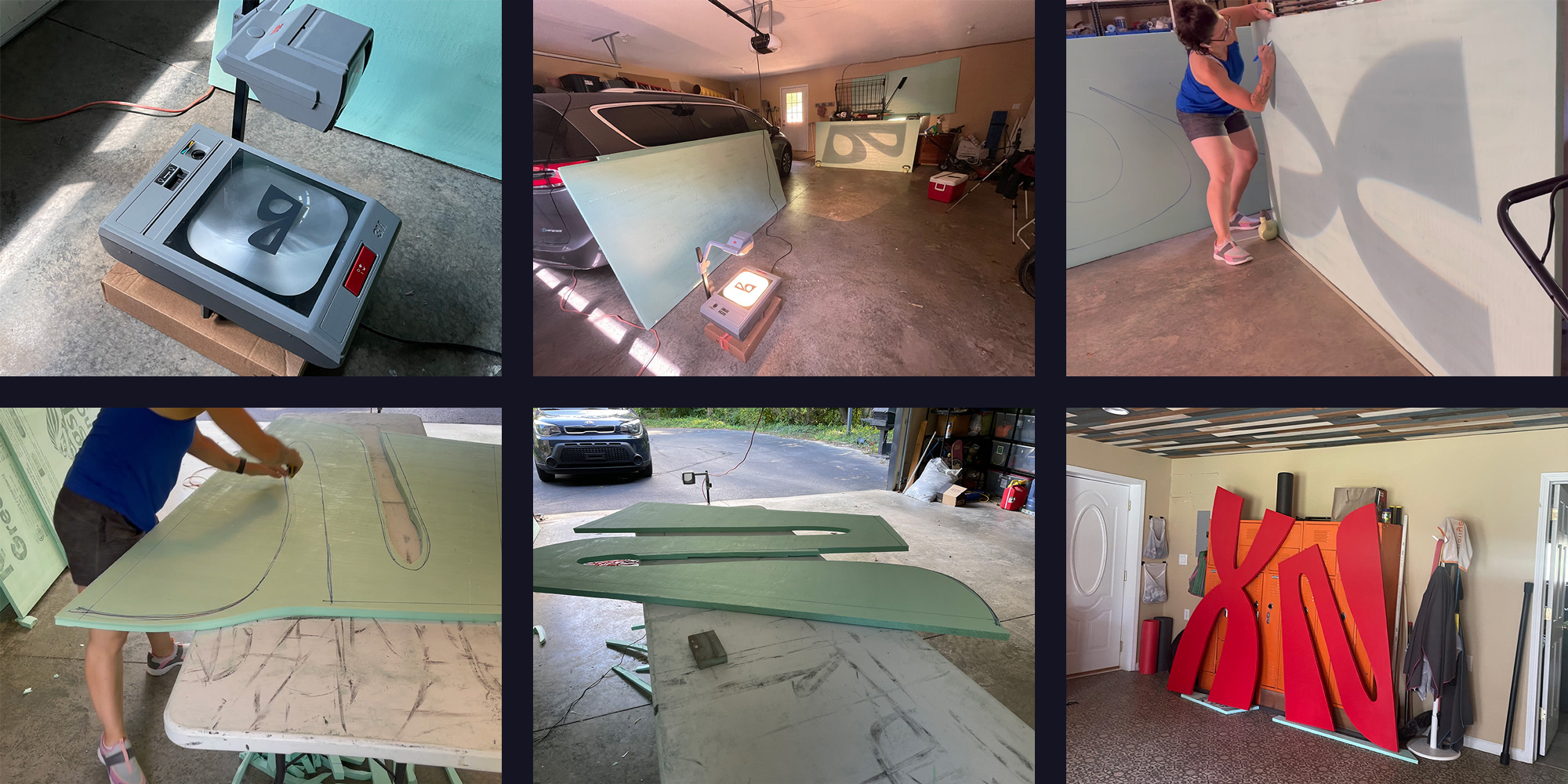
After putting letters on the floor of the stage every year since 2014 (except for 2015 when we didn’t put any anywhere) we decided to put letters up in the air this year. (The difficulty of raising them and getting them to stay there reminded us why we have avoided it all these years.) Given that the letters had to be super curvy we needed a material that was “easy” to cut and light to lift so we ended up using 2-inch-thick insulation foam. We purchased 4-by-8-foot boards, traced the design on them with an overhead projector that the past owners of our house had left behind, and then cut them by hand. Gave them like four coats of paint, pre-measured their “kerning”, and crossed our fingers that we would be able to get them in place and in position at the venue.
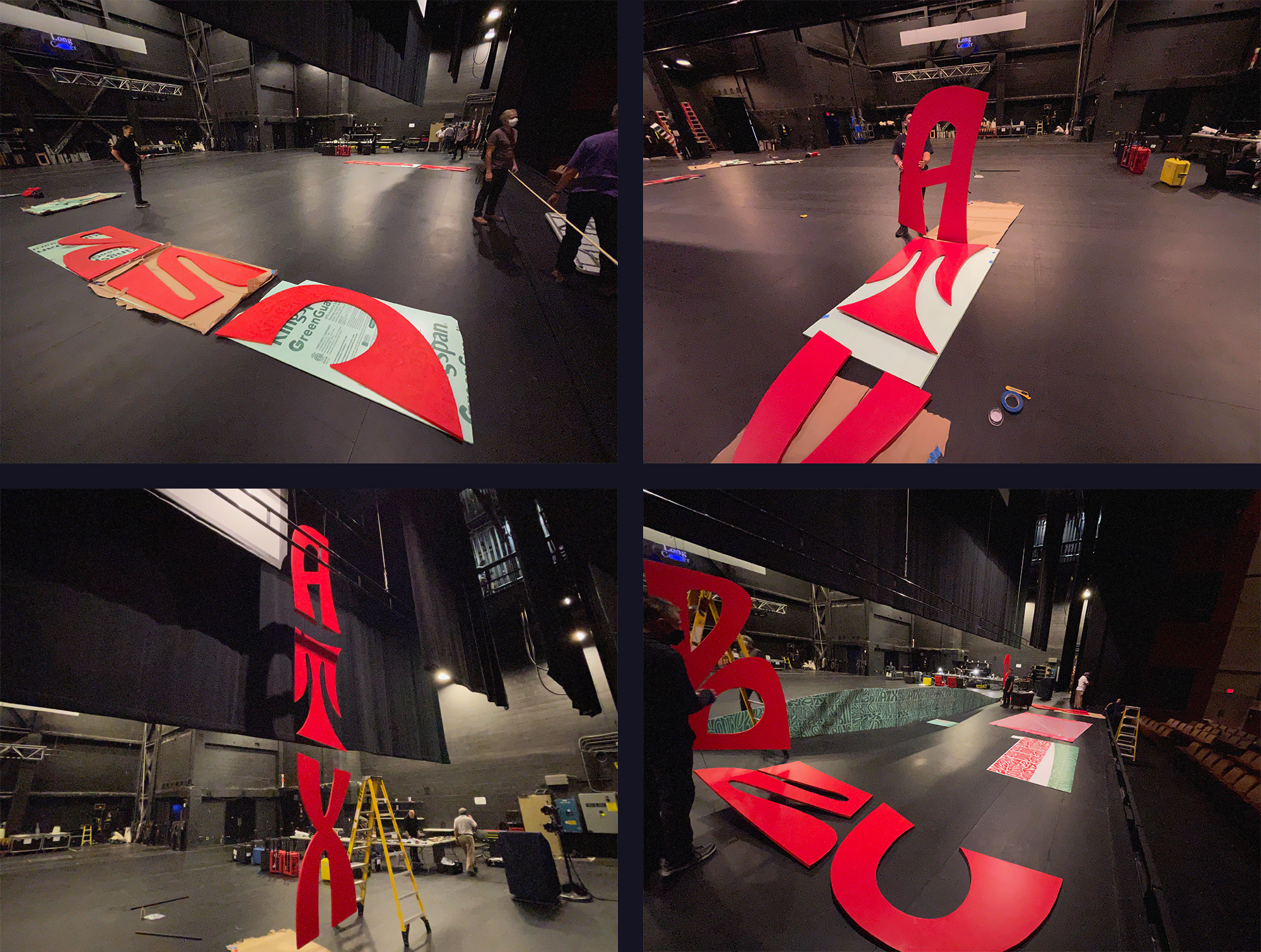
Not pictured above is the moment where the three letters on the left side – “BNC” — came crashing down as we were re-lowering them to make some adjustments. The black fishing line that kept the letters together was so thin and sharp that as the letters fell, the line cut into them but, luckily, not enough to completely disfigure them. After recouping and reinforcing as much of the letters as we could they went back up and there was this magical moment where the light technician at the venue — after waiting hours for us to get the letters up — did what she was there to do and the way she illuminated the letters made them look one thousand times better than we imagined. Like, we assumed they were going to look okay, but once they were up there and illuminated they were so damn cool. We would also like to say we planned this in advance but we didn’t expect that all of the photos attendees would take of the speakers on stage would be so perfectly branded with the “BNC” / “ATX” letters always appearing on the photos and looking stunning.
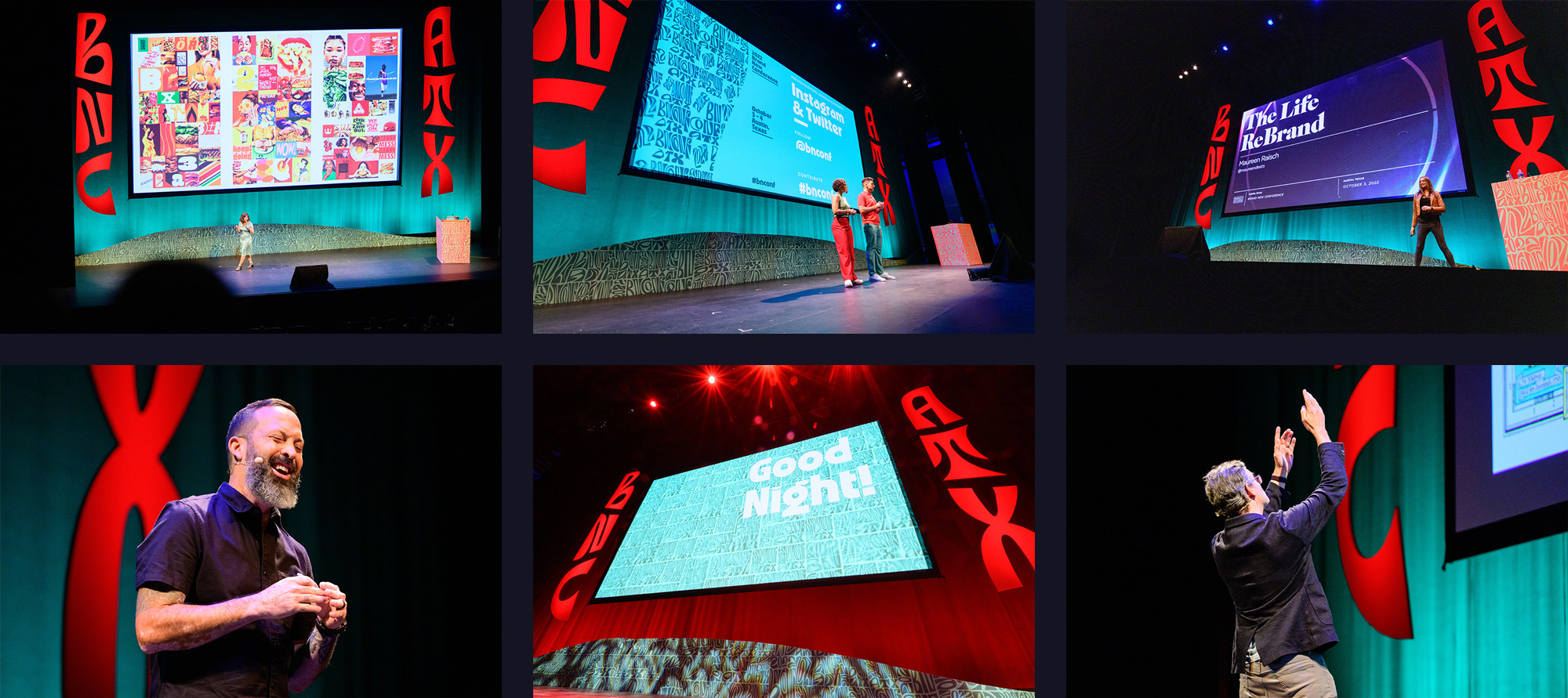
The other elements of the stage did not show as well as planned because the package that contained the podium wrap and the pattern wave along the floor did not arrive in time. (Thank you UPS.) Below is a render of what those elements were supposed to be: The podium was meant to be white with simple typography so that it would contrast with the pattern in the background and the background was supposed to have this very nice flow from stage left to stage right as the speakers walked past it. The last-minute solution was that we wrapped the podium with a backdrop we were going to use for an Instagram booth and the wave pattern we cobbled together from the pieces that we cut out from the correct version, which we were going to use elsewhere in the venue as decorations so they were not perfectly matched. There were even a couple of seams where the pattern doesn’t actually connect. C’est la vie.
Opening Titles and Speaker Intros
With so many good ingredients from GEO to work with, we felt they deserved a bit of music that was as unique and weird as them. Instead of licensing stock music from PremiumBeat, as we’ve done in the past, we decided to ask a good friend of ours, Norbert Herber, here in Bloomington, IN, who teaches at IU and is a great musician and sound artist to create something custom. We are very musically-un-inclined but we were able to provide him with enough direction to create something eclectic and weird and Austin-y. The main goal of the music was to sound like “something weird but not unpleasant”.
It was an extremely fun process and a testament to how good Norbert is that he was able to do something so unique based on our uneducated feedback and direction. If you have ever tried to art direct music… it’s not nearly as easy as art directing kerning. The resulting composition for the opening titles includes genres and references as broad as mariachis, polka, Ennio Morricone, video games, and more, all unified by the most unexpected of heroes: an auctioneer who provides the titular “2022” beat and some additional gibberish. Below is a glimpse at his file so that you can see all the different layers at play and underneath it is the finished animation by GEO.
In tandem with the 30-second main title music, Norbert also developed a 10-second complementary version for the speaker intros and then created three variations within the same structure in order to provide some aural diversity throughout the day. Not backing up from a challenge, GEO created three different motion templates for the speaker intros to match the changes in the music.
Appreciating People Appreciating it
We make our own bed and sleep in it every year by choosing to do a lot of manual labor and assembly, which often requires many, many hours and plenty of physical strain. We mention this not to seek sympathy but to say that the reason we do it is because of how much attendees appreciate it. It makes the build-up, stress, and last-minute ordeals of all things conference pay off.
Given how much we struggled with the concept and tight time frame for the production of this year’s materials we actually already have an idea cooking for the 2023 Brand New Conference in Chicago on September 21 – 22 — pre-sale registration available! — that we are starting to test and, pending global pandemics or government meltdowns, we can’t wait to do this again.