About the Identity
As outsiders, two things stood out on our first visit to Salt Lake City: The mountains and the tight grid the city is built on. Both of which served as the foundation for this year’s identity.
The Mountains
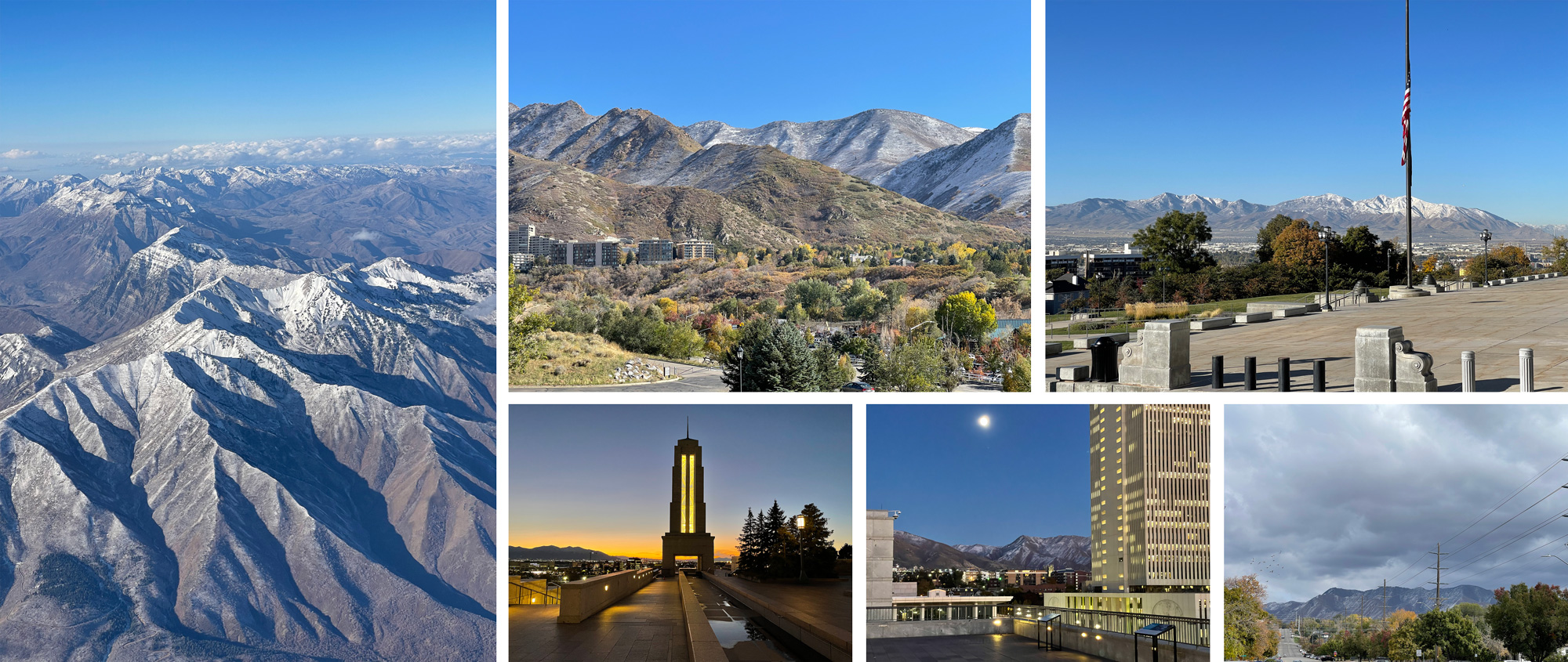
Situated in a mountain valley with the Wasatch Mountains to the East and North, and the Oquirrh Mountains to the west, there is no spot in Salt Lake City where you can not not see the mountains and they are stunning from sunrise to sunset and even in the middle of the night when the moon is bright so it was impossible to resist interpreting the mountains in some way, which is what lead to the first element of the identity, an abstract representation of snow-capped mountains with a sky subtly shifting across times of day (without literally visualizing it from dusk till dawn).
Animated by our third-time collaborator, GEO, the mountains appear at first peaceful but sudden shifts are meant to represent exaggerated tectonic shifts that, while we are no geologists and have no idea whether that statement is scientifically correct, it sounds awesome as a design concept. Part of what makes the Wasatch Range so appealing is how the smaller protrusions layer perfectly flat in front of the successively larger ones behind. With an average of 222 sunny days per year, we couldn’t avoid a bright blue sky that in turn helps shape the snow caps of the mountains.
The City Grid
With some of the most generously wide streets we’ve ever seen, the city’s tight rectangular grid is impressive and what makes it even more impressive is that it has been exactly the same since the city’s founding. The grid is so tight that one of the city’s main arteries, the 17.3-mile-long State Street, can be seen uninterrupted from the top of the steps of the Utah State Capitol Building, where the street starts and heads North.
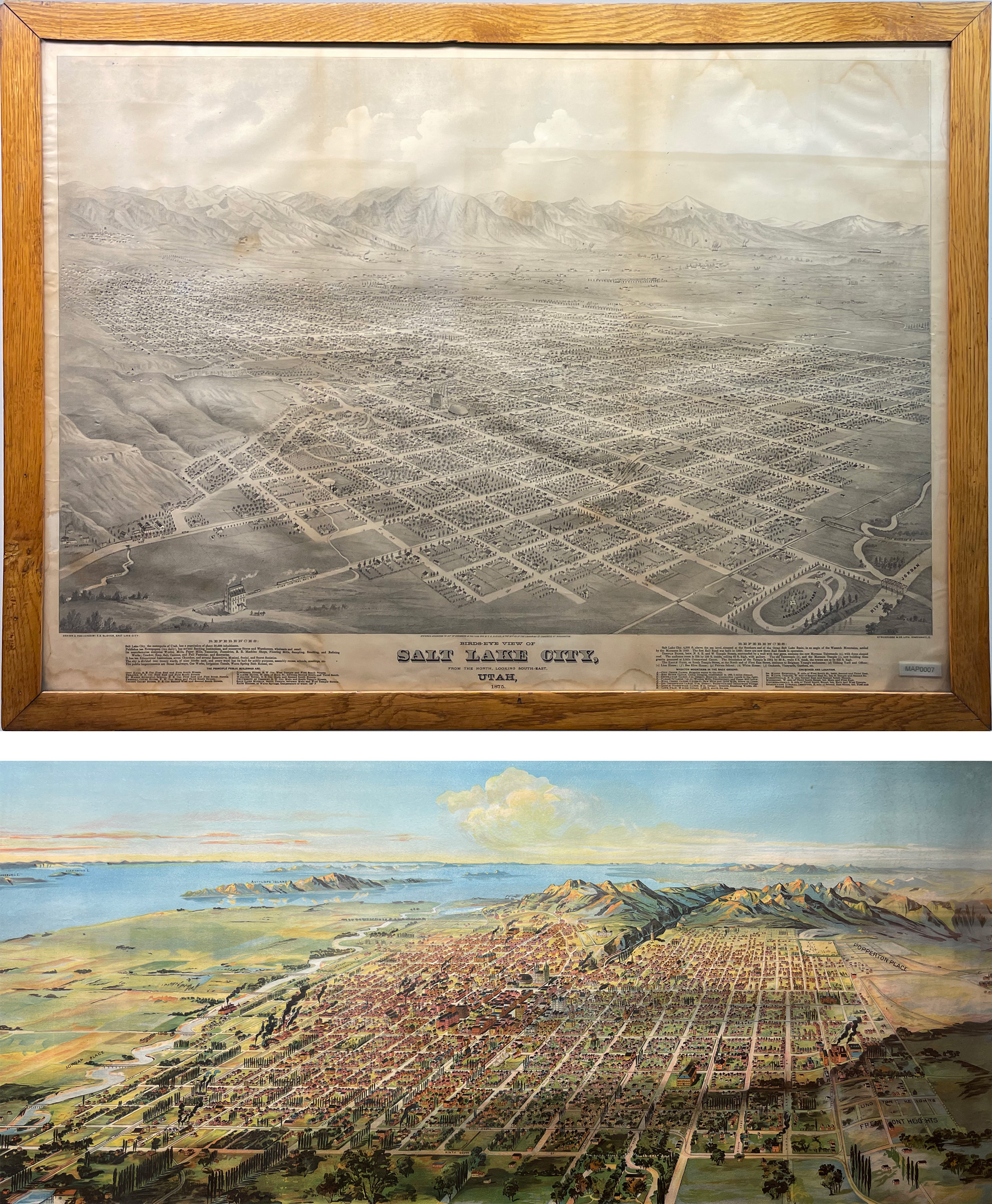
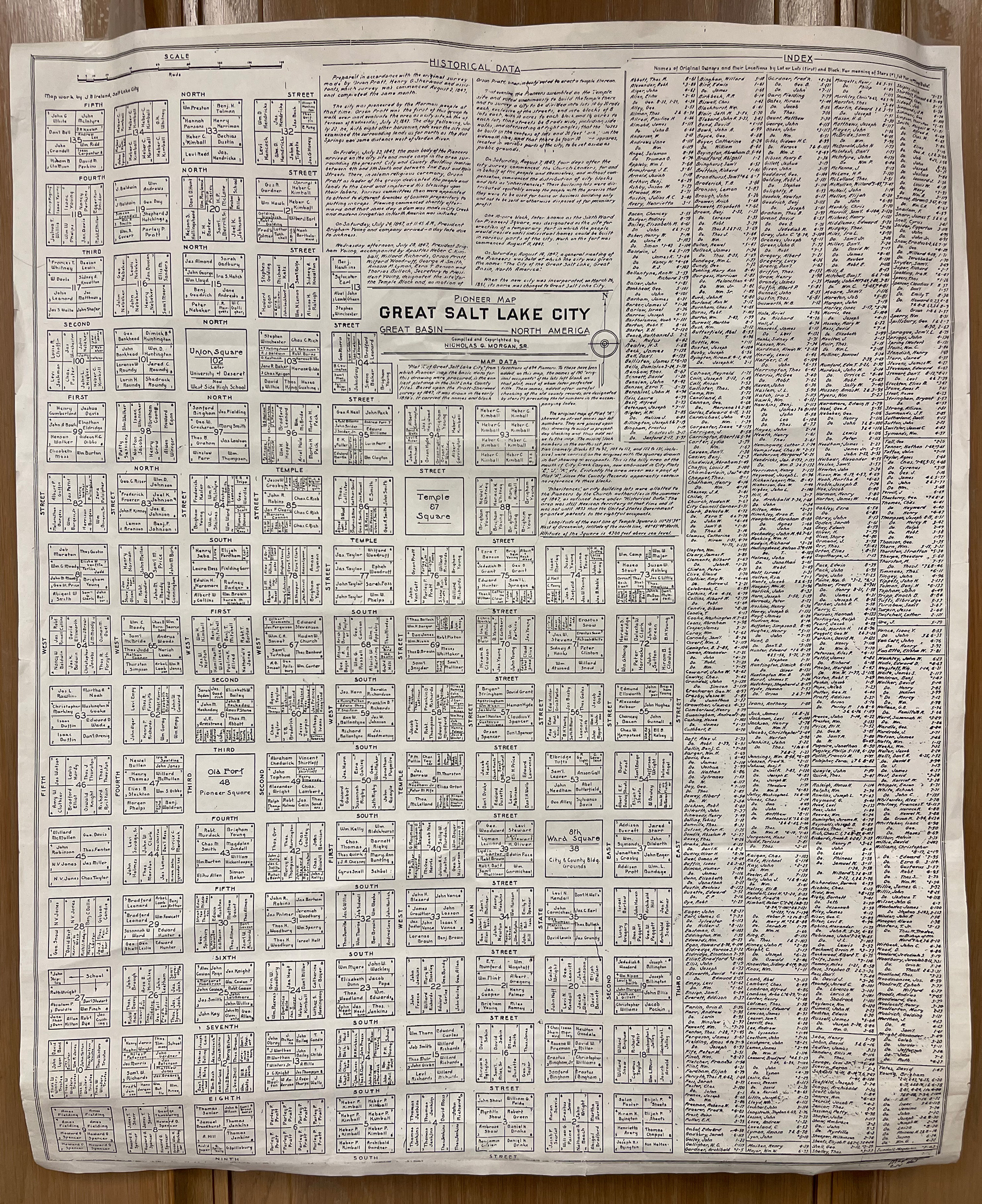
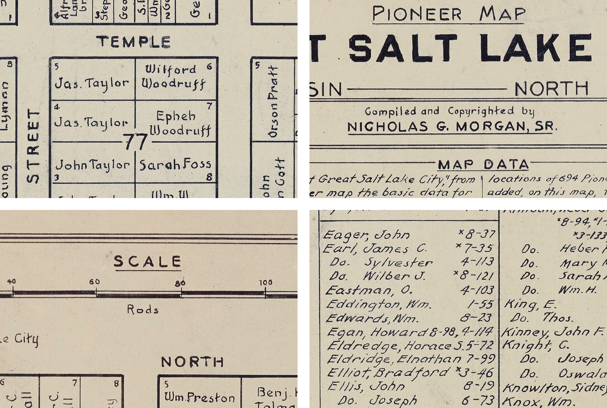
While we had noticed the satisfying grid while walking downtown it wasn’t until we saw some very old maps at The Pioneer Memorial Museum that we knew we had to somehow accentuate this aspect of the city in the identity and then we found the Holy Grail of SLC maps. Just look at this thing:
Certainly, a tight grid is nothing special in graphic design… pretty much everything we do here at UnderConsideration has an underlying grid that is very similar to the above, so saying “We are going to use a grid” wasn’t enough. But let’s put a pin in that as it will come back in the story.
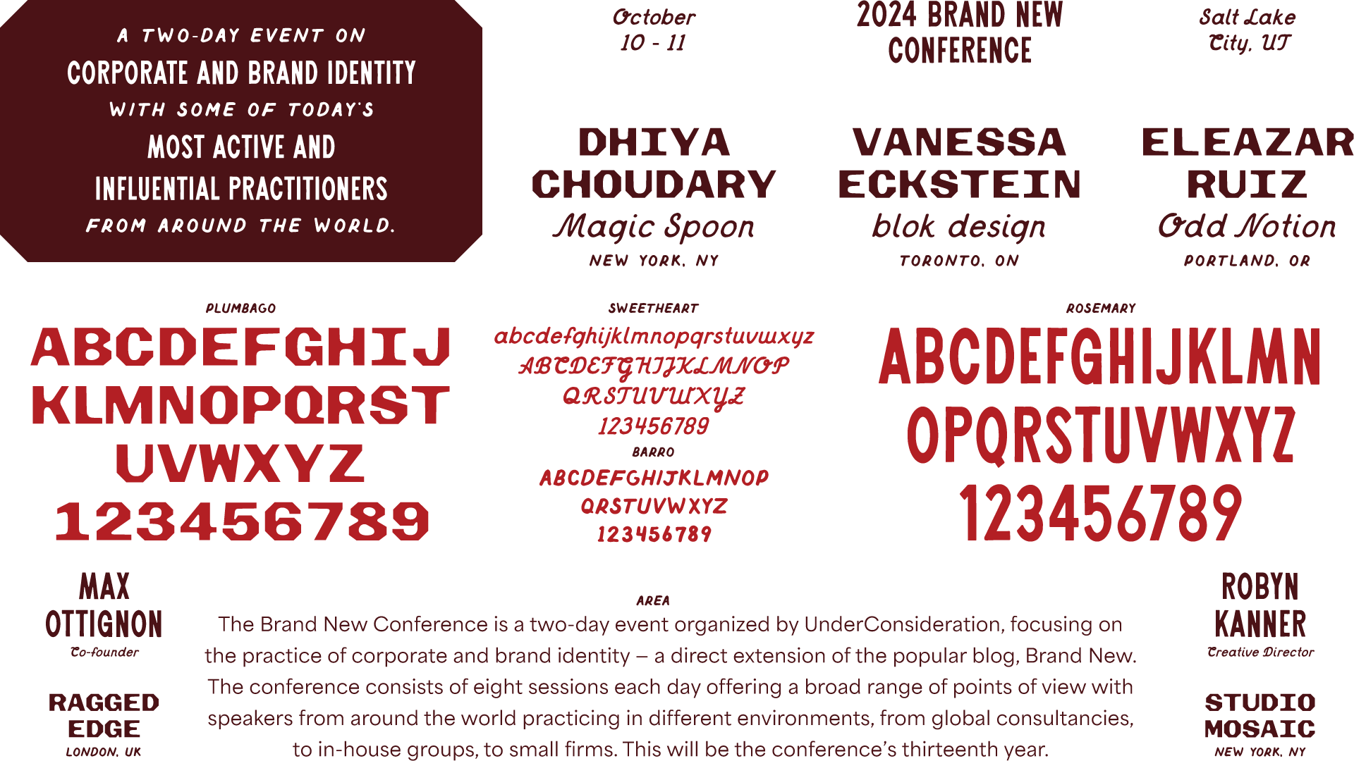
The Type
From the moment we stepped into The Pioneer Memorial Museum we realized this was a treasure trove of potential design references — if you are coming to Salt Lake City for the conference, we highly encourage a visit — but it wasn’t until the literal, very end that we spotted something unique: an 1872 street car used by the city’s transportation system, Salt Lake City Lines (still in operation to this day).
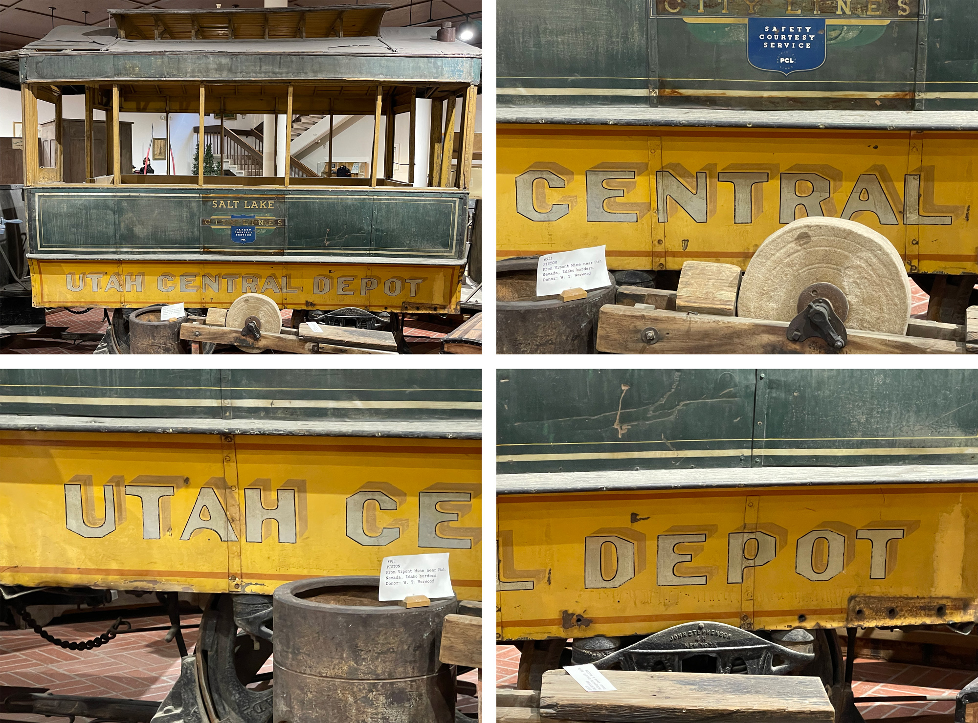
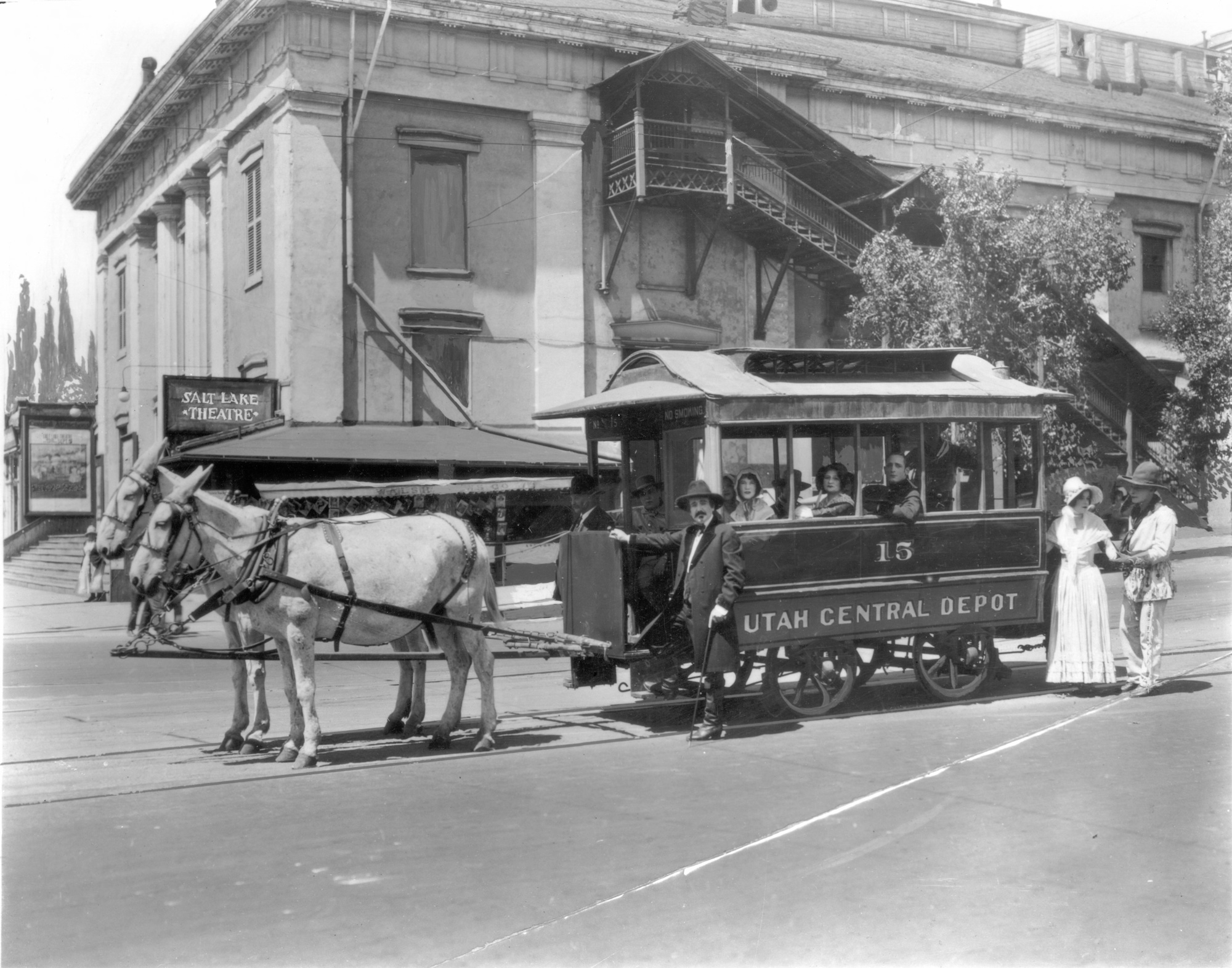
The hand-painted typography on the side of the street car called to us and we answered. Right then and there we knew it would become the cornerstone of the identity in all its quirky glory. We are not type designers and the sample set of letters was very limited so we also knew we needed reinforcements. We’ve been fans of Jesse Ragan and Ben Kiel for some time and last year we got to know them a little better as their foundry and custom type business, XYZ Type, were a sponsor of the 2023 Brand New Conference so we reached out to them to see if they would want to tackle it. They did. After some healthy back and forth, Plumbago was born. You can read a more in-depth take on the design of the typeface over at XYZ Type’s website.
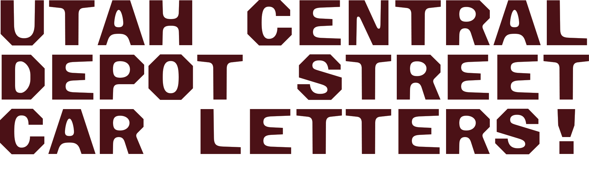
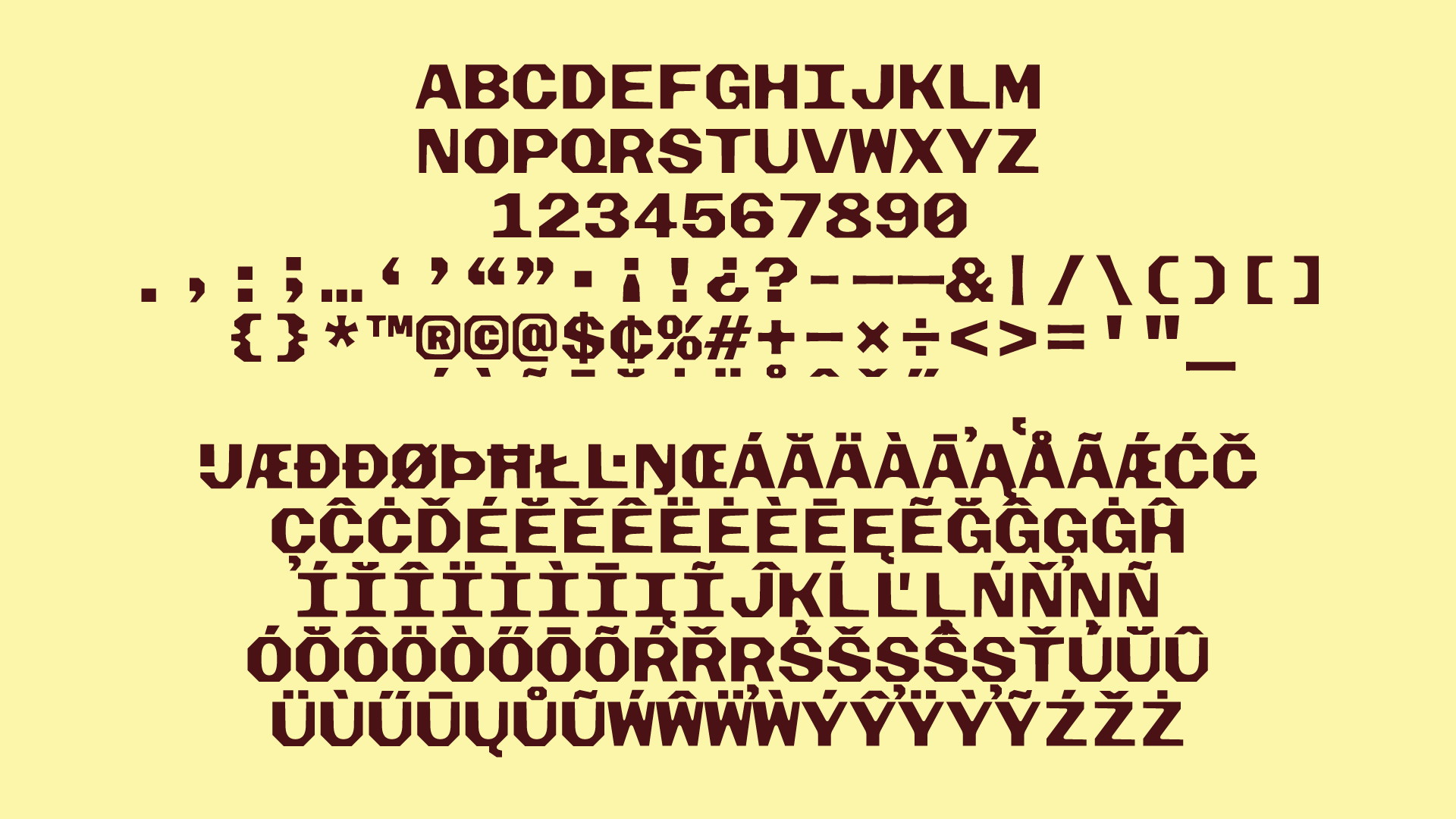
Our brief to XYZ Type was to hone in on the quirks that make these letters unique — the octagonal contours, the tear-drop counters, the tapering horizontal strokes — and create an uppercase display typeface with the curveball that we wanted it to be monospace because, you guessed it, then we could replicate the city grid through the typographic compositions.
Plumbago is not a hardcore monospace as some letters are slightly narrower than others and any “circular” letters that would have an overshoot also have one here, so the “O”, “B”, and “S” for example are a hair taller than other letters, which helps soften the typeface and make it feel less mechanical, bringing in some of the human touch from the hand-painted version of the original.
As usual, we don’t have a formal logo or a single lock-up and this year’s grid approach lended itself to a number of compositions and configurations where no space is left unused and grids within grids are created to place smaller bits of text within the name of the event, replicating the map with each lot singled out within each city block. As you’ve seen now on the website, the logo compositions live on top of the abstract mountain animations creating a contrast between the two elements that subtly reference our original impression of Salt Lake City: Mountains and grid.
The supporting typography is also inspired by the same map and its lovely and meticulously hand-drawn typography.
As either luck would have it or as Instagram’s algorithm has gotten ambitiously more invasive, we were served an ad for Taylor Penton’s hefty collection of hand-drawn typefaces. We selected some of the most “normal” ones so as not to distract too much from the primary typeface but still capture that early-settler typography from the nineteenth century. Perhaps a little controversially, we’ve elected to do every block of text in a centered arrangement, which might be too much for longer paragraphs but once you center one thing, it’s hard not to center everything else. For body copy we chose Area from Blaze Type for its simplicity and subtle personality.
What Comes Next?
As is typically the case at this stage of the conference, we have a fairly close idea of how we will translate this digital expressions into print and swag but the details have yet to be formalized and the crazy hand assembly yet to be defined. If all goes well, you can expect a lot of full-bleed coverage with the mountains and sky. We always remain positively optimistic at this point but also dead-afraid of the production that will ensue.