CLIENT
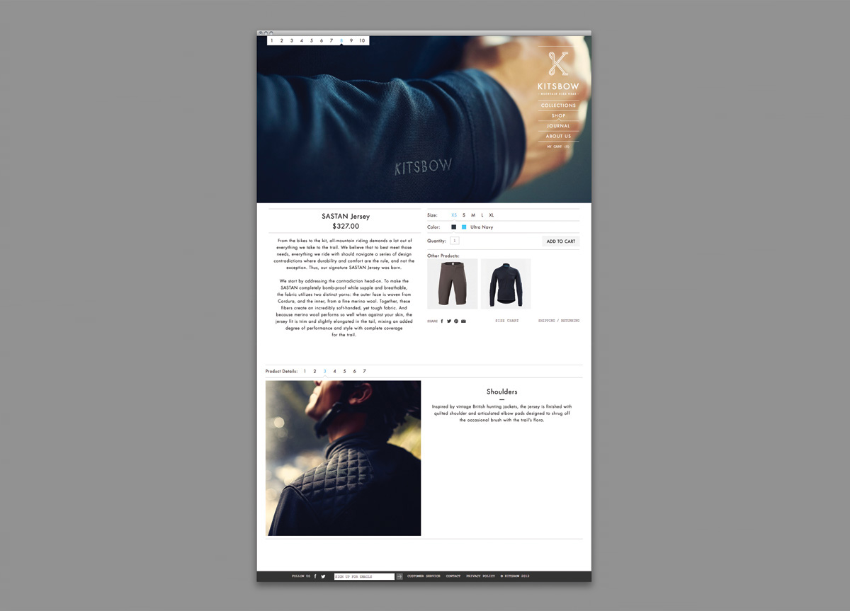
Based in Marin, CA, they design and produce high quality mountain bike apparel with a minimal aesthetic and tailored details. Their products are impeccably made and justifiably expensive. Their target audience are passionate mountain bikers who are happy spending money on the very best quality gear.
BRIEF
Frustrated by a lack of stylish apparel in the mountain biking sector, Kitsbow’s founder set out to create a new sort of company that makes refined mountain biking apparel at a higher price point. Our client was entering a sector where the masculine grunge aesthetic reigns supreme. They wanted to disrupt this and create a brand (and accompanying visual identity) that echoed the quality and craftsmanship that went into their product. With an abstract name without meaning, the challenge was designing an iconic mark that carried the connotations the client was seeking.
APPROACH
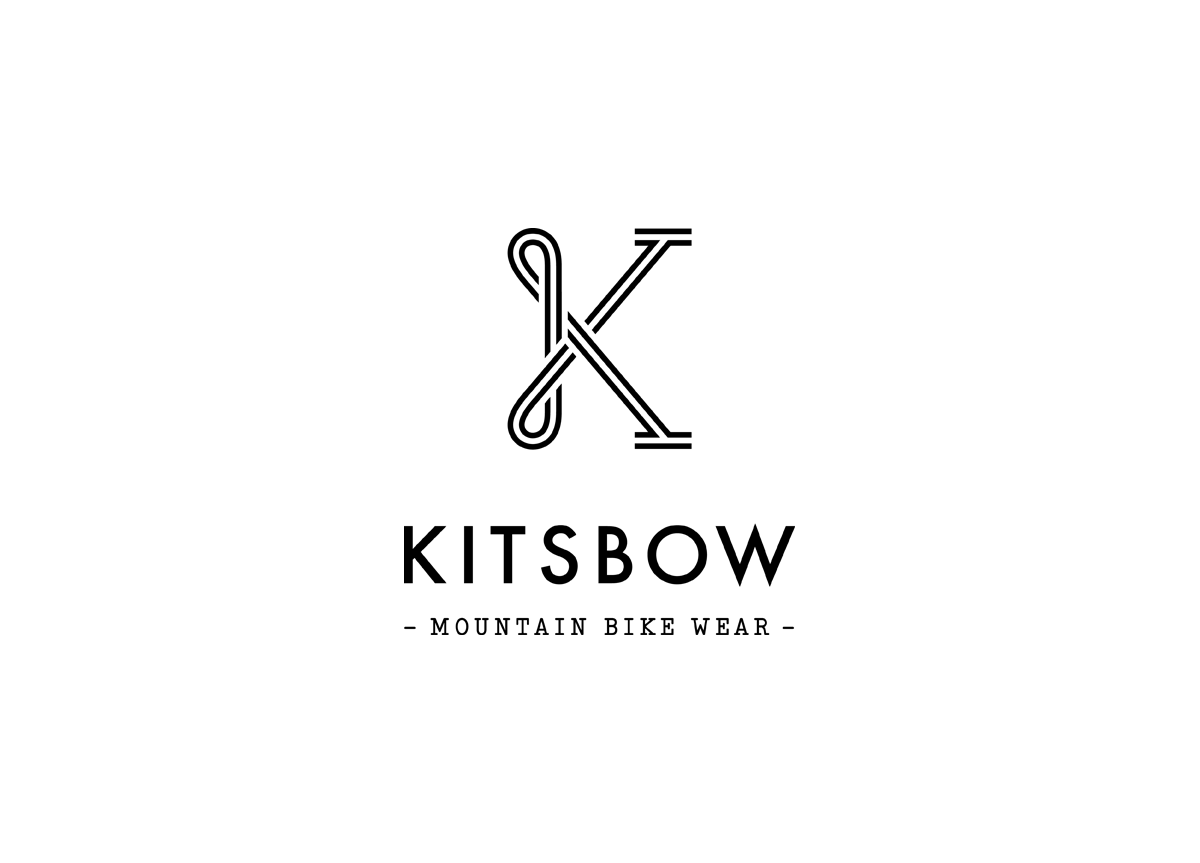
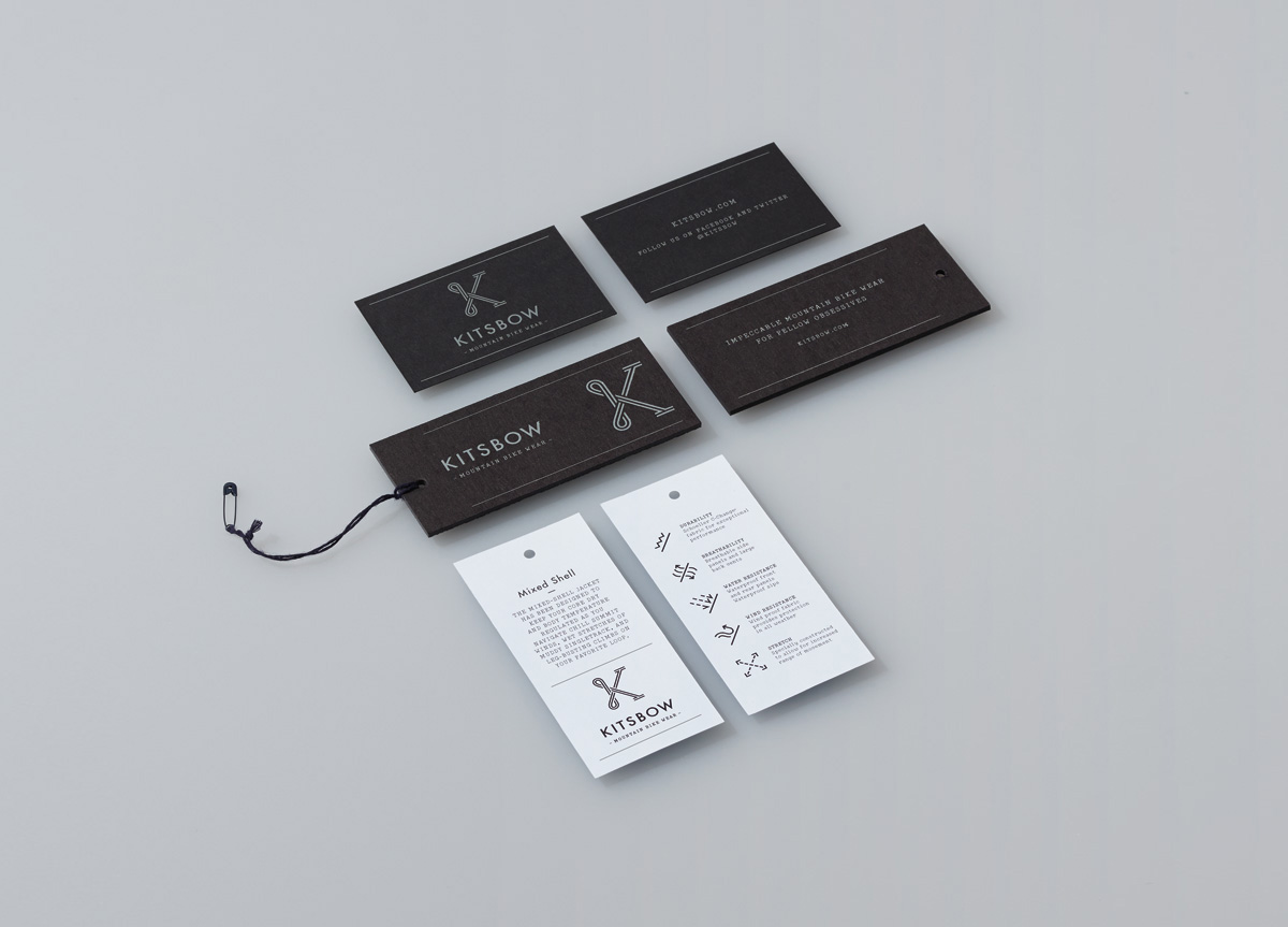
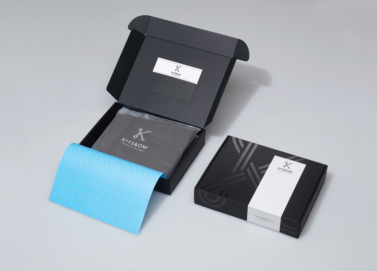
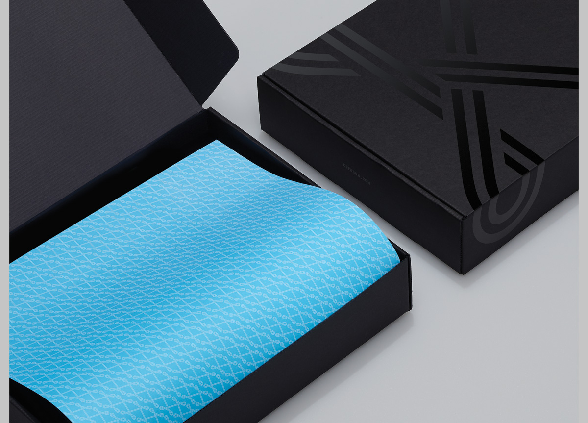
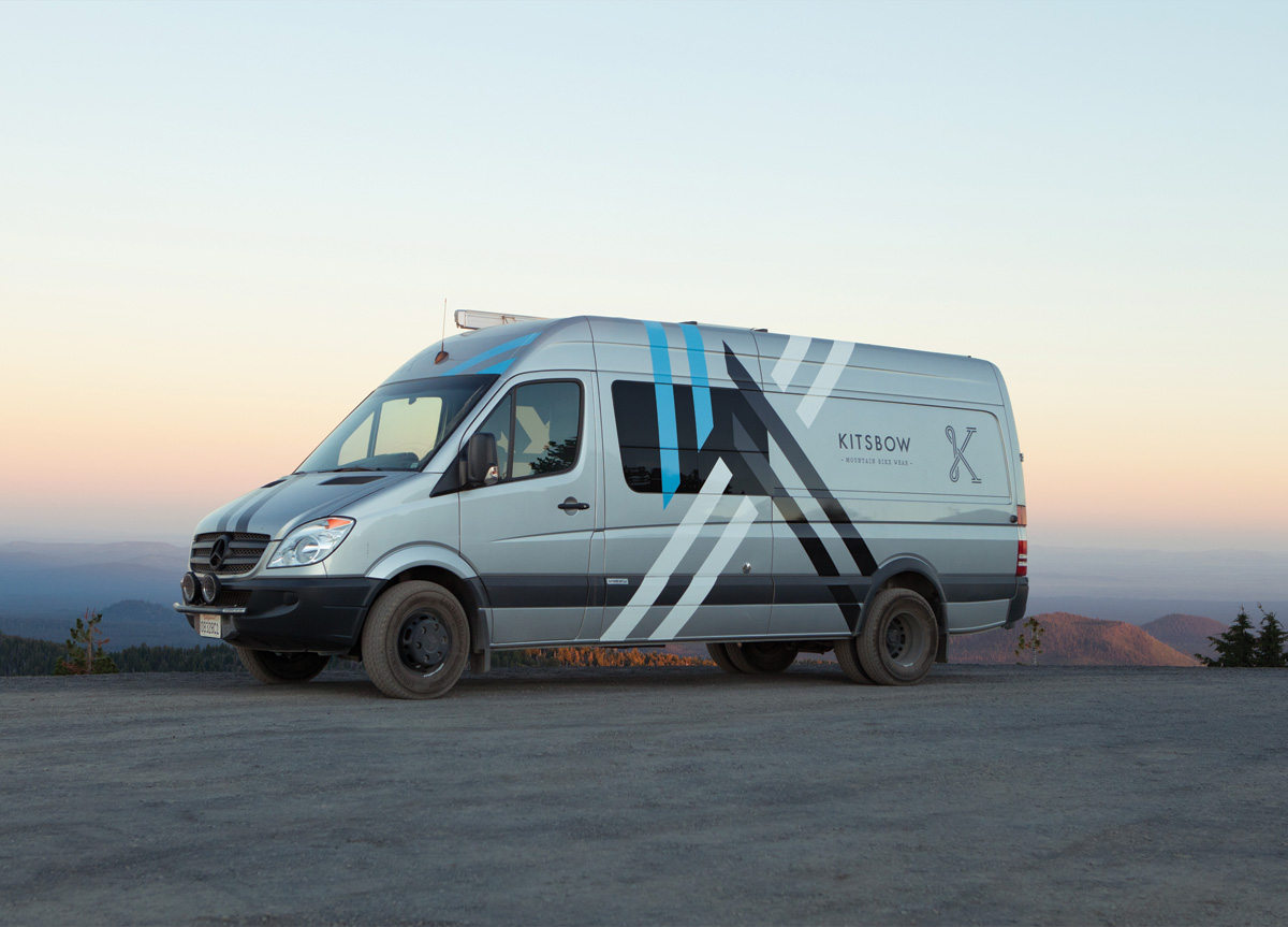
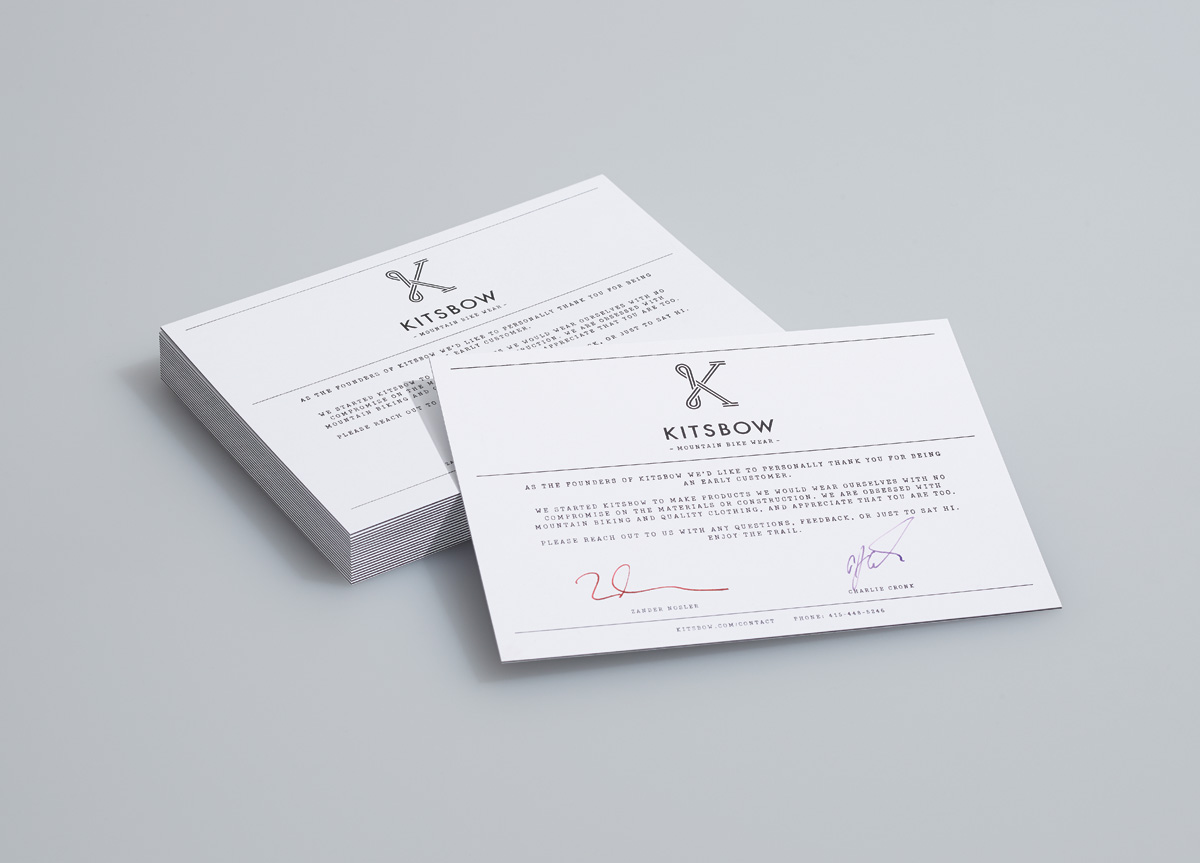
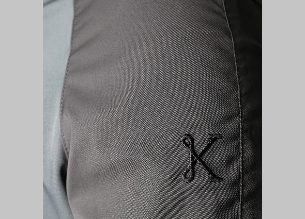
We saw an opportunity to embrace the elegance and tailored construction of their products. The resulting marque has a level of craft and elegance that paired perfectly with their product and brand promise. The looping of the “K” brings associations of tailored stitching, while also making reference to the winding trails on which mountain bikers ride. Introducing stripes into the mark allowed us to crop the logo to provide a more sporty and dynamic appearance when needed. We used extra thick card stocks, varnishes, and foils to provide a sense of tactility and substantial quality.
