
![]()
![]()
CLIENT
BRED focuses on different mediums serving non-profit, cultural, and corporate environments while seeking clients that share their appreciation for creative opportunities. The studio’s core belief revolves around effective design, the organizing force in defining, creating, and communication of meaning.
BRIEF
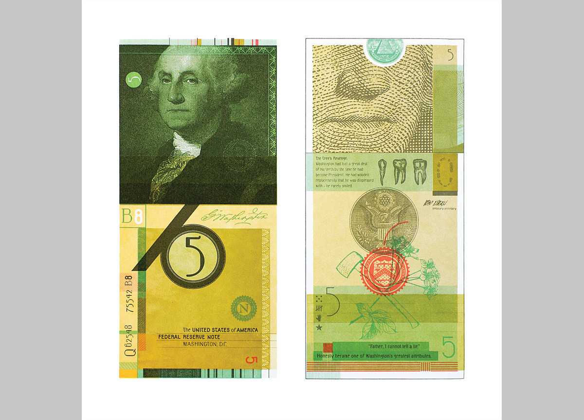
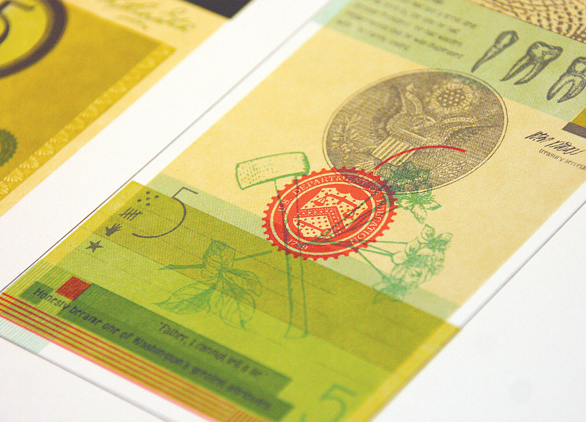
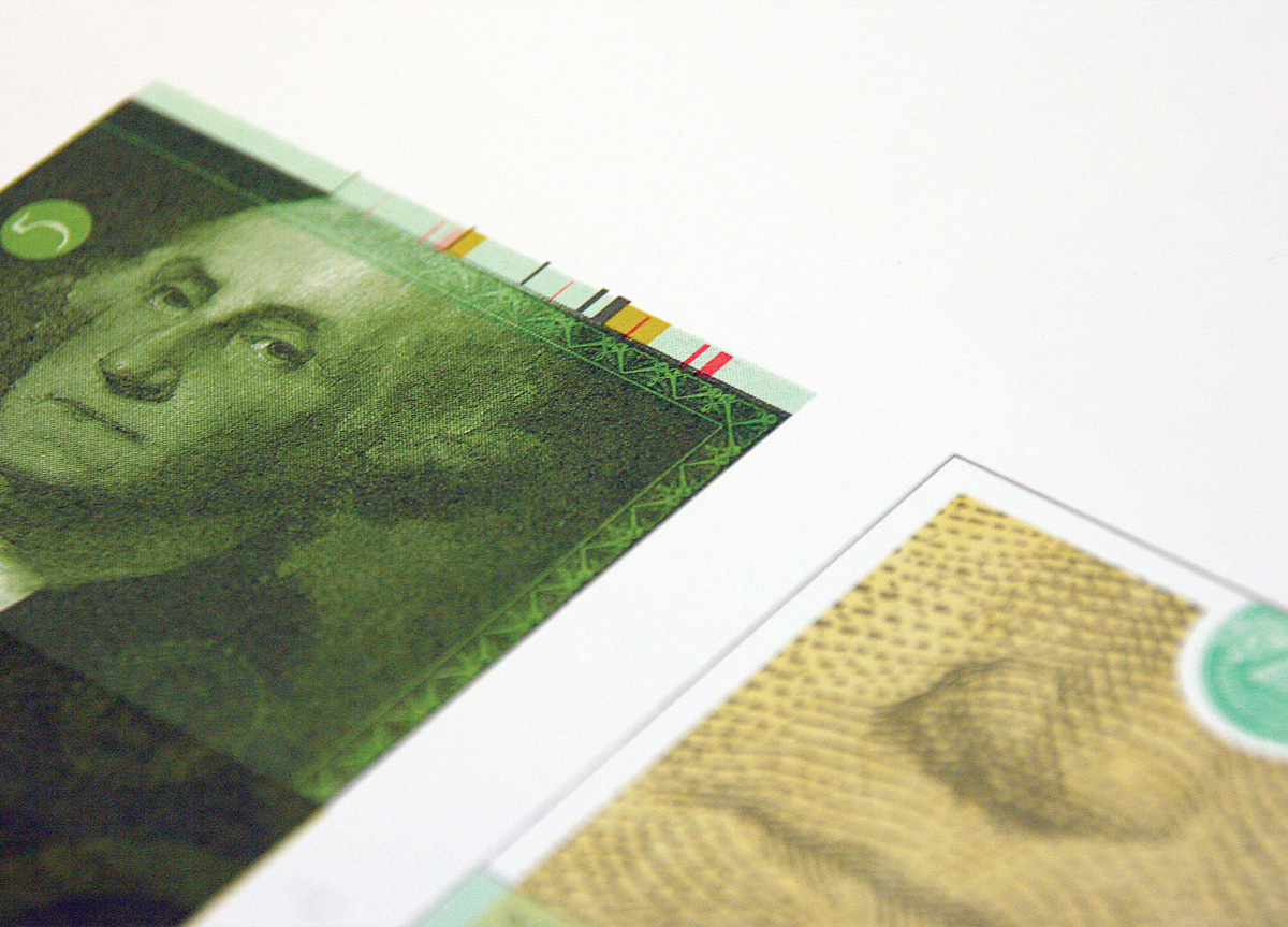
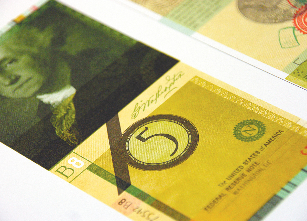
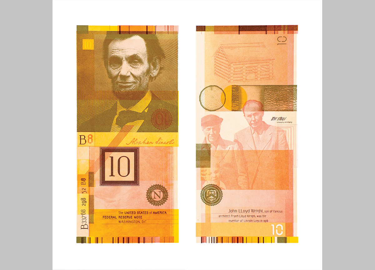
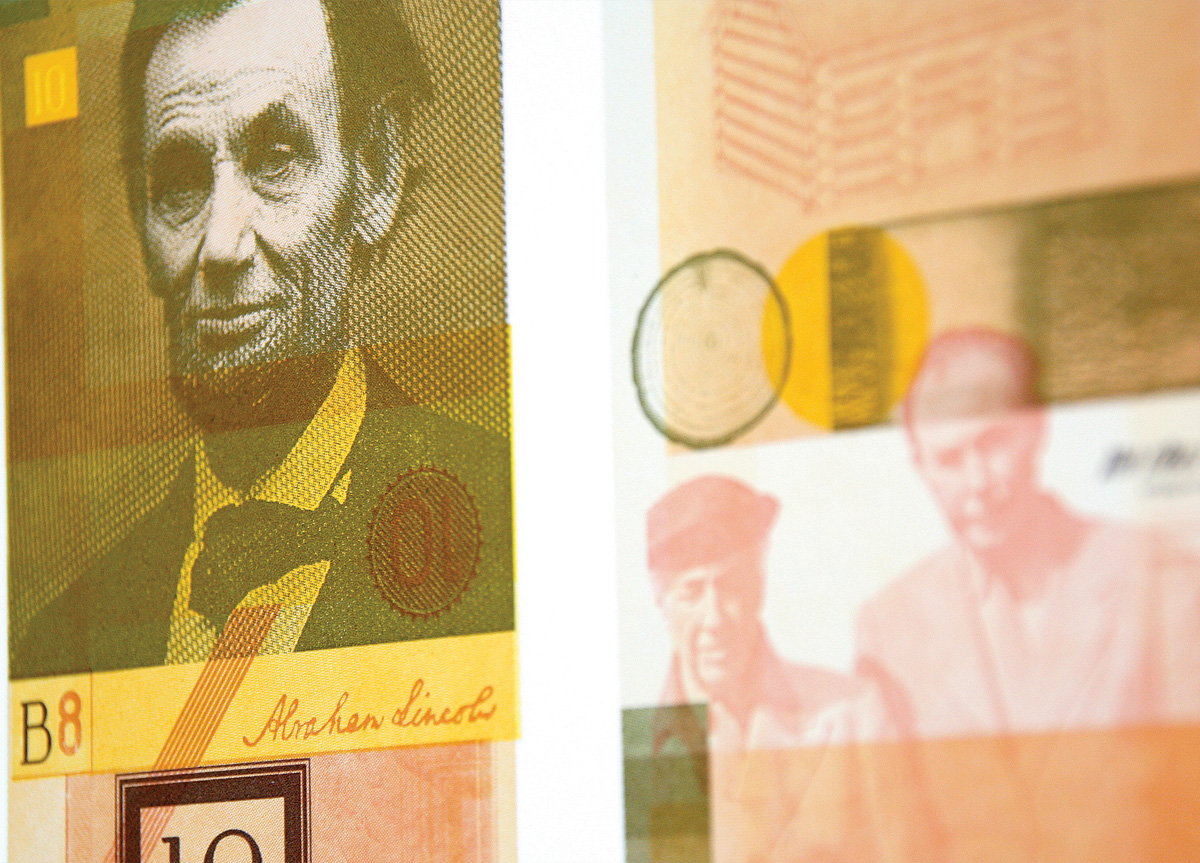
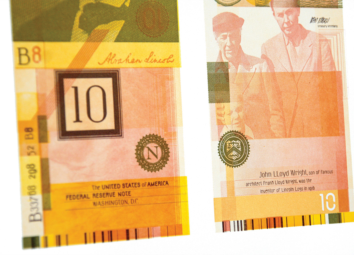
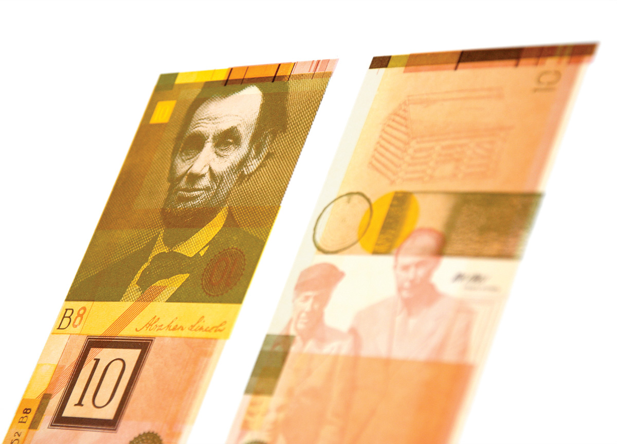
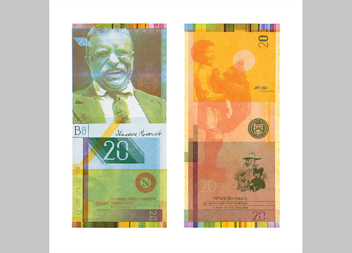
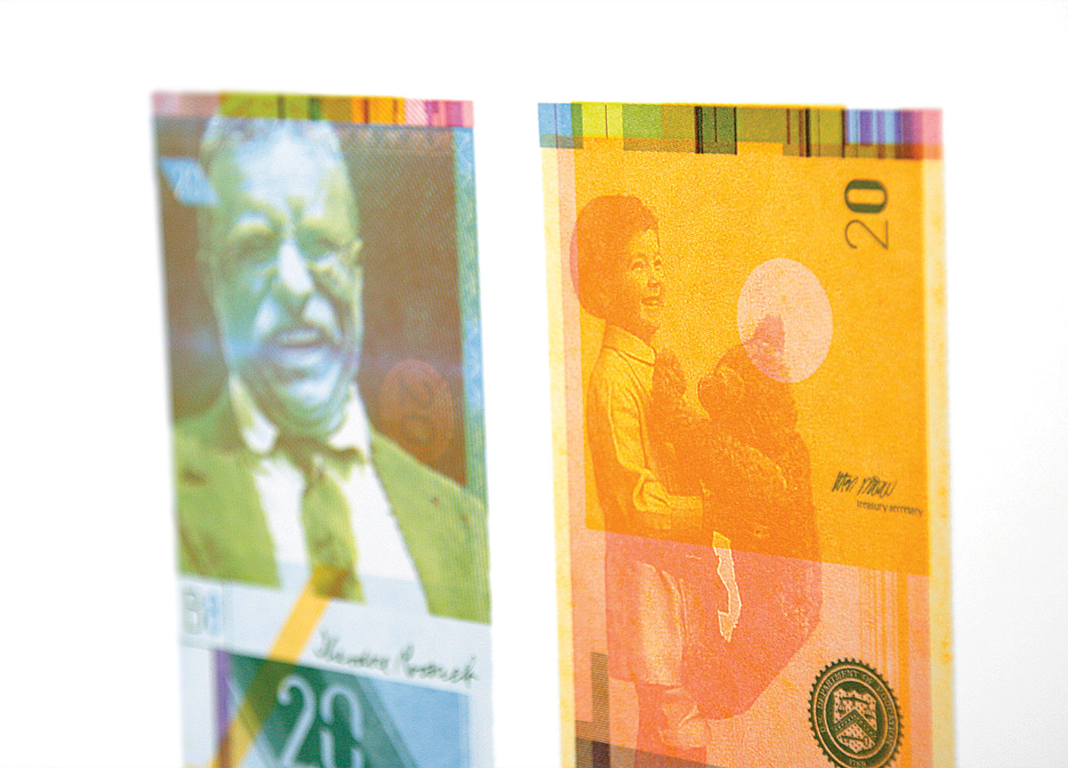
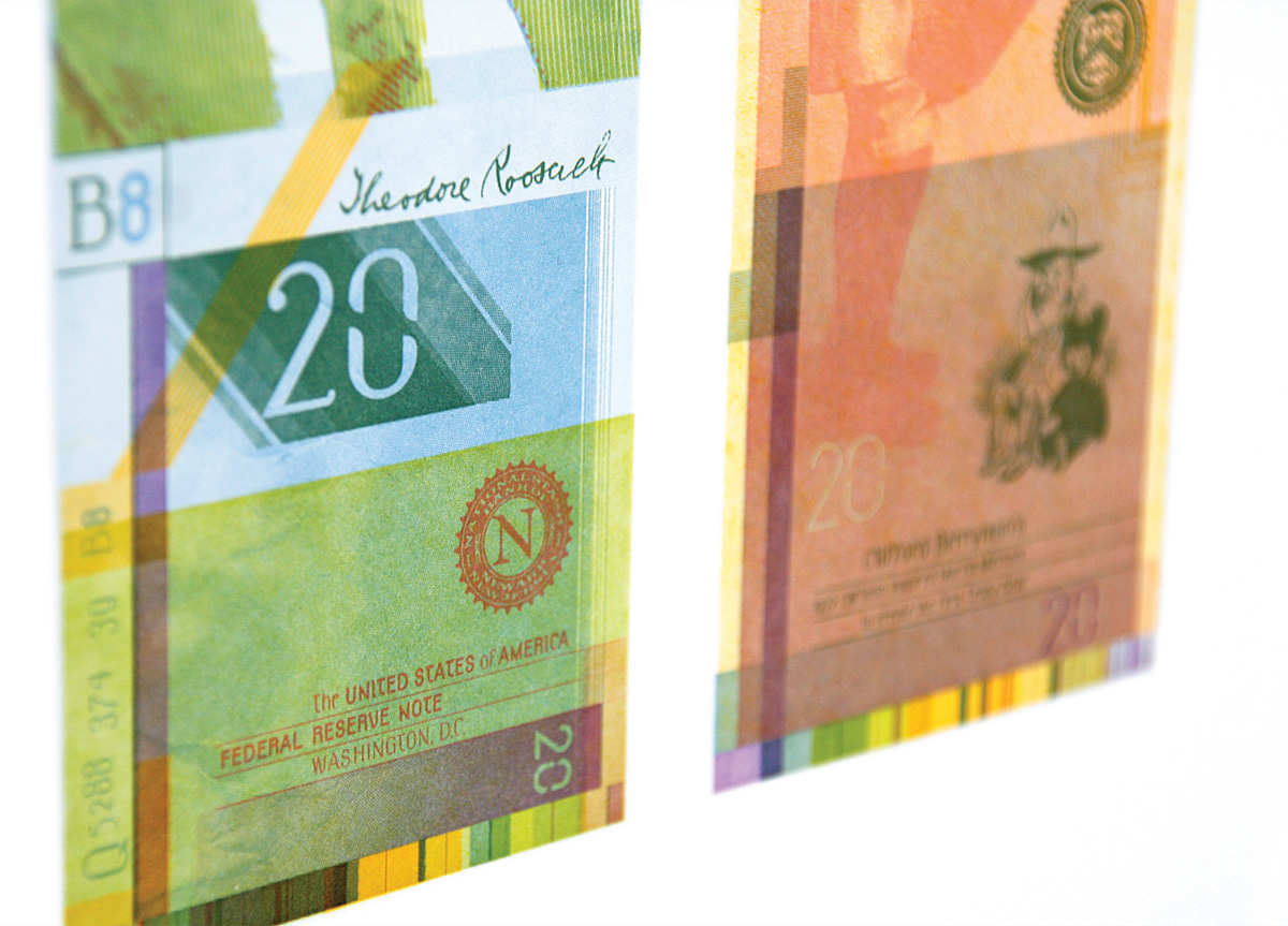
This self-initiated project was inspired in part by W. A. Dwiggins’ 1932 proposal Towards a Reform of the Paper Currency, Particularly in Point of Its Design. This experimental investigation was also created to showcase and promote a new type family, Ludd, recently designed by the studio.
APPROACH
I wanted to try and retain the spirit of the current US bills while contrasting the more iconic elements with a humorous look at American history and its myths. Formally, I was reacting to the conservative nature and blandness of our bills, trying to develop a more dynamic composition and impression without losing the narratives. I assign a currency project to my students and I was curious how I might respond to the same design problem. Working within these formal, conceptual, and system oriented parameters, I have a greater understanding about the design process and the various macro/micro issues involved.


