CLIENT
AIA Indianapolis is the local chapter of the American Institute of Architects, the voice of the architectural profession.
BRIEF
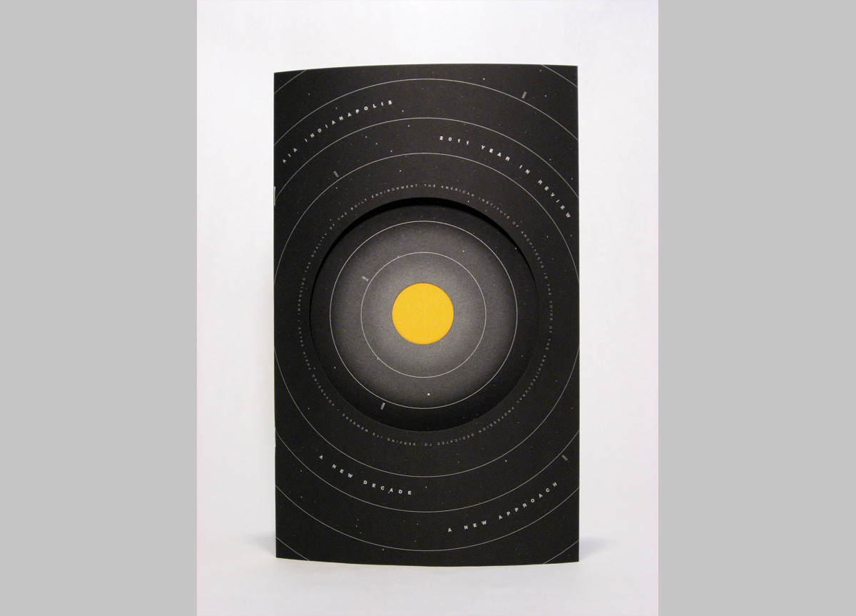
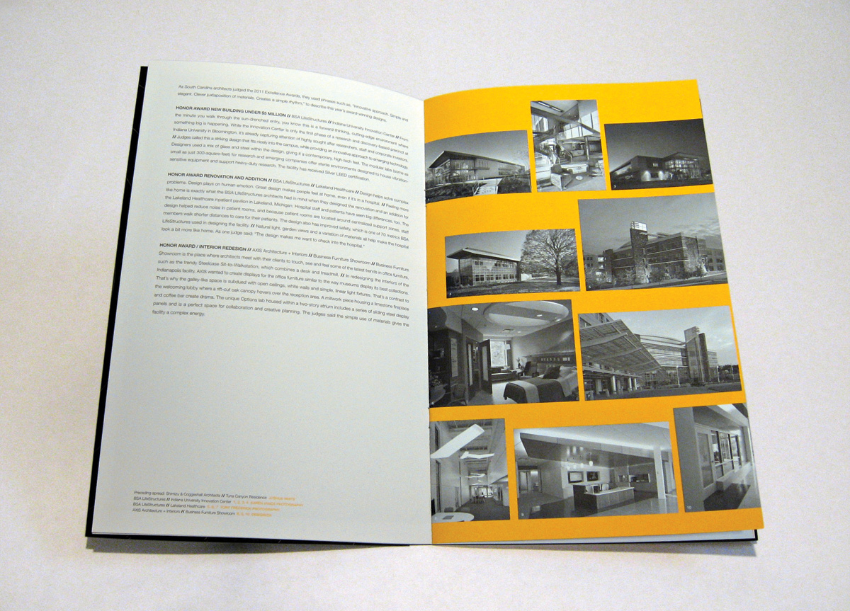
Our client requested a clean and simple presentation of the previous year’s high points and events—essentially an annual report. We were also asked to provide a graphic interpretation of their annual programming theme “A New Decade. A New Approach" for the review’s cover.
APPROACH
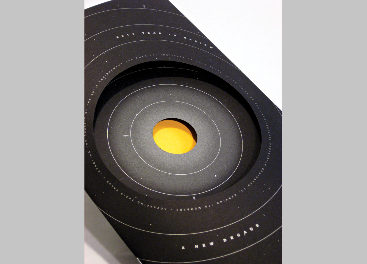
This piece is called the Year In Review and it serves as a de facto annual report for AIA Indianapolis. We have been fortunate enough to design this piece for twelve years. Every year the goal is to recount the events of the year and to graphically interpret the group’s programming theme. This year the theme was “A New Decade. A New Approach." We designed an orbital motif that illustrates the passing of a decade and alludes to Indianapolis’ nickname—the Circle City.
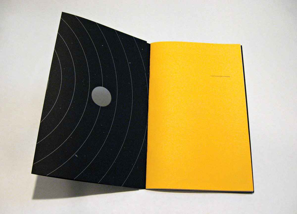
PRODUCTION LESSONSThe budget for this piece is low. We know that we have two colors to work with (black and fluorescent gold) to accomplish our task. Using moderately priced papers and working with a very generous printer, we were able to afford the double die-cut that enhances the dimensionality of the cover. Special attention should be paid to the silver hairline rules of the inside front cover that our printer matched perfectly from one side of the sheet to the other.
Judge's Comments
Very eye-catching cover, through use of a die-cut as well as quietly elegant typography. — Louise Fili
This piece, beautifully designed, shows that the technique of die-cutting adds meaning to the message and story of the piece, rather than adding fluff. — Mig Reyes
Having die-cut-fun with another-triparound- the-sun. — Robynne Raye
Simple? Lining up register of cutting of concentric circles, with print, on several panels is a deceptively difficult production challenge. — Ben Levitz
