You’re looking at one of the…
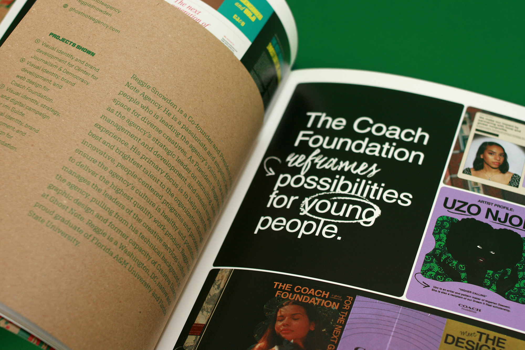
A graphic design firm generating its own projects, initiatives, and content while taking on limited client work. Run by Bryony Gomez-Palacio and Armin Vit in Bloomington, IN.
Join our Mailing List
Colophon
Headlines and wordmark
Druk Condensed XX Super by Berton Hasebe for Commercial Type.
Body
Neue Haas Unica by Toshi Omagari for Monotype. Served via fonts.com.
UCLLC logo
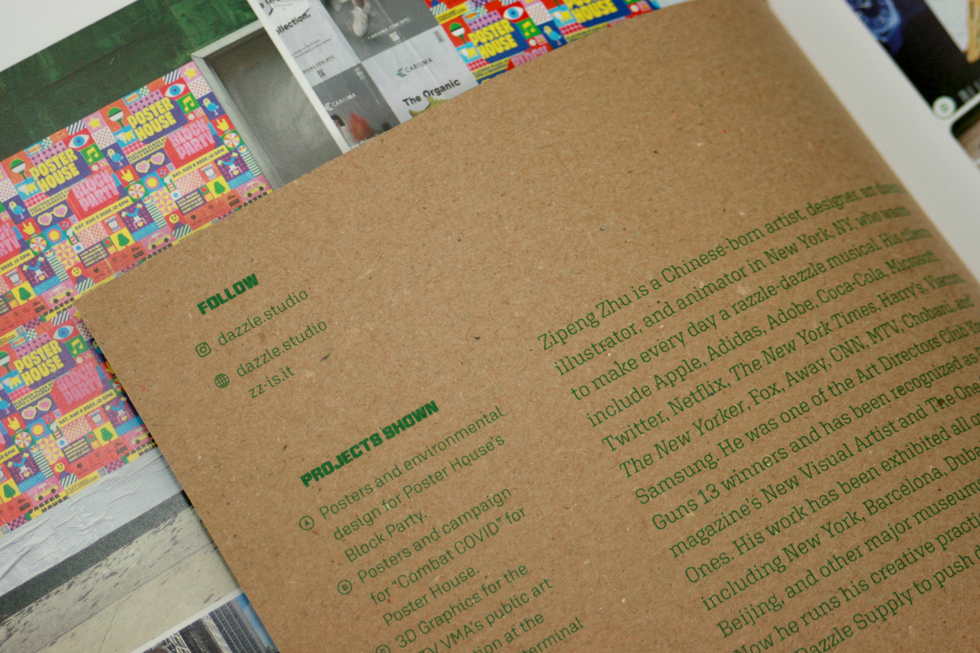
Custom lettering by Mark Caneso.
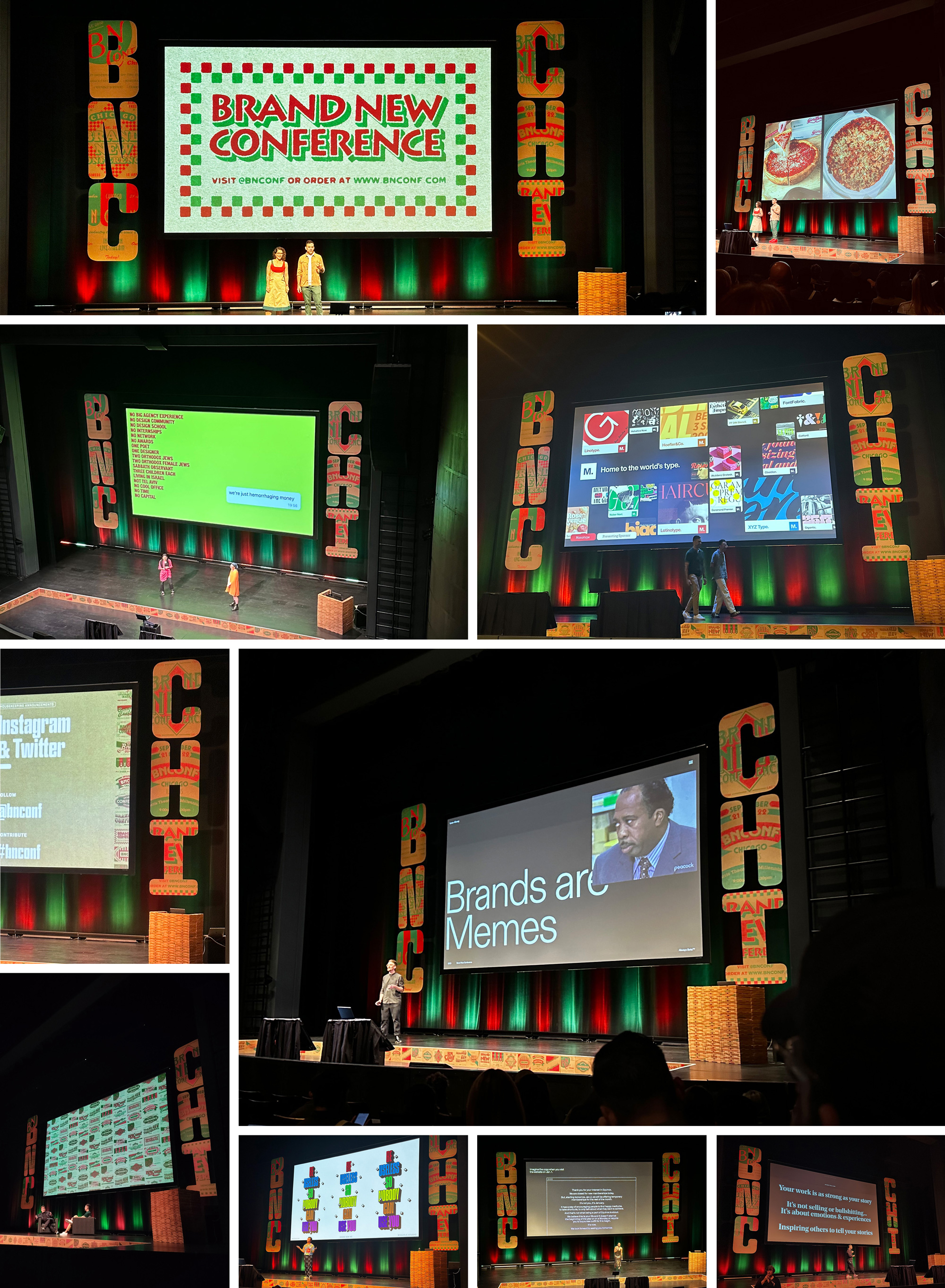
2023 Brand New Conference Identity
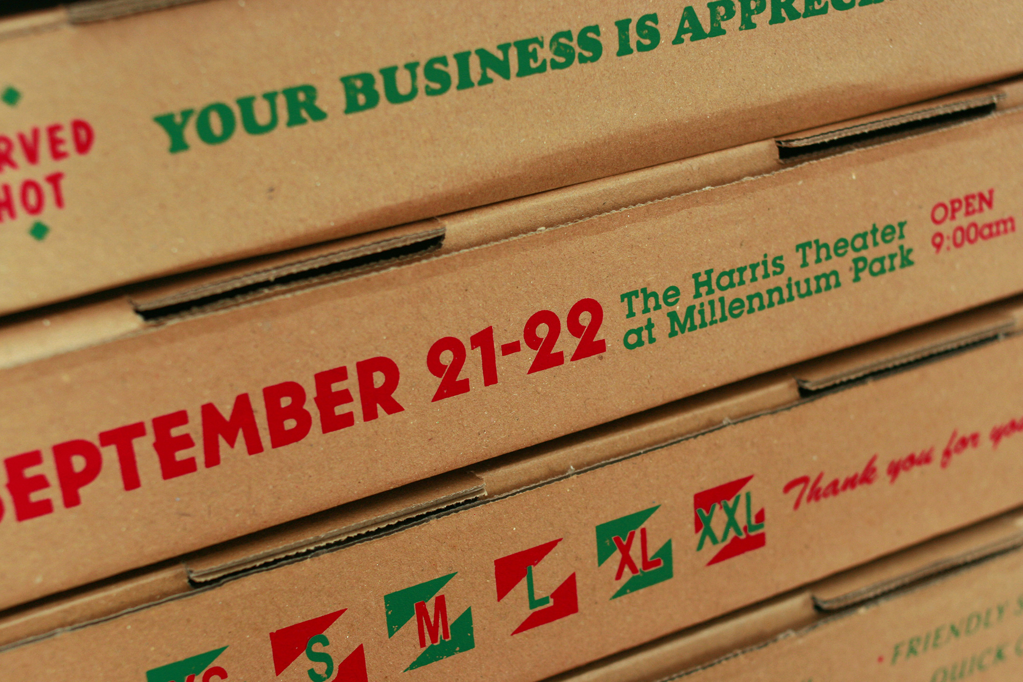
This past September 21 – 22 we celebrated the twelfth edition of the Brand New Conference in Chicago, IL. Here is a deep dive into this year’s pizza joint-inspired identity. This case study got quite long, so you might need to schedule a good 10 minutes to get through it all!
Early Failures
In the last paragraph of last year’s case study we wrote, “Given how much we struggled with the concept and tight time frame for the production of this year’s materials we actually already have an idea cooking for the 2023 Brand New Conference in Chicago”. That original idea was crafting little deep dish pizzas with a tufting machine — a fun idea that didn’t quite pan out. Nor did the second idea nor the third. Our struggles are chronicled and illustrated in the opening remarks of the first day of the conference so we won’t repeat them here but it’s worth mentioning that the struggles actually helped pave the way for the final idea.
Defining Chicago-style Pizza
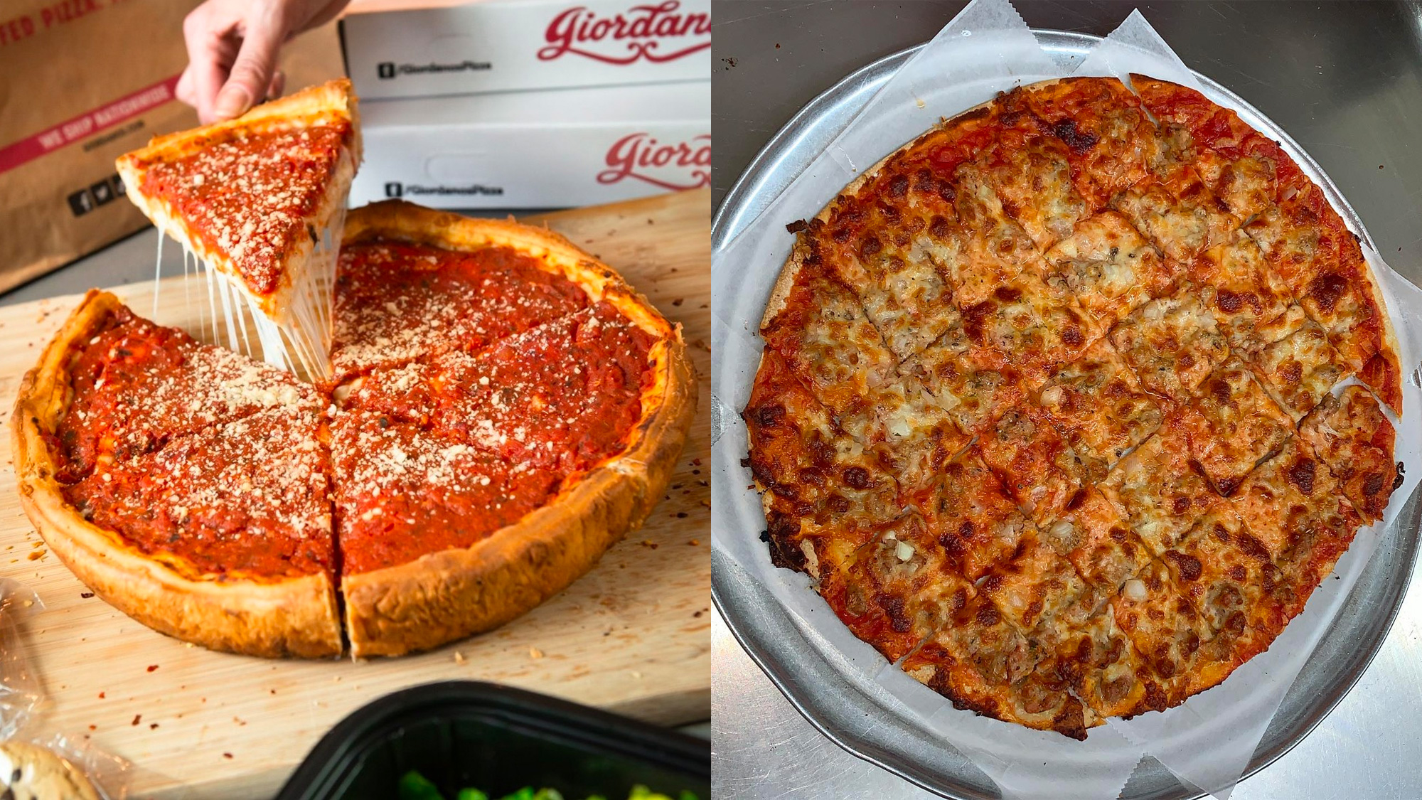
For many, specifically outsiders, the defining style is deep dish pizza, which Chicago can lay claim to having, if not invented, pioneered or, at the very least, marketed the hell out of as an unmissable attraction mastered by local chains like Giordano’s and Pizzeria Uno. For many others, specifically locals, the defining style is what’s known as tavern style pizza, which is the complete opposite of its more famous relative with a thin and crispy base and no puffy crust. The style’s name comes from its origins in the 1940s when pizza was served in taverns, often at no charge, one square at a time — easily served on a napkin — to keep patrons drinking. Tavern-style pizza become our North Star.
Embracing Pizza Joints
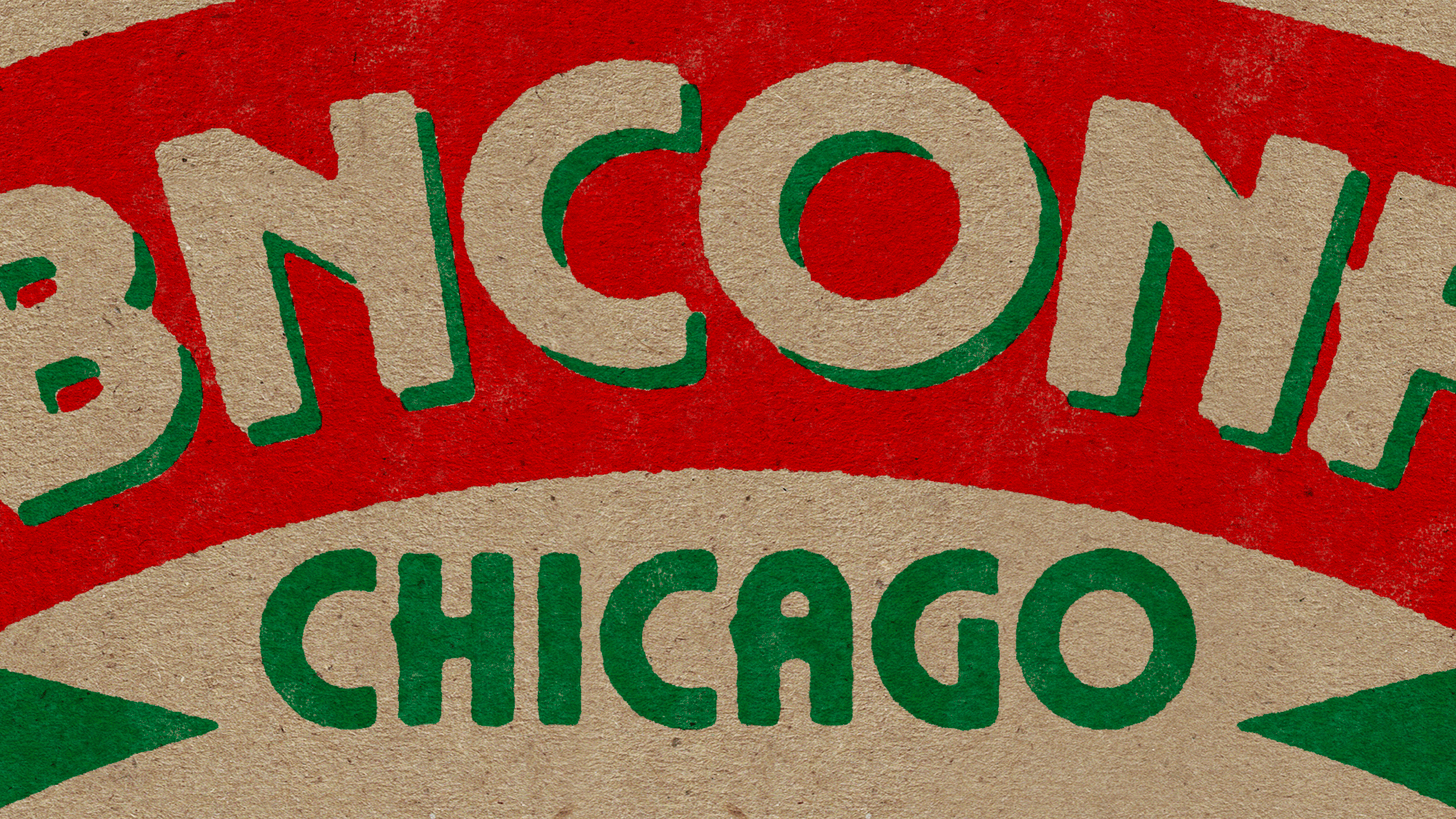
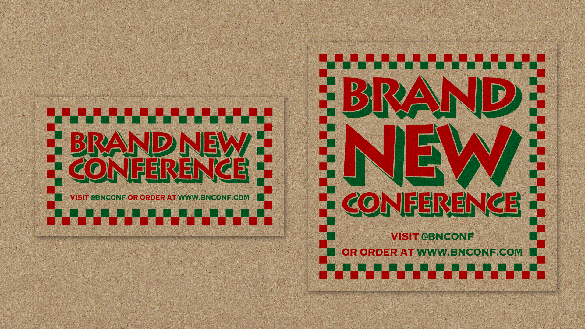
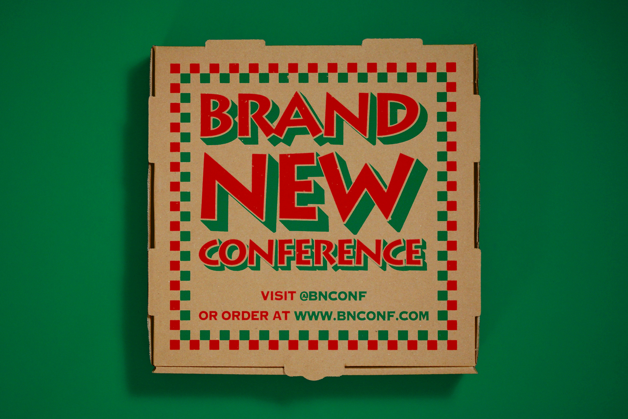
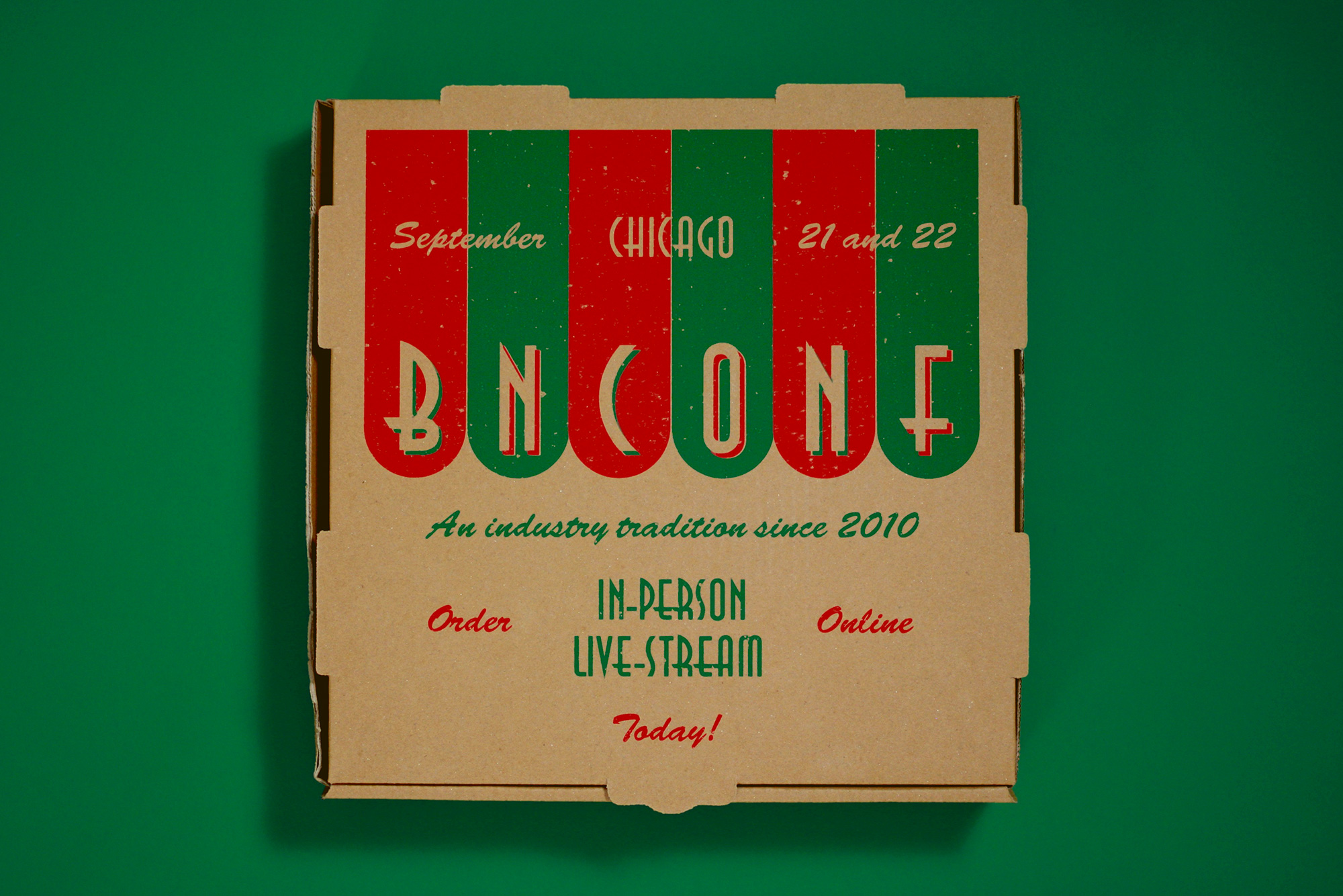
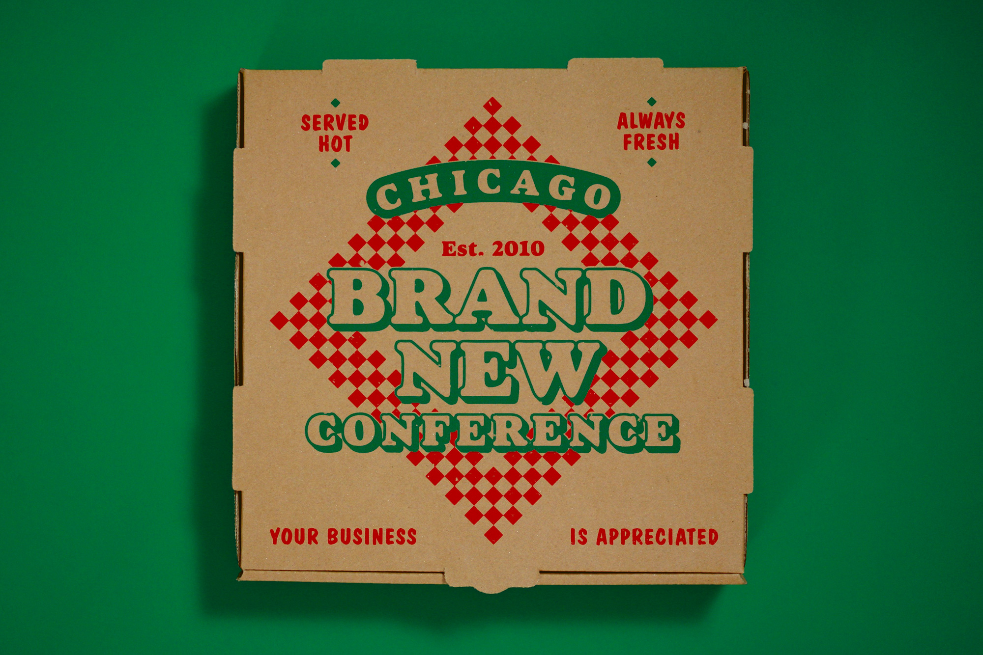
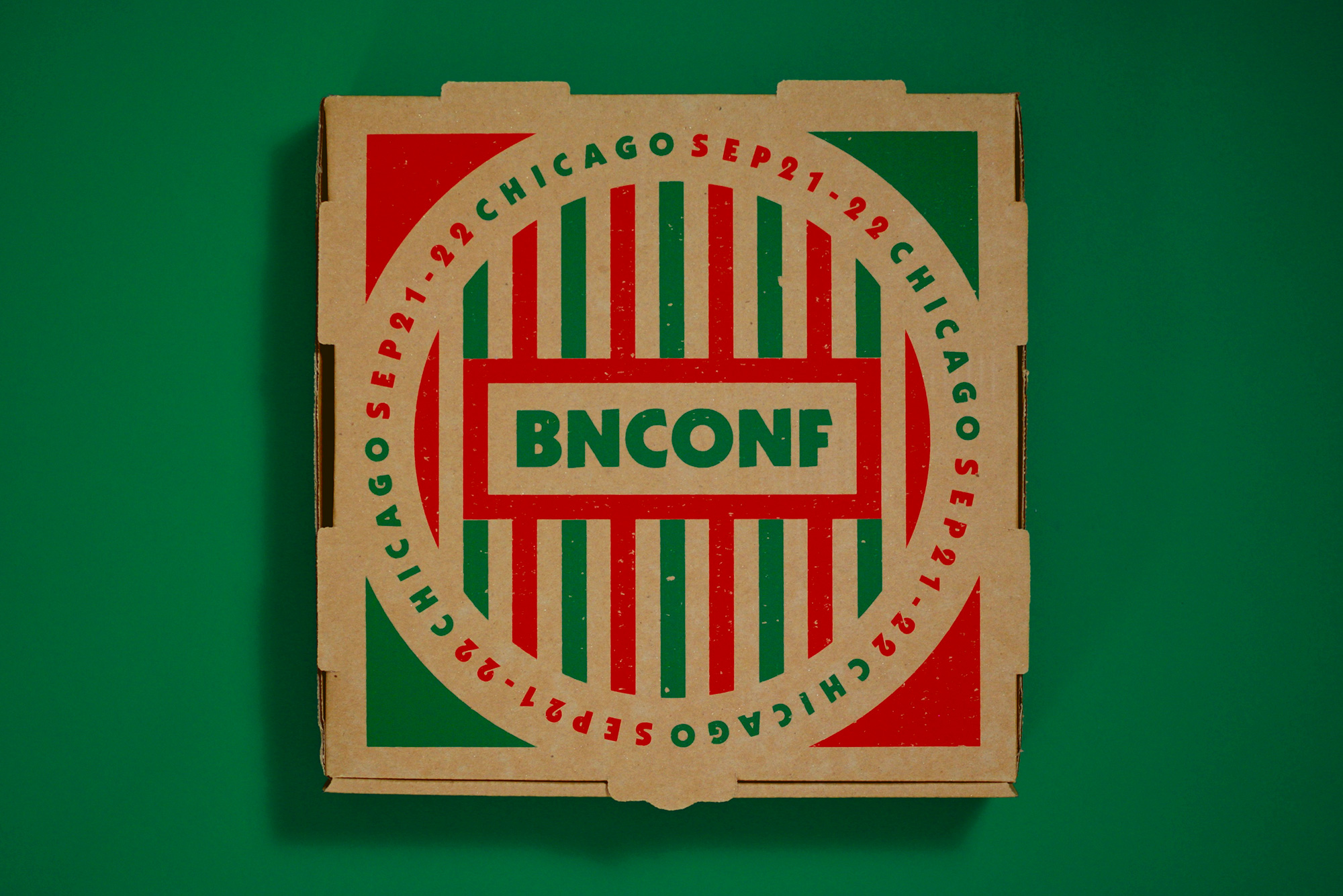
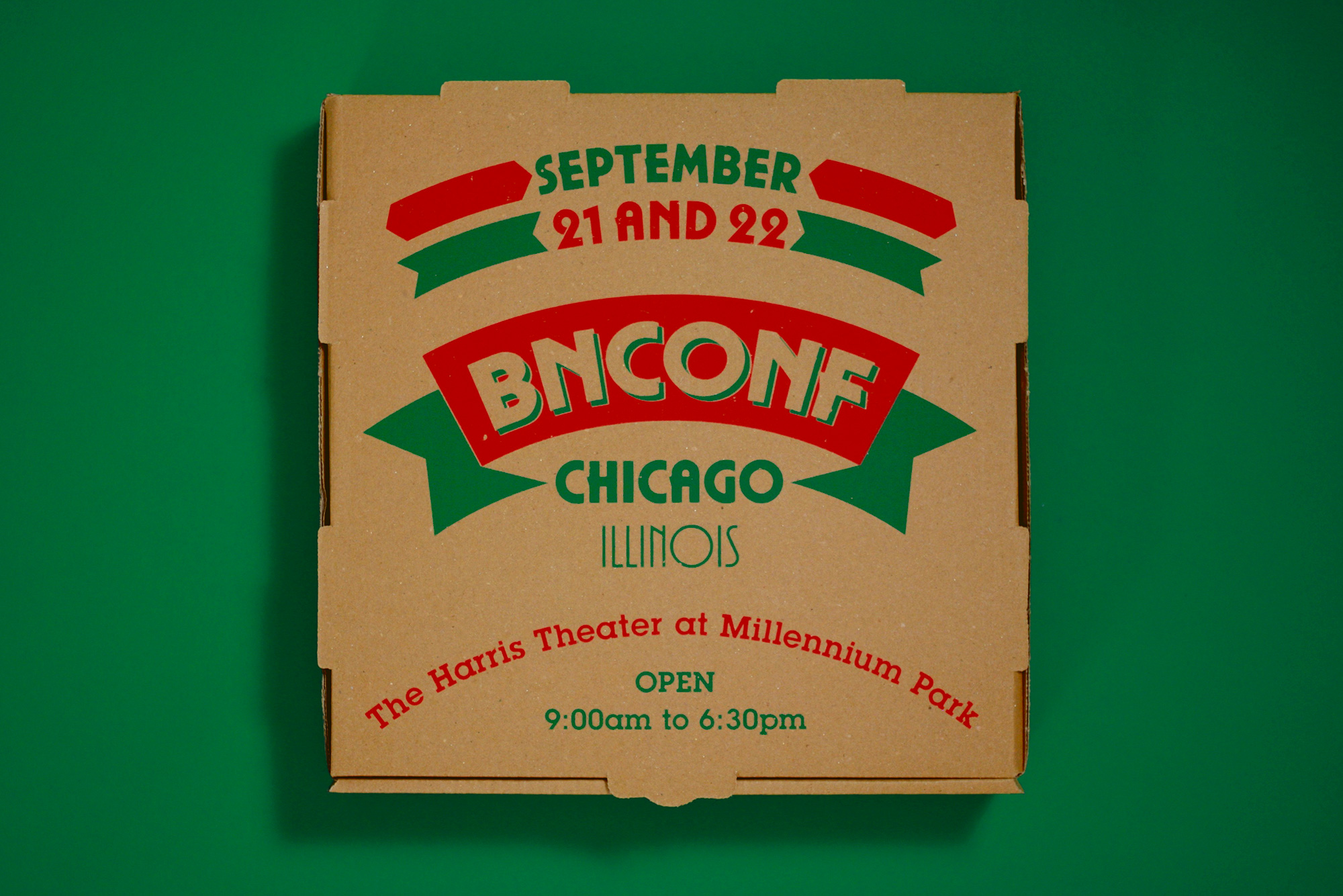
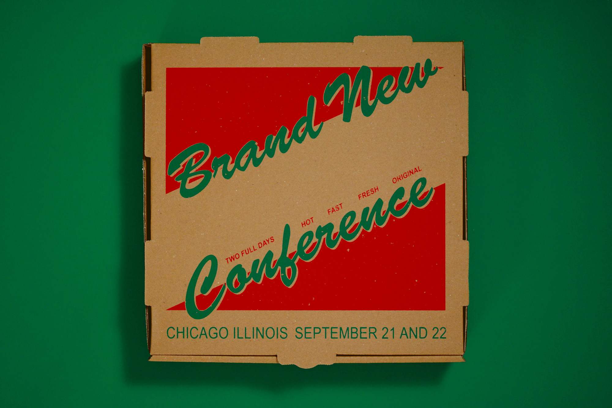
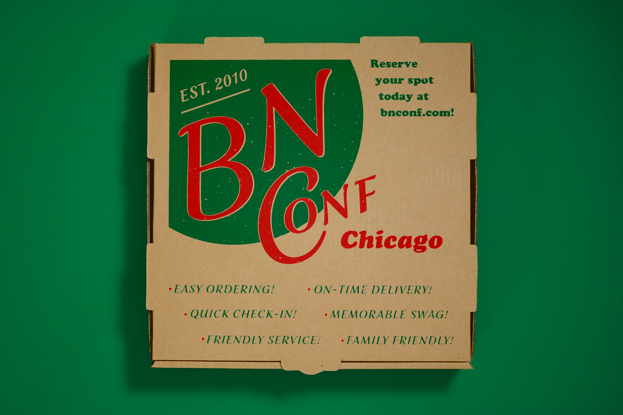
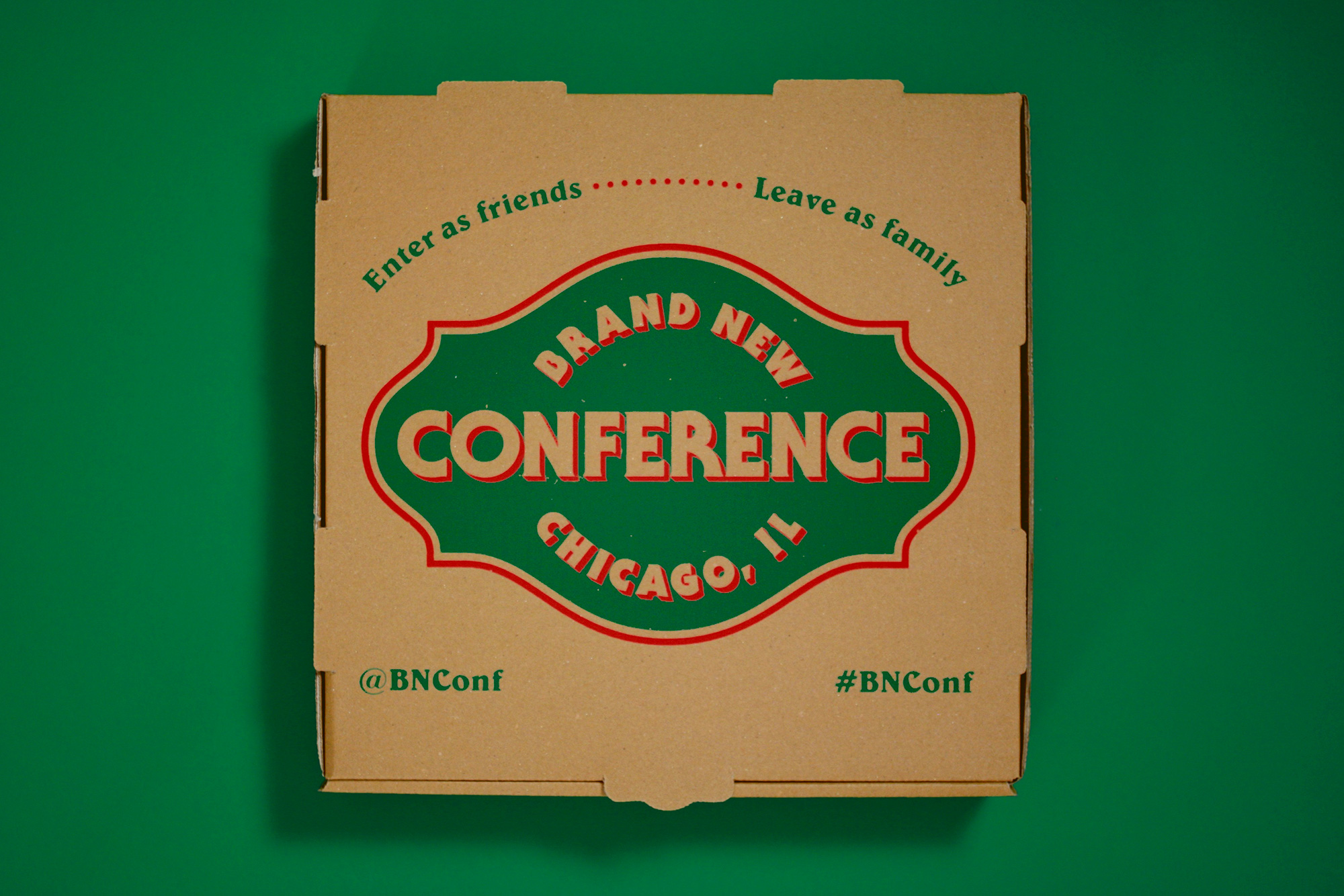
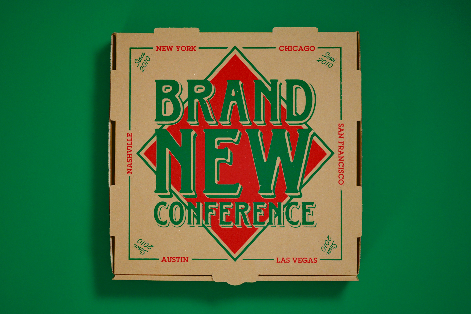
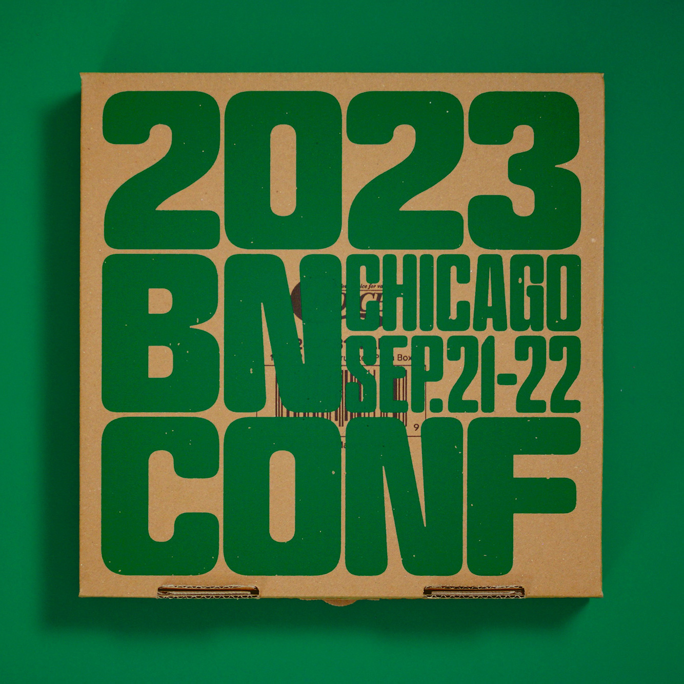
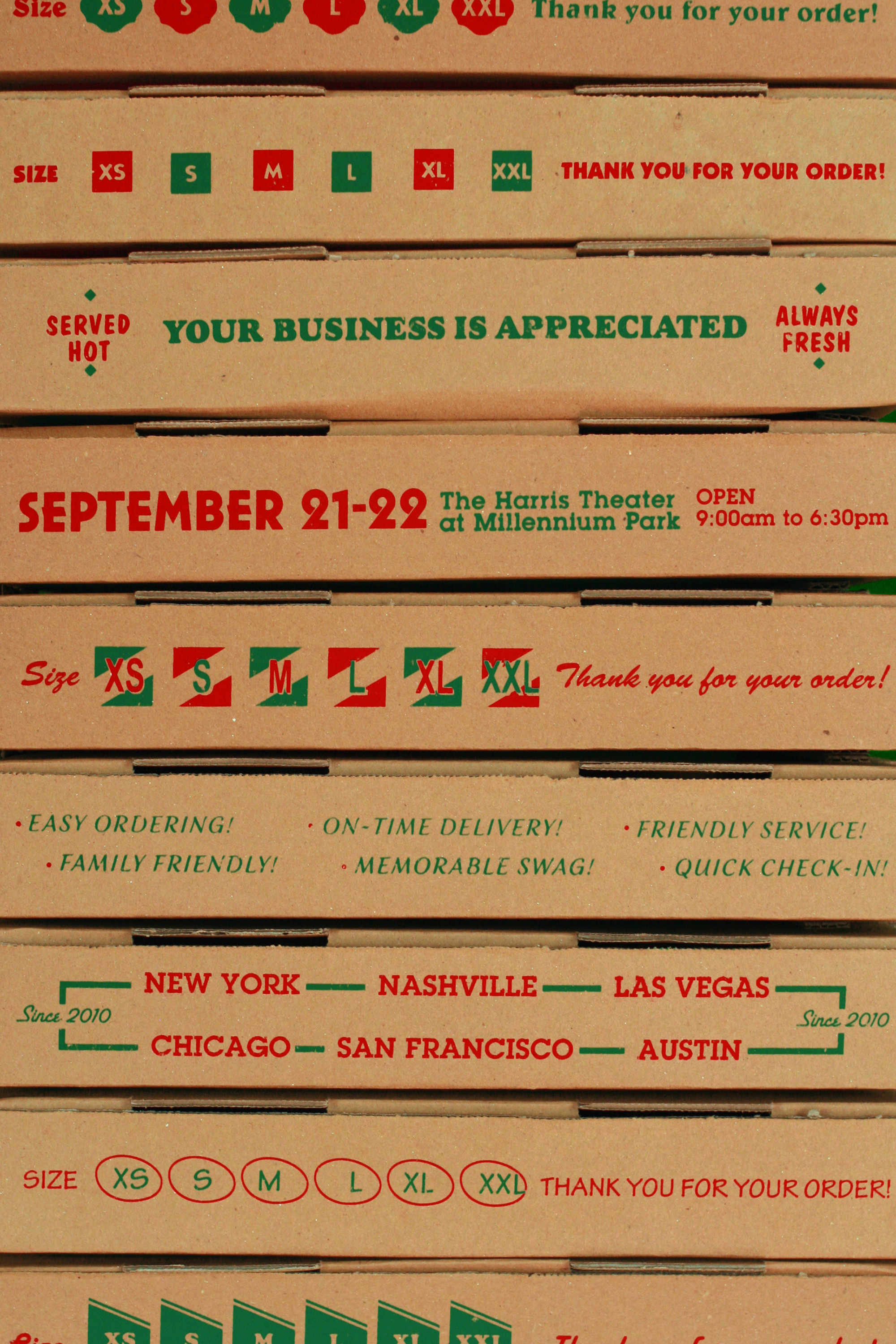
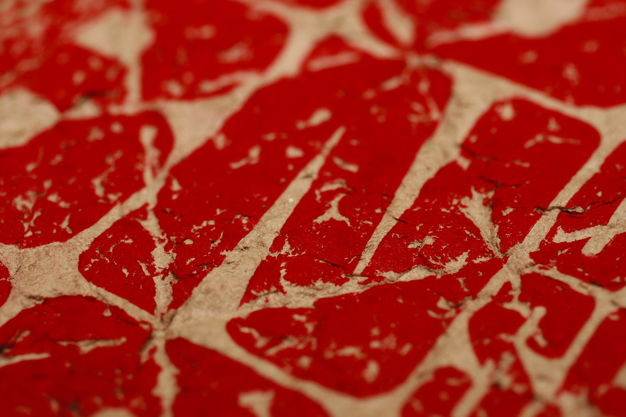
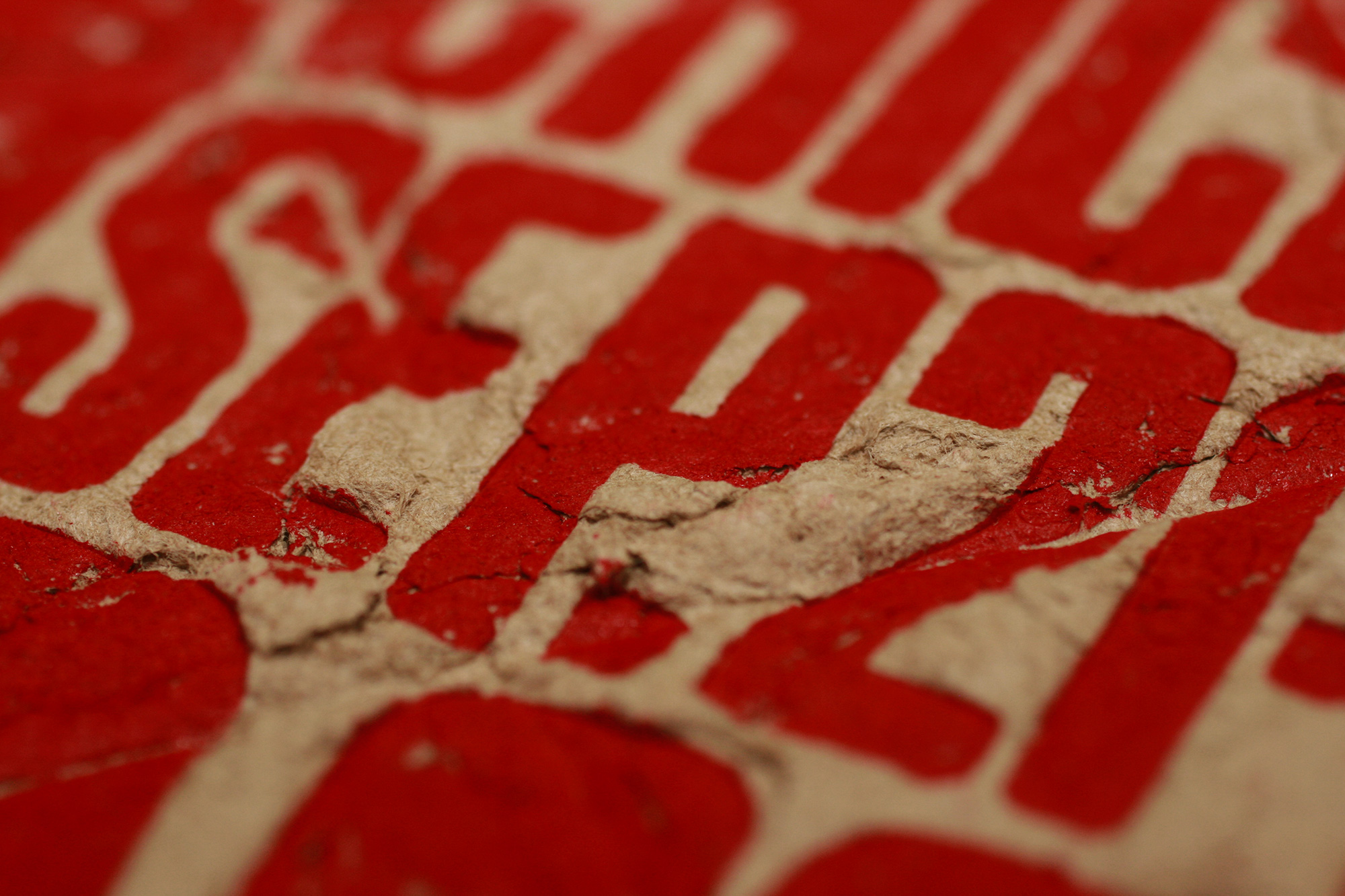
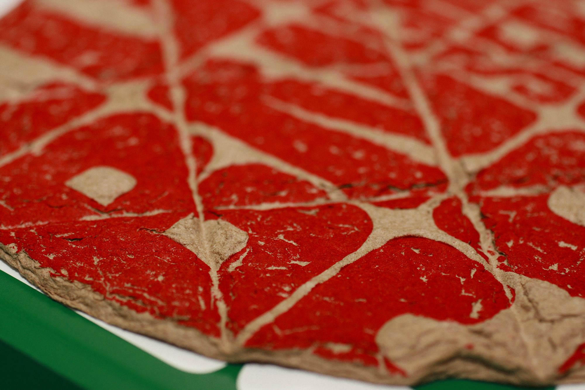
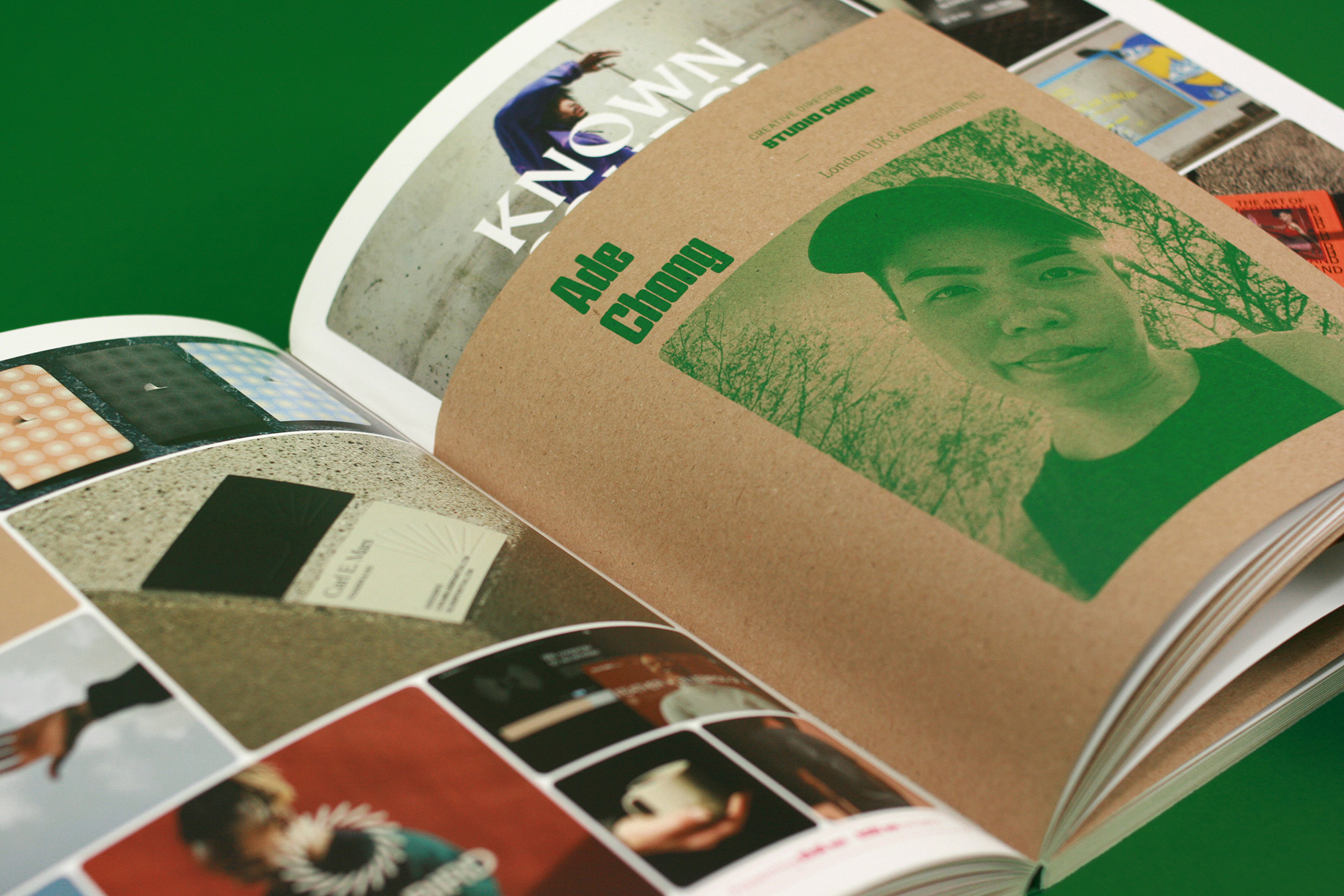
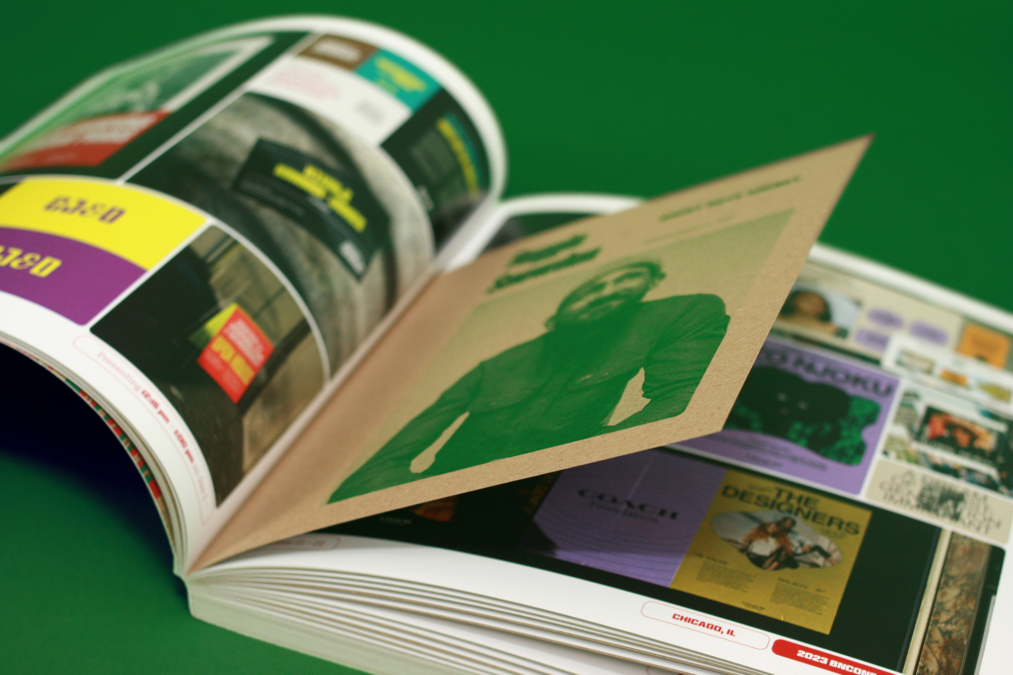
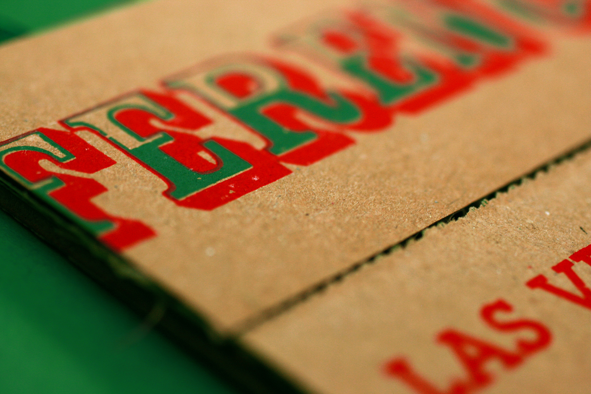
There is a fairly in-depth write-up about the genesis of the pizza concept on the conference’s website but I’ll summarize that below to get the case study started: In our field research that took us to all far corners of Chicago what we found were dozens of unassuming, unglamorous pizza joints, most of them with exterior signs of what we might traditionally regard as “bad” design and in their unapologetic use of green, red, and white color palette — because Italy — what we would definitely label as clichéd.
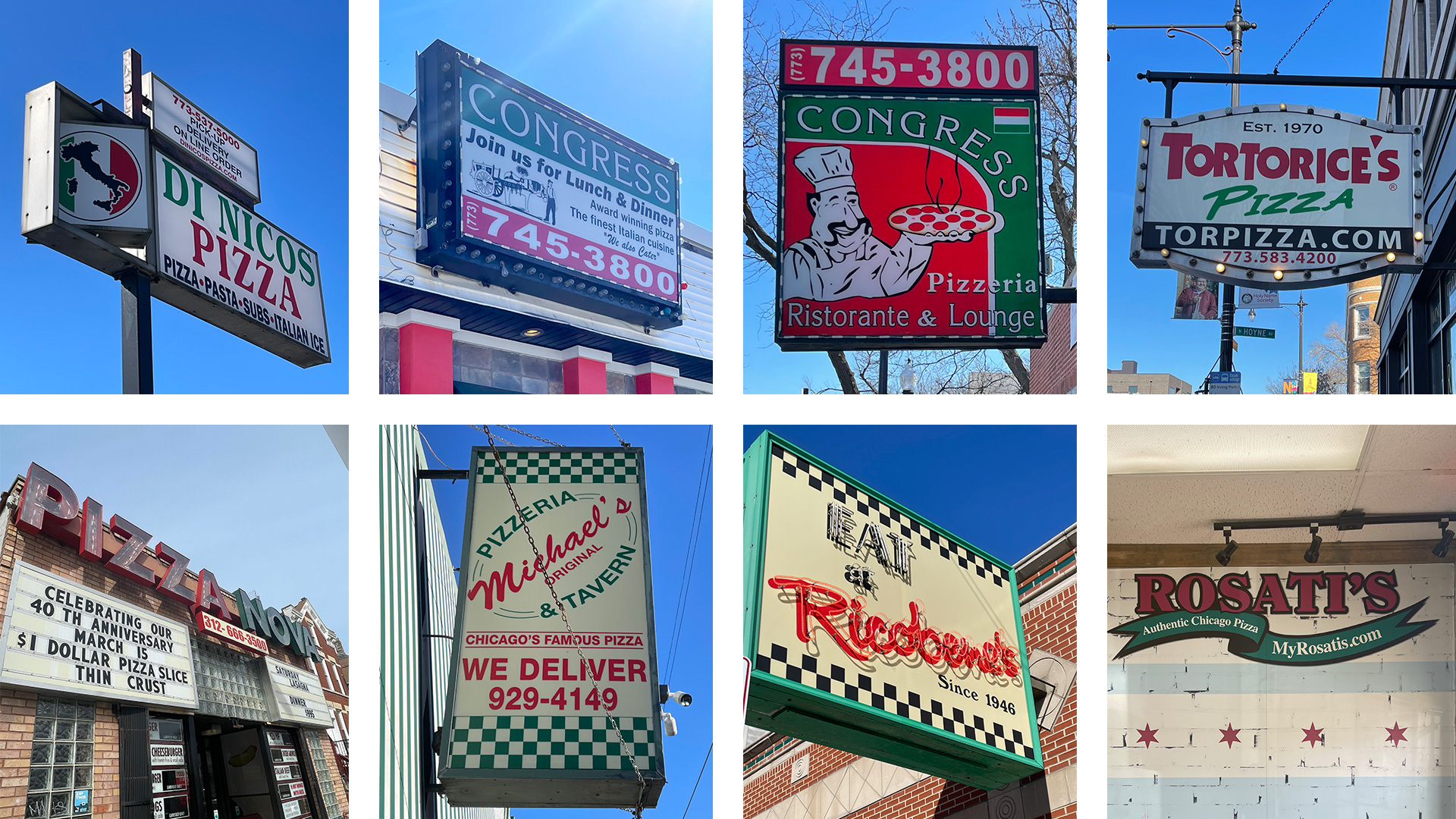
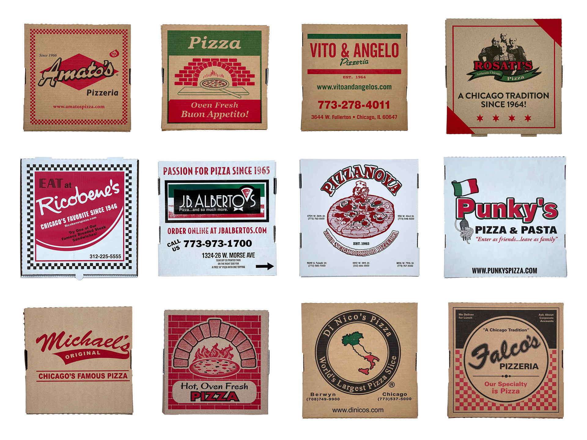
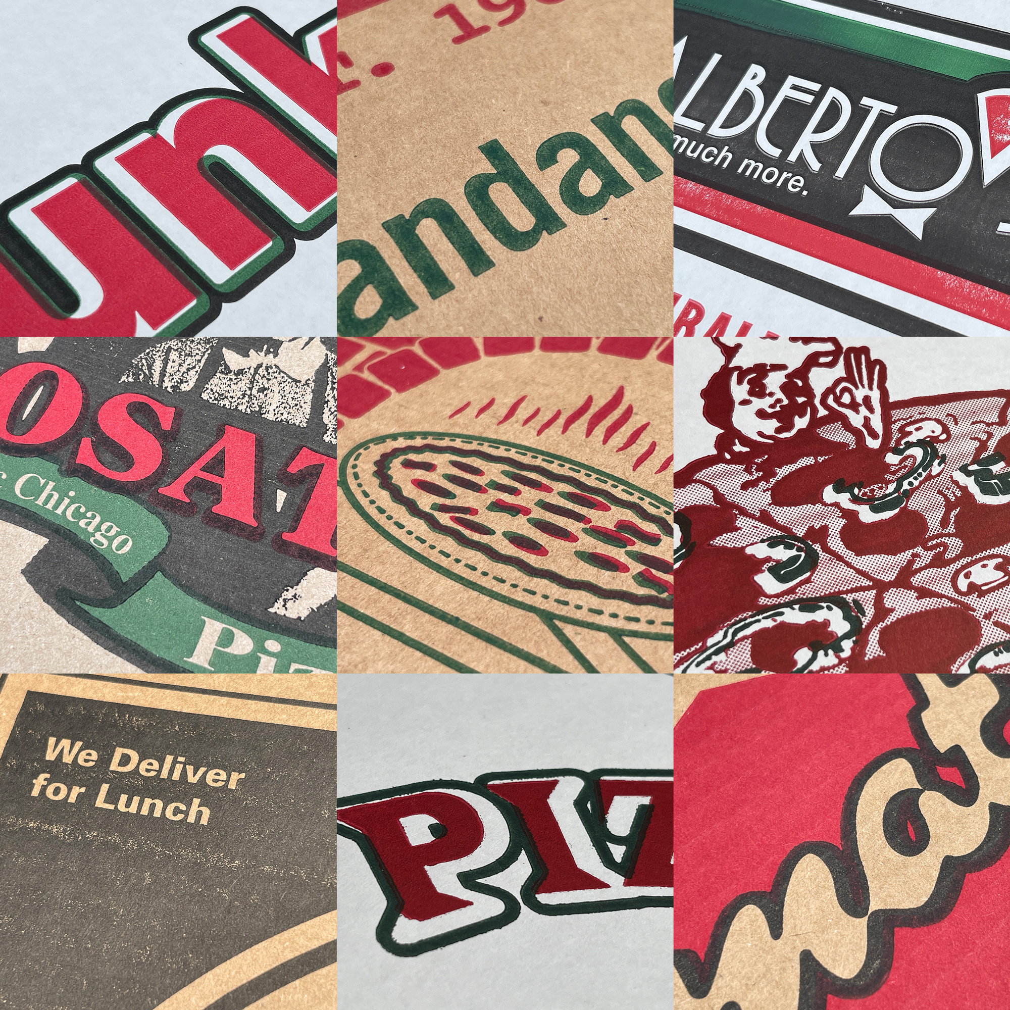
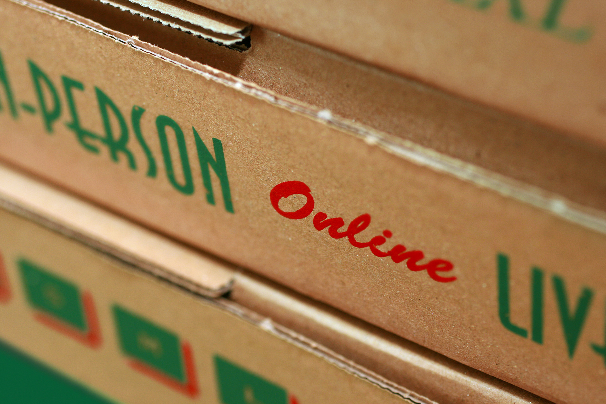
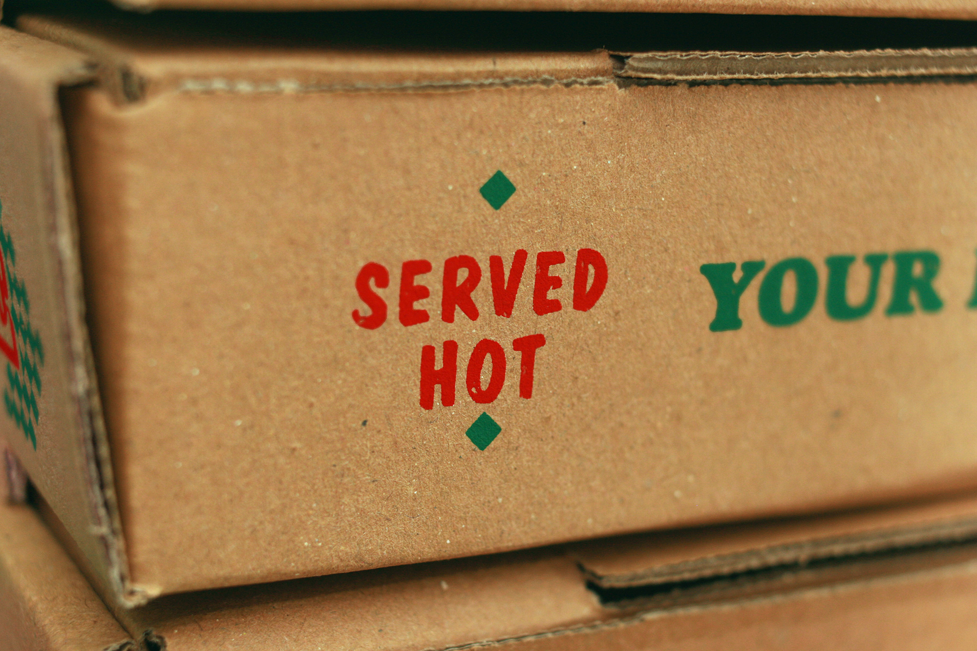
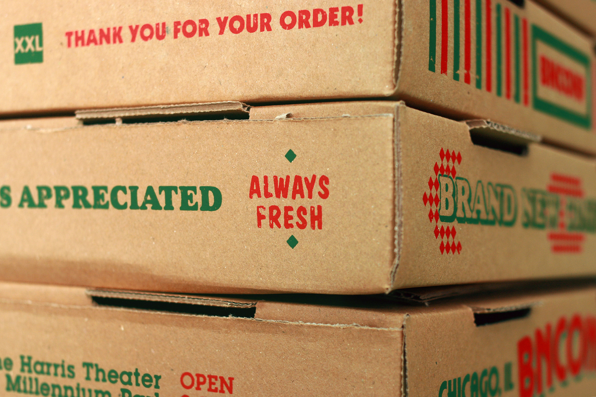
The other element that stood out as a potential building block for the identity was the venerable pizza box. Printed most often on natural corrugated Kraft paper, which isn’t the best conduit for fine printing, the pizza joint’s logo, graphics, and typography — none of which anyone would consider high-end or sophisticated in the traditional sense — are commonly printed off register on the boxes and the permeability of the Kraft paper means the ink often spreads more than it should, yielding a finished product that is far from premium. And that’s where we found our inspiration.
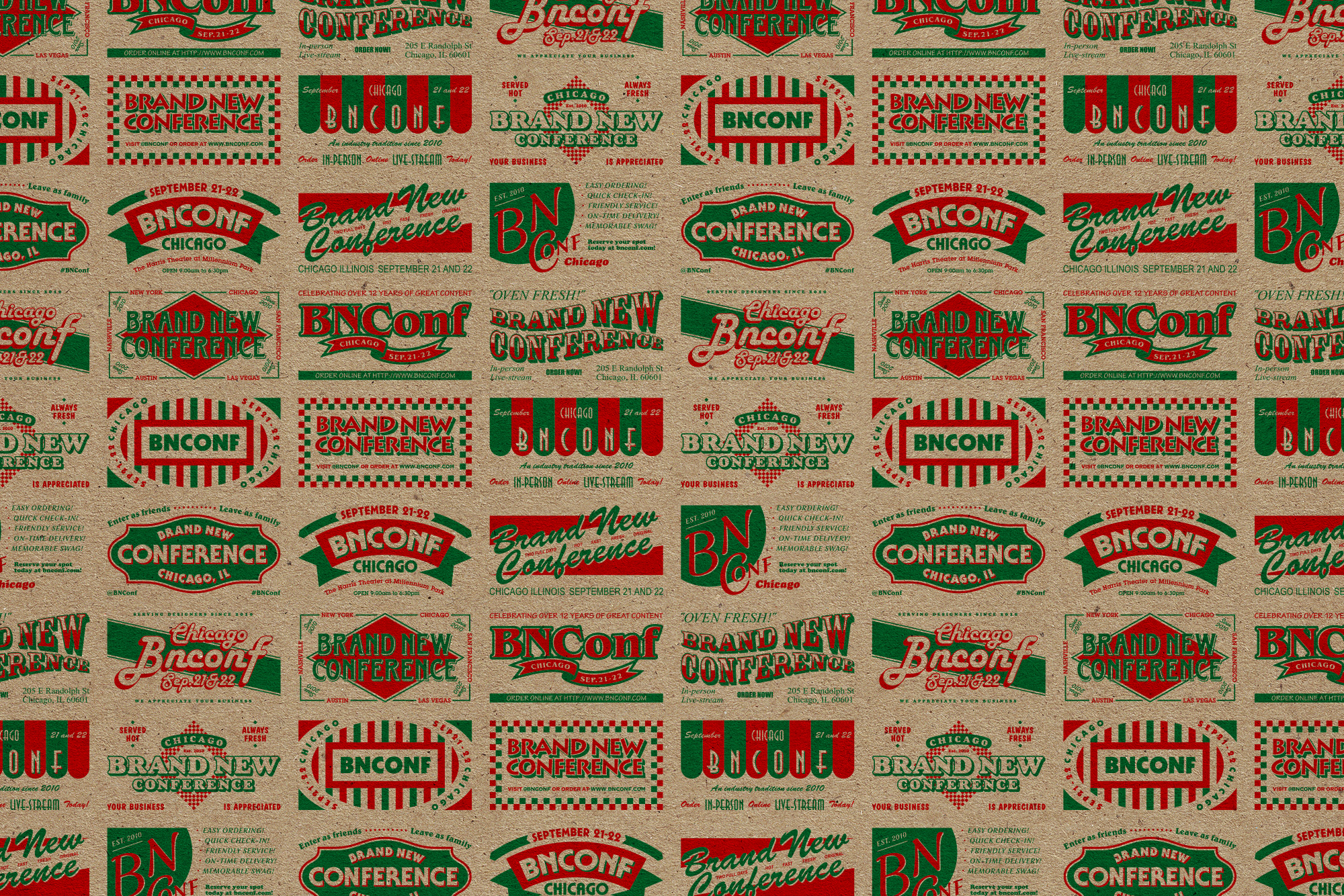
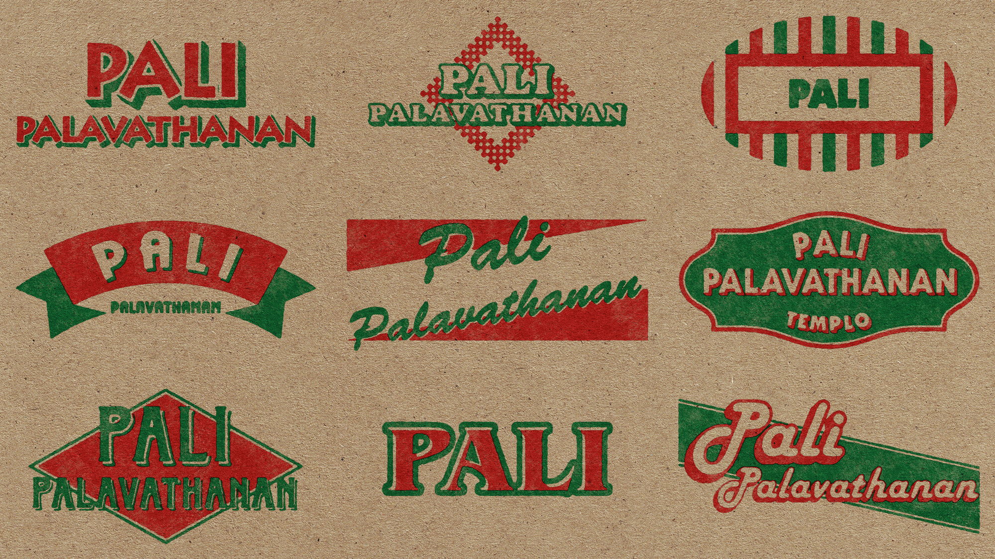
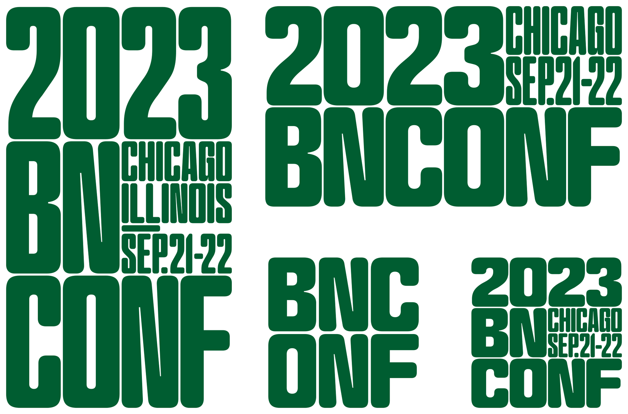
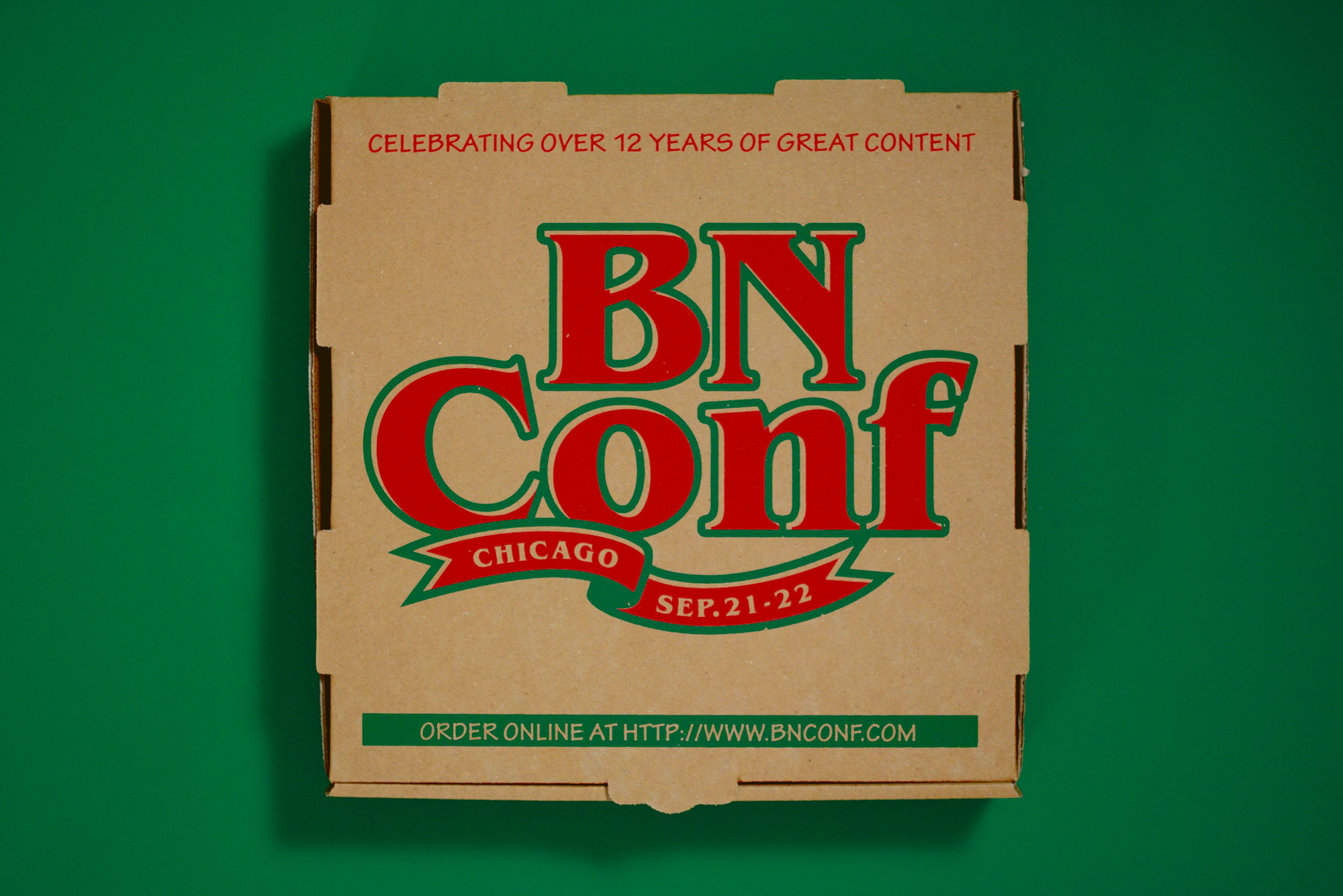
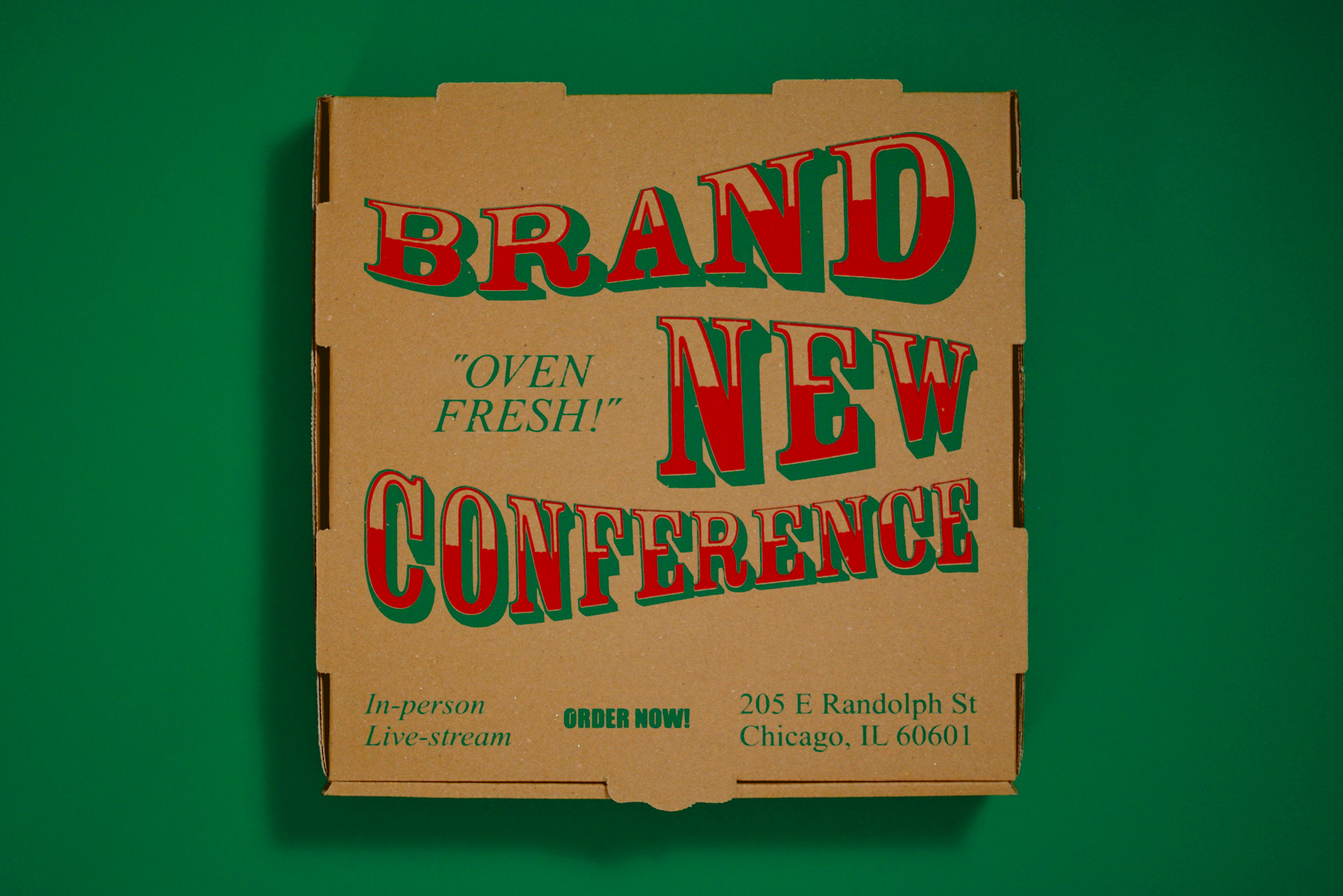
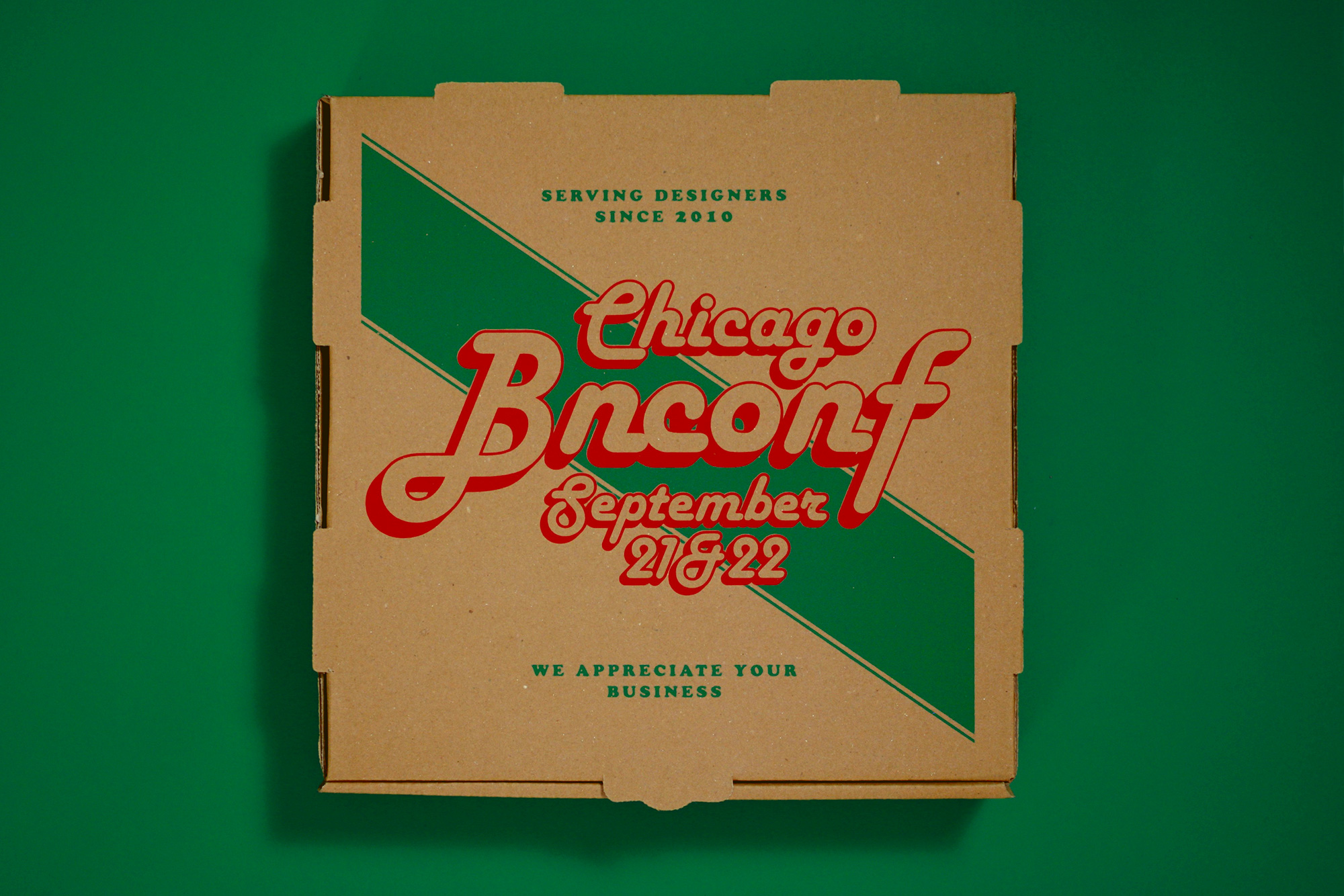
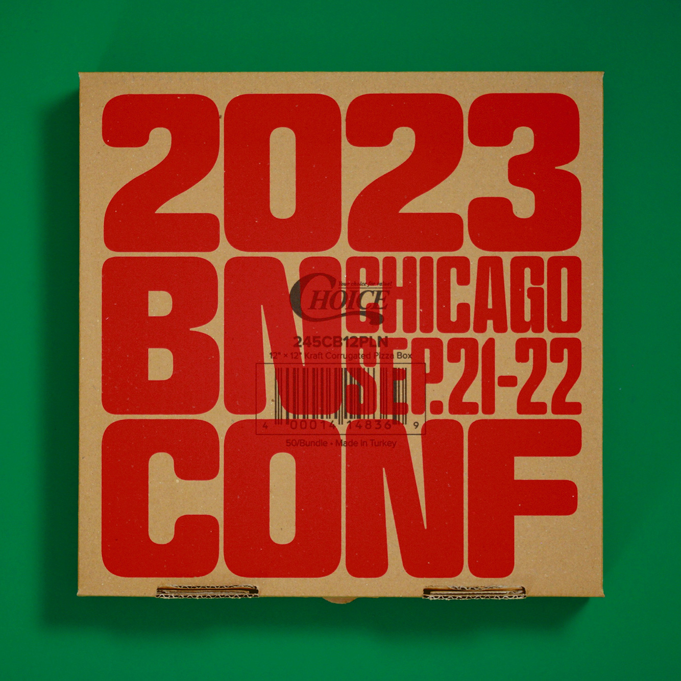
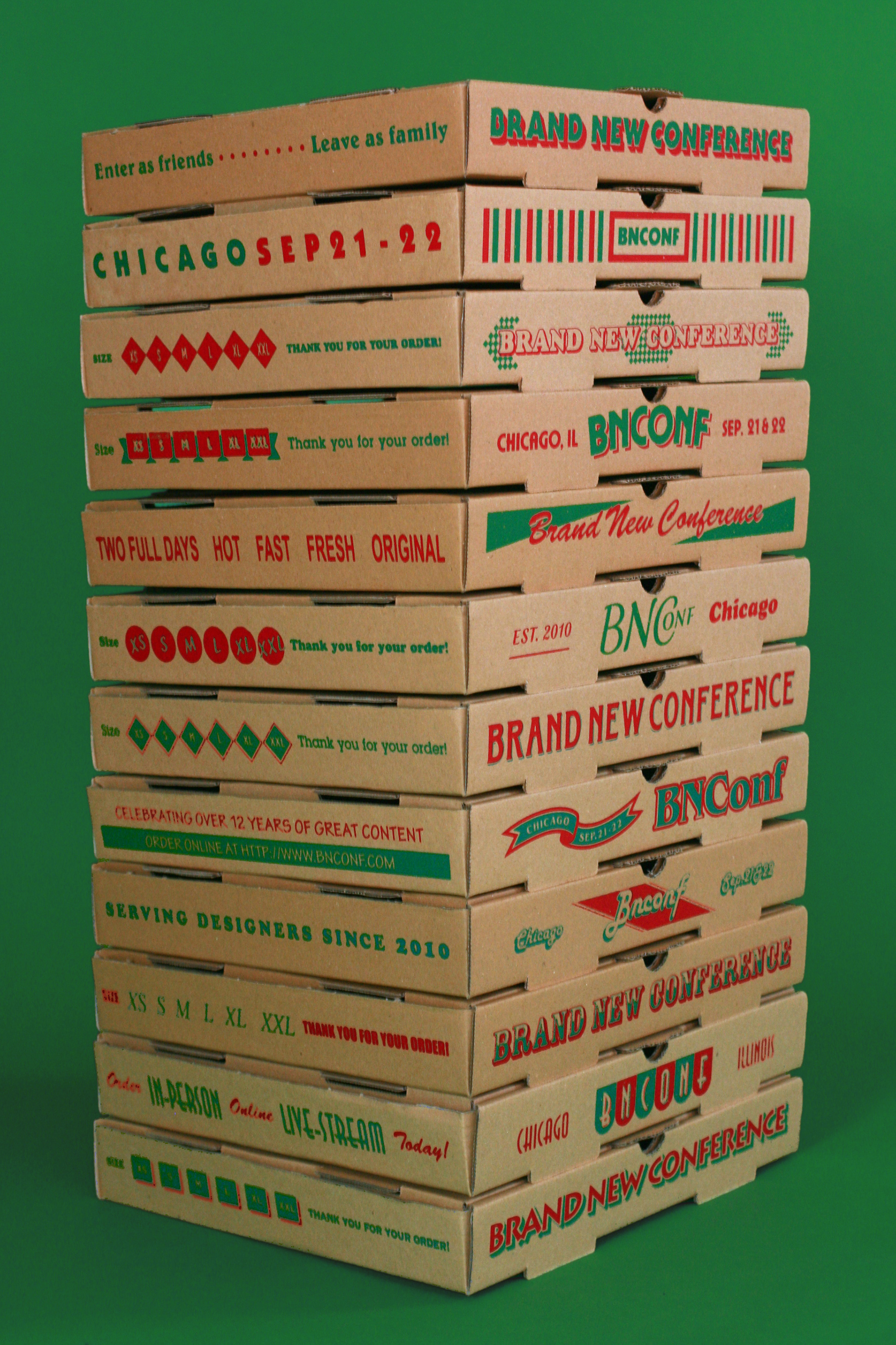
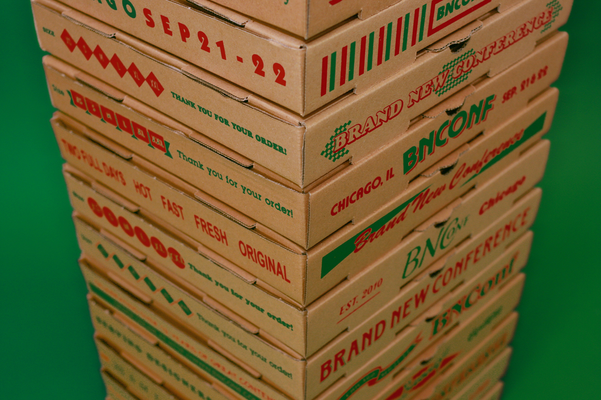
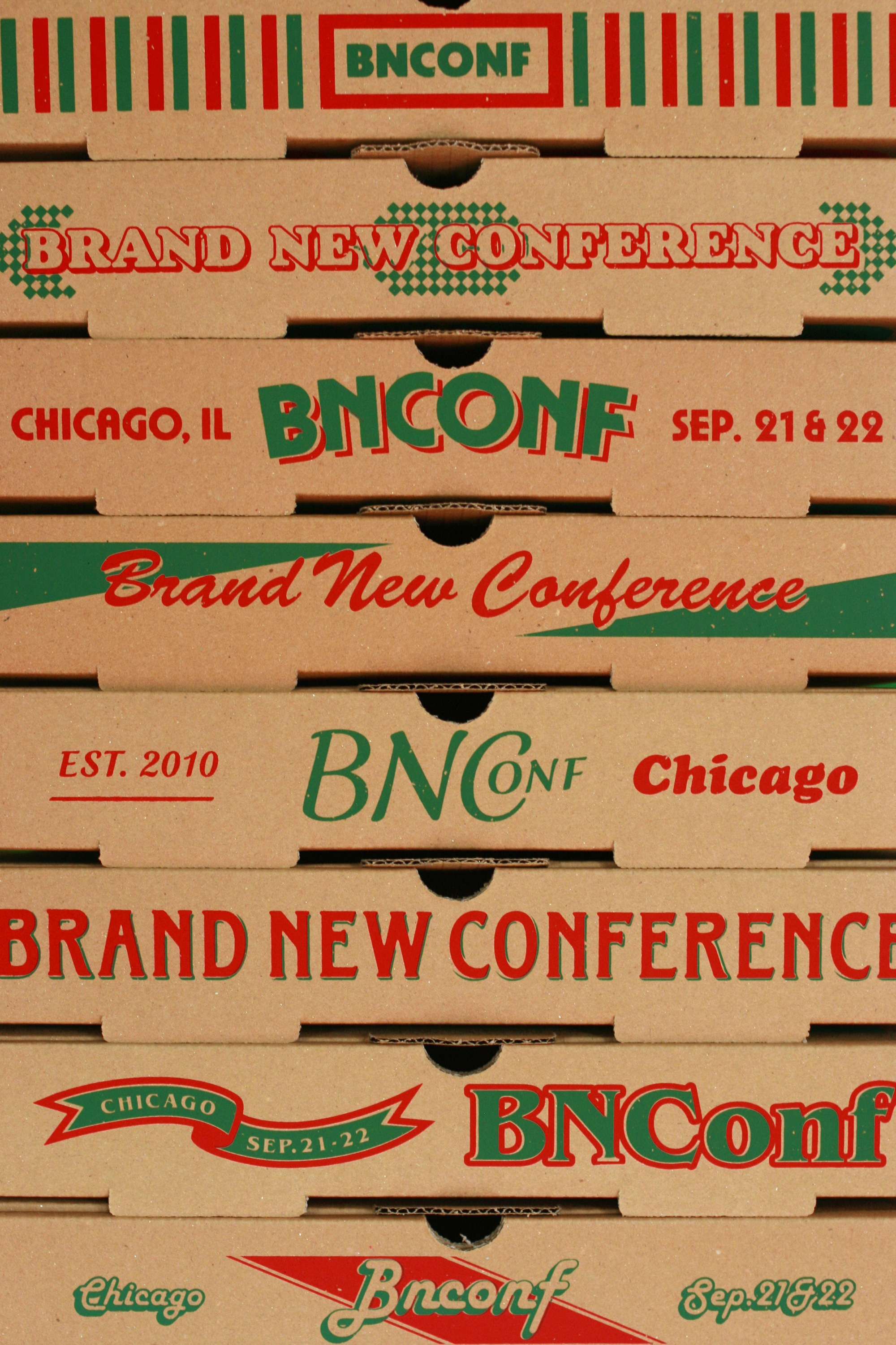
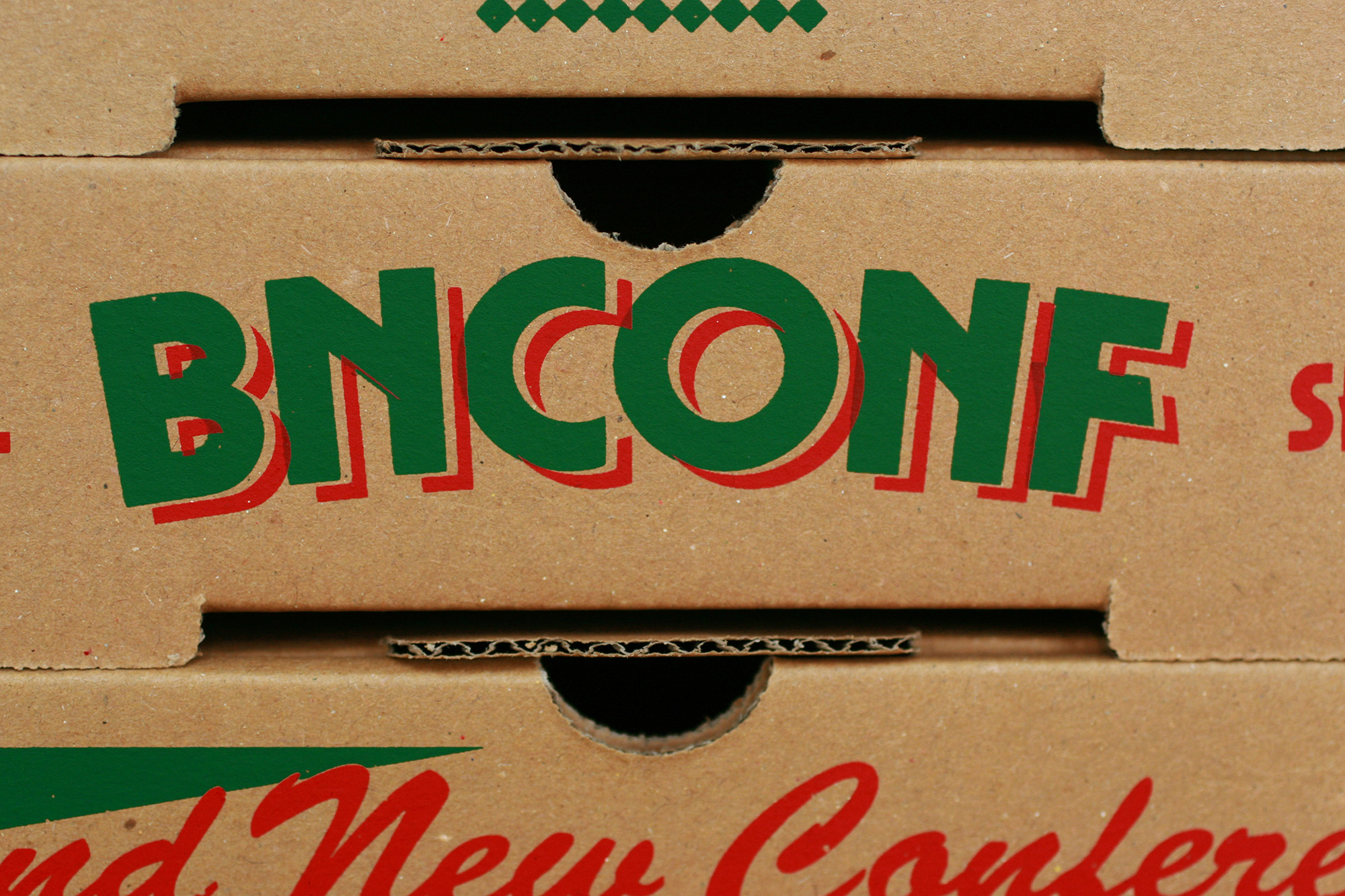
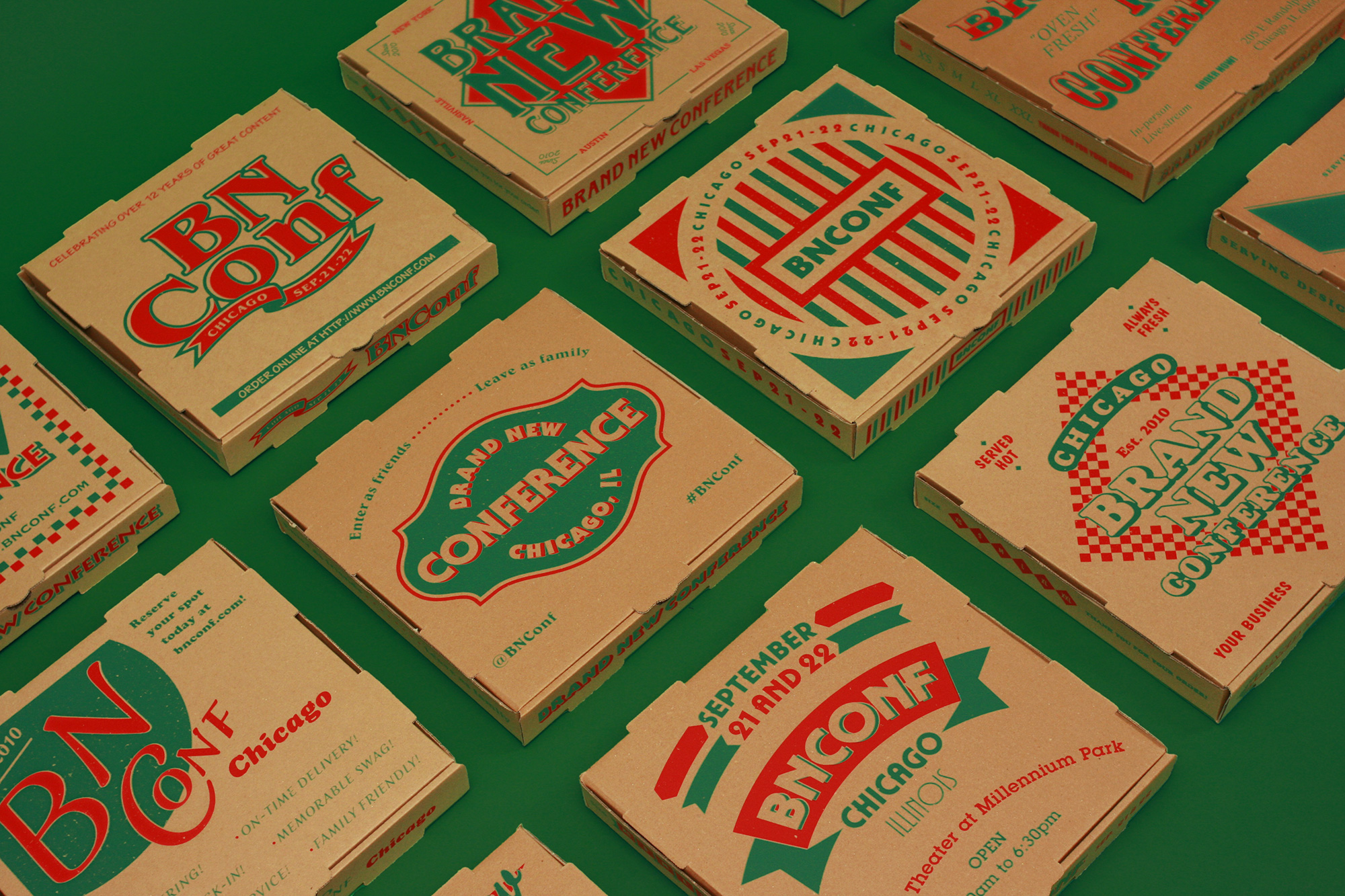
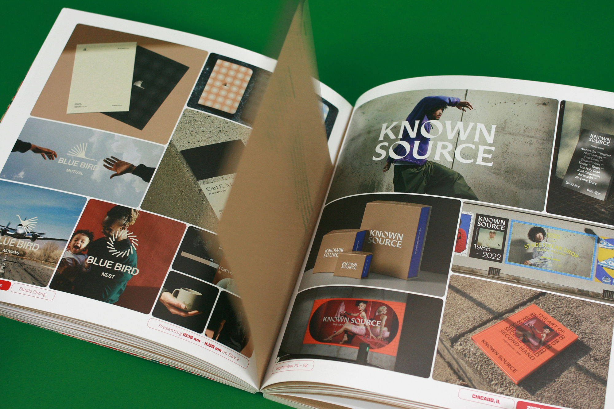
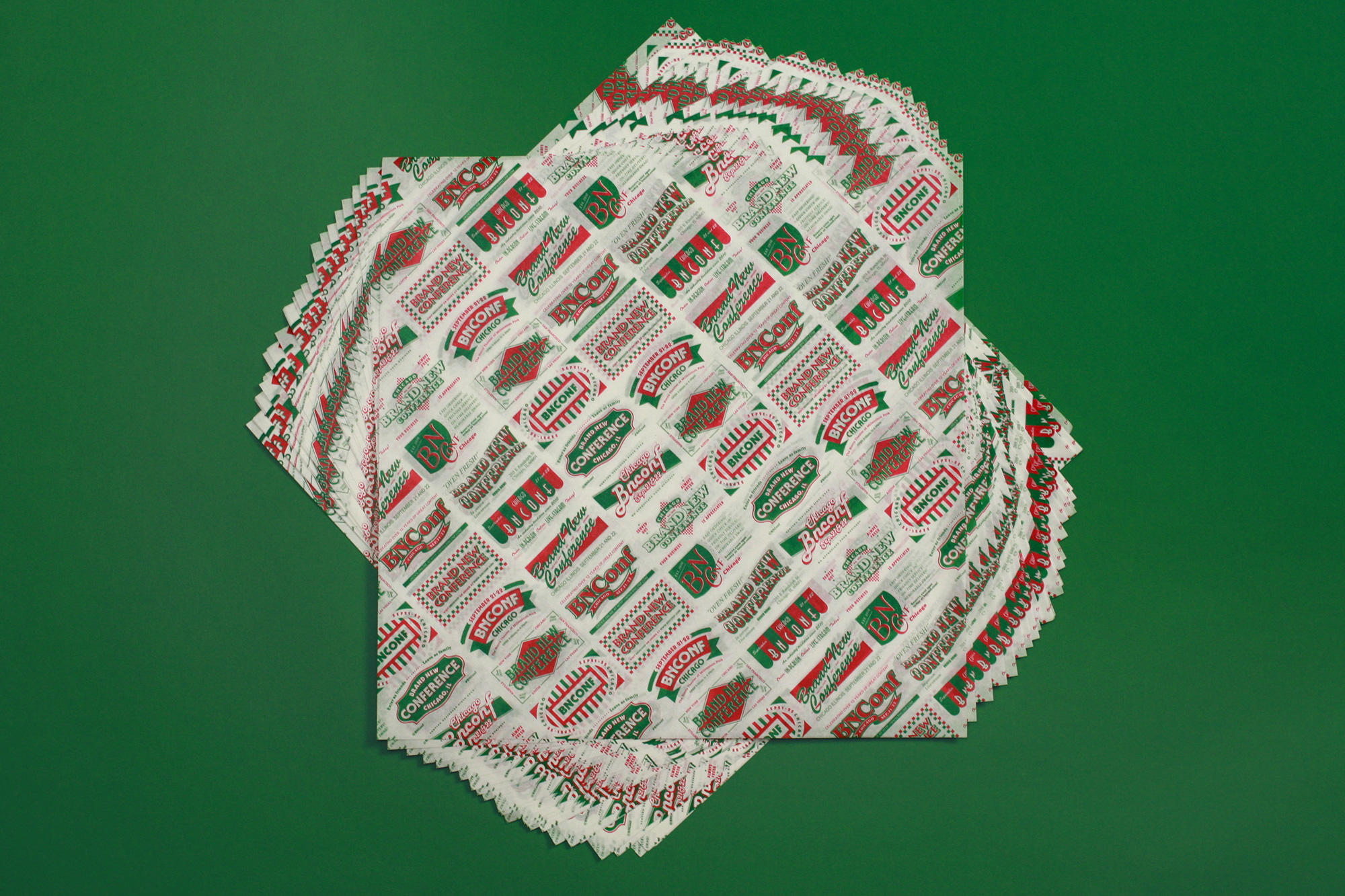
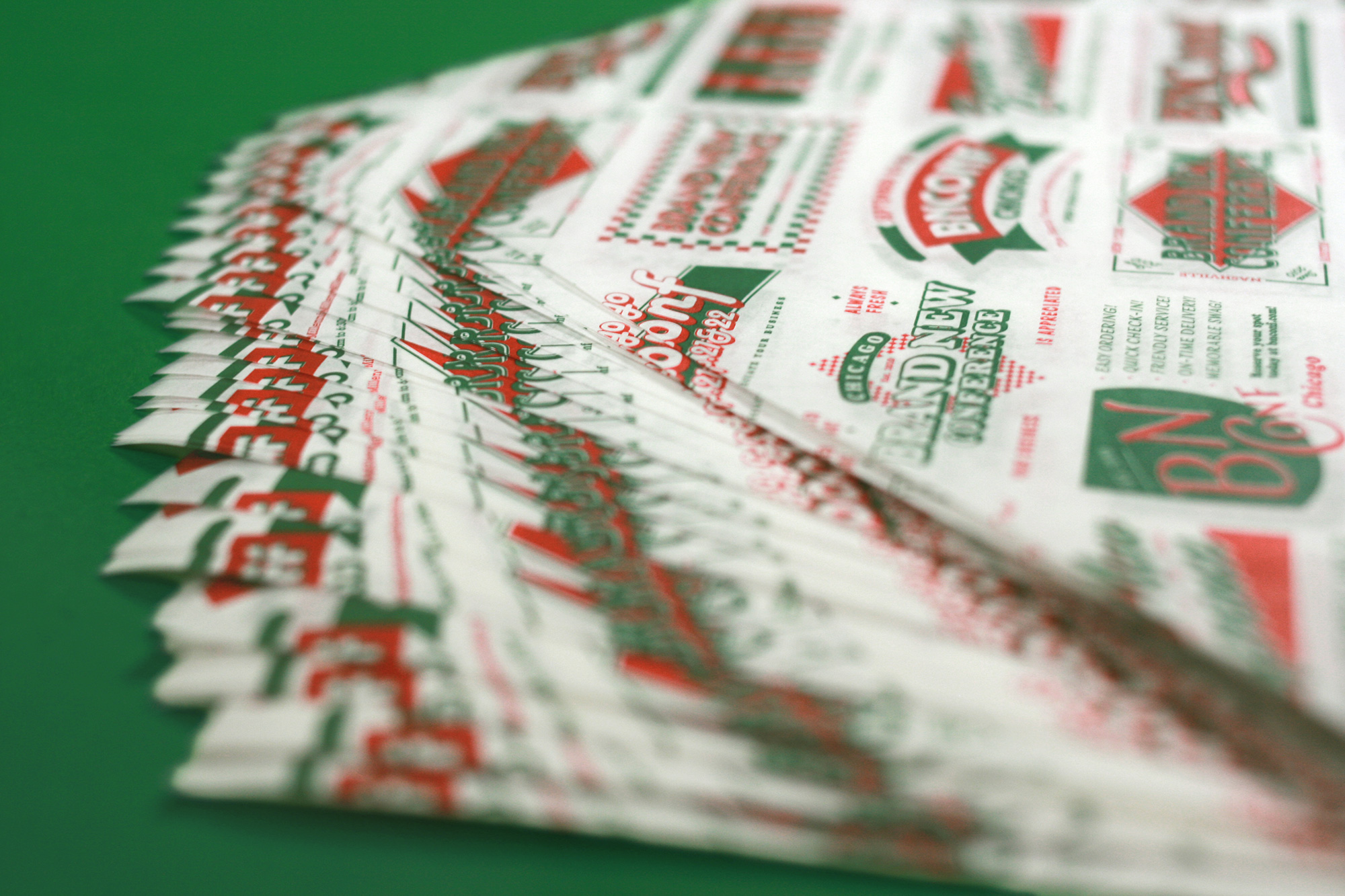
Fake BNConf Pizza Brands
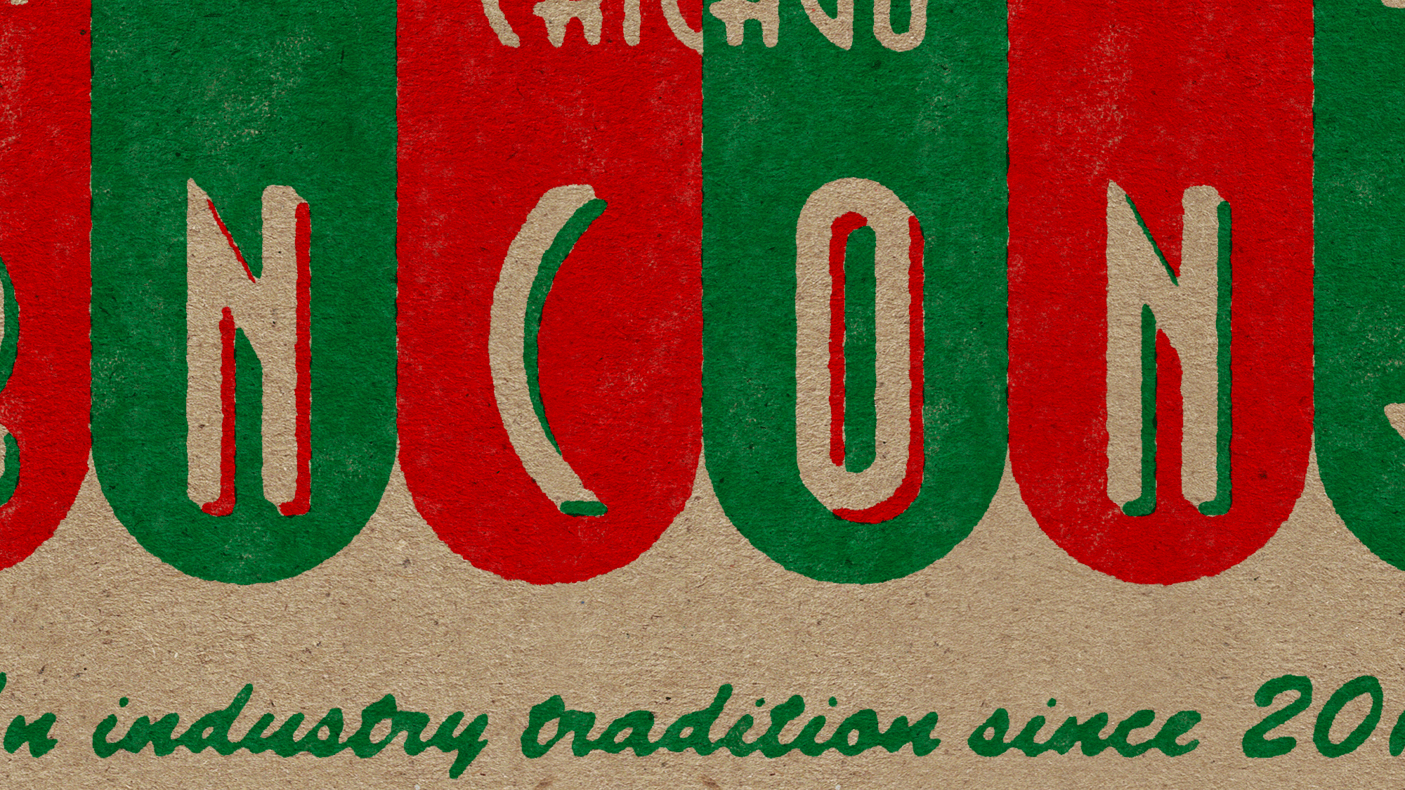
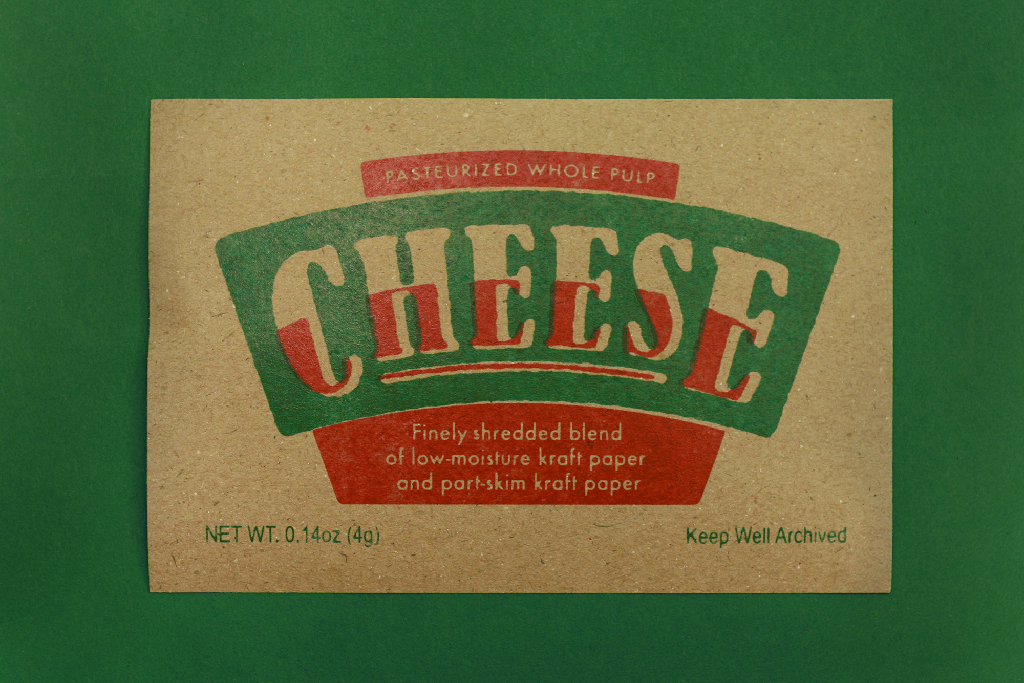
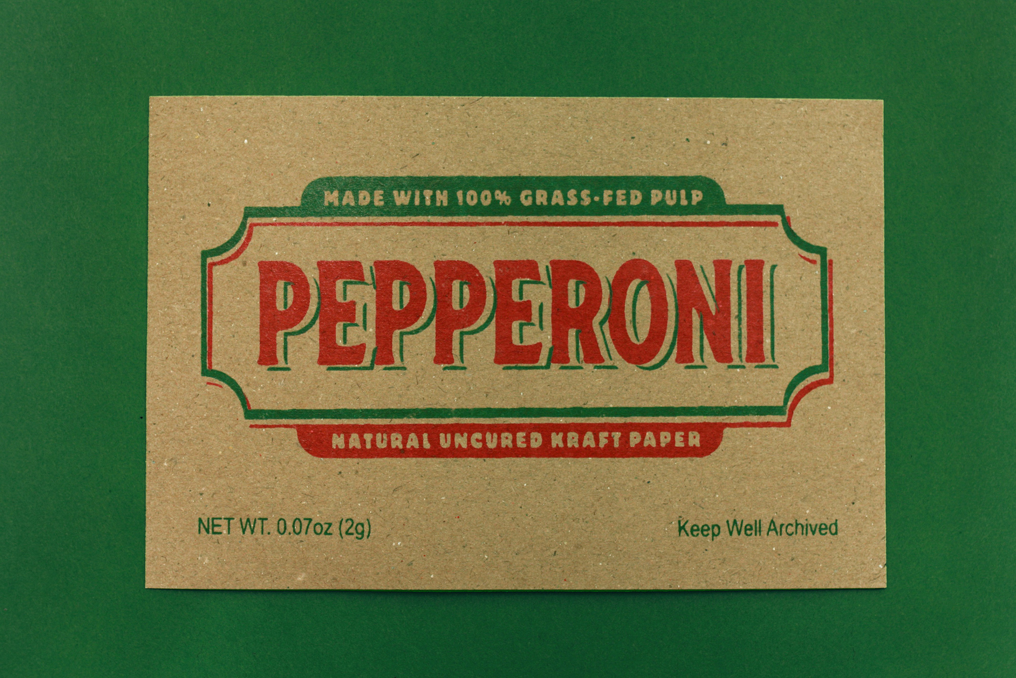
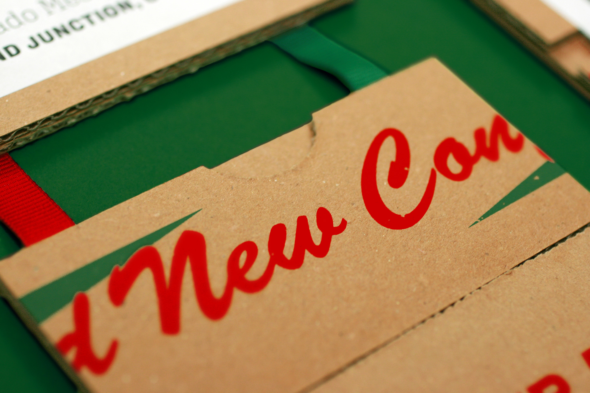
With the vernacular of small pizza joints defined as our go-to visual language we loaded all the fonts we usually avoid — Brush Script, Dom Casual, Lithos, Rosewood, Tekton, Algerian (like, Algerian!) — and started designing. No design is the same, only a couple of more than 20 typefaces are repeated, and they all vary in their quality of design. Some look as if they were designed without a budget or technical know-how by the owner using Microsoft Word and others are more purposely well designed as if the owner had hired a designer. Everything is only two colors (red and green) and the copywriting adapts the typical messaging on pizza boxes to promote the family values of BNConf. For the sake of variety, 6 of the 12 brands use the full “Brand New Conference” name and 6 use the “BNConf” shorthand. At this point we also set the rule that any time these appeared they had to be on top of a kraft paper texture… they would never exist on white. To translate the imperfectness of pizza box printing to digital applications we did some subtle Photoshop work to make the type look as if its ink was seeping into the kraft paper and all of their edges were made wobbly because printing on kraft never yields crisp printing. For both fun and a 1940s nostalgic patina we added a jittery, low-frame rate texture animation to each of the designs that later informed a lot of the motion work.
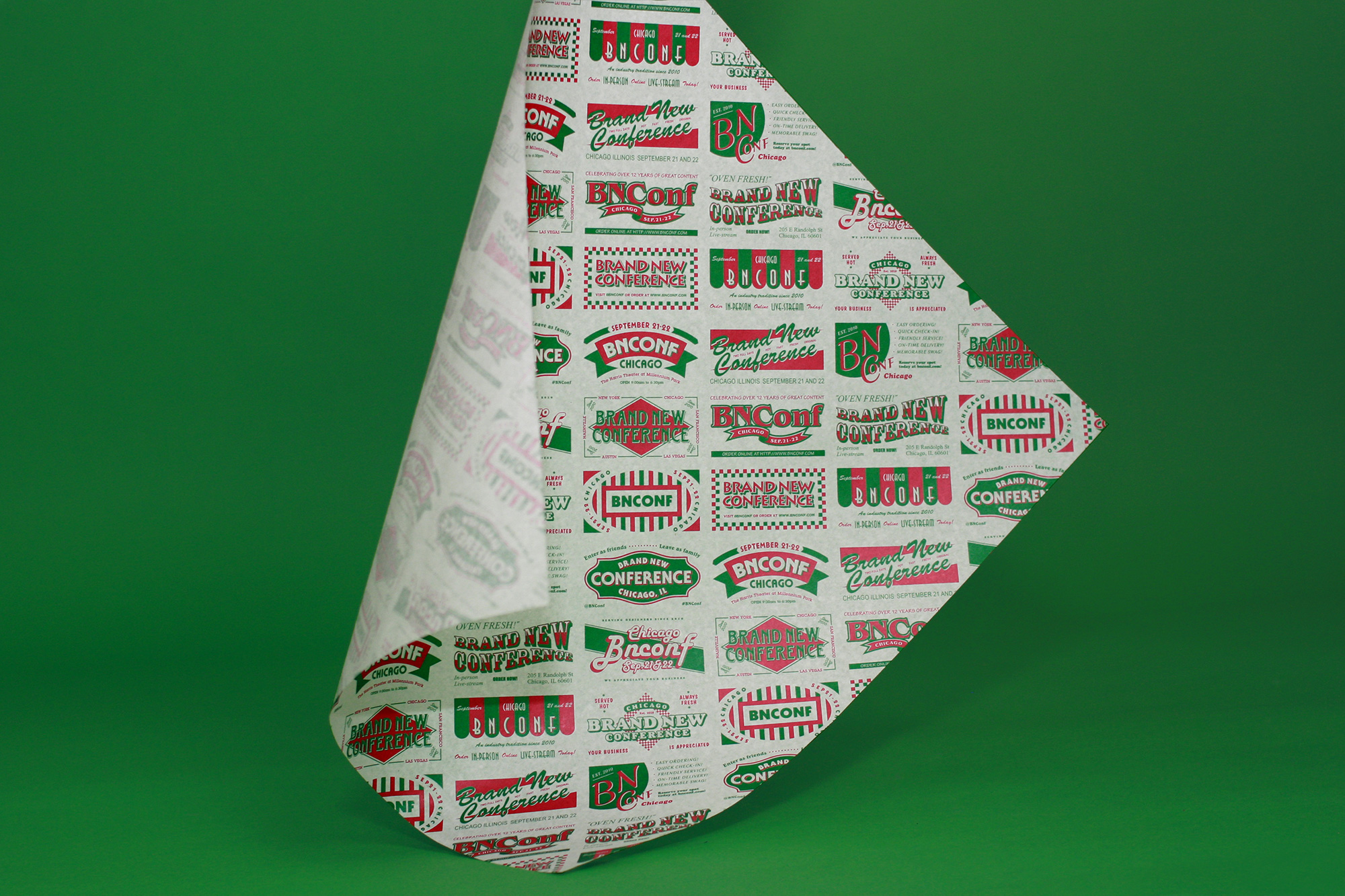
And, yes, of course we turned all of these into a pattern because they align so neatly and the resulting texture from all the typefaces and shapes is pretty groovy.
Because our in-house animation skills are limited to GIFs and we wanted to take those naive-like designs and lo-fi textures into overdrive as a way to infuse some unexpected personality and energy into the identity and to highlight and exaggerate the over-printing effect we went back to GEO — who did last year’s conference lettering — to bring these designs to life and, as usual, he delivered!
And, also, yes, of course we animated the pattern too and it’s bananas.
Speaker Pizza Brands
The last drop we squeezed out of the fake pizza brands is that we generated the names of the speakers in 9 out of the 12 designs — 3 of them were very time consuming to customize — which were later used in the introduction animations (that will be shown further down in the case study.
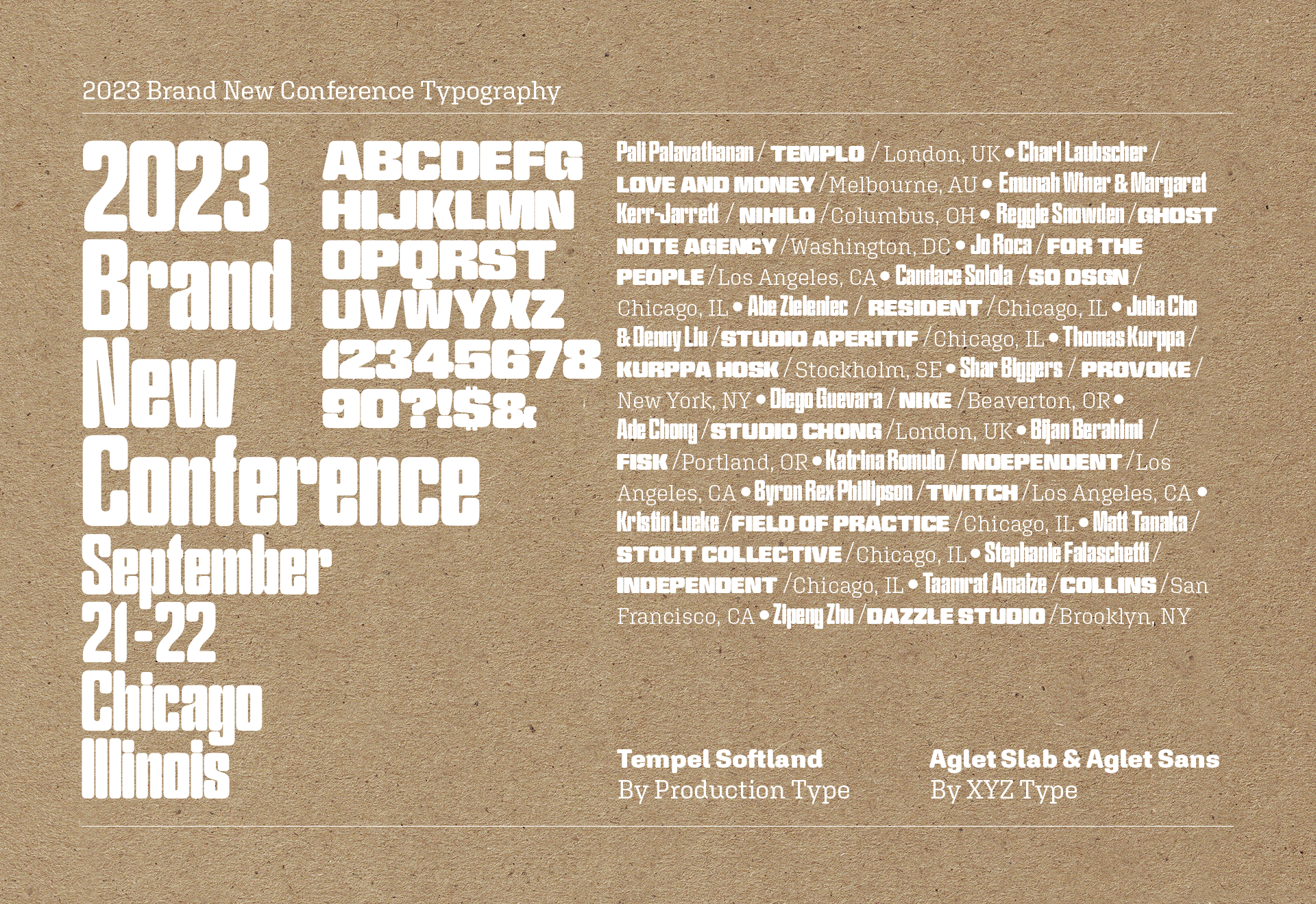
Typography
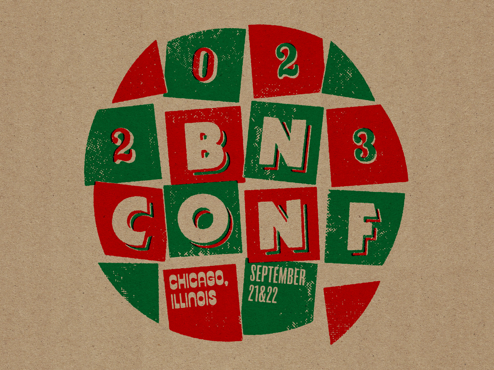
As a second layer to the identity that lives (sometimes literally) on top of all of the fake BNConf pizza brands and their kooky collection of typefaces is a more “neutral” typeface that ties everything together: Tempel Softland by Production Type. Aside from being a super cool-looking typeface on its own, it instantly made us think of one of Chicago’s nicknames: The “City of Broad Shoulders” because, well, look at it. We worked with Production Type to create a custom version that included both narrower and wider widths and more weight variations, resulting in a lovely variable font. As supporting typefaces we selected Aglet Slab and Aglet Sans from our newest sponsor, XYZ Type, which have a very charming and idiosyncratic construction that felt unique and fresh and their rounded corners matched those of Tempel Softland quite well.
Identity Elements
Given the recent popularity of the Bento Box identity elements presentation, we couldn’t resist from creating one. (Side note: as a non-motion designer, this was surprisingly hard to put together!)
Website and Social Media
With the website we were able to establish the type hierarchy and it helped us figure out some rules about color and asset use. For example: none of the typography or graphic bits from the fake pizza brands could ever be used for any of the actual communication or typography of the website or program — instead, the fake pizza brands would only exist as this sub-layer of visual stuff that we couldn’t pull from. Once you start using the red-and-white tablecloth checkerboard pattern anywhere it’s game over for any kind of sophisticated design system. One thing we decided last year was that moving forward from 2022 until further notice, the bones of the website would remain the same and we would just re-skin it to adapt to each year’s design instead of re-inventing (and re-coding) the website from scratch every year so if you look at the 2022 website you can see the same layout with some necessary adjustments.
For social media we actually didn’t do as many posts or stories as last year… it wasn’t a premeditated decision it just happened that way. Not a whole lot to say about it other than showing some slightly different layouts and combination of assets than we used elsewhere.
Opening Titles and Speaker Intros
With a winning formula last year that brought together GEO’s animation prowess with Norbert Herber’s insane ability to create something rhythmic out of the gibberish of our sound art direction, we decided to do it the exact same way this year. Spoiler, it will 99% sure be the same approach next year. For 2023, the music is a combination of two iconic sounds from Chicago: 1940s and ’50s Blues because that’s the era when tavern pizza was introduced and 1980s House because why not? We also ended up with some Waltz in there because at the beginning Norbert was playing with tarantella to allude to the cheesy Italian look of many pizza joints. There is some vintage radio/phonograph static thrown in there as an aural representation of the jittery, lo-fi paper effect we have going and, lastly, Norbert threw in a great reference to a newer Chicago classic (at the :29 mark in the video below).
Once the music was ready, we handed it off to GEO to do his thing and his thing he did, matching the beats perfectly with the various animation elements he had already built for the website and social media content while adding new elements like the speaker headshots, speaker pizza brands, and the Tempel Softland BNConf logos. The animation ends with a 1-minute loop of the fake pizza brands arranged in a thick frame as that allowed us to place some typography in there to kick of the show.
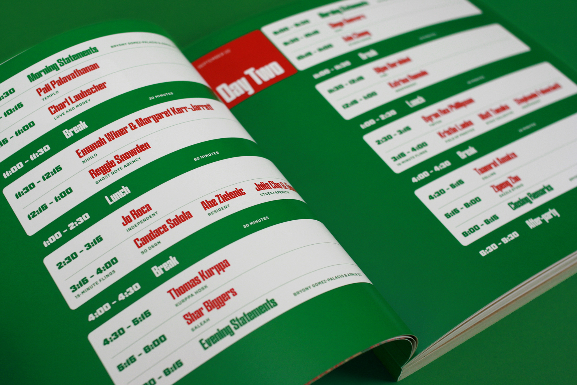
For the speaker intros, Norbert created three different 10-second arrangements, with each one mixing the different music styles in different ways: Arrangement one mixed House and Blues, arrangement two mixed Waltz and House, and arrangement three mixed Blues and Waltz. To match the different arrangements, GEO created three different motion templates that we then rotated amongst the 20 speaker intros.
Getting Knee-deep in Kraft
All of the above was the digital aspect of the identity which we wouldn’t say is “easy” but compared to the physical applications, well, they are easy. After our failed attempts at tufting and putting pepperoni, cheese, and tomato sauce in resin we did start to find our groove with the third failed attempt where we were using pieces of pizza boxes to create stuff. The texture and color of kraft paper is just too cool and, as a big bonus for us, it exists in a lot of different formats: single sheets, big rolls, thick boards, thin boards, shredded, and in dozens of bag and box shapes, so we decided to go all in on kraft and use it in as many places and as much as possible.
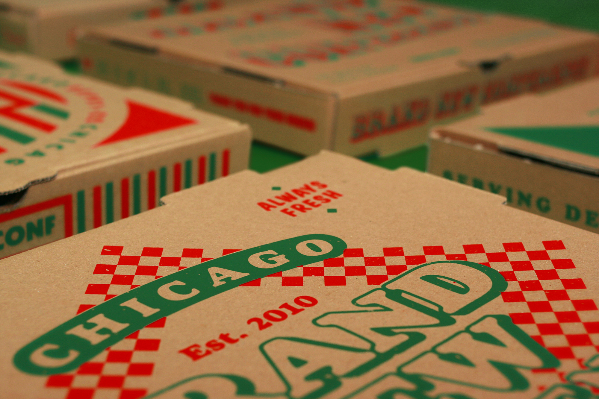
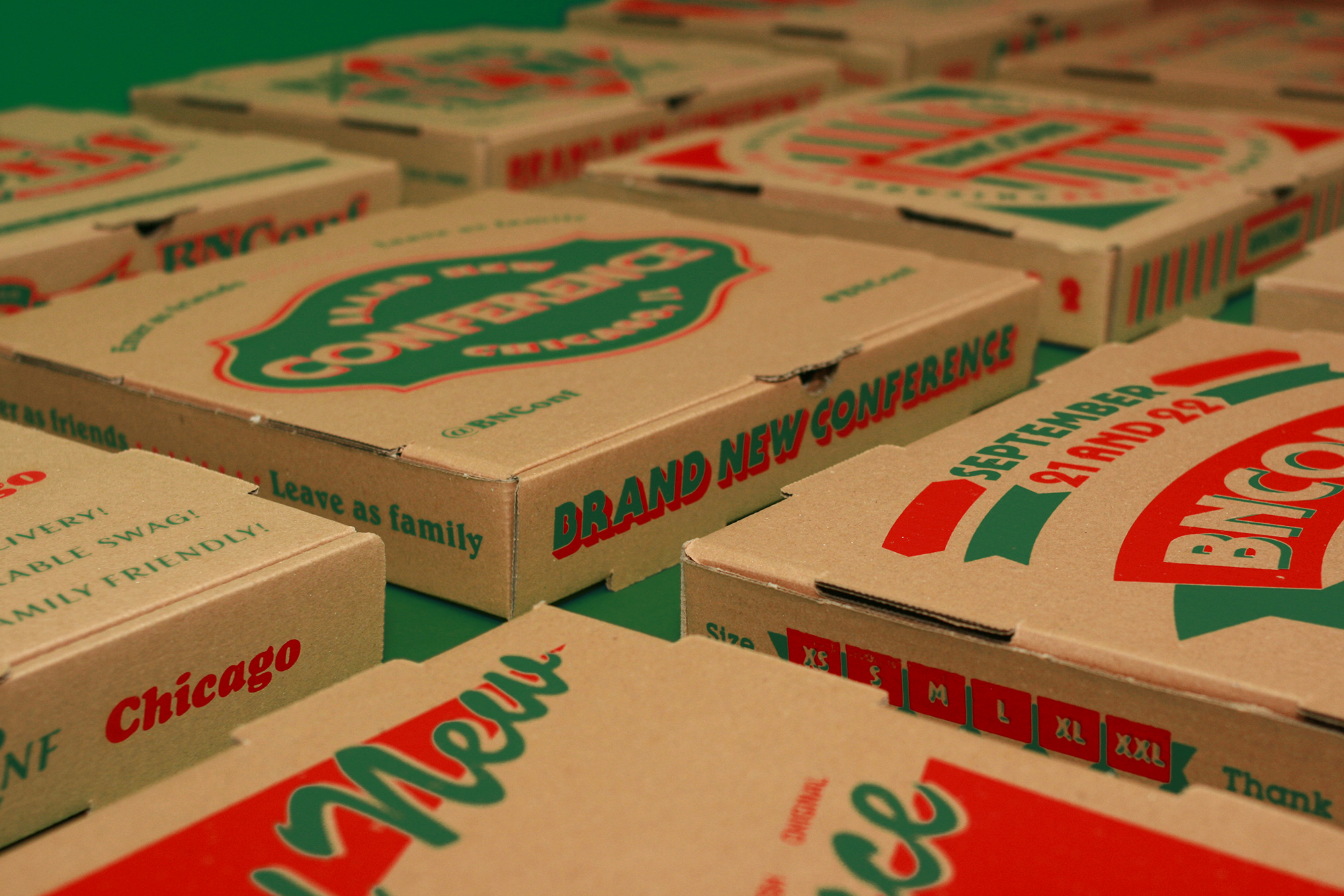
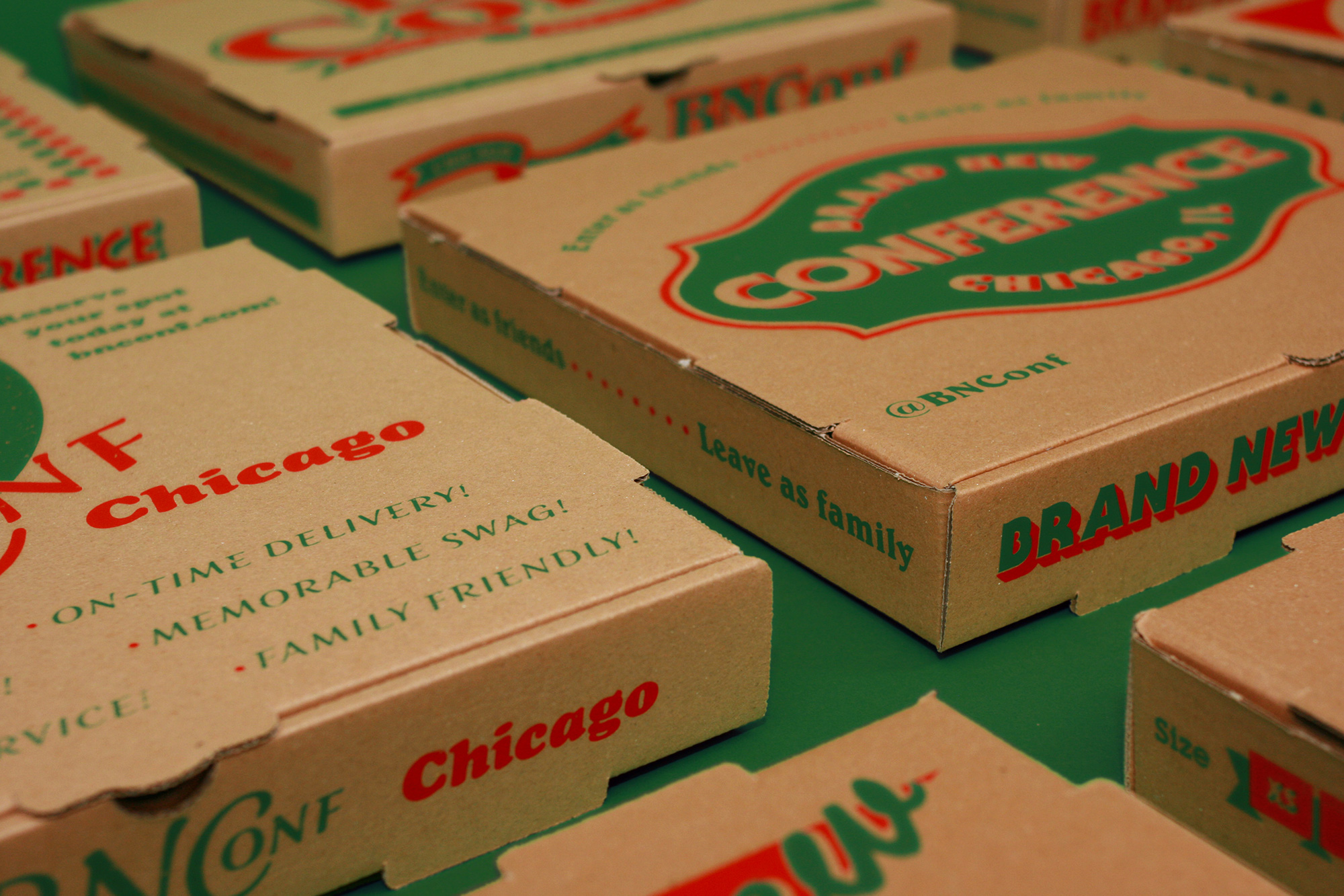
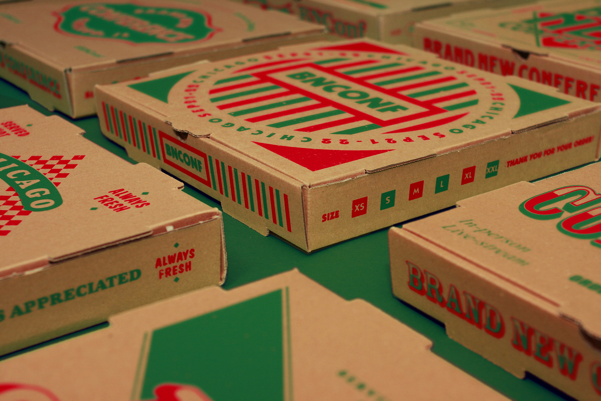
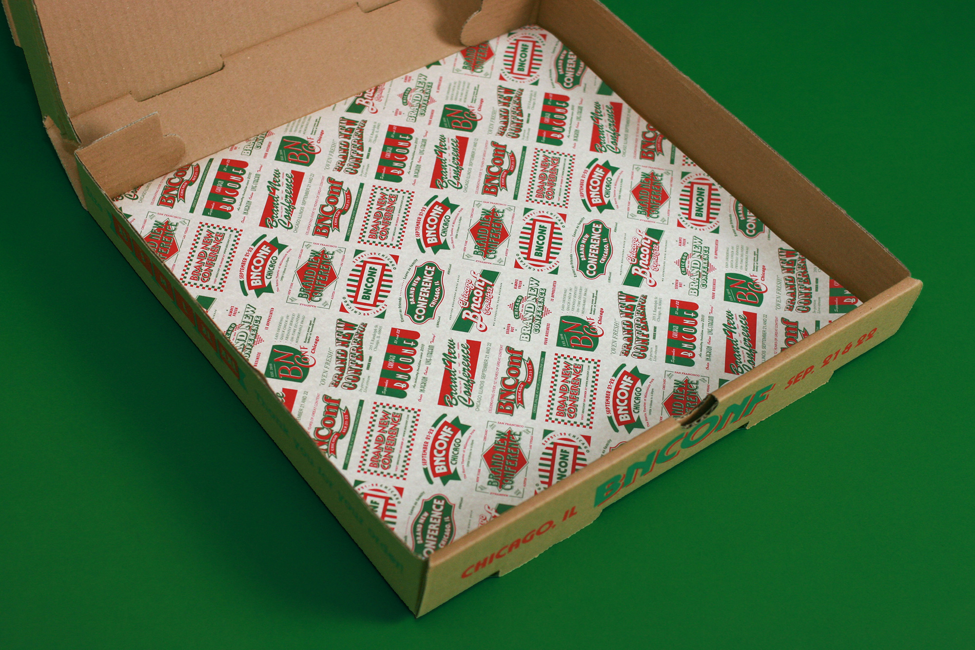
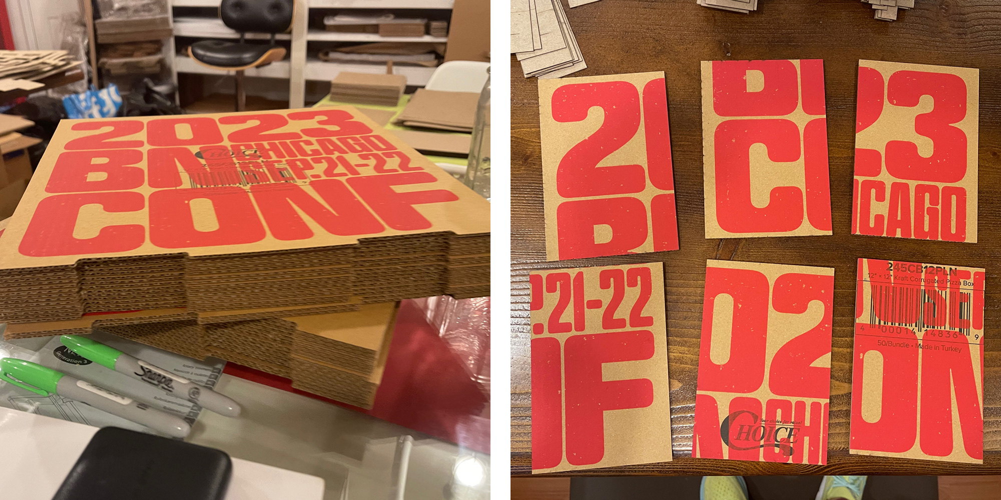
Pizza Boxes
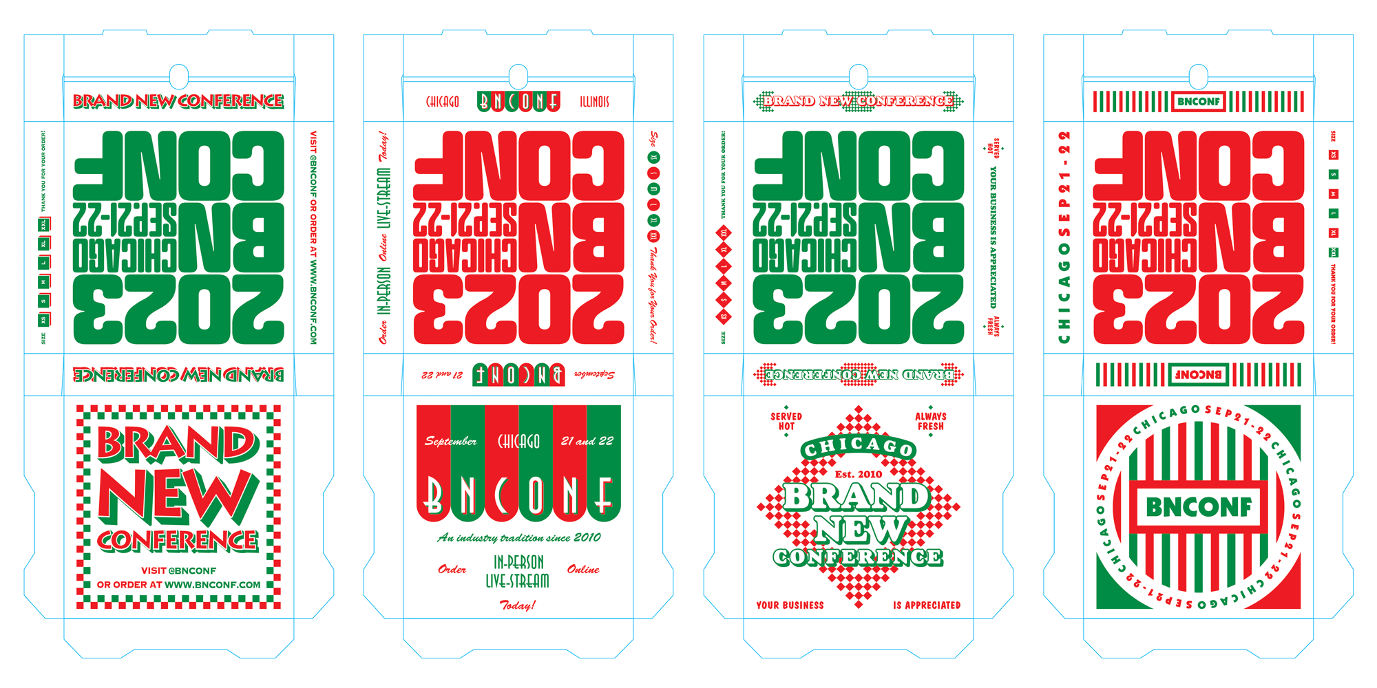
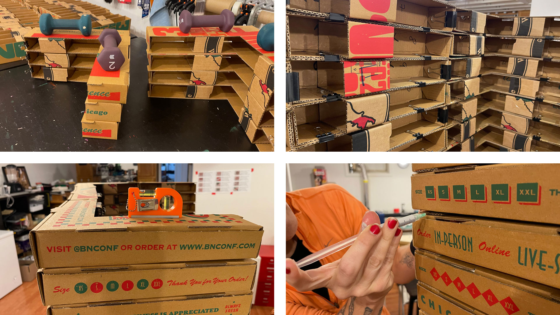
Once we decided to go down the pizza joint route we knew right away that we HAD to create pizza boxes as part of the physical applications, so our first step was repurposing all of the fake pizza brands that we had designed for a 16:9 ratio for screen use into a 1:1 ratio to use as the graphics for the top of the boxes.
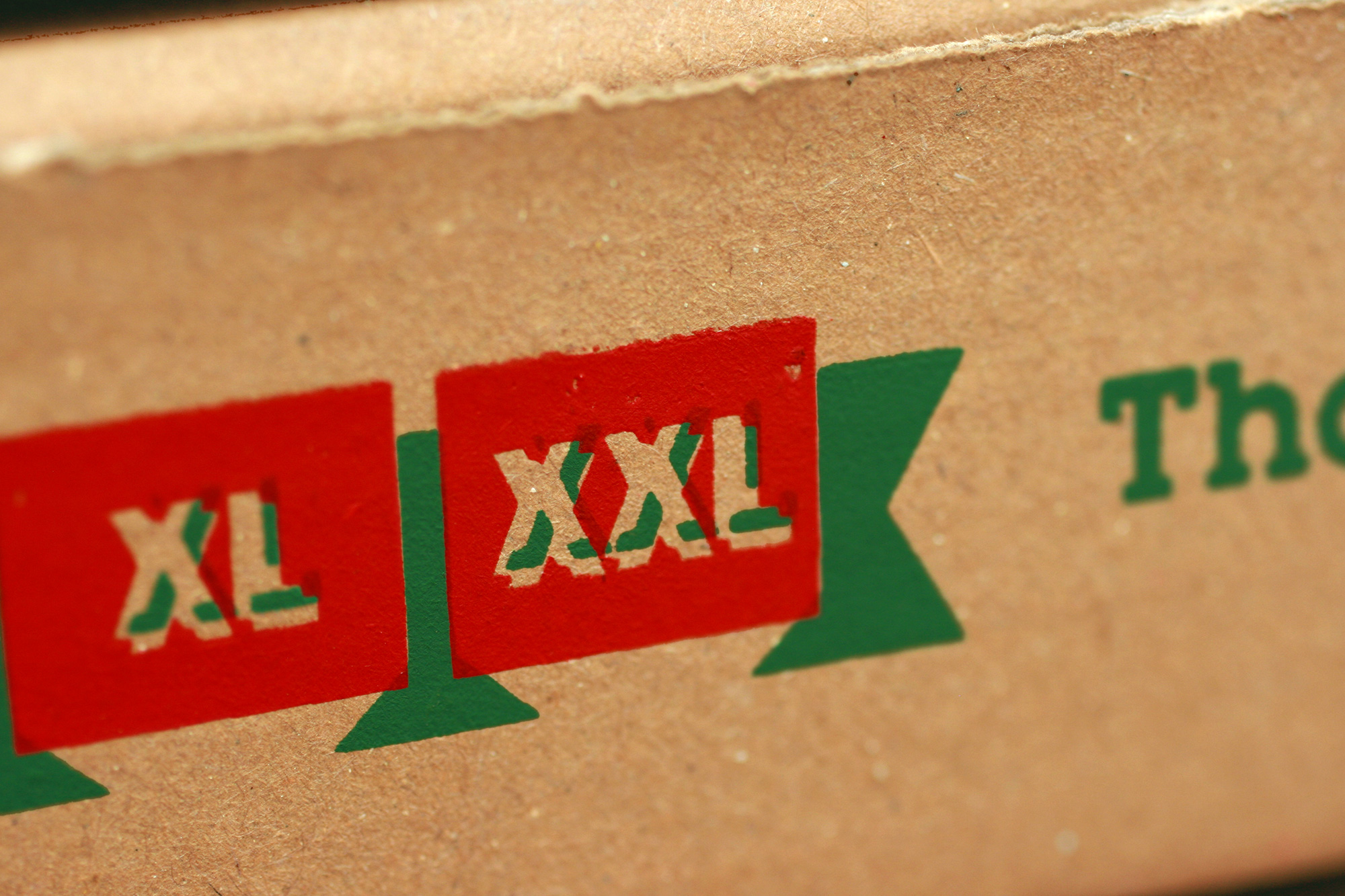
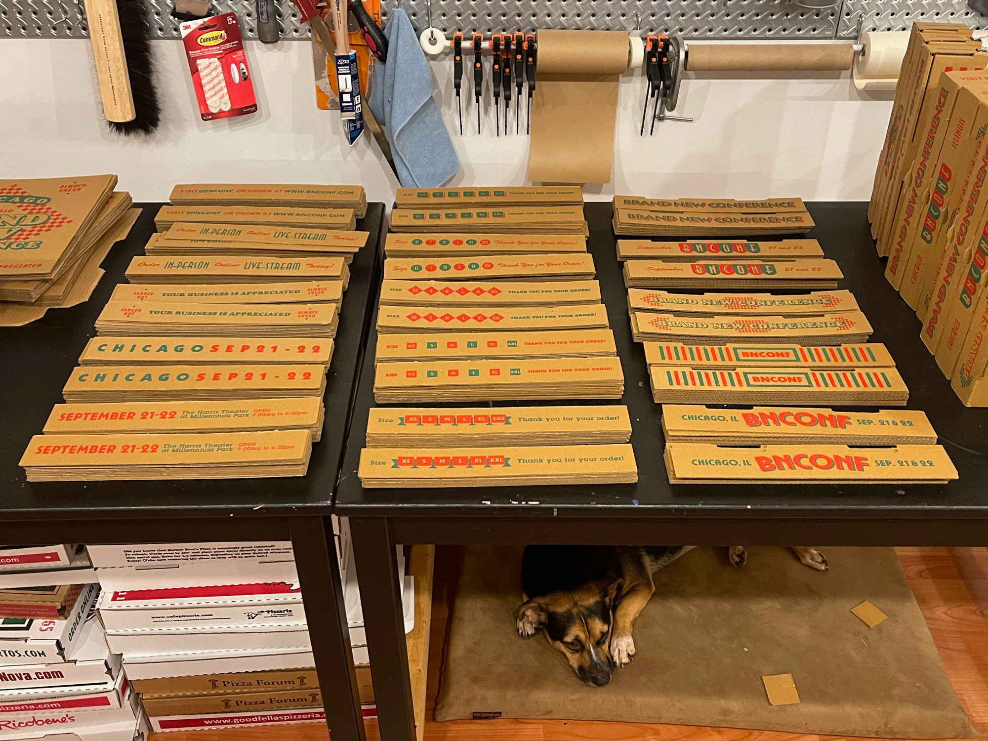
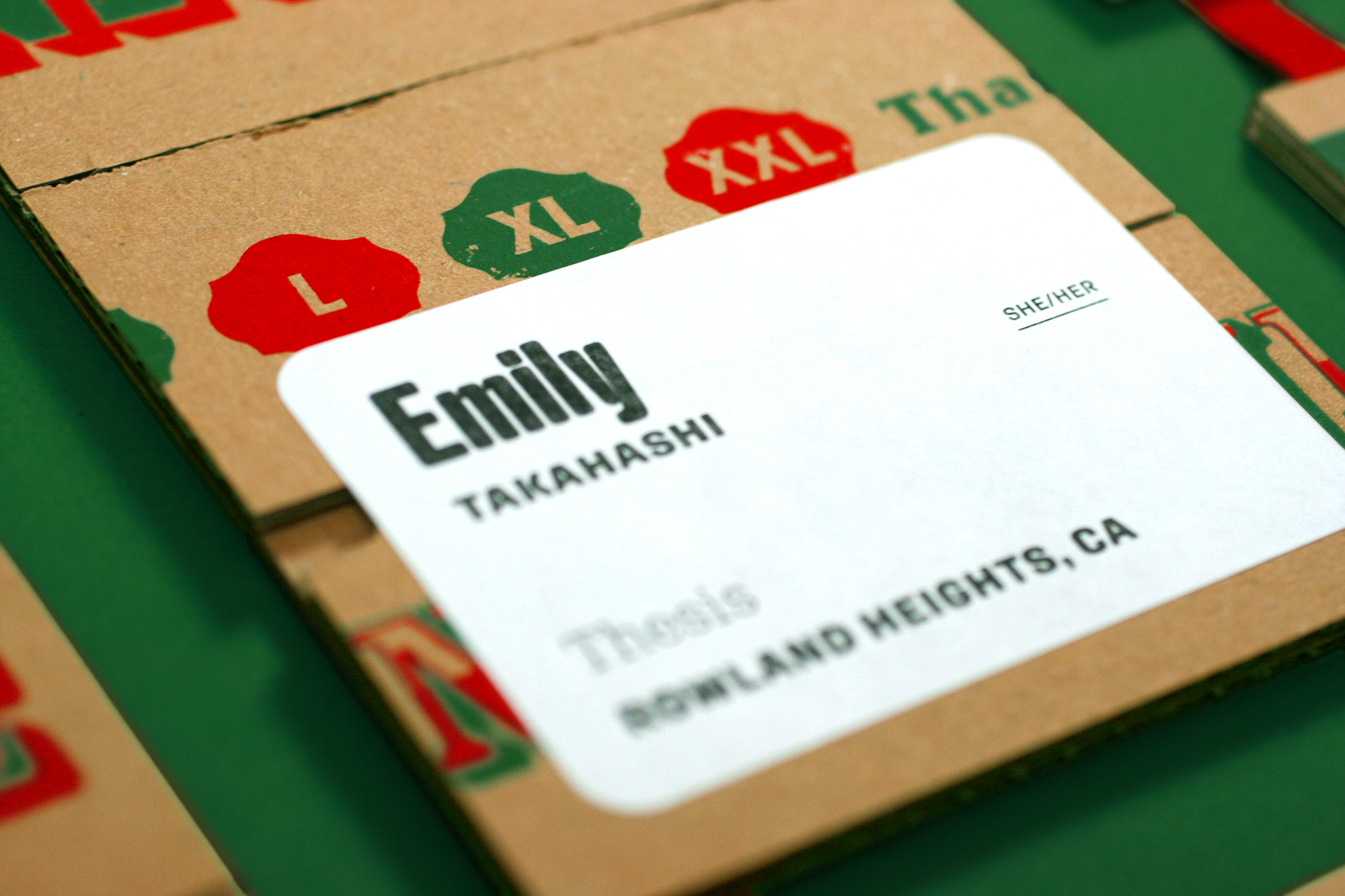
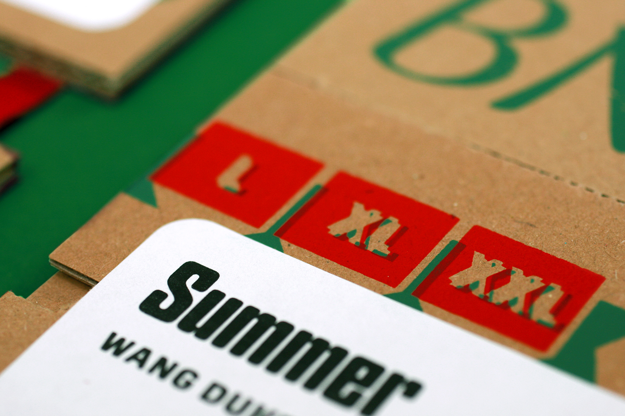
Since we had 12 designs and were expecting between 1,000 and 1,200 in-person attendees, we decided it would be fitting to print 100 boxes of each design. Ideally the boxes would have been printed using an offset press to get that imperfect printing effect but because no commercial printer in their right mind would only print 100 of a design we had to print them using silkscreen which was a little too crisp and perfect but we asked the printer to be a little sloppy and imperfect — we even demanded no use of registration marks so that we could get the off-register printing effect. We set up dielines for each of the 12 designs, creating some fun designs for the sides of the boxes. One of the sides includes the list of t-shirt sizes — as the conference t-shirt was included in the pizza box — so the volunteers could stuff boxes, mark them, and know what was inside each one.
Program
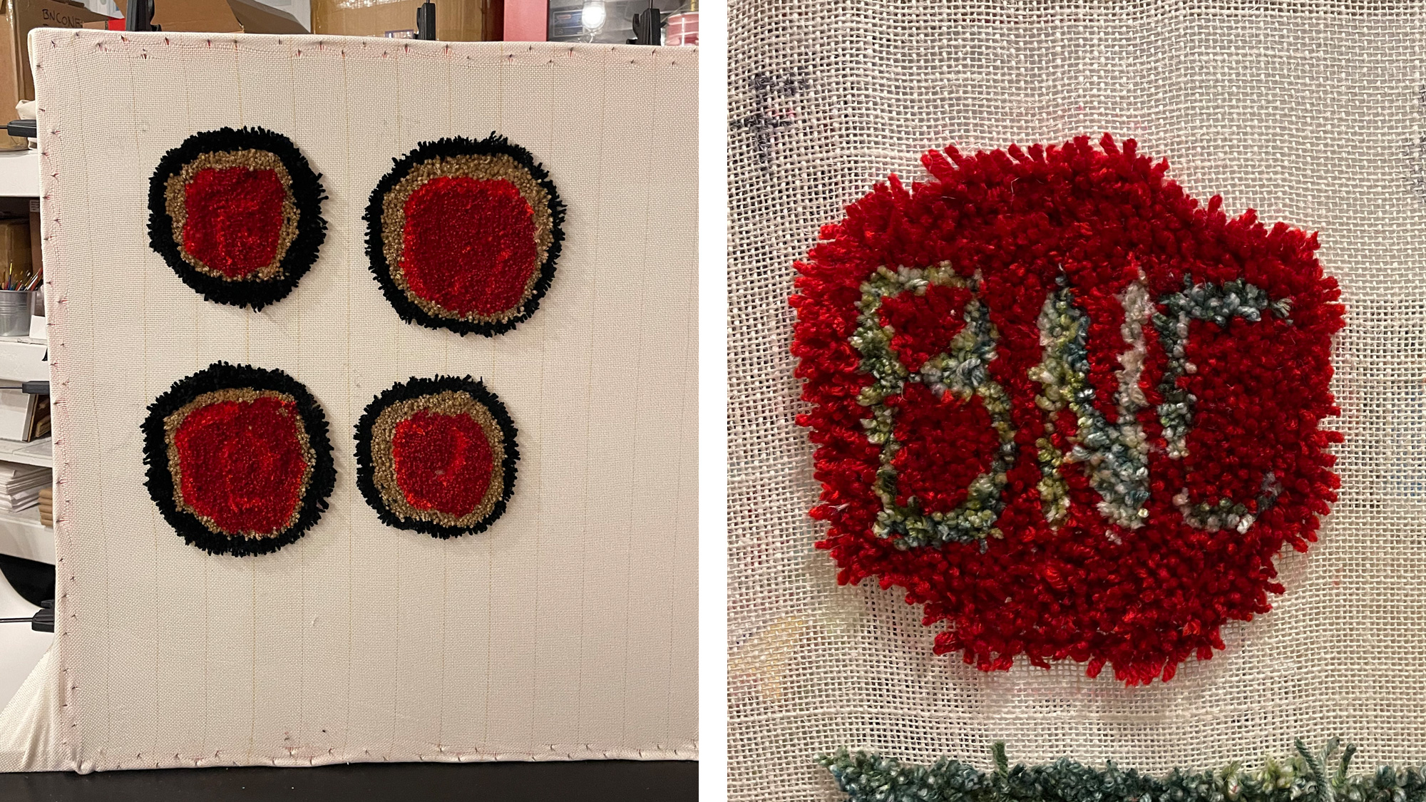
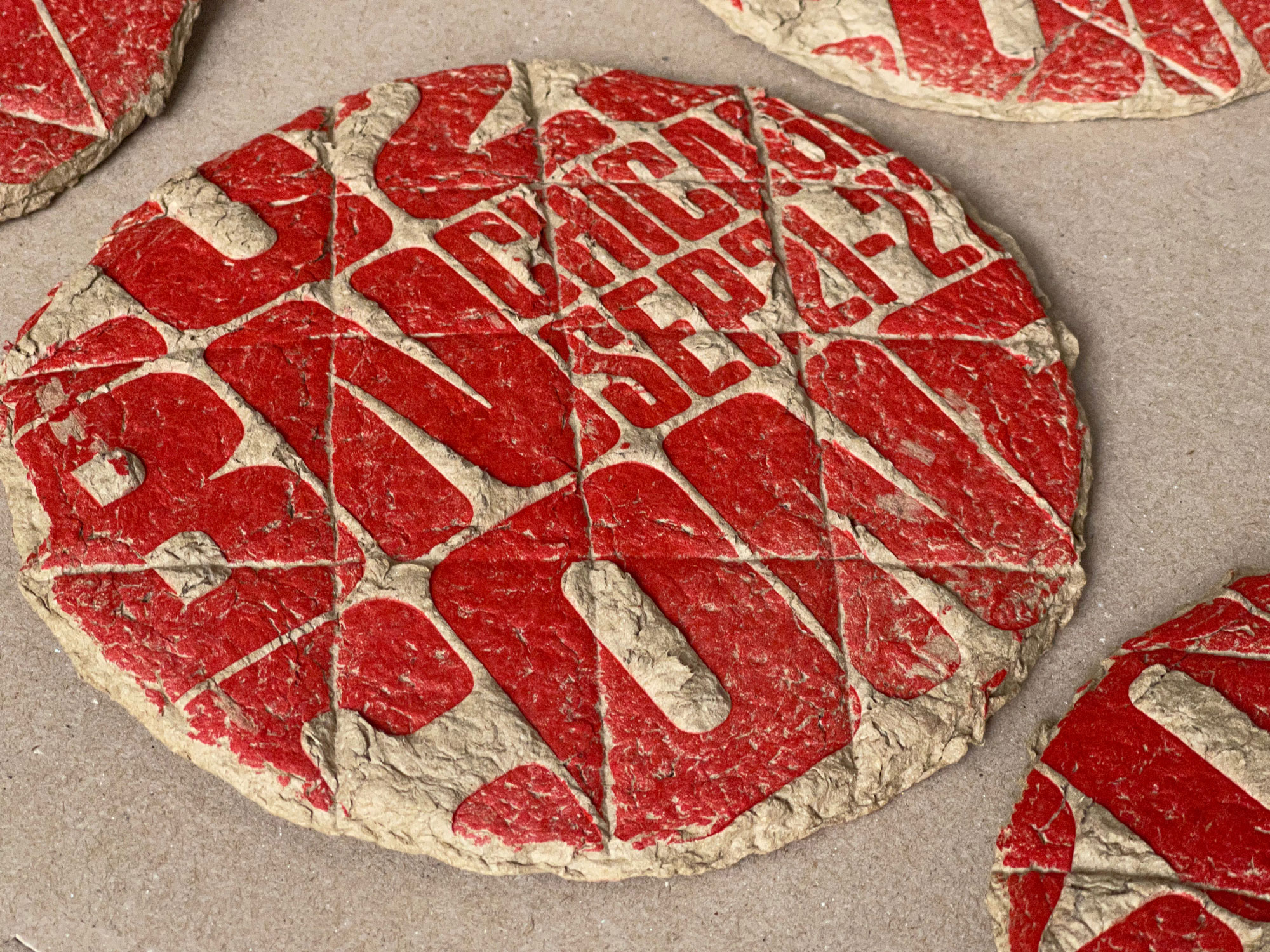
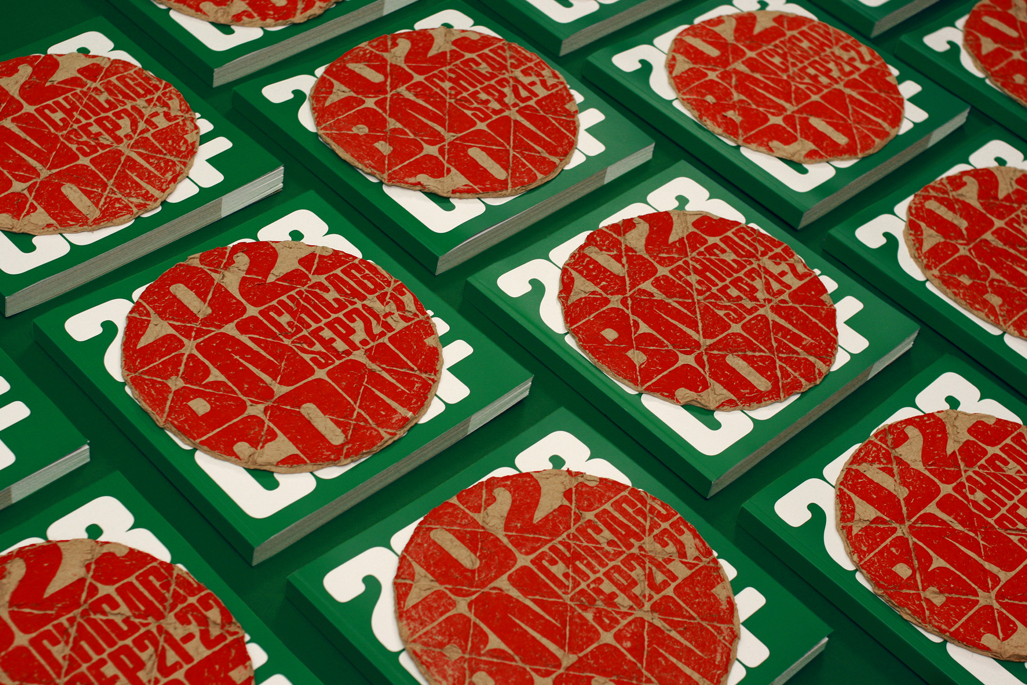
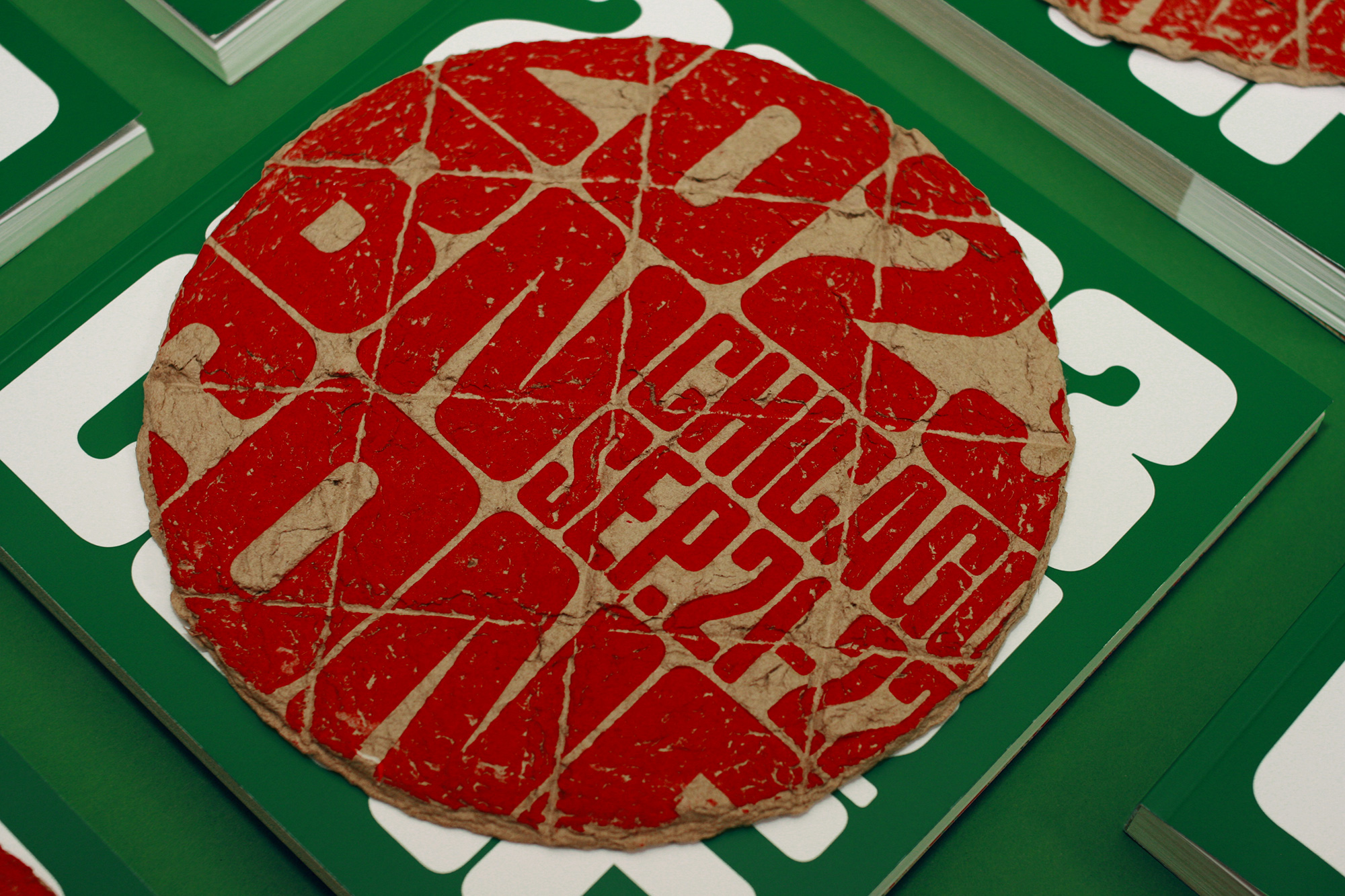
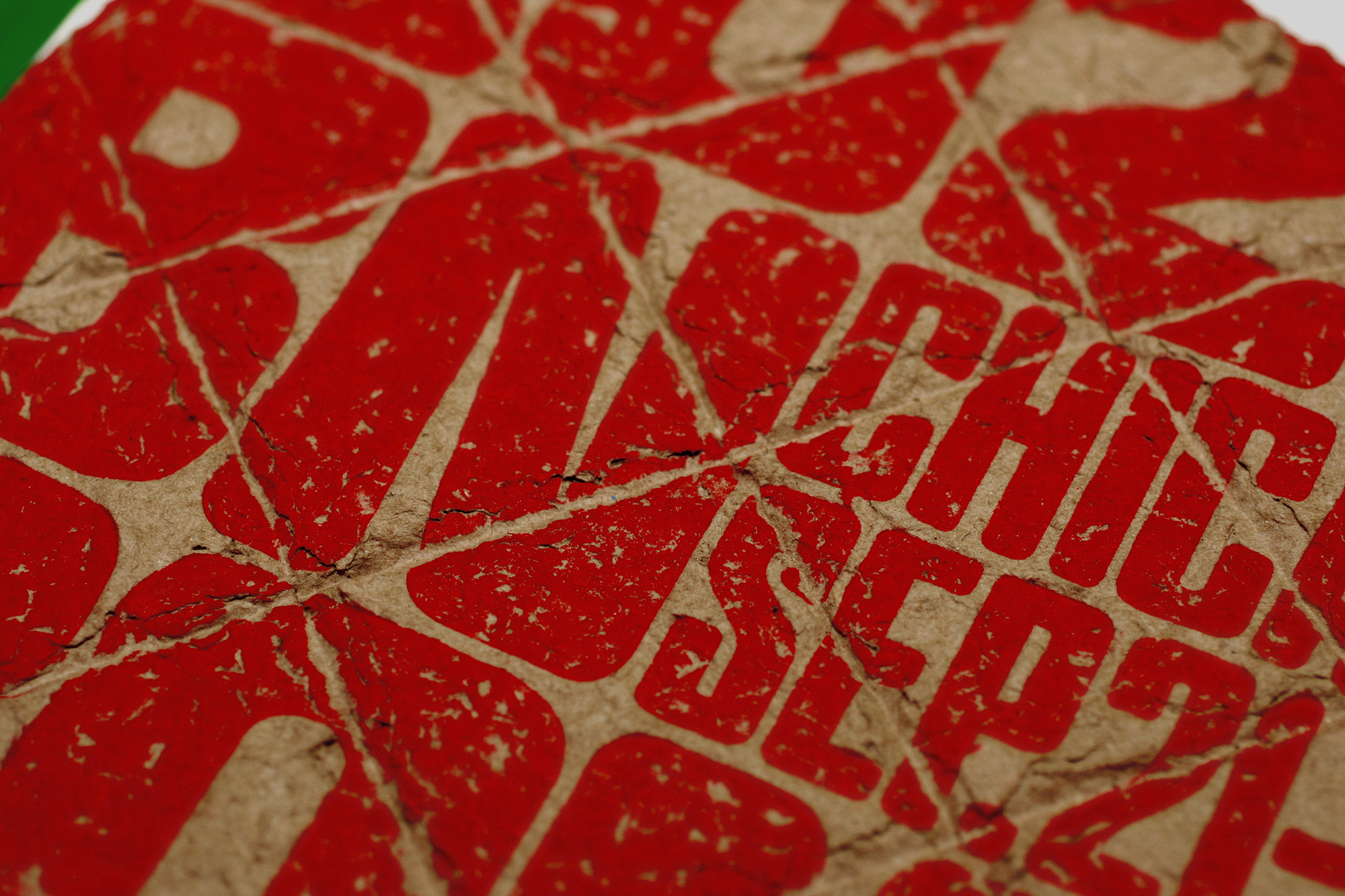
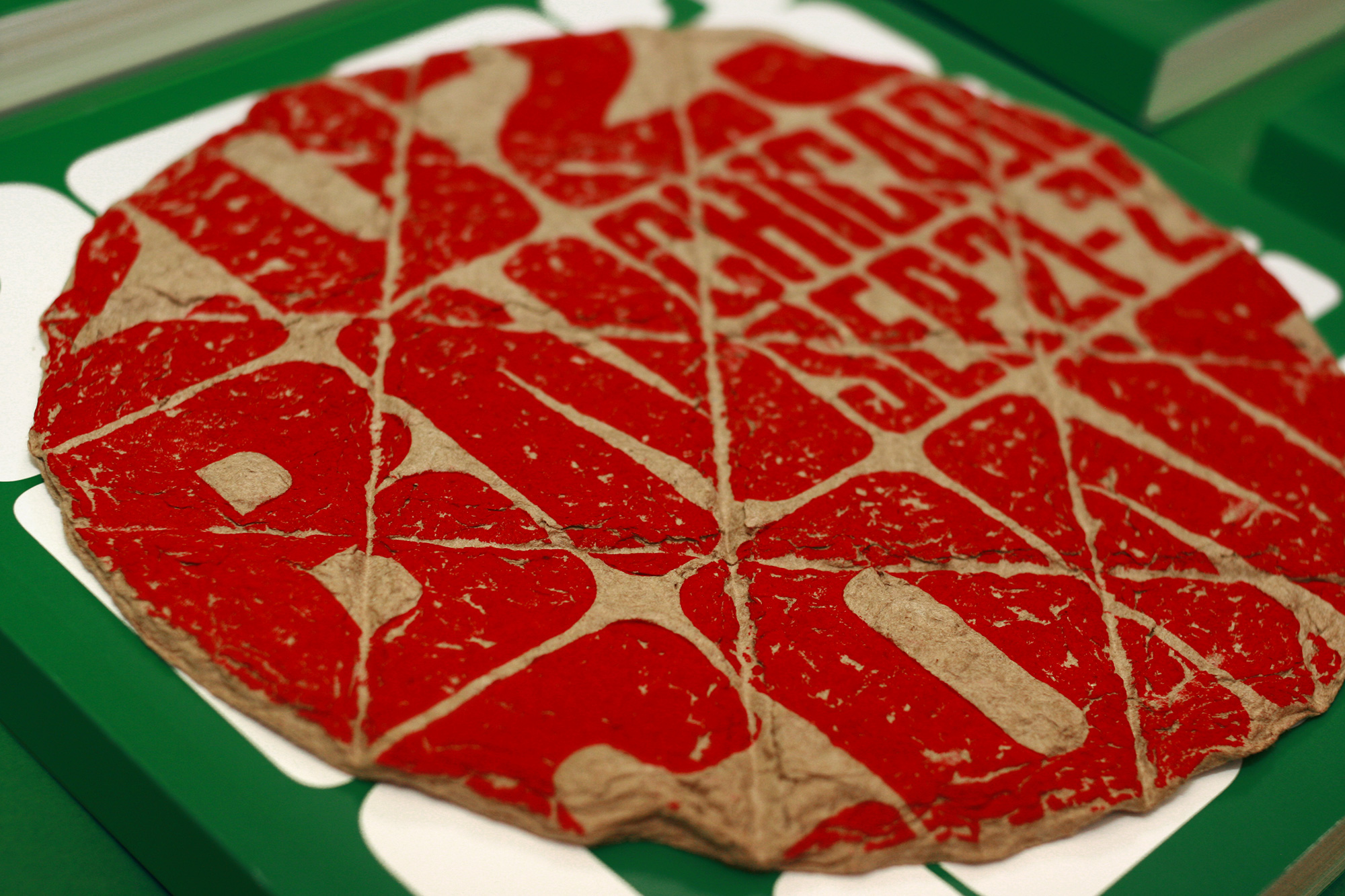
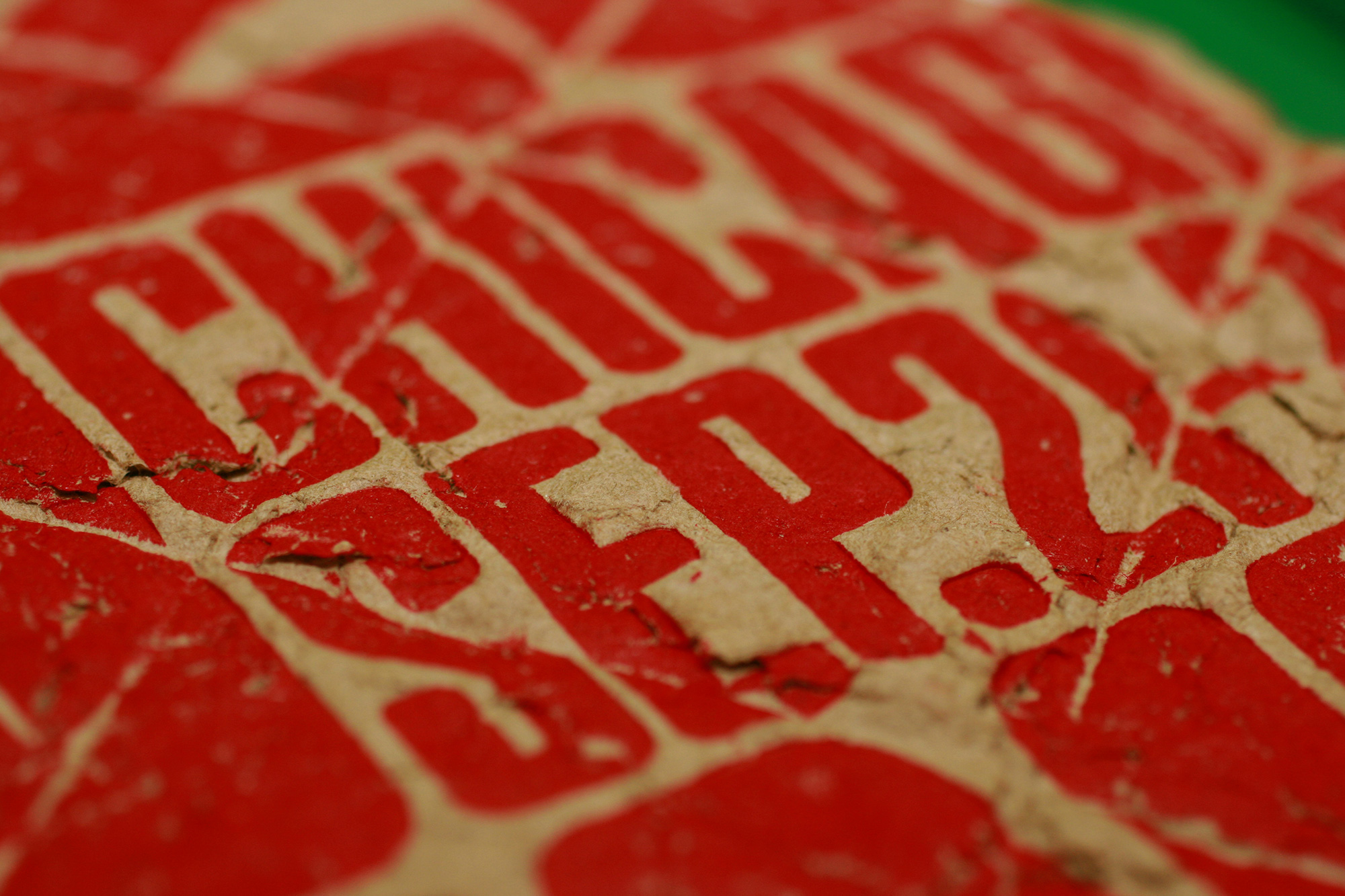
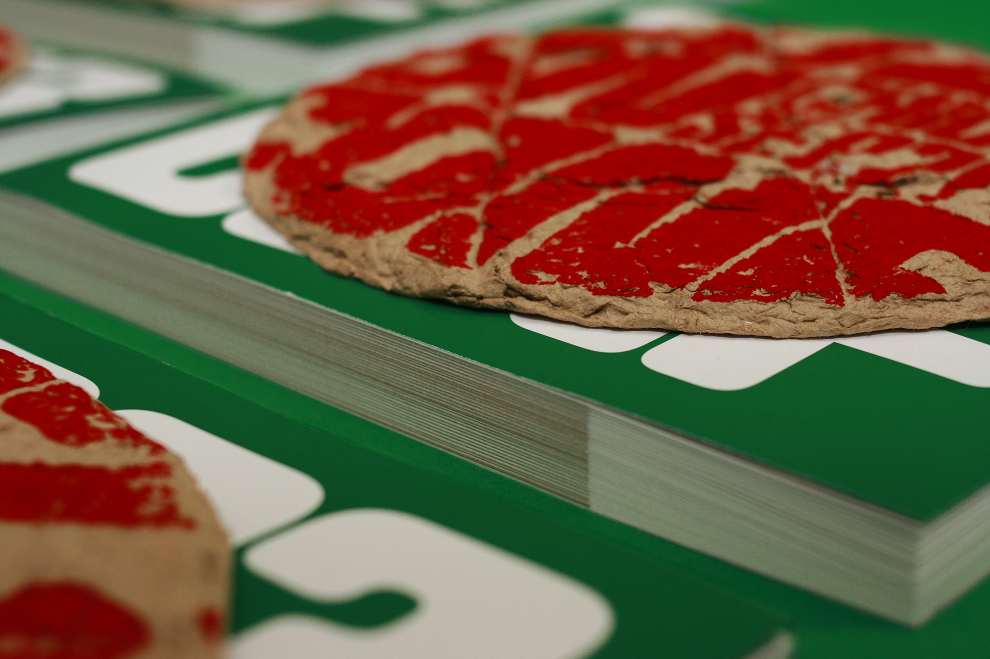
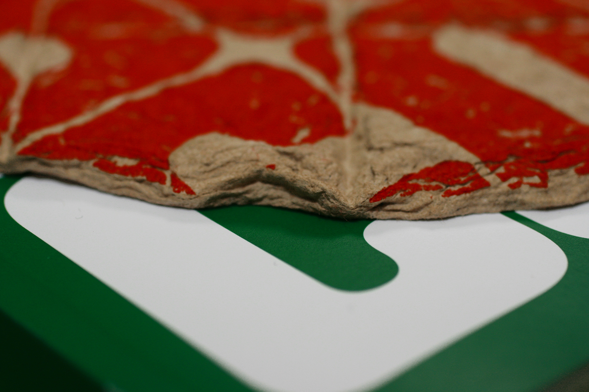
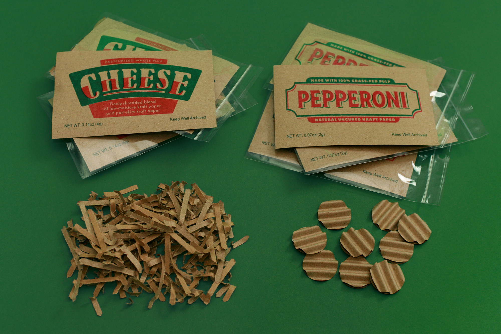
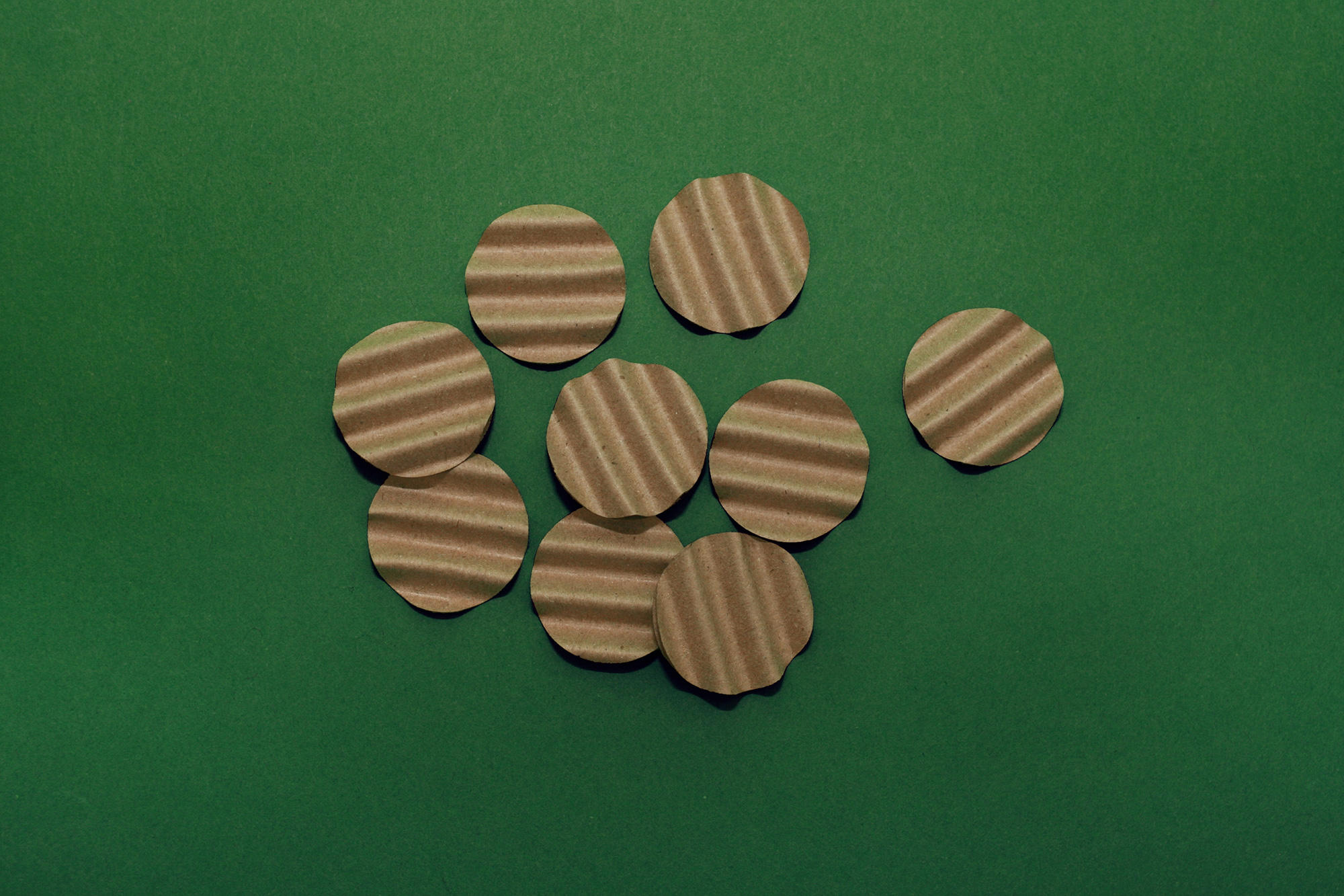
Since we had a pizza box to deliver the program the only acceptable outcome to that idea was to put a pizza inside it but we were not just going to print a photo of a pizza on the program cover or do some kind of puffy sticker or something else that might have been easier than what we ended up with, which was “baking” pizzas from scratch using kraft paper and going full method on our kraft approach. In order to do this we had to create pulp so that later we could shape that pulp into pizza shapes with enough body and heft to them so they wouldn’t crumble as well as being able to handle a tavern-style cut while still wet.
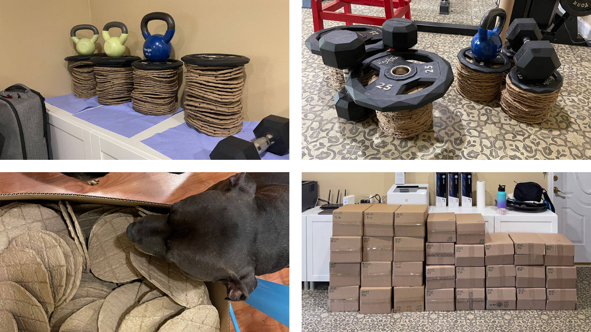
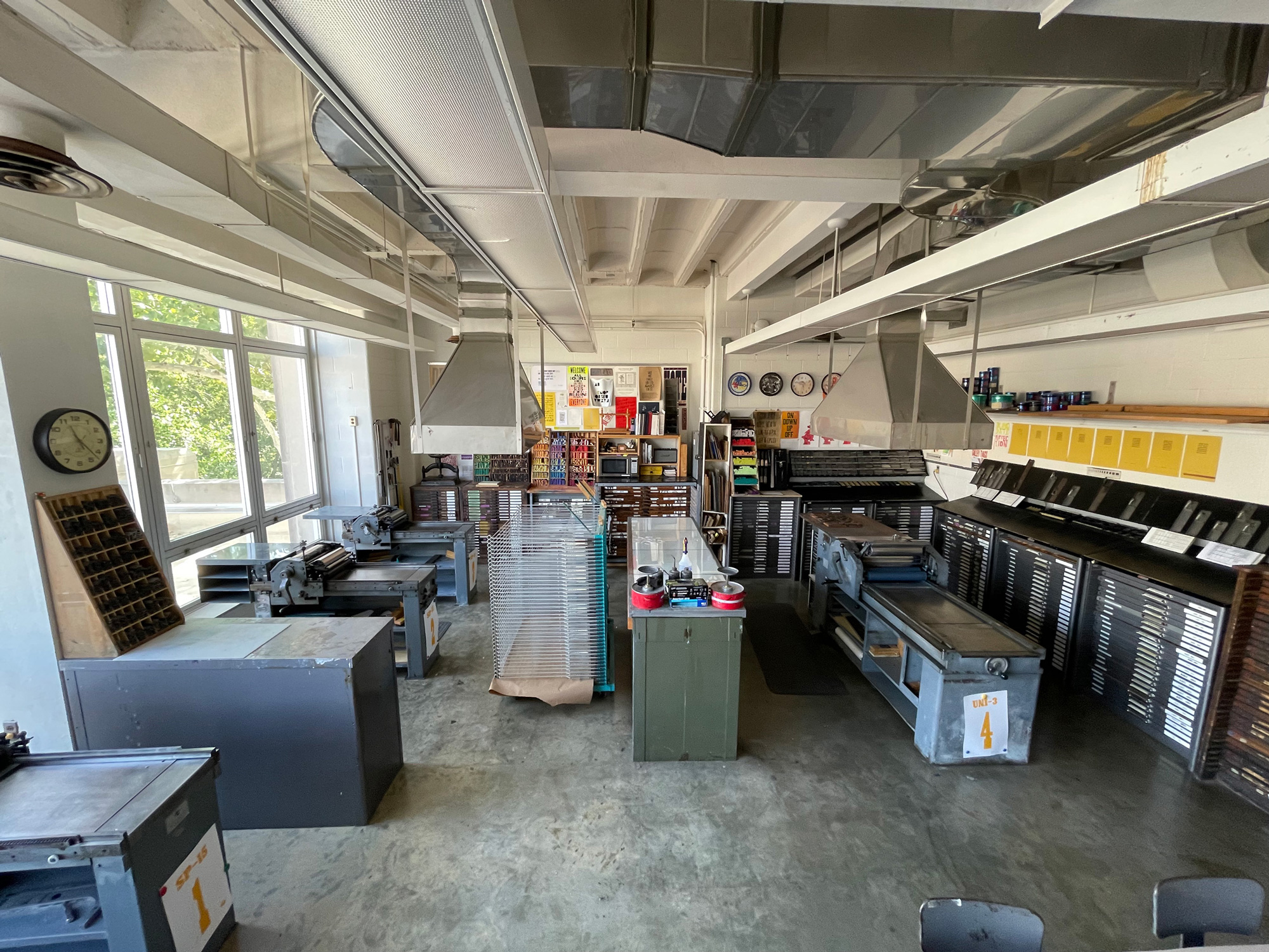
We did this process for about 6 weeks, every day, including weekends, anywhere between 3 and 6 hours a day and by “we” it should be acknowledged that Bryony did 80% of these on her own. The next step with the pizzas was getting some ink on them and if you have ever tried printing on extra thick, extra textured paper this is no easy feat. We tried a couple of home/office approaches but we simply could not get a good impression of any kind. Then, we remembered a fantastic resource we have at our disposal in our tiny little city of Bloomington, IN: The Letterpress Studio at the Eskenazi School of Art, Architecture + Design at Indiana University. A little slice of printing heaven with Vandercook presses, wood and metal fonts, a bookbinding press, a fancy paper cutter, and a foil stamper. The Vandercooks were perfect for what we needed. We organized our pizzas by weight — yup, we weighed each one individually — so that we could do all 70-gram pizzas at once, all 60-gram together, and so forth as each weight required different “settings” on the press.
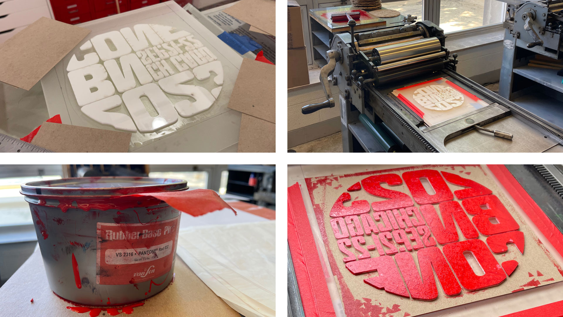
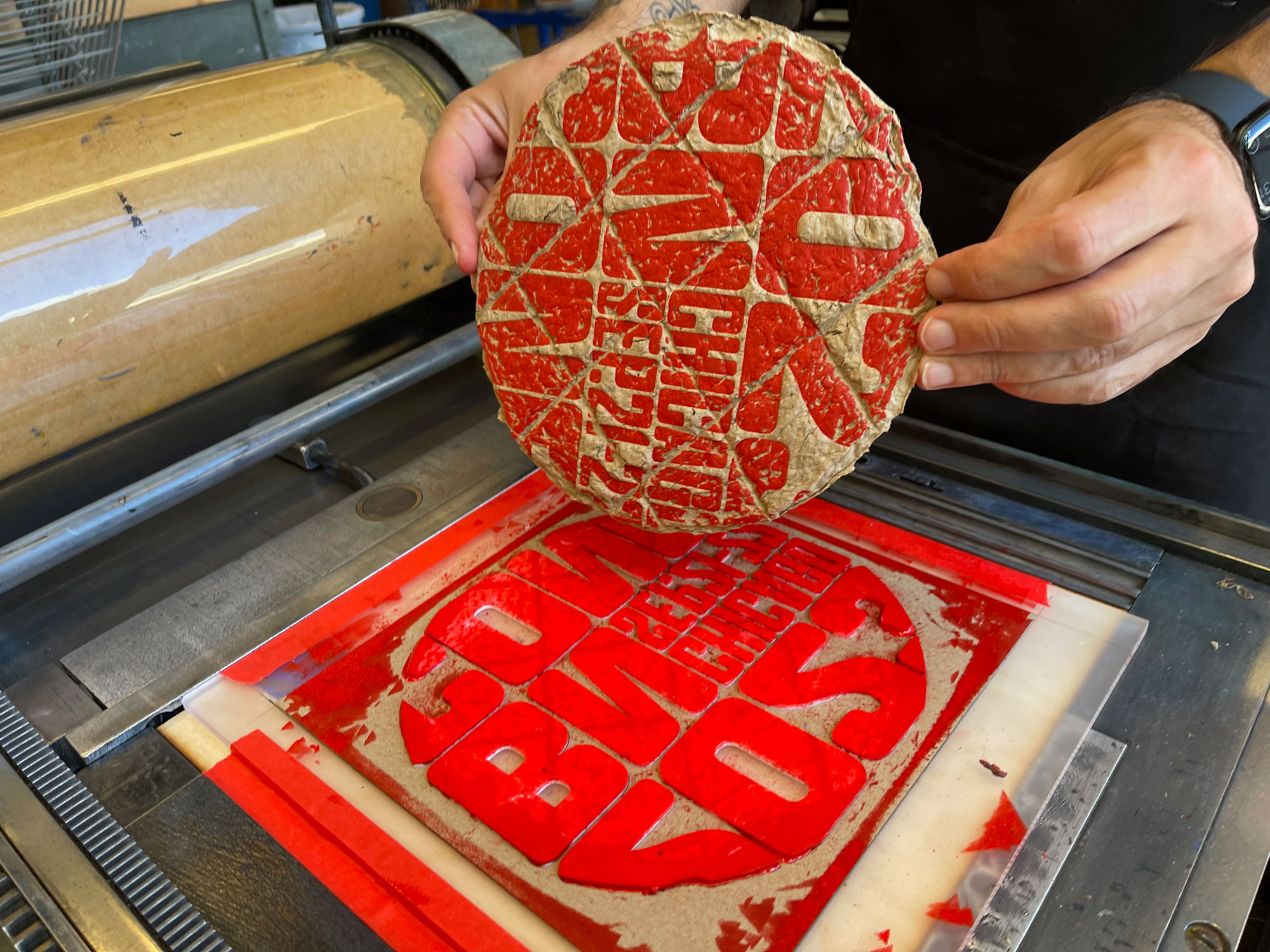
One important note at this point is that up until now, any time we used Tempel Softland on top of kraft we had a rule that it had to be white and while that was our first attempt we eventually shifted to red ink because, well, pizza! So the red ink is meant to be the tomato sauce on top of the kraft paper which is meant to be the dough. This shift to red pays off further, so keep reading and scrolling.
After printing around 1,300 pizzas we then had to apply some primer on the back because otherwise the kraft paper was absorbing all of the glue and it wouldn’t stick. Skipping that video as it’s not that exciting. Then we had to patiently wait for the program to be printed, bound, and delivered by the best printer in the world, Classic Color — call Jeff Hernandez for all your major printing needs! — to our home office. Two weeks before the conference, the programs arrived and we got to work.
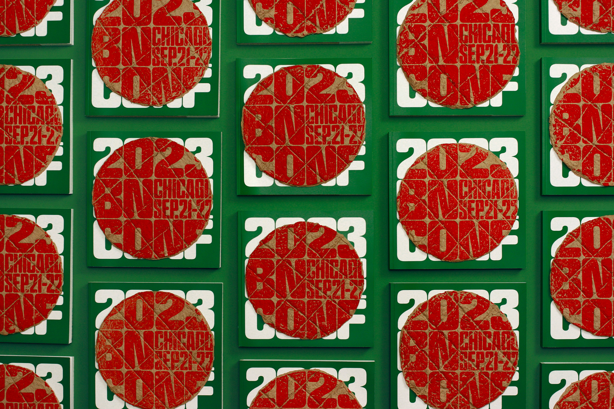
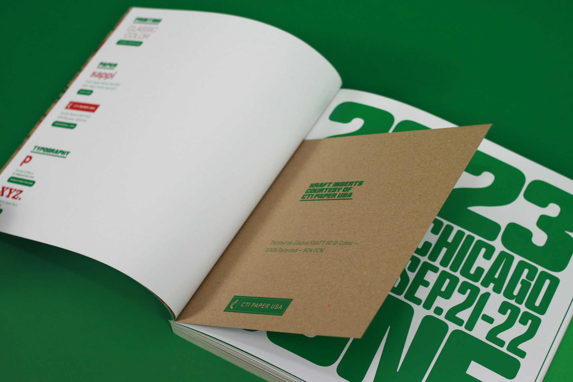
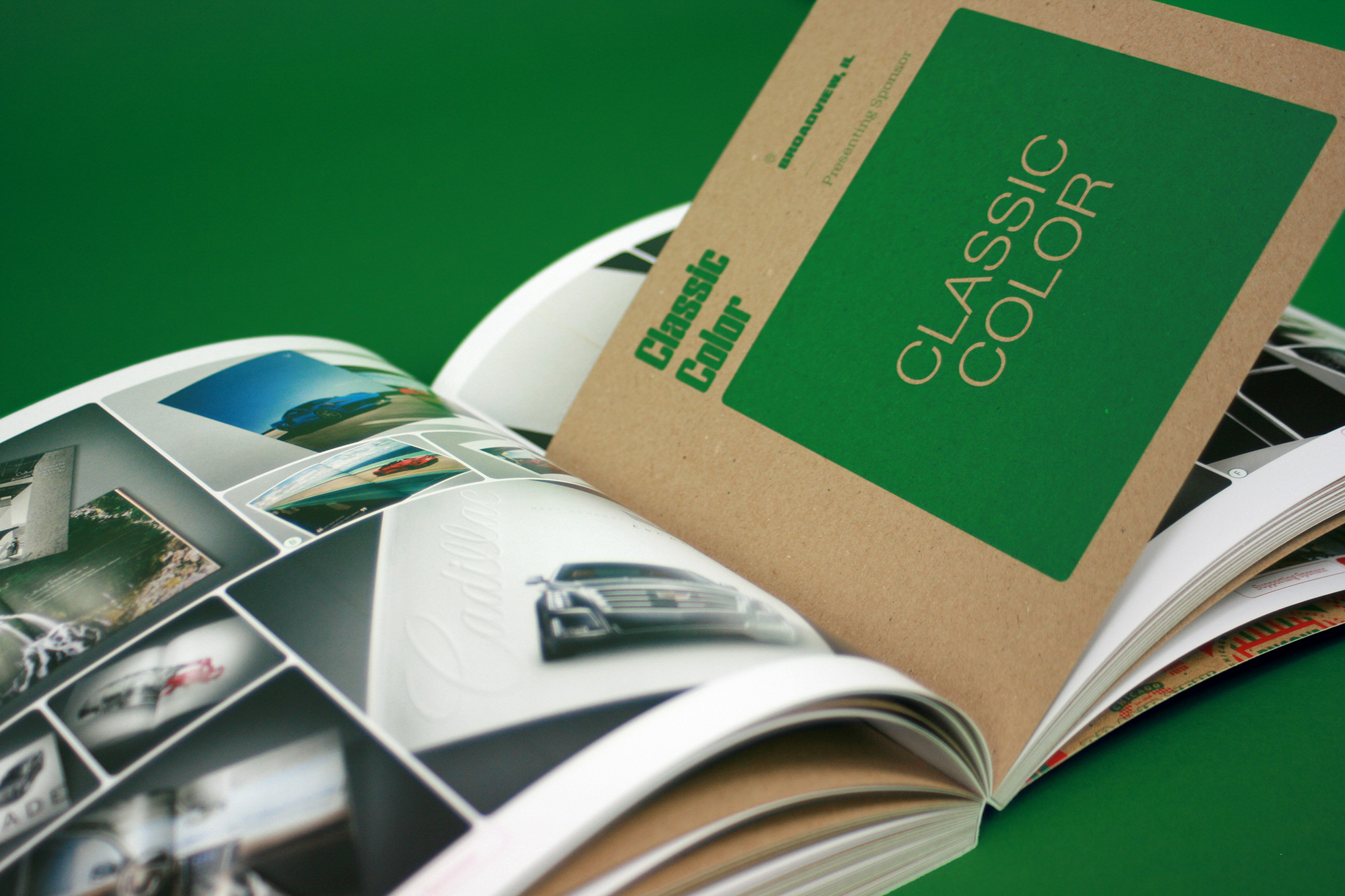
For the interior of the program we decided to get a little fancy this year by using smaller inserts of kraft paper in between the regular-sized pages to deliver the bios and headshots of each speaker (and the bios and logos of each sponsor). Since the pizza box is square, the program is square, ergo the inserts are square. Printed in a single color, these little things proved to be a huge technical challenge for Classic Color who, as always, rose to it. If you are interested in this kind of thing: The inserts aren’t just a square tucked into the spine, they are a square plus a long strip that stretches from the bottom, where the insert aligns, to the top that is hidden into the spine. This ensured that the spine of the book was an even thickness from top to bottom instead of the top area being much thinner. Achieving this requires a whole lot more explanation that is hard to convey in words but let’s just say that Classic Color went above an beyond to satisfy our design whims.
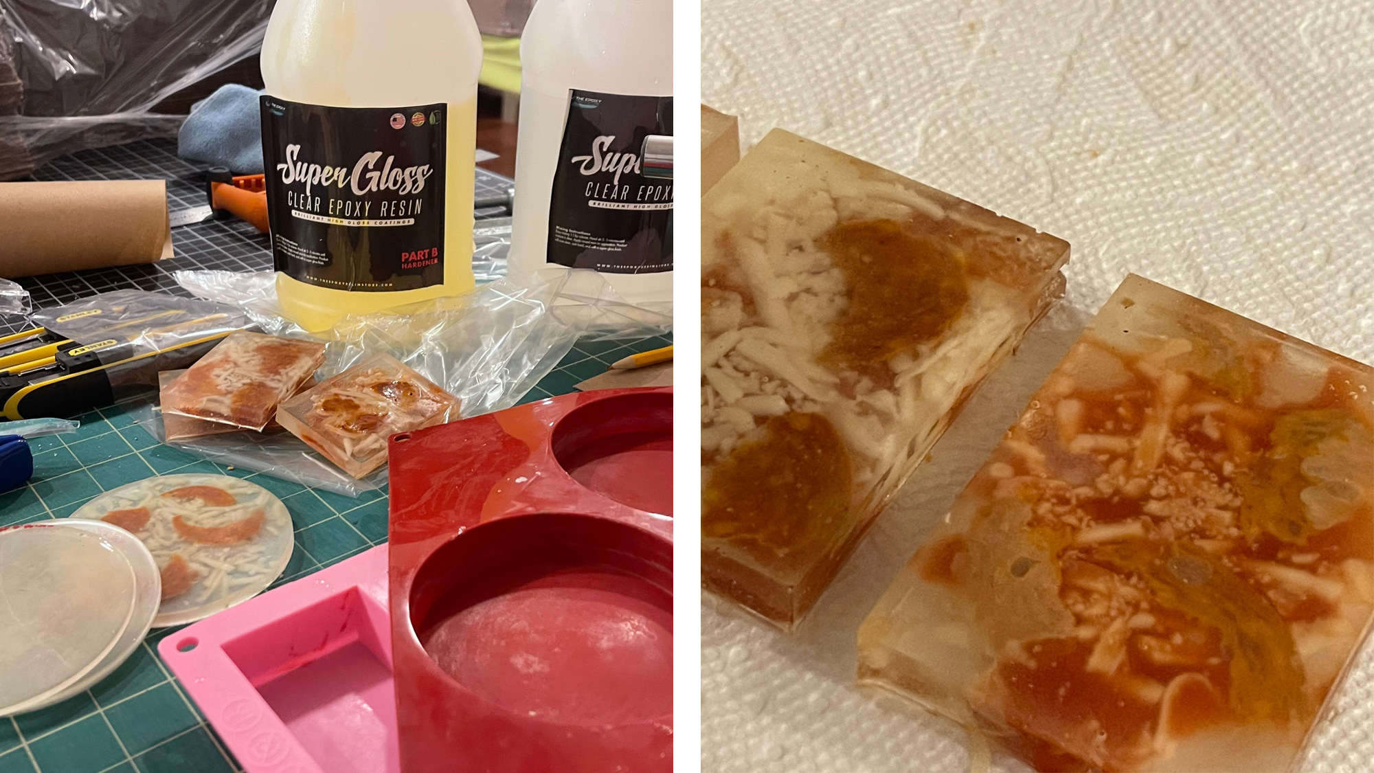
Pizza Toppings
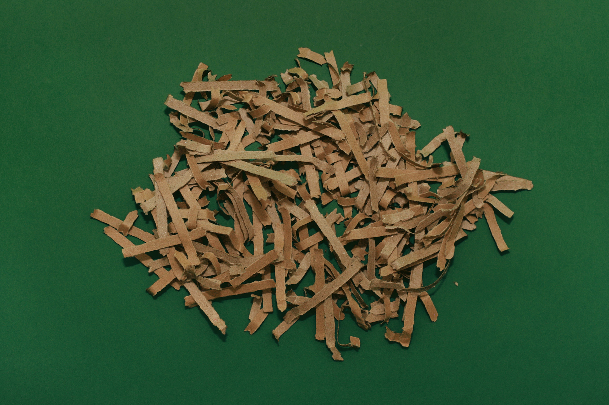
Since the program is a pizza, a pizza needs toppings. Our pizza already had the tomato sauce — the red ink — but it still needed cheese and the most classic of toppings, pepperoni. At one point we considered adhering the cheese and pepperoni to the pizza on the program but it was nearly impossible to get it to stick so we decided to provide the two ingredients on their own for anyone that wanted to finish the illusion of the pizza. Since everything is made of kraft paper, both the cheese and the pepperoni are also made from kraft paper and came in individual packets for easy deployment (and semi-easy clean-up). As you might expect by now, making these wasn’t as easy as you might imagine. The cheese was shredded in the one shredder that survived and the pepperoni was cut out from strips of kraft board with the flute exposed.
Final Pizza Presentation
At the event, attendees were handed their pizza box that contained the program and the t-shirt. To finish off the pizza concept, the box comes with an actual food-grade liner and little packets of crushed red pepper flakes and parmesan cheese.
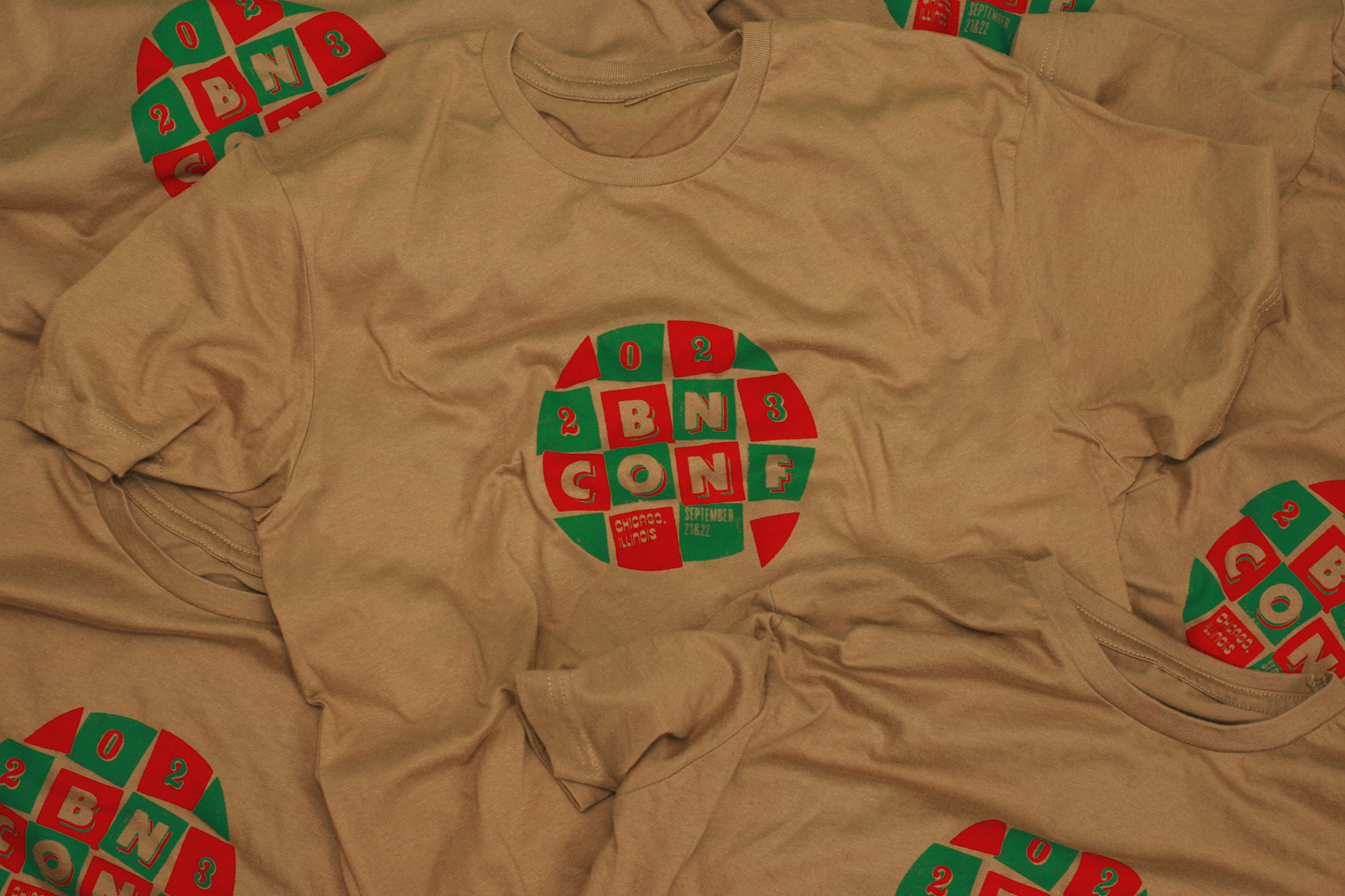
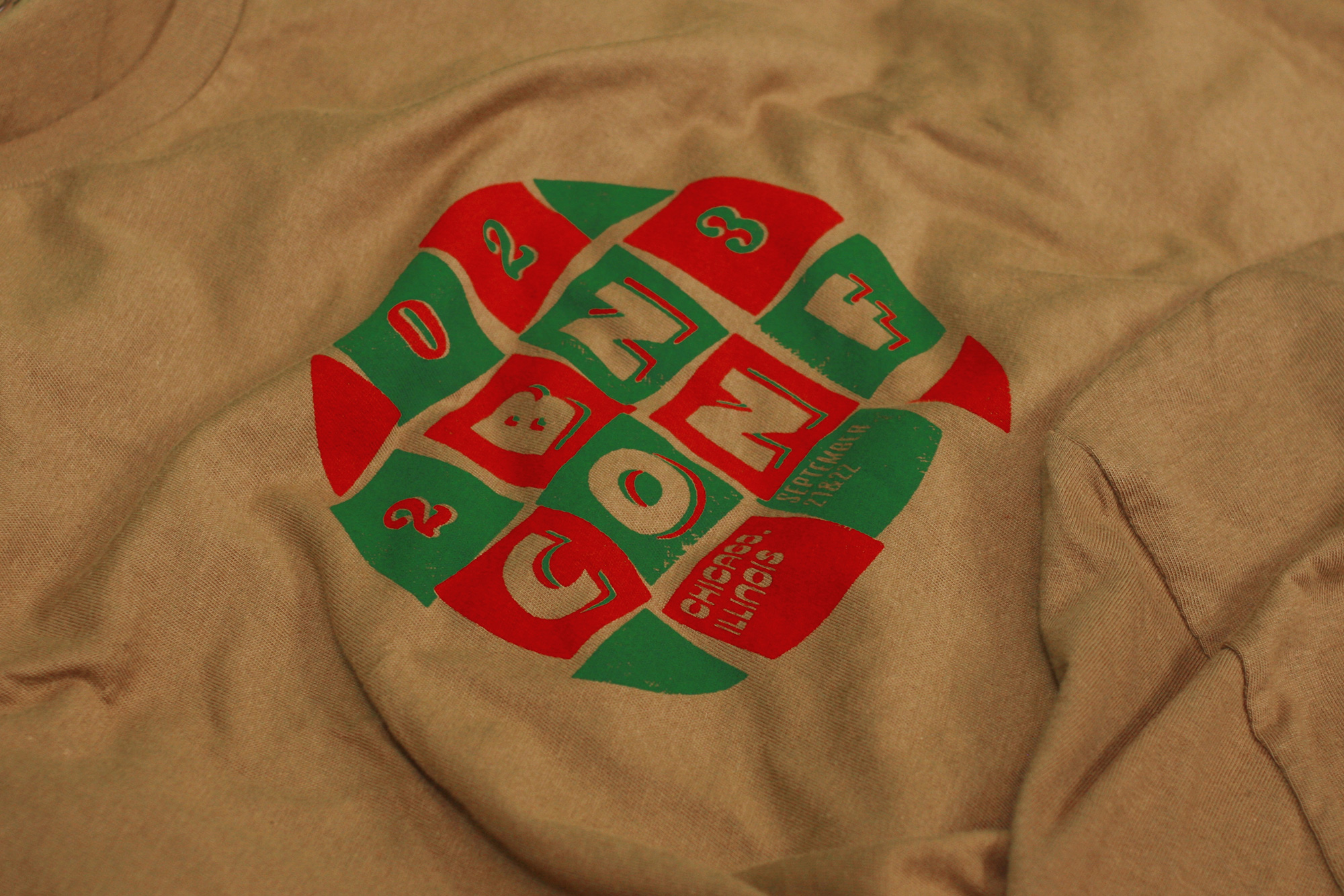
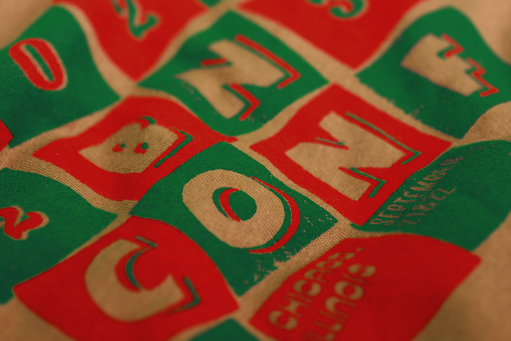
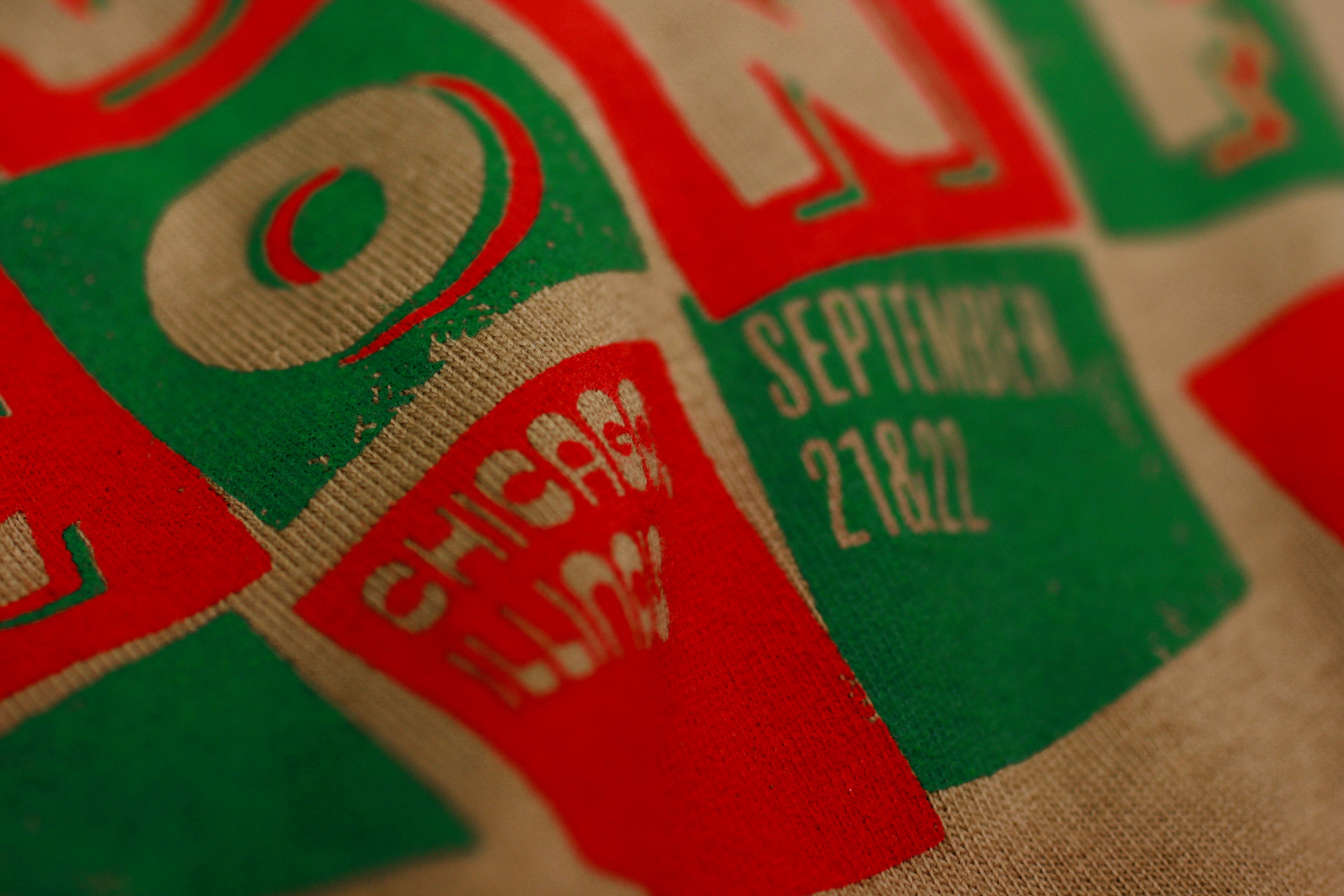
T-shirt
We are very well aware that the base color of the t-shirt we chose is one of the most unflattering available to every possible skin tone but we had to commit to the kraft paper color and texture at every turn of the identity. For the design, at one point we tried to create the ultimate fake pizza brand in a similar style to the 12 others but in the end we opted for a design that interpreted the tavern-cut in a slightly different way while still playing with the relatively un-refined typography.
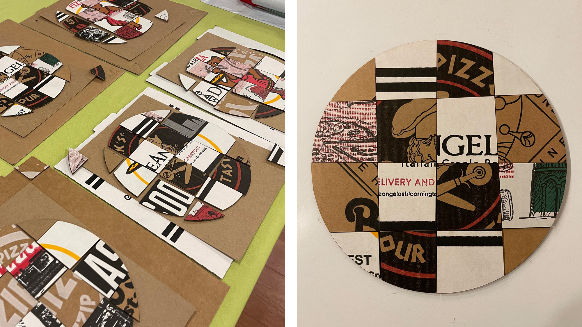
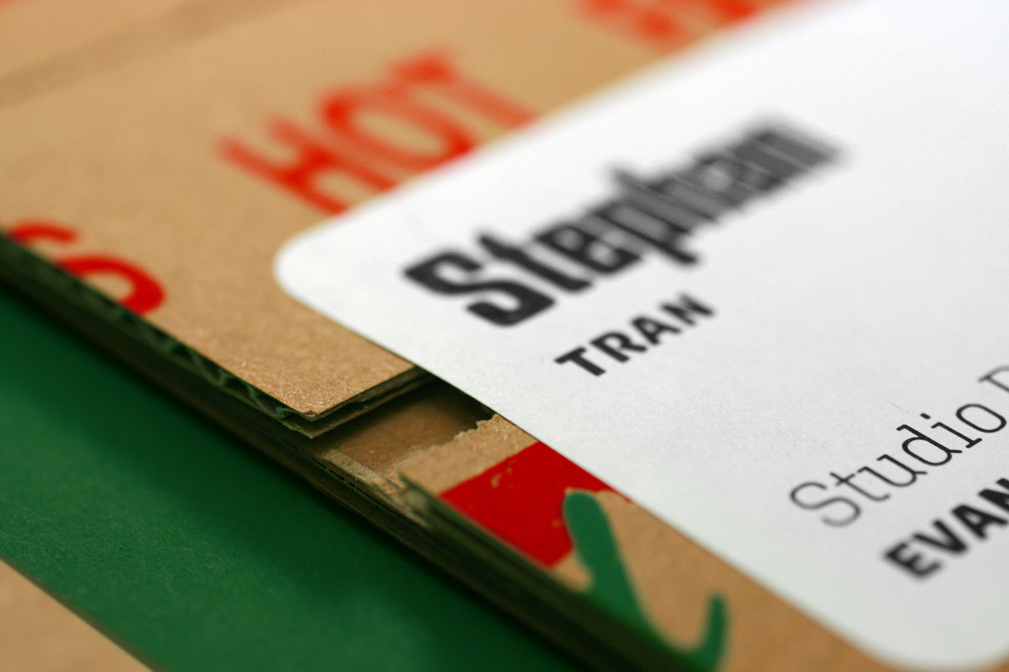
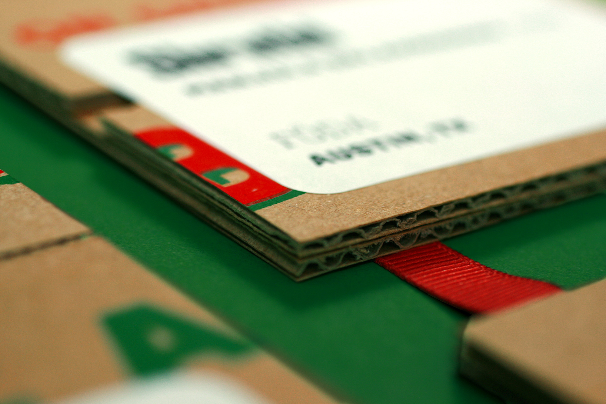
Badges
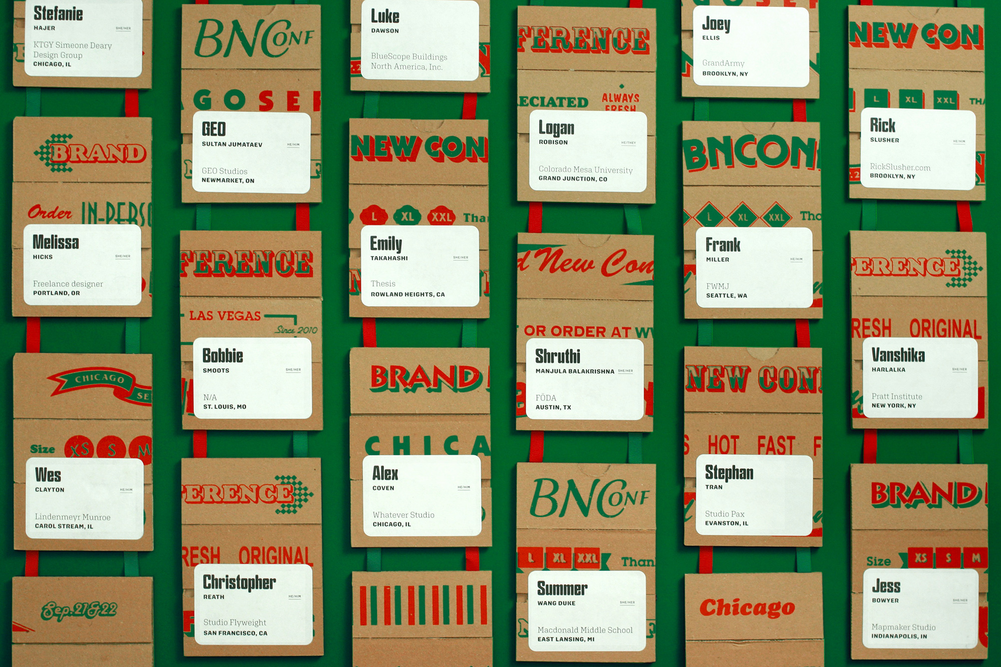
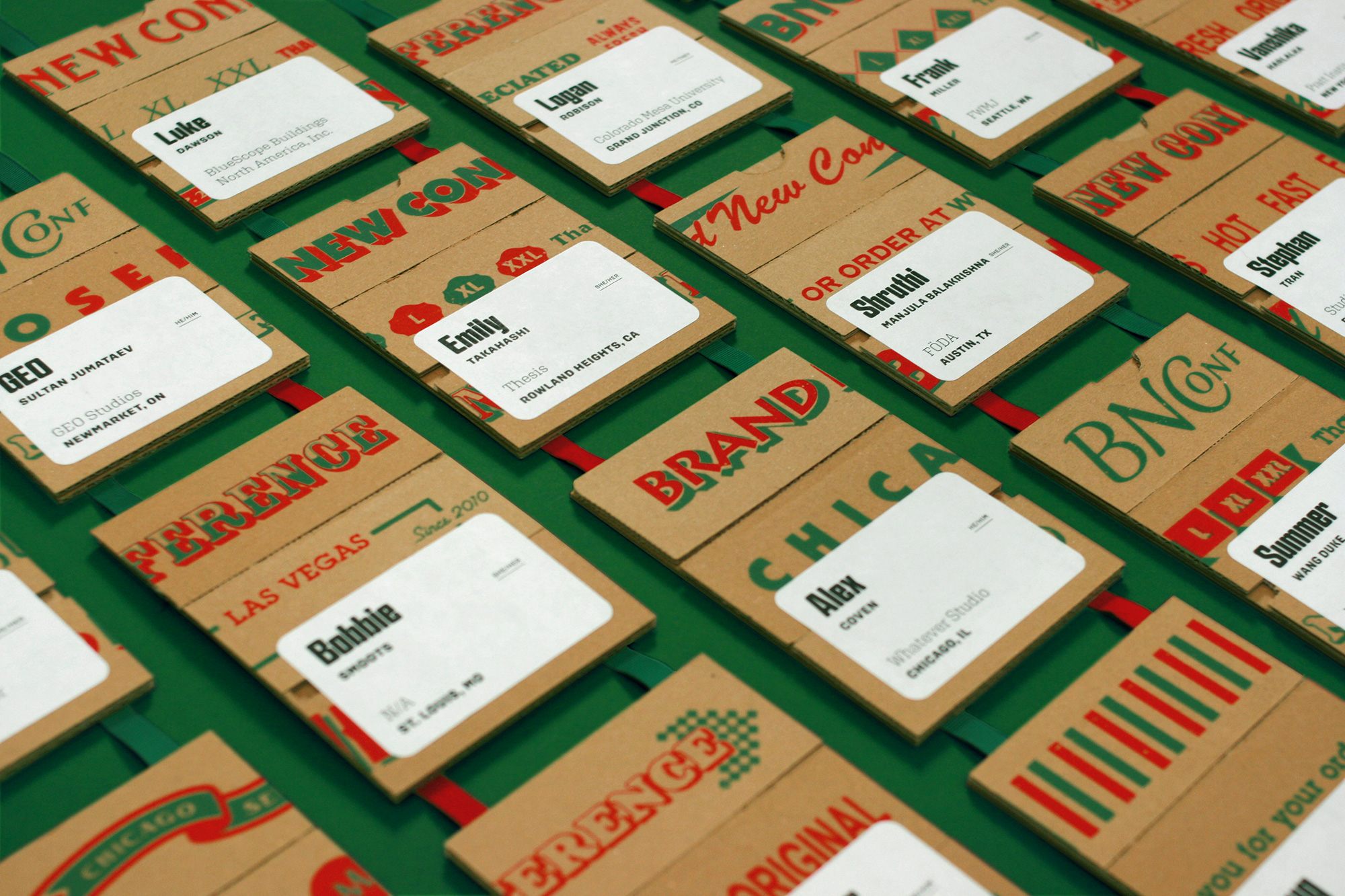
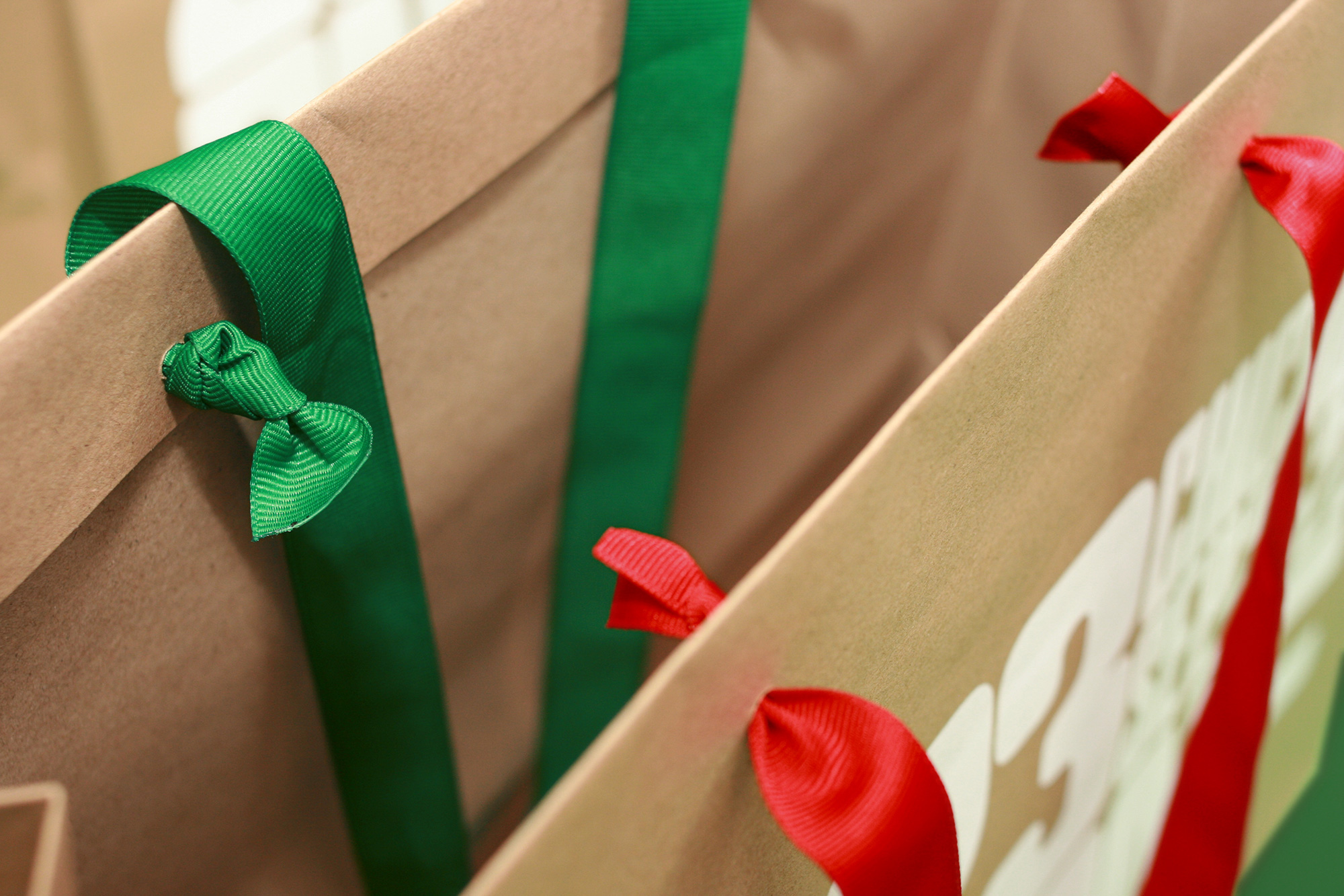
For the badges, we used the backs of the pizza boxes we printed as, well, the backs of the badges and then the front of the badges are cobbled together from the four different sides of the boxes, mixing and matching designs in a semi-random way just to get some nice visual texture on them. This meant we had to slice and dice the pizza boxes in very specific ways — like high-end cuts of meat — so that things would align neatly as we brought them together. We usually avoid using pre-cut labels for printing each attendee’s name but this year, the rounded edges of Avery’s labels were a perfect extension of the visual language we started developing with Tempel Softland that eventually led to various layouts that utilized rounded-corner boxes. Since we were adhering two layers of kraft boxes, this allowed us to integrate the lanyard into the badge seamlessly, sandwiching one red ribbon and one green ribbon between the two layers.
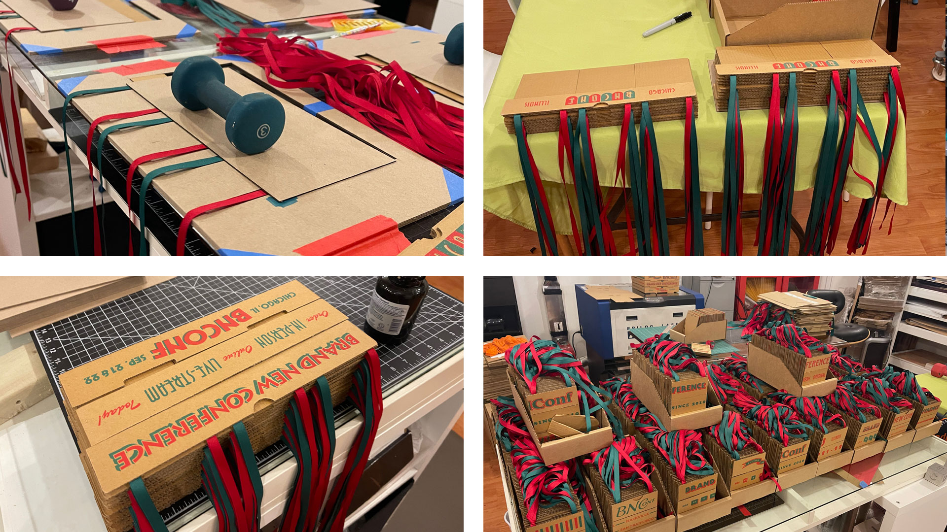
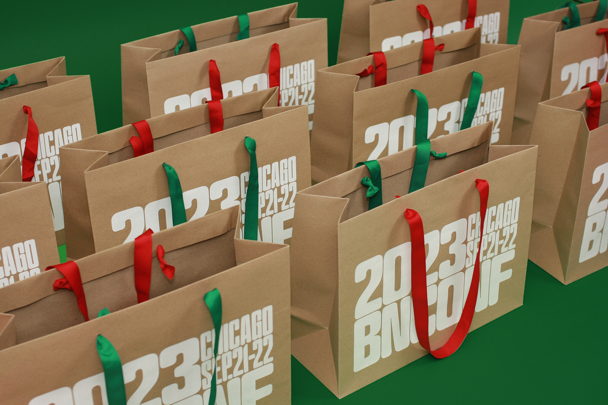
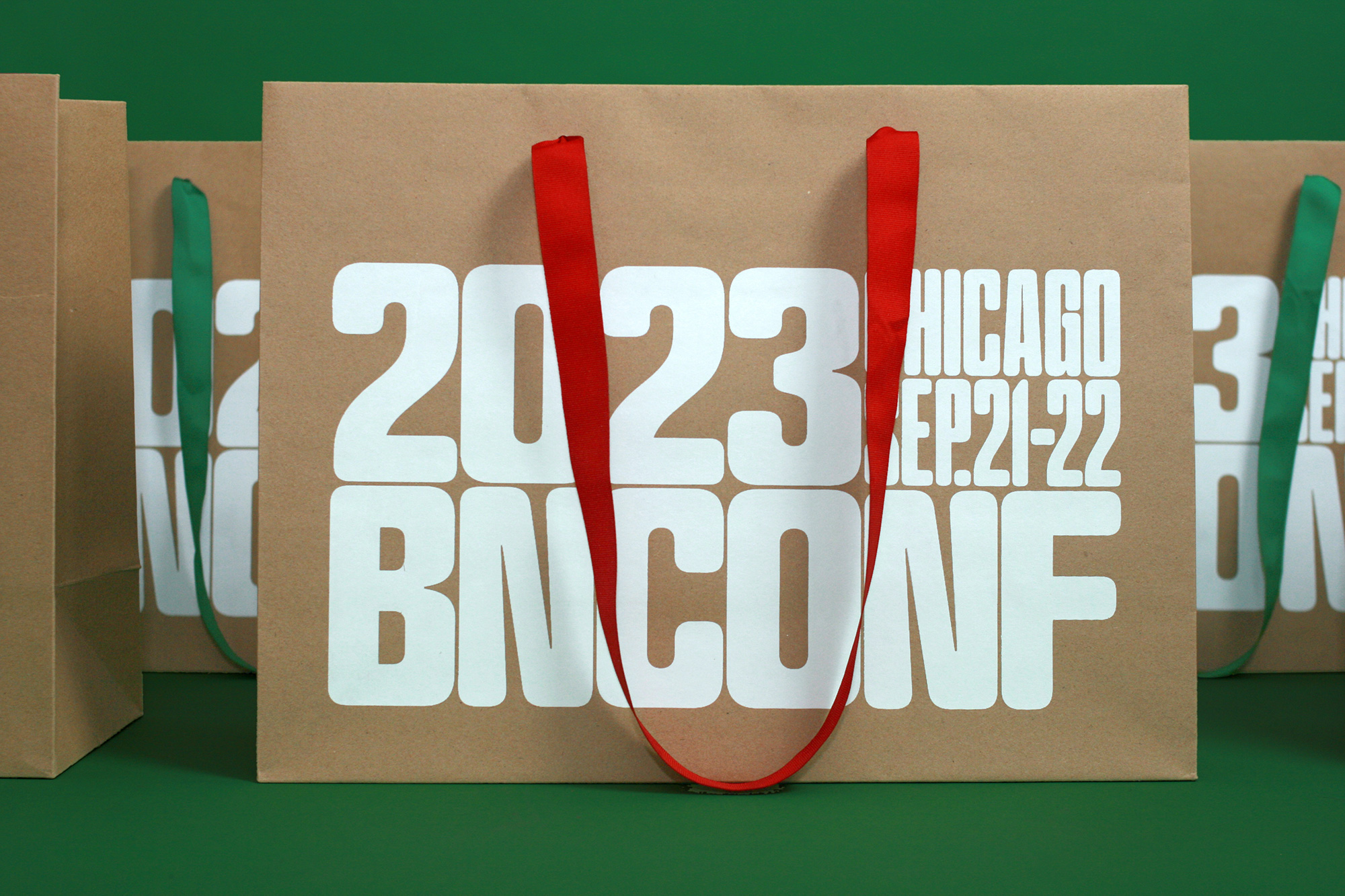
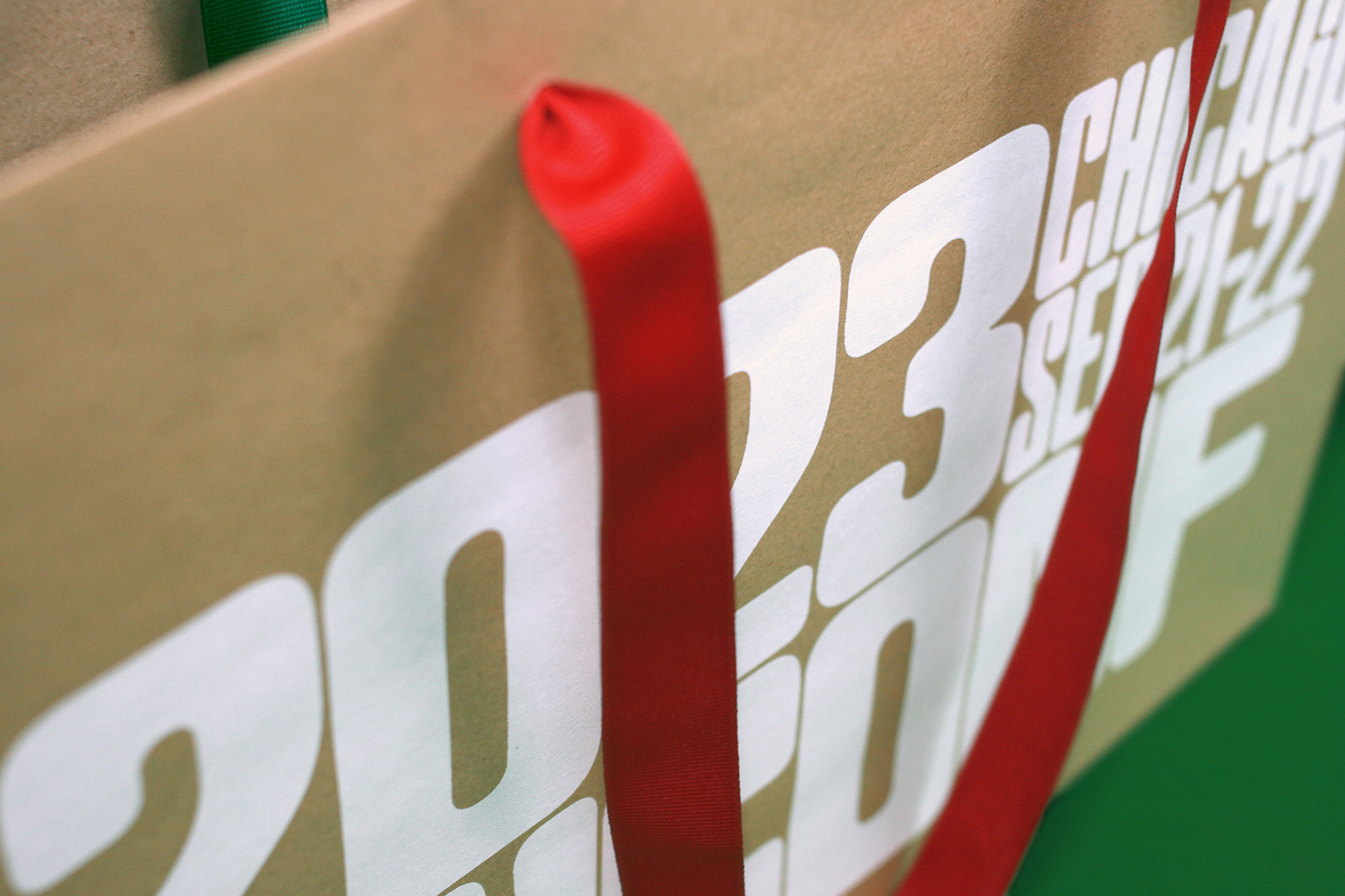
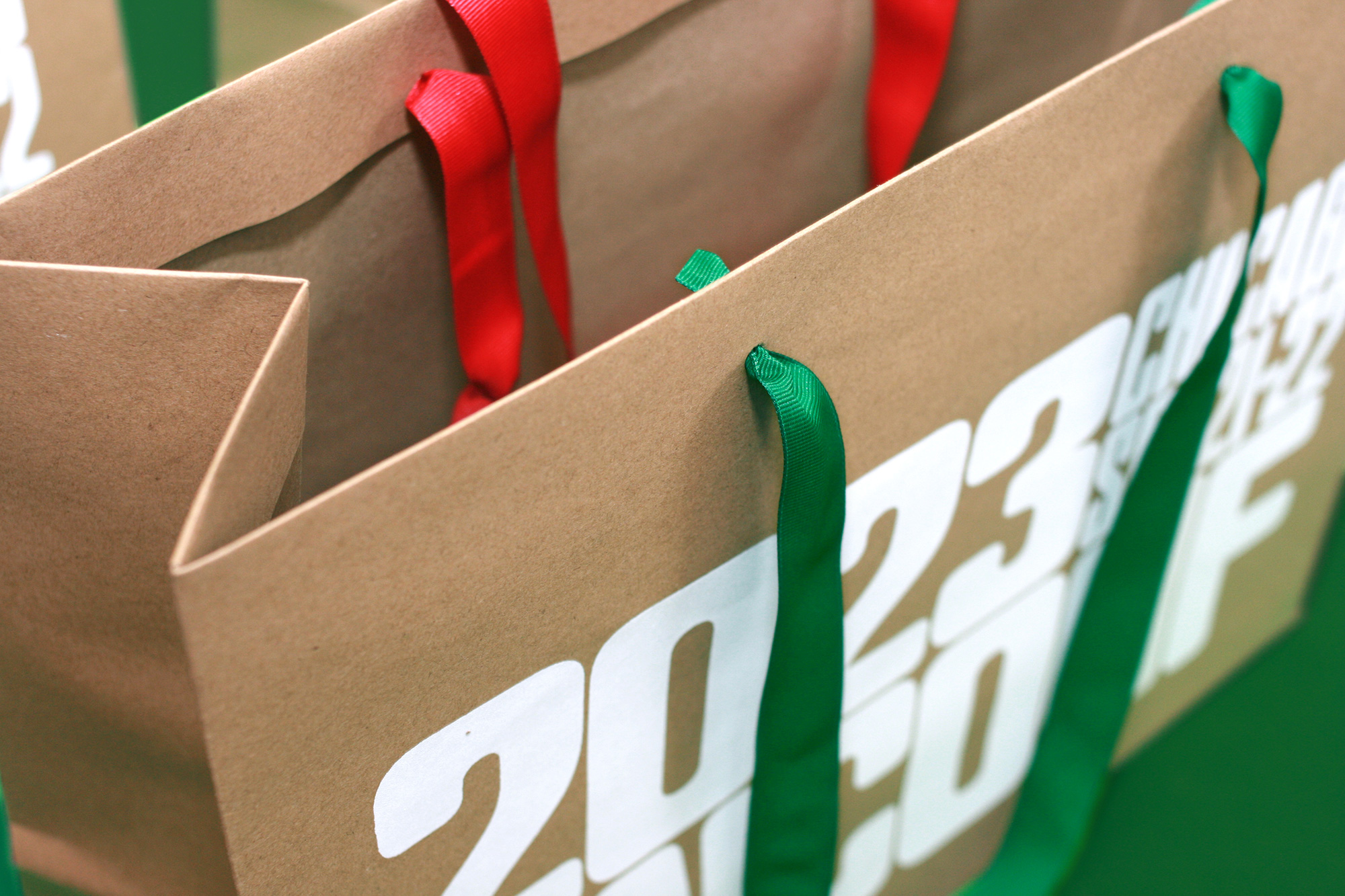
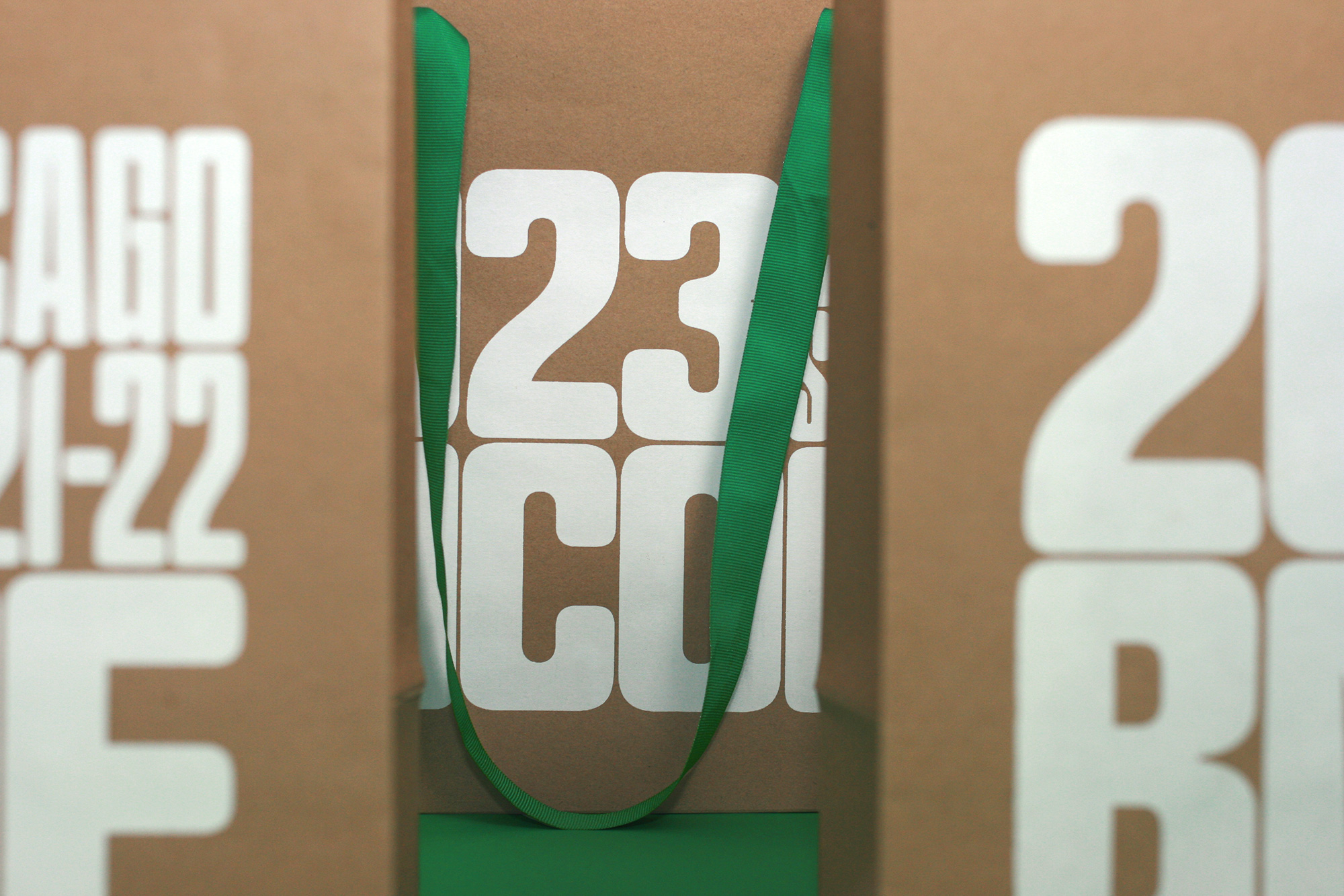
Goodie Bags
We haven’t done a proper tote bag in a while so we originally set out to do a very cool one with plenty of time to produce it but, unfortunately, the vendor we had worked with in the past without any troubles somehow was incapable of getting the colors right on fabric so after multiple tries and a lot of time lost, we had to pivot with three weeks to spare into another solution that involved kraft paper bags, silkscreen printing, and — our signature move — replacing the stock handles with custom handles. One red, one green, in the same fabric as the lanyards for the badges. Synergy, baby.
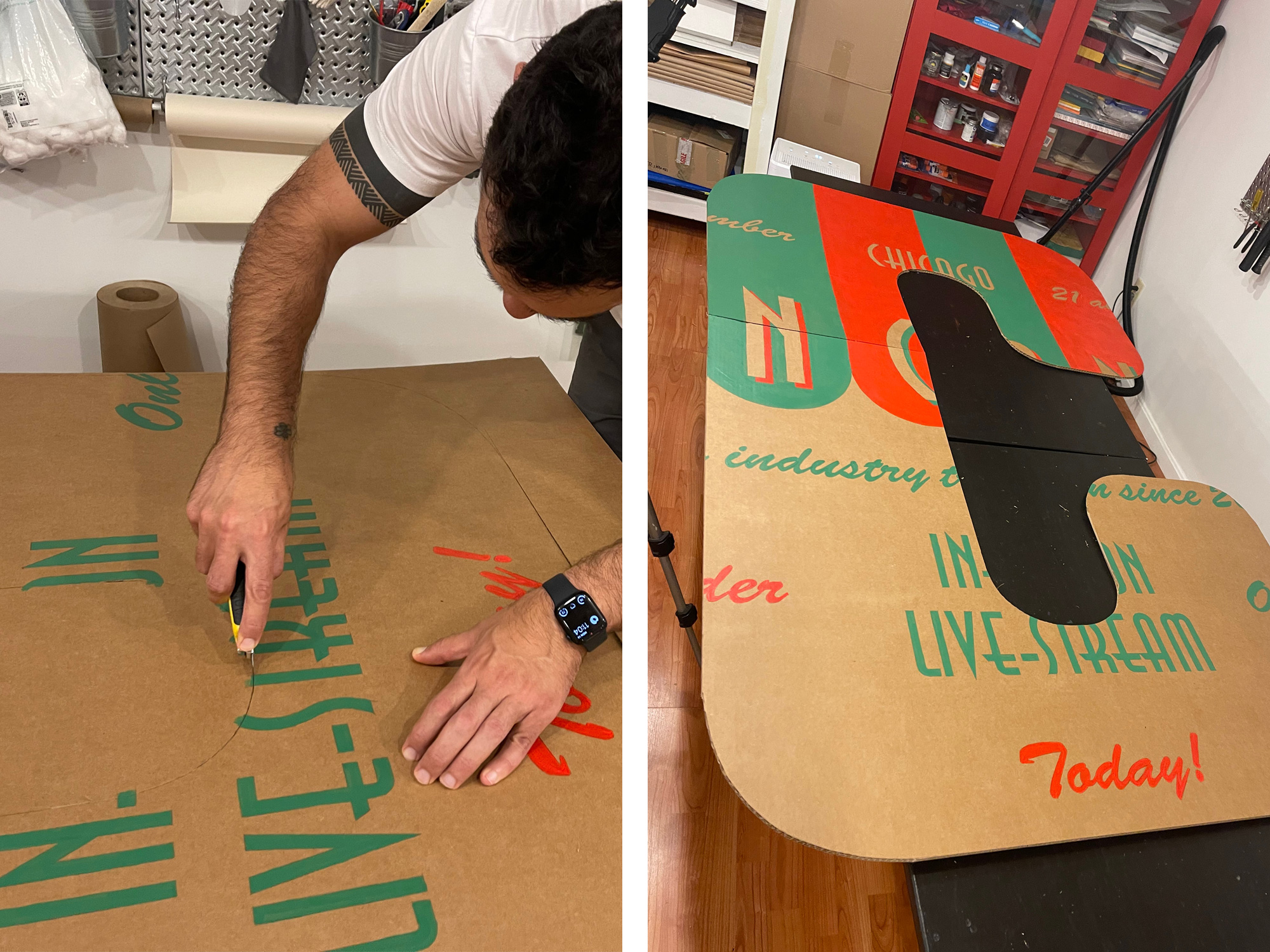
Stage Letters
After the success of last year’s screen-flanking letters we decided to do the same thing this year. Each letter is about 4 feet wide by 6 feet high and made from corrugated kraft paper. We chose the six designs from the fake pizza brands that would reproduce the best when masked inside different letters. The letters are all hand-painted and hand-cut. They were not as impactful as last year’s but they still looked pretty damn good!
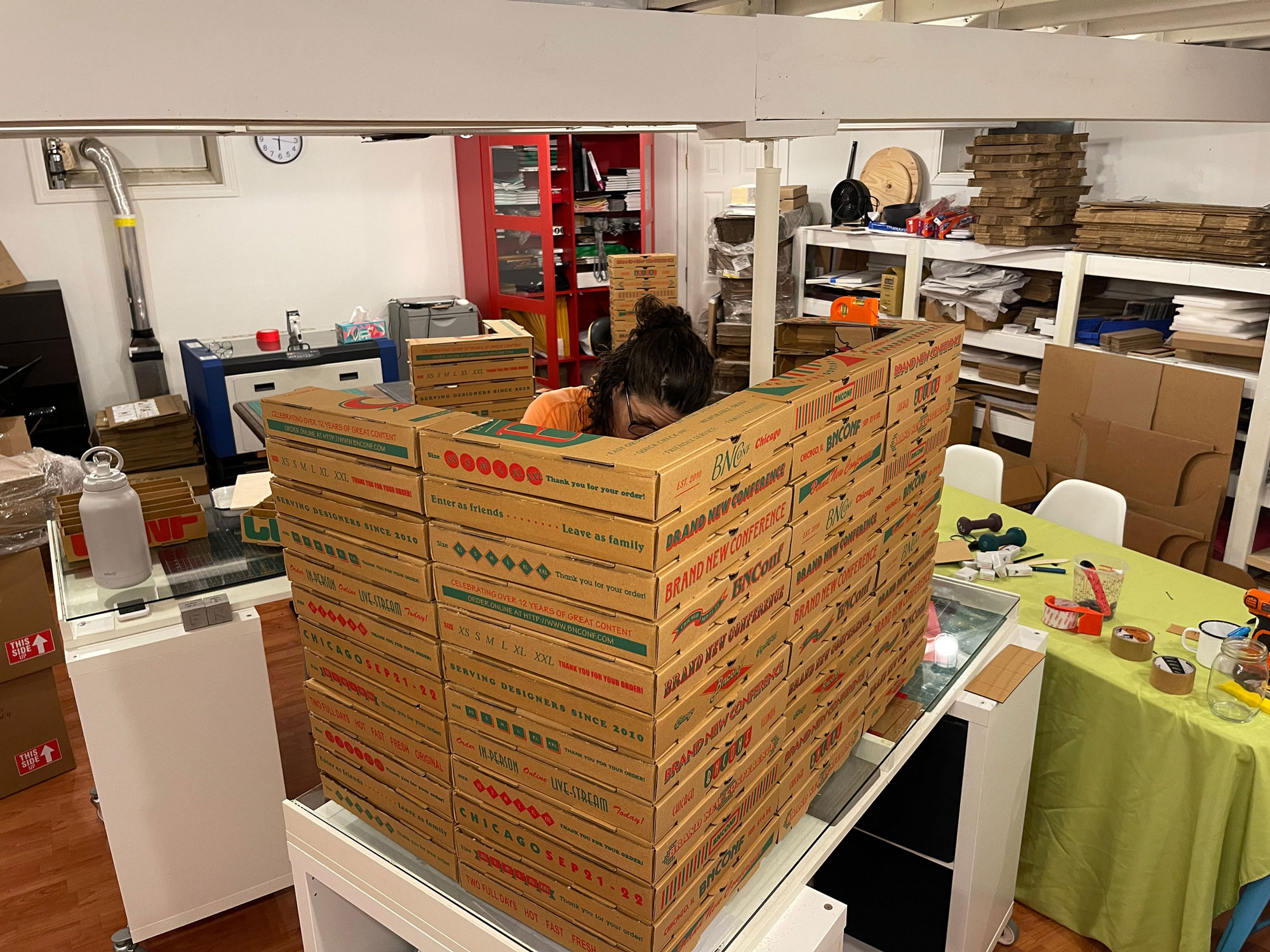
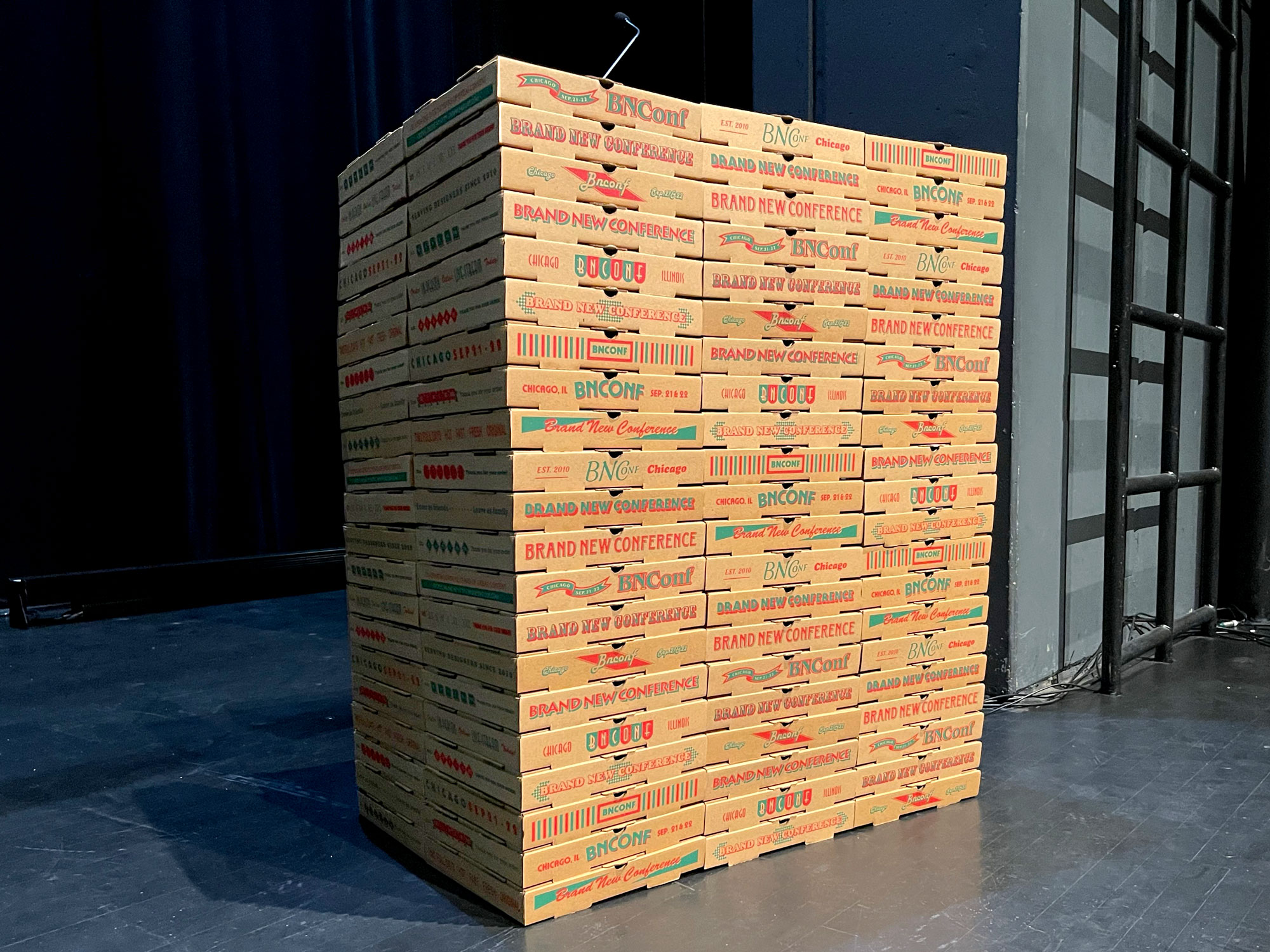
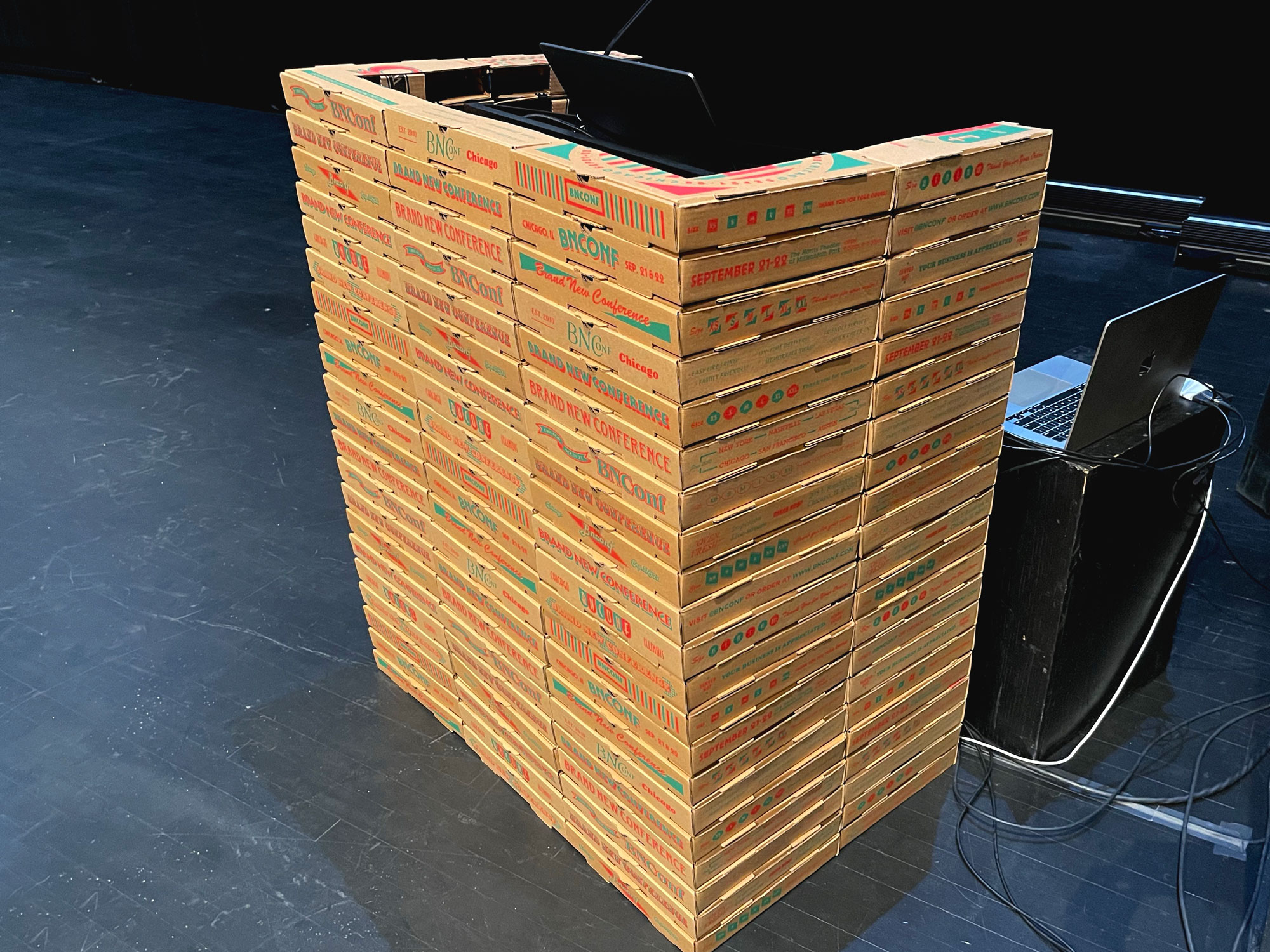
Podium
For the podium we usually do a simple digital print on yard sign material that is easy to place around any given podium. This year we did something a little different to take advantage of the many pizza boxes we printed. We wanted to create the impression of the speaker being in the middle of a large stack of pizza boxes, like you would see in a pizza joint as employees build and stack boxes to get orders out the door. We could have probably just stacked all the pizza boxes as they were but the footprint would have been too big and the podium would have looked massive, so we strategically cut pizza boxes to create a hollow structure that would only be about 4 inches thick instead of the 12 inches of the full box. One thing we didn’t expect was that, unlike all previous eleven conferences, none of the speakers presented from the podium because this was the first year we had the presenter notes from Keynote displayed in a confidence monitor which worked a little too well in giving speakers the confidence to stand in the middle of the stage so we have zero pictures of speakers behind the podium (or as the sound tech staff member called it, “The Pizza Pod”). We didn’t even take a good picture of it in situ with good lighting. Our best podium yet but sadly the least photographed.
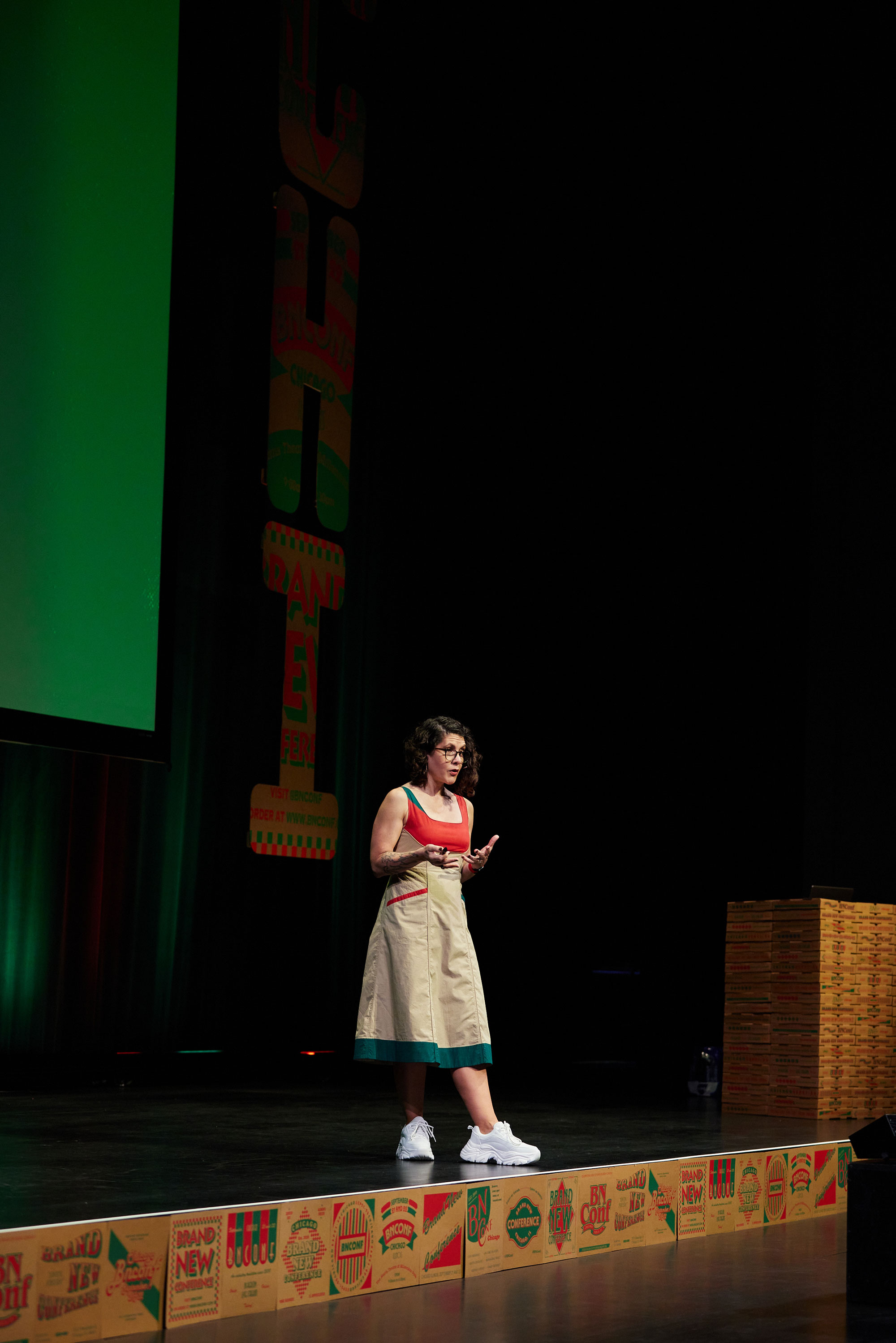
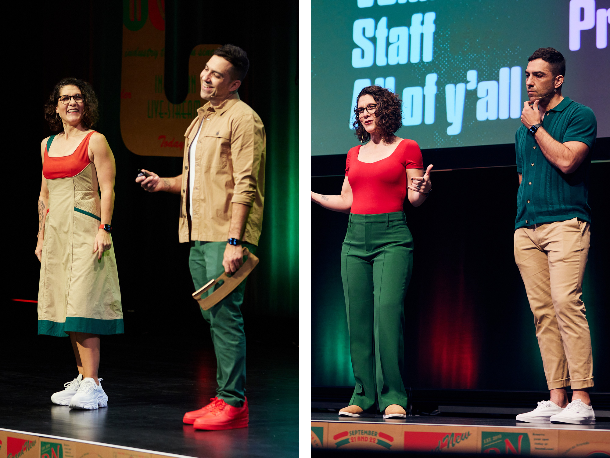
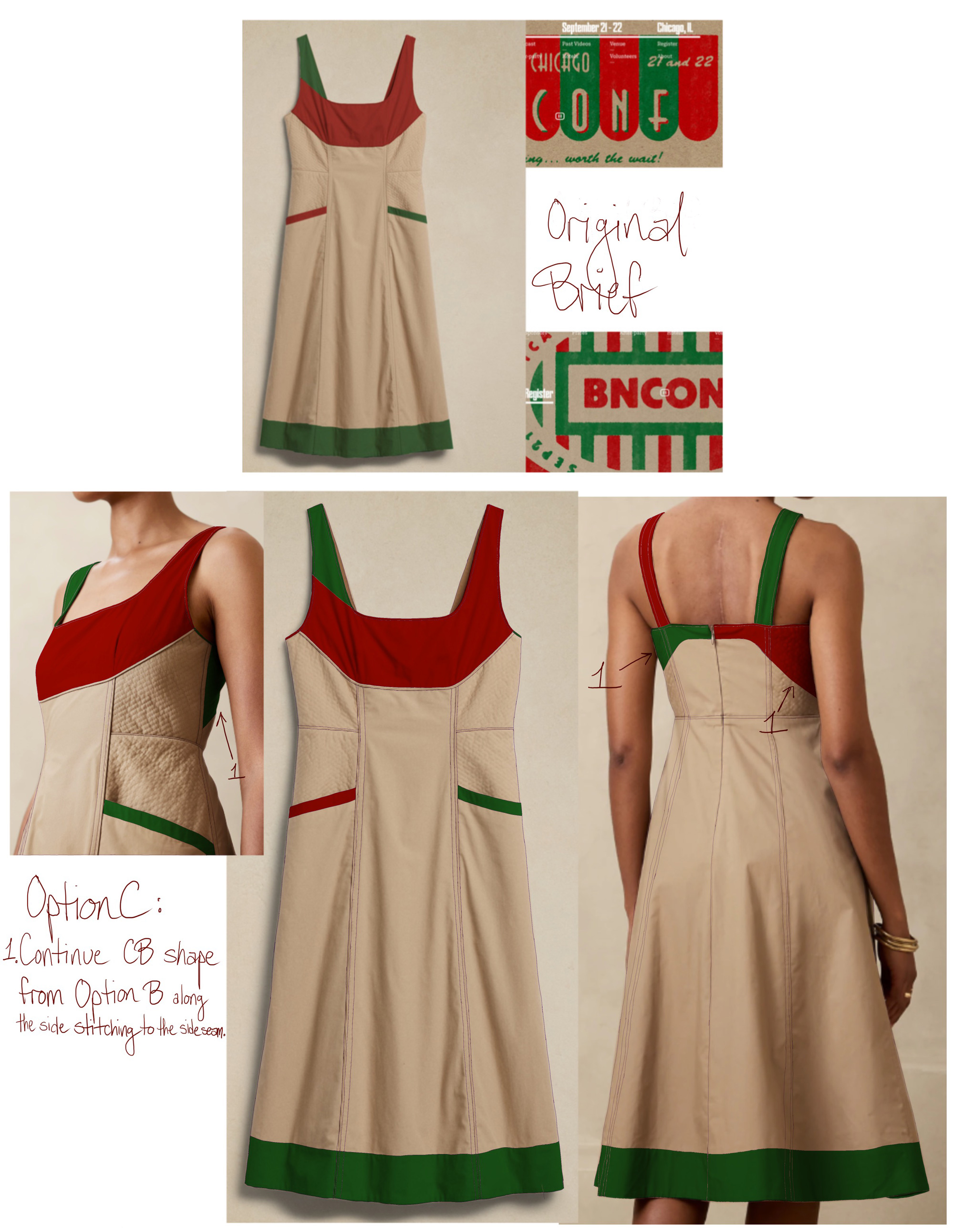
The Fits
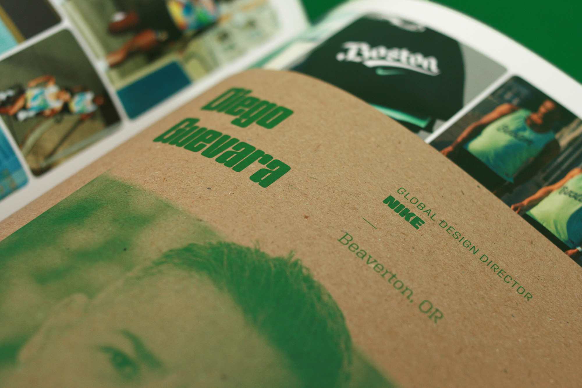
We usually color-coordinate our outfits with each identity but since this year’s colors were more “normal” — khaki, dark green, and red are fairly common fashion choices (more so than last year’s mint green for example) — we had more to choose from and be more on brand. Bryony’s first day dress got the most compliments and people assumed it was custom-made for the event but it was just customized by local costumer designer Nicole Hiemenz who hand-painted a Banana Republic dress. Armin also had an excuse to purchase some bitchin’, all-red Nike Air Force 1s.
Embracing Chaos
For last year’s conference we suffered a little bit because we got a late start and faced many mini emergencies throughout the production so we vowed to not let that happen again. However, having gotten a good head start on the production we took on far more manual labor than we anticipated. So this year’s production was less stressful overall but it was far more intense in how many things we ended up doing. This isn’t a plea to get kudos or a glorification of the grind, it’s more of a therapeutic release to acknowledge that shit got heavy and that we need to set some limits as we worked non-stop on this from June 6 when we got back from an early Summer vacation straight through September 19 with no weekends and very few moments of relaxation, which were hard to achieve anyway as our office, then our workshop, then our garage, then our guest room all became war rooms for production, storing, sorting, and shipping of conference materials. The chaos was real and, for better or worse and we hate to admit it but, now that the craziness has passed, we miss the chaos.