You’re looking at one of the…
A graphic design firm generating its own projects, initiatives, and content while taking on limited client work. Run by Bryony Gomez-Palacio and Armin Vit in Bloomington, IN.
Join our Mailing List
Colophon
Headlines and wordmark
Druk Condensed XX Super by Berton Hasebe for Commercial Type.
Body
Neue Haas Unica by Toshi Omagari for Monotype. Served via fonts.com.
UCLLC logo
Custom lettering by Mark Caneso.
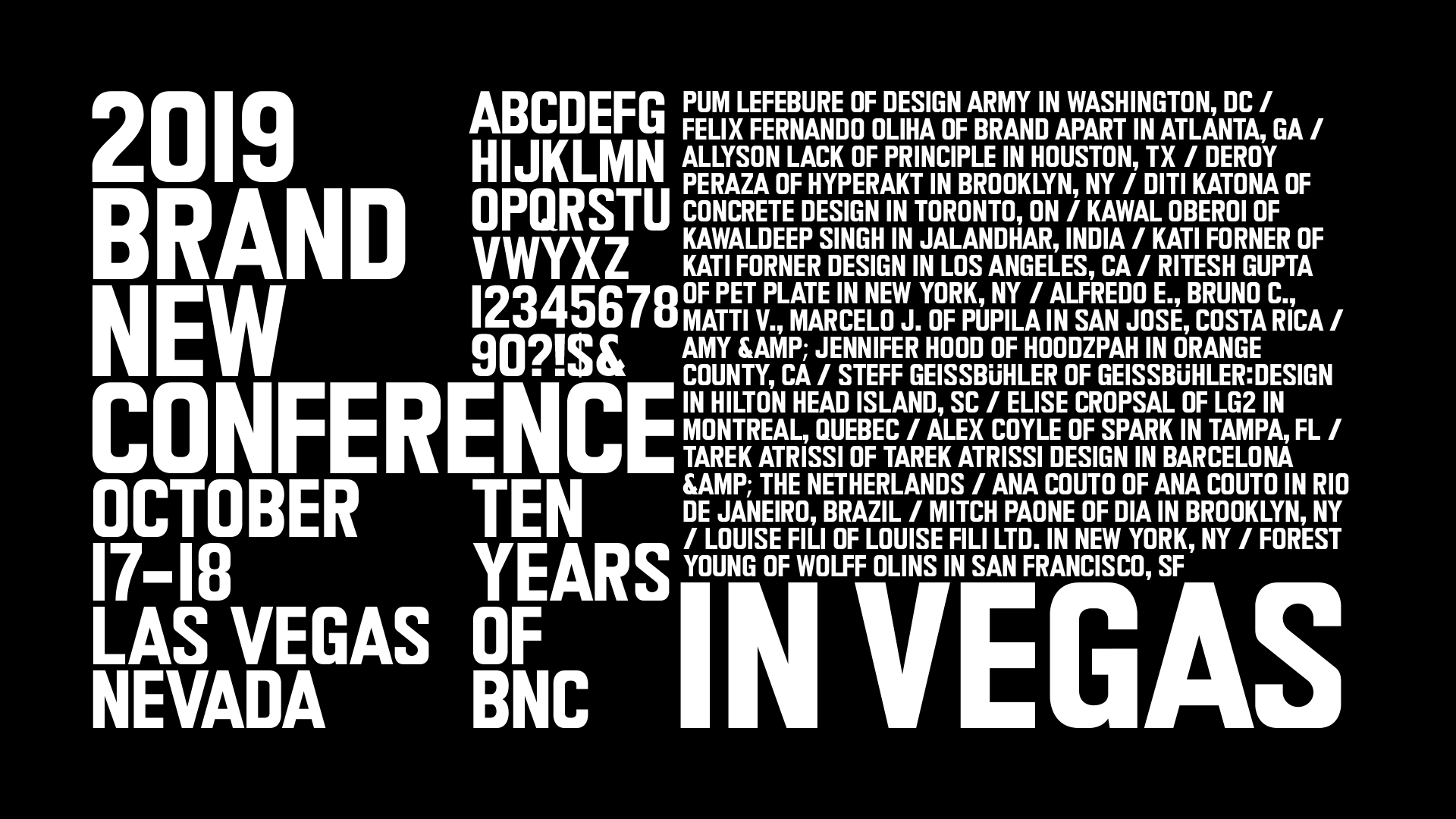
2019 Brand New Conference Identity
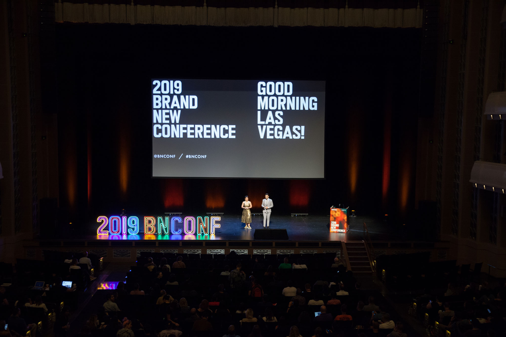
This past October 17 – 18 we celebrated the tenth anniversary of the Brand New Conference in Las Vegas, NV. It was a fun two days and, as usual, we enjoyed doing some crazy stuff for the applications especially with the challenge of channeling Las Vegas’ frenetic energy. We don’t go into the behind-the-scenes in this post so if you are interested in how we put together the materials this video covers it. Long post ahead with lots of video files.
Vegas References
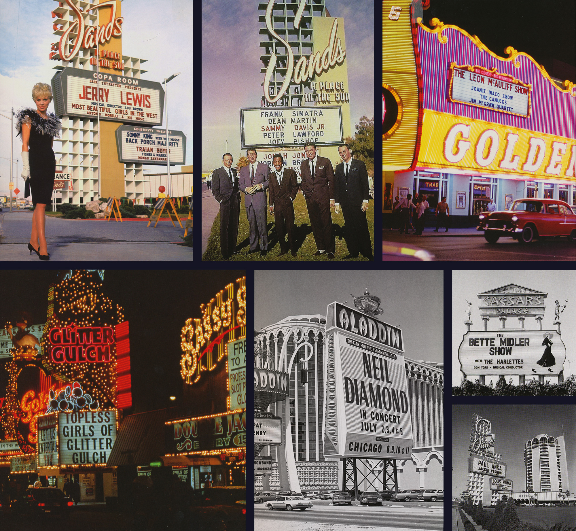
Given that the venue for the conference was in Downtown Las Vegas — the original townsite and original gambling district of Las Vegas prior to the Strip — we were heavily attracted to the 1940s and 1950s version of the city, which manifested itself in an eclectic combination of the niceties of Mid-Century Modernism and the tackiness of neon light casino-ism.
The book, Vegas Gold by David Willis, and the Instagram hashtag #VintageVegas, became our guiding lights — pun semi-intended. While the neon signs are indeed the heroes of vintage Las Vegas, we were equally attracted to the unsung marquee signs that, underneath the glitz and glimmer of the neon signs, announced the various acts that were playing at any given casino and/or hotel in movable utilitarian fonts. These two elements served as the basis for the identity.
Custom Typeface
At first we tried to find existing typefaces that matched the marquee style but what we found was either too slick or too grungy so we turned to our old friend, eBay. We were able to locate a full package of vintage marquee letters that would provide us with a starting point.
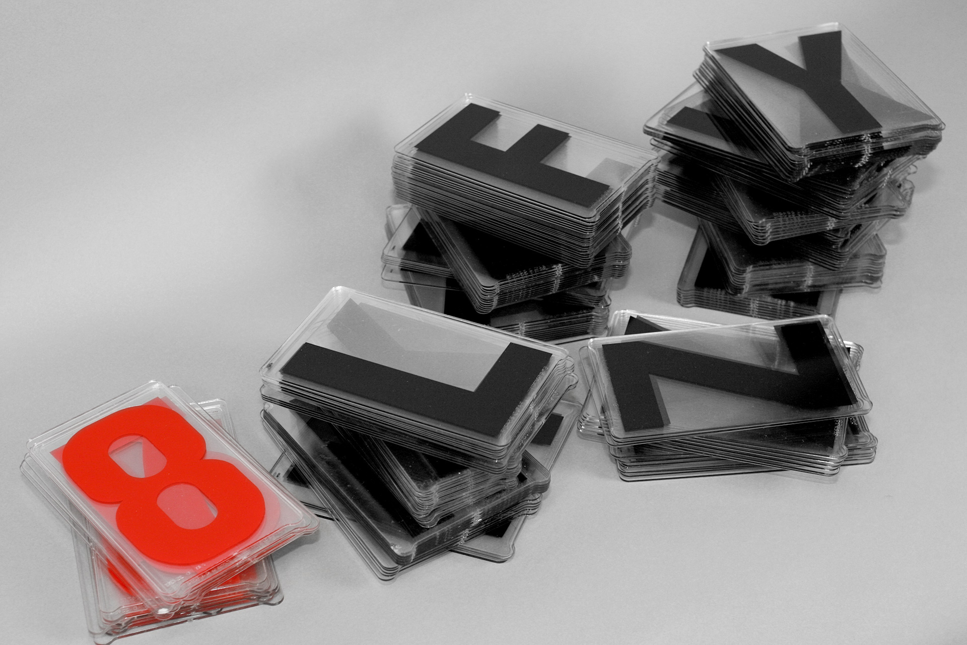
After scanning all the letters we cleaned them up, established some mathematical boundaries, and treated each character as if it had to be drawn with a ruler, compass, and/or French Curves. We fell in love with the modularity of the letters as well as their flat tops and bottoms, which became more noticeable when the font was stacked, which became more interesting the tighter it was stacked. Said tightness became a key component of the identity.
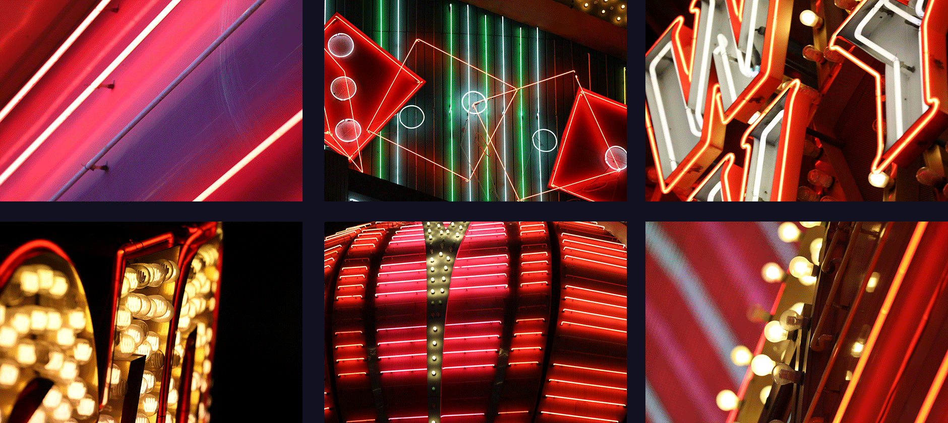
Neon Lights
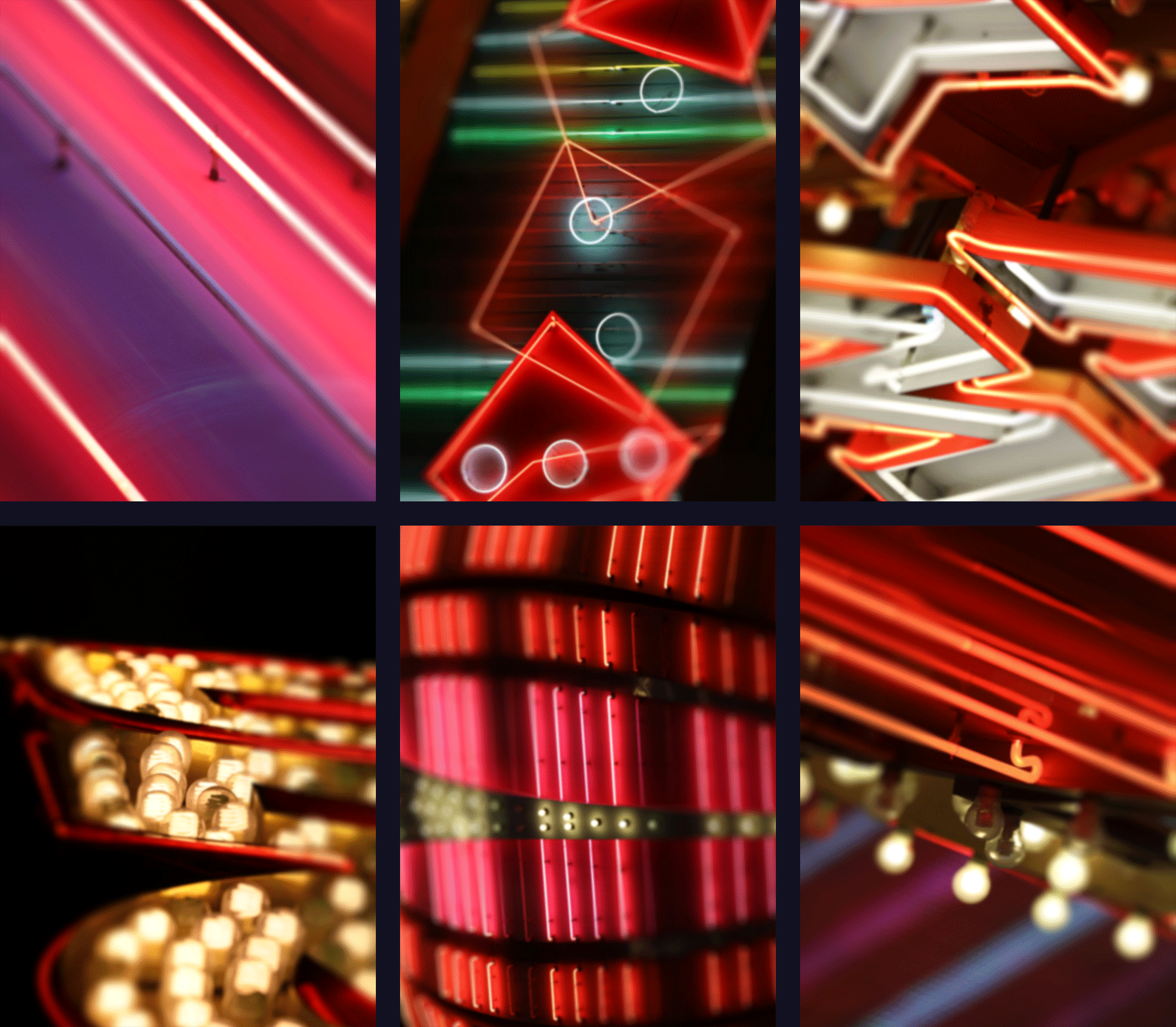
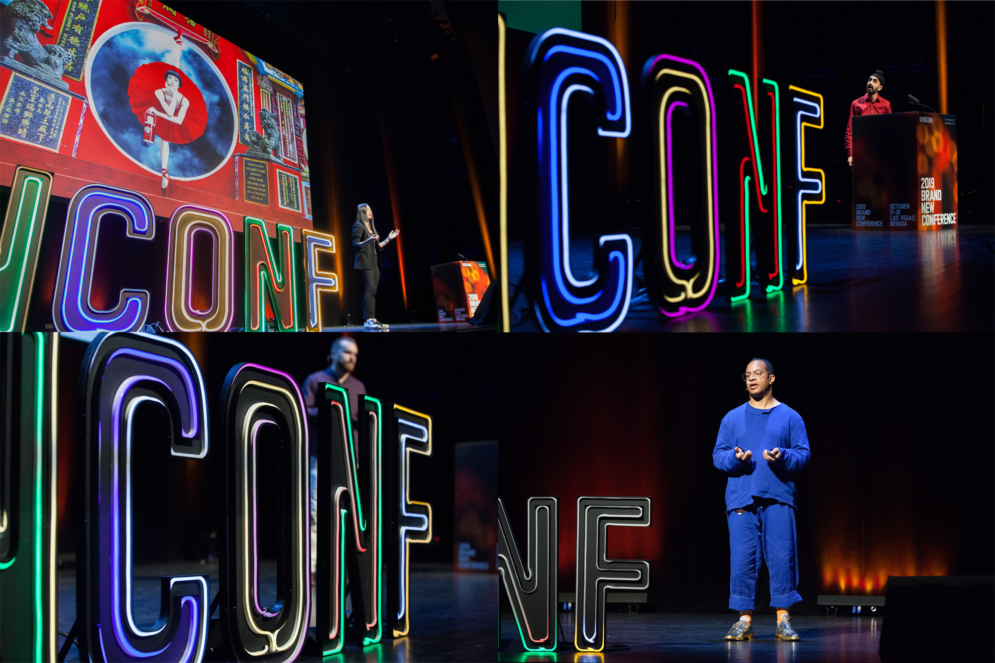
We wanted to capture the visual and sensory overload of being in Las Vegas and specifically of walking along Fremont Street — where many of the original neon signs still stand — which is a kind of frenetic on-off-on-off flickering of neon signs, light bulbs, and letters and the constant dinging of the slot machines inside. We took a special trip to Las Vegas, armed with a telephoto lens, and photographed every possible neon sign that we could stand under. We photographed them in bursts so that we could capture as many “On” and “Off” states as possible. From the more than 2,600 images we took, we selected the ones that yielded the best on-off states and that looked the coolest as abstractions of neon signs.
We then combined the photos with the new typeface — spelling out, as usual, “BNCONF” — by referring back to the marquee font in real life, where each character lives centered inside an acrylic frame. We replicated these layouts but in a looser way with wider margins so that the images could show through better. This modularity then allowed us to mix and match the different images that, when paired, create that sensory overload feeling you get from being in Vegas.
And that gave us the primary building block of the identity: a constant on-off, neon-light-infused modular grid that we could apply to the website and social media posts.
Programs
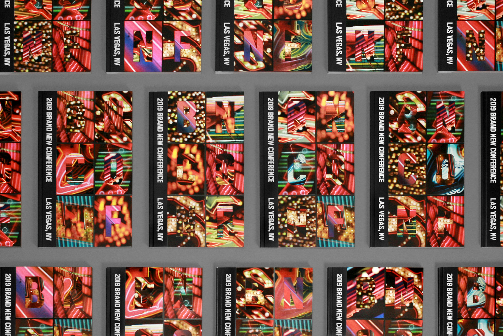
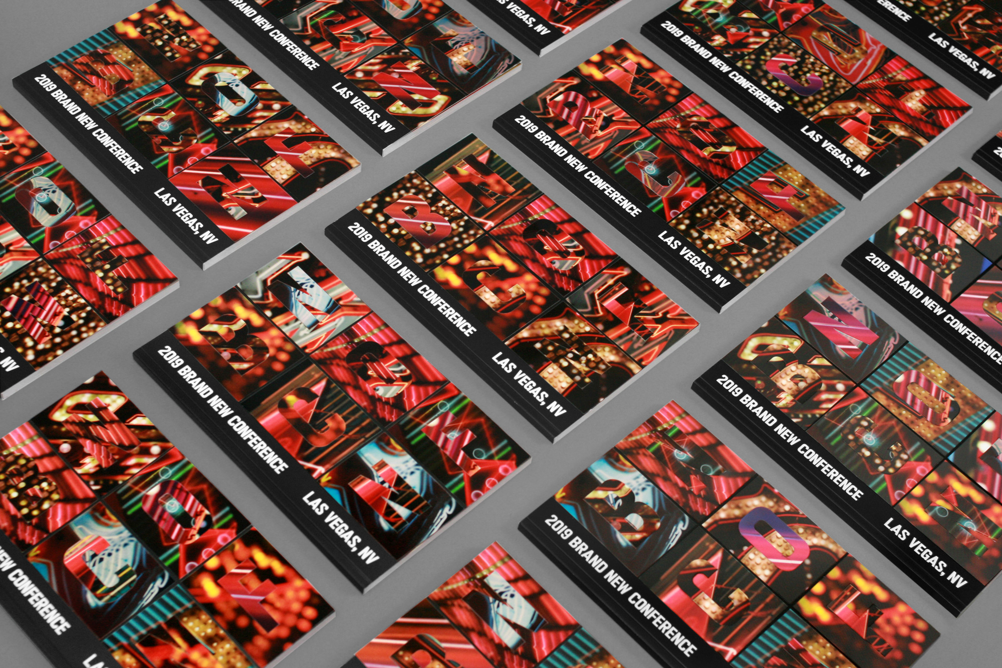
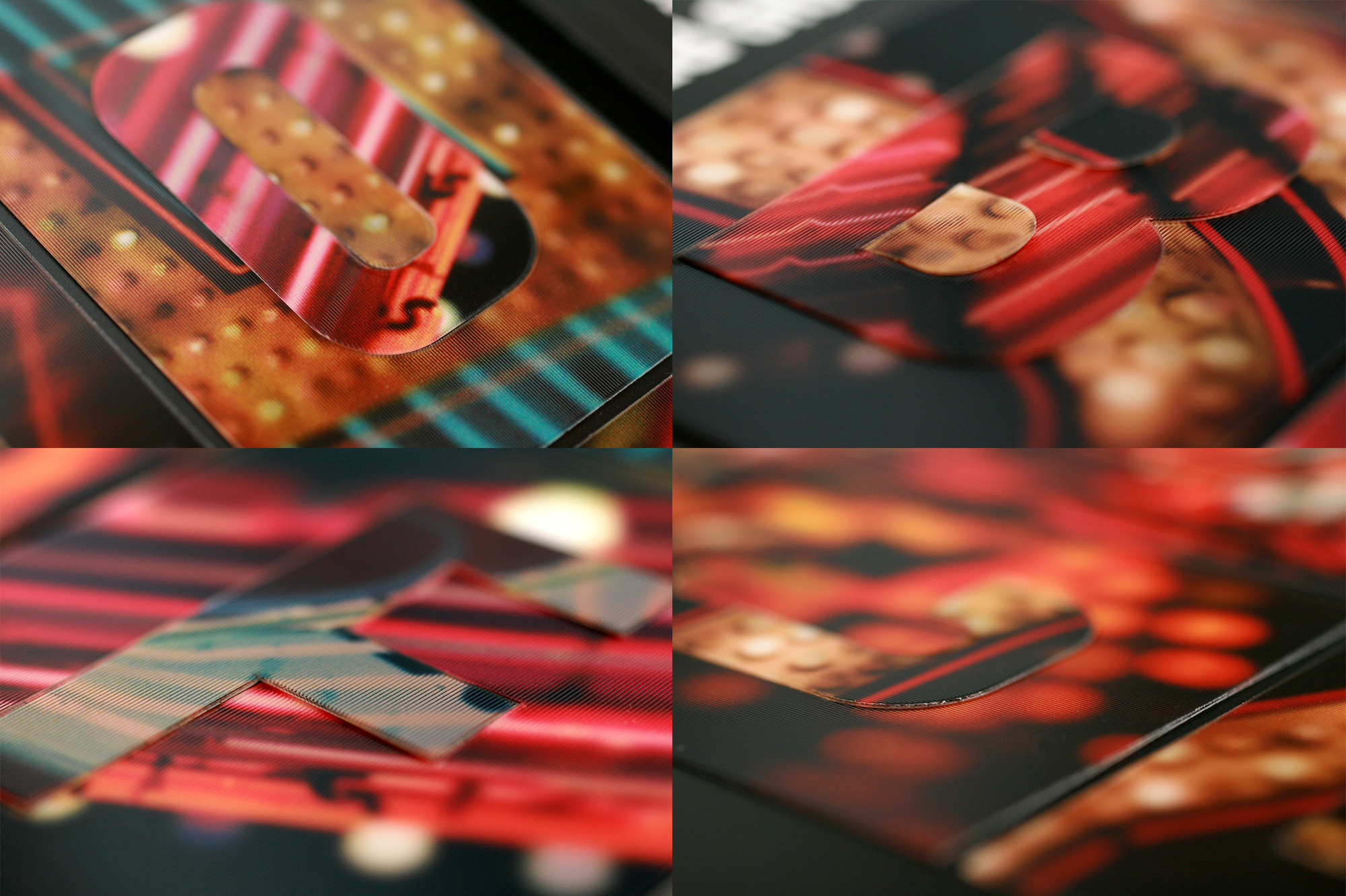
The real challenge of this year’s identity was how to bring to life, in analog form, our on-off compositions that were so relatively easy to deploy digitally. Enter lenticular printing. A technique we never imagined we would use, since it’s something we usually associate with tacky postcards and cheap promos but it was the only way to achieve this effect. Luckily, our trusted printer, Classic Color, knew of a lenticular sheet manufacturer, Pacur, that makes some of the best lenticular sheets available so between Classic’s excellent printing and Pacur’s quality materials we knew we could exceed our own expectations of what lenticular can do or look like.
Because we never take the easy way out with the conference materials we customized every single program by mixing and matching 12 different images that were each printed 6 times and each of those having a die-cut for “B”, “N”, “C”, “O”, “N”, and “F” respectively. This allowed us to create an infinite number of possible combinations — 221,298,739,200 to be exact, actually, according to our super smart 12-year-old daughter. Each letter had a peel-off adhesive backing and we manually placed each combination, one at a time over a very long stretch of hours. If you are wondering, yes, the counters of the “B” and the “O” had to be placed individually as well to match the “background”. Sure, we could have easily printed 12 different compositions in a single sheet of lenticular and have the printer glue them in some mechanical way but this hand-assembled approach yielded a highly tactile feel in the spots where each letter nestled itself tightly.
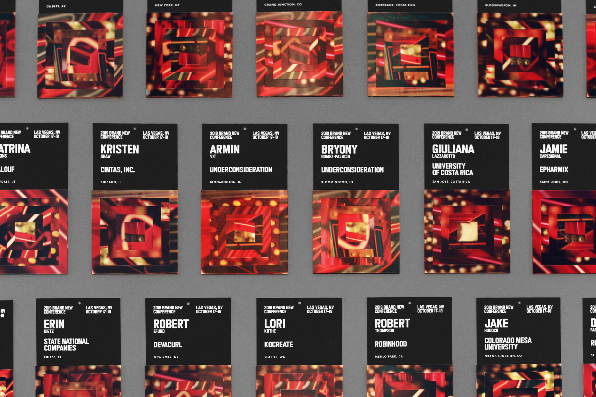
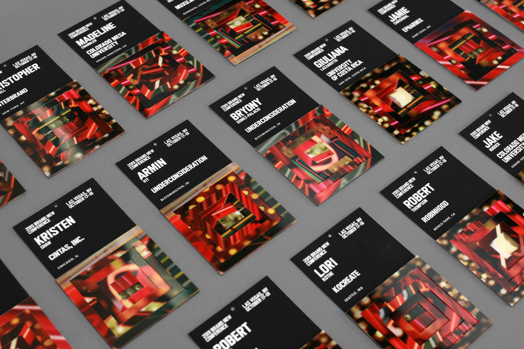
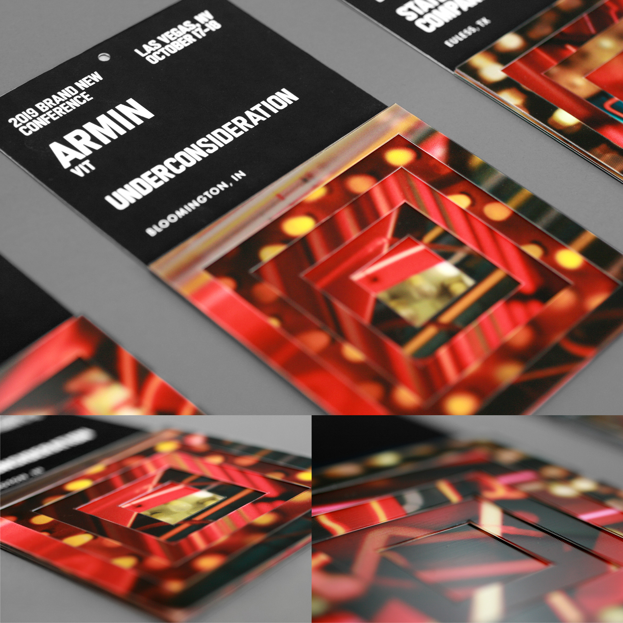
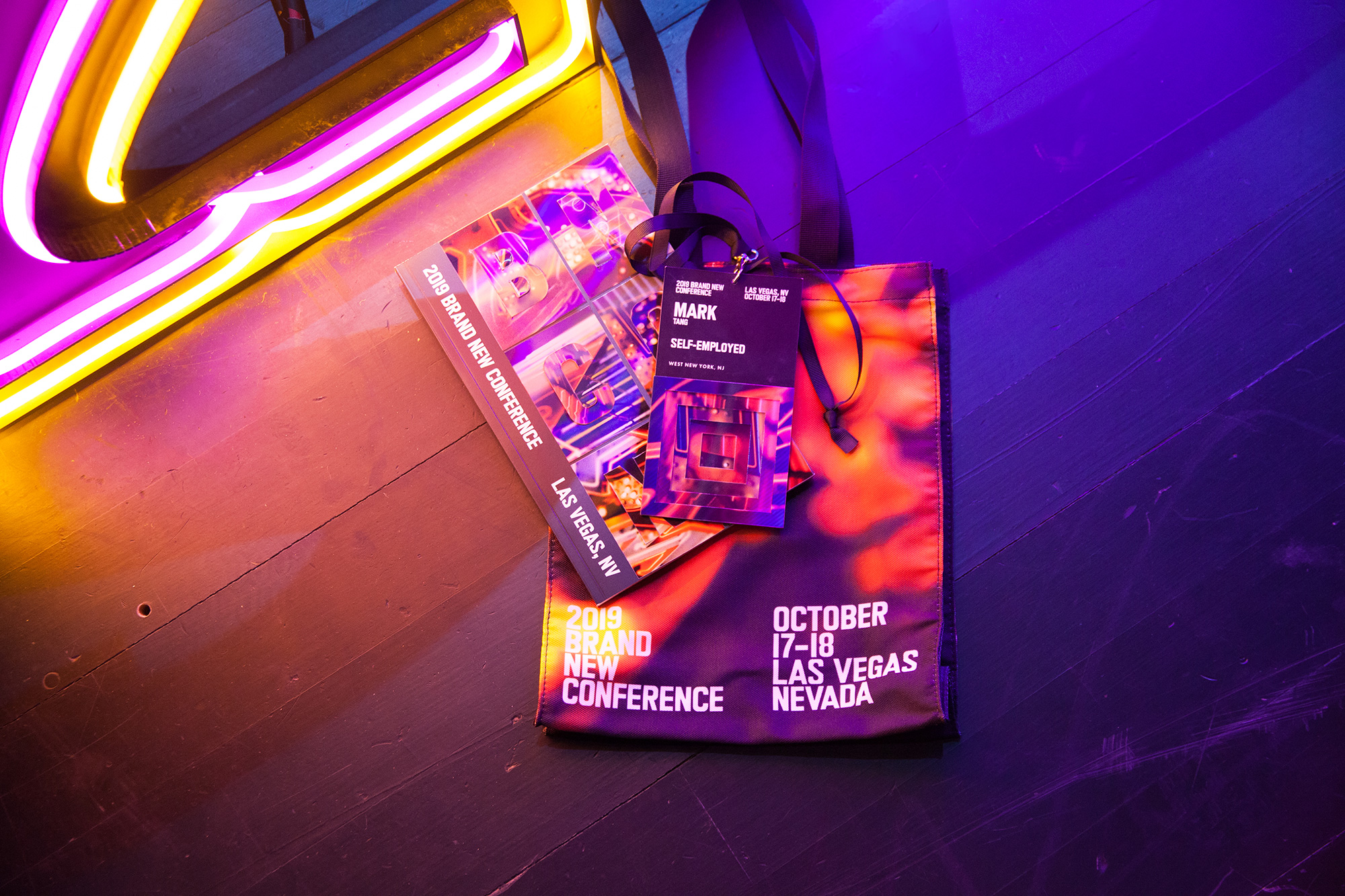
Badges
Our first inclination for the badges was to somehow fit a lenticular “BNCONF” on them but there was not enough space so we opted for a kind of nested Russian Doll slash inverted pyramid arrangement where five frames in decreasing thickness stack on top of each other for a kind of tunnel vision effect and to further play on the nature of more-is-more of Vegas.
As with the programs we printed and die-cut a variety of frames — four of each thickness — so that we could create various combinations.
The condensed custom font proved to be very useful this year as it allowed for people’s names to be displayed very large and still fit in the narrow 3.5 inches of the badge.
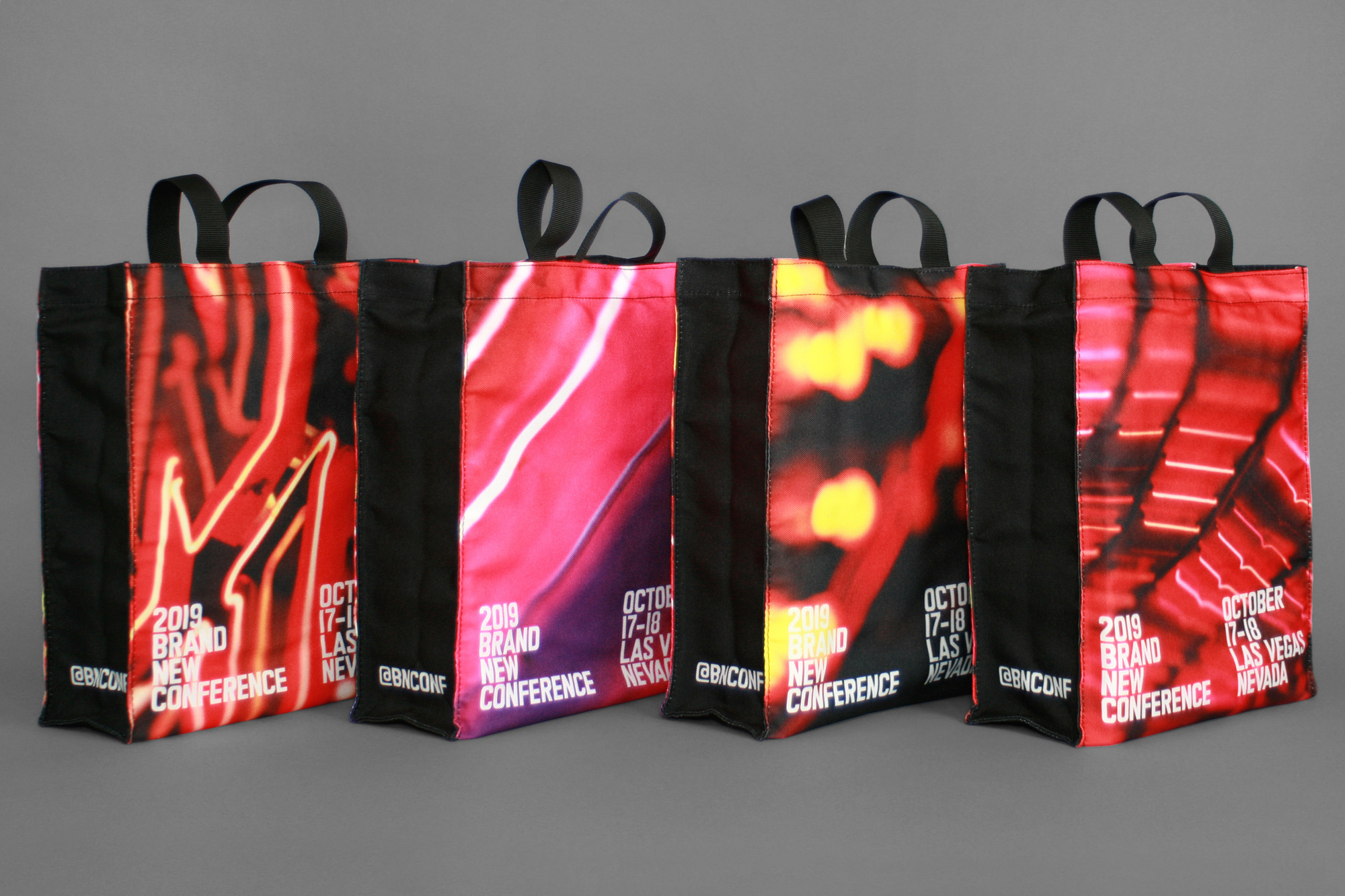
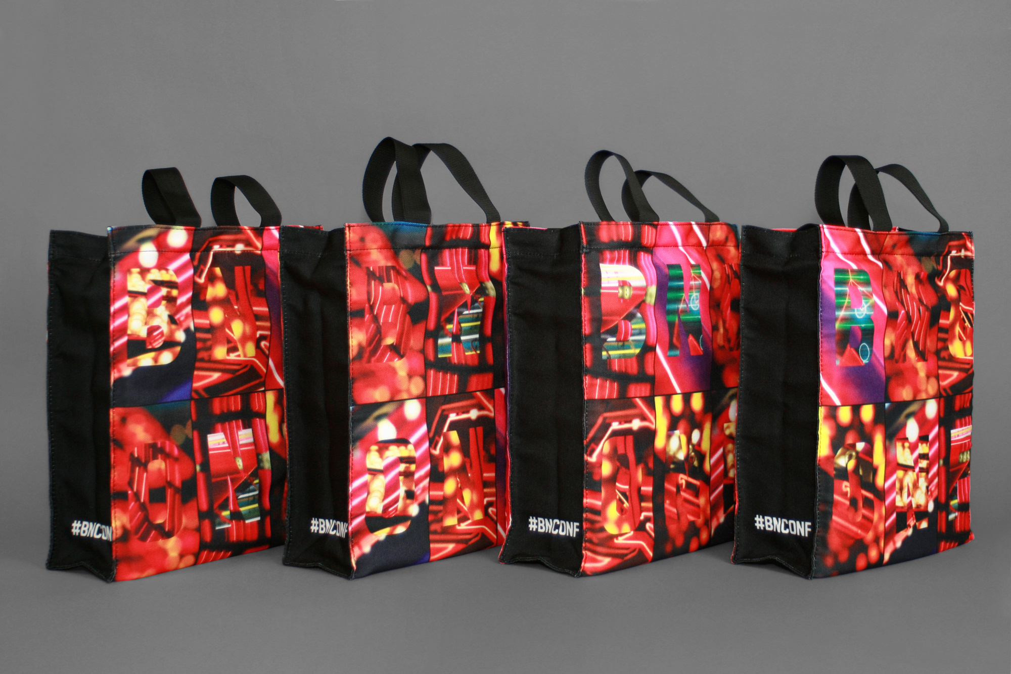
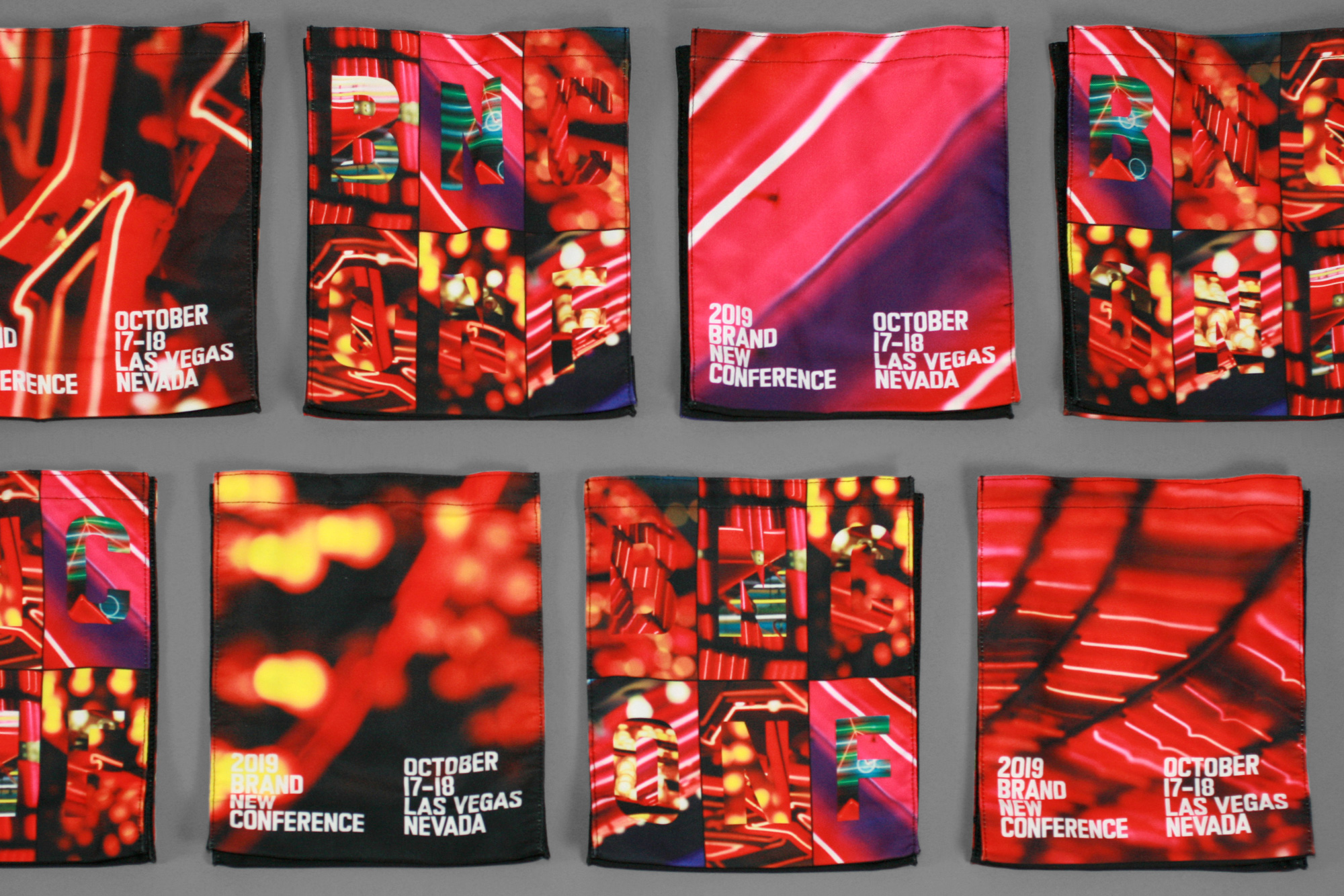
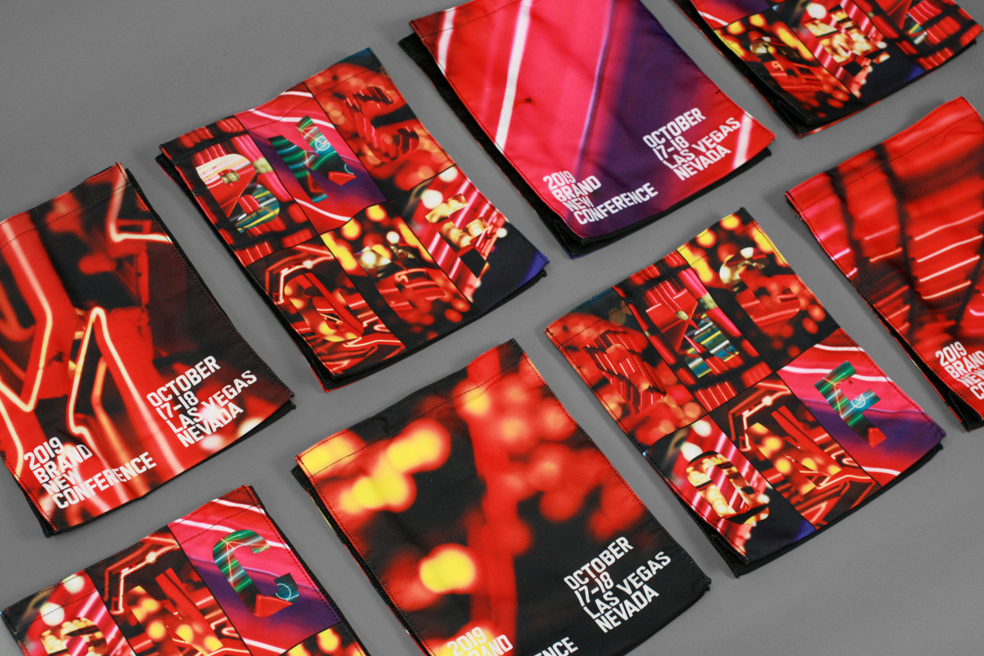
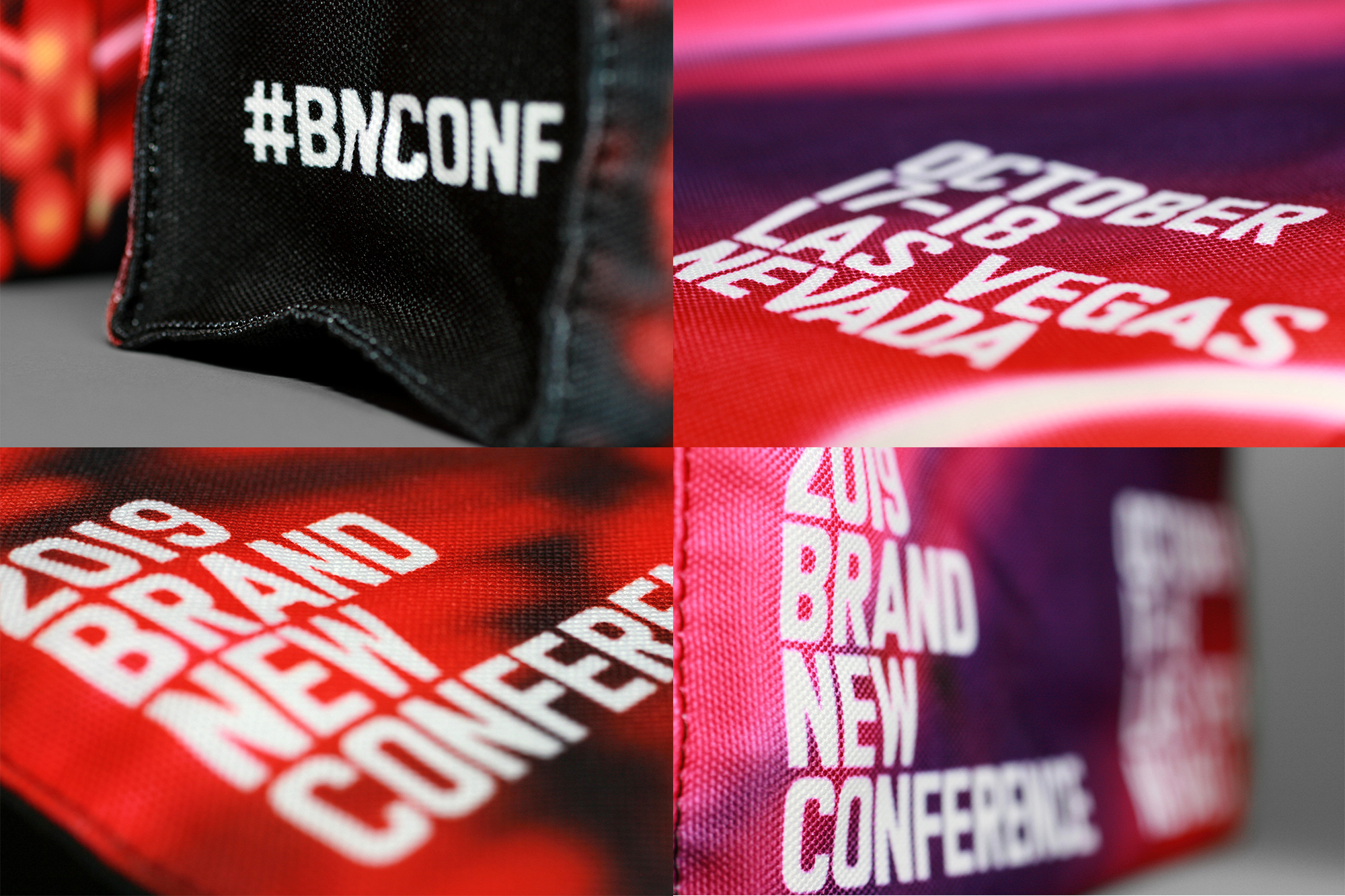
Tote Bags
Given the amount of hand assembly required for the programs and badges we decided to keep the tote bags relatively simple with a full print on all sides. There are four different designs with the front showing a full-bleed picture of some of our favorite neon-light photos and the back showing different combinations of the “BNCONF” letters.
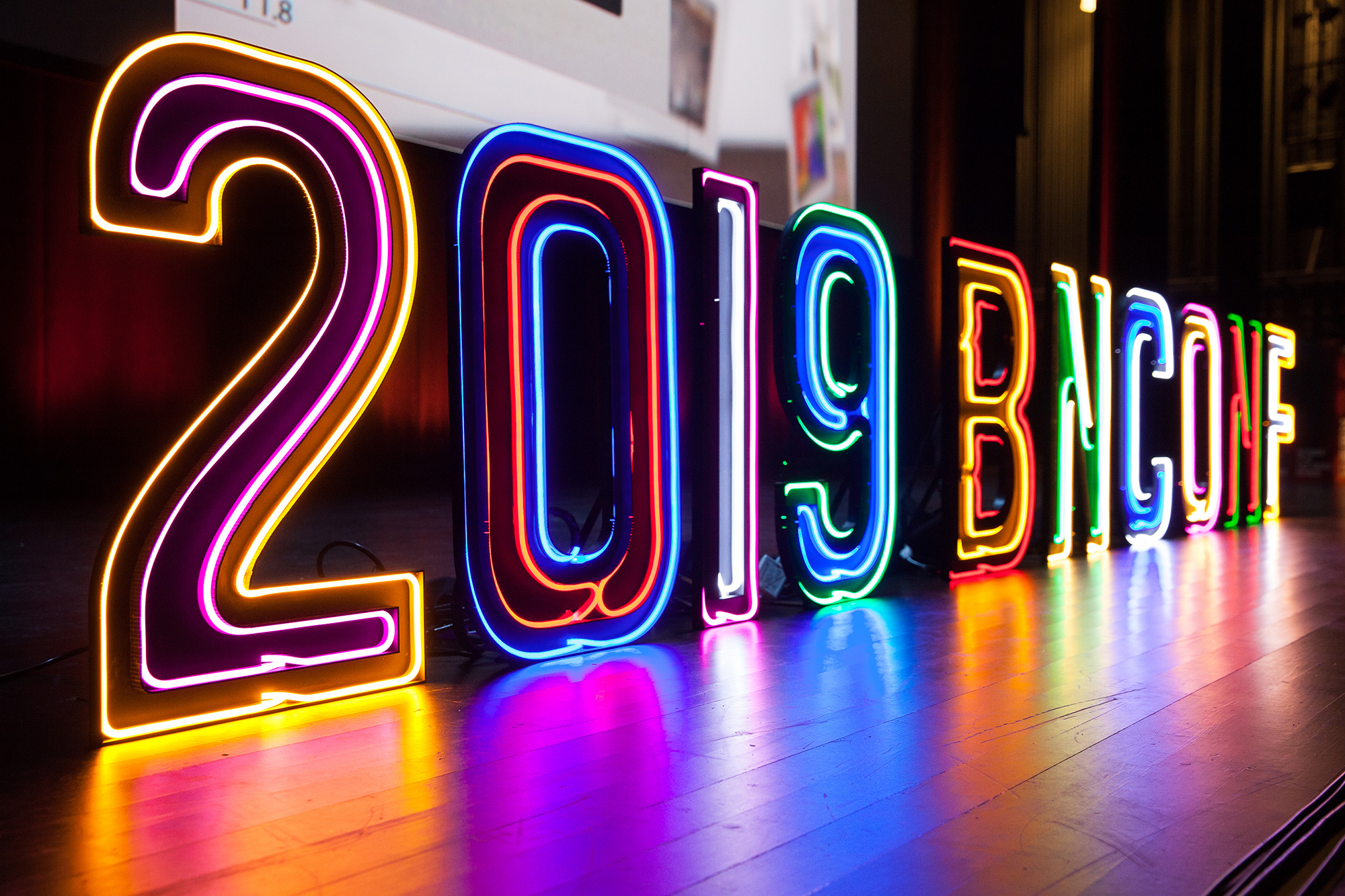
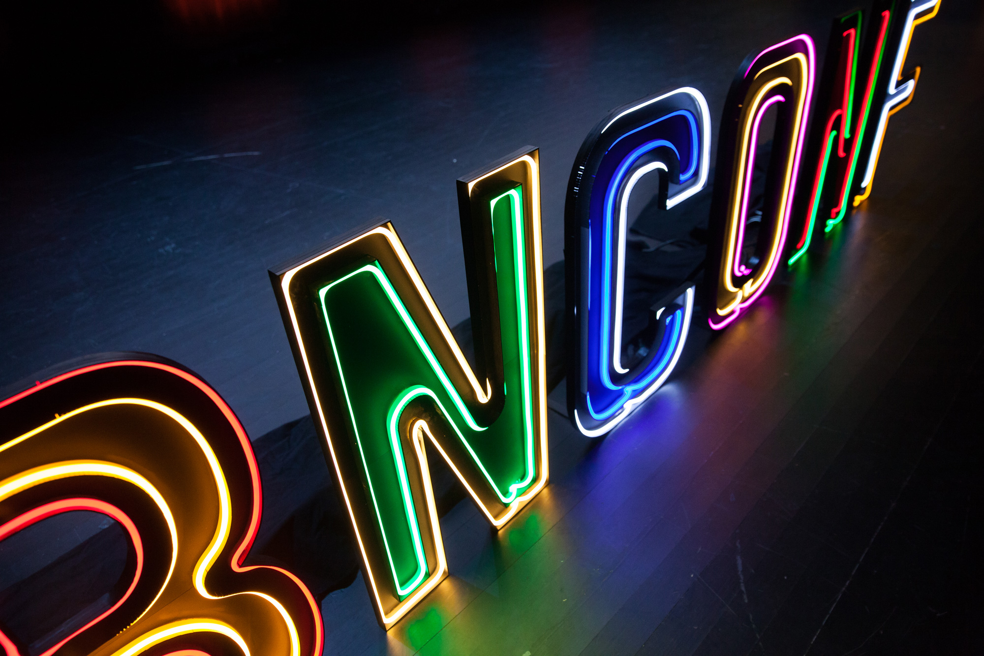
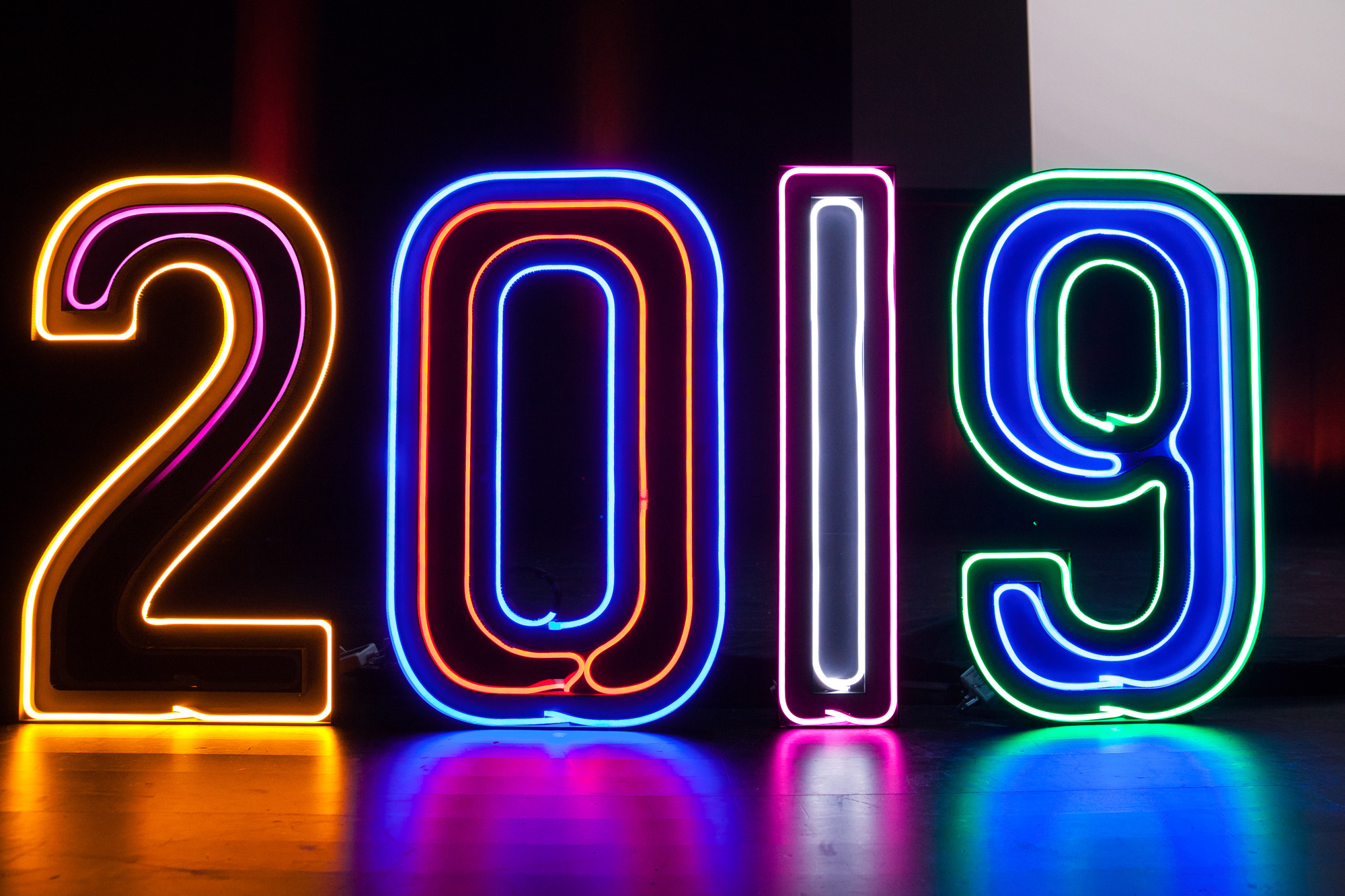
Stage Letters
We wanted to create the closest rendition of neon possible and since working with actual neon is, like, super hard, we found these great thick strips of LED lights that behaved very closely to neon as they were hard to twist into curves creating similar effects to using glass tubes. We created 4-foot-tall letters in black acrylic using the custom typeface to serve as the frames for the LED strips. As a bonus, the lights had different settings and could be set to a pulsing effect so it even animated like neon. (These were made in-house, like a boss, by Bryony.)
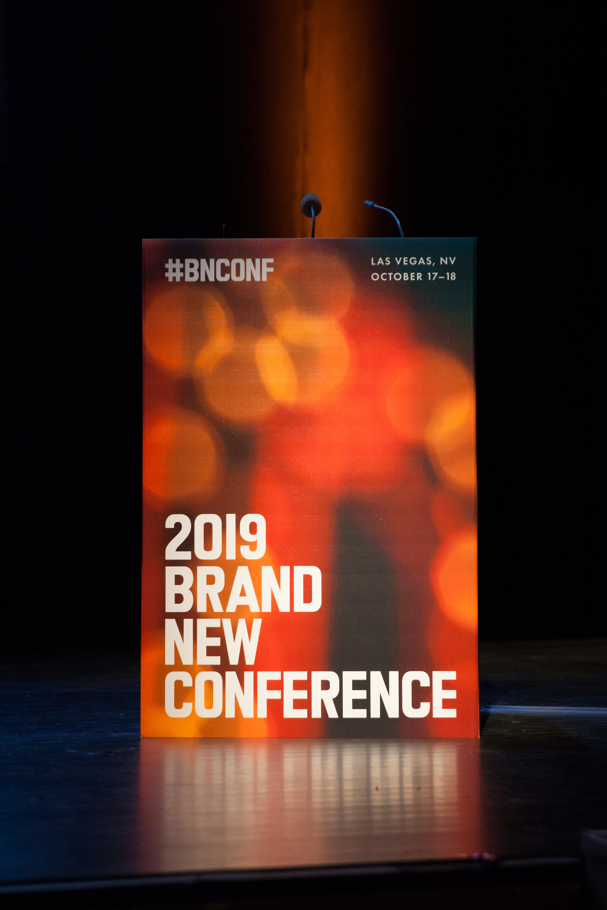
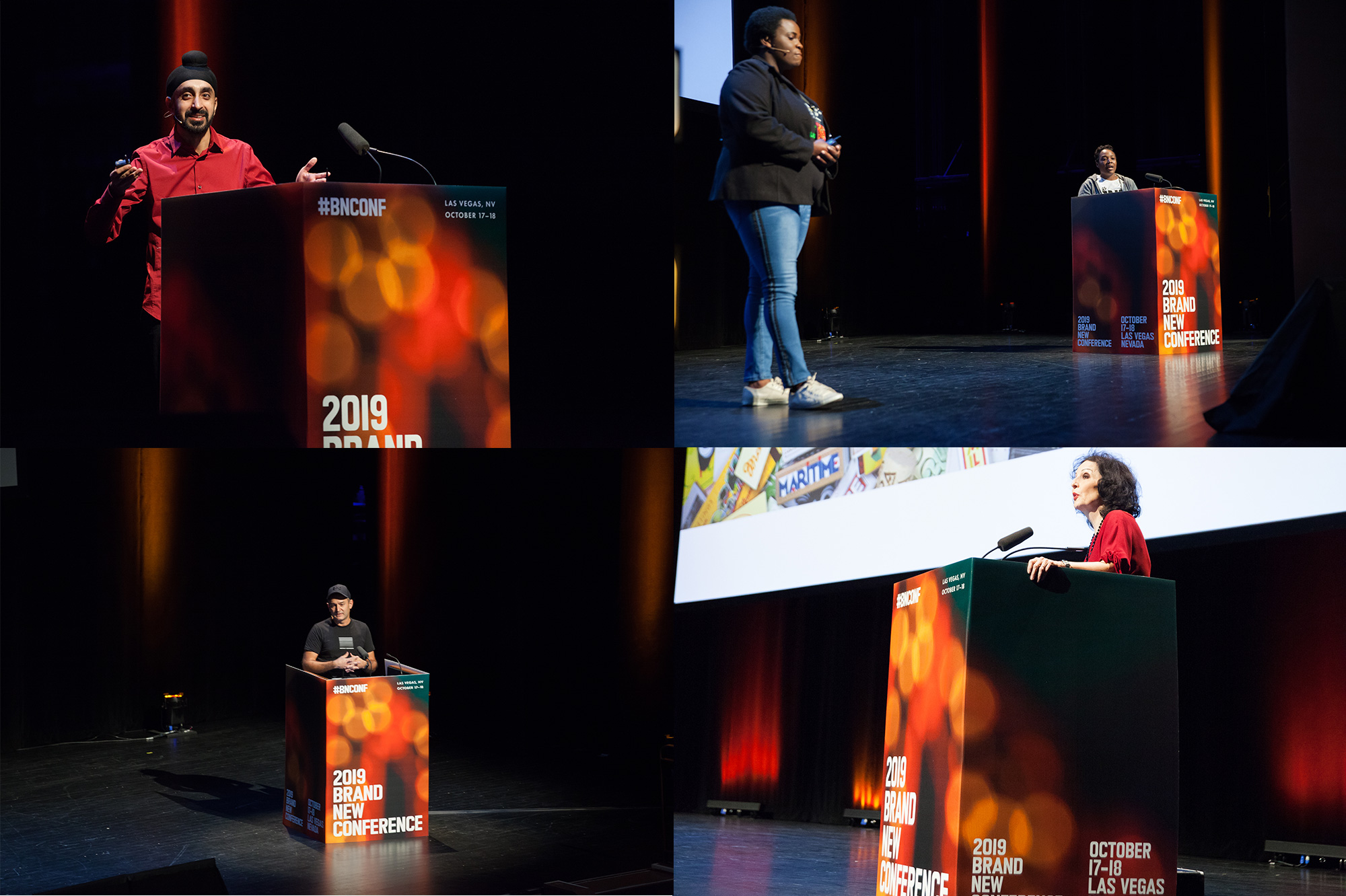
Podium
A fairly simple approach to the podium (so that it wouldn’t steal the thunder of the letters) with a big, abstract, colorful image and big-but-not-too-big typography so that all the Instagram pictures of the speakers taken by the audience that go out into the world have clear branding.
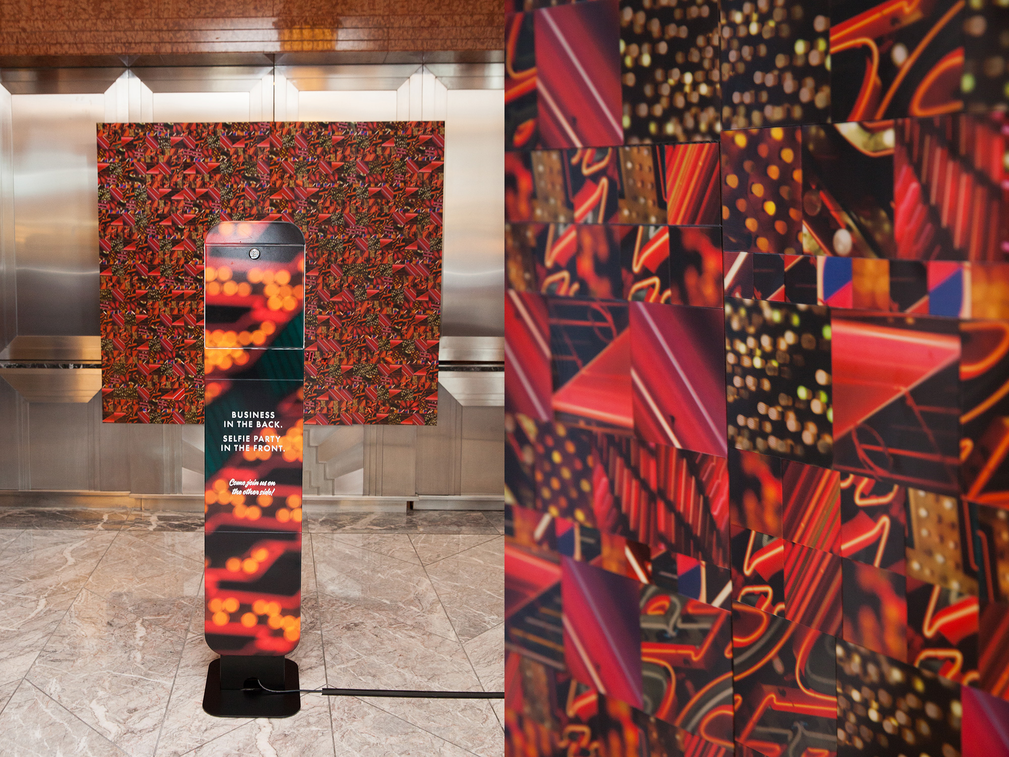
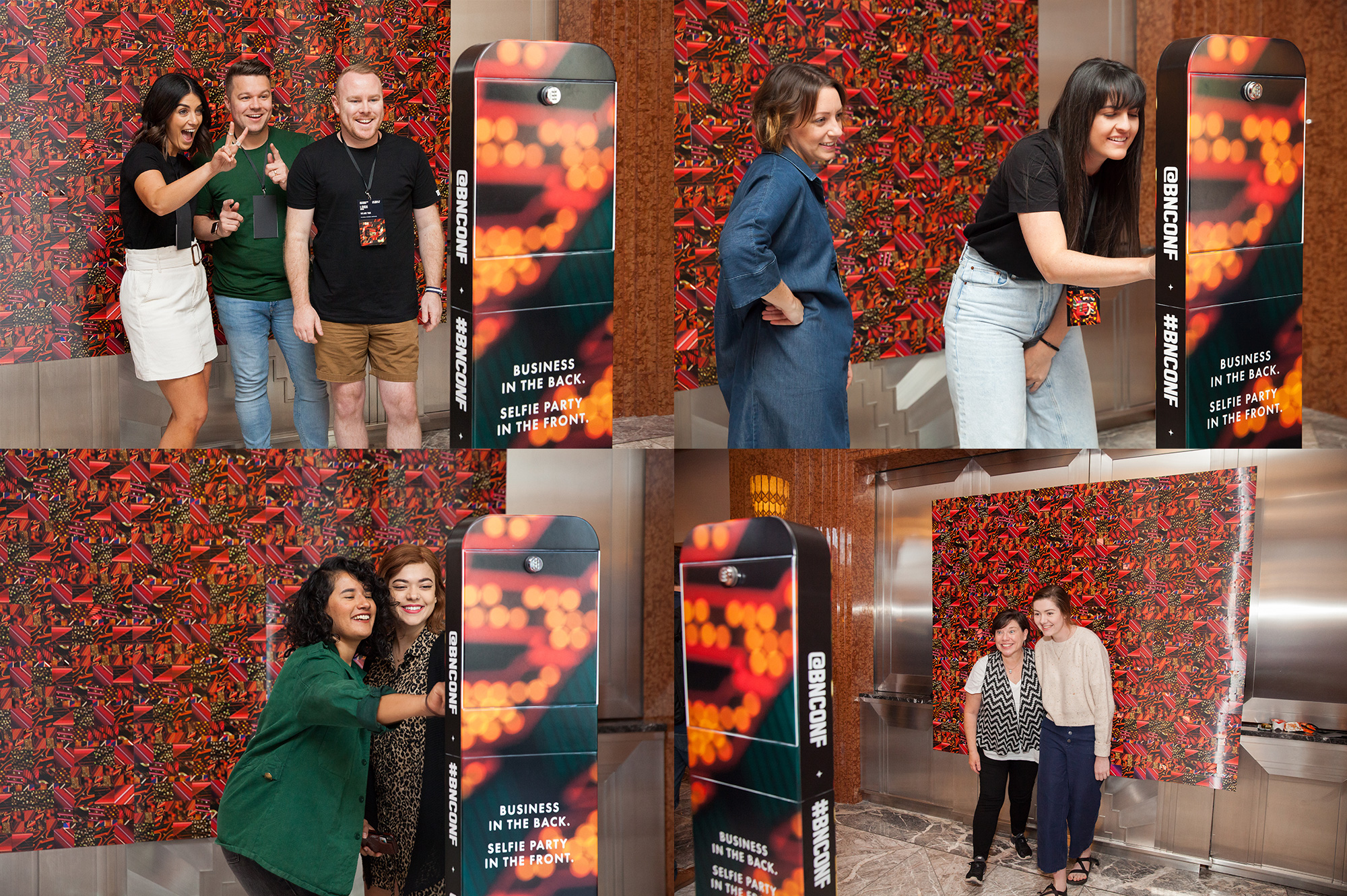
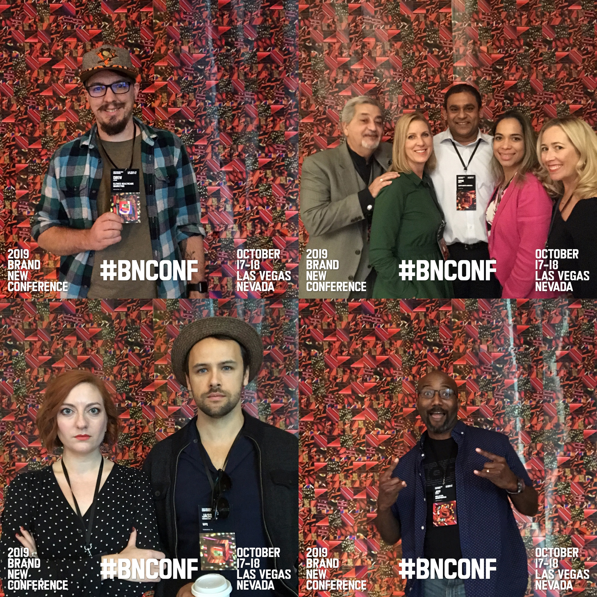
Selfie Stand Backdrop
A bonus application was a big backdrop for the fun selfie stand that we made using all the “holes” from the lenticular frames of the badge.
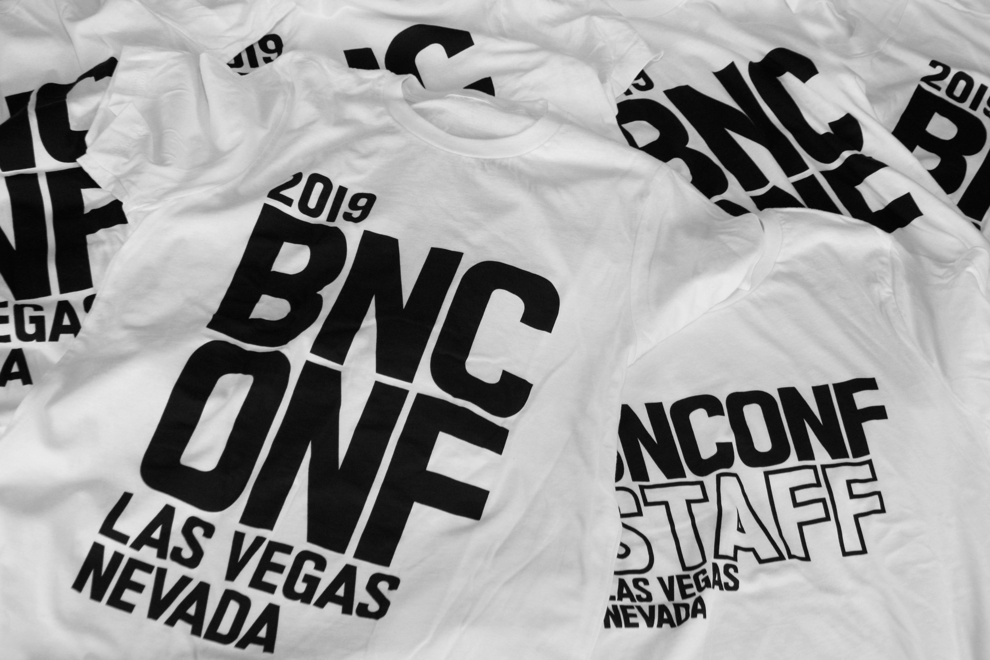
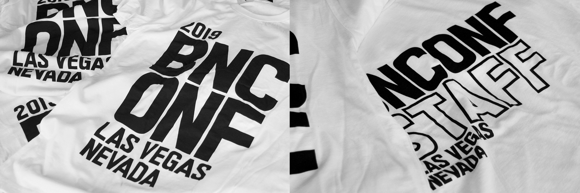
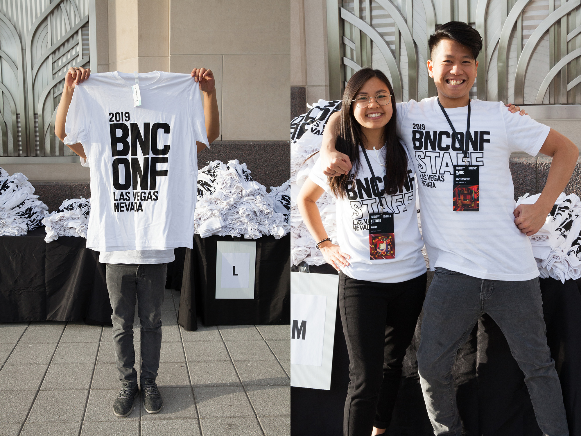
T-shirt
We went off brand with the t-shirt as it’s the only application that uses a white background but we didn’t want a black t-shirt with thick white ink on it as we really wanted some big typography on it, so we opted for a smooth t-shirt with water-based printing so that they wouldn’t have that plastic-y silkscreen feeling. A simple tweak on the composition was used for the staff t-shirts.
Motion Stuff
We did two different compositions for the speakers using some of the video footage we had of the neon lights and mixing them in with the BNCONF letters. The music is jazzy-lounge-y as a reference to the 1950s vibe of Las Vegas.
A brief intro was also created for the very start of the conference each day. Not as impressive as those 3-minute opening titles of other conferences but, in our defense, we rarely have 3 minutes to spare during our opening remarks.
And a couple of simple interstitials as segues between speakers.
That’s it!
As usual we have no idea where we go from here but we are excited to start scheming for next year’s conference in Austin, TX on October 22 – 23. Pre-sale tickets already available!