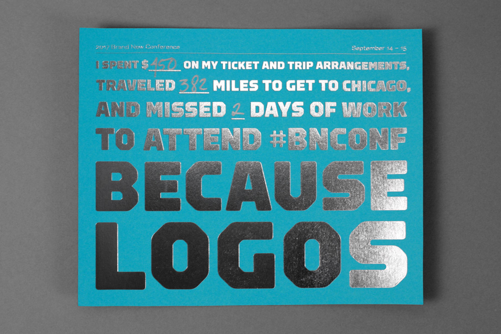
You’re looking at one of the…
A graphic design firm generating its own projects, initiatives, and content while taking on limited client work. Run by Bryony Gomez-Palacio and Armin Vit in Bloomington, IN.
Join our Mailing List
Colophon
Headlines and wordmark
Druk Condensed XX Super by Berton Hasebe for Commercial Type.
Body
Neue Haas Unica by Toshi Omagari for Monotype. Served via fonts.com.
UCLLC logo
Custom lettering by Mark Caneso.
2017 Brand New Conference Identity
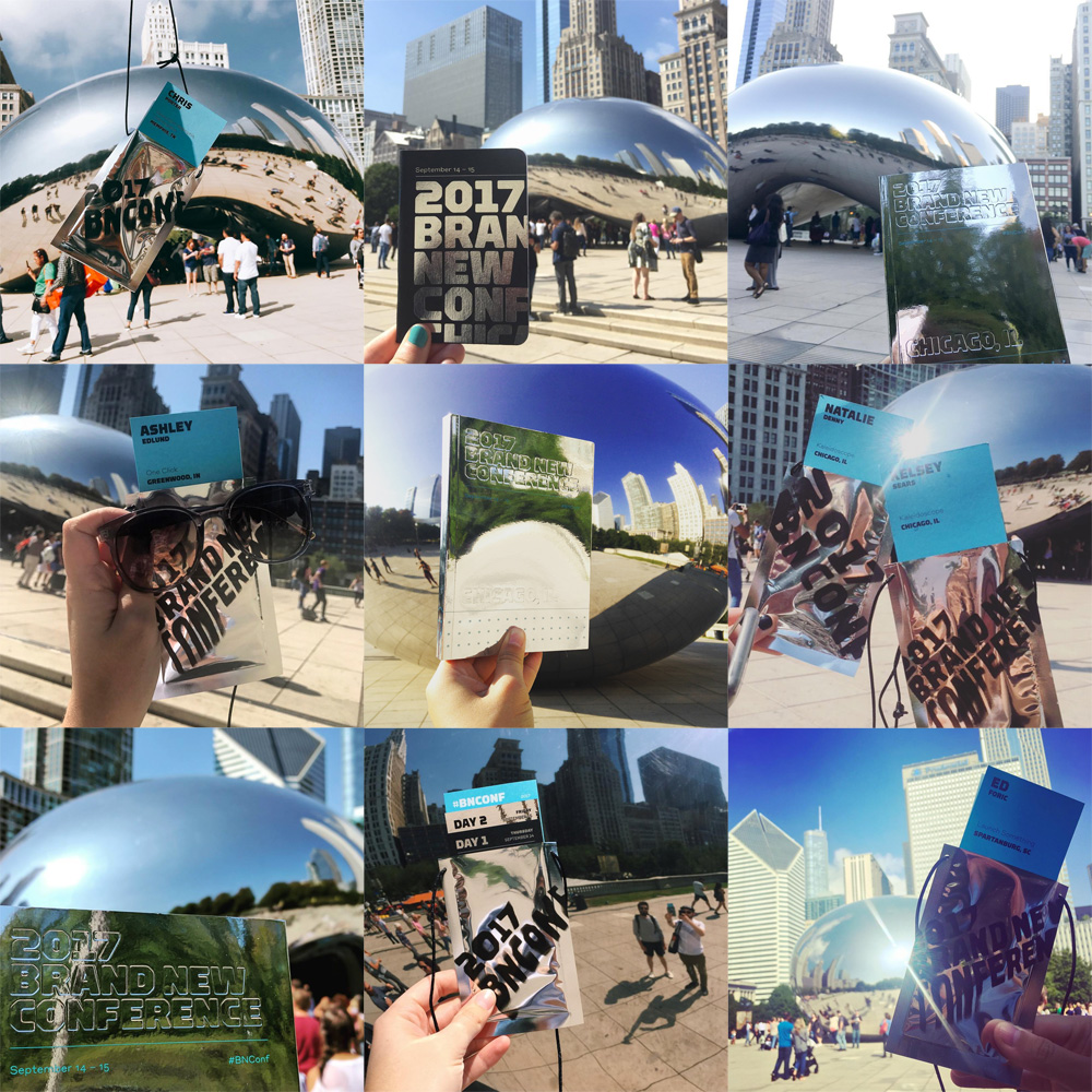
In September of 2017 we celebrated our ninth (9!) Brand New Conference in Chicago, IL, and there are few cities as visually pleasing as this year’s host so while the challenge of drawing inspiration from it might seem easier due to the abundance of it, we still aimed for something unexpected. Right behind the venue sits the Cloud Gate — or “the bean” — a fantastic sculpture that reflects and distorts whatever is around it and this felt like a totally weird, challenging point of reference to jump from. Hopefully you will enjoy another year of DIY shenanigans.
Full set of photos of the materials here; believe it or not, the ones shown here are a limited selection.

Logo
The logo is explained in more detail here so above are the final assets we were working with. The logo could be used in its straight-up form typeset in Type Supply’s Torque or in its distorted version that meant to emulate the distortions caused by the Cloud Gate. Online, the effect was easy to implement because we could animate it and it would instantly convey the distortion but in print it was a little more complicated or, at least, it wasn’t as vivid so we made sure to use some of the wilder (yet still readable) distortions for print applications.
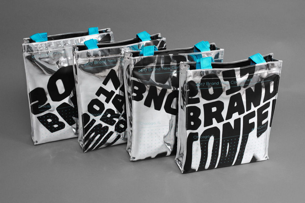
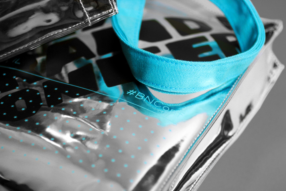
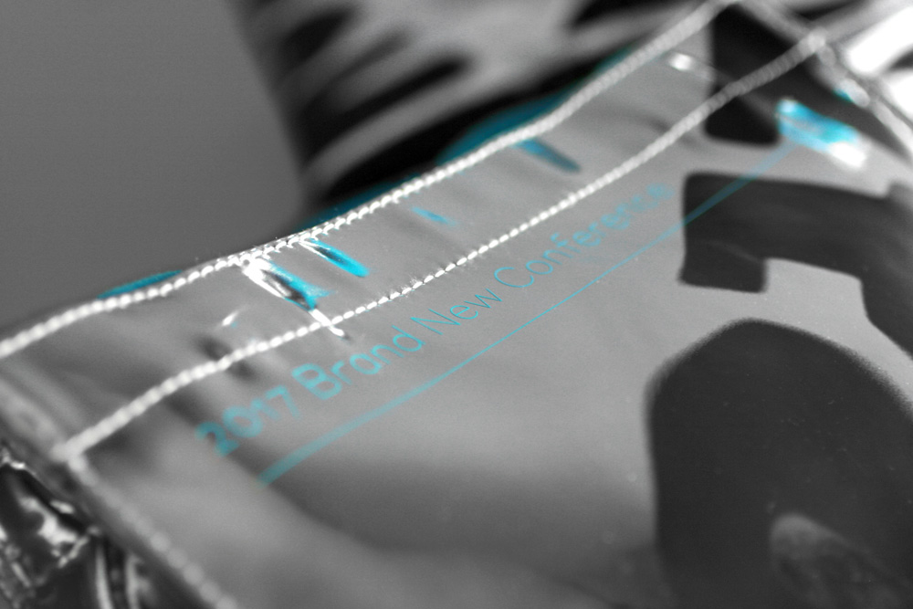
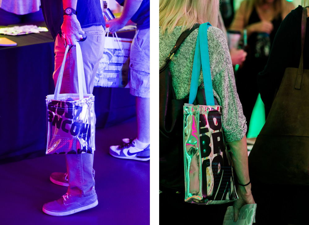
Tote bags
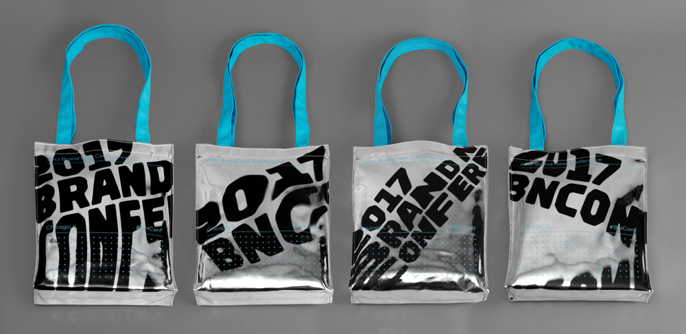
This year, we started the identity process with the bags because from the start we knew two key things: we wanted a reflective material and we wanted the design to bleed off the edges. This is not possible with traditional tote bags, as you can’t bleed anything and material options are limited, so we knew a third key thing, which was that the bags needed to be outsourced to China and the lead time for that is 6 or 7 months. The bag factory was able to source and amazing fabric that was reflective and had a super nice thick body to it. They were also able to silkscreen on it, going beyond the edges, and then sewing the bags together. We selected four distorted type treatments and unified them with a layout that later became the basic approach to all applications (lots of Styrene from Commercial Type, thin rules, and the star pattern derived from the Chicago flag).
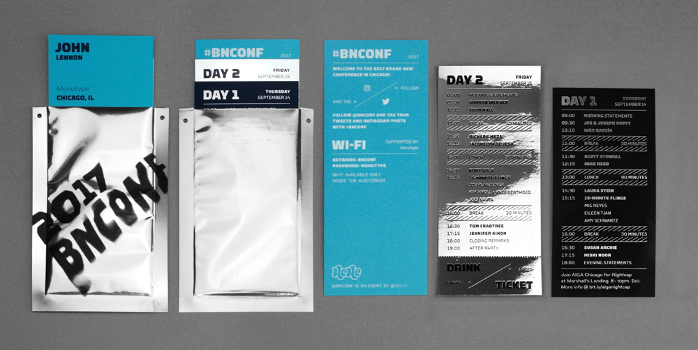
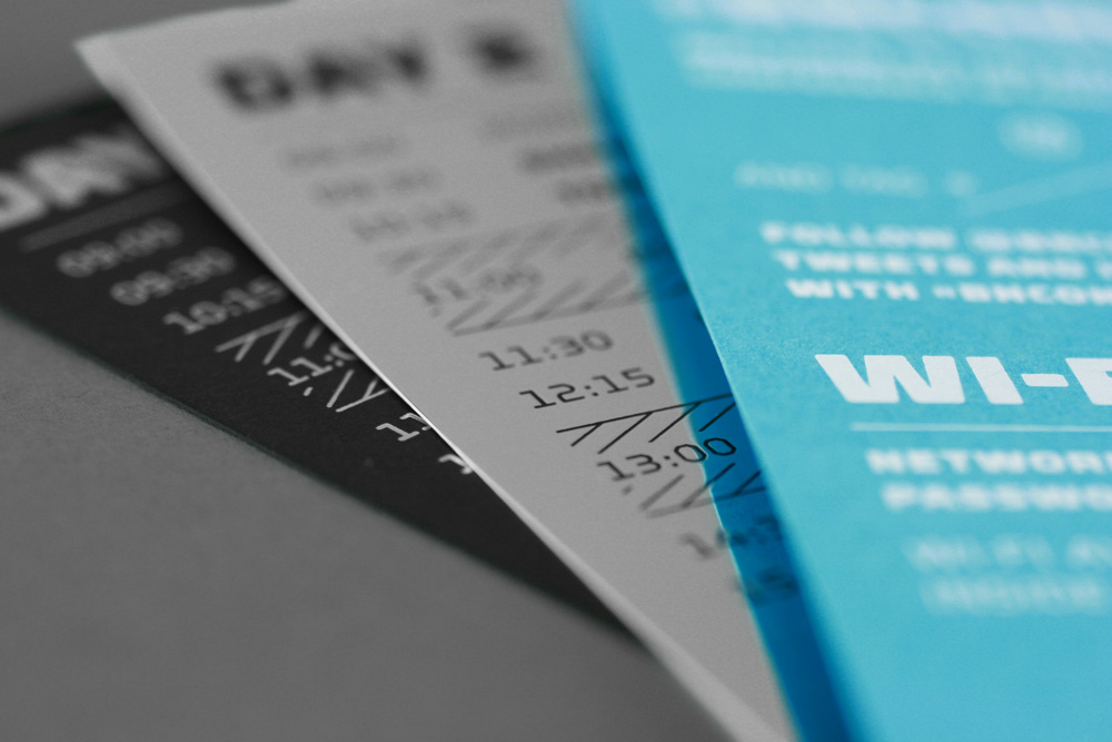
Badges
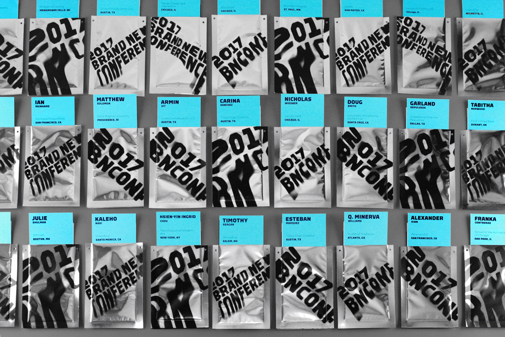
At first, we wanted to buy a bunch of the fabric from the bags and use it for both the badges and the program but it cost, like, five times more to ship the fabric from China than the material itself, so we decided to use different reflective materials for each application. The problem with reflective materials is they are hard to work with and we picked a particularly hard one to do the badges: Super thin metallized poly bags. After trying half a dozen methods to “print” on them ourselves we realized the only way to do it was with silkscreen but because the bags are so tiny and hard to work with, no printer wanted to do full-bleed, so we did what you do in this case, which was to silkscreen it ourselves, even though we had never done it. We got a DIY silkscreen kit, a drying rack from Craigslist, some advice from our friends at Industry Print Shop on what ink to use, and we got to it.
65% of the first print run came out like crap so we applied what we learned on it and banged out a thousand more bags the weekend before the event. Same as the tote bags, there were four different type distortions used to provide some variety.
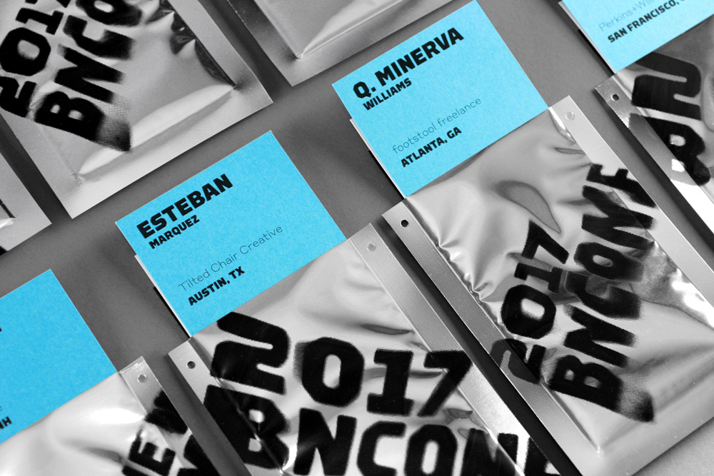

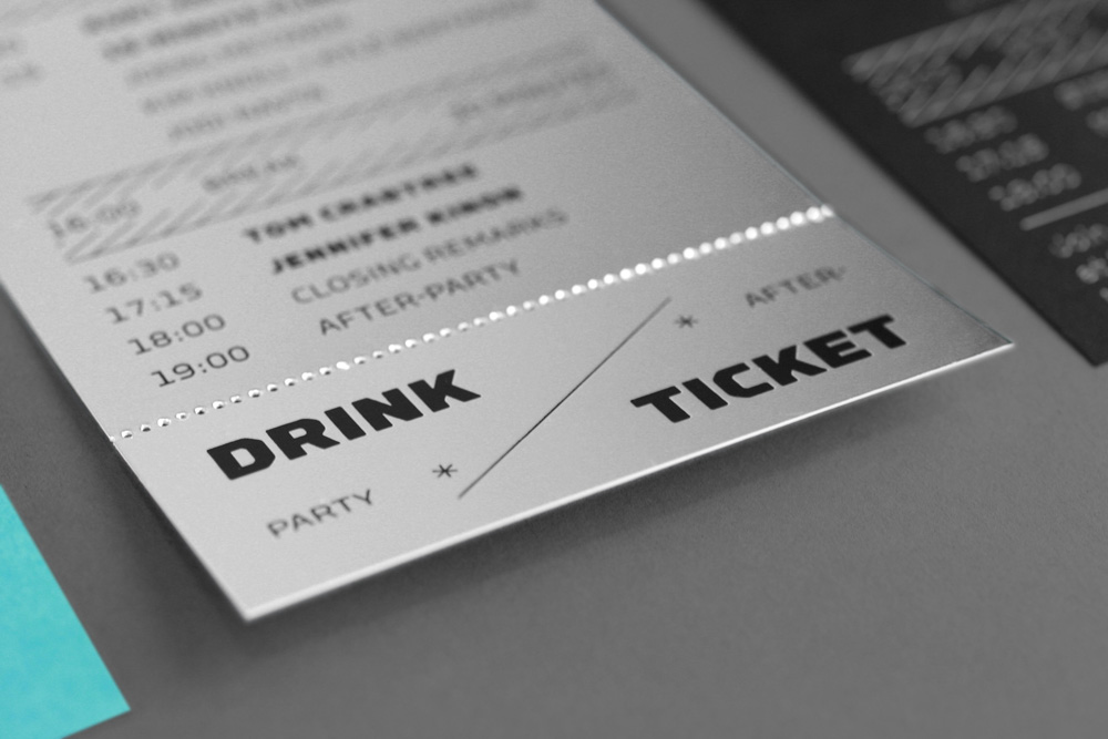
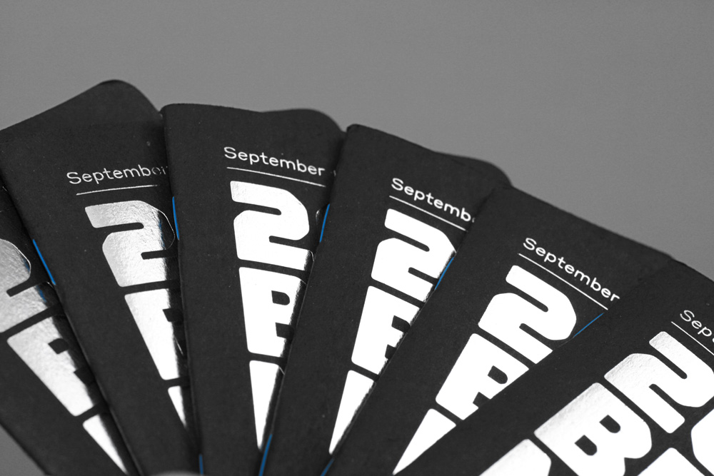
We bought bags that had a clean-cut opening (vs. sealable flap) so we used it as a little pouch to insert each person’s name plus two inserts with each day’s schedule. Staggered in height, people could see there were three inserts, one of which included a tear-away drink ticket for the after-party.

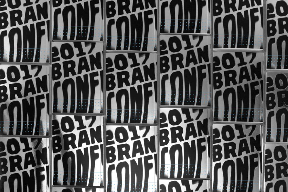
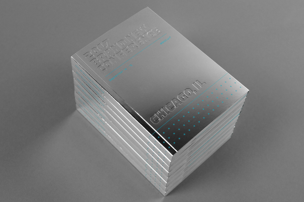
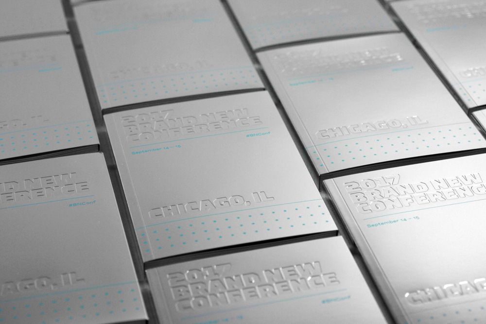
Program
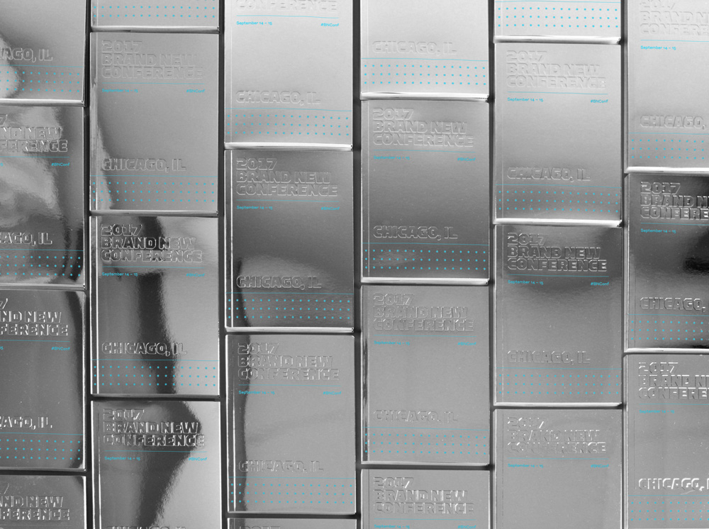
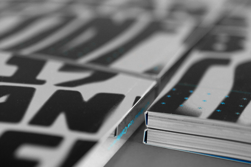
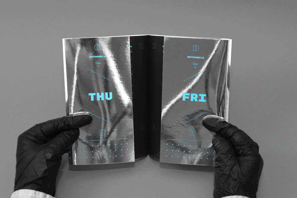
For the program we used Mirri, probably the best reflective paper I’ve seen and to highlight such lovely paper we did a straightforward deboss of the logo on the cover to further enhance the distortion effect. Additionally, we stretched the reflective concept into the pagination of the book by splitting day one’s speakers on the left side of the book and day two’s speakers on the right side. We emphasized this by splitting the book in half with the help of extended flaps that tucked into the center spread and directed readers to the appropriate side (a video further down below, under the “Reflectiveness” title, illustrates this). The layouts are “mirrored” too, so day two speakers were flush-left/rag-right and day one speakers were flush-right/rag-left.
For the fourth year in a row we’ve had the pleasure of printing the program with Classic Color and every year they continue to amaze us with their adventure-ness and quality. The interior of the program is printed on Sappi‘s McCoy Silk.
Reflectiveness
Bonus Applications
This year we had a couple of bonus applications: a sketchbook printed by Scout Books and a small commemorative print printed by Studio on Fire. Both have silver foil stamping on sweet, sweet thick paper stock.

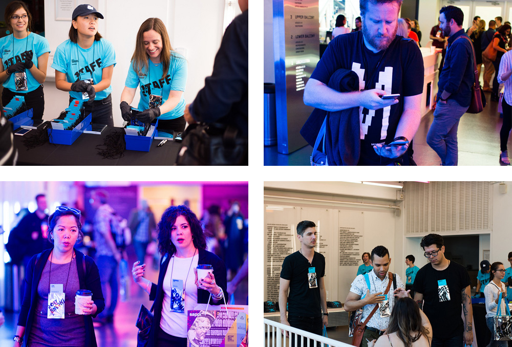
Instagram Validation
One of the things that gives us the most satisfaction is when attendees Instagram the heck out of the materials. This year there was the unexpected bonus of people walking over to the Cloud Gate and photographing the materials with it as the backdrop.
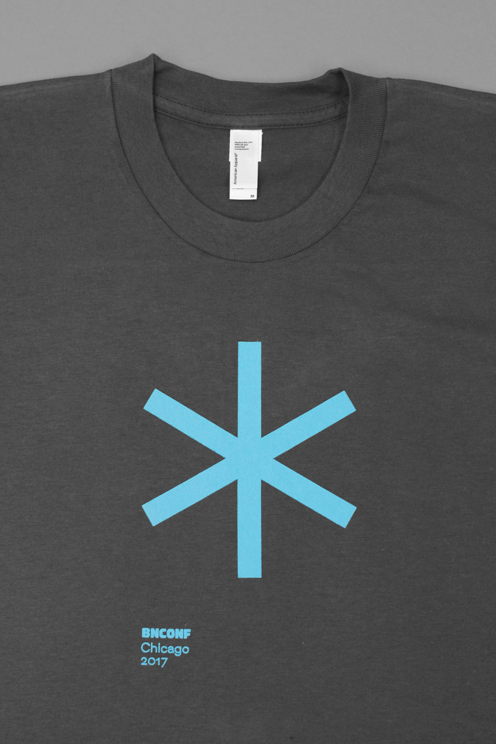
T-shirt
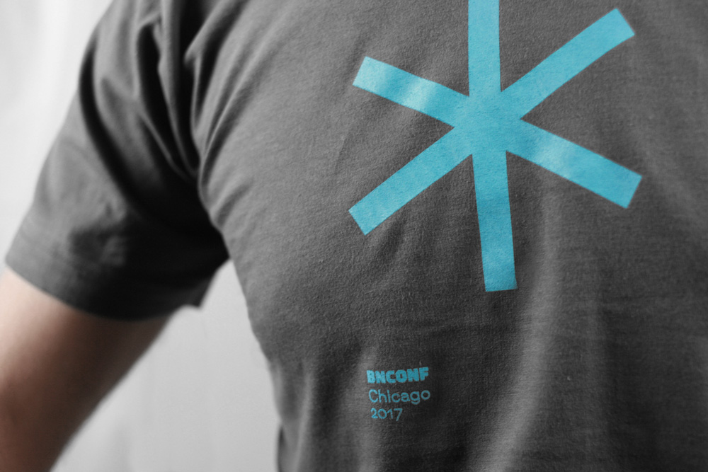
Pretty straightforward: a big star. We thought about doing the distorted letters on it but considered that it might be too droopy to wear on your torso.
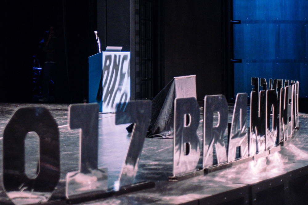
Stage Letters
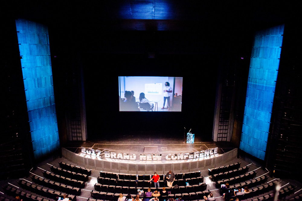
By now it shouldn’t be a surprise we are going to put some big letters on the stage as we’ve been doing this for a few years now but the challenge still remains on how to make it happen each time. This year we had the letters water-jet-cut on clear acrylic and then we applied a super thin film of mylar.

Motion Graphics
We usually do some basic Flash animations or even basic-er Keynote transitions for the presentation slides during the event. This year we had the help of Three Bears Theory who designed an opening title sequence (above) and speaker intros (below).
We had originally selected a weird, militaristic audio loop and were set to roll with it but then found a much more upbeat, quirky piece — Dr Swing & the Crazy Bunch — that lent itself quite well to animating the stars as the focal point of the intros.
That’s it!
Another year, another round of fun. This Summer we were a little bit limited on how much hand assembly and manual work we were able to do due to our move out of Austin but we are already scheming for next year’s materials for the 2018 Brand New Conference in New York… for which we are already selling tickets.