CLIENT
A Grand Rapids, MI, nonprofit whose mission is to give opportunities for people to make positive economic and social progress in their lives. WMCAT addresses unemployment and high school achievement through adult career training and teen arts programs.
BRIEF
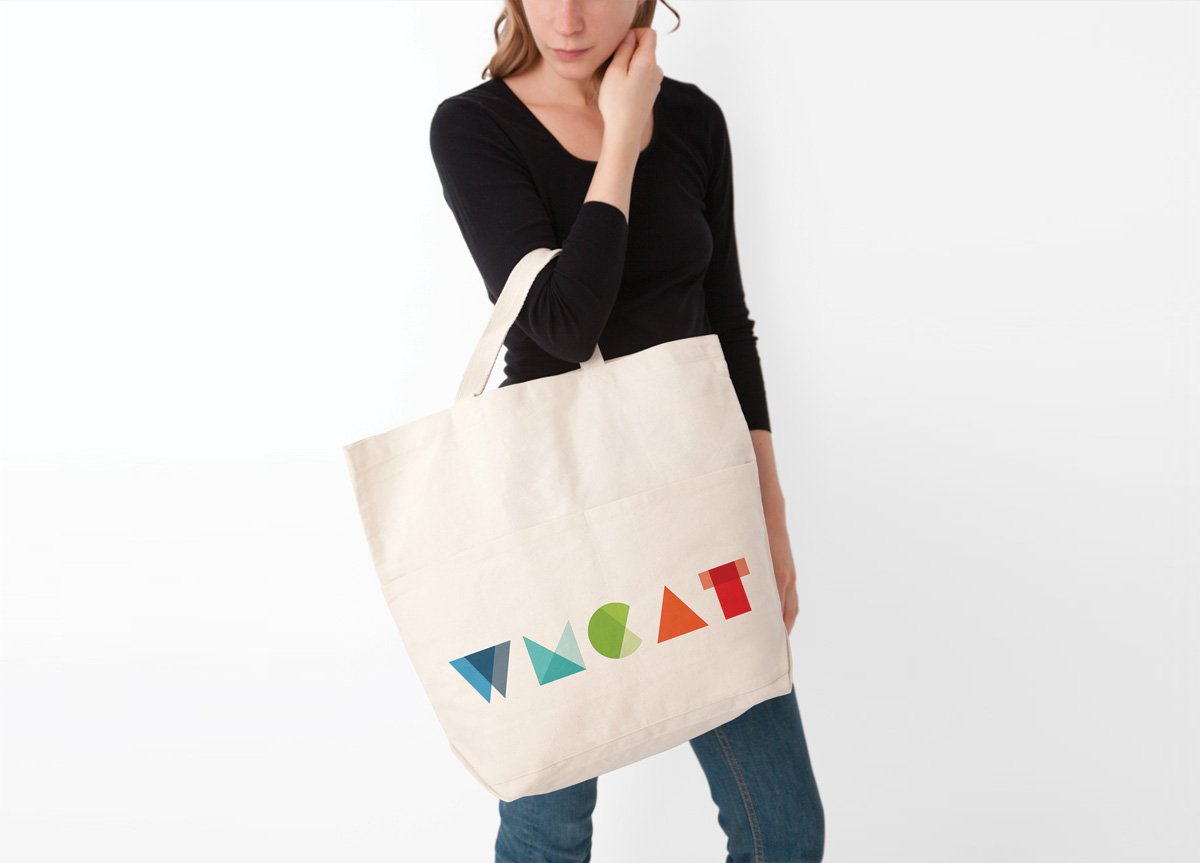
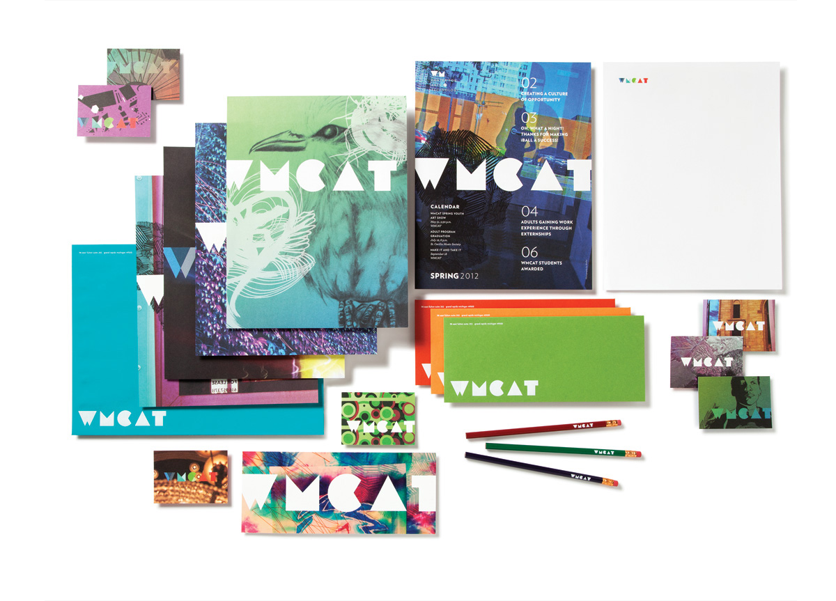
The assignment was to design a new logo and identity system that was more reflective of their creative, student-centered organization. The client felt that there was confusion about what WMCAT meant or stood for and wanted an identity that showed off their personality. Along with the logo, we developed a stationery system, quarterly newsletter, postcards, and apparel. We included student artwork in WMCAT’s identity materials to work as conversation pieces and to showcase the kind of work that comes from their students.
APPROACH
Since the previous logo was very technical and corporate in feeling, we decided to approach the challenge from the arts perspective. Starting with inspiration from a wide variety of student artwork, we boiled the wordmark down to simple shapes and colors that would integrate well with student work. The end result was a bold, vibrant, and unifying element with a big personality. The concept resonated with the client and how they wanted their organization to be perceived by the community and by prospective students.


