CLIENT
A digital publishing platform that reinvents visual storytelling within a market long dominated by a handful of major players. Their browser-based tool is intuitive, helping creators develop their own stories, and can be experienced through the immersive Madefire app for iPad and iPhone.
BRIEF
Moving Brands began working with Madefire at its inception, together defining their purpose as, “A thrilling reading experience that’s shared. Creators first.” Moving Brands worked with the Madefire team to ensure this purpose and the behaviors were at the heart of the strategy and business model, brand, and identity, and all the experiences they developed for the creator and reader communities.
APPROACH
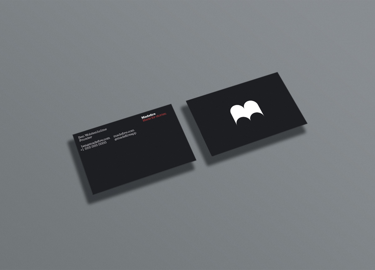
Madefire was created as a truly moving world identity, with every element of the identity system specifically designed to appear more tactile and immersive when seen in the app’s native environment. The core Madefire identity assets, including fonts, color palette, and textures—pay homage to the vernacular of traditional comic visual language. The logo, built out of four circles, reads as an “M” and feels book-like in its form, and comes to life through animation and sound design. All the assets in the system take cues from the logo using it as a red thread to hold a tight system together—geometric radii and sharp end points can be seen within the icon set, button language, and user interface design.


