


Online
- FPO (For Print Only) / Celebrating the reality that print is not dead by showcasing the most compelling printed projects.
- Art of the Menu / Cataloguing the underrated creativity of menus from around the world.
- Quipsologies / Chronicling the most curious, creative, and notable projects, stories, and events of the graphic design industry on a daily basis.
- Speak Up (2002 – 2009) / Discussing, and looking for, what is relevant in, and the relevance of, graphic design. Archives Only.
- Word It (2003 – 2010) / Encouraging creative diversity in the community through monthly, one-word challenges. Archives Only.
- Brand New Classroom (2010 – 2011) / Providing a space for critique and opinions on student identity work. Archives Only.
Publishing
- The 2010 Brand New Awards / 2011, self-published.
- Flaunt: Designing effective, compelling and memorable portfolios of creative work / 2010, self-published.
Events & Judged Competitions
- Brand New Conference / A one-day event on the development of corporate and brand identity projects by some of today’s most active and influential practitioners from around the world.
- Brand New Awards / Celebrating the best identity work produced around the world.
- FPO Awards / Celebrating the best print work from around the world.
Writing
- Graphic Design, Referenced: A Visual Guide to the Language, Applications, and History of Graphic Design / 2009, Rockport.
- Women of Design: Influence and Inspiration from the Original Trailblazers to the New Groundbreakers / 2008, HOW Books.
- The Word It Book: Speak Up Presents a Gallery of Interpreted Words / 2007, HOW Books.
Graphic Design
- Department of Design / Designing corporate and brand identities and full development of printed and digital matter for clients.

A B-Side BY Armin
Mothers Against Drunk Driving
![]()
Founded in 1980 Mothers Against Drunk Driving (MADD) is the largest non-profit in the U.S. working to protect families from drunk driving and underage drinking. A new logo was introduced this month. Press release here.
Thanks to Roy Levitt for the tip.

DATE: Apr.20.2011 POSTED BY: ArminCATEGORY: Non-Profit The B-Side COMMENTS:

TAGS: lowercase, sans serif,

A B-Side BY Armin
New Zealand Labour Party
![]()
Positioned centre-left, the New Zealand Labour Party is a political party in New Zealand. They have held the Prime Minister position 9 times since their inception in 1916. The new logo has been designed by Auckland-based Barnes, Catmur & Friends. Design Daily explains the relevance of the fern.
Thanks to John Moore for the tip.
DATE: Apr.19.2011POSTED BY: ArminCATEGORY: Politics The B-Side COMMENTS:
TAGS: ligature, new zealand, red, sans serif,
Opinion BY Armin
Deutsche Eishockey Liga
![]()
Established in 1994, the Deutsche Eishockey Liga (German Ice Hockey League in English, DEL for short), is the professional Hockey league in Germany, featuring 14 teams and, apparently, the highest number of American and Canadian players outside the NHL. The new logo has been designed by buergerclever.
Thanks to Simon Vatareck for the tip.
DATE: Apr.18.2011POSTED BY: ArminCATEGORY: Sports The B-Side COMMENTS:
A B-Side BY Armin
Tetley
![]()
Established in 1837, Tetley is the second largest manufacturer of tea in the world. New logo has been introduced without much of a peep.
Thanks to Nicholas Chuva Plagge for the tip.
DATE: Apr.13.2011POSTED BY: ArminCATEGORY: Consumer products The B-Side COMMENTS:
A B-Side BY Armin
Bauhaus Dessau Foundation
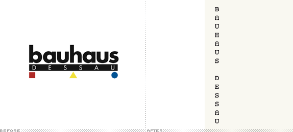
Housed in the historical Bauhaus building, the Bauhaus Dessau Foundation, established in 1994 is “a centre of research, teaching and experimental design” based on “conserving, researching into and passing on the Bauhaus heritage”. Its new identity has been designed by Hort, based on a modified Courier, system fonts, black-and-white, and a strict grid system.
Thanks to Luke Alexander Atkinson for the tip.
DATE: Apr.11.2011POSTED BY: ArminCATEGORY: Culture The B-Side COMMENTS:
A B-Side BY Armin
2015 IIC Cricket World Cup
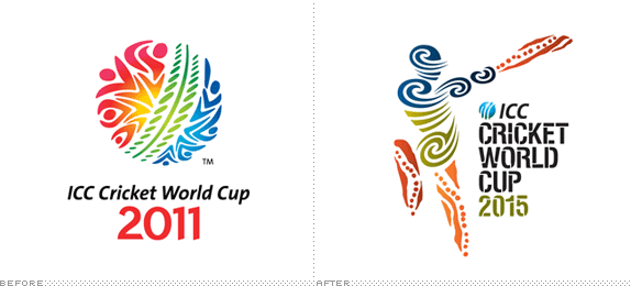
First played in 1975, the International Cricket Council (IIC) Cricket World Cup is the most notable tournament in the world of cricket played every four years. The 2011 Cup, played in India, Sri Lanka, and Bangladesh just finished with India taking the championship. The logo for the 2015 IIC Cricket World Cup, jointly hosted by Australia and New Zealand, was presented this week. The identity was designed by the Australia office of Futurebrand who commissioned Jumbana Group/Balarinji for the logo. Press release here. Bigger view here.
Thanks to Lawrence Nievaart for first tip.
DATE: Apr.07.2011POSTED BY: ArminCATEGORY: Sports The B-Side COMMENTS:
TAGS: cricket, futurebrand, illustration, stencil,
A B-Side BY Armin
Root Sports
![]()
Root Sports, a subsidiary of DirecTV Sports, is the new name that will take over three regional sports channels in Seattle (formerly FSN Northwest), Denver (formerly FSN Rocky Mountain), and Pittsburgh (formerly FSN Pittsburgh). Troika has designed the identity and on-air package. All work can be seen at their website.
DATE: Apr.06.2011POSTED BY: ArminCATEGORY: Entertainment The B-Side COMMENTS:
TAGS: animation, italic, sans serif, sports, troika,
A B-Side BY Armin
Frankfurt Book Fair
![]()
The Frankfurt Book Fair (Frankfurter Buchmesse in German), running since 1949, is the world’s largest book fair in the world, attracting publishers from all countries representing every single book genre and industry imaginable — it is a great launching pad for new titles as well as for wheelings and dealings for securing international rights licenses and partnerships. Their logo has been redesigned for the upcoming fair this October.
Thanks to Sriparna Ghosh for the tip.
DATE: Apr.05.2011POSTED BY: ArminCATEGORY: Culture The B-Side COMMENTS:
TAGS: condensed, germany, icon, sans serif,
A B-Side BY Armin
North American Soccer League
![]()
Set to begin play this week, on April 9, the North American Soccer League (NASL) is a new, second-tier (to the MSL), men’s soccer league in the United States, Canada, and Puerto Rico, consisting of eight teams. The NASL previously existed from 1968 to 1984 and the new logo is based on the last one used by the league. The new identity has been designed by 343RLP+ Creative Group. Brief story here.
Thanks to Roy Levitt for the tip.
DATE: Apr.04.2011POSTED BY: ArminCATEGORY: Sports The B-Side COMMENTS:
TAGS: crest, sans serif, soccer,
A B-Side BY Armin
Fort Lauderdale Strikers
![]()
Prior to the 2011 season known as Miami FC, the newly renamed Fort Lauderdale Strikers are a soccer team that play in the North American Soccer League. The new identity has been designed by 343RLP+ Creative Group. Press release here.
Thanks to Roy Levitt for the tip.
DATE: Mar.30.2011POSTED BY: ArminCATEGORY: Sports The B-Side COMMENTS:


Books about logo design, the designers that create them and the meaning of branding.
