


Online
- FPO (For Print Only) / Celebrating the reality that print is not dead by showcasing the most compelling printed projects.
- Art of the Menu / Cataloguing the underrated creativity of menus from around the world.
- Quipsologies / Chronicling the most curious, creative, and notable projects, stories, and events of the graphic design industry on a daily basis.
- Speak Up (2002 – 2009) / Discussing, and looking for, what is relevant in, and the relevance of, graphic design. Archives Only.
- Word It (2003 – 2010) / Encouraging creative diversity in the community through monthly, one-word challenges. Archives Only.
- Brand New Classroom (2010 – 2011) / Providing a space for critique and opinions on student identity work. Archives Only.
Publishing
- The 2010 Brand New Awards / 2011, self-published.
- Flaunt: Designing effective, compelling and memorable portfolios of creative work / 2010, self-published.
Events & Judged Competitions
- Brand New Conference / A one-day event on the development of corporate and brand identity projects by some of today’s most active and influential practitioners from around the world.
- Brand New Awards / Celebrating the best identity work produced around the world.
- FPO Awards / Celebrating the best print work from around the world.
Writing
- Graphic Design, Referenced: A Visual Guide to the Language, Applications, and History of Graphic Design / 2009, Rockport.
- Women of Design: Influence and Inspiration from the Original Trailblazers to the New Groundbreakers / 2008, HOW Books.
- The Word It Book: Speak Up Presents a Gallery of Interpreted Words / 2007, HOW Books.
Graphic Design
- Department of Design / Designing corporate and brand identities and full development of printed and digital matter for clients.

A B-Side BY Armin
Charles Sturt University
![]()
Established in 1989, Charles Sturt University has close to 36,000 students enrolled across various campuses in Australia. It offers undegraduate, graduate and postgraduate degrees and has a good offering of distance learning options. A new identity was released last month.
Thanks to Edward Kindred for the tip.

DATE: May.06.2011 POSTED BY: ArminCATEGORY: Education The B-Side COMMENTS:

TAGS: australia, sans serif, university,

A B-Side BY Armin
Newsday
![]()
Founded in 1940, Newsday is a local newspaper primarily serving Nassau and Suffolk counties and the New York City borough of Queens on Long Island, and it is a staple of the New York visual landscape. In March Newsday introduced a new logo, here is how it looks on the paper.
Thanks to Geoffrey Sorensen for the tip.
DATE: May.05.2011POSTED BY: ArminCATEGORY: Publishing The B-Side COMMENTS:
TAGS: new york, newspaper, sans serif,
A B-Side BY Armin
Jakprints
![]()
Established in 1999 (I think), Jakprints is an online, one-stop shop for all possible full-color offset printing from stationery to collateral material to apparel and more. The new logo has been floating around since August of last year but it just recently made unto their website.
Thanks to Jeremiah Boncha for the tip.
DATE: May.04.2011POSTED BY: ArminCATEGORY: Graphics Industry The B-Side COMMENTS:
TAGS: icon, sans serif,
A B-Side BY Armin
The Dock at Montrose Beach

As an ex-Chicagoan I felt compelled to post this. Located on Montrose Beach, the largest beach along Lake Michigan in Chicago, The Dock at Montrose Beach is one of only three full service restaurants to be found along the coast of the city. Hanging by the lake is one of the most awesome things about Chicago, now it can be done from a nice patio deck enjoying fine food. Logo was designed by JL Murtaugh from no_grand. I generally don’t opine on the B-Side, but I just love the simplicity and childlike adorableness of this. A couple more logo configurations below or after the jump.
Continue reading this entry
DATE: May.03.2011POSTED BY: ArminCATEGORY: Hospitality The B-Side COMMENTS:
TAGS: blue, chicago, sans serif,
A B-Side BY Armin
Yellow Pages Association
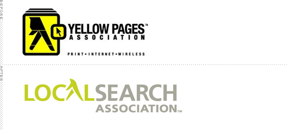
Originally founded in 1975 and known as the Yellow Pages Association, the newly named Local Search Association is the “largest trade organization of print, digital, mobile and social media that help local businesses get found and selected by ready-to-buy consumers.” From the press release: “The Association’s new logo incorporates a clean and modern design with a nod to the strong connection advertisers and consumers have with the Yellow Pages’ iconic walking fingers. The fingers have been given a more movement-oriented touch and dropped into the Local Search Association name, signifying Yellow Pages’ integral role as part of local search.” Brand launch video below (or after the jump).
Continue reading this entry
DATE: May.02.2011POSTED BY: ArminCATEGORY: Publishing The B-Side COMMENTS:
TAGS: fingers, sans serif, yellow pages,
A B-Side BY Armin
AVOS
![]()
AVOS is a “new Internet company” launched by Chad Hurley and Steve Chen, co-founders of YouTube (now owned by Google after a $1.76 billion purchase). AVOS has recently made big news as they have just acquired Delicious, the “leading social bookmarking service for saving, sharing, and discovering web bookmarks”. The AVOS wordmark is composed of two different typefaces: Brandon Grotesque for the “A” and “V” (the “V” is turned upside down to make the “A”) and Plau for the “OS”. Yup, weird. But none of us are billionaires, so what do we know?
DATE: Apr.29.2011POSTED BY: ArminCATEGORY: Technology The B-Side COMMENTS:
TAGS: sans serif,
A B-Side BY Armin
Ten Days on the Island
![]()
Ten Days on the Island is Tasmania’s state-wide biennial multi art-form festival, featuring theatre, dance, visual arts, music, film, opera, and literature in indoor and outdoor venues. The identity and materials for the event have been designed by Sydney-based Toko. I chose to show the application rather than the logo in the header image because it’s in the application that this identity really stands out.
DATE: Apr.28.2011POSTED BY: ArminCATEGORY: Culture The B-Side COMMENTS:
TAGS: event, sans serif, tasmania, toko,
A B-Side BY Armin
Youth Service America
![]()
Founded in 1986, Youth Service America (YSA) “improves communities by increasing the number and the diversity of young people, ages 5-25, serving in substantive roles.” Their goals are to “Educate youth, teachers, community organizations, media, and public officials in the power of youth as problem solvers.” and “Engage children and youth as volunteers, as academic achievers, and as community leaders.” A new identity has been created by Redding, CT-based Alexander Isley Inc.. More on the new identity here.
DATE: Apr.26.2011POSTED BY: ArminCATEGORY: Non-Profit The B-Side COMMENTS:
TAGS: flexible identity, sans serif,
A B-Side BY Armin
Ebony
![]()
First published in 1945, Ebony magazine “profiles successful African-American role models; discusses the issues that our community faces today; goes one-on-one with the hottest celebrities and community leaders; and brings you tips on career, relationships, health, parenting, personal finance and much more.” Earlier this month the magazine introduced a cover to cover redesign, including the logo, all done internally. For a full look at the redesign cover and interiors see here.
Thanks to Craig Brimm for the tip.
DATE: Apr.25.2011POSTED BY: ArminCATEGORY: Publishing The B-Side COMMENTS:
TAGS: magazine, sans serif,
A B-Side BY Armin
St. Petersburg/Clearwater
![]()
St. Petersburg/Clearwater is, as the name implies, a small region in Florida encompassing the area of and between the cities of St. Petersburg and Clearwater, featuring lovely beaches, resorts, and weather. In March a new identity designed by Pentagram was introduced.
DATE: Apr.21.2011POSTED BY: ArminCATEGORY: Destinations The B-Side COMMENTS:


Books about logo design, the designers that create them and the meaning of branding.
