


Online
- FPO (For Print Only) / Celebrating the reality that print is not dead by showcasing the most compelling printed projects.
- Art of the Menu / Cataloguing the underrated creativity of menus from around the world.
- Quipsologies / Chronicling the most curious, creative, and notable projects, stories, and events of the graphic design industry on a daily basis.
- Speak Up (2002 – 2009) / Discussing, and looking for, what is relevant in, and the relevance of, graphic design. Archives Only.
- Word It (2003 – 2010) / Encouraging creative diversity in the community through monthly, one-word challenges. Archives Only.
- Brand New Classroom (2010 – 2011) / Providing a space for critique and opinions on student identity work. Archives Only.
Publishing
- The 2010 Brand New Awards / 2011, self-published.
- Flaunt: Designing effective, compelling and memorable portfolios of creative work / 2010, self-published.
Events & Judged Competitions
- Brand New Conference / A one-day event on the development of corporate and brand identity projects by some of today’s most active and influential practitioners from around the world.
- Brand New Awards / Celebrating the best identity work produced around the world.
- FPO Awards / Celebrating the best print work from around the world.
Writing
- Graphic Design, Referenced: A Visual Guide to the Language, Applications, and History of Graphic Design / 2009, Rockport.
- Women of Design: Influence and Inspiration from the Original Trailblazers to the New Groundbreakers / 2008, HOW Books.
- The Word It Book: Speak Up Presents a Gallery of Interpreted Words / 2007, HOW Books.
Graphic Design
- Department of Design / Designing corporate and brand identities and full development of printed and digital matter for clients.

A B-Side BY Armin
Honeydrop
![]()
Launched no more than two years ago Honeydrop is “a healthy low-calorie organic beverage sweetened with a spoonful of honey and brewed with juices and teas.” New York-based Monday Collective has revised their logo and packaging. Case study here. Shot of the packaging below (or after the jump).


DATE: Jun.03.2011 POSTED BY: ArminCATEGORY: Consumer products The B-Side COMMENTS:


A B-Side BY Armin
Big Ten Network
![]()
Established in 2006, the Big Ten Network — now BTN — is a partnership between th Big Ten Conference and Fox Networks for a channel covering over 600 events featuring the schools of the Big Ten Conference. Press release here. There is also customized color versions of the logo for each of the 12 schools that make up the Big Ten.
Thanks to John Coburn for the tip.
DATE: Jun.02.2011POSTED BY: ArminCATEGORY: Sports The B-Side COMMENTS:
TAGS: football, sports, television,
A B-Side BY Armin
SnackWell’s
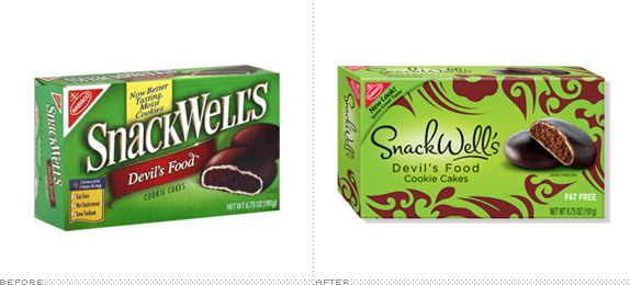
SnackWell’s, a brand of sweet not-so-crappy-for-you snacks produced by Nabisco, has just updated its logo and packaging. New tagline is “Be Bad. Snack Well.” Press release here. More packaging images and logo at SnackWell’s site.
Thanks to Cary Whitt for the tip.
DATE: May.26.2011POSTED BY: ArminCATEGORY: Consumer products The B-Side COMMENTS:
A B-Side BY Armin
Azteca 7
![]()
Launched in 1983 TV Azteca is the second largest television network in Mexico with two main channels Azteca 13 and Azteca 7, with the latter being the “funner” channel, mainly by carrying The Simpsons. This past February, Azteca 7 launched a new logo and look. A few color variations and speech bubble configurations are shown here.
Thanks to José Héctor Gálvez for the tip.
DATE: May.25.2011POSTED BY: ArminCATEGORY: Entertainment The B-Side COMMENTS:
TAGS: mexico, speech bubble, television,
A B-Side BY Armin
Wichita Wings
![]()
Originally an indoor soccer team that played from 1979 to 2001, the Wichita Wings are getting a second chance and will begin playing in the 2011 – 12 season of MISL. Story here.
In other news: when Whataburger called to get its logo back, it did.
Thanks to J. Jason Smith for the tip.
DATE: May.23.2011POSTED BY: ArminCATEGORY: Sports The B-Side COMMENTS:
A B-Side BY Armin
Florian Stephens
![]()
Florian Stephens is a London-based 3D artist and designer. Fellow Londoners at Disengised have designed a logo — an “icosahedron (20 identical equilateral triangular faces, 30 edges and 12 vertices) which is colored in dynamically” — that has over 1,700 possible permutations. Case study here.
DATE: May.18.2011POSTED BY: ArminCATEGORY: Graphics Industry The B-Side COMMENTS:
TAGS: flexible identity, sans serif,
A B-Side BY Armin
![]()
Pinterest is a handy bookmarking site that allows you to “pin” things on your very own personal cloud board. A new logo has been designed by Brooklyn-based Michael Deal and Juan Carlos Pagan. A fun, in-depth making-of-the-logo post by the Pinterest team can be found here.
Thanks to Cole Imperi for the tip.
DATE: May.16.2011POSTED BY: ArminCATEGORY: Publishing The B-Side COMMENTS:
A B-Side BY Armin
Sanofi-Aventis

Based in Paris, France, Sanofi-Aventis is a “global healthcare leader” with more than 100,000 employees in 100 countries. They have a broad portfolio of pharmaceutical products that made €30.384 million in sales last year. A new logo, called “Bird of Hope”, was released this month. Here is a long explanation on the logo: “the icon is made of three shapes that make a whole: a planet with the bird of hope in the center. These three shapes structure our ambition, which puts the patient at the center of our activities. The bird illustrates the hope we offer to our patients. The three different shapes show the diversity of our teams, cultures, know-how and locations around the world. This new icon represents the hope that we bring to the approximately 7 billion people around the world; our focus on the patient, our desire to working tirelessly, and our passion and confidence, to enhance life.” You can see an animation of the logo here.
DATE: May.13.2011POSTED BY: ArminCATEGORY: Corporate The B-Side COMMENTS:
TAGS: icon, sans serif,
A B-Side BY Armin
Potty Mouth Soap
![]()
Potty Mouth Soap is a line of novelty products for cleaning that toddler of yours’ filthy mouth. Old logo had been done with an online logo service. New logo by Cincinnati, OH-based Ladd Design Communications.
DATE: May.11.2011POSTED BY: ArminCATEGORY: Consumer products The B-Side COMMENTS:
TAGS: illustration, serif,
A B-Side BY Armin
Mom’s Best Naturals
![]()
Mom’s Best Naturals is a line of breakfast cereals made from all natural ingredients. A new logo and packaging have been making it to market recently.
Thanks to Josh Crain for the tip.
DATE: May.09.2011POSTED BY: ArminCATEGORY: Consumer products The B-Side COMMENTS:
TAGS: red, sans serif, script,


Books about logo design, the designers that create them and the meaning of branding.
