A B-Side BY cole
Whipsaw

The industrial design studio Whipsaw has undergone an identity and website update by Method. More of which can be found here.

DATE: Jul.22.2011 POSTED BY: Cole Baldwin
 CATEGORY: Corporate The B-Side
  COMMENTS:

TAGS: sans serif,

The B-Side BY cole
Serena & Lily

Established in 2003, Serena & Lily has transformed from a nursery bedding to home products provider and updated their identity, designed by Partners & Spade, to reflect that change. More on that here.
Thanks to Kevin Tucker for the tip.

DATE: Jul.21.2011 POSTED BY: Cole Baldwin
 CATEGORY: Consumer products The B-Side
  COMMENTS:

TAGS: logo, sans serif, serif,

The B-Side BY cole
Hiro Sake

Hiro Sake is a new high-end imported brand that attempts to differentiate itself from other spirits by “expressing its cultural authenticity with a contemporary style.” The direction of the logotype was influenced by traditional Japanese calligraphy. You can read more and see the bottle here.

DATE: Jul.20.2011 POSTED BY: Cole Baldwin
 CATEGORY: Food The B-Side
  COMMENTS:

TAGS: calligraphy, packaging,

A B-Side BY Armin
Canadian Oil Sands

Canadian Oil Sands is the largest owner of Syncrude, a leader in Canada’s oil sands industry, and what it does is that it provides investment opportunities into Syncrude. Earlier this year they introduced a new identity designed by Toronto-based Craib Design & Communications.
Thanks to Raul Leto for the tip.

DATE: Jul.19.2011 POSTED BY: Armin
 CATEGORY: Corporate The B-Side
  COMMENTS:

TAGS: canada, droplet, maple leaf, rounded sans serif,

The B-Side BY cole
Vétérinaire de la Côte Fleurie

Clinique Vétérinaire de la Côte Fleurie, France’s largest veterinary clinic specializing in equine care, has recently had an identity makeover courtesy of Deux Point Duex. Some very nice images here.

DATE: Jul.18.2011 POSTED BY: Cole Baldwin
 CATEGORY: Health The B-Side
  COMMENTS:

TAGS: france, veterinary,

A B-Side BY Armin
G. Schirmer Inc.

Established in 1861, G. Schirmer Inc. is a classical music publisher. A new logo has been designed by Fuzzco.

DATE: Jul.15.2011 POSTED BY: Armin
 CATEGORY: Culture The B-Side
  COMMENTS:

TAGS: icon, sans serif,

The B-Side BY cole
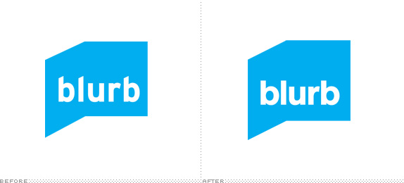
Blurb

The “make your own book” company Blurb, established in 2005, has undertaken a promotional campaign and had their identity refreshed by San Francisco based Duncan/Channon. More can be found here.
Thanks to Michael Lemme for the tip.

DATE: Jul.14.2011 POSTED BY: Cole Baldwin
 CATEGORY: Publishing The B-Side
  COMMENTS:

TAGS: icon, sans serif,

A B-Side BY cole
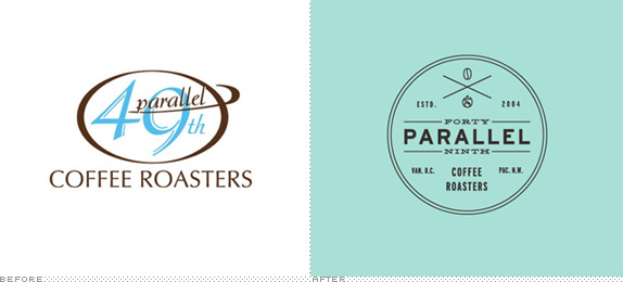
49th Parallel

49th Parallel Coffee Roasters has recently had an identity upgrade in what looks like an attempt to be taken seriously as a coffee provider. A bit more here.
Thanks to Harry Olson for the tip.

DATE: Jul.13.2011 POSTED BY: Cole Baldwin
 CATEGORY: Food The B-Side
  COMMENTS:

TAGS: coffee, logo, sans serif, slab serif,

A B-Side BY cole
Committee of Organ Donation in Lebanon

The Committee of Organ Donation in Lebanon is an organization dedicated to gifting organs from donors to people in need. Their identity centers on what would be a grisly concept if it was not so tastefully done. A bit more information can be found here.
Thanks to Ivan Raszi for the tip.

DATE: Jul.12.2011 POSTED BY: Cole Baldwin
 CATEGORY: Health The B-Side
  COMMENTS:

TAGS: healthcare, logo, organ,

The B-Side BY cole
Schlecker

Established in 1975, Schlecker, the Germany based drugstore and one of the largest European retailers, has undergone a recent identity update. The new logo features a bit friendlier type treatment (based on Frutiger, but tweaked for individualization) in an attempt to appear more inviting and approachable. The official press release can be found here but may require Google Translate for the non-German speakers.
Thanks to Ralitza Dilovska for the tip.

DATE: Jul.11.2011 POSTED BY: Cole Baldwin
 CATEGORY: Corporate The B-Side
  COMMENTS:


