


Online
- FPO (For Print Only) / Celebrating the reality that print is not dead by showcasing the most compelling printed projects.
- Art of the Menu / Cataloguing the underrated creativity of menus from around the world.
- Quipsologies / Chronicling the most curious, creative, and notable projects, stories, and events of the graphic design industry on a daily basis.
- Speak Up (2002 – 2009) / Discussing, and looking for, what is relevant in, and the relevance of, graphic design. Archives Only.
- Word It (2003 – 2010) / Encouraging creative diversity in the community through monthly, one-word challenges. Archives Only.
- Brand New Classroom (2010 – 2011) / Providing a space for critique and opinions on student identity work. Archives Only.
Publishing
- The 2010 Brand New Awards / 2011, self-published.
- Flaunt: Designing effective, compelling and memorable portfolios of creative work / 2010, self-published.
Events & Judged Competitions
- Brand New Conference / A one-day event on the development of corporate and brand identity projects by some of today’s most active and influential practitioners from around the world.
- Brand New Awards / Celebrating the best identity work produced around the world.
- FPO Awards / Celebrating the best print work from around the world.
Writing
- Graphic Design, Referenced: A Visual Guide to the Language, Applications, and History of Graphic Design / 2009, Rockport.
- Women of Design: Influence and Inspiration from the Original Trailblazers to the New Groundbreakers / 2008, HOW Books.
- The Word It Book: Speak Up Presents a Gallery of Interpreted Words / 2007, HOW Books.
Graphic Design
- Department of Design / Designing corporate and brand identities and full development of printed and digital matter for clients.

A B-Side BY Armin
Koning & Hartman
![]()
Established in 2005, Koning & Hartman is a Dutch business-to-business provider of telecommunication services. New logo introduced back in April. No further info.
Thanks to Maarten Heijmerink for the tip.

DATE: Aug.26.2011 POSTED BY: ArminCATEGORY: Telecom The B-Side COMMENTS:

TAGS: dutch, rounded sans serif,

A B-Side BY Armin
OneMain Financial
![]()
OneMain Financial is the new name for the former CitiFinancial, Citibank’s consumer-finance business as it prepares to sell that division. More story here.
Thanks to Robert Tommy Ward for the tip.
DATE: Aug.24.2011POSTED BY: ArminCATEGORY: Finance The B-Side COMMENTS:
TAGS: blue, sans serif,
A B-Side BY Armin
Psion
![]()
Established in 1980, Psion is a London-based manufacturer of rugged mobile computing solutions and devices. Way back in January they introduced a new look designed by the London office of Futurebrand. Explanation here. Detail and groovy animation below (or after the jump).
Continue reading this entry
DATE: Aug.23.2011POSTED BY: ArminCATEGORY: Technology The B-Side COMMENTS:
A B-Side BY Armin
The Center for Contemporary Art
![]()
Established in 1970 as the Somerset Art Association founded in Bernardsville, NJ, The Center for Contemporary Art, as it has been known since 2010, is a nonprofit organization devoted to “study, experience and create the multiple languages of the visual arts”. The new logo has been designed by Tom Browne.
DATE: Aug.22.2011POSTED BY: ArminCATEGORY: Culture The B-Side COMMENTS:
TAGS: icon, sans serif,
A B-Side BY Armin
JayneMax
![]()
JayneMax is a collection of luxury handbags growing in popularity, they made a cameo in Ugly Betty, and have opened more than a dozen stores recently. New logo designed by Brand Navigation.
DATE: Aug.19.2011POSTED BY: ArminCATEGORY: Consumer products The B-Side COMMENTS:
TAGS: blue, sans serif, serif,
A B-Side BY Armin
Southern Illinois University Carbondale
![]()
Established in 1869, Southern Illinois University Carbondale, a public higher education institution, has more than 20,000 total enrolled students. Earlier this month they introduced a new identity designed by Chicago, IL-based Lipman Hearne. A page dedicated to the new branding is here.
Thanks to Dan Reedy for first tip.
DATE: Aug.18.2011POSTED BY: ArminCATEGORY: Education The B-Side COMMENTS:
TAGS: serif, university,
A B-Side BY Armin
Bot Water
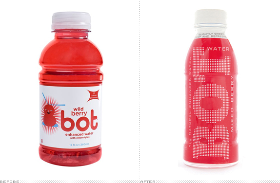
Introduced in 2007 as a kid’s beverage, bot is a line of “enhanced, flavored water.” The beverages have now been rebooted for an adult costumer base. The redesign was done by Boulder, CO-based TDA_Boulder. Detail of the new bottles below (or after the jump).
Continue reading this entry
DATE: Aug.17.2011POSTED BY: ArminCATEGORY: Consumer products The B-Side COMMENTS:
TAGS: packaging,
A B-Side BY Armin
Famous Idaho Potato Bowl
![]()
Formerly known as the Humanitarian Bowl, an NCAA football game that features “a top selection from the Western Athletic Conference (WAC) and the Mid-American Conference (MAC)” and is the longest-running outdoor cold-weather Bowl, played since 1997. The Idaho Potato Commission has signed a six-year naming rights deal to sponsor the bowl and it follows “the tradition of commodity-named bowl games with connections to a state’s top agricultural export.” (i.e., the Orange Bowl, Sugar Bowl and Cotton Bowl). But let’s be honest here, this is on Brand New because I have always wanted to post a logo that is a potato-colored football covered with sour cream and chives. Press release here.
Thanks to Noah Rothschild for the tip.
DATE: Aug.16.2011POSTED BY: ArminCATEGORY: Sports The B-Side COMMENTS:
A B-Side BY Armin
Hero MotoCorp
![]()
Established in 1984 as a partnership between Japan’s Honda and India’s Hero Group, Hero Honda has grown to be the largest manufacturer and seller of motorcycles in India. This month, with Hero taking over the whole business, the company was renamed Hero MotoCorp. The new logo has been designed by Wolff Olins. Story here.
DATE: Aug.15.2011POSTED BY: ArminCATEGORY: Consumer products The B-Side COMMENTS:
TAGS: india, sans serif, wolff olins,
A B-Side BY Armin
National Railway Museum
![]()
Opened in 1975, the National Railway Museum features “over 300 years of railway history and its collections include over 100 locomotives, some 250 items of rolling stock and thousands of other objects — from posters and tickets to uniforms and silverware.” It has two locations in the UK, one in York and the other in Shildon. The new identity was designed by Thompson Brand Partners. Creative Review has a bit more story and images.
Thanks to Cody Pate for the tip.
DATE: Aug.12.2011POSTED BY: ArminCATEGORY: Culture The B-Side COMMENTS:
TAGS: icon, museum, sans serif, uk,


Books about logo design, the designers that create them and the meaning of branding.
