
A B-Side BY Armin
Maybank
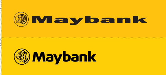
Established in 1960, Maybank is Malaysia’s largest financial services group with “over 1,750 branches and offices in 14 countries, employing 40,000 Maybankers and serving over 18 million customers.” Do not adjust your set, the “before” logo is that stretched. Press release here. Bigger view of the icon below (or after the jump).
Continue reading this entry

DATE: Sep.19.2011 POSTED BY: Armin
 CATEGORY: Finance The B-Side
  COMMENTS:

TAGS: bank, malaysia, sans serif, yellow,

A B-Side BY Armin
Teletoon

First airing in 1997, Teletoon is a Canadian TV channel focused on cartoons and animation. The new logo was updated in-house. Press release here. Bigger view of the logo below (or after the jump).
Continue reading this entry

DATE: Sep.15.2011 POSTED BY: Armin
 CATEGORY: Entertainment The B-Side
  COMMENTS:


A B-Side BY Armin
Intrax

Established in 1980, Intrax is “a globally-oriented company that provides a lifetime of high quality educational, work and volunteer programs that connect people and cultures.” A new logo designed by MetaDesign rolled out earlier this year. From the press release: “The logo features a customized typeface with distinct inflections that demonstrate ‘connections.’ The most prominent feature of the logo is the letter ‘x,’ from which an arrow shape has been derived and assigned a complementary color. This arrow symbolizes the personal and professional direction, as well as the forward-looking outlook, that Intrax program participants gain.” More application images here.

DATE: Sep.13.2011 POSTED BY: Armin
 CATEGORY: Education The B-Side
  COMMENTS:

TAGS: metadesign, sans serif, x,

A B-Side BY Armin
Osteopathic Centre for Children
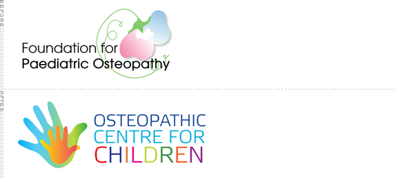
Founded in 1991, the Osteopathic Centre for Children is a “charitable organisation based in the UK that seeks to ensure that paediatric osteopathy […] is established as the first option for parents and carers concerned for their child’s health.” New logo appeared in early August. Bigger view of the logo below (or after the jump).

DATE: Sep.12.2011 POSTED BY: Armin
 CATEGORY: Health The B-Side
  COMMENTS:

TAGS: gradient, sans serif, uk,

A B-Side BY Armin
Women at NBCU
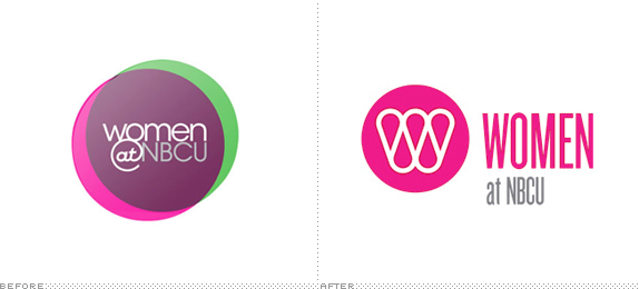
Launched in 2008, Women at NBCU is an “ad sales, marketing and research initiative [that] creates custom solutions for advertisers to connect with female consumers via NBCUniversal’s wide portfolio.” Logo designed by Wolff Olins. A few more images at Wolff Olins designer Mike Abbink’s website.
Thanks to Marc Nijborg for the tip.

DATE: Sep.09.2011 POSTED BY: Armin
 CATEGORY: Media The B-Side
  COMMENTS:

TAGS: condensed, monogram, wolff olins,

A B-Side BY Armin
University of San Francisco
Founded in 1855, the University of San Francisco is “one of only 28 Jesuit Catholic colleges in the country and the oldest university in San Francisco” with under 10,000 students enrolled. A new logo was introduced in August, designed by Studio Hinrichs. “The cross formed in the center of the refreshed symbol represents University’s Jesuit Catholic identity. The arrows point both outward and inward reflecting the ongoing dialogue and engagement between the university and society.” Press release here.
Thanks to JMarc Nijborg for the tip.

DATE: Sep.08.2011 POSTED BY: Armin
 CATEGORY: Education The B-Side
  COMMENTS:

TAGS: cross, sans serif, university,

A B-Side BY Armin
Santo Domingo
Cluster Turístico de Santo Domingo, the tourism office of the capital of the Dominican Republic, has just released a new destination logo for the city. More story here.
Thanks to Mirek Janczur for the tip.

DATE: Sep.07.2011 POSTED BY: Armin
 CATEGORY: Destinations The B-Side
  COMMENTS:


A B-Side BY Armin
Steak ’n Shake
First opened in 1934 in Normal, IL, Steak ‘n Shake is a chain of around 500 diners around the U.S.. Revised logo has been appearing slowly this year.
Thanks to Laura Shumaker for first tip.

DATE: Sep.06.2011 POSTED BY: Armin
 CATEGORY: Restaurant The B-Side
  COMMENTS:

TAGS: black, sans serif,

A B-Side BY Armin
Erzgebirge (Ore Mountains)
Erzgebirge (Ore Mountains) sit at the border of Germany and the Czech Republic. As their name implies, the mountains were rich in ores, including silver, tin, and copper. It became an important mining area. A new logo for Tourismusverband Erzgebirge has been designed by Sandstein.
Via The Branding Source.

DATE: Aug.30.2011 POSTED BY: Armin
 CATEGORY: Destinations The B-Side
  COMMENTS:

TAGS: germany, icon, sans serif,

A B-Side BY Armin
Hatuey

Originally brewed in Cuba in 1927, Hatuey is currently produced by Bacardi. This summer it introduced the beer in the American market. Design by Spring Design Partners. Another image below (or after the jump).


DATE: Aug.29.2011 POSTED BY: Armin
 CATEGORY: Consumer products The B-Side
  COMMENTS:


