


Online
- FPO (For Print Only) / Celebrating the reality that print is not dead by showcasing the most compelling printed projects.
- Art of the Menu / Cataloguing the underrated creativity of menus from around the world.
- Quipsologies / Chronicling the most curious, creative, and notable projects, stories, and events of the graphic design industry on a daily basis.
- Speak Up (2002 – 2009) / Discussing, and looking for, what is relevant in, and the relevance of, graphic design. Archives Only.
- Word It (2003 – 2010) / Encouraging creative diversity in the community through monthly, one-word challenges. Archives Only.
- Brand New Classroom (2010 – 2011) / Providing a space for critique and opinions on student identity work. Archives Only.
Publishing
- The 2010 Brand New Awards / 2011, self-published.
- Flaunt: Designing effective, compelling and memorable portfolios of creative work / 2010, self-published.
Events & Judged Competitions
- Brand New Conference / A one-day event on the development of corporate and brand identity projects by some of today’s most active and influential practitioners from around the world.
- Brand New Awards / Celebrating the best identity work produced around the world.
- FPO Awards / Celebrating the best print work from around the world.
Writing
- Graphic Design, Referenced: A Visual Guide to the Language, Applications, and History of Graphic Design / 2009, Rockport.
- Women of Design: Influence and Inspiration from the Original Trailblazers to the New Groundbreakers / 2008, HOW Books.
- The Word It Book: Speak Up Presents a Gallery of Interpreted Words / 2007, HOW Books.
Graphic Design
- Department of Design / Designing corporate and brand identities and full development of printed and digital matter for clients.

A B-Side BY Armin
Wo Hing General Store
![]()
Parallel to today’s main post, Wo Hing General Store is a new Chinese restaurant by Charles Phan and The Slanted Door Group. The identity has been designed by San Francisco-based Manual. “The logo plays with the delicate nature of noodles, a main staple on the restaurant’s menu. We also noticed a similarity to the structure of tubular neon signs that are often associated with Chinese street food. In addition to the logo, we created a rich, colorful visual language using only the aforementioned humble noodle. Using a scanner, designers experimented with raw and cooked noodles to create a number of flowing, abstract images.” Plenty of cool application shots here.

DATE: Feb.23.2012 POSTED BY: ArminCATEGORY: Restaurant The B-Side COMMENTS:

TAGS: blue, manual creative, sans serif,

A B-Side BY Armin
Teenage Cancer Trust
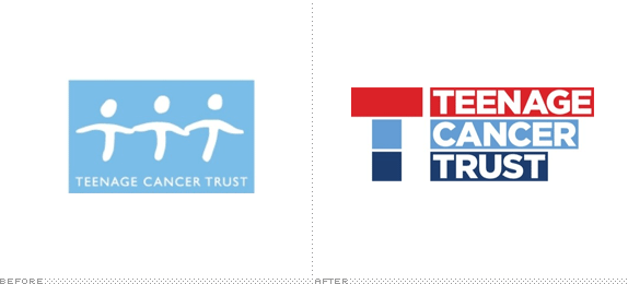
Established in 1990, Teenage Cancer Trust is a UK-based charity “devoted to improving the lives of teenagers and young adults with cancer”. A new identity was introduced in January, designed by The Cernis Collective in collaboration with Why Not Associates. Story here.
Thanks to Dan Adler for the tip.
DATE: Feb.22.2012POSTED BY: ArminCATEGORY: Non-Profit The B-Side COMMENTS:
TAGS: sans serif,
A B-Side BY Armin
Dignity Health
![]()
Established in 1986, Dignity Health (formerly Catholic Healthcare West) is one of the largest healthcare networks in the U.S., with 10,000 physicians and 55,000 employees across Arizona, California, and Nevada. They changed their name and logo in January. Press release here [PDF]. Logo explanation: “The logo represents the coming together of caregivers, services, care centers, etc., to create a continuum of care. The three sections remind us of the three dimensions of our mission — healing, advocacy, and partnering. The icon surrounds a central space, symbolizing how an integrated health system honors the inherent dignity of each individual.”
Thanks to Carlos Montalvan for the tip.
DATE: Feb.21.2012POSTED BY: ArminCATEGORY: Health The B-Side COMMENTS:
TAGS: gradient, icon, orange, sans serif,
A B-Side BY Armin
California Tortilla
![]()
Established in 1995 in Bethesda, MD, California Tortilla is a chain of fast casual Tex-Mex restaurants with 36 locations on the East Coast in Delaware, Maryland, Virginia, Pennsylvania and DC. A new avocado-based logo was introduced earlier this year. Story here. Logo detail below (or after the jump).
Continue reading this entry
DATE: Feb.20.2012POSTED BY: ArminCATEGORY: Restaurant The B-Side COMMENTS:
A B-Side BY Armin
Music Choice
![]()
Music Choice is a range of music channels provided by cable services like Comcast and Time Warner Cable. In January, they introduced a new logo designed by Siegel+Gale. Bigger view of the logo below (or after the jump).
Continue reading this entry
DATE: Feb.17.2012POSTED BY: ArminCATEGORY: Media The B-Side COMMENTS:
TAGS: custom, script, siegel+gale,
A B-Side BY Armin
Nature’s Path
![]()
Dating back to 1949, Nature’s Path produces and sells organic cereals and granola. Last November they introduced a new logo and packaging (shown below, or after the jump). Story here.
Continue reading this entry
DATE: Feb.16.2012POSTED BY: ArminCATEGORY: Consumer products The B-Side COMMENTS:
TAGS: illustration, packaging, sans serif,
A B-Side BY Armin
SunRun
![]()
Established in 2007, SunRun is one of the leading providers of home solar services in the U.S. with over 15,000 customers. A new, more apocalyptic looking logo was introduced in January.
Thanks to Alden Woodrow for the tip.
DATE: Feb.15.2012POSTED BY: ArminCATEGORY: Technology The B-Side COMMENTS:
TAGS: lowercase, sans serif,
A B-Side BY Armin
Reel FX
![]()
Established in 1993 and formerly known as Radium/Reel FX, Reel FX is a visual effects, animation and entertainment studio with offices in Dallas, TX and Santa Monica, CA. They recently introduced a new logo, which isn’t anything earth-shattering or particularly notable but they have put together an amazing animation piece of their logo that is a must-watch. Here. And a behind the scenes story is here.
Thanks to Ben Williams for the tip.
DATE: Feb.14.2012POSTED BY: ArminCATEGORY: Graphics Industry The B-Side COMMENTS:
TAGS: animation, sans serif,
A B-Side BY Armin
Corel
![]()
Established in 1989 with the launch of CorelDraw, Corel is a software developer “with more than 100 million active users in over 75 countries.” None of which are graphic designers, unless you count using CorelDraw as a punchline for bad graphics. The new logo was introduced back in April or May of 2011. Not sure how we missed it. Story here.
Thanks to Nodws for the tip.
DATE: Feb.13.2012POSTED BY: ArminCATEGORY: Technology The B-Side COMMENTS:
A B-Side BY Armin
Deutsche Welle
![]()
On the air since 1953, Deutsche Welle is Germany’s international broadcaster, “its work around the globe is based on German federal law and is financed from tax revenue.” It has a staff of about 1,500 people across the world. A new logo was introduced last week. Release here.
Thanks to Ivan Filipov for the tip.
DATE: Feb.10.2012POSTED BY: ArminCATEGORY: Media The B-Side COMMENTS:
TAGS: blue, monogram, sans serif,


Books about logo design, the designers that create them and the meaning of branding.
