
A B-Side BY Armin
Telenav
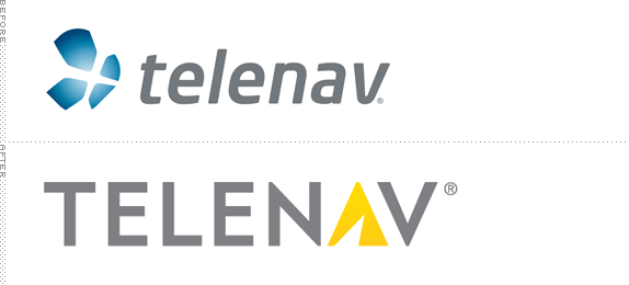
Established in 1999, Telenav provides custom wireless location-based services for both consumers in the form of apps and as features for partners like wireless carriers, automobile manufacturers and original equipment manufacturers (OEMs), app developers, advertisers and agencies. Earlier this year, Telenav introduced a new logo. No press release, no design credit.
Thanks to Myles Dordick for the tip.

DATE: Aug.23.2012 POSTED BY: Armin
 CATEGORY: Technology The B-Side
  COMMENTS:

TAGS: sans serif, yellow,

A B-Side BY Armin
Rosetta Stone

Established in 1992, Rosetta Stone provides “cutting-edge interactive technology that is changing the way the world learns languages. The company’s proprietary learning techniques—acclaimed for their power to unlock the natural language-learning ability in everyone—are used by schools, businesses, government organizations and millions of individuals around the world.” A revised logo was introduced recently, designed by Pappas Group.

DATE: Aug.15.2012 POSTED BY: Armin
 CATEGORY: Technology The B-Side
  COMMENTS:

TAGS: 3d, gradient, sans serif,

A B-Side BY Armin
Iplay
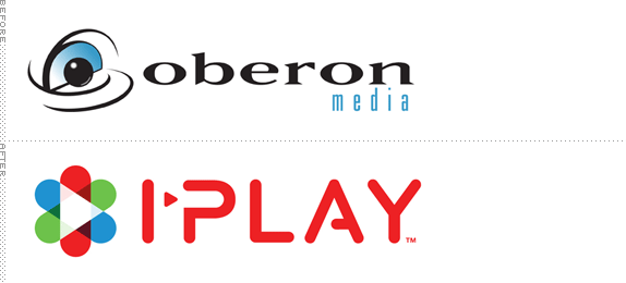
Established in as Oberon Media, Iplay, which takes its new corporate name from its consumer online portal, is an interactive games marketplace and a “multi-platform casual games company” providing distribution of interactive game entertainment for such�partners�as Microsoft, Yahoo and AT&T. The new logo, designed by Berkeley, CA-based Thermostat represents “[Content], curation and�connectivity with an orbiting group of letter Is that expresses�connectivity.�We use the RGB color spectrum graphically to represent all digital media�content and curation by how the shapes overlap and form a new shape of a play�button in the center.” A few application images below (or after the jump).
Continue reading this entry

DATE: Aug.13.2012 POSTED BY: Armin
 CATEGORY: Technology The B-Side
  COMMENTS:


A B-Side BY Armin
Campaign Monitor
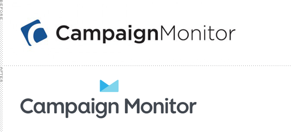
Launched in 2004, Campaign Monitor is an e-mail marketing service that allows users to send lovely designed newsletters and provides thorough results and data on each campaign sent. Last month, Campaign Monitor introduced a new look with a new logo that combined a custom wordmark by Minneapolis, MN-based Anthony Lane and a new icon by the in-house design team. Buzz, a member of the team writes in this post: “Some people see it as an envelope, others the letter ‘M’, a graph, crown, folded paper… or something else entirely.”
Thanks to Zac Davies for the tip.

DATE: Jul.06.2012 POSTED BY: Armin
 CATEGORY: Technology The B-Side
  COMMENTS:

TAGS: custom, icon, sans serif,

A B-Side BY Armin
oDesk

Launched in 2003, oDesk is an online workplace, “enabling businesses and contractors to work together without geographic limits.” In the first quarter of 2012, oDesk posted 399,071 jobs and there 273,844 applicants, making it one of the largest online services of its kind. A new logo was introduced recently, designed by Turner Duckworth. A bigger view of the logo below (or after the jump).
Continue reading this entry

DATE: Jul.05.2012 POSTED BY: Armin
 CATEGORY: Technology The B-Side
  COMMENTS:

TAGS: green, sans serif,

Opinion BY Armin
TicketLeap Ditches Frog

Established in 2003, TicketLeap is an online service to sell tickets and market events. Their mission is to “Democratize ticketing by bringing an innovative ticketing experience to everyone.” If you’ve ever held an event and tried to sell tickets or reserve free tickets, there is no easy way to do so, other than something like TicketLeap or its main competitor (and I’m guessing market leader) Eventbrite. To better position itself, TicketLeap has done a bunch of changes behind the scenes and introduced a new identity designed by Brooklyn, NY-based Red Antler.
Continue reading this entry

DATE: Jun.28.2012 POSTED BY: Armin
 CATEGORY: Technology
  COMMENTS:

TAGS: gradient, icon, red antler, sans serif,

A B-Side BY Armin
New Image Systems
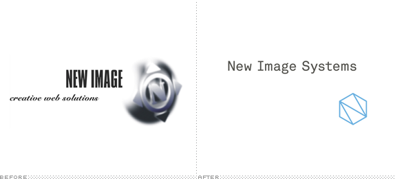
New Image Systems, formerly known as New Image Creative Web Solutions, is an IT services company in Germany. A new identity was designed by Berlin-based Boymeetsgirl, who explains: “The sophisticated mark — an allegory to an extraordinary solid network — the distinctive console-styled typography, the powerful colors, the linear design system which is derived from the mark, and the use of a very particular kind of paper with a extreme high opacity decodes the new name into a visual identity that stands out from the masses of IT service providers and manifests the ambition to create remarkable software and system-solutions.” Application images below (or after the jump).
Continue reading this entry

DATE: Jun.19.2012 POSTED BY: Armin
 CATEGORY: Technology The B-Side
  COMMENTS:

TAGS: colorful, monogram, slab serif,

A B-Side BY Armin
Genome from Yahoo!
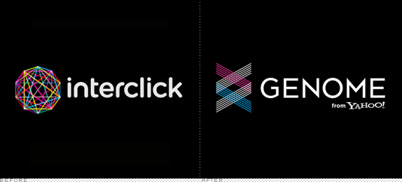
Launched this year, after the purchase of Interclick by Yahoo! in 2011, Genome from Yahoo! is “the most complete, custom audience buying solution” that “combines technology, data, premium media and analytics to help advertisers meet their marketing goals.” To be honest, I have no idea what that means. The new identity was designed by New York, NY-based The Nation. More images and video here.

DATE: Jun.14.2012 POSTED BY: Armin
 CATEGORY: Technology The B-Side
  COMMENTS:

TAGS: icon, sans serif,

Opinion BY Armin
Polycom Phone Home (and Office)

Established in 1990, Polycom, with 3,800 employees in 80 offices in 36 countries, specializes in “open standards-based unified communications (UC) solutions for telepresence, video, and voice.” If that means not much to you, they make those triangle, UFO-shaped phones that people scream at during conference calls — they are as much a staple of corporate America offices as the cubicle. Simplification aside, Polycom does have quite the stronghold and edge on all kinds of conferencing platforms that go beyond the phone, offering video and mobile solutions — they have more than 800 issued or pending patents too. Last week, Polycom introduced a new logo and identity designed by San Jose, CA-based John McNeil Studio that signals a commitment to continuing its transformation to a software-led company.
Continue reading this entry

DATE: May.30.2012 POSTED BY: Armin
 CATEGORY: Technology
  COMMENTS:


A B-Side BY Armin
Google Developers

Originally named Google Code, Google Developers is a source for all the developers who embrace Google’s open-source platforms. Portland, OR-based Instrument designed their new identity. Explanation and further images here.

DATE: May.25.2012 POSTED BY: Armin
 CATEGORY: Technology The B-Side
  COMMENTS:


