
A B-Side BY Armin
Tourism Fiji
About: Tourism Fiji is the organization that promotes the Pacific Ocean nation of Fiji.
Design by: N/A.
Ed.’s Notes: Pardon my French, but holy shit on both logos. Logo with tagline below (or after the jump).
Relevant links: News story. Tourism Fiji Brand launch Facebook album.
Continue reading this entry

DATE: Nov.26.2012 POSTED BY: Armin
 CATEGORY: Destinations The B-Side
  COMMENTS:


A B-Side BY Armin
Dallas
About: Dallas as described by the client in this project, the Dallas Convention & Visitors Bureau: As the ninth-largest city and part of the fourth-largest metropolitan area in the nation, Dallas covers approximately 343 square miles and has a population of 1,223,229. The ultra modern and sophisticated city attracts worldwide travelers, making the area the No. 1 visitor and leisure destination in Texas.”
Design by: N/A.
Ed.’s Notes: In the embedded video below (or after the jump) you can see the logo can change the shape inside the “D”.
Relevant links: NBC DFW story.
Continue reading this entry

DATE: Oct.30.2012 POSTED BY: Armin
 CATEGORY: Destinations The B-Side
  COMMENTS:

TAGS: city, neutraface, star, texas,

A B-Side BY Armin
Izmir

About: “Izmir is a historical metropolis in the western extremity of Anatolia and the third most populous city in Turkey with nearly 4 million inhabitants. It is widely believed that Homer lived and wrote ‘The Odyssey’ in Izmir. The city has been one of the principal mercantile cities of the Mediterranean Sea for much of its history. Over the last two decades, Istanbul remerged as the financial, social, and cultural capital of Turkey, attracting the creative class of Izmir. As a response, in 2010 the Izmir Development Agency embarked on a city marketing strategy and kick started Turkey’s first city branding project. As a result, I Mean It Creative was commissioned in 2012 to create the visual and verbal identity of Izmir.”
Design by: I Mean It Creative
Ed.’s Notes: There isn’t a link with all the info or images, so plenty is posted here.
Relevant links: N/A.
Continue reading this entry

DATE: Oct.24.2012 POSTED BY: Armin
 CATEGORY: Destinations The B-Side
  COMMENTS:

TAGS: hand-drawn, turkey,

A B-Side BY Armin
Catedral Alta Patagonia
About: Catedral Alta Patagonia is a very popular ski resort, and one of the largest in South America, located on the Catedral mountains in the Patagonia, Argentina.
Design by: N/A.
Ed.’s Notes: The logo represents the four different mountains that make up Catedral. And then it’s mashed up with a tulip. Explanation graphic below (or after the jump). Plus, it looks like ski slopes!
Relevant links: Press Release (Spanish).
Continue reading this entry

DATE: Sep.26.2012 POSTED BY: Armin
 CATEGORY: Destinations The B-Side
  COMMENTS:


Opinion BY Armin
Colombia goes Cuckoo for Coco
Known mostly for two clichés — coffee and drug cartels — Colombia is a rich and diverse country and due to its large geographical size and population it is one of the most active and influential countries in South America. It also benefits from an amazing location at the Northwest point of its continent, with coasts on both the Pacific Ocean and the Caribbean, a lush forest, and an epic mountain range in the Andes. Last Friday, before a soccer match between Colombia and Uruguay, the host introduced its new country brand and tagline, “The Answer is Colombia,” created by the joint efforts of Sancho BBDO and BBD for the identity and by JWT, RepGrey, and MEC for the advertising.
Continue reading this entry

DATE: Sep.11.2012 POSTED BY: Armin
 CATEGORY: Destinations
  COMMENTS:

TAGS: colombia, colorful, flexible identity,

A B-Side BY Armin
Visit Indy

Formerly known as Indianapolis Convention & Visitors Association, the newly renamed Visit Indy is the organization devoted to promoting the city. A new logo, designed by local firm The Lodge was introduced last week. From a news story: “The logo uses several Indy-centric images including an ‘I’ in the word Indy that is supposed to symbolize Monument Circle and a large oval shape coming off the tail of the ‘y’ in Indy symbolizing the Indianapolis Motor Speedway and Indy 500.” A bigger and more gradient-y view of the logo below (or after the jump).
Continue reading this entry

DATE: Aug.21.2012 POSTED BY: Armin
 CATEGORY: Destinations The B-Side
  COMMENTS:

TAGS: script,

Opinion BY Armin
The Original Wine Country

Located in the Northern coast of California, Sonoma County is one of the most well-known wine-grape-growing, wine-producing, and wine-consuming regions not just in the United States but around the world. Boasting 13, the most in the U.S., American Viticultural Areas — official regions with boundaries defined by the Alcohol and Tobacco Tax and Trade Bureau and the United States Department of the Treasury — Sonoma County is home to 1,800 grape growers and 350 wineries across 60,000-plus acres of awesome land. But nowadays pretty much every city and country has its very own “Wine Country” and Sonoma County was feeling the competition or, put more officially, “there is more pressure than ever before to strengthen the presence of Sonoma County and its AVAs among world-class wine regions” so three of the county’s leading organizations — Sonoma County Vintners, Sonoma County Winegrape Commission, and Sonoma County Tourism Bureau — banded together to create an official destination brand as well as a national campaign to “build awareness through communications and promotion that will keep the Sonoma County brand visible and relevant, ensuring that every winery, grower, and our region as a whole benefits from the power of our brand.” The identity has been designed by Landor.
Continue reading this entry

DATE: Aug.20.2012 POSTED BY: Armin
 CATEGORY: Destinations
  COMMENTS:

TAGS: destination, landor, stencil, wines,

Opinion BY Armin
V Marks the Spot

Located in Central London, the Victoria district is a high traffic area thanks to Victoria Station, a complex that serves the Underground, railway, and buses, with more than 100 million passengers going through every year. Victoria also includes Tate Britain, Buckingham Palace and three Royal Parks, but unlike other districts like The City, Soho, or the South Bank, Victoria doesn’t quite have a defined personality. Land Securities, the largest commercial property company in the UK that develops and manages high-end office, retail, and residential space and has many properties in Victoria is looking to establish an identity for the district, which has been designed by London-based SomeOne.
Continue reading this entry

DATE: Jul.25.2012 POSTED BY: Armin
 CATEGORY: Destinations
  COMMENTS:

TAGS: london, Sans Serif, someone,

Opinion BY Armin
A Night at the Shrewsbury

Located close to the Welsh border in Shropshire county in the West Midlands, England, Shrewsbury is a small town with a population of 70,000. What it lacks in human beings it makes up for in charm, with a town center still laid out in its medieval form with boutique shops and restaurants. Facing competition from other, nearby small towns with their own charms and looking to increase daytrip and overnight-stay visitors, the Shropshire Council and Shropshire Tourism decided it was time to establish a brand for the town and they worked with London-based & Smith and We All Need Words to design it. One of the town’s attractions is its sixteenth-century Tudor architecture: houses with black and white timber facades in geometric patterns, which served as one of the main elements of the new identity.
Continue reading this entry

DATE: Jul.18.2012 POSTED BY: Armin
 CATEGORY: Destinations
  COMMENTS:

TAGS: black, flexible identity, uk, white,

Opinion BY Armin
Czech Republike? More like Czech Republican’t
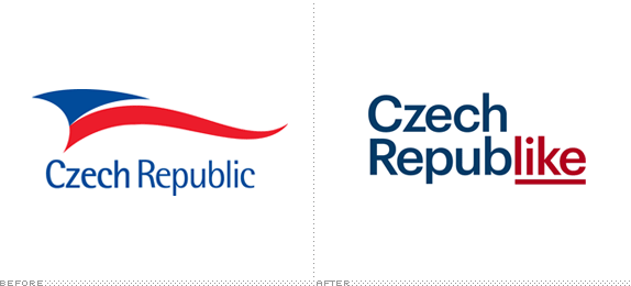
I kind of hate describing destinations as almost anything I can say is obvious. So, the Czech Republic: in Europe, pretty. This month, the Czech Tourist Authority (CTA), revealed the winner of a “tender” — the Europeans way of a) saying Request for Proposal or b) asking for spec work — issued in April to create a new marketing logo to promote the country. From a shortlist of six proposals that you can see here, the CTA along with “representatives of the Union of Graphic Design, partners and sponsor,” plus “representatives of the Ministry for Regional Development, Ministry of Foreign Affairs and Czech Centres,” selected the work of Prague-based Marvil and awarded them a prize of CZK$2.5 million (US$119,000).
Continue reading this entry

DATE: Jul.16.2012 POSTED BY: Armin
 CATEGORY: Destinations
  COMMENTS:

TAGS: Czech Republic, destination, Sans Serif,


