
Opinion BY Armin
Arrow Marks the Spot
Founded in 1856, Lincoln is the capital of the state of Nebraska and, with approximately 300,000 citizens in the metro area, its second most populated city, after neighboring Omaha. Lincoln has a nice, friendly, groovy feel that is lost on most potential tourists or people looking to live in nice, friendly, groovy places. Last week, the Lincoln Chamber of Commerce introduced a new brand that aims to attract talented people to live there and boost the economy. The identity was designed by local firm Archrival. A handy PDF with the brand presentation can be found here.
Continue reading this entry

DATE: Jun.27.2012 POSTED BY: Armin
 CATEGORY: Destinations
  COMMENTS:


A B-Side BY Armin
Odessa
Odessa is the third largest city in Ukraine situated on the coast of the Black Sea, which has helped its tourism. Working with the Odessa City Council Moscow-based Art. Lebedev Studio created a new logo and identity around an anchor — part of the city’s flag and coat of arms — that also alludes to a heart. More images, including a riff on the I ♥ NY logo, here.
Spotted at The Branding Source.

DATE: Jun.13.2012 POSTED BY: Armin
 CATEGORY: Destinations The B-Side
  COMMENTS:


A B-Side BY Armin
Colorado Springs
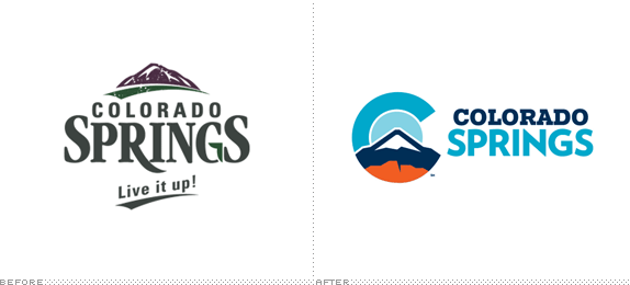
Located in South-Central Colorado, Colorado Springs is home to a little over 400,000 folks, many of which were offended at the “before” image shown above which was introduced in November of last year which led to a whole ordeal of doing a new logo. Story here. The new-new logo was designed by local design firm Fixer Creative Co. after an open call for proposals. Their story here.

DATE: Apr.12.2012 POSTED BY: Armin
 CATEGORY: Destinations The B-Side
  COMMENTS:

TAGS: blue, orange, slab serif,

Guest Opinion by Bill Dawson BY Brand New
Grand Central Time
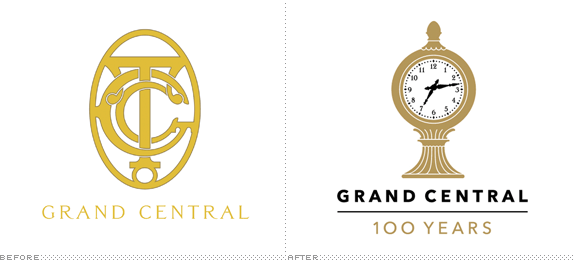
New York’s Grand Central Terminal train station will celebrate its centennial in 2013. In honor of that milestone, Midtown TDR Ventures worked with Pentagram to create a new logo and identity system for the landmark location. Pentagram partner Michael Bierut oversaw the project with designer Joe Marienek. The logo includes an interpretation of the four-sided Tiffany timepiece that sits atop the information kiosk at the center of the Main Concourse. The clock is set at 7:13 PM (19:13) to represent the year that the station became officially known as Grand Central Terminal.
Continue reading this entry

DATE: Apr.04.2012 POSTED BY: Brand New
 CATEGORY: Destinations
  COMMENTS:

TAGS: icon, New York, pentagram, Sans Serif,

A B-Side BY Armin
Kansas City Convention & Visitors Association
Established in 1966, the Kansas City Convention & Visitors Association “markets the Greater Kansas City area as a favored destination for visitors and conventions.” They recently introduced a new identity designed by Kansas City, MO-based Willoughby Design. Identity applications here and a pretty scary launch video — which I am guessing was not done by Willoughby Design — below (or after the jump).
Continue reading this entry

DATE: Mar.09.2012 POSTED BY: Armin
 CATEGORY: Destinations The B-Side
  COMMENTS:

TAGS: blue, Sans Serif,

Opinion BY Armin
Tahoe South is Where It’s At
Located smack in the middle of the border between California and Nevada states, Lake Tahoe is one of the most popular vacation and fun-having destinations in the U.S. with a mix of nature-y stuff like skiing, hiking, boating, and more as well as, thanks to its Nevada location, plenty of gambling. Lake Tahoe has two main cities, Tahoe City to the North on the California side and South Lake Tahoe on the South still in California but a stone’s throw away from Nevada, making it more attractive to the work-hard-play-hard crowd. In charge of the South side is the Lake Tahoe Visitors Authority who are intent of making their side the side to be in. Changing the destination name from Lake Tahoe South Shore to simply Tahoe South, they have introduced a new identity designed by San Francisco, CA-based Duncan/Channon.
Continue reading this entry

DATE: Feb.14.2012 POSTED BY: Armin
 CATEGORY: Destinations
  COMMENTS:

TAGS: custom, duncan channon, script, underware,

A B-Side BY Armin
Salerno

Salerno is a sea-side city in Campania, Italy. This month the City of Salerno introduced a new “consumer” logo to complement the city’s official seal. The new logo has been designed by Massimo Vignelli. Story and pictures of Vignelli’s presentation here. One image that explains the concept behind the logo below (or after the jump).
Continue reading this entry

DATE: Dec.02.2011 POSTED BY: Armin
 CATEGORY: Destinations The B-Side
  COMMENTS:


Opinion BY Armin
São Paulo Attracts
São Paulo is the largest city in Brazil and one of the most populated cities in the world with 10 million people in the city proper, being close to 19 million counting the surrounding metropolitan area, and it receives an additional 10 million visitors a year. All in all, lots of people in a city with lots to do and lots to see. This month the São Paulo Turismo agency introduced a new identity designed by Romulo Castillho to help propel the city forward with a unified message as it enters a busy decade with the World Cup and Summer Olympic Games. Ideafixa posted a detailed interview with Romulo and has a few more images.
Continue reading this entry

DATE: Dec.02.2011 POSTED BY: Armin
 CATEGORY: Destinations
  COMMENTS:

TAGS: brazil, colorful, Sans Serif, sao paulo,

Opinion BY Armin
United Dots of America
Established in 1776, the United States is, like, a big country. With stuff. Lots of stuff. And the Corporation for Travel Promotion — now doing business as “Brand USA” — which was established in 2010 as part of the Travel Promotion Act of 2009, would like you to come visit if you don’t live here. Brand USA is the “first nationally coordinated program to market the U.S. abroad.” It is a non-profit private-public partnership with a Board of Directors, appointed by the U.S. Secretary of Commerce and its estimated $200 million marketing budget for 2012 will come from a combination of the private sector and a nominal $14 fee paid by visitors from visa waiver countries. “No U.S. taxpayer dollars” we are assured “are used to fund the efforts of Brand USA.” Yesterday, at a travel industry event in London, Brand USA made its international debut. The logo and identity have been designed by The Brand Union and an advertising campaign slated for spring 2012 will be created by JWT.
Continue reading this entry

DATE: Nov.08.2011 POSTED BY: Armin
 CATEGORY: Destinations
  COMMENTS:

TAGS: dots, the brand union, USA,

A B-Side BY Armin
Maldives
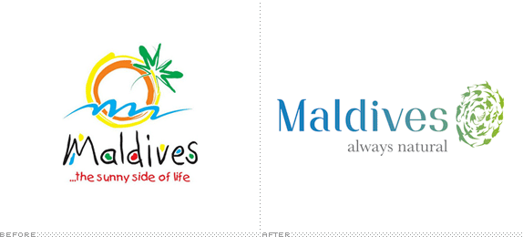
The Maldives is an archipelago of 1,190 Islands in Asia, near India and Sri Lanka. It has a population of 350,000, and described by the Maldives Marketing & Public Relations Corporation (MMPRC) as having ” deep blue seas, turquoise reefs, white sandy beaches and palm trees.” In October MMPRC introduced a new tourism logo and slogan. Press release here.

DATE: Nov.04.2011 POSTED BY: Armin
 CATEGORY: Destinations The B-Side
  COMMENTS:


