
Opinion BY Armin
Energizing Eindhoven
Because my knowledge of Eindhoven is minimal, here is a slightly edited Wikipedia description: “Eindhoven is a municipality and a city located in the province of North Brabant in the south of the Netherlands, originally at the confluence of the Dommel and Gender streams. The city had 218,559 inhabitants (November 2012) and 261,082 if adjacent Veldhoven is included, making it the fifth-largest city of the Netherlands and the largest of North Brabant.” A new identity for the city has been launched by Eindhoven365, an organization that combines the operations of CityDynamiek and Eindhoven VVV (the regional tourist bureau) to establish a “clear city marketing strategy for the purpose of creating a strong brand policy and brand perception for the city of Eindhoven”. The identity and strategy have been designed by the “Virtual Design Agency”, a collaboration of various local individuals and firms. For additional information and process images, a comprehensive Tumblr has been going on for a few months.
Continue reading this entry

DATE: Jun.04.2013 POSTED BY: Armin
 CATEGORY: Destinations
  COMMENTS:

TAGS: custom, icon, red, the netherlands,

Opinion BY Armin
Minsk Gets in Line

Established in 1067, Minsk is the capital and largest city of the Republic of Belarus with nearly 2 million people — about 20 percent of the population of the country. Today, as described by the Minsk City Executive Committee, Minsk is “a modern, dynamic city, the largest transport and logistics center, a cultural and scientific center of the country” with high education standards, positive diversity, clean and green (as in parks and stuff), and mostly as a city on the rise. “Minsk,” however, share London- and Moscow-based agency INSTID, who have been working with the city on its new identity since August 2012, “lacks a clear identity. Its residents define themselves mostly by nationality, and admit that Minsk does not have a particular culture or tradition of its own.” Commissioned by the city’s tourist information agency, INSTID’s task was to “help improve international recognition of Minsk to help it attract foreign investment, visitors, and talent” and “help residents feel proud of Minsk and develop a unique city culture based on their distinct character, and create a powerful platform for city’s future development.” The new identity will begin to be implemented this summer.
Continue reading this entry

DATE: May.20.2013 POSTED BY: Armin
 CATEGORY: Destinations
  COMMENTS:

TAGS: blue, flexible identity, lines, minsk,

A B-Side BY Armin
Nevada (Tourism)
About: As described by the client, the Nevada Commission on Tourism: “Nevada is one of the largest states in the U.S., meaning you won’t find a shortage of action in the Silver State. It’s one of the only places you can ski world-class runs in the morning, then walk world-class greens in the afternoon. You can bike or hike the Tahoe Rim Trail, navigate a kayak on the Truckee River through downtown Reno, take an ATV up Sand Mountain near Fallon and snowmobile miles of wide-open terrain near Elko. You can even test your Indy car or NASCAR skills in the Mario Andretti and Jeff Gordon Racing School at Las Vegas Motor Speedway—after you take in a world-famous show and dine at a five-star resort and casino, of course.”
Design by: Y&R.
Ed.’s Notes: Good update. Any idea what the symbol over the first “a” means? TV spot below (or after the jump).
Relevant links: Press release. Reno Rebirth blog story
Continue reading this entry

DATE: Apr.25.2013 POSTED BY: Armin
 CATEGORY: Destinations The B-Side
  COMMENTS:

TAGS: Sans Serif, uppercase,

Opinion BY Armin
Knock-Knock-Knocking on Hell’s Door
Smack in the middle and covering the south area of Australia, South Australia is one of the eight states and territories of the country, accounting for a small 8% of its population, most of them living in the capital city of Adelaide. Unlike its way more popular neighbors New South Wales and Victoria and their own capital cities, Sydney and Melbourne respectively, we don’t hear much about South Australia. Hoping to change that, the Economic Development Board under the leadership of Jay Weatherill, Premier of South Australia, has just introduced a new identity for the state designed by Cato Partners. Without getting further into the work, and judging from the image above alone, you know that this is not going to end well and the backlash has already started, driven mostly by a Facebook page simply called The new South Australia logo sucks.
Continue reading this entry

DATE: Mar.07.2013 POSTED BY: Armin
 CATEGORY: Destinations
  COMMENTS:

TAGS: australia, cato partners, red, window,

A B-Side BY Armin
Belize
About: Client is Belize Tourism Board. “Belize is a country located on the north eastern coast of Central America. It is the only country in the area where English is the official language, although Kriol and Spanish are more commonly spoken. Belize is bordered to the north by Mexico, to the south and west by Guatemala and to the east by the Caribbean Sea. Its mainland is about 290 kilometres (180 mi) long and 110 kilometres (68 mi) wide.” (Source: Wikipedia)
Design by: Olson.
Ed.’s Notes: Video on the making of the logo and bigger view below (or after the jump).
Relevant links: Olson project page.
Continue reading this entry

DATE: Feb.11.2013 POSTED BY: Armin
 CATEGORY: Destinations The B-Side
  COMMENTS:


Opinion BY Armin
Next Stop: PHL

Founded in 1682, Philadelphia is “one of the leading cities in the world. Located in between New York City and Washington D.C., 40% of the U.S. population is within a day’s drive.” This succinct description — more facts here — comes from the Philadephia Convention & Visitors Bureau (PHLCVB), the official Tourism Promotion Agency for the city and the primary sales/marketing agency for the Pennsylvania Convention Center. Its mission is to “generate economic impact and job growth by increasing the region’s hotel occupancy and revenues” as well as doing “whatever it takes to attract ethnically diverse regional, national and international convention and tourism customers through creative sales, marketing and communications efforts.” To that effect PHLCVB introduced late last year a new destination brand designed by J2 Design Partnership based on strategy by Ex;it — both local firms.
Continue reading this entry

DATE: Feb.11.2013 POSTED BY: Armin
 CATEGORY: Destinations
  COMMENTS:

TAGS: acronym, philadelphia, square, uppercase,

A B-Side BY Armin
The City of St. Augustine
About: St. Augustine is a city in the northeastern region of the U.S. state of Florida. Founded in September 1565 it is the second oldest continuously occupied European-established city and port in the continental United States. St. Augustine lies in a region of Florida known as “The First Coast”, which extends from Amelia Island in the north to Jacksonville, St. Augustine, and Palm Coast in the south. According to the 2010 census, the city population was 12,975. St. Augustine is the headquarters for the Florida National Guard. (Source, modified: Wikipedia)
Design by: We are Charette.
Ed.’s Notes: Y’all will be happy to know the design firm is located in St. Augustine. Bigger view of the logo and the icon below (or after the jump)
Relevant links: St. Augustine’s 450th year celebration site.
Provided quote:“The mark we designed combines the profile of the Castillo de San Marcos with a representation of water, and the colors reflect both our Spanish heritage (in earthy terra cotta oranges and vibrant reds) and our maritime history (in a regal blue). The typography feels both historic and humanistic.”
Continue reading this entry

DATE: Feb.07.2013 POSTED BY: Armin
 CATEGORY: Destinations The B-Side
  COMMENTS:


A B-Side BY Armin
Enterprise Florida

About: Enterprise Florida, Inc. is a partnership between Florida’s business and government leaders and is the principal economic development organization for the state of Florida. Headquartered in Orlando, Enterprise Florida’s mission is to facilitate job growth for Florida’s businesses and citizens leading to a vibrant statewide economy. In pursuit of its mission, Enterprise Florida works closely with a statewide network of economic development partners and is funded both by the State of Florida and by private-sector businesses.”
Design by: On Ideas.
Ed.’s Notes: The logo has been met with controversy for its focus on men by using a tie in its logo, earning the label of being sexist. I couldn’t agree more, this logo is sexist because it offends both men and women because it’s a bad concept executed badly.
Relevant links: Tampa Bay Business Journal story.
Thanks to James I. Bowie for the tip.

DATE: Feb.04.2013 POSTED BY: Armin
 CATEGORY: Destinations The B-Side
  COMMENTS:

TAGS: gradient, Sans Serif,

Opinion BY Armin
Bulgaria’s Everything-but-the-Kitchen-Sink Approach Sinks

I always have a hard time introducing destinations so let’s just go with a few, simple facts about Bulgaria: located in Southeastern Europe it is the continent’s 14th-largest country with more than 7 million habitants and, apropos to this review, welcomes more than 8 million tourists per year. Last week, the Bulgarian Ministry of Economy, Energy and Tourism introduced a new tourism logo designed by Sofia-based Publicis MARC Group that will begin to be used in September 2013.
Update: This new logo system does NOT replace the painted rose logo. This is NOT a country brand (for which the painted rose logo is used) but a tourism brand — the challenge being “To create a globally competitive integrated brand system for the first time in the history of the Bulgarian travel industry”. Publicis MARC Group has also provided some text. Apologies for any confusion.
Continue reading this entry

DATE: Jan.22.2013 POSTED BY: Armin
 CATEGORY: Destinations
  COMMENTS:

TAGS: bulgaria, colorful, flexible identity,

Opinion BY Armin
Kangaroo Makeover
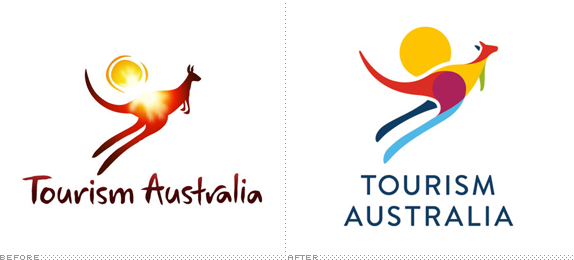
Tourism Australia is a Government-owned agency that is responsible for “attracting international visitors to Australia and encouraging Australians to travel domestically, both for leisure and business events.” In 2003, the agency received a big boost — as in $AU350 million over four years — to promote the country’s brand and in 2004 they introduced a logo designed by Futurebrand — see PDF case study — that introduced the image of the hopping kangaroo with the sun behind it. After eight years, this image appears to still hold value and has been redesigned by Interbrand Australia.
Continue reading this entry

DATE: Dec.19.2012 POSTED BY: Armin
 CATEGORY: Destinations
  COMMENTS:

TAGS: australia, colorful, interbrand, overlay,


