Opinion BY Armin
War! What is it good for? For Good Logos

Founded in 1917 and first opened to the public in 1920, the Imperial War Museum — no plural at the time — was established to create a record of the experience of Great Britain during the first World War. Since then, and with an expansion to four other museums — IWM London; IWM North in Trafford, Greater Manchester; IWM Duxford near Cambridge; the Churchill War Rooms in Whitehall, London; and the historic ship HMS Belfast — the Imperial War Museums (IWM) is “the world’s leading authority on conflict and its impact, focusing on Britain, its former Empire and the Commonwealth, from the First World War to the present.” IWM, as it is now officially named, introduced a new identity last month, designed by London-based Hat Trick.
Continue reading this entry

DATE: Oct.13.2011 POSTED BY: Armin
 CATEGORY: Culture
  COMMENTS:

TAGS: flexible identity, hat-trick, museum, Sans Serif, uk,

Opinion BY Armin
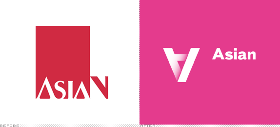
Asian Art Museum Turned on its Head

First opened in 1966 as a wing of the M.H. de Young Memorial Museum in Golden Gate Park in San Francisco, the Asian Art Museum, now in its own building, is currently one of the largest museums in the Western world devoted exclusively to Asian Art, housing a collection of over 17,000 artworks. It was also one of the most financially troubled museums in the Western world devoted exclusively to Asian Art with a $120 million debt, which was recently announced would be solved, setting the museum up for a much needed reinvention: “Our new brand,” explains Jay Xu, Director of the Asian Art Museum “promises to awaken the past and inspire the next. It means we’ll unlock the past for visitors and bring it to life by sparking connections. We’ll also be a catalyst for new art, new creativity and new thinking.” To help turn things around, literally, the Asian Art Museum worked with Wolff Olins to design its new identity.
Continue reading this entry

DATE: Oct.03.2011 POSTED BY: Armin
 CATEGORY: Culture
  COMMENTS:

TAGS: flexible identity, museum, Sans Serif, wolff olins,

Opinion BY Armin
Human Rights Logo Takes Flight

In early May, the call for entries for A Logo for Human Rights (LHR), a “global creative online competition with cash prizes and open to everyone,” was announced. The goal? To “create a human rights logo ‘by people for people’, thus making a contribution towards the global spread and implementation of human rights with the support of a large public.” The process was your typical contest malarkey: People design, people upload, people vote on uploaded logos, designers e-mail friends and family to vote for their logos, participants complain about the voting process, the top 100 vote getters get presented to the jury (Spiekermann! Ai WeiWie! Jimmy Wales! Jimmy Carter!) and the “experts” (No! Idea! Who! They! Are!), the jurors select their own favorite ten logos, of those top vote getters ten finalists are presented again for online public voting, participants complain about the selection process, finalists designers e-mail friends and family to vote for their logos, a winner is announced. On Friday, LHR announced that Serbian designer Predrag Stakic had been selected as the winner from over 15,000 submissions.
Continue reading this entry

DATE: Sep.26.2011 POSTED BY: Armin
 CATEGORY: Culture
  COMMENTS:


A B-Side BY Armin
Lighthouse

Established in 1986, Lighthouse is a “digital culture agency” based in Brighton, UK. They support, commission and exhibit work by artists and filmmakers. Logo designed by Dandelion & Burdock. “Our new logo includes a subtle suggestion of moving lights.” Press release here.

DATE: Sep.20.2011 POSTED BY: Armin
 CATEGORY: Culture The B-Side
  COMMENTS:

TAGS: sans serif,

Opinion BY Armin
Pitchfork Forks its Logo

In March of 2009 we reported on the redesign of Pitchfork, the online source for new-fashioned journalism and opinion on music. Established in 1996, Pitchfork has become one of the most influential music arbiters, has launched a concert series, and has spawned Pitchfork TV (in 2008) to showcase videos and other music related content. Yesterday, Pitchfork unveiled a site redesign and a new wordmark to accompany its pitchfork icon.
Continue reading this entry

DATE: Aug.30.2011 POSTED BY: Armin
 CATEGORY: Culture
  COMMENTS:


A B-Side BY Armin
The Center for Contemporary Art

Established in 1970 as the Somerset Art Association founded in Bernardsville, NJ, The Center for Contemporary Art, as it has been known since 2010, is a nonprofit organization devoted to “study, experience and create the multiple languages of the visual arts”. The new logo has been designed by Tom Browne.

DATE: Aug.22.2011 POSTED BY: Armin
 CATEGORY: Culture The B-Side
  COMMENTS:

TAGS: icon, sans serif,

A B-Side BY Armin
National Railway Museum

Opened in 1975, the National Railway Museum features “over 300 years of railway history and its collections include over 100 locomotives, some 250 items of rolling stock and thousands of other objects — from posters and tickets to uniforms and silverware.” It has two locations in the UK, one in York and the other in Shildon. The new identity was designed by Thompson Brand Partners. Creative Review has a bit more story and images.
Thanks to Cody Pate for the tip.

DATE: Aug.12.2011 POSTED BY: Armin
 CATEGORY: Culture The B-Side
  COMMENTS:

TAGS: icon, museum, sans serif, uk,

A B-Side BY Armin
Seattle Symphony

Established in 1903, the Seattle Symphony is now in its 109th season. With the arrival of a new music director, they have introduced a new logo, designed by local design firm PhinneyBischoff, that “[intends] to exemplify the Northwest’s past, present and future aptitude for innovation, and reflect an organization that advances music in new and inventive ways.” Press release here.
Thanks to Dan Dixon for the tip.

DATE: Aug.01.2011 POSTED BY: Armin
 CATEGORY: Culture The B-Side
  COMMENTS:

TAGS: icon, music, sans serif, seattle,

Opinion BY Armin
Speech Bubbles Up from Down Under

Officially formed in 1980 but only opened in 2001, the National Museum of Australia (NMA) “explores the land, nation and people of Australia. The Museum celebrates Australian social history in a unique way by revealing the stories of ordinary and extraordinary Australians.” The NMA is located in Canberra, the national capital of Australia, and is housed in an enthusiastically designed building by Ashton Raggatt McDougall that lives in a picturesque peninsula. The museum recently introduced a new identity designed by Sydney-based Gen.a.
Continue reading this entry

DATE: Jul.26.2011 POSTED BY: Armin
 CATEGORY: Culture
  COMMENTS:

TAGS: australia, museum, sans serif, speech bubble,

A B-Side BY Armin
G. Schirmer Inc.

Established in 1861, G. Schirmer Inc. is a classical music publisher. A new logo has been designed by Fuzzco.

DATE: Jul.15.2011 POSTED BY: Armin
 CATEGORY: Culture The B-Side
  COMMENTS:

TAGS: icon, sans serif,


