Opinion BY Christian Palino
Half the Sky is the Limit

Half The Sky is a media project aimed at focusing attention on the oppression of women and girls around the world. Based on Nicholas Kristof’s and Sheryl WuDunn’s work for the New York Times, later turned into a book, Half The Sky seeks to become a social movement through a multi-media campaign including a PBS television series, educational short films, and a social action game with Facebook. The identity has been designed by Chermayeff & Geismar’s Sagi Haviv.
Continue reading this entry

DATE: Jul.14.2011 POSTED BY: Christian Palino
 CATEGORY: Culture
  COMMENTS:

TAGS: chermayeff and geismar, sans serif,

Opinion BY Armin
Splashy Museum

Established in 1937, the National Maritime Museum (NMN) in Greenwich, England is one of the largest museums in the world on this theme and one of the most popular attractions in the UK. Along with the NMN sit the The Royal Observatory, which happens to the epicenter of Greenwich Mean Time (GMT), and The Queen’s House, the birthplace of British architectural Classicism. Today, NMN is launching a new identity for all of its attractions, designed by London-based Someone.
Continue reading this entry

DATE: Jul.12.2011 POSTED BY: Armin
 CATEGORY: Culture
  COMMENTS:


Guest Opinion by Joshua Levi Posted BY Brand New
Forward-Looking Image

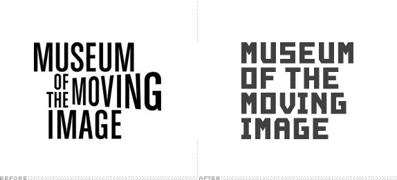
When I was a kid, my family and I would see shows at our town’s golden era movie house. It was a small, second-run theater. Its rich decor and the perpetual smell of popcorn oozed of the past in this kind of magical way. My favorite visit was to see Back to the Future. I can remember the juxtaposition of an art deco theater and a time-traveling Delorean like it was yesterday. I was taken back to that moment earlier this year, and again last week, walking around the Museum of Moving Image (MoMI) in New York with a new expansion designed by Leeser Architecture and new identity and signage designed by karlssonwilker. While this project is a few months old, there is not much information out there about it, so I decided to do some digging and gather some of the loose images on this project, most found on this Flickr set by Archidose and this Facebook album from karlssonwilker.
Continue reading this entry

DATE: Jun.28.2011 POSTED BY: Brand New
 CATEGORY: Culture
  COMMENTS:

TAGS: custom, karlssonwilker, museum, New York, sans serif,

A B-Side BY Armin
Expo 2015

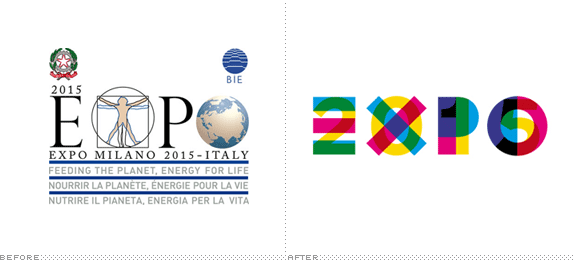
To be held in Milan, Italy Expo 2015 is the next World Fair, where countries set up extravagant pavilions to strut their stuff. This year’s them is “Feeding the Planet”. The new logo is the result of a contest. (Yes, we are still covering contests). The winning entry was by Andrea Puppa from Milan.
Thanks to Giorgio Caviglia for the tip.

DATE: Jun.24.2011 POSTED BY: Armin
 CATEGORY: Culture The B-Side
  COMMENTS:

TAGS: overlay, sans serif,

A B-Side BY Armin
Nationaltheater Mannheim

Established in 1957, in its current form and building, Nationaltheater Mannheim (National Theatre Mannheim) is a performance center for opera, ballet, and theater in Mannheim, Germany. A new identity has been designed by Munich-based Anzinger Wüschner Rasp. Not a lot of story. A cover featuring the new identity shown below (or after the jump).
Continue reading this entry

DATE: Jun.21.2011 POSTED BY: Armin
 CATEGORY: Culture The B-Side
  COMMENTS:

TAGS: acronym, germany, sans serif,

Opinion BY Armin
Van Gogh’s Brush Strokes

Established in 1973 in Amsterdam, the Van Gogh Museum holds over 200 paintings as well as drawings and letters of Vincent van Gogh. More than 1.5 million people visit every year, making it the most visited museum in the Netherlands and, according to research by The Art Newspaper, it is the 23rd most visited museum in the world. Earlier this month the museum introduced a new identity designed by Amsterdam-based Koeweiden Postma.
Continue reading this entry

DATE: Jun.21.2011 POSTED BY: Armin
 CATEGORY: Culture
  COMMENTS:

TAGS: amsterdam, gotham round, koeweiden postma, museum, the netherlands,

Opinion BY Armin
D is for Design and Dots

Established in 2010, Design Museum Boston (DMB) is a nonprofit organization that “envisions creative, engaging public art and design education for Boston and New England.” Without its own physical space DMB is a nomadic museum — or what they call a “decentralized network of physical and virtual exhibits” — bringing different programming and experiences to galleries, retail environments, and public spaces. Back in January — sorry, sometimes we are out of the loop on things — DMB introduced a new identity designed by Continuum and, to many people’s amusement, the design process was thoroughly documented on Core77: Here is a list of posts from nine weeks worth of work and, a highlight from week 5, here are the design concepts shown.
Continue reading this entry

DATE: Jun.15.2011 POSTED BY: Armin
 CATEGORY: Culture
  COMMENTS:

TAGS: boston, dots, icon, museum, sans serif,

A B-Side BY Armin
Urban Institute for Contemporary Arts

Founded in 1977, the Urban Institute for Contemporary Arts (UICA) is Michigan’s largest contemporary arts center. “We created something that would be long lasting, accessible, graphic, and bold — without being obviously artsy. […] And just as many new experiences challenge us at first glance the cropped typography makes us slightly uncomfortable while giving a nod to all things new that are emerging within our organization.” The new identity was designed by Grand Rapids, MI-based Peopledesign. You can see more applications here and read more about it here. Video of the logo transformation below (or after the jump).
Thanks to Michael Karlesky for the tip.

DATE: Jun.09.2011 POSTED BY: Armin
 CATEGORY: Culture The B-Side
  COMMENTS:

TAGS: helvetica, sans serif,

Opinion BY Armin
Deconstructing CAMH’s Building

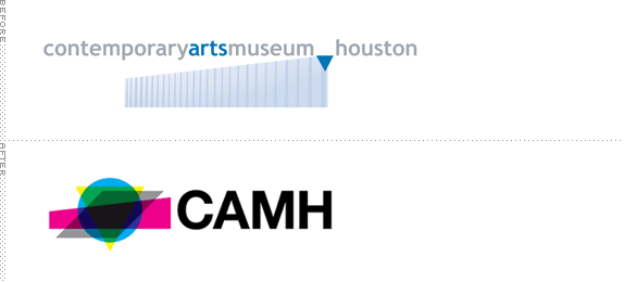
Founded in 1948, the Contemporary Arts Museum Houston (CAMH) is a “non-collecting institution dedicated to presenting the best and most exciting international, national, and regional art.” Located in Houston’s museum district, CAMH is housed in a very unconventional building — especially for Houston architecture standards — designed by architect Gunnar Birkerts. Viewed from the top, the building’s North and South walls are parallel to the street while the West and East walls are angled at 45 degrees. Viewed at street level, the building has a subtle but noticeable slant. It’s on these physical attributes (as well as an odd triangle shape that sits on top of the entrance) that CAMH has introduced a new logo and identity designed by New York-based AHL&CO.
Continue reading this entry

DATE: May.04.2011 POSTED BY: Armin
 CATEGORY: Culture
  COMMENTS:


A B-Side BY Armin
Ten Days on the Island

Ten Days on the Island is Tasmania’s state-wide biennial multi art-form festival, featuring theatre, dance, visual arts, music, film, opera, and literature in indoor and outdoor venues. The identity and materials for the event have been designed by Sydney-based Toko. I chose to show the application rather than the logo in the header image because it’s in the application that this identity really stands out.

DATE: Apr.28.2011 POSTED BY: Armin
 CATEGORY: Culture The B-Side
  COMMENTS:

TAGS: event, sans serif, tasmania, toko,


