


Online
- FPO (For Print Only) / Celebrating the reality that print is not dead by showcasing the most compelling printed projects.
- Art of the Menu / Cataloguing the underrated creativity of menus from around the world.
- Quipsologies / Chronicling the most curious, creative, and notable projects, stories, and events of the graphic design industry on a daily basis.
- Speak Up (2002 – 2009) / Discussing, and looking for, what is relevant in, and the relevance of, graphic design. Archives Only.
- Word It (2003 – 2010) / Encouraging creative diversity in the community through monthly, one-word challenges. Archives Only.
- Brand New Classroom (2010 – 2011) / Providing a space for critique and opinions on student identity work. Archives Only.
Publishing
- The 2010 Brand New Awards / 2011, self-published.
- Flaunt: Designing effective, compelling and memorable portfolios of creative work / 2010, self-published.
Events & Judged Competitions
- Brand New Conference / A one-day event on the development of corporate and brand identity projects by some of today’s most active and influential practitioners from around the world.
- Brand New Awards / Celebrating the best identity work produced around the world.
- FPO Awards / Celebrating the best print work from around the world.
Writing
- Graphic Design, Referenced: A Visual Guide to the Language, Applications, and History of Graphic Design / 2009, Rockport.
- Women of Design: Influence and Inspiration from the Original Trailblazers to the New Groundbreakers / 2008, HOW Books.
- The Word It Book: Speak Up Presents a Gallery of Interpreted Words / 2007, HOW Books.
Graphic Design
- Department of Design / Designing corporate and brand identities and full development of printed and digital matter for clients.

Opinion BY Armin
A Dell-icate Redesign
![]()
Established in 1984 by Michael Dell in our hometown of Austin, TX, Dell is one of the largest technology companies in the world with 96,000 employees and it is currently number 38 of the Fortune 500. Well known for its hardware, shipping 110,000 “systems” (laptops, desktops, and netbooks) every day around the world, Dell also provides a number of IT solutions for businesses and other organizations. Around summertime of this year, Dell began implementing an evolution of its very well recognized logo. The brand group at Dell was kind and resilient enough to share with us a bit of the back story. This implementation is merely the visible result of a process that started in 2007 when Dell announced an initiative to consolidate its more than 800 creative agencies around the world — 800! — that worked with its brand resulting in a “highly fractured brand for Dell.” As an example, at one point, “Dell was using more than 15 different typefaces — and that was only for English.” In 2009 Dell decided it was time to revisit its brand positioning “while analyzing why the brand value had been declining (most notably) in the past five years.”
Continue reading this entry

DATE: Nov.15.2010 POSTED BY: ArminCATEGORY: Consumer products COMMENTS:

TAGS: blue, dell, lippincott, museo, stone yamashita partners, wordmark, y and r,

Opinion BY Armin
Office for Mac Icons get Tangled
![]()
Like a square peg in a round hole that has been forcefully and successfully been pushed through, Microsoft’s Office for Mac suite of productivity tools has been living in Mac users’ desktops since the late 1980s and has gradually become less annoying to use with the 2004 and 2008 versions making substantial effort to play nicely. The latest Office for Mac version is the 2011 suite and it comes with a fresh coat of paint to the user interface, the application icons and the packaging. The latter two of Brand New’s interest, designed by frog.
Continue reading this entry
DATE: Nov.04.2010POSTED BY: ArminCATEGORY: Consumer products COMMENTS:
Opinion BY Sam Becker
Imitation Imitation Sugar
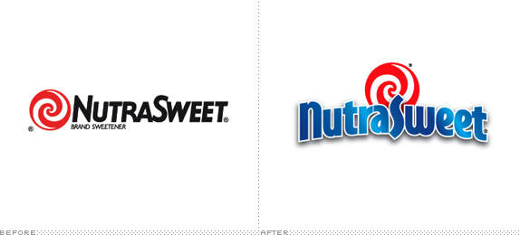
NutraSweet, one of the first, most visible purveyors of aspartame recently refreshed their brand in an obvious move to take on the pastel world of packet sweeteners. Now NutraSweet, which originated as an ingredient brand (a B-to-B of the food world, if you will) is waging a three-front war with the likes of Sweet n’ Low, Equal and their aftertaste-less companion, Splenda.
Continue reading this entry
DATE: Nov.03.2010POSTED BY: Sam BeckerCATEGORY: Consumer products COMMENTS:
TAGS: color variations, gradient, packaging,
Opinion BY Armin
Follow-up: My Little Pony
![]()
Please don’t question me as I feel a deeply rooted obligation to continue coverage of the evolving identity of the 25-year-old Hasbro brand, My Little Pony. I reviewed it last September and even included it in the Best identities of 2009. (I like to keep you all guessing as to my sanity). To coincide with the launch of the animated series My Little Pony Friendship Is Magic on The Hub channel, recently reviewed here, My Little Pony has introduced a new logo.
Continue reading this entry
DATE: Nov.02.2010POSTED BY: ArminCATEGORY: Consumer products COMMENTS:
Opinion BY Armin
Industrial Honey
![]()
We are going a bit small this Friday morning with a product made by small flying insects, produced in a small British city, catering to a small audience. Sheffield Honey Company “is an artisan producer of premium quality local English honey and beeswax products” and sells Blossom, Soft Set and Heather honey. Their identity was designed by local busy bees DED Associates.
Continue reading this entry
DATE: Oct.22.2010POSTED BY: ArminCATEGORY: Consumer products COMMENTS:
TAGS: ded associates, icon, packaging, sans serif, uk,
Opinion BY Armin
OnStar gets OnGotham
![]()
First developed in 1995 by General Motors in collaboration with Electronic Data Systems and Hughes Electronics Corporation, OnStar is a “provider of in-vehicle safety, security and communication services” integrated with all contemporary GM models. Some of its main functions include monitoring the car through GPS in the event of a stolen vehicle, it can deploy medical assistance at the touch of a button, hands-free calling, and, perhaps, most popularly, it has the ability to unlock the cars to your door as you slap your forehead when you see the keys dangling from the ignition. OnStar is a subscription based service, and more than 6 million users pay between $18 and $28 for it. In mid-September OnStar announced new services — like the ability to, OMG, update your Facebook status via voice control — a new brand message, “Responsible Connectivity”; new tagline, “Live On”; new ad campaign; and a new logo. The advertising was done by Warren, MI-based Campbell-Ewald, and I am not sure if they also carried out the identity redesign.
Continue reading this entry
DATE: Oct.11.2010POSTED BY: ArminCATEGORY: Consumer products COMMENTS:
TAGS: gotham, gradient, sans serif,
Opinion BY Armin
Discovery Kids Grows Up
Launched in 1996, Discovery Kids is another popular channel of the Discovery Communications empire with an emphasis on — stating the obvious here — programming for kids focusing on science and nature shows. Beyond its programming, Discovery Kids has also grown into a successful product brand, selling everything from little plastic dinosaurs to night goggles. This merchandising extension is important to note as on October of this year, Discovery Kids, the channel, will be replaced by The Hub, a collaboration between Discovery Communications and toy maker Hasbro. We covered that logo in February. So the new identity, created by Irvine, California-based Mattson Creative, is now a consumer product brand and not just a channel identifier.
Continue reading this entry
DATE: Aug.30.2010POSTED BY: ArminCATEGORY: Consumer products COMMENTS:
TAGS: blue, kids, mattson creative, sans serif,
Opinion BY Armin
Like a (Crystal) Rock
Outside of the few well-known, national bottled water brands like Evian, Dasani, or Aquafina, the United States is awash in smaller brands that are sold only in specific regions or states. A couple of them are produced by Crystal Rock LLC, which distributes the eponymous Crystal Rock water and Vermont Pure throughout the Northeast. Crystal Rock LLC also distributes coffee of their own brand, Cool Beans, and over 40,000 office products through Crystal Rock Office. All these different products allow Crystal Rock to claim being “the largest independent home and office distributor of its kind in the United States.” Over the Summer, a new corporate mark as well as some brand extensions were created by Prospect, CT-based Worx Branding & Advertising.
Continue reading this entry
DATE: Aug.20.2010POSTED BY: ArminCATEGORY: Consumer products COMMENTS:
TAGS: blue, sans serif, water,
Opinion BY Armin
Any way you Slice It
Did you know that a ceramic called zirconium oxide is the most durable substance on earth after diamonds? Not only that, but that it kicks metal’s ass in terms how sharp, hard and durable it can be. That’s why Slice makes it slicing and dicing products out of ceramic. Offering a small range of products designed by design celebrities like Karim Rashid, Michael Graves and Yves Behar, the Slice brand is all about simplicity, playfulness and sharpness. A new logo and packaging design by San Francisco-based Manual reinforces that.
Continue reading this entry
DATE: Aug.13.2010POSTED BY: ArminCATEGORY: Consumer products COMMENTS:
TAGS: manual creative, packaging, sans serif, slice, wordmark,
Opinion BY Armin
Olay Rejuvenates
Concocted as a gift for his wife, the story goes, Graham Wulff a chemist in Durban, South Africa first created the silky smooth pink facial cream, Oil of Olay, in the early 1950s. By the end of the decade, Oil of Olay was selling worldwide. It was purchased by Richardson-Vicks in 1970 and Richardson-Vicks was purchased by Procter & Gamble in 1985 who, in 2000, shortened the name simply to Olay. Today, it is one of the most recognized brands in the beauty market around the world and is part of P&G’s $26.3 billion business in the beauty and grooming category (along with Head & Shoulders, Pantene, and Wella). But the Olay identity hasn’t changed much in the last fifty years. The cameo — which I didn’t know cameo was a word to describe a “piece of jewelry, typically oval in shape, consisting of a portrait in profile carved in relief” — of the Olay woman has only been updated twice in that time. Clearly, it was time for some rejuvenating treatment, executed by P&G’s design team, led by Ronald Burrage, Associate Director of Global Skin Design at P&G, and by consultancy LPK.
Continue reading this entry
DATE: Aug.04.2010POSTED BY: ArminCATEGORY: Consumer products COMMENTS:
TAGS: custom, icon, lpk, olay, procter and gamble,


Books about logo design, the designers that create them and the meaning of branding.
