Opinion BY Armin
So Uncool

If there is one thing I absolutely do not miss about New York it is window air conditioner units. They suck. They are a pain in the ass to take home, because you obviously don’t have a car in New York. They are noisy, very, very noisy. They leak. The only real area they make cold is a 6-foot straight stream directly in front of the machine. They are ugly. No, I don’t miss them. And, man, I love our central air conditioning in Texas. If I remember correctly, our two apartments in New York were host to Friedrich air conditioners — perhaps there was a Frigidaire in there too for good measure — a staple of the New York landscape. Friedrich has been making AC units since the early 1950s, and it had specialized in refrigerators prior to that, and designing furniture back when it first started in 1883. With the launch of a new pair of models this year — the terribly named and spelled Kühl and Kühl+ — Friedrich introduced a new logo.
Continue reading this entry

DATE: Jul.23.2010 POSTED BY: Armin
 CATEGORY: Consumer products
  COMMENTS:

TAGS: friedrich, icon, sans serif,

Opinion BY Armin
Miller High Life Overhaul

First brewed in the mid nineteenth century by Frederick Miller in Milwaukee, Wisconsin, Miller High Life — well, to be clear, Miller High Life wasn’t introduced until 1903 — is one of most well known American beer brands. I have never had a Miller High Life so I can’t attest to its flavor, and it’s probably for the better, so that I don’t derail into a diatribe about my preferred beers. Earlier this year, Miller High Life introduced a whole new look for all of its packaging and graphics designed by the San Francisco office of Landor, with illustration assistance by Chris Mitchell.
Continue reading this entry

DATE: Jul.22.2010 POSTED BY: Armin
 CATEGORY: Consumer products
  COMMENTS:


Opinion BY Armin
Twinkle, Twinkle Black Star

Opening later this Summer just a couple miles north of UnderConsideration headquarters is the Black Star Co-Op Pub and Brewery, providing a fresh take on the co-op model. And by fresh I mean it involves beer and a place to eat some pub grub along with it or, as founder Steven Yarak, says “Why shouldn’t you own the pub you drink at?!”. Black Star’s member-owners also have a say in what the beers taste like, participating in tastings with Black Star’s own brewer, Jeff Young, who will be creating beers under three categories: Rational, Irrational, and Infinite. In preparation for their opening, Black Star has a new identity designed by Austin-based Ptarmak.
Continue reading this entry

DATE: Jun.04.2010 POSTED BY: Armin
 CATEGORY: Consumer products
  COMMENTS:


Opinion BY Armin
Shiny, Happy Soymilk

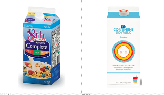
In the realm of packaging for soymilk absolutely nothing comes to mind as I like my milk made of milk, but there are those that prefer their milk made out of soybeans. For some of those, their soy intake just got a little brighter with the redesign of 8th Continent soymilks by BBDO West in collaboration with UK illustrator Ben Javens
Continue reading this entry

DATE: May.28.2010 POSTED BY: Armin
 CATEGORY: Consumer products
  COMMENTS:

TAGS: bbdo, ben javens, illustration, packaging,

Opinion BY Armin
Snapper Snaps Sam

If your lawn — assuming you have a backyard or frontyard, or some sort of grassy patch — looks anything like mine, then mowing is on your mind, as Spring begins to kick in and the non-mowing days of Winter come to an end. I have a mower, but I have no idea what brand it is, some kind of Earthsomething or other. For a Texan, I really disappoint when it comes to my fuel-powered equipment. Clearly, I’m in the minority when it comes to outdoor power equipment appreciation as it is a $8.5 billion market with $6.5 being consumed by lawn mowing equipment, according to this handy brand case study [PDF] that places Snapper as one of the top brands in said industry with more than one hundred years of experience. Recently, Snapper introduced Snapper NXT, a new line of products designed by BMW Group DesignWorks USA and along with them came a revised identity by CBX.
Continue reading this entry

DATE: Mar.29.2010 POSTED BY: Armin
 CATEGORY: Consumer products
  COMMENTS:

TAGS:

Opinion BY Christian Palino
Griffin’s New, Orange, G / @-Sign / Ear Thingy

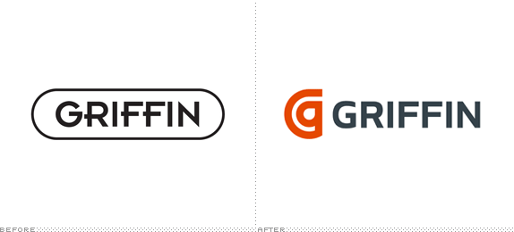
Griffin Technology, established in 1992, is a provider of accessories for personal computing and and digital media that develops a range of products from cases to travel solutions — with an emphasis on Apple products — including the original iTrip. In an effort to keep a fresh face, Griffin’s brand mark is evolving for what looks like the fourth time since they opened their doors in 1992 (a snapshot of the changes on their blog) introducing a new identity created in-house at the very end of last year.
Continue reading this entry

DATE: Mar.23.2010 POSTED BY: Christian Palino
 CATEGORY: Consumer products
  COMMENTS:

TAGS:

INTL. REVIEW BY John Ryan POSTED BY Brand New
Molson Canadian, Now More Canadian

First brewed in 1959 Molson Canadian has never shied away from wearing its Canadian-ness on its sleeve. Whether it be the pseudo rabble-rousing “I am Canadian” ads of the late 1990s, the Molson Mega Keg (an overt play on Canada’s love of oversized monuments along the Trans-Canada Highway), or even the brand name itself. However Canadians have always had a bit of a love hate relationship with brands that speak so directly to the notion of being Canadian. So it’s no surprise that recent examples of Molson Canadian’s overt Canadiana often walk the line between patriotic and palatable by presenting Canadian symbols such as the maple leaf in its logo in a rather caricaturish manner; It’s as if the hyper exaggerated water-and-ice-drenched maple leaf and faux italic typography of Molson Canadian’s previous identity are quite tenuously saying “We’re absolutely, completely, and utterly Canadian (whatever that might mean).”
Continue reading this entry

DATE: Feb.05.2010 POSTED BY: Brand New
 CATEGORY: Consumer products
  COMMENTS:

TAGS:

Opinion BY Armin
Crystal Light, Thinner and Lighter

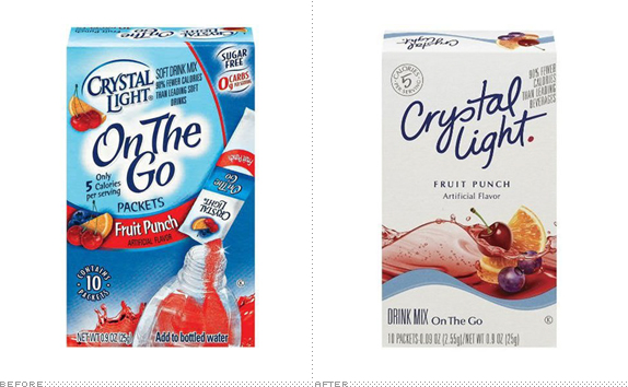
Crystal Light is a sugar-free soluble powder manufactured by Kraft Foods since 1982. Originally offered in only five flavors, the line-up now includes twenty-eight. And as non diet sodas become more and more the face of fattening evil, flavored waters and juices have risen in popularity in the last few years. While I prefer my water on tap without any kind of powder, Kraft Food bets upwards of $40 million in advertising in the last couple of years and more this year, that other people do. And while Crystal Light is clearly targeted towards women, Kraft Foods estimates that 40% of consumers are men, yet at point of purchase, women are the overwhelming majority. This past November, Kraft Foods introduced a new look for Crystal Light with an environmental-friendly range of packaging.
Continue reading this entry

DATE: Feb.03.2010 POSTED BY: Armin
 CATEGORY: Consumer products
  COMMENTS:

TAGS:

Opinion BY Christian Palino
Common Vision

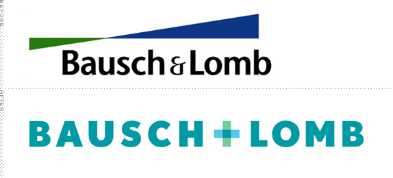
Bausch + Lomb, — no longer spelled with an ampersand, now with a plus sign — the eye health company that began in 1853 in Rochester, New York as a small optical shop and has grown into a multi-billion dollar organization with 13,000 employees, now has a revised brand identity to better support their broad offering in over 100 countries. B+L describes their product offering in three categories: Vision Care (with well-know products like SofLens and PureVision), Pharmaceuticals (with products that treat eye conditions including glaucoma, eye allergies, conjunctivitis, dry eye and retinal disease), and Cataract and Vitreoretinal Surgery (delivering intraocular lenses and surgical instruments and devices). Chances are, if you’re wearing glasses or contact lenses, you’re familiar with B+L’s consumer products.
Continue reading this entry

DATE: Jan.12.2010 POSTED BY: Christian Palino
 CATEGORY: Consumer products
  COMMENTS:

TAGS:

Opinion BY Armin
A Clawed, Orange Crustacean is Worth a Thousand Words

Remember the mid- to late-1990s? When everyone and their mother came up with a .com and an idea of delivering the wackiest products or services through the magic of the Internet and the funding of bottomless venture capitalists? For example, you know, lobsters. Lobsters. By Internet. Delivered by FedEx. Makes perfect sense. Started in 1995 by Providence, Rhode Island entrepreneur Andrew Rock, Lobster.com has been delivering fresh lobsters — only the freshest and Maine Certified — for more than a decade. Being early adopters, means that they got a fantastic URL and they recently put that to good use with an identity redesign by fellow Providence business, Nail.
Continue reading this entry

DATE: Dec.14.2009 POSTED BY: Armin
 CATEGORY: Consumer products
  COMMENTS:

TAGS:


