


Online
- FPO (For Print Only) / Celebrating the reality that print is not dead by showcasing the most compelling printed projects.
- Art of the Menu / Cataloguing the underrated creativity of menus from around the world.
- Quipsologies / Chronicling the most curious, creative, and notable projects, stories, and events of the graphic design industry on a daily basis.
- Speak Up (2002 – 2009) / Discussing, and looking for, what is relevant in, and the relevance of, graphic design. Archives Only.
- Word It (2003 – 2010) / Encouraging creative diversity in the community through monthly, one-word challenges. Archives Only.
- Brand New Classroom (2010 – 2011) / Providing a space for critique and opinions on student identity work. Archives Only.
Publishing
- The 2010 Brand New Awards / 2011, self-published.
- Flaunt: Designing effective, compelling and memorable portfolios of creative work / 2010, self-published.
Events & Judged Competitions
- Brand New Conference / A one-day event on the development of corporate and brand identity projects by some of today’s most active and influential practitioners from around the world.
- Brand New Awards / Celebrating the best identity work produced around the world.
- FPO Awards / Celebrating the best print work from around the world.
Writing
- Graphic Design, Referenced: A Visual Guide to the Language, Applications, and History of Graphic Design / 2009, Rockport.
- Women of Design: Influence and Inspiration from the Original Trailblazers to the New Groundbreakers / 2008, HOW Books.
- The Word It Book: Speak Up Presents a Gallery of Interpreted Words / 2007, HOW Books.
Graphic Design
- Department of Design / Designing corporate and brand identities and full development of printed and digital matter for clients.

Opinion BY Armin
Armani Exchange, Seeing Double
![]()
In December of 2009 we reported on the redesign of the Armani Exchange identity by Chermayeff & Geismar partner Sagi Haviv. This year, 2011, marks the 20th anniversary of Armani Exchange and Haviv was commissioned to design a new mark for A|X to celebrate the milestone throughout the year that will be put to use in applications ranging from bags, store fronts, and online media to advertising, t-shirts, and clothing labels.
Continue reading this entry

DATE: Mar.10.2011 POSTED BY: ArminCATEGORY: Consumer products COMMENTS:

TAGS: armani exchange, chermayeff and geismar, serif,

Opinion BY Armin
Follow-up: Starbucks Rolls Out New Identity
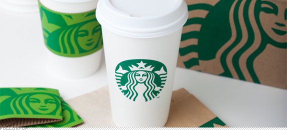
Today marks the 40th anniversary of Starbucks. It’s also the day when the new “STARBUCKS”-less Starbucks logo and identity go into effect and we have some nice photographs of the new cups, cup holders, and shopping bags right here. As part of the anniversary, Starbucks is also introducing a new coffee blend, called Tribute, and a new range of sweet snacks called Starbucks Petites. On their site be sure to check out a cute animation on the home page.
Continue reading this entry
DATE: Mar.08.2011POSTED BY: ArminCATEGORY: Consumer products COMMENTS:
Opinion BY Armin
Siriusly Lame
![]()
In 2008 the two leading satellite radio companies — and as I understand it, the only ones granted a license to do so by U.S. Federal Communications Commission — merged to create SiriusXM, a powerhouse with 135 channels of commercial free music with more than 20 million subscribers. The original companies were strong on their own: Sirius launched in 2001, made a big splash in 2004 when it lured Howard Stern away from earth-bound radio; and XM, also launched in 2001, attracted Oprah and her team of personalities in 2006. Operating with a very mergerish logo since the merger, a new logo had been spotted as early as November of last year and just this month the new SiriusXM logo appeared on their website.
Continue reading this entry
DATE: Feb.28.2011POSTED BY: ArminCATEGORY: Consumer products COMMENTS:
TAGS: blue, radio, sans serif,
Opinion BY Armin
Like Two Ps in a Pod
![]()
Whether it’s the close-ups of bland Buitoni packs on Top Chef or the sardonic parade of Apple products on 30 Rock, product placement feels like it’s at an all-time high. It’s mostly our fault too, since we skip ads with our DVRs and look away while annoying 15-second ads play before a web broadcast, product placement gets to us at the moment we are paying attention, during the actual program. Common practice in U.S. shows this was forbidden in the UK until this past Friday when Ofcom, the “Independent regulator and competition authority for the UK communications industries” announced it would be taking responsibility for the rules governing product placement in the UK and allowing it in original programming. Along with the announcement they have released a logo that is to be used for three seconds at the beginning and end of a show as well as after any commercial break.
Continue reading this entry
DATE: Feb.17.2011POSTED BY: ArminCATEGORY: Consumer products COMMENTS:
TAGS: monogram, sans serif,
Opinion BY Armin
Coinstar, More Coin less Star
![]()
When we were in New York we would amass mountains of coins since most bodegas, mom-and-pops, and pharmacies would not accept credit card payments for any purchases under $5 or $10 so there was a lot of cash involved. At one point we had two 32-ounce yogurt containers filled with coins. We carried them from Brooklyn to a Coinstar in Manhattan and went back home with more than $200. Boom. Coinstar — a coin-counting kiosk set up inside a retailer lets you exchange coins for either cash or gift cards to places like Amazon and iTunes, keeping an average of 10% if you choose cash — first appeared in San Francisco in 1992 and today counts with more than 19,000 kiosks in the U.S., Canada, Puerto Rico, Ireland and the UK, processing around 50 billion coins a year. This week a new logo for Coinstar was introduced by its parent company, Coinstar Inc., who also own the DVD-renting Red Box kiosks, to separate the corporate mark from the consumer mark.
Continue reading this entry
DATE: Feb.10.2011POSTED BY: ArminCATEGORY: Consumer products COMMENTS:
TAGS: coinstar, green, icon, sans serif,
Opinion BY Armin
Chicken Beats Pilgrim
![]()
Established in 1946, Pilgrim’s Pride is the largest producer of chicken — sold at grocery stores in fresh, fully cooked, ready to cook, and frozen varieties — in the United States (second in the world), processing over 38 million chickens a week. Currently ranked at 317 in the Fortune 500, Pilgrim’s Pride employs over 41,000 people across the United States, with headquarters in Pittsburg, Texas. They are also suppliers to KFC. Less flatteringly, they filed for bankruptcy in 2008 and exited in late 2009. Last November they started introducing a new logo and packaging and this year it is in full roll-out. The brand positioning and identity was designed by Addison Whitney.
Continue reading this entry
DATE: Jan.25.2011POSTED BY: ArminCATEGORY: Consumer products COMMENTS:
TAGS: addison whitney, icon, packaging, pilgrim's pride, serif,
Opinion BY Armin
Guten Tag 7up
![]()
There isn’t much to be introduced about 7up, the lemon-lime concoction offered by Pepsi that competes against Coca-Cola’s Sprite. I don’t like soda to begin with and lemon-lime sodas just taste like fermented bubbled water, so my connoisseurship in the realm of lemon-lime-soda-branding is limited. What I will say is that, in trying to look for a “before” image, 7up has one of the most voluble logos with at least five or six different variations coming up as “7up logo” in Google Images — for that reason, please note the above image is not “Before/After” but “American/German.” Anyway… In Germany, a new logo and packaging for 7up was introduced to the market late last year. There is no information to go from, other than the German 7up website.
Continue reading this entry
DATE: Jan.20.2011POSTED BY: ArminCATEGORY: Consumer products COMMENTS:
TAGS: 7up, germany, packaging, sans serif,
Opinion BY Armin
PUR Filtrates its Serifs
![]()
Developed by Recovery Engineering, Inc. and first sold for the household market in 1994, PUR (pronounced like “pure”) is a range of water filtration products — faucet-mounts, pitchers, refrigerator filters, etc. — that are now a part of P&G. While I like to turn on the faucet, stick my head underneath and gulp, I realize that some water is better taken filtrated, especially in Mexico, where our house brand in my teens was the competing Brita. The new PUR logo has been around since October, appearing on new packaging and coupons, and it wasn’t until last week that it made its way unto the website.
Continue reading this entry
DATE: Jan.19.2011POSTED BY: ArminCATEGORY: Consumer products COMMENTS:
TAGS: lowercase, pur, sans serif,
Opinion BY Armin
All right Mr. Schultz, I’m Ready for my Close-up
![]()
Starbucks needs no introduction but just in case: Founded in 1971 in Seattle, Starbucks is the world’s leading coffee retailer with more than 16,000 stores in 50 countries (this despite numerous closings in the last year or so). Starbucks also manages Tazo tea, Ethos water, and Seattle’s Best Coffee. And, part of the reason why we are here today, Starbucks sells more than coffee and its stores offer more than coffee (Wiiii-Fiiii says I in an Oprah wail). Yesterday, Starbucks announced that beginning in March, to coincide with their 40th anniversary, their brand would be making a bold visual evolution. Namely (pun intended) dropping its name from the logo. The new identity has been developed in-house — Starbucks has one of the strongest internal teams in a big corporation — in partnership with Lippincott.
Continue reading this entry
DATE: Jan.06.2011POSTED BY: ArminCATEGORY: Consumer products COMMENTS:
TAGS: green, icon, lippincott, starbucks,
Follow-Up BY Armin
Follow-up: Seattle’s Best Coffee

In May of this year we reported on the drastic redesign of Seattle’s Best Coffee. Our super scientific polls revealed that out of 4,542 votes, 46% were of the opinion that such a big change was a bad move and 25% thought it was a smart one. In terms of execution, out of 4,524 votes, 35% thought the execution was bad and 24% great. The pendulum certainly swings to the negative but not too heavily. A big part of their relaunch was the notion of making coffee consumption simpler and more accessible, whether it was getting SBC at a vending machine, from Burger King, or movie theaters. At the grocery store, SBC is simplifying the selection process with a new packaging system based on levels, announced yesterday.
Continue reading this entry
DATE: Dec.01.2010POSTED BY: ArminCATEGORY: Consumer products COMMENTS:
TAGS: packaging, seattle's best coffee,


Books about logo design, the designers that create them and the meaning of branding.
