A B-Side BY Armin
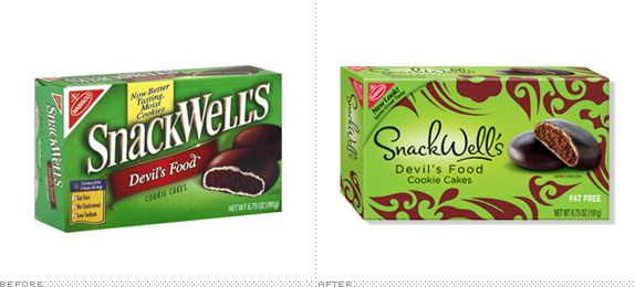
SnackWell’s

SnackWell’s, a brand of sweet not-so-crappy-for-you snacks produced by Nabisco, has just updated its logo and packaging. New tagline is “Be Bad. Snack Well.” Press release here. More packaging images and logo at SnackWell’s site.
Thanks to Cary Whitt for the tip.

DATE: May.26.2011 POSTED BY: Armin
 CATEGORY: Consumer products The B-Side
  COMMENTS:


A B-Side BY Armin
Potty Mouth Soap

Potty Mouth Soap is a line of novelty products for cleaning that toddler of yours’ filthy mouth. Old logo had been done with an online logo service. New logo by Cincinnati, OH-based Ladd Design Communications.

DATE: May.11.2011 POSTED BY: Armin
 CATEGORY: Consumer products The B-Side
  COMMENTS:

TAGS: illustration, serif,

A B-Side BY Armin
Mom’s Best Naturals

Mom’s Best Naturals is a line of breakfast cereals made from all natural ingredients. A new logo and packaging have been making it to market recently.
Thanks to Josh Crain for the tip.

DATE: May.09.2011 POSTED BY: Armin
 CATEGORY: Consumer products The B-Side
  COMMENTS:

TAGS: red, sans serif, script,

Opinion BY Armin
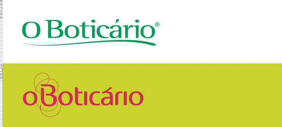
The Smoother O Boticário

In May of 2010 we reported on the introduction of a new corporate identity for Grupo Boticário, the parent company behind consumer brand O Boticário, which covers more than 600 products in body care, female fragrances, home spa, make up, male fragrances, man care, and skin care. I’m recycling some of the introduction from that post: Originally a small prescription pharmacy that started in 1977 in the city of Curitiba, Paraná in Brazil, O Boticário has 2,500 stores in Brazil alone, 70 across 15 other world cities, and presence in multiple sales points like department stores. Earlier this month, O Boticário introduced a revised identity designed by the São Paulo office of Futurebrand, who were also responsible for the parent company logo.
Continue reading this entry

DATE: Apr.26.2011 POSTED BY: Armin
 CATEGORY: Consumer products
  COMMENTS:

TAGS: brazil, dalton maag, futurebrand, packaging,

Opinion BY Clinton Duncan
Nokia’s New Brand Typeface

Nokia is the company many of us used to buy our phone from, before you-know-who started making the you-know-what. Since then Nokia has been in gradual, steady decline. To the point where the CEO felt the need to write a rather alarming memo to all his staff, using the metaphor of a “burning platform” to describe the situation Nokia finds itself. In this metaphor, the rather unappealing solution is to jump, and plunge into the ice cold North Sea below. Or commission London-based Dalton Maag to create a new typeface, call it Pure and organise a grand launch party featuring commissioned artworks from a hand picked bunch of leading designers — either way works, apparently. Introduced in late March, Nokia Pure is as important as Nokia’s own logo, as it will be the face (literally) of the mobile devices and stand front and center in all communications for the company.
Continue reading this entry

DATE: Apr.22.2011 POSTED BY: Clinton Duncan
 CATEGORY: Consumer products
  COMMENTS:

TAGS: dalton maag, nokia, typeface,

Opinion BY Armin
Redhook, Line, and Sinker

Founded in 1981 in Seattle, WA, Redhook is a craft beer brewery with a devoted following not just in the northwest of the U.S. but nationwide as passion for craft beers has grown over the last 30 years and as Redhook has increased its distribution reach. Its flagship beer is the ESB (Extra Special Bitter) but it counts with a few other year-round selections, like an IPA, as well as seasonal offerings. In March Redhook introduced a completely new bottle and packaging.
Continue reading this entry

DATE: Apr.20.2011 POSTED BY: Armin
 CATEGORY: Consumer products
  COMMENTS:


Opinion BY Armin
CooperVision, Looking Good

Established in 1979, CooperVision, part of The Cooper Companies, is a manufacturer of contact lenses that hasn’t enjoyed the mainstream consumer popularity of competing brands like Acuvue, Bausch+Lomb, or CIBA Vision, placing it squarely in fourth place. Although CooperVision had a good rapport with eye care professionals recognition among consumers who more and more are getting their contact lenses straight from the source. In March CopperVision introduced a new identity designed by Siegel+Gale that aims to bring it more visibility.
Continue reading this entry

DATE: Apr.19.2011 POSTED BY: Armin
 CATEGORY: Consumer products
  COMMENTS:

TAGS: coopervision, flexible identity, illustration, siegel+gale,

A B-Side BY Armin
Tetley

Established in 1837, Tetley is the second largest manufacturer of tea in the world. New logo has been introduced without much of a peep.
Thanks to Nicholas Chuva Plagge for the tip.

DATE: Apr.13.2011 POSTED BY: Armin
 CATEGORY: Consumer products The B-Side
  COMMENTS:


Opinion BY Armin
Carlsberg, Partying Like it’s 2015

First brewed in 1847, Carlsberg beer, a pilsner, is produced by Copenhagen-based Carlsberg Group, the fourth largest brewer in the world behind Anheuser-Busch InBev, SAB Miller, and Heineken… which is what brings us to today’s post. In an effort to double its profits by 2015, Carslberg is being repositioned to “help the brand unleash its full potential.” A new tag line, “That calls for a Carlsberg,” and new advertising will help push the new visual identity designed by San Francisco-based Office.
Continue reading this entry

DATE: Apr.12.2011 POSTED BY: Armin
 CATEGORY: Consumer products
  COMMENTS:


Opinion BY Rietje Gieskes
Aster-isk Identitus

Aster, one of the oldest shoe brands in France, has been delivering high quality children’s footwear since 1913. Their shoes feature a unique die-cut of an Aster (Diplopappus) flower, a shape recently upgraded to brand icon status. The redesign, led by Bayaderes, includes a refined color palette and a playful script.
Continue reading this entry

DATE: Apr.07.2011 POSTED BY: Rietje Gieskes
 CATEGORY: Consumer products
  COMMENTS:


