
![]()
![]()
CLIENT
A small company based in Medellín, Colombia, as a laboratory of ideas that designs products “see and touch” in limited-edition series. Targeted mainly to young consumers 20 – 35 years old.
BRIEF
With a young audience in mind, create a funny and relaxed logo. In addition to this, it must be flexible to be used in the different kinds of products that the company designs.
APPROACH
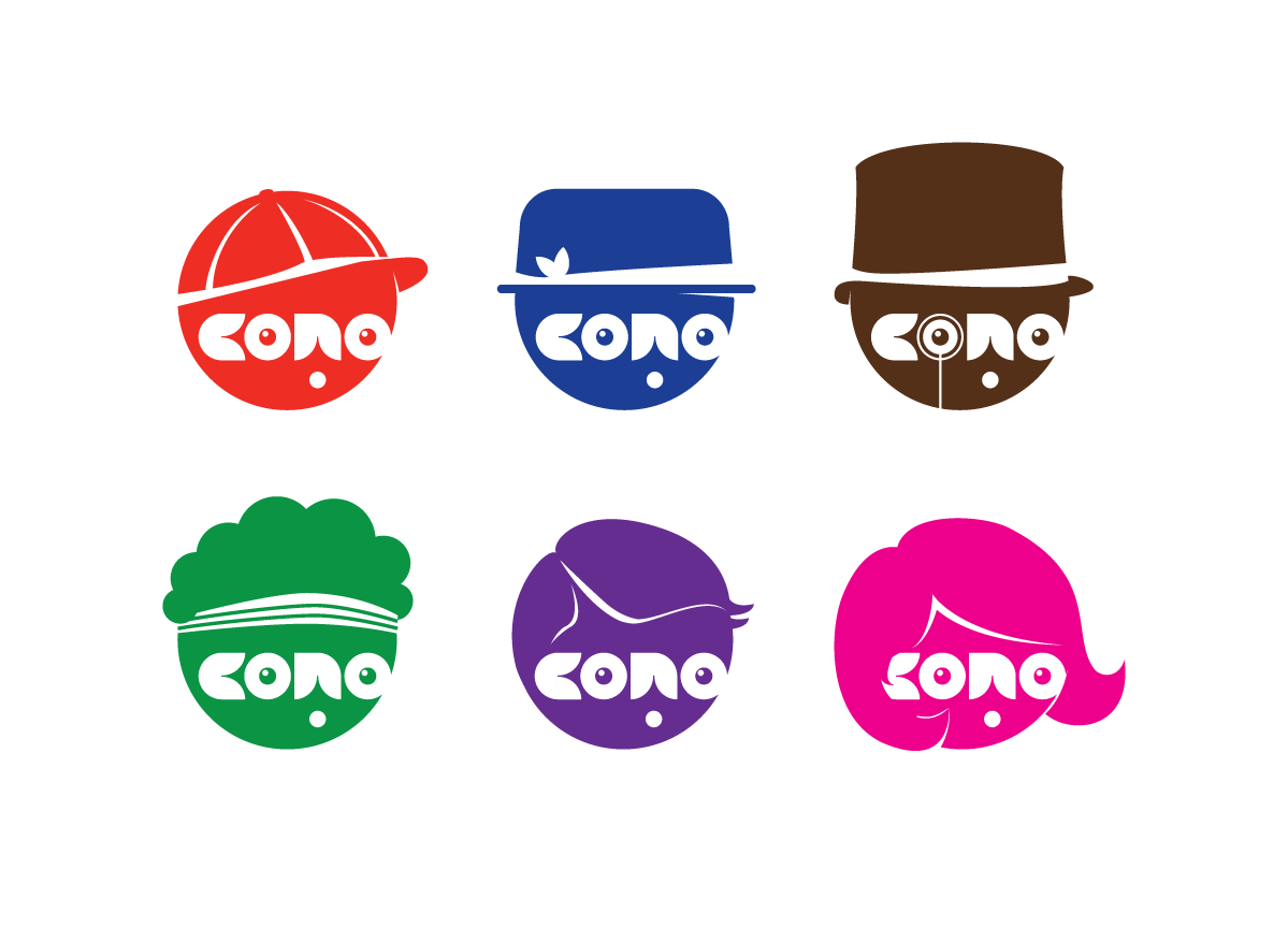
A four-letter word was the beginning to play with shapes that were later identified as letters. While the curves show the relaxed mood of the brand, they become funny anthropomorphic beings with huge possibilities of visual play. At the end, we got to an image easily adaptable to different kind of media: paper print, textile print, web, and mobile, among others.


