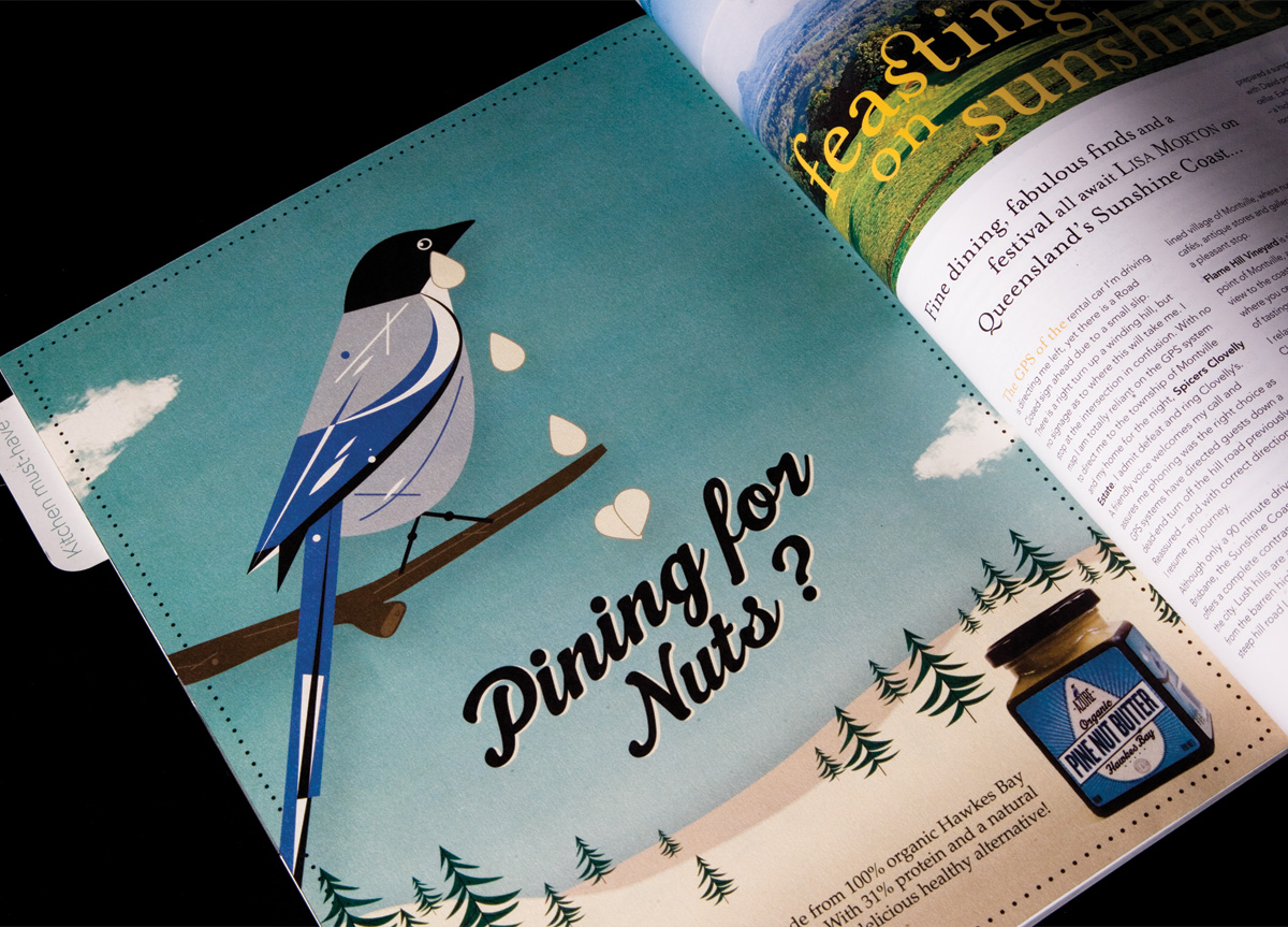
CATEGORY

Comprehensive Identity Programs

LEVEL

Student

RANK


DESIGN CREDITS

Designer

Thomas Lawlor

Instructors

Penny Dombroski
Tamara Nyholt
Mark Queenin
Heather Rennie


TAGS

, , , , ,


LINKS

Azure by Thomas Lawlor


CLIENT

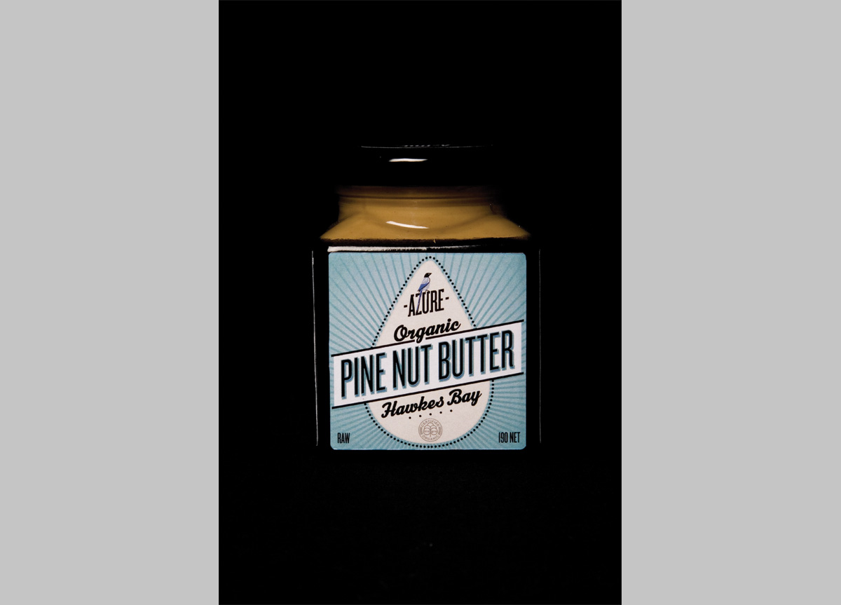
Makers of organic pine nut butter for boutique and gourmet food suppliers. The target audience are lovers of fine food. They enjoy dining out at expensive restaurants, cooking, and entertaining at home with friends. The price point dictates the demographic to be skewed toward professional people with disposable incomes.


BRIEF

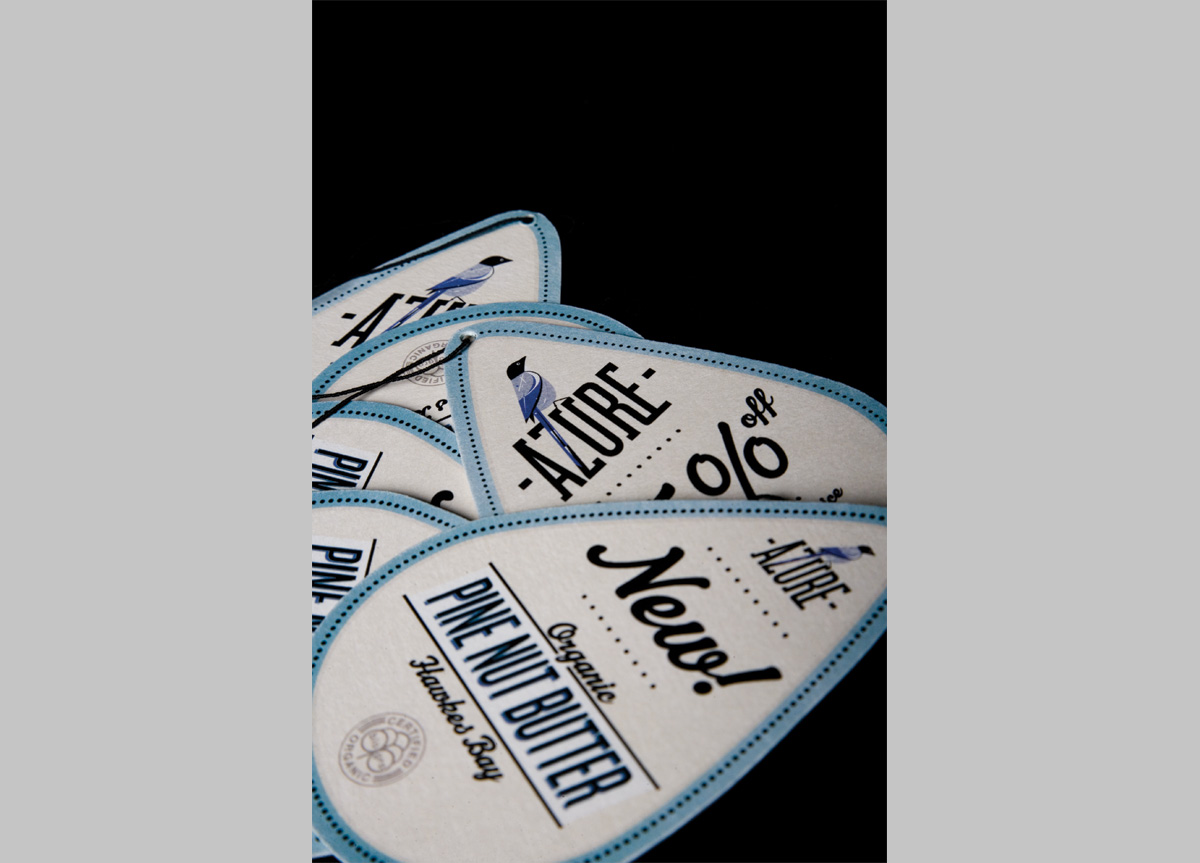
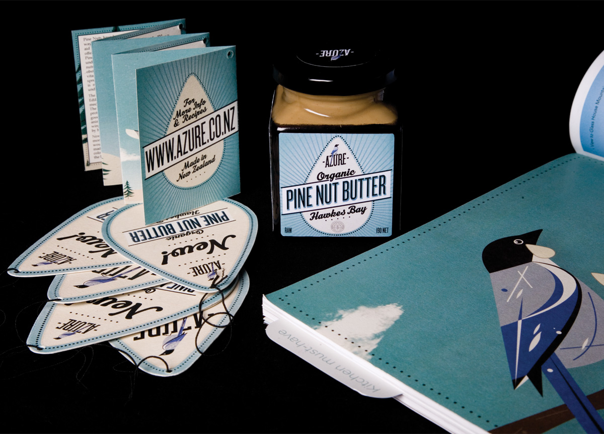
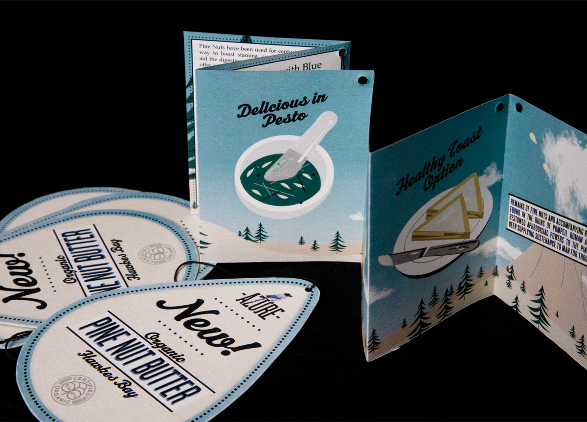
In order to sit comfortably in the boutique food market, the aim was to design a logo and packaging that had some retro cool appeal, communicating “heritage” while maintaining a modern look and feel at the same time.


APPROACH

The 1950s style of illustration, vivid neutral color palette, diagonal treatment of the type, and font choices unify the identity and give the product its retro charm. It maintains a cool, restrained balance that gently nods to the 50s without looking old-fashioned.

Thomas’s strength is his aesthetic. He has a keen eye for styling and working up a design with finesse. His strength is that he has the maturity to know when to stop, which sets him apart from his classmates. This project showcases his unique and quirky point of view successfully. The decision to use retro-styled typography and illustration with a modern flavor somehow adds an idiosyncratic charm that makes this project so endearing. — Penny Dombroski, tutor, and Nick Konings, graphic design course leader of Media Design School

Browse entries