CATEGORY

Offset

RANK


PRODUCTION DETAILS

Quantity

10,000

Page Count

Paper Stock

Newsprint, 50lb

Number of Colors

CMYK

Dimensions

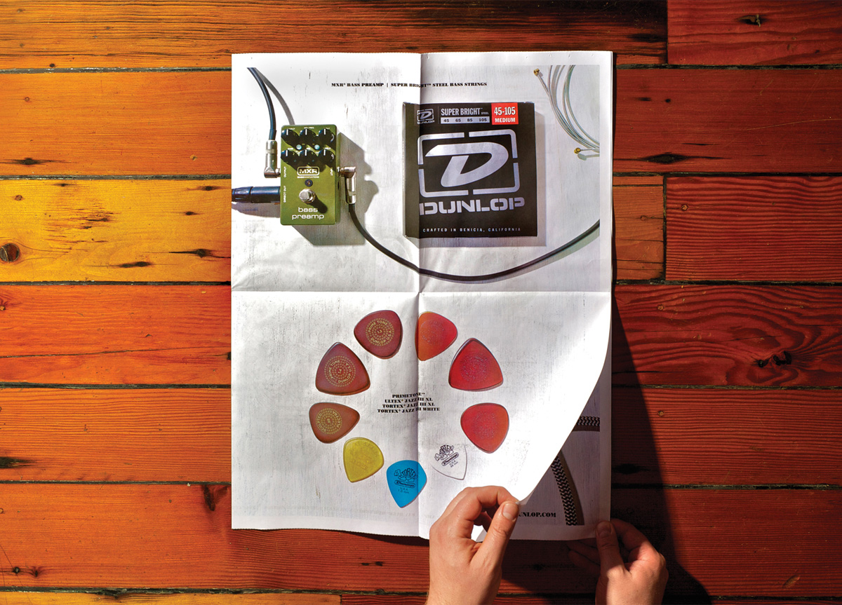
Flat: 22.75 × 35
Folded: 8.5 × 11.375

Binding

Special Techniques


ADDL. DESIGN CREDITS

President

Jimmy Dunlop

Creative Director

Joey Tosi

Art Director

Graham Shaw

Senior Designer

Justin Butler

Photographer and Designer

Mick Waller

Production Artist

Hank Alva


ADDL. PRODUCTION CREDITS


TAGS

, , ,


LINKS

Dunlop Manufacturing Inc.
American Foothill Publishing

Poster by/for Dunlop Manufacturing, Inc.Poster by/for Dunlop Manufacturing, Inc.Poster by/for Dunlop Manufacturing, Inc.Poster by/for Dunlop Manufacturing, Inc.Poster by/for Dunlop Manufacturing, Inc.


CLIENT

Dun­lop Man­u­fac­tur­ing, Inc., locat­ed in Beni­cia, CA, was found­ed as a small, fam­i­ly-owned and oper­at­ed com­pa­ny in 1965, and has since grown to be a lead­ing man­u­fac­tur­er of elec­tron­ic effects, picks, capos, slides, strings, and oth­er musi­cal instru­ment accessories.


BRIEF

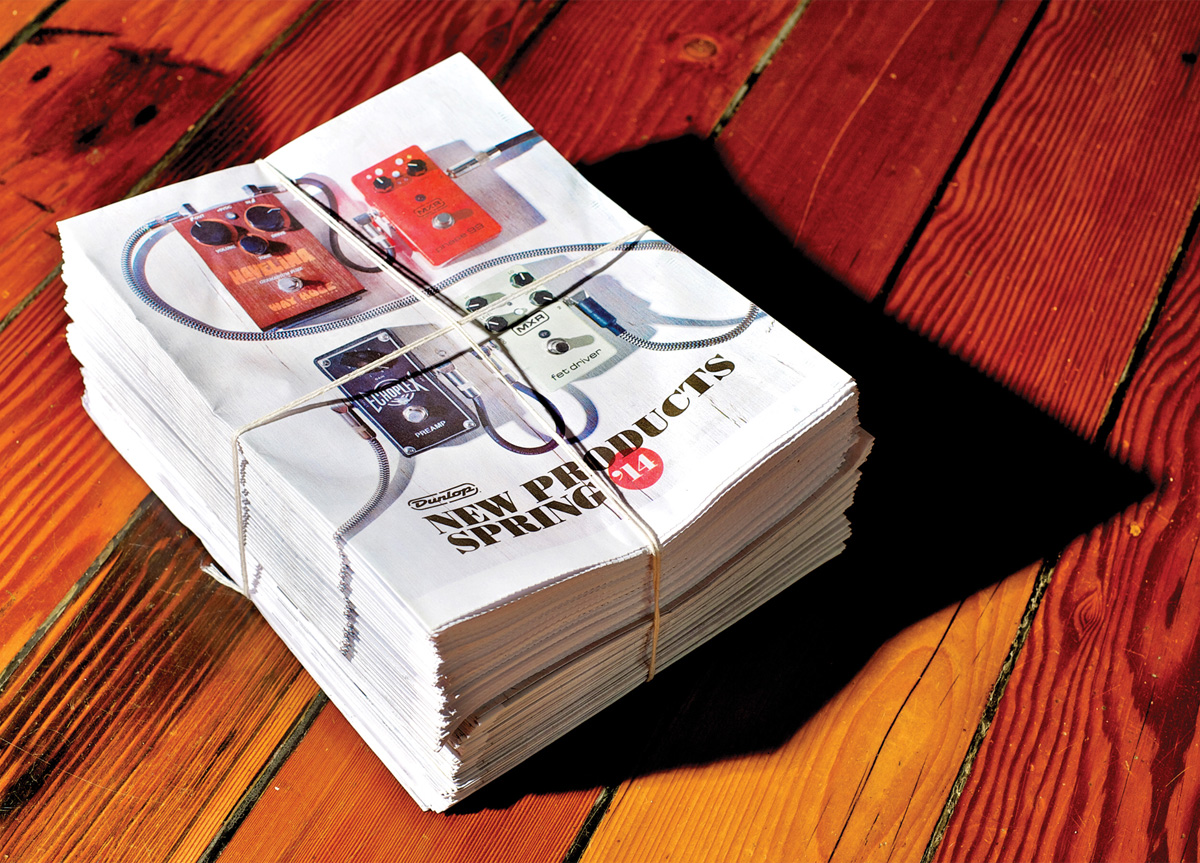
We were approached by our mar­ket­ing depart­ment to pro­duce our annu­al cat­a­log for 2014. Through ana­lyz­ing the cat­a­log’s func­tion and life, we decid­ed to change our approach.


APPROACH

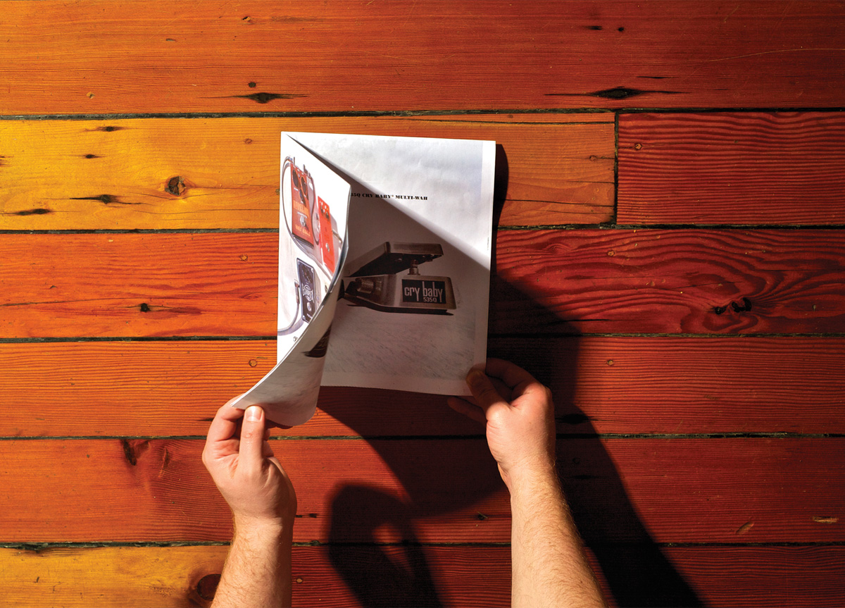
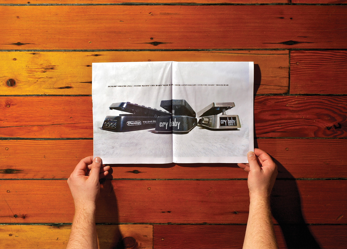
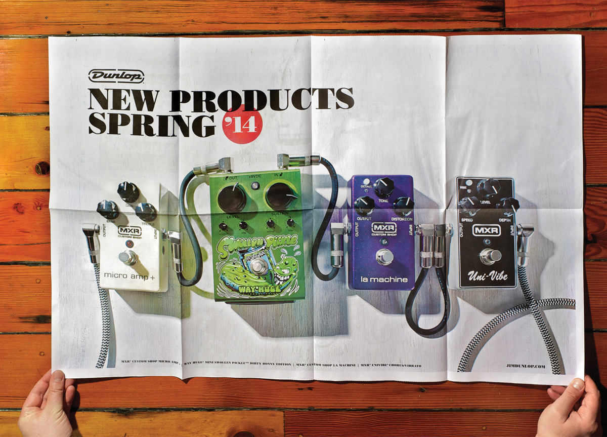
Tra­di­tion­al­ly we pro­duce a siz­able 150-page per­fect bound cat­a­log at the end of the year, but we felt that a more focused “New Prod­uct” print piece would serve us bet­ter. The news­pa­per is designed to be gear porn. It offers no more than aggres­sive­ly lit dynam­ic pho­tos and cryp­tic prod­uct names to incite the view­er’s curios­i­ty. The poster’s visu­al style is an evo­lu­tion­ary step for Dunlop—moving the com­pa­ny towards a notion of raw ele­gance. Tak­ing some cues from fash­ion brands like John Var­vatos, Dun­lop is attempt­ing to re-shape the visu­al land­scape of qual­i­ty gui­tar accessories.

PRODUCTION LESSONS

The biggest pitfall of using newsprint on a web press is ink show-through. When printing two-sided designs on thin stock there ends up being a great amount of ink saturation. One of the ways we lessened this effect was backing off on the ink coverage. It was a tough line to ride when trying to achieve a dramatic result, but we feel we achieved a good balance. Next time around we may go with a thicker coated stock to avoid this issue entirely.

Browse entries