CLIENT
Schnitz is a sandwich shop whose first location is in New York, NY, in the Lower East Side, which is known for its grittiness and counter culture—they fit right in. Previously, they were only at New York City markets, and known to be rebels—always doing things a bit differently, but still putting their food first.
BRIEF
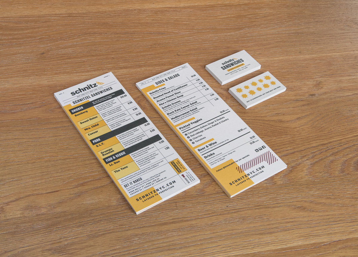
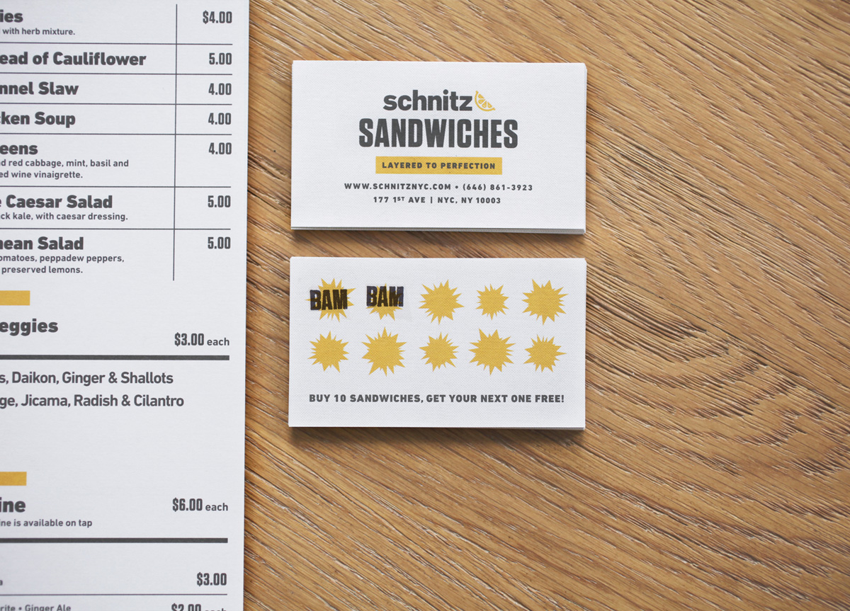
The Schnitz team came to us looking for creative leadership. We revamped their entire look and feel to match who they were and created all the printed items within the restaurant, from their menuboard to the loyalty cards.
APPROACH
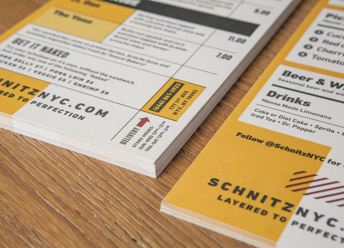
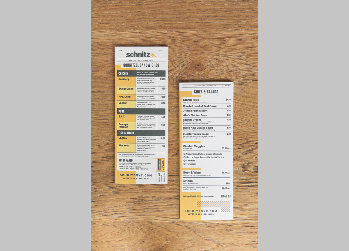
When designing for a restaurant, a menu is their most important asset. It’s their signature piece. But, it also needs to be their most flexible piece—this makes menu design challenging. Schintz has style and a rebellious attitude, so we designed a punchy system to match. The menu uses yellow and black for high contrast, bold sections to make choosing a sandwich easy, and a sans serif typeface to keep a clean edge. Yet, there is still a hint of playfulness, just like the food they serve. DIN Next was used as a nod to the food’s German roots and to match the calculated rigor that is employed for each sandwich.
