
![]()
![]()
CLIENT
TED is a nonprofit devoted to spreading ideas, usually in the form of short, powerful talks (18 minutes or less). TED began in 1984 as a conference where Technology, Entertainment, and Design converged, and today covers almost all topics—from science to business to global issues—in more than 100 languages.
BRIEF
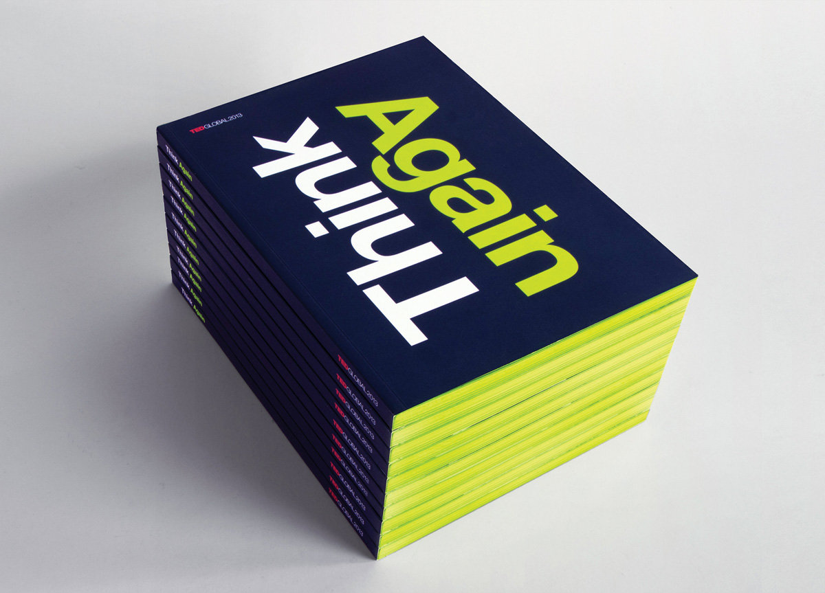
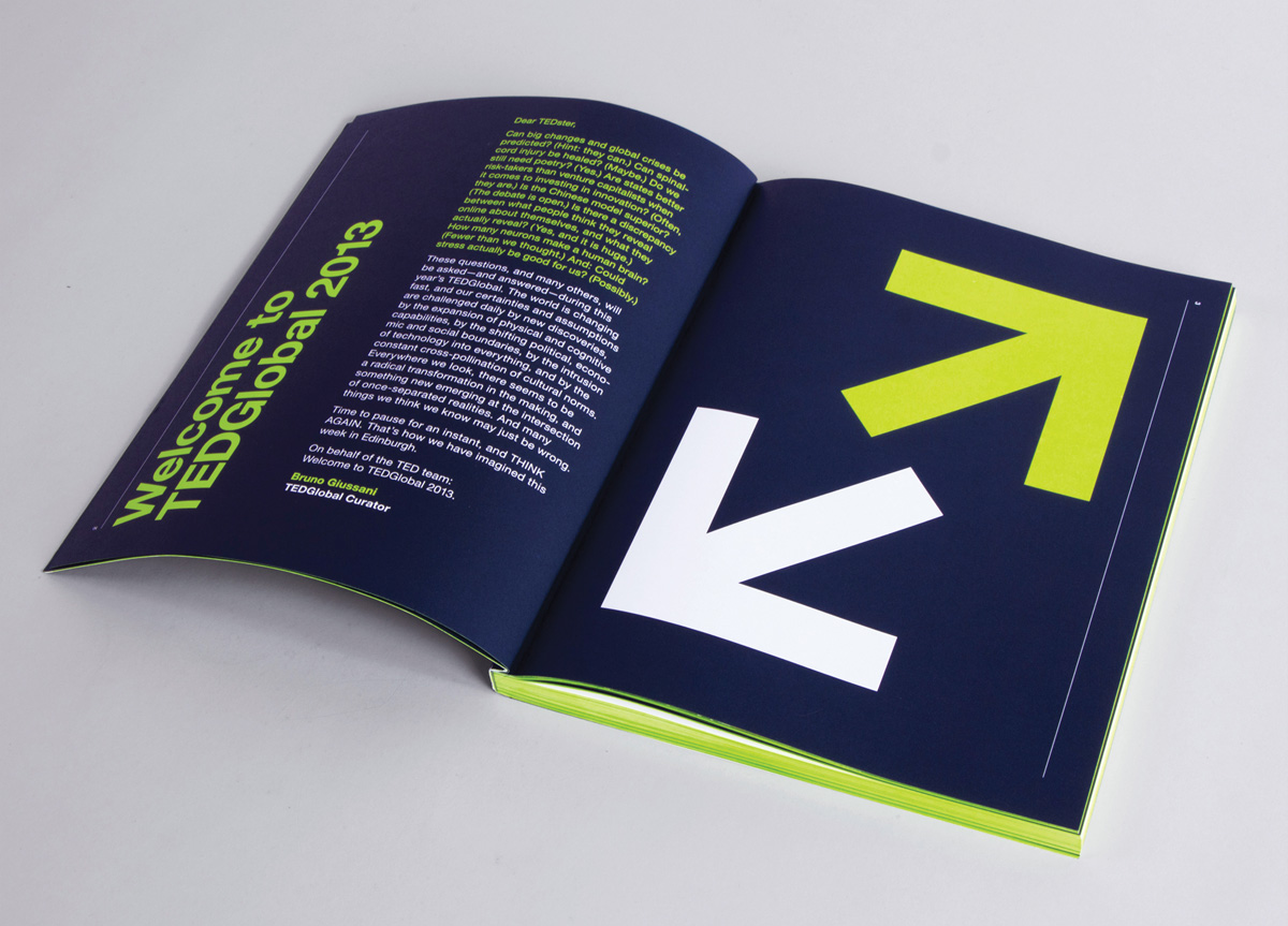
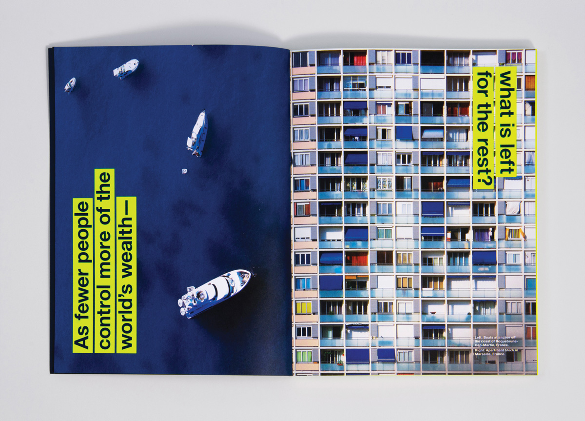
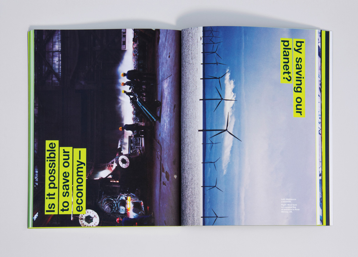
The theme for TEDGlobal 2013 was Think Again. Disciplines merge and cross-pollinate. Technology intrudes into biology and society. Power and authority are redistributed. Hopes and anxieties collide. A new world is emerging at the intersection of once-separated realities, and everything we know just may be wrong.
APPROACH
Hybrid Design took on the concept of Think Again, creating a comprehensive identity for the TEDGlobal 2013 conference. The goal was to encourage participants to approach old problems from new perspectives, and to look at everything from a new angle. This idea was explored by flipping imagery and typography to discover new connections. Throughout the book and conference a neon yellow acts as an agent of differentiation, championing alternate perspectives, and those who present them. Most dramatically the edge painting highlights an often unconsidered plane of the book, demanding recognition of something often unnoticed.


